
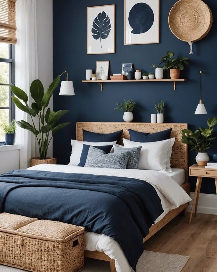
These 20 navy blue bedroom ideas run from a single velvet pillow swap to full built-in wardrobes with brass hardware, so the deciding factor is how much of the room you’re willing to change and how many weekends you can give it.
A navy accent wall with removable wallpaper lets renters test the look without a lease fight; the built-in wardrobes further down take a real budget and a contractor, but they show where this color can go long-term.
Matte paint finish matters more than the exact shade; eggshell or satin bounce too much light and flatten navy into something brighter than it should read.
1. Wood Accents
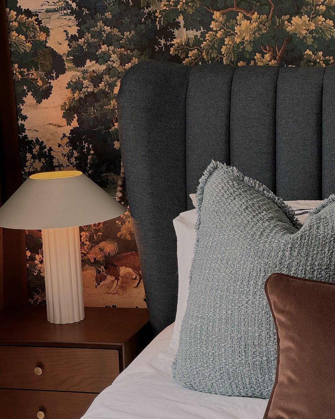
Warm wood keeps navy from feeling cold in a bedroom. Oak or walnut nightstands, a wooden headboard, or reclaimed shelving bring in an organic quality that balances the blue.
Light woods like ash or pine give a Scandinavian contrast.
A linen duvet and a woven basket or two help highlight the grain. The whole combination costs about what you’d spend on a single decent dresser, and most of it moves with you when you go.
2. Navy and Gold
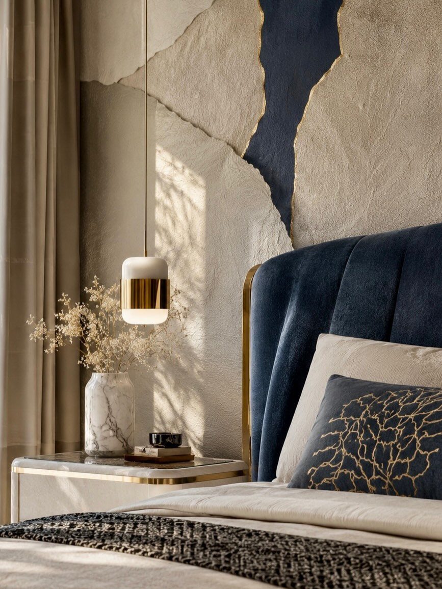
Gold against navy reads as luxury because the metals catch light against such a deep, light-absorbing color. Hardware, a pendant light, or a mirror frame carries the accent without scattering it everywhere.
A marble vase with dried stems is enough ornament. Too much gold drifts toward disco territory fast.
Matte navy paint with brushed gold fixtures works better than high-gloss navy with polished gold; the contrast stays controlled. If your budget is tight, switch out drawer pulls first.
3. Navy Accent Wall
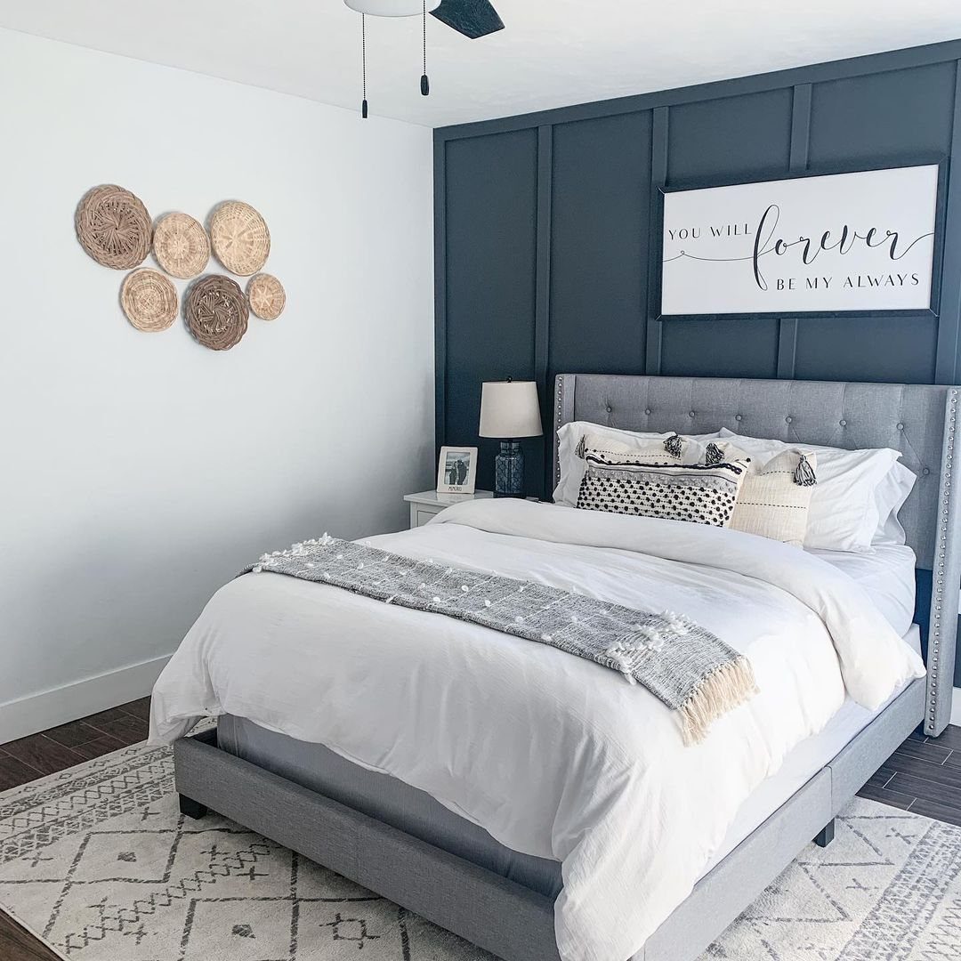
One navy wall behind the bed gives you the drama without boxing yourself in. I always suggest matte finish, not eggshell or satin; matte absorbs light and lets navy read at its deepest.
The wall frames whatever headboard you have now, even a basic metal frame. Pale furniture or soft bedding on the other three sides keeps the room from going cave-dark.
For renters, removable wallpaper in a navy pattern tests the idea without paint. Check a sample in both daylight and lamplight before you commit; navy shifts more than you’d expect across different hours.
4. Navy Velvet Headboard
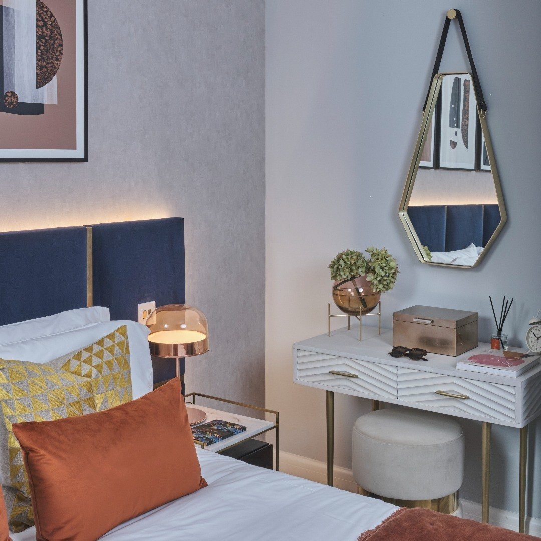
Velvet gives navy a quality flat fabrics don’t: the pile catches light differently through the day, so the color seems to move. A tall headboard in this material anchors the room by itself.
I look for one that extends 15–20 cm past each side of the mattress. That extra width gives the bed visual weight it wouldn’t have otherwise.
White or cream bedding against it keeps the palette fresh. If a full velvet headboard is too much for your budget, one velvet pillow on linen bedding delivers some of the same effect for a fraction of the cost.
5. Navy Ceiling
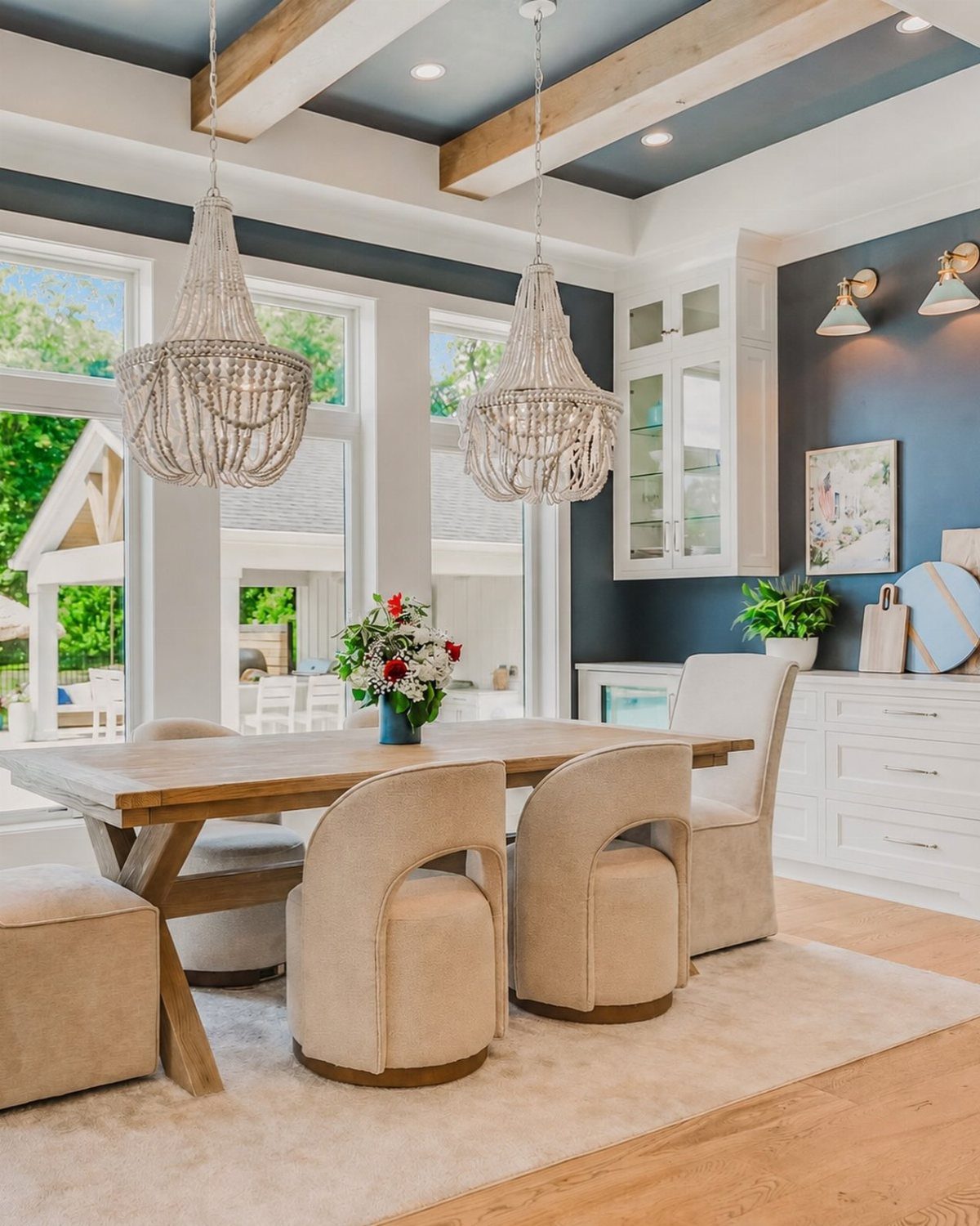
A navy ceiling, sometimes called the fifth wall, wraps the room in color without darkening the walls themselves. It works best when your ceiling clears about 2.7 meters; anything lower and the color can press down.
White walls and trim below balance the drama. Light wood beams, if you have them, add structure without competing.
Peel-and-stick ceiling wallpaper now exists for this, and it’s manageable as a weekend DIY. Paint takes longer but costs less.
Move the bed out first; neck-craning in place is a mistake that only happens once.
6. Navy and Brown
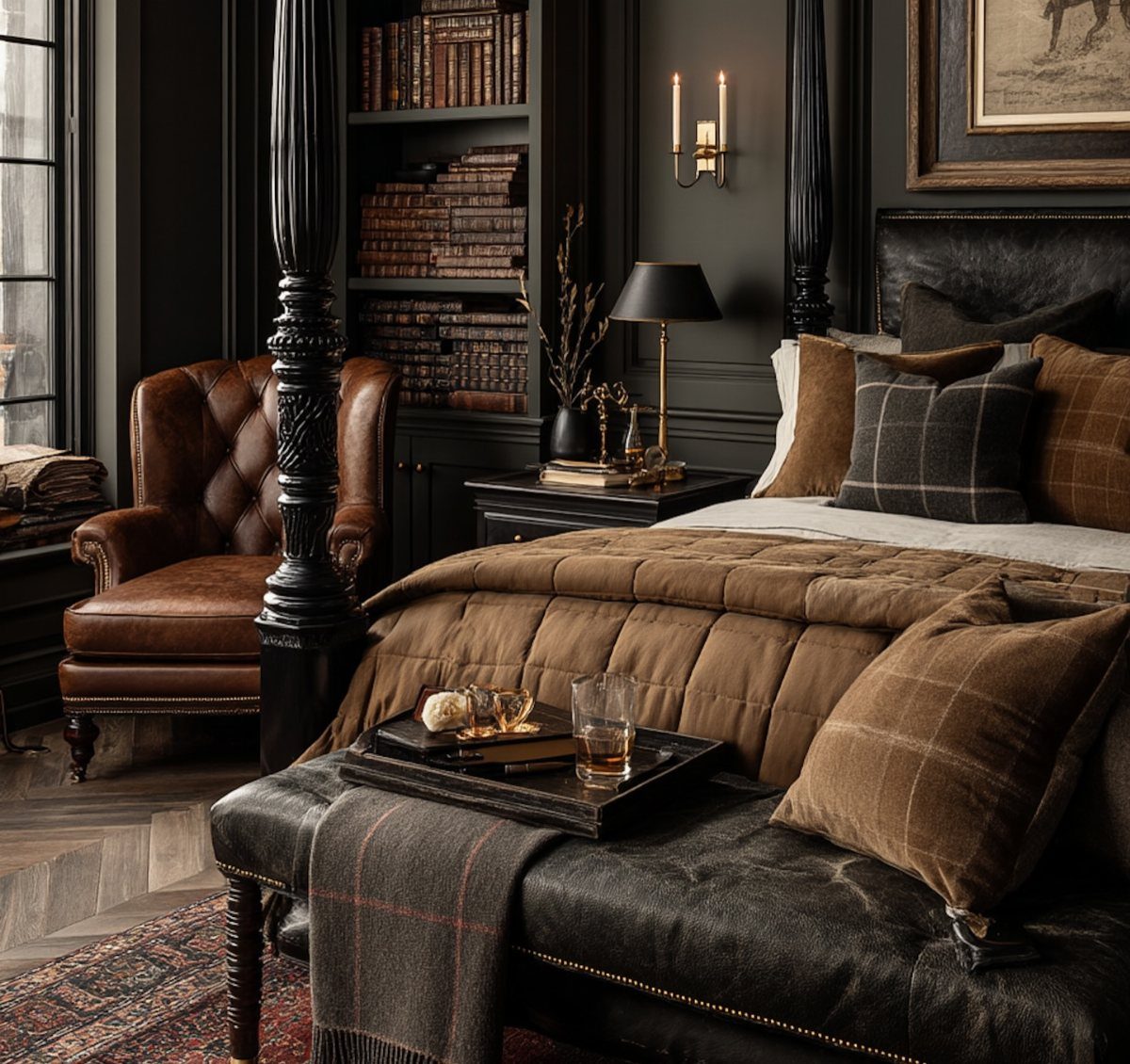
Navy with brown succeeds because both colors read as deep and grounded rather than competing for attention. Cognac leather, walnut wood, or a chocolate brown throw each add warmth that navy alone can flatten.
One substantial brown piece is usually enough; a leather bench or a walnut dresser carries the weight. More than that and the room starts to feel like a study nobody leaves.
I think of this combination as the comfortable private library palette. It suits people who want their bedroom to feel collected over time rather than staged, and who don’t mind a space that photographs darker than it lives.
7. Navy and White
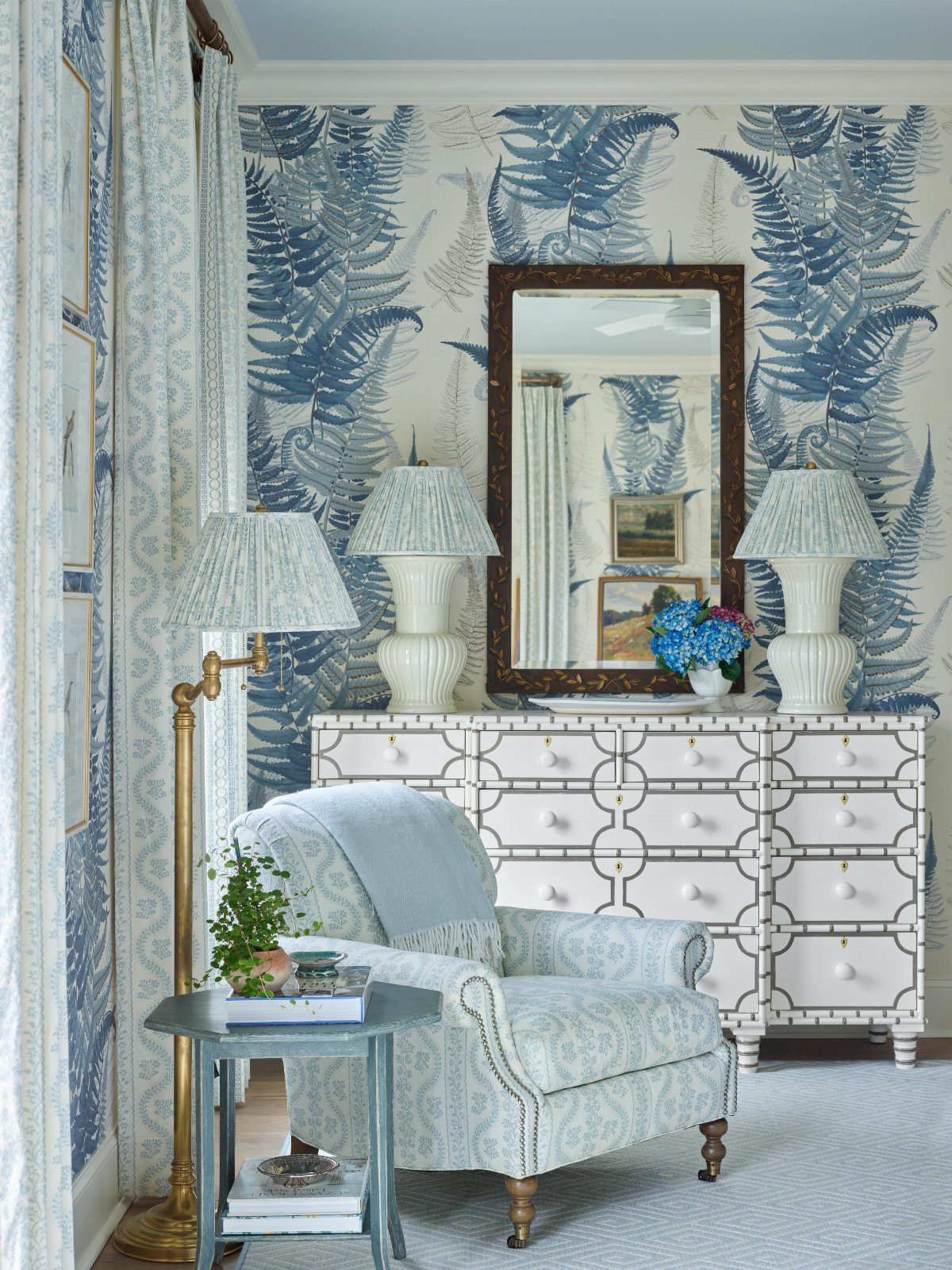
Navy and white is the pairing most people picture first, and it still earns its place when you keep the contrast working for you rather than against the room.
Crisp white sheets against a navy wall brighten the whole space, then you echo that navy back into a headboard stripe, a lumbar pillow, or framed prints so the color travels instead of parking in one spot.
Traditional pieces fit right into a navy and white room; modern lines work just as well. I’d pick this one for anyone who wants a clean look that still feels warm enough to sleep in.
8. Navy and Blush Pink
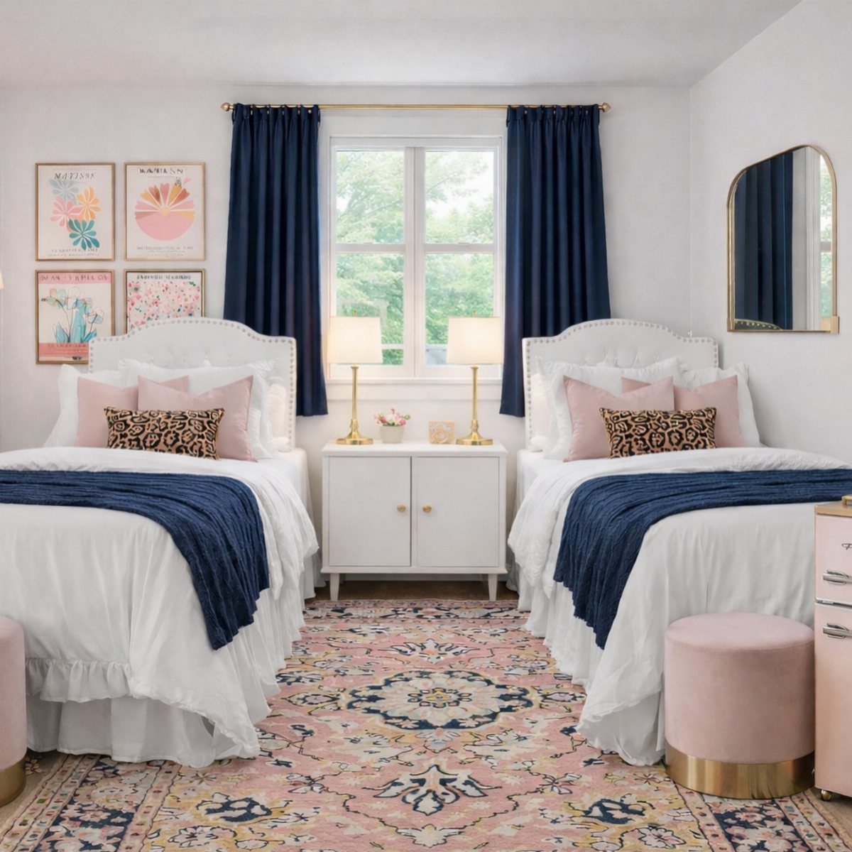
Blush pink against navy reads romantic without tipping into sweet, but only if navy stays dominant.
One blush throw pillow, a ceramic vase, or a velvet bench is plenty; more than that and the softness starts to compete with the depth you’re after.
Warm lamp light in the evening brings the combination to life. This suits a shared bedroom or a guest room where you want some energy without loud color.
9. Coastal Navy Bedroom
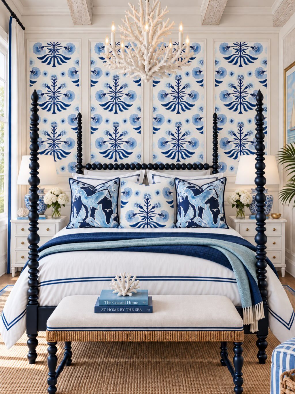
A coastal navy bedroom brings the ocean in through texture and tone rather than theme-park props. White linen, rattan, pale oak, and woven shades do the work; one simple seascape or a textured pendant is enough nod to the beach.
Sandy neutrals keep navy from going too dark, and natural fibers prevent the room from feeling stiff. Skip the rope accents and seashell collections; they tip quickly into kitsch.
This one stays fresh year-round, though it shines brightest when winter drags on and you need a reminder of summer air.
10. Mirrors
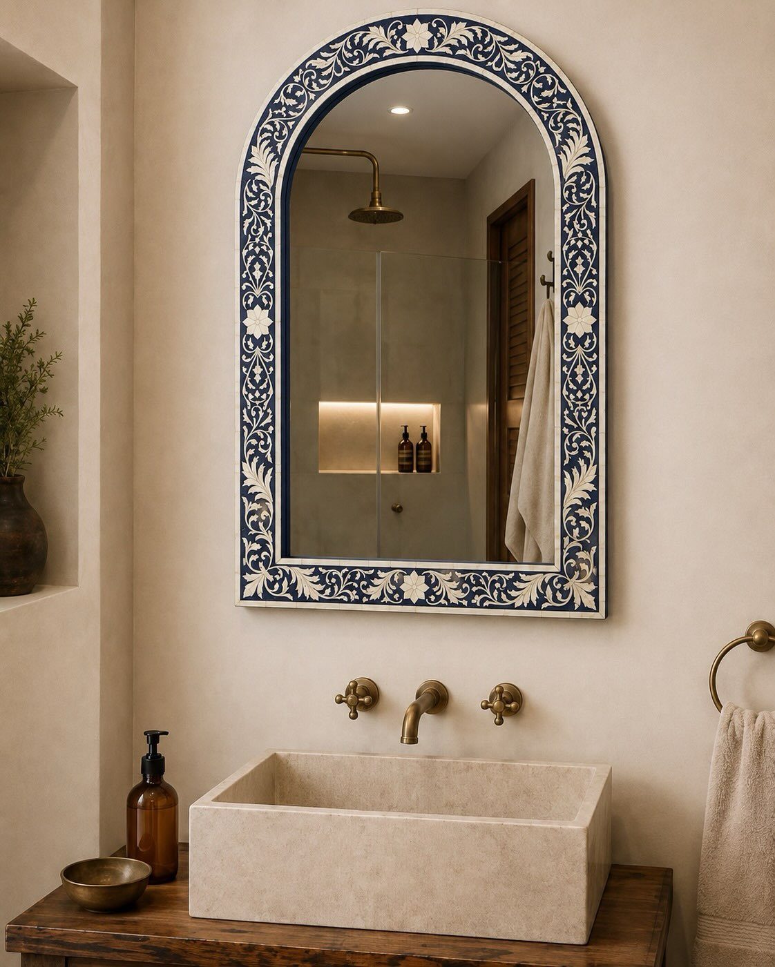
Dark walls swallow light, so a mirror in a navy bedroom does real work beyond decoration. An arched shape with a thin brass or wood frame catches daylight from a window and spreads it back into the room.
Place it opposite the window or beside the bed where the reflection stays calm, not cluttered.
A patterned frame lets a mirror carry its own color story without fighting the wall. In a smaller room this move matters most; the reflection effectively borrows space.
Keep the glass clean, and the frame narrow enough that the mirror surface does the heavy lifting.
11. Layered Textures
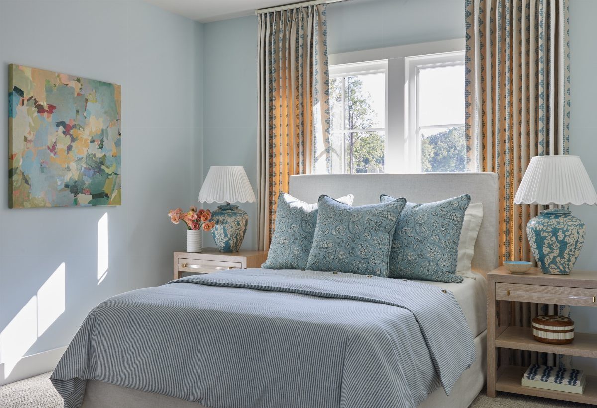
Midnight blue, a shade darker than classic navy, can flatten a room unless you build in contrast with your hands.
A chunky knit throw, faux fur pillow, woven rug, and linen curtains give your eye somewhere to land so the space feels full rather than heavy.
A nonslip pad between them keeps the layers from shifting. Mixed fabrics look good in photos, but more importantly they feel good to actually live inside.
This idea costs little and rewards the effort.
12. Navy Built-in Wardrobes
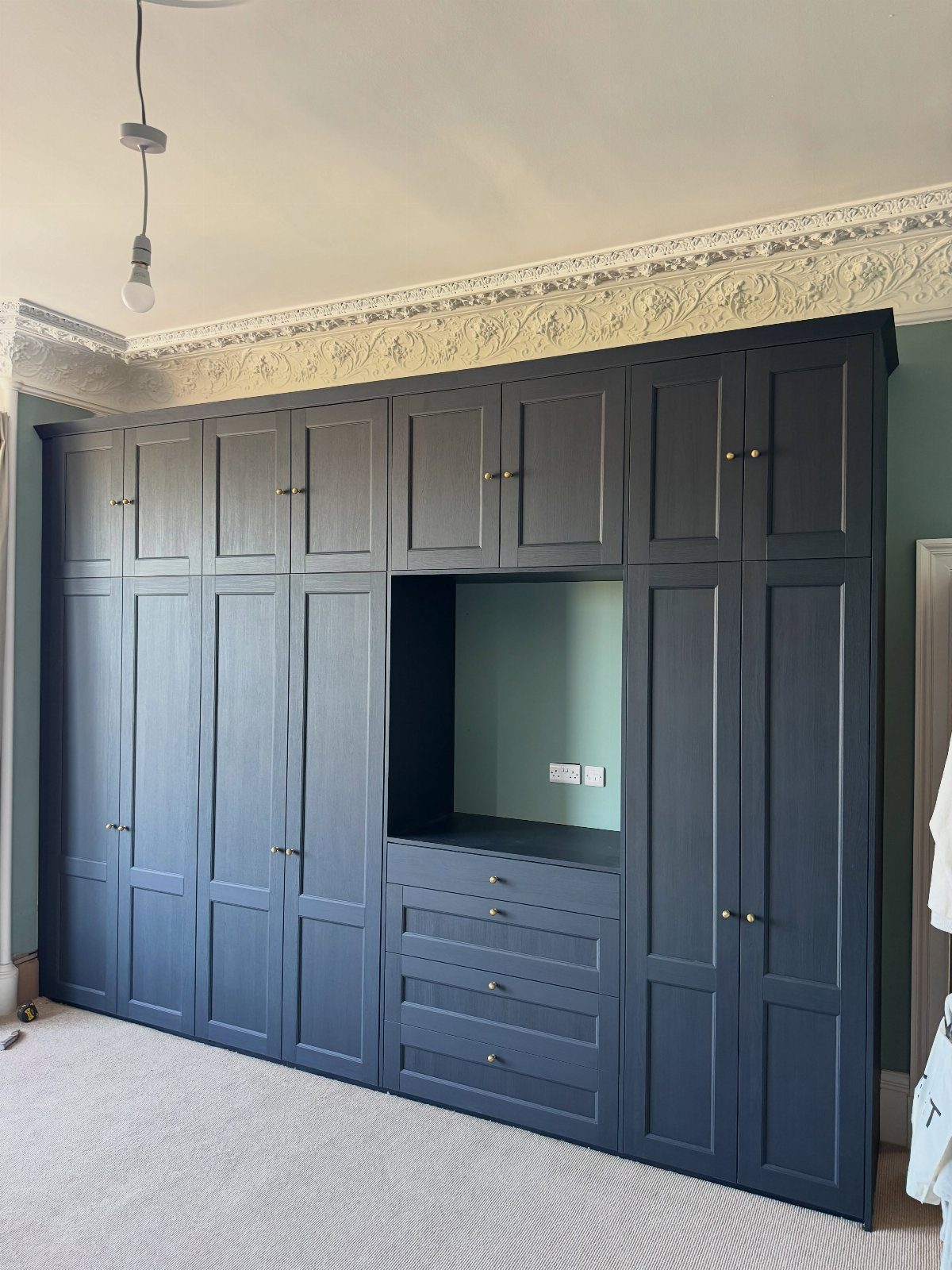
Floor-to-ceiling built-in wardrobes in navy turn storage into architecture. Shaker doors with brass knobs give the wall purpose and polish at once.
Brass hardware and professional help with the install are worth the cost; this is not a solo weekend project.
A desk recess with a light teal back panel breaks up the mass and proves built-ins can do more than hold clothes. Extend to the ceiling, always; a gap above collects dust and looks unfinished.
13. Navy and Black
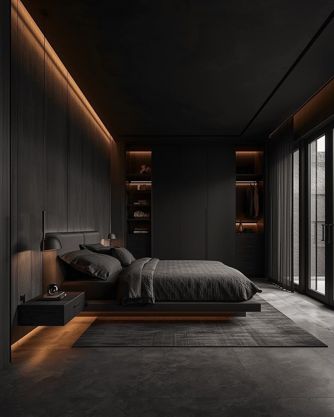
Navy and black together push a bedroom into territory most color guides warn against, which is exactly why it works when you commit fully.
The pairing needs darkness everywhere: walls, furniture, hardware, lighting, all carrying weight so neither color reads as an accident.
Once the navy and black settle into one deep tone, the difference is in what you touch: a nubby weave on the bench, the soft pile of a rug, matte paint against a lacquered frame.
Velvet, linen, bouclé, and natural wood add the variation that pattern or contrast normally would. Without them, the space sinks into a single plane.
This suits someone who wants their bedroom to feel like evening, not morning. It trades away the ease of adding color later; every new piece has to pass the same darkness test.
If that feels too final, navy and charcoal keeps some flexibility while staying moody.
14. Navy and Ochre Accents
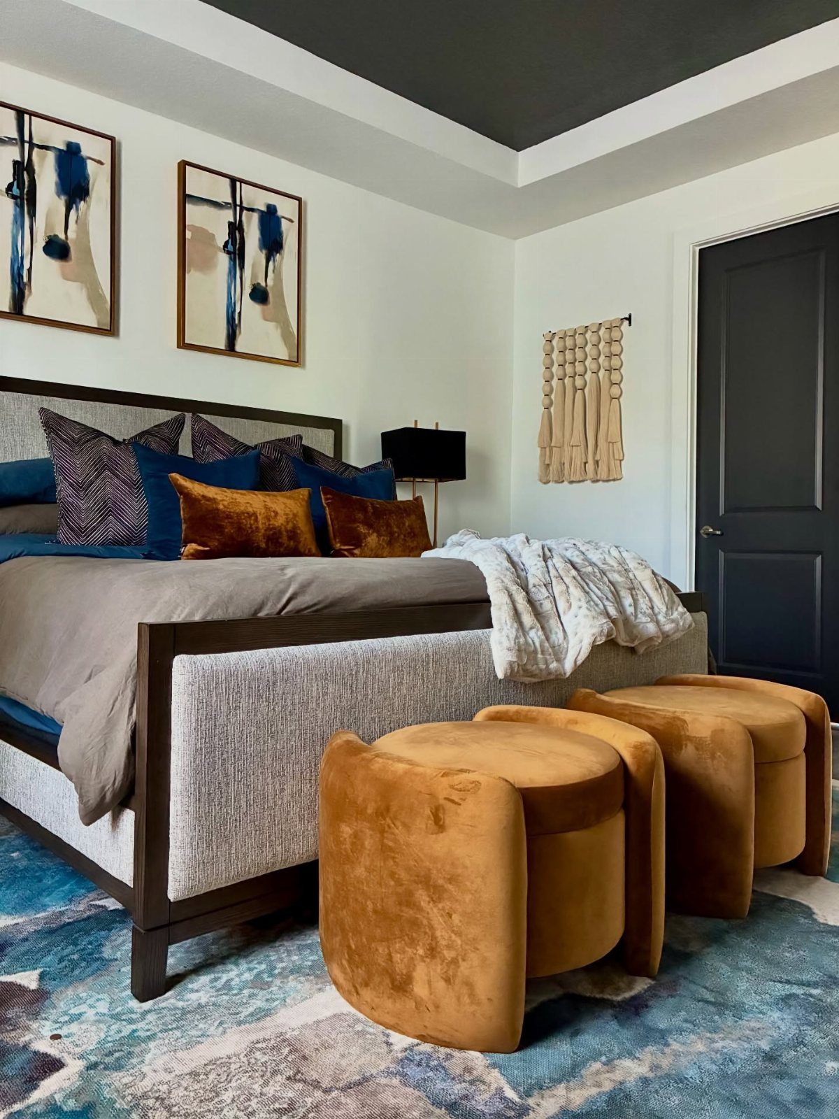
Ochre against navy reads warmer than gold and less expected than blush. Keep the walls white so the color hits in textiles, not paint.
For renters or anyone painting one wall navy, this pairing keeps the mood without the commitment of colored cabinetry.
15. Navy Blue Paneled Walls
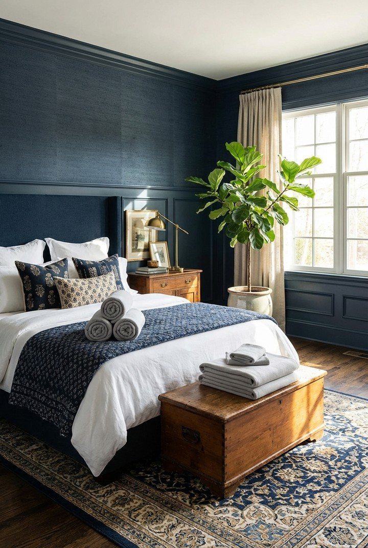
Paneling turns navy paint into architecture. The boards catch light differently than flat drywall, so the same color reads lighter by day and deeper after dark.
White bedding against it stays nonnegotiable; pattern competes with the lines. A wooden chest at the foot, like the one visible, warms the whole thing up.
Hiring out wall paneling runs more than doing it yourself, but either way the real cost is time: a miter saw and a nail gun turn it into a weekend job if you are comfortable with both.
The paneling is not.
16. Navy Twin Bedroom
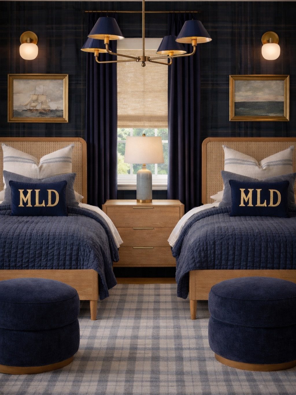
Two twin beds in navy work best when the bedding matches exactly. Mismatched quilts read camp; identical ones read intentional.
The cane headboards here add texture without weight, which matters in a shared room where visual clutter doubles. Monogrammed pillows are a nice touch if you have a machine or a friend with one.
Leave enough space between mattress edges for a shared nightstand and lamp. Navy walls behind dark bedding need something pale on the floor or window, or the room caves in.
Plaid wallpaper, like what’s visible, handles that job without extra thinking.
17. Rustic Navy Bedroom

Exposed beams and navy walls share a language: both look like they took effort and both reward imperfection. Pinecone headboard trim is the kind of detail you collect on walks, not buy.
Taxidermy isn’t for everyone; antlers or a good reproduction achieve the same vertical draw without the dusting guilt. Earth-toned bedding against navy keeps the palette to two families, which saves money because everything coordinates.
This setup trades polish for atmosphere. If you need your bedroom to photograph like a hotel, look elsewhere.
If you want it to feel like a cabin, start with the beams and add navy after.
18. Gold Tree Wall Mural

A wall mural of a gold tree sounds like a lot. In practice, the metallic reads as texture more than motif, especially with lights threaded through.
The quilted bedding and curtains in matching navy keep the eye from scattering. I’d mount it on the wall behind the headboard only, not wrapping corners.
Too much gold elsewhere tips toward hotel lobby. One big gesture beats a cluster of small ones.
19. Navy Blue Plaid Wallpaper
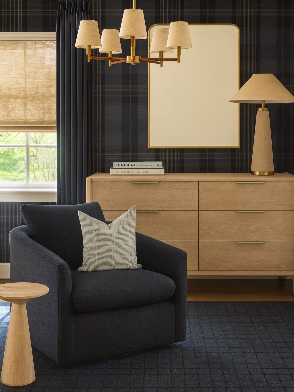
Plaid wallpaper in navy risks lodge or prep-school depending on scale. The pattern visible here is large enough to read as texture from the doorway, small enough to hold detail up close.
A single accent wall keeps it from overwhelming; paint the rest in a solid that picks up one of the plaid’s secondary colors. Light wood furniture balances the darkness the way painted pieces can’t.
Removable wallpaper exists for this exact situation, though I’d test a sample for a week: adhesive formulas vary, and some lift paint in humid bathrooms. Bedrooms are usually safer.
The armchair in matching navy is a flex; a cream or tan one relaxes the whole thing.
20. Navy Rattan Kids Bedroom
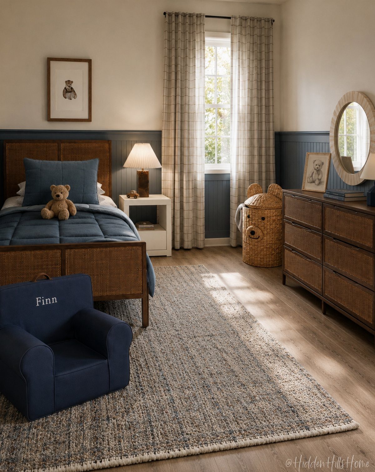
Rattan softens navy enough for a child’s room without washing it out into baby blue.
One woven piece, usually the headboard or a chair, keeps the room from going flat against solid navy bedding and wall paneling that reads as texture, not pattern.
A beadboard wall in deep blue gives the room structure; rattan adds warmth that keeps it from feeling like a nautical theme threw up.
I would skip the themed accessories (no anchors, no whales) and let the materials do the work. A name-embroidered chair is cute if you are committed to the spelling forever; otherwise, plain upholstery travels better as the child grows.
This suits parents who want a color with staying power that still feels gentle at bedtime.
Why Choose Navy Blue?
Navy blue soaks up light and leaves the room feeling wrapped in, which is exactly what I want from a bedroom.
Navy blue has stayed put for decades in American homes and closets while trend colors came and went. Most people find it calming rather than closing in, which is rare for a color this dark.
Balancing Dark Colors
Light, streamlined furniture and white or cream bedding keep the contrast alive.
Light hardwood or a whitewashed floor pushes back against the depth of navy walls. Brighter bedding in lighter tones keeps the scale from tipping too dark.
Morning sun pulls it toward brighter; evening pulls it toward mood. One overhead fixture will fight you; stack your light in layers instead.
Lighting Tips for Navy Bedrooms
A dimmer switch pays for itself in a navy room. Dropping from full brightness down to 30% turns the same room into a different space entirely.
Textiles and Materials
Do not make every surface blue. I use navy as the anchor, then pile on cream, blush, brown, green, brass, wood, and anything with texture.
Velvet, linen, and knits mixed together add the warmth and variation the room needs. These fabrics make a navy bedroom feel inviting and cozy rather than cold or flat.
Soft fabrics and natural materials balance the drama of dark walls.
Frequently Asked Questions
What color goes with navy blue in a bedroom?
White, cream, blush pink, gold, and warm wood tones all pair well with navy blue.
I use navy as the anchor and pile on cream, brown, green, brass, and anything with texture so the room stays warm rather than cold or flat.
What color compliments navy blue the most?
White and cream are the most reliable partners for navy blue.
Crisp white sheets against a navy wall brighten the whole space, and echoing that navy back into a headboard stripe or a lumbar pillow keeps the color moving instead of parking in one spot.
This pairing fits traditional pieces or modern lines equally well.
What are some ideas for decorating a navy blue bedroom?
An accent wall behind the bed gives drama without boxing the room in, especially in matte finish so the navy reads at its deepest.
What is a good dark blue color for a bedroom?
Navy blue is the most popular choice because it reads as calming rather than closing in, which is rare for a color this dark.
The shade I see recommended most often is a deep, balanced navy that sits right in the middle, not drifting toward purple on one side or teal on the other.
A step darker still, there is a navy that reads almost black in low light; I would save that one for a single wall rather than wrapping the whole room.





