
These 13 palettes run from a single gallon of paint and a weekend of cutting in to full jewel-tone rooms anchored by a sofa you sit against.
1. Harvest Warmth
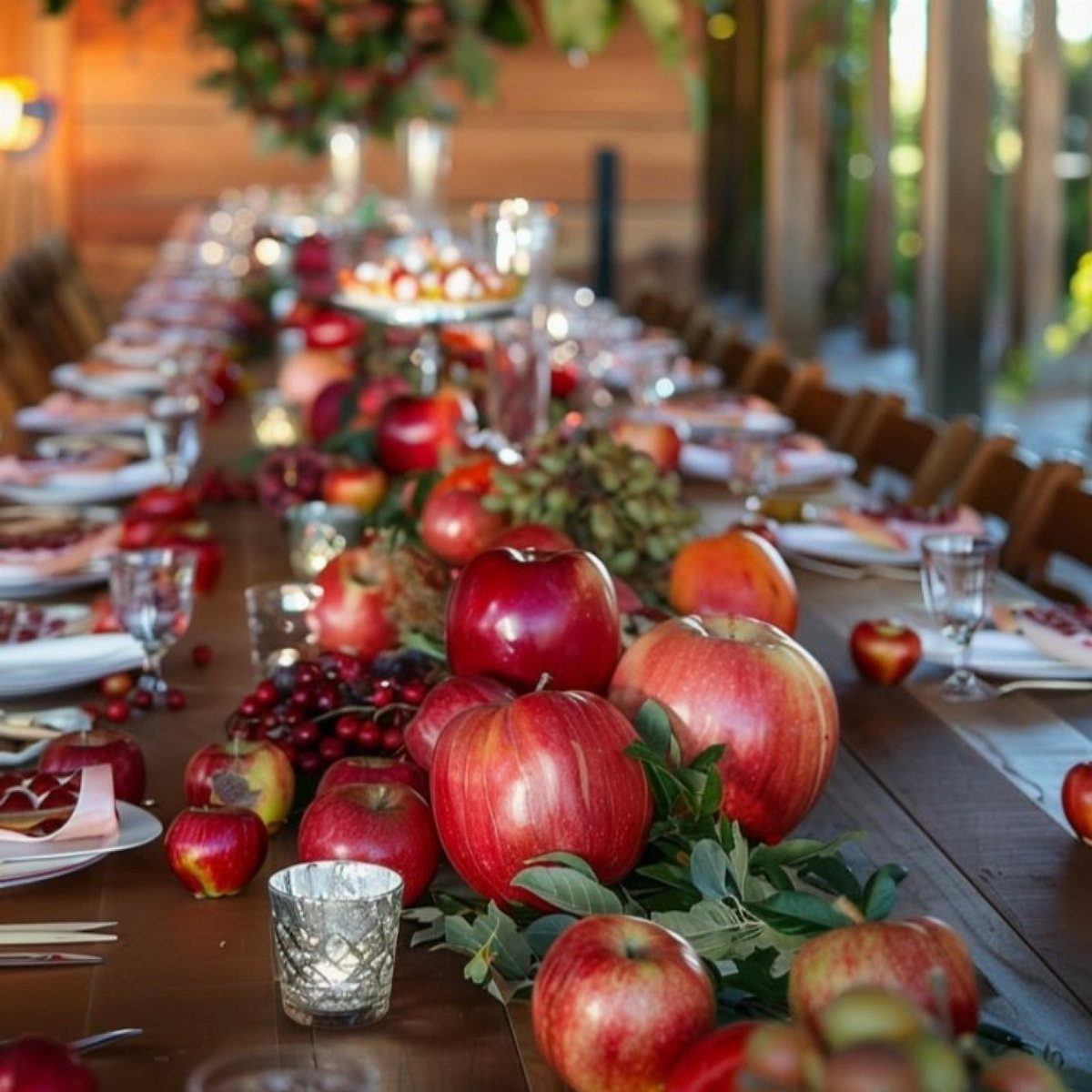
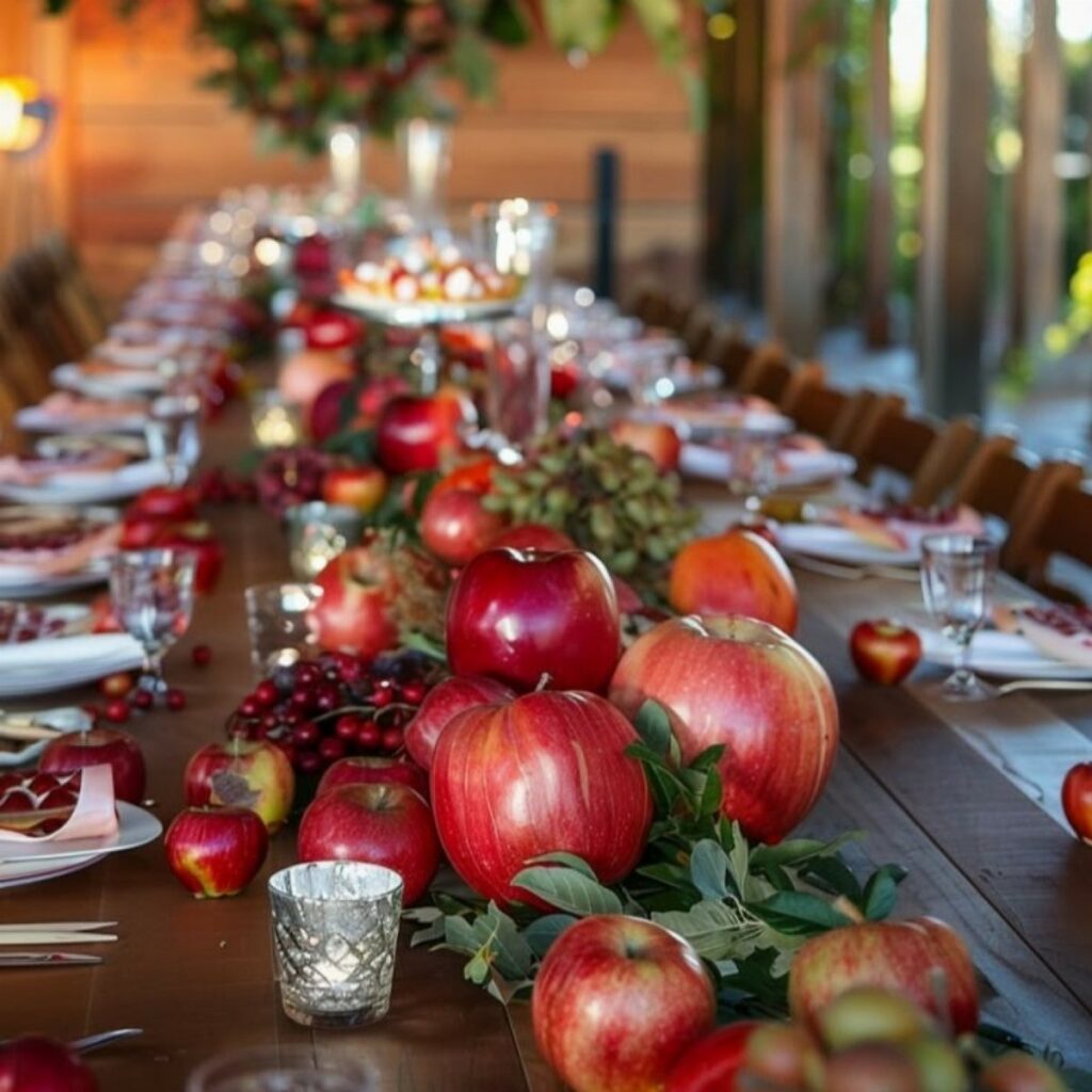
A runner of real fruit and cut greens turns a harvest table into something you could walk outside and gather yourself.
Spiced rust, antique gold, and olive green layer together without fighting for attention; the wheat tone underneath keeps it from reading too dark.
I’d start with a burlap base and build up: brass lanterns at the ends, velvet pillows on nearby chairs if the dining space opens to a living area.
The maker of the table setting uses seasonal fruit and foliage for texture and warmth, which tells you this look was built to be touched and eaten, not just photographed.
This palette suits farmhouse or traditional rooms where a little roughness around the edges feels intentional, not sloppy.
2. Earthy Neutrals
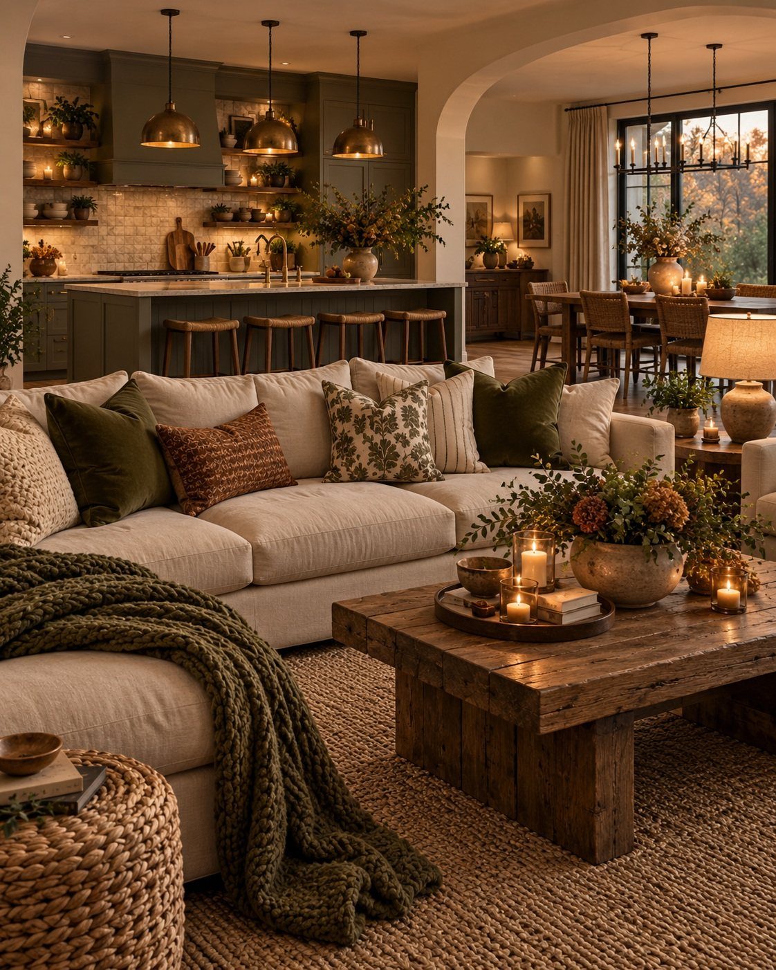
Cream boucle, stone gray pottery, and terracotta together make a fall palette that skips the obvious orange entirely. This range stretches from kitchen cabinets to living room sofa to small accessories without a jarring shift between spaces.
Terracotta vases and woven rugs ground the space while warm white keeps it from going muddy. Muted earthy shades hold a connection to the outdoors and a calm that works past November, not just during it.
For renters or anyone who can’t repaint, this is the palette to build with pillows, throws, and a single clay-colored bowl on the table. Skip it if you want your fall decor to read seasonal at a glance.
3. Golden Ochre
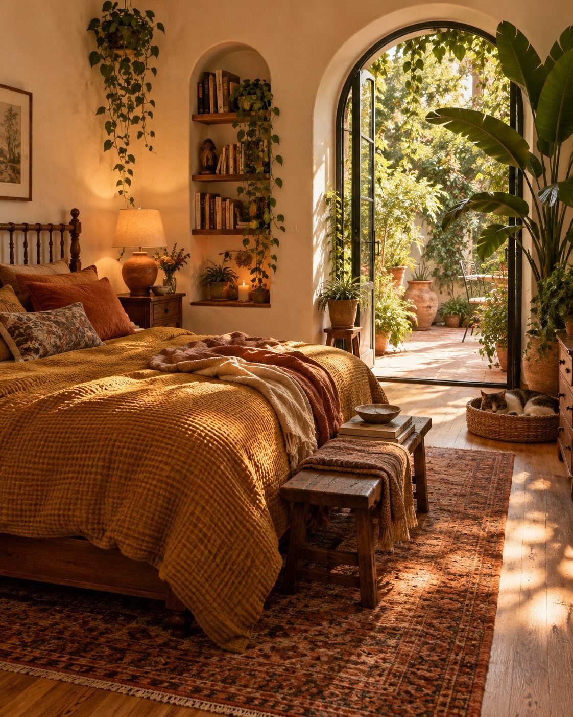
Golden ochre sits between summer yellow and autumn rust, bright enough to lift a room but deep enough to feel like October. Texture makes this color live: a nubby weave catches light differently than flat paint ever would.
Terracotta accents and a patterned rug keep it from floating away into pure sunshine. If you’re missing the longer days, this is the shade to bring back some warmth without pretending it’s still August.
A single ochre throw or a fresh set of pillow covers changes the whole bed without a full overhaul.
The maker of this bedroom chose golden ochre for its cheerfulness; the arched doorway and potted plants outside extend that warmth into the adjoining space.
4. Pumpkin & Spice
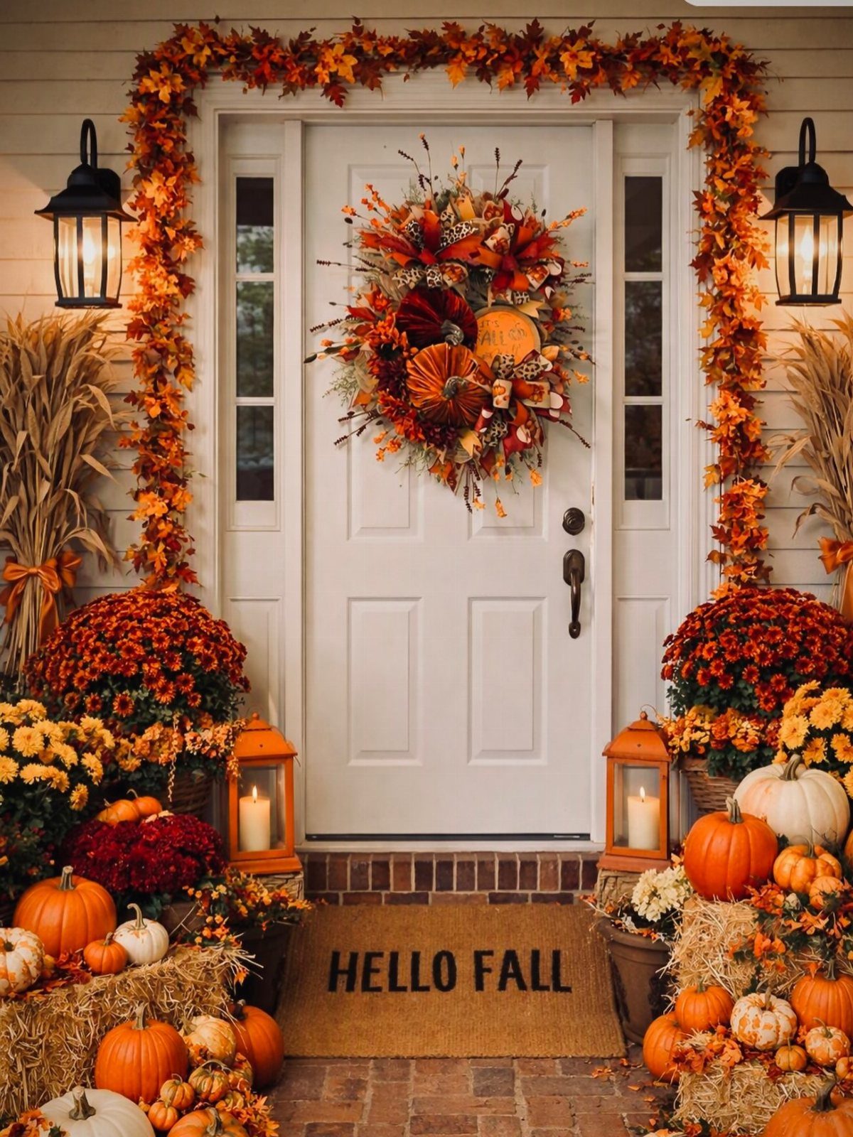
A little goes far outside: frame the door with dried corn stalks that stay out of the walkway, and pick lanterns that still light the step after dark.
Inside, I’d move the same colors to a mantel with amber glass candles and a plaid throw on the nearest chair. A porch version stays cheap if you keep the wreath frame and swap in fresh mums each season.
Farmhouse and cottage styles suit this best; modern spaces may need to dial the orange back to a single pumpkin.
5. Charcoal & Gold
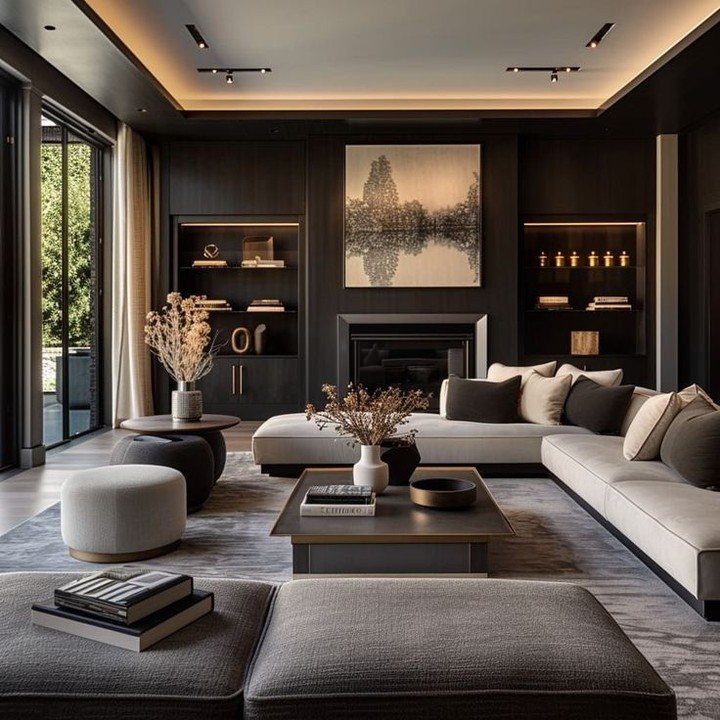
Charcoal walls with antique gold accents create a room that improves as the sun goes down.
Dark paint needs somewhere to breathe; without built-in shelving to break it up, keep charcoal to one accent wall and place soft gold in at least three spots so it reads as deliberate, not leftover.
Krystal Reinhard of Old Soul Interiors used Benjamin Moore’s Midnight Oil in a similar space to highlight original millwork; the color lets furnishings and art take center stage while the room still feels wrapped in something.
Taupe napkins and smoky glassware continue the mood at table height. This one asks for a little nerve and a space that gets enough light to keep the charcoal from flattening to black.
6. Rich Burgundy
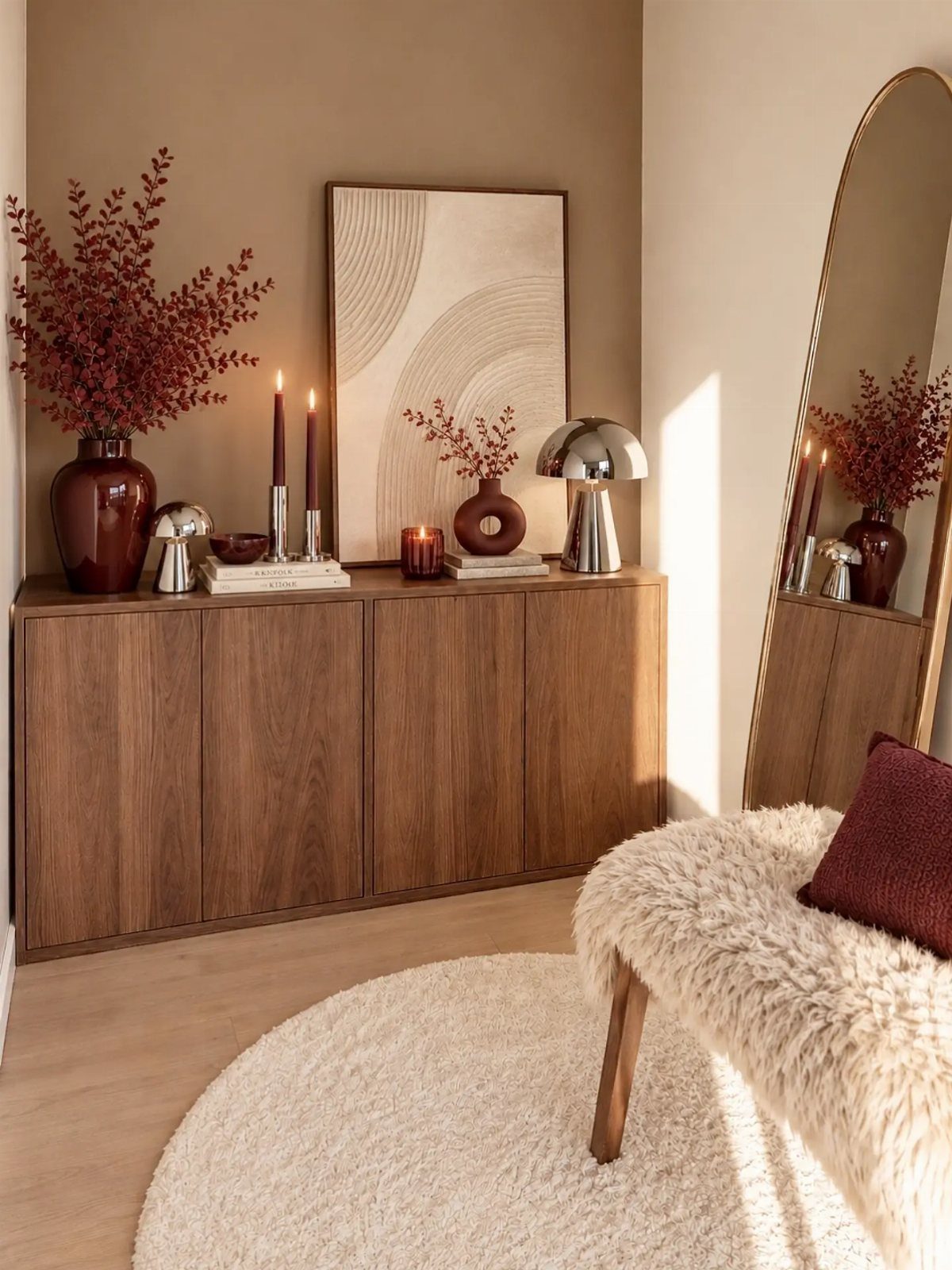
Deep burgundy brings wine-red warmth to a room without the shout of brighter reds. Keep burgundy controlled: one vase, two candles, a dark bowl, and the color still carries the room.
Marie Flanigan, the designer behind a high-gloss burgundy library, pairs this shade with wood, plaster, or stone for rooms that feel both elegant and lived-in.
A single burgundy velvet pillow or a set of taper candles tests the color without asking for long-term commitment. Farrow & Ball’s Blazer or Preference Red are solid paint choices if you want to go further.
This palette trades the casual ease of orange and gold for something more formal; use it in spaces where you entertain or want to feel dressed up at home.
7. Muted Orange
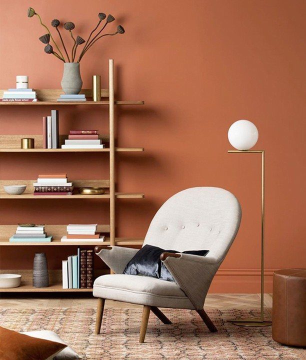
Muted orange steps back from the shout of pumpkin to something closer to weathered clay or old brick. A terracotta wall wraps a room in warmth without demanding all the attention.
I would start with paint on one wall, then layer in a cream armchair and a dark pillow so the color has something to lean against.
For a small space, this is the safer way to try orange. It costs the same as any gallon of quality paint, plus a weekend of cutting in around trim.
8. Biophilic Shades
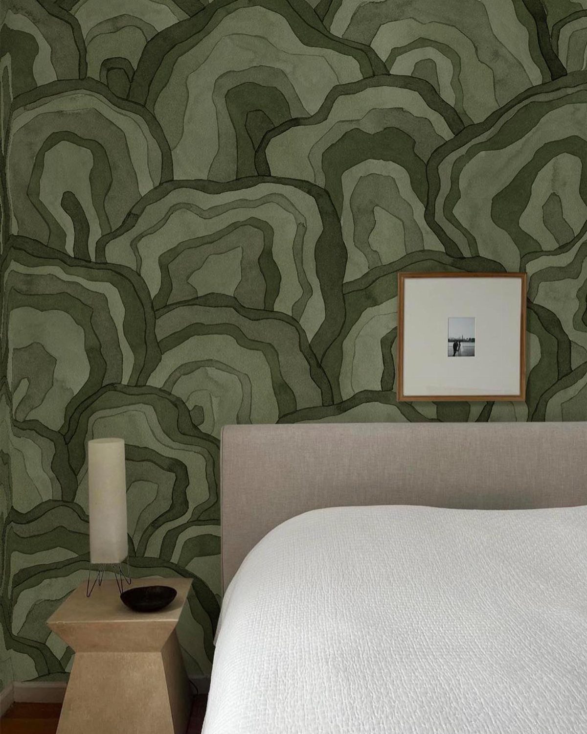
Biophilic shades pull from moss, olive, and the gray-green of sage leaves. Wavy, organic shapes in wallpaper carry the idea without a single plant in the room.
Moss green and earthy clay together create the calm that comes from remembering the outdoors.
Swap in pillows and a throw first if you are not ready for wallpaper. Drapery in these tones changes out easily when the season turns, and cotton blends keep the price reasonable.
This suits bedrooms and anywhere you want to lower the volume.
9. Soft Autumn Palette
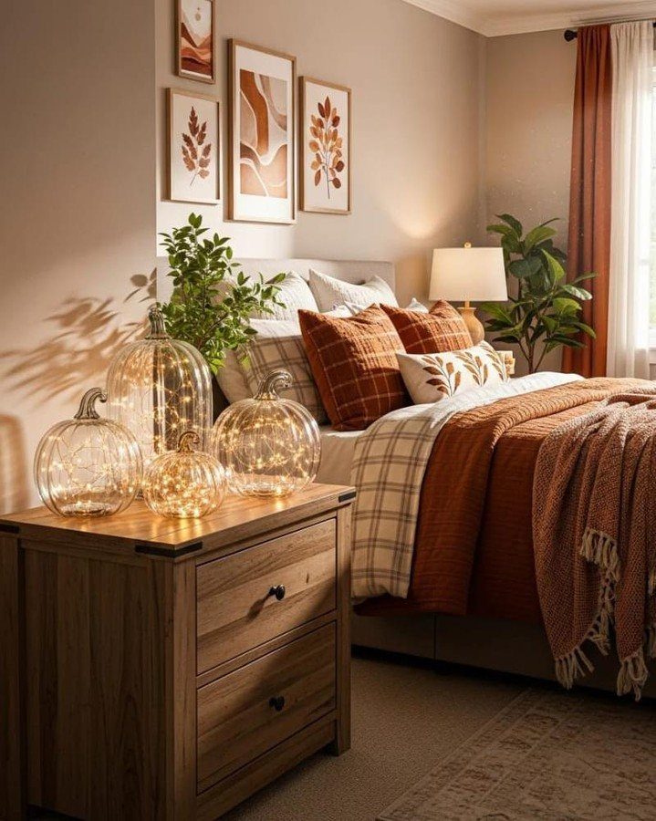
Soft autumn colors keep the familiar shapes of fall, dusty rose, soft olive, light taupe, but pull them back to a whisper.
Botanical prints in muted earth tones bridge the gap between the bed and the wall without adding another loud pattern.
This palette needs good light to read as warm rather than washed out. A north-facing room might need the lamp left on through the afternoon.
10. Deep Eggplant

Deep eggplant sits between purple and brown, close enough to neutral that it reads as rich rather than loud. Farrow & Ball’s Brinjal is the paint that gets mentioned for this, a color with enough depth to handle floor-to-ceiling use.
Eggplant is a color that holds its own, dark and saturated enough to anchor a space without help. One wall in a small study, or a ceiling in a powder room, goes far enough for most homes.
I would not try to balance it with bright white. Cream or a warm gray keeps the edge off.
11. Navy & Rust
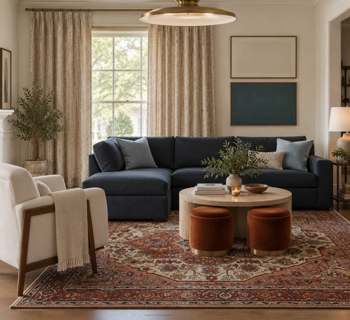
Navy and rust pair a cool anchor with a warm accent, the kind of contrast that reads as collected rather than accidental. Navy carries the large shapes, rust answers with smaller, softer ones, and the two split the work evenly.
An oriental rug with both tones already in it saves the trouble of matching later. Copper candlesticks or blue and white ceramics pick up either side without adding a third color.
This works for transitional rooms and eclectic mixes where you already own too many styles to call it one thing.
12. Blush & Copper
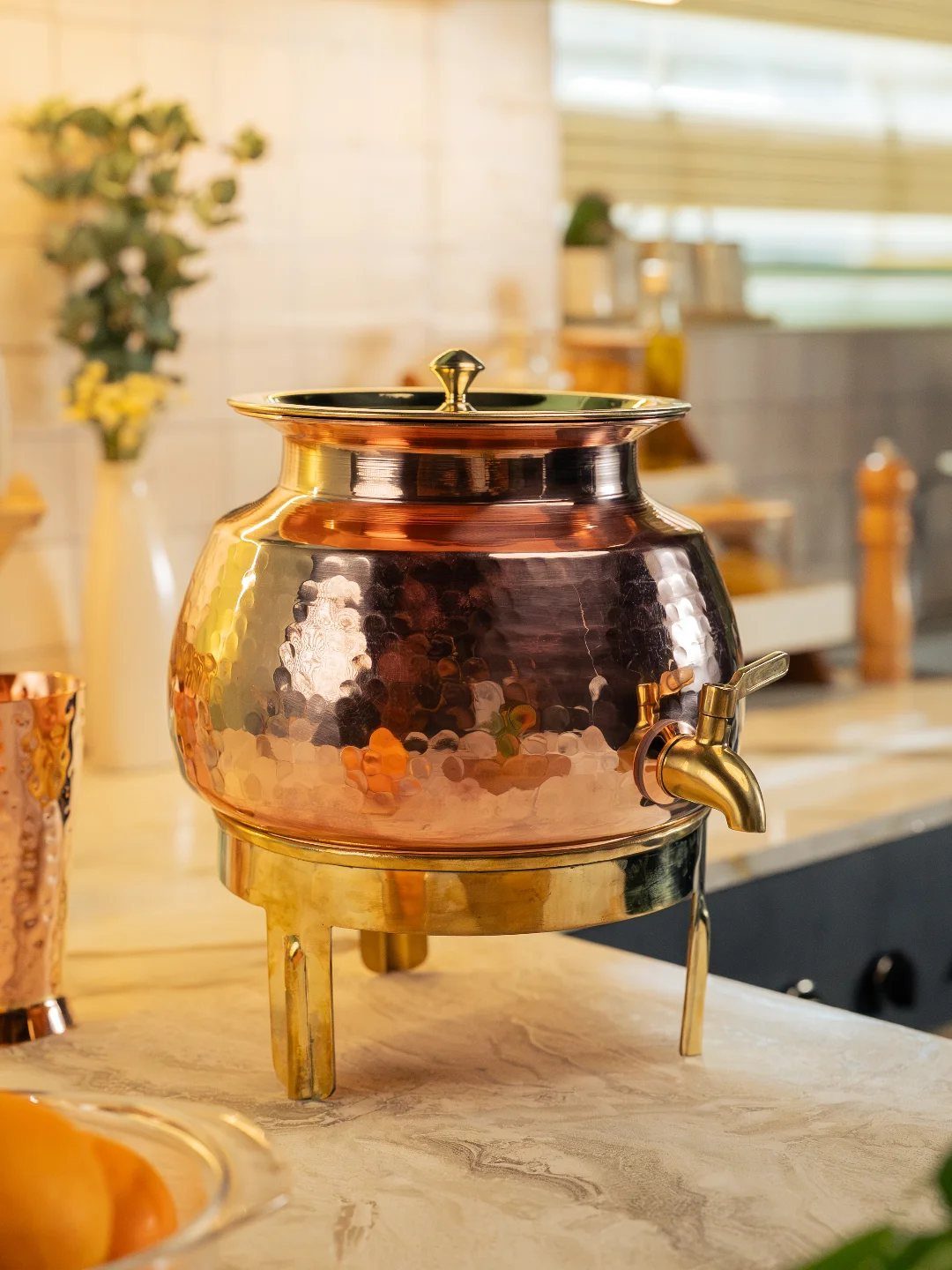
Blush and copper step away from every expected fall combination into something that feels more like a dressed table than a decorated room. Hammered copper, pure and uncoated, catches light in a way that polished metal cannot match.
Blush taper candles, cream roses, and copper mugs carry the palette through a dinner without requiring a full room commitment. I would use this for entertaining when the usual orange and brown starts to feel repetitive.
The maker of that dispenser notes their artisans leave the copper bare, so it will age and darken. Plan for that change, or polish it back, or let it go.
13. Jewel Tones
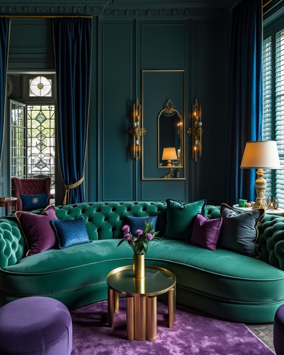
Jewel tones bring saturated color into a room without reading as bright or primary. Emerald, sapphire, and ruby layer together the way fall leaves do on a branch: each distinct, none competing.
The chalkier versions hitting this year make these easier to live with than the glossy iterations of seasons past. A dusky garnet reads warmer than a true red; a stormy sapphire settles next to gray without jarring.
Start with one piece you sit against or walk on: a sofa, a rug, curtains. Add the second tone in something smaller, a throw or a pair of lamps.
Three jewel tones in one room is the limit before it turns theatrical, and two is often enough for a space under 300 square feet.
Gold hardware and mirrors keep jewel tones from feeling cold; the metal adds the warmth that makes these colors livable in a room you actually use. Matte or antiqued brass works here too; polished chrome fights the softness.
This palette suits someone who wants fall color but finds orange tired. It trades the literal autumn reference for mood, which means guests feel the season without being able to name why.
Choosing a Fall Color Palette
Start with what is already on your walls, floors, and furniture. Your sofa color, wood tone, and existing textiles set the base that seasonal hues have to work with.
Layer in fall tones that complement those pieces rather than fight them. A warm ochre reads very different against gray walls than against cream ones.
Test throws, pillow covers, or a small rug in the new color before committing to larger pieces. Most renters and first-home owners stay busy year-round, so building around what you own keeps the budget real.
If your space leans cool already, charcoal and gold or navy and rust add autumn warmth without clashing. If it runs warm, earthy neutrals and soft blush deepen what is there.
Using Color in Decor
Textiles carry most of the weight for seasonal color without requiring paint or furniture swaps. A new set of pillow covers, a throw blanket, or a table runner in your chosen palette changes the room in an afternoon.
Florals and stems do the same: dried grasses, burgundy branches, or even grocery store mums in a copper vase hit the tone without permanence.
Accent pieces fill gaps; a candle, a bowl, or a stack of books in the right shade ties the look together. A whole room redo is not the only way to bring fall color in.
Three to five pieces in a single palette, distributed at different heights and across different surfaces, read as intentional rather than scattered. Remove your summer colors first so the fall tones have space to register.
Trendy Fall Colors
Earthy neutrals have held steady as the base most people actually live with: mushroom, taupe, and warm greige work with existing furniture and read as updated rather than trendy.
Moody combinations have moved in alongside them, charcoal paired with gold or deep eggplant against natural wood, giving the darkness some lift.
Softer shades have also surfaced, blush with copper feels unexpected for fall but functions like a muted version of the usual warmth.
These trends all share one trait: they layer over what you already own rather than demanding a blank slate. That matters when your project budget is tight and your timeline is a weekend.
Pick one trend direction, earthy, moody, or soft, and repeat it in three places in the room.
Decorating Without Orange
A moody burgundy palette works the same way, deep wine tones on textiles or stems carry the season without touching the orange family. Navy and rust is another route; the rust reads as warm and weathered rather than straight pumpkin.
These palettes suit spaces where orange feels off or tired, or for years when you simply want a change. Warmth still matters, the shorter days ask for that, but where that warmth comes from changes.
Start with one anchor piece in your chosen alternate palette, a navy throw, a charcoal ceramic, a burgundy dried arrangement, and build around it with tones that share the same depth.
Frequently Asked Questions
What colors are trending for fall 2026?
Earthy neutrals lead right now: terracotta, taupe, and warm whites as a base. Navy with rust or charcoal with muted gold has moved in alongside them, darker and heavier than past years.
Blush paired with copper surfaced recently too, lighter than the usual fall heaviness but still reading warm.
What are the trending fall color palettes right now?
Three directions keep surfacing: earthy neutrals, moody combinations, and softer shades.
How do I choose a fall color palette that works with my home?
Your sofa, rug, wall color, and flooring are fixed; the palette has to live with them.
Can I decorate for fall without using orange?
Yes. Charcoal and gold also creates a cozy autumn feel without a single orange pumpkin.





