
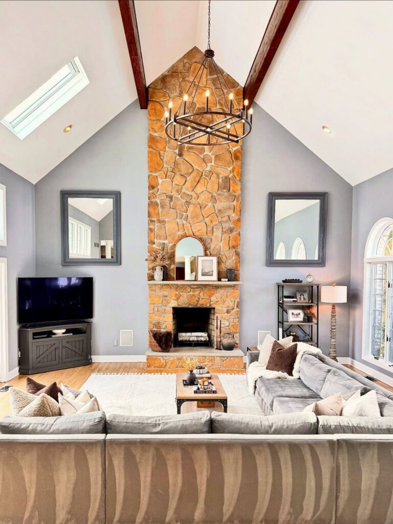
These ideas run from a single tray swap to a full sectional investment, and the right one depends on how much time you have and what your landlord will let you change.
Even with white walls and a no-nails lease, you can still build the same warmth as someone laying new oak panels, just through different means.
The Command strips rated for frame weight matter more than the frames themselves when you are hanging that gallery wall.
1. Create Warmth with Wood Details
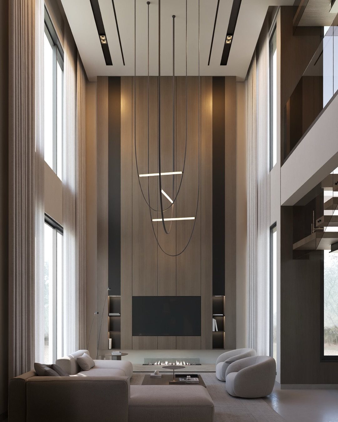
Tall wood panels behind a sofa do more than look good; they keep a high-ceilinged room from feeling cold. Wooden legs on an accent chair work the same way in a smaller rental, and the effect holds.
A coffee table in oak or walnut costs less secondhand, and less still if you refinish it yourself over a weekend. Brass or bronze hardware on a lamp base gives a similar warmth if your lease forbids anything permanent.
This one suits renters who cannot alter walls but still want the room to feel settled.
2. Choose Textured Fabrics
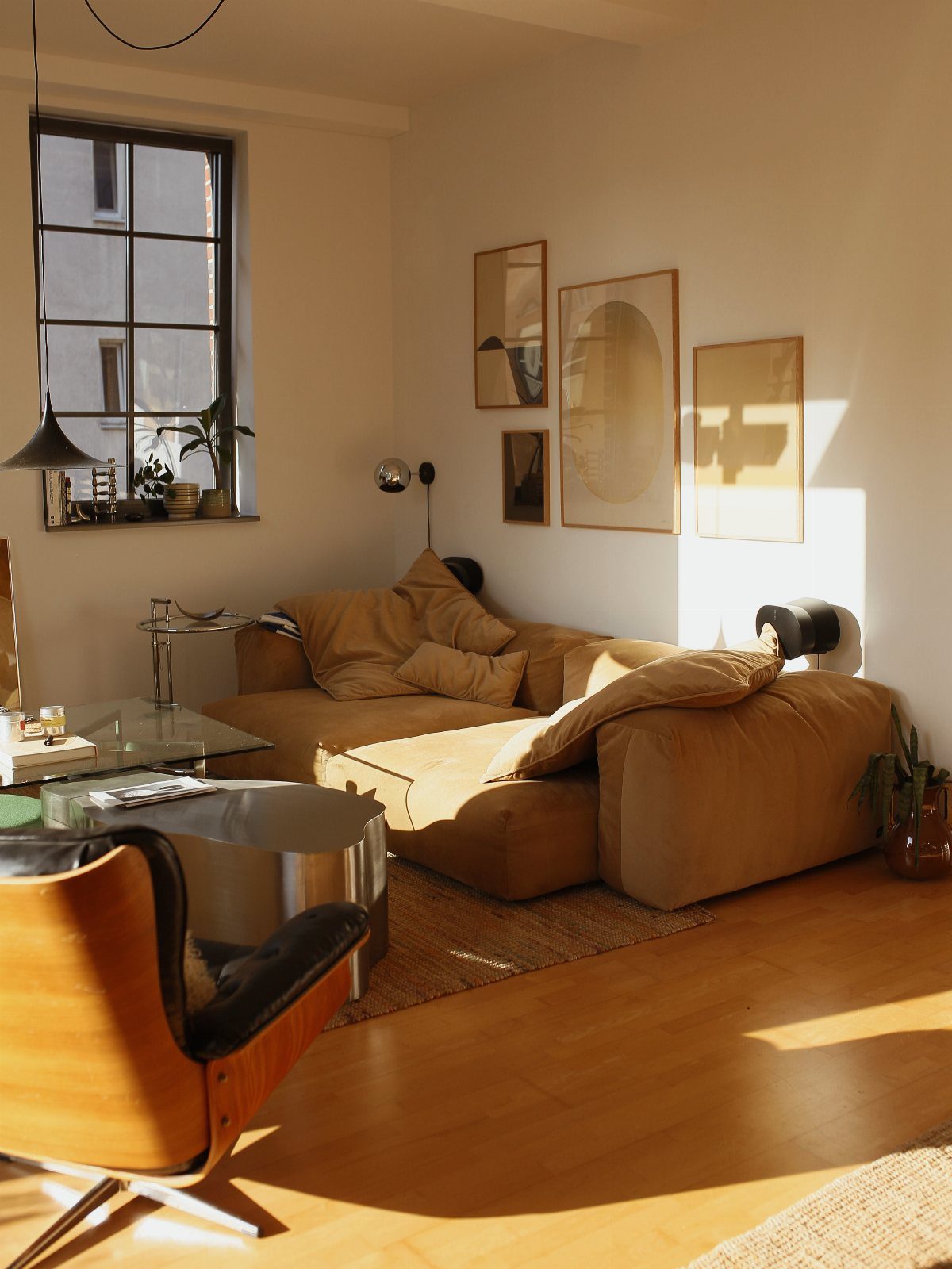
A sofa in nubby tan fabric reads warmer than the same shape in smooth twill. The texture catches light differently across the day, so the color never goes flat.
I look for upholstery with a visible weave: linen slub, soft boucle, or a chenille that has some irregularity.
A throw in cable knit or a loose wool weave laid across the arm adds another layer without introducing a new color.
Jute or sisal underfoot completes it. Sourcing the rug secondhand and knitting the throw yourself keeps all three elements within a tight budget.
3. Incorporate House Plants
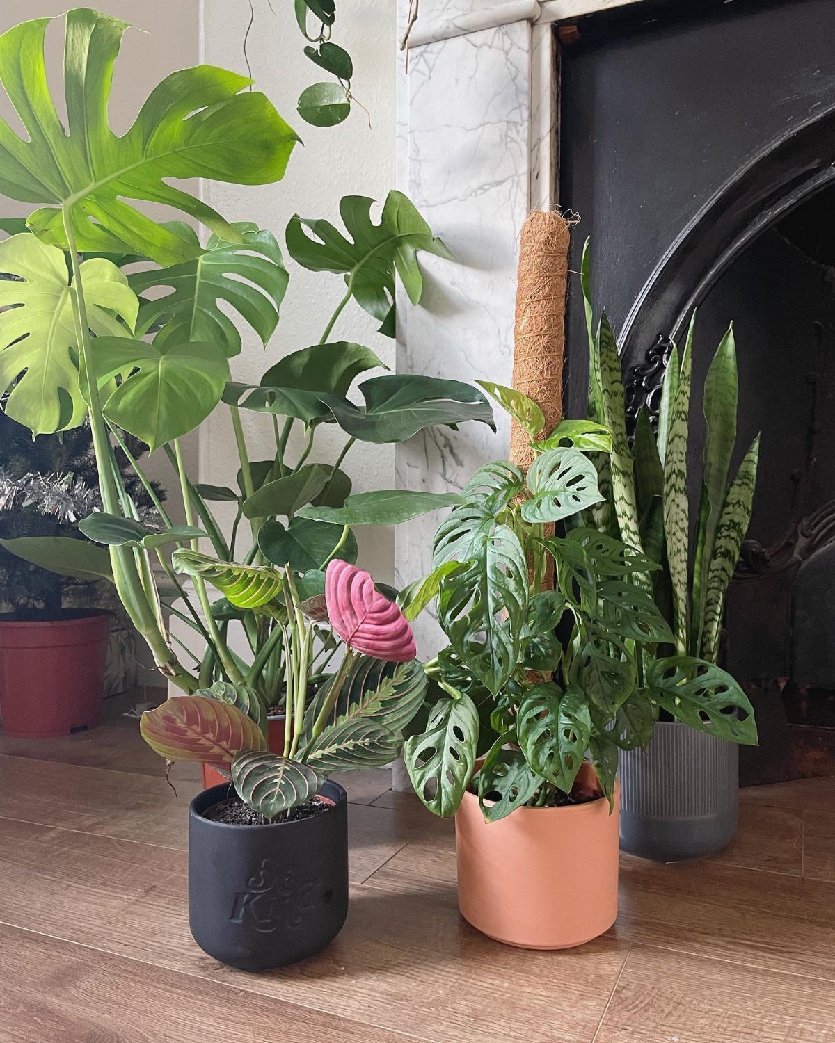
A Monstera or snake plant against white marble does what no throw pillow can: it shifts slightly every time you walk past, so the room feels alive. The green reads as color without breaking the neutral palette.
Terracotta or unglazed ceramic pots suit most plants, and grouping odd numbers at different heights looks more settled than pairs. A moss pole for climbing varieties turns a single plant into a vertical shape without much added cost.
Water once a week, less in winter. This is the lowest-stakes way I know to add actual life to a space you are not allowed to paint.
4. Diversify Textures
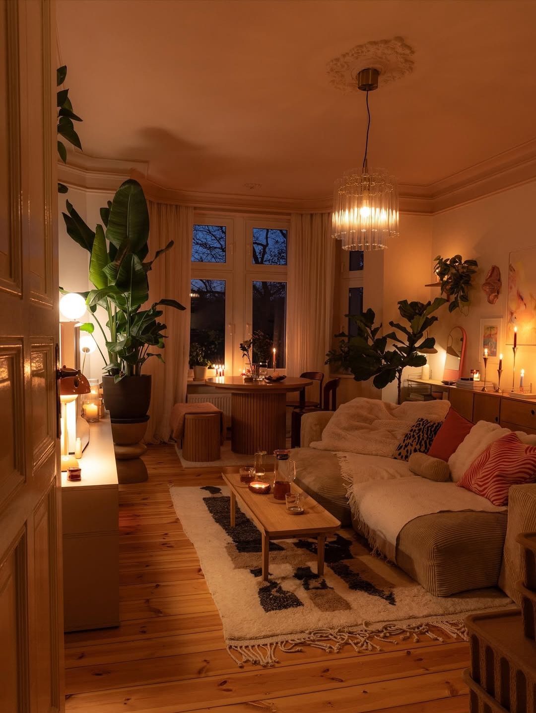
The limit is higher than most people think.
I start with one soft base, usually a linen sofa, then add one rough natural material, jute or raw wood, and one hard accent, brass or ceramic. A fourth layer with a patterned rug works because the colors stay quiet.
Terracotta and sheepskin are the two I reach for when a room still feels too designed. Both look better slightly worn, which saves money and removes pressure.
5. Use a Variety of Unsaturated Shades
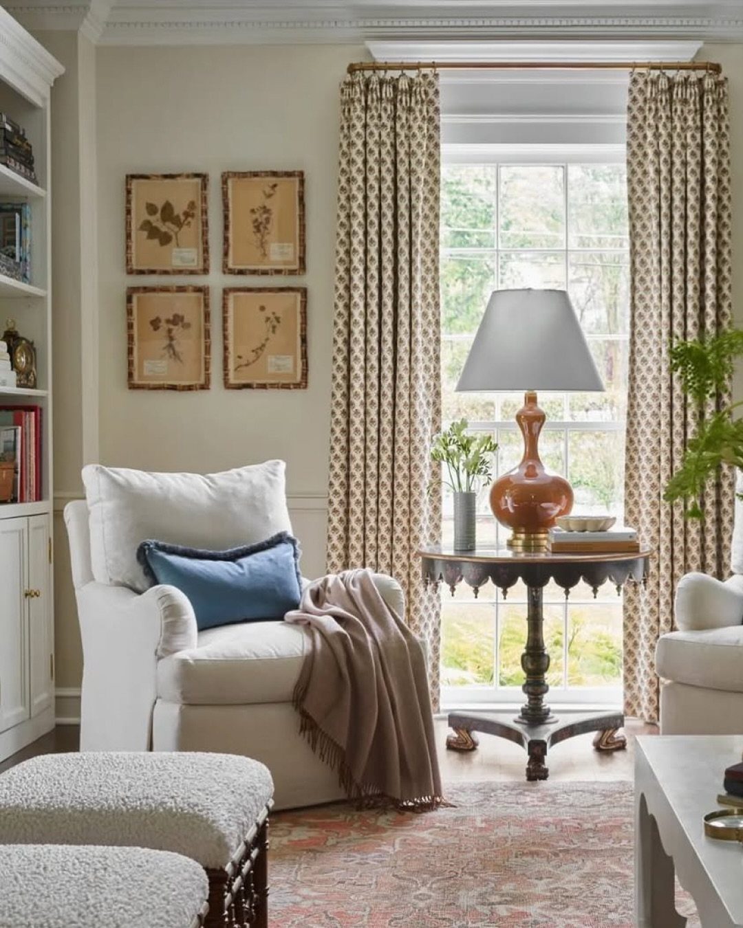
The blue pillow on that white chair is not a departure from neutral; it is a cooler neutral against warmer ones.
Beige, gray, and white together create depth the same way contrasting colors would, but the result stays calm enough for a rental you might leave in a year.
I mix tones through small pieces first: one throw in oatmeal, another in stone gray, a print with a blue-gray undertone. If the combination works on the sofa, it will work on the wall.
Gray upholstery with brown undertones, the kind that warms in afternoon light, has become my default for secondhand finds I plan to re-cover.
6. Curate a Gallery Wall
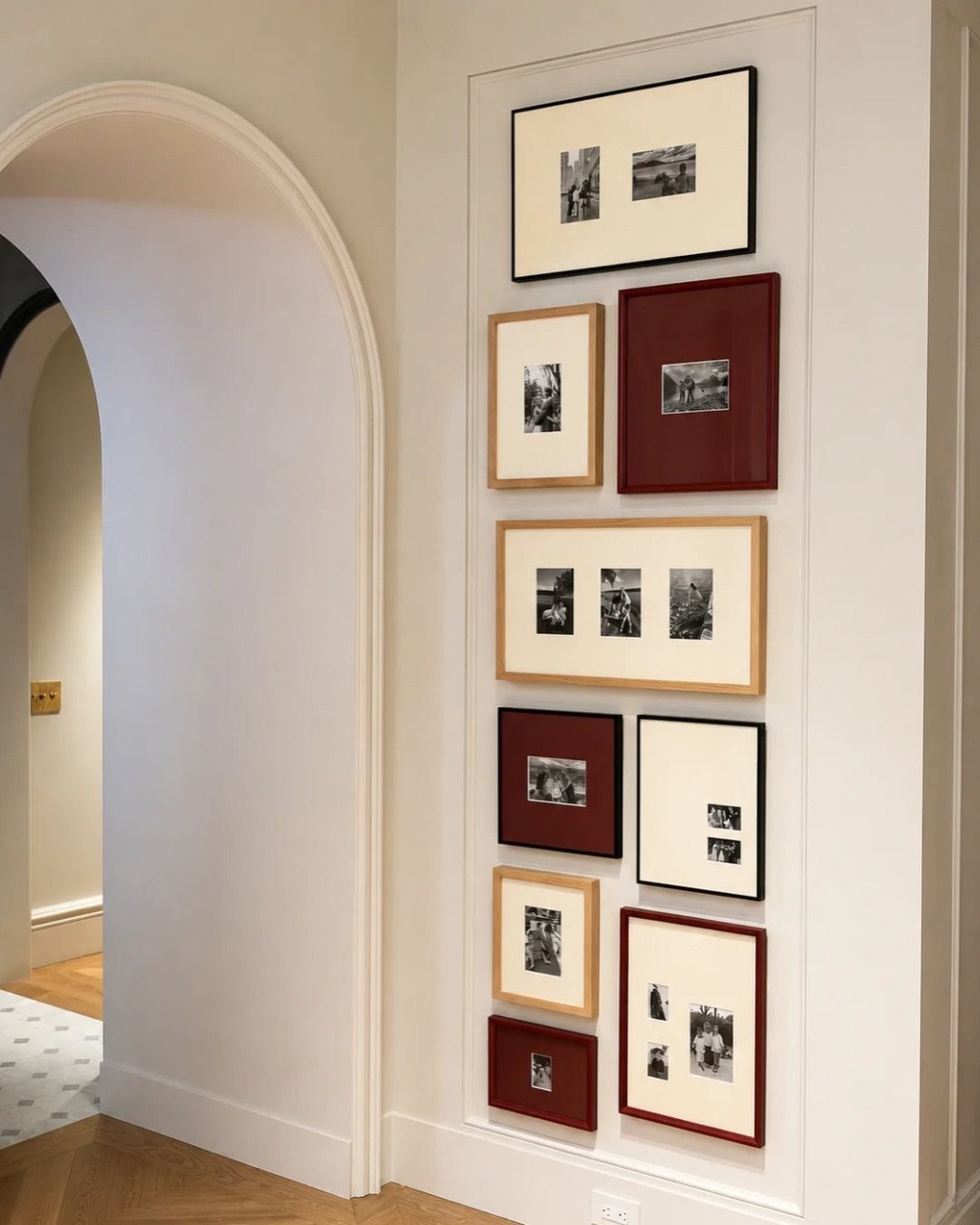
A gallery wall of mismatched frames turns a blank rental wall into something intentional without a single nail in the drywall, if you use Command strips rated for the weight.
I lay the arrangement on the floor first, starting with one larger anchor piece slightly off-center, then fill in with smaller frames 2–3 inches apart. Mirrors scattered in add light, which matters in a north-facing room.
Botanical prints in warm wood frames are my usual starting point; they bridge modern and traditional without committing to either.
7. Ground Your Space with a Touch of Black
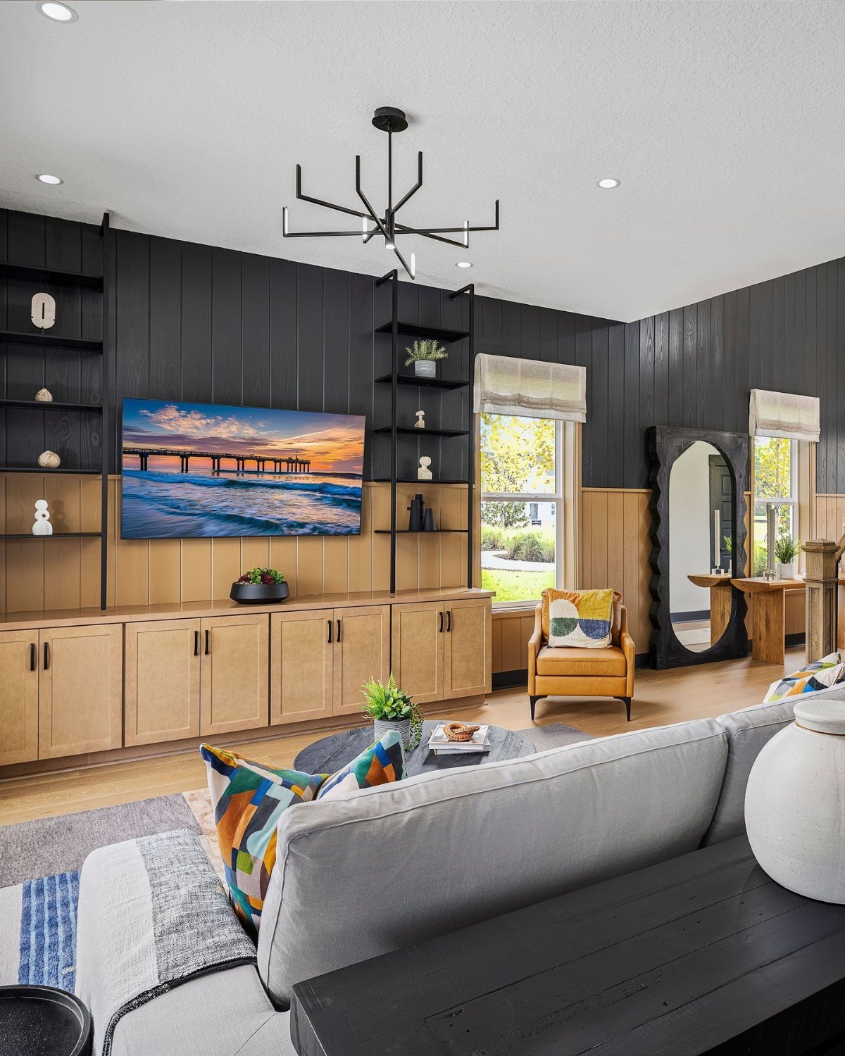
A black accent wall or a single black-framed mirror gives a pale room the weight it needs to feel finished.
A single dark element in a cream room pulls the whole space into focus; paint a wall, add a lamp base, or lay a black tray on the coffee table.
The mirror leaning against that wall works the same way: it catches light without softening the contrast. A black chandelier overhead repeats the tone so nothing reads as random.
A media console in walnut or a darker wood does the same job under a television, balancing that black rectangle with storage below.
Place dark elements low and high so the eye travels through the room, not to one clustered spot.
8. Incorporate Decorative Accessories
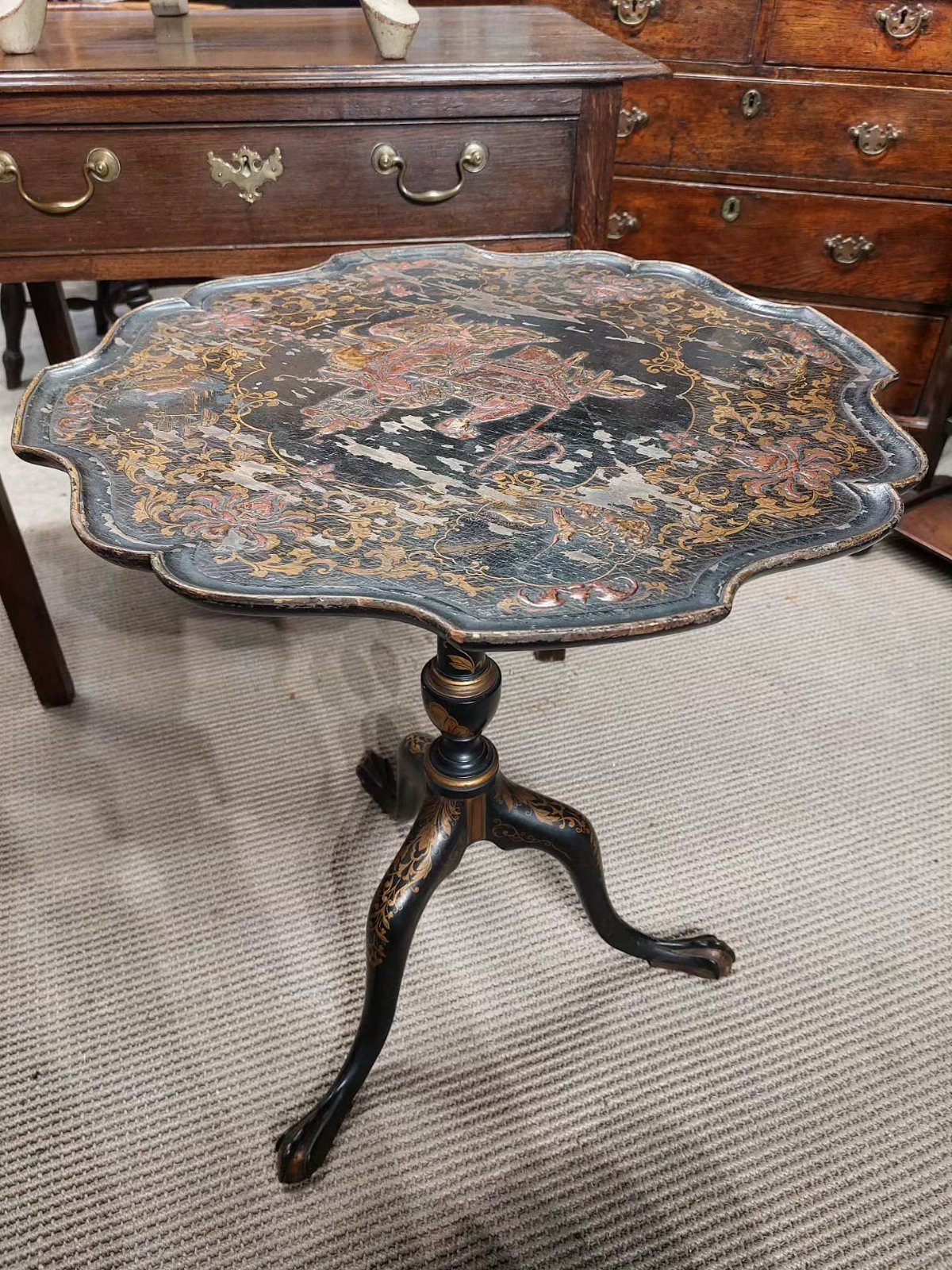
One found piece with real character, like a scalloped chinoiserie table, can carry a whole corner without any other competing shapes.
The distressed top and curved legs add more interest than a new reproduction, and the wear is part of why it works in a neutral room: the finish has depth without demanding attention.
Before adding anything like it, clear the surfaces. Remotes, chargers, and draped blankets fight harder against quiet colors.
One drawer or basket for daily clutter leaves room for a single decorative piece to matter. The tilt-top table here measures 25 inches high and 21 inches across, a footprint that fits beside most sofas without blocking traffic.
9. Use Decorative Trays
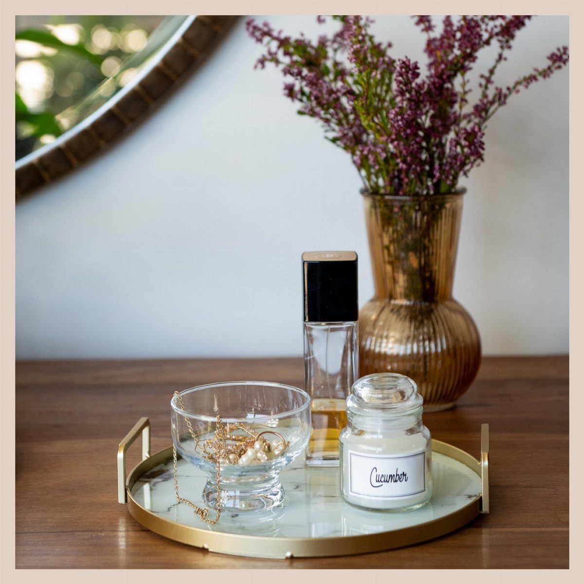
A marble tray on the coffee table corrals the small items that otherwise scatter and read as mess. A tray that holds jewelry and a small jar works the same way for remotes, coasters, or the book half-read.
The handles make it portable, so clearing for guests takes one lift.
Gold or brass against white marble adds warmth without leaving the neutral range. A tray about 12 inches across groups objects cleanly without becoming the table’s main event.
The purple flowers behind it show how a tray also creates a boundary: inside the tray, intentional; outside, everyday life.
10. Soft Neutral Corner Styling with Built-In Shelving
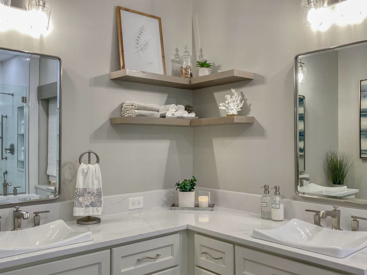
Two floating shelves in a corner turn dead space into a quiet display. I rearrange mine every few months; the change costs nothing and refreshes the whole room.
The best corner shelves sit at staggered heights, around 12 to 16 inches apart, so taller objects fit without crowding. Leave some empty surface between items.
A shelf packed edge to edge looks styled for a photograph; one with breathing room looks lived in.
11. Invest in Luxe, Neutral Furniture
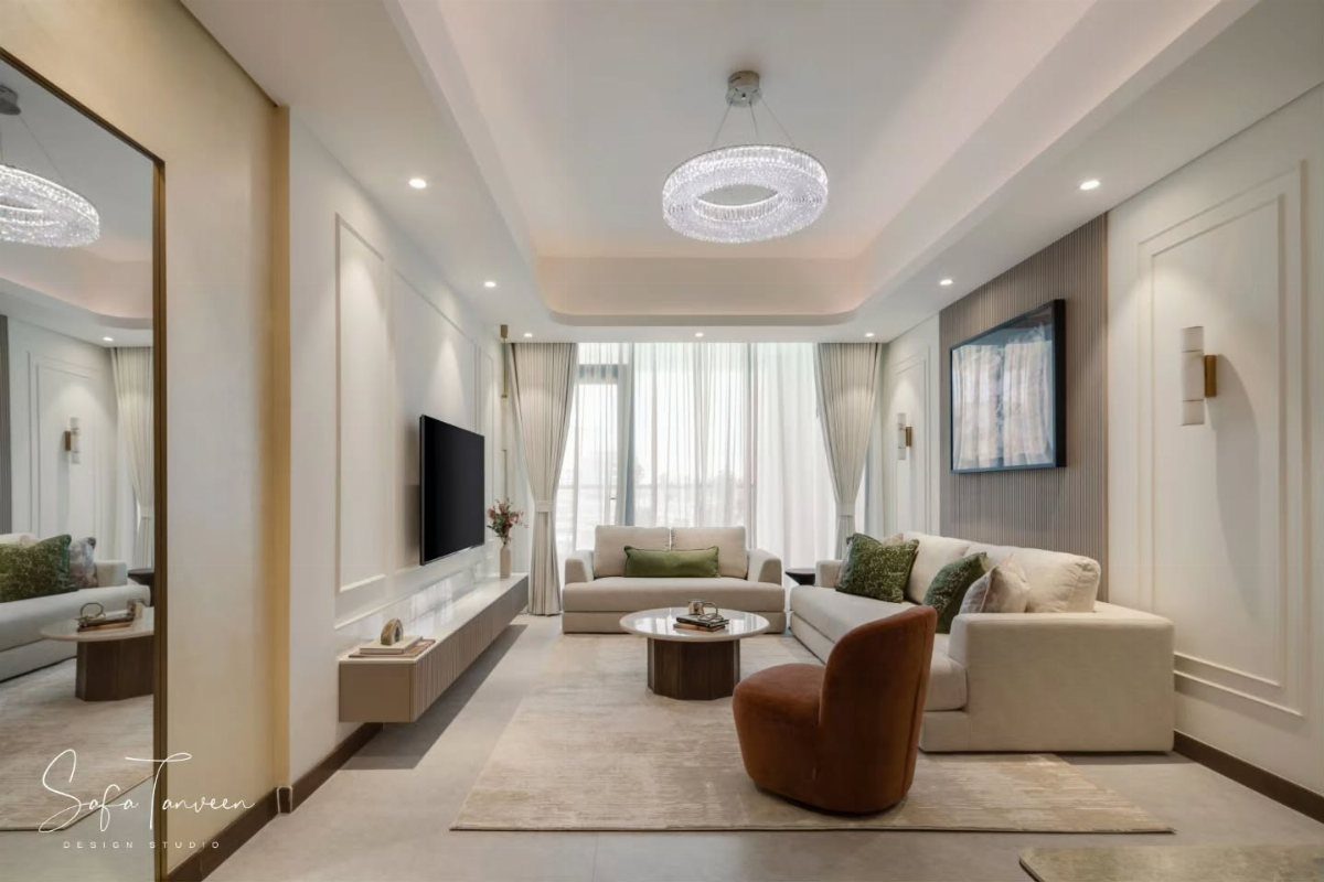
A cream sectional in linen or suede becomes the room’s constant while smaller pieces rotate around it. A neutral sofa anchors the space without shouting, and a brown velvet chair beside it adds a second texture at a different scale.
That layering matters more than matching: similar neutrals read flat, while a warm tone against a cool one creates depth.
Sheer curtains and recessed light keep the palette from feeling heavy. For households with spills, gray or warm brown upholstery hides wear better than white.
The investment is in the largest piece; pillows and throws swap cheaply when tastes change.
12. Add a Little Color
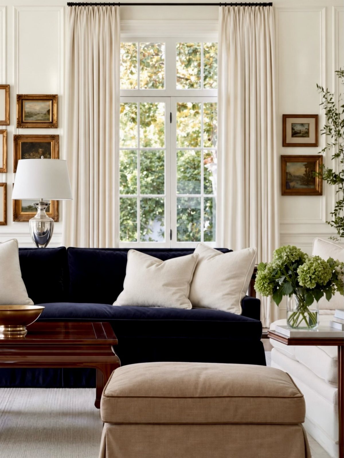
A navy sofa against white walls proves neutral does not mean colorless. The blue here is deep enough to read as a near-neutral, especially with tan leather and wood nearby.
Daffodil yellow lamps or sage green pillows work the same way: small doses of saturated color that do not overwhelm the quiet base.
I add color through items I can change, not the sofa itself. A lamp shade or a throw pillow takes thirty seconds to swap when the mood shifts.
Fresh hydrangeas on a coffee table are the freest version of color: alive for two weeks, then gone, leaving the room to rest again.
Layering for Depth
Layering different textures, colors, and materials keeps a neutral living room from feeling like a showroom.
I start with a base, usually a wool or jute rug, then add a second layer, maybe a smaller vintage piece or a flat-weave cotton throw.
The same principle works on the sofa: a linen cover gets a nubby cotton blanket and a velvet pillow. Three textures minimum, or the eye stops moving and the room goes flat.
Wood against metal, matte against sheen, rough against smooth. Each pairing creates a small tension that holds attention without shouting.
A palette kept to two or three unsaturated shades lets the textures themselves become the interest. A woven basket next to a glazed ceramic lamp, a raw-edge coffee table on a plush rug.
The contrast does the work.
Importance of Lighting
Lighting makes or breaks a neutral room. Without it, beige walls read institutional and gray goes cold.
I treat overhead fixtures as sculpture in their own right. A cascading chandelier, the kind that pools light downward without dominating the ceiling, gives the room a center and casts shadows that animate plain surfaces.
The rest of the lighting builds around it: table lamps with linen shades for warmth, a floor lamp angled to wash one corner.
Layers of light at different heights, all warm-toned, do the work. Cool daylight bulbs undo every soft texture in the room.
Bulbs at 2700K or lower, dimmed wherever the switch allows it, give the right glow. A neutral room lit well feels lived-in at 7 p.m. in January.
The same room under harsh light feels temporary, like a hotel lobby waiting for checkout.
Balancing Visual Weight
A neutral room dies when every piece carries the same visual weight. All light and it floats away; all heavy and it sinks.
I balance by pairing opposites. A low, wide sofa needs something vertical nearby: a tall floor lamp, a narrow bookcase, a plant on a stand.
A solid, blocky coffee table lightens up with a glass vase or a low bowl that lets the eye travel through it. Dark grounds light; thick balances thin.
Matching end tables, same height and same visual mass, was an early misstep that flattened the room. The room felt staged.
Now I vary by at least 6 inches in height or by material density: one table in oak, the other in blackened metal. The contrast keeps the eye moving, and a moving eye reads a room as interesting rather than flat.
Choosing the Right Neutrals
The right neutral starts with what is already fixed. Flooring, wall color, natural light, any stone or brick.
These dictate what will read as belonging rather than imposed.
I work with, not against, existing conditions. Warm oak floors pull toward cream, camel, and the warmer end of gray.
Cool concrete or white tile wants blue-gray, sage, or a true white with no yellow undertone. A room with strong natural light can handle deeper neutrals without going dim; a north-facing room needs lighter values to stay awake.
Coastal spaces have taught me that muted blue belongs in a neutral palette. Faded, dusty blues read as neutral-adjacent, especially against white or bleached wood.
I add them through pillows or a single ceramic piece, never as a wall color. The effect stays airy and casual rather than themed.
Frequently Asked Questions
What color is best for a neutral living room?
Soft beiges, creamy whites, and warm grays with brown undertones work best because they shift with natural light rather than going flat. I look for shades that warm in afternoon sun and avoid anything too cool or too yellow.
Navy, sage, and dusty blue read as neutral-adjacent when used in small doses against this base.
What is the 3 color rule in interior design?
The rule calls for a dominant color, a secondary color, and an accent color. In a neutral living room, this might mean cream walls as dominant, warm gray upholstery as secondary, and black or brass as accent.
I find the palette stays calmer if all three sit in the unsaturated range rather than fighting for attention.
What are the color trends for living rooms in 2026?
Soft neutral tones continue to trend for a calm, inviting atmosphere, with muted coastal colors like faded blue and sage green as quiet accents. The shift is toward warmth and livability rather than stark minimalism.
What is the 2/3 rule for sofas?
The sofa should occupy about two-thirds of the wall length it sits against for visual balance. A piece too small floats awkwardly; one too large crowds traffic flow.
I measure the wall, subtract space for side tables or floor lamps, then shop within that remaining two-thirds.





