
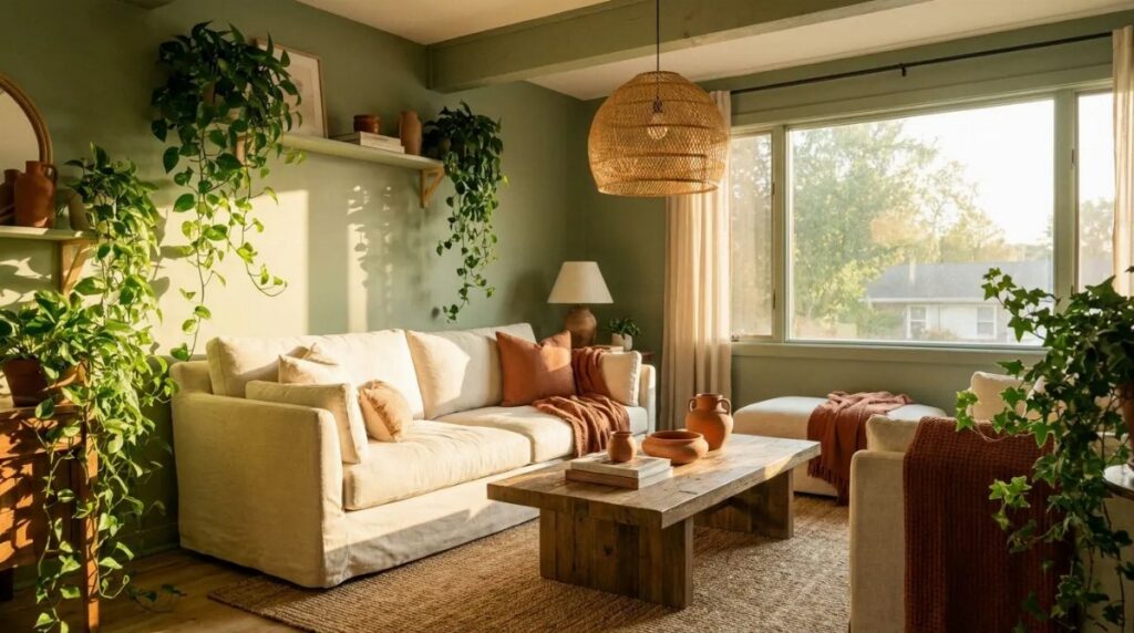
The ideas below range from a single afternoon with a brush to a bigger piece you can carry to the next place, and the split is simple: can you paint your walls, or does the color have to travel with you?
A forest velvet couch against neutral walls builds a whole room without touching a paint can, while masking tape and two quarts in close greens turns a flat rental wall into architecture over one weekend.
1. Dark, Moody Walls
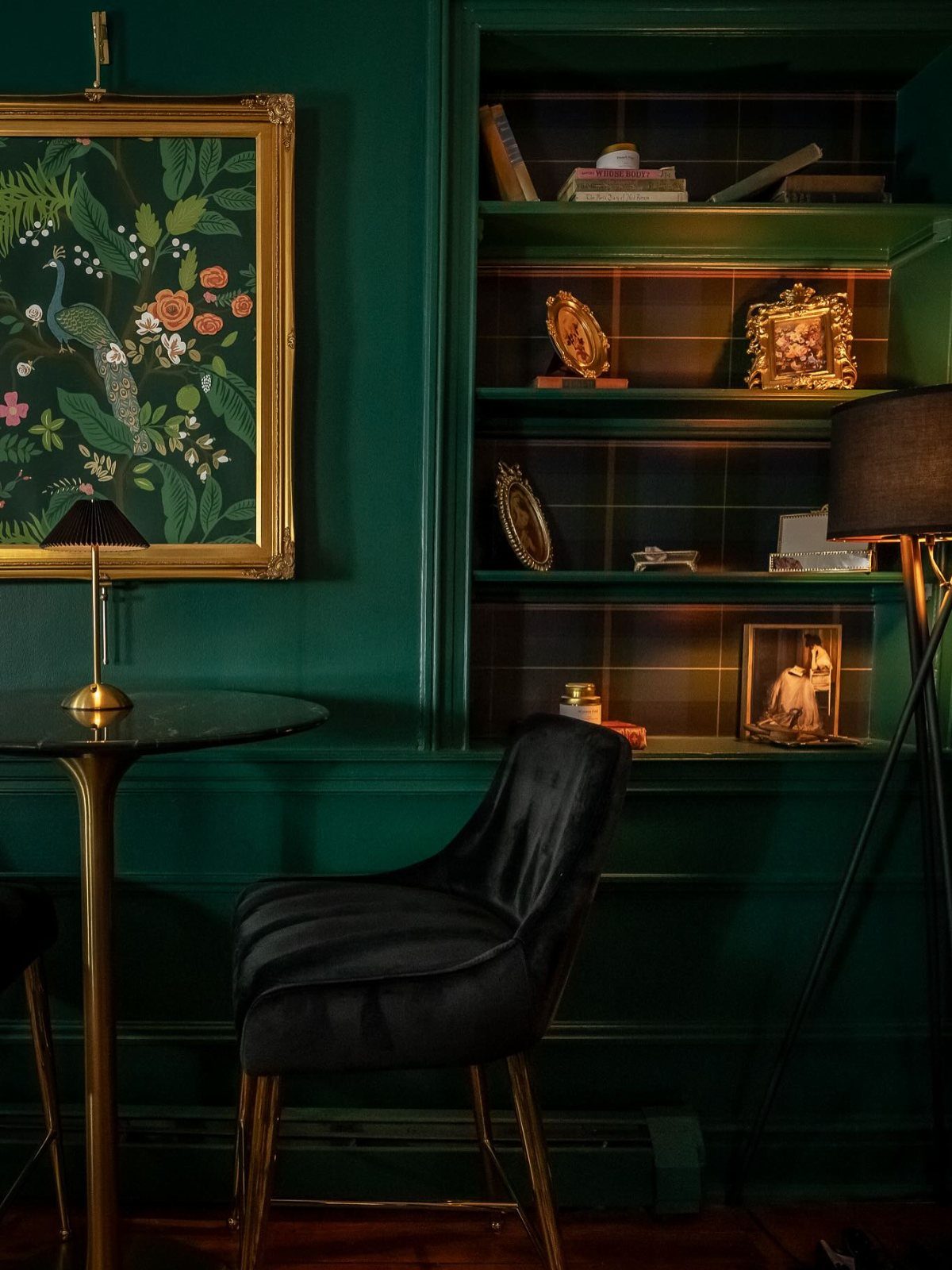
Dark green walls turn a living room into something closer to a private library than a showpiece.
The shade to look for is the deep emerald type, something like Clare Paint’s Current Mood, which holds enough black to feel grounded without going flat.
A room with built-ins already has the bones for this.
Paint the walls and the shelving back the same color, then let the objects do the work: brass frames, worn spines, a black velvet chair with gold legs if the budget stretches that far.
Vintage furniture layers in easier than new pieces because the dents and patina already belong with a moody wall.
Small rooms with small windows suit this best. The lack of light stops being a problem and becomes the point.
2. Create a Cozy Nook
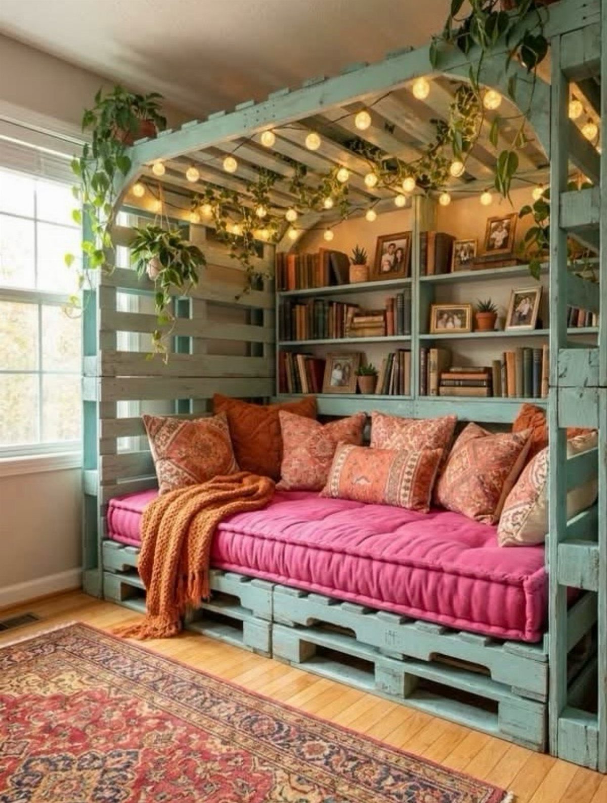
A reading nook needs a corner and enough wall for a chair and a small shelf.
Green works here as accent rather than field: paint the pallet frame or the built-in surround in a light teal, something that reads fresh against whatever cushion you throw on it.
The specific move is choosing a bold green fabric for the mattress or the throw pillows, then letting the plants echo it. String lights warm up the palette if the pink and orange lean too tropical for your taste.
This suits renters who can’t paint the whole room but can build something freestanding in a weekend. Take it apart when you move.
3. Decorate with Delicate Botanical Prints
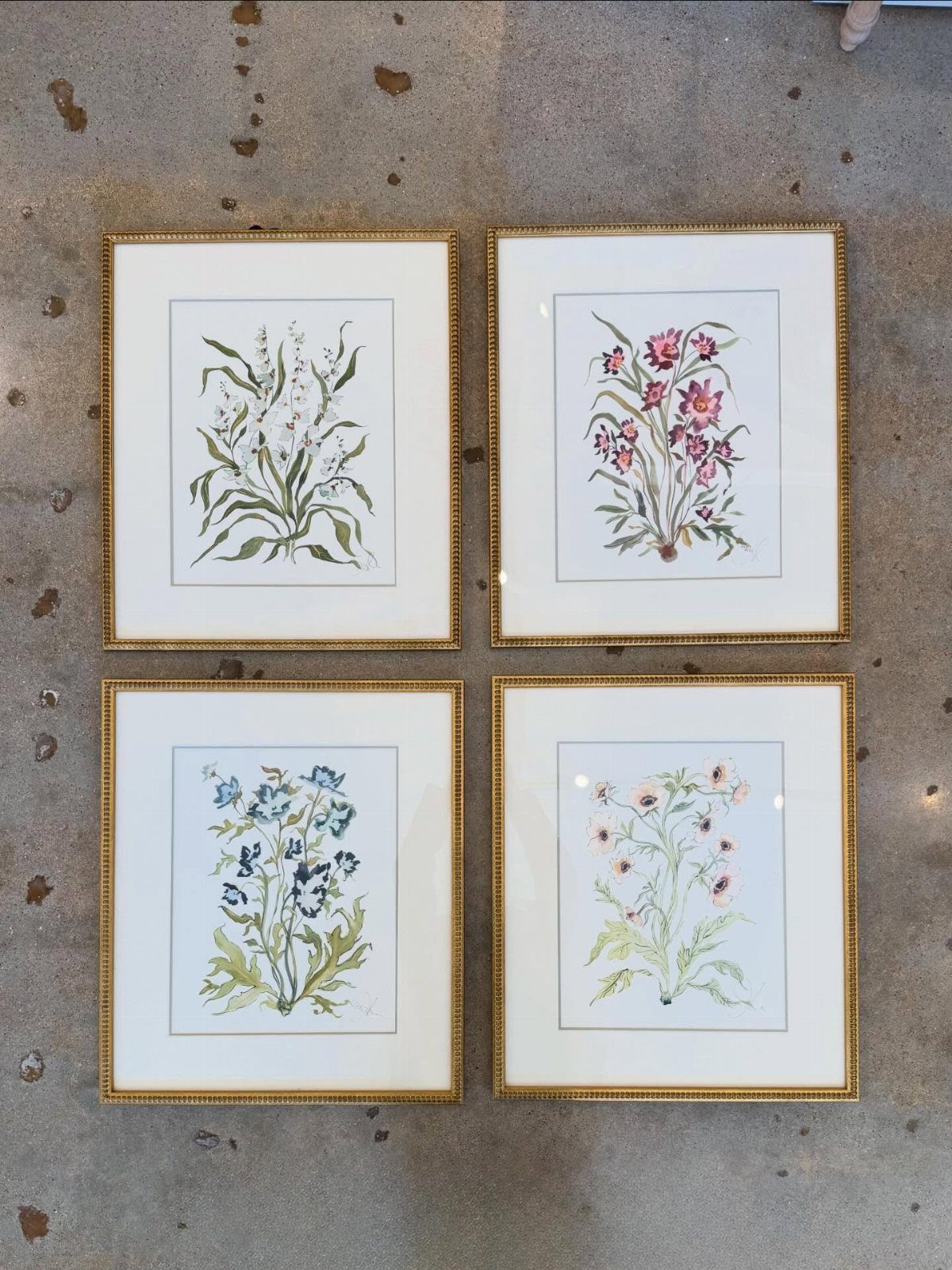
Botanical prints work as wallpaper or as frames, and the choice depends on how long you plan to stay.
Wallpaper in a soft green floral, something like the delicate repeats you see in old herbaria, turns a whole wall into a garden. Four gold-framed prints laid on the floor, ready to hang, give the same effect without the commitment.
The green stays quiet, the prints do the pattern, and nothing competes. Light wooden floors keep the room from feeling like a greenhouse; the cream sofa gives your eye somewhere to rest.
I’d pick the framed route for a first apartment. The prints move with you, and the frames sell for half what you paid if you change your mind.
4. Decorate with Antiques
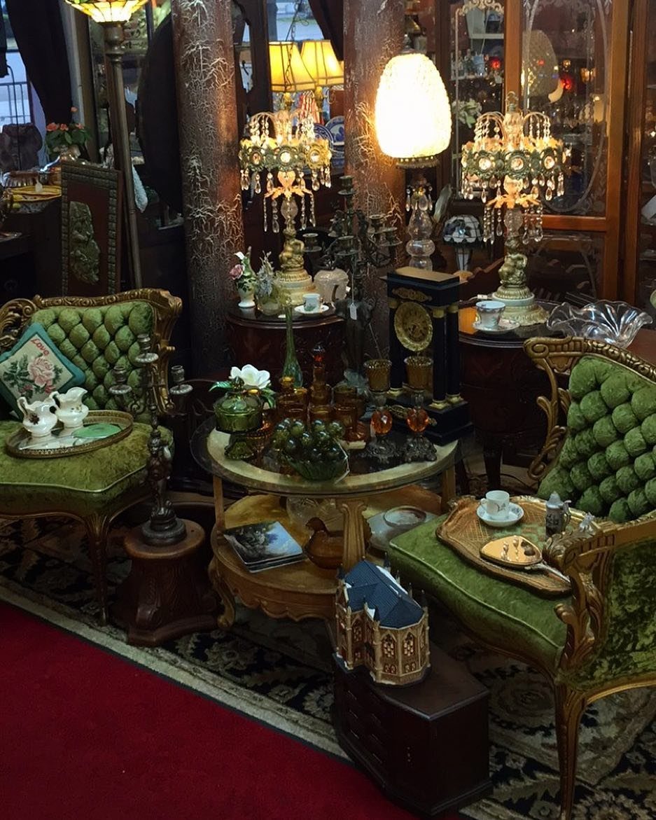
Antiques collect in green rooms because both colors came from the same era. The light green wall reads almost as a neutral, a shade like Beauvais No.195 that sits behind dark wood and gold without disappearing.
The practical move is starting with one piece that carries real age, something with wood worn soft at the edges, and building around it.
A pair of green velvet chairs against that pale wall gives you the palette in two objects. Everything after that, the small tables and the lamps, fills in at your own pace.
This asks for patience and a tolerance for clutter. If you need the room finished by Sunday, skip this one.
5. Create Contrast with Wood Paneling
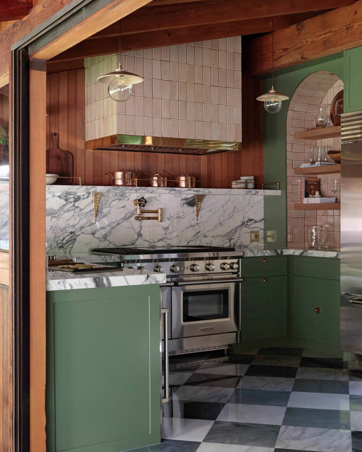
Wood paneling breaks up green paint the same way a white ceiling does, but with more warmth.
The vertical boards run up to a painted ceiling, sage green carried straight over, and the grain between them keeps the color from going flat.
The specific technique is extending the green to the ceiling while the paneling stays natural. That contrast lets you use a stronger green than you might risk on four solid walls.
Gold fixtures against the painted ceiling pick up the tone of the wood without matching it; the eye moves between the two.
This needs existing walls worth showing, or the budget to add them. If your living room has the standard painted drywall, thin vertical boards applied directly over it run about the same labor cost as skim-coating.
6. Sage Green Everything
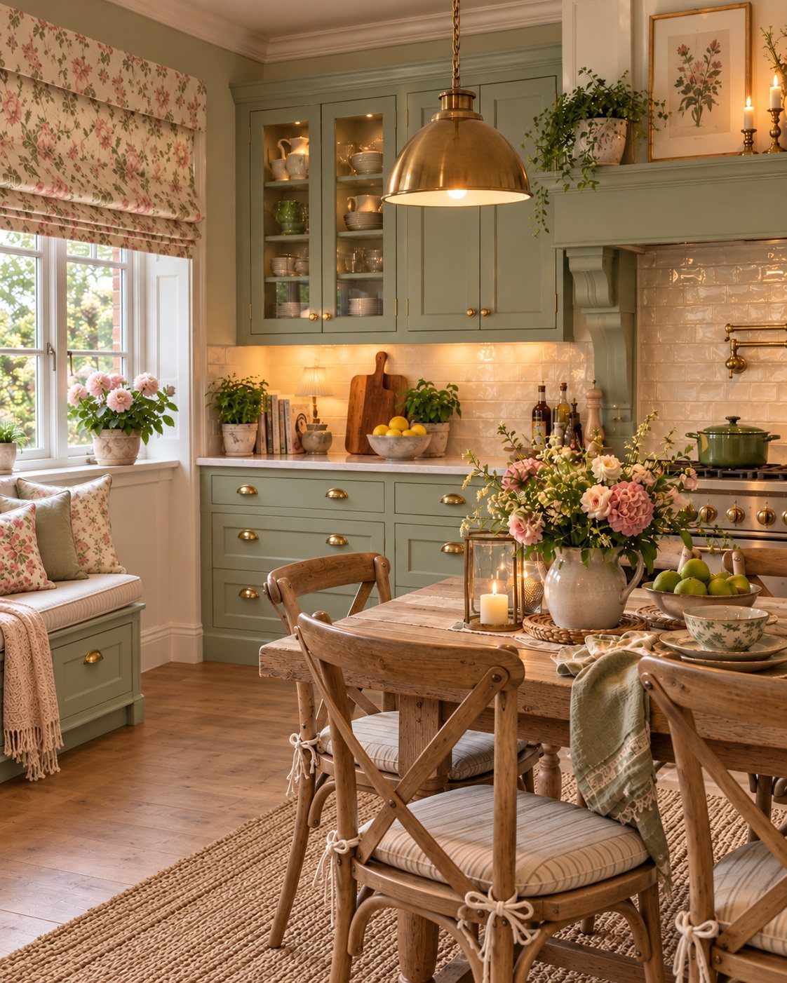
Sage green is the shade you pick when you want calm without cold. It sits in the middle of the green family, muted enough to read as neutral in some lights, green enough to feel alive in others.
Mylands calls it Serpentine No.192; other paint lines have their own names for nearly the same thing.
The pairing that makes it work is light fabric and rattan. A sage wall behind a cream linen sofa and a woven chair gives you the biophilic effect without the houseplant body count.
Layer in a knitted throw and one or two textured cushions, and the room holds together without looking decorated.
This is the entry point for green skeptics. The color does not announce itself; it recedes, and the room feels better without the visitor knowing why.
7. Go for Stripes
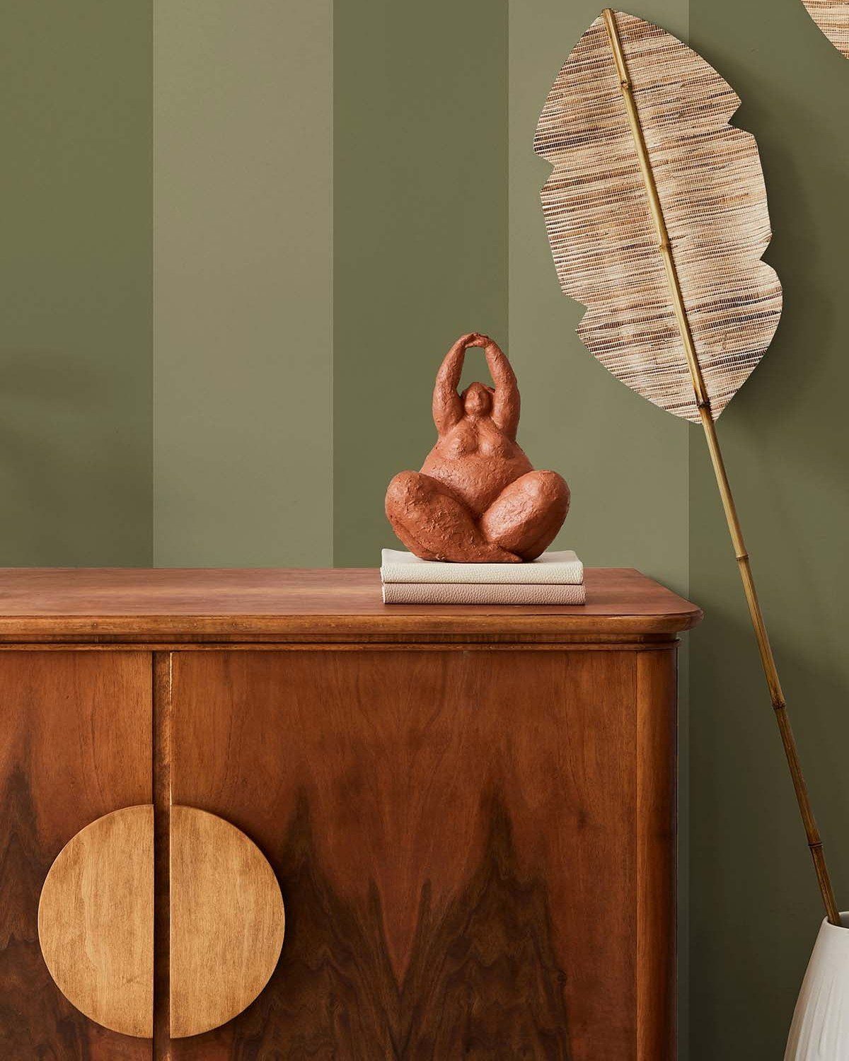
Vertical stripes in sage and olive turn a flat wall into architecture without adding any actual molding. Masking tape, a level, and two quarts of paint in close greens get you there in a weekend on a tight budget.
Spacing takes the most thought: measure your wall width, decide how many stripes you want, and accept that the end ones may need to be slightly wider or narrower. I like odd numbers; the center stripe anchors the room.
Paint the base coat first, tape when it’s fully dry, and seal the tape edge with the base color again before rolling the contrast stripe. Peel the tape while the second coat is tacky.
This suits renters who can paint and repaint, and anyone whose living room feels like a box. Wobbly stripes read as mistake, not style, so patience pays off here.
8. Use Furniture to Bring
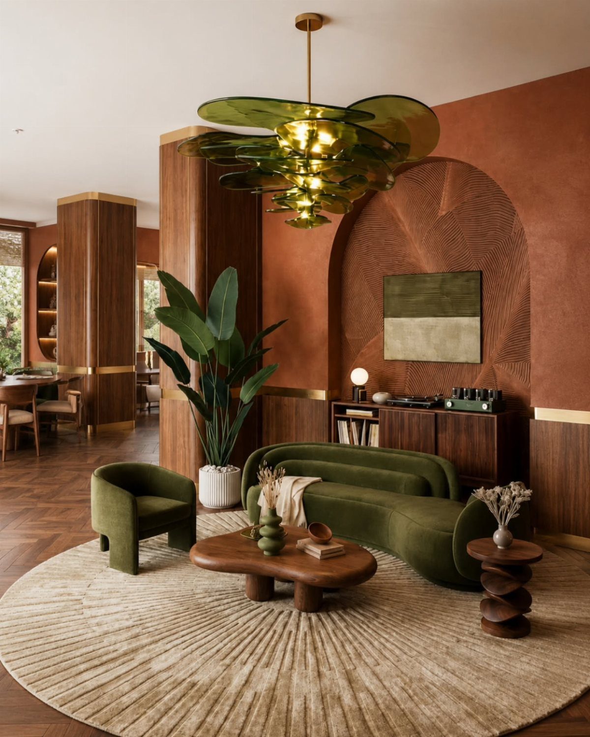
A green sofa carries the whole color scheme so the walls can stay neutral.
I look for velvet or a dense weave in forest or emerald; it photographs deeper than it reads in person, so go one shade lighter than you think.
Layering matters. Matching throw pillows in slightly different greens keep it from looking like a set.
A green glass light fixture overhead, a planter with something trailing, and you’ve built a room without touching a paint can.
This works best when you want flexibility. Move the sofa, and the room goes back to blank slate.
The cost lands higher than paint, lower than custom built-ins; expect eight hundred to two thousand for a quality piece. Burnt orange or terracotta nearby keeps the green from going flat, and white accents stop it from sinking into gloom.
9. Mid-century Styling
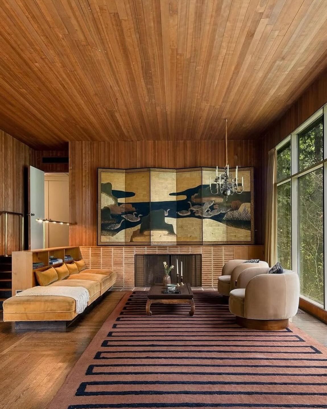
Olive green and teal read as mid-century because the era favored them, not because the colors themselves date a room. Pair them with warm wood and the right secondary tones: mustard, burnt orange, or a deep coral.
Matte paint keeps the wall from feeling like a showroom. I like something with umber in the mix; it shifts in light and avoids that flat institutional look.
Natural wood trim or furniture frames it without competing.
Paneling helps, though real boards are a project. Panel-effect wallpaper fakes the texture for a fraction of the effort and cost, and it holds up fine for years if the wall underneath is smooth.
This palette suits anyone whose taste runs toward collected rather than minimal, and who has the patience to hunt down the right wood pieces. The risk is period costume; skip the starburst clock and it stays livable.
10. Keep It Monochrome
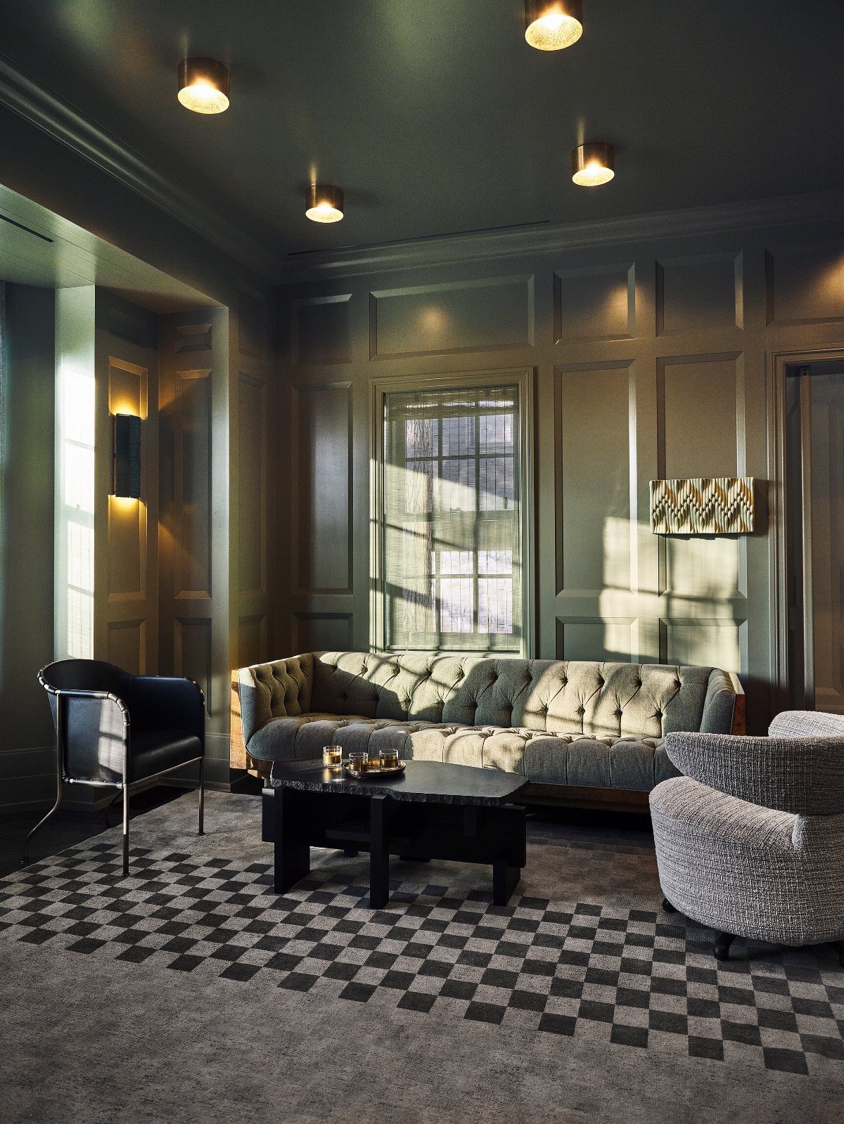
Gray-green on walls, trim, and even fireplace bricks collapses the room’s edges into one quiet envelope.
Benjamin Moore’s Knoxville Gray is the shade I point people toward; it reads as green in daylight and gray by lamplight, so the room changes with the hours.
Everything else in the room has to cooperate. You need contrast in texture, not color, or the room goes muddy.
A tufted sofa, a nubby armchair, a smooth coffee table, a rough rug; the eye reads the differences even when the tones match. Black anchors it, white would break it.
This is for someone who wants calm more than statement. It costs no more than any paint job, just the decision to commit fully.
One white wall kept for brightness breaks the spell; surrender that safety entirely.
11. Add a Gallery Wall
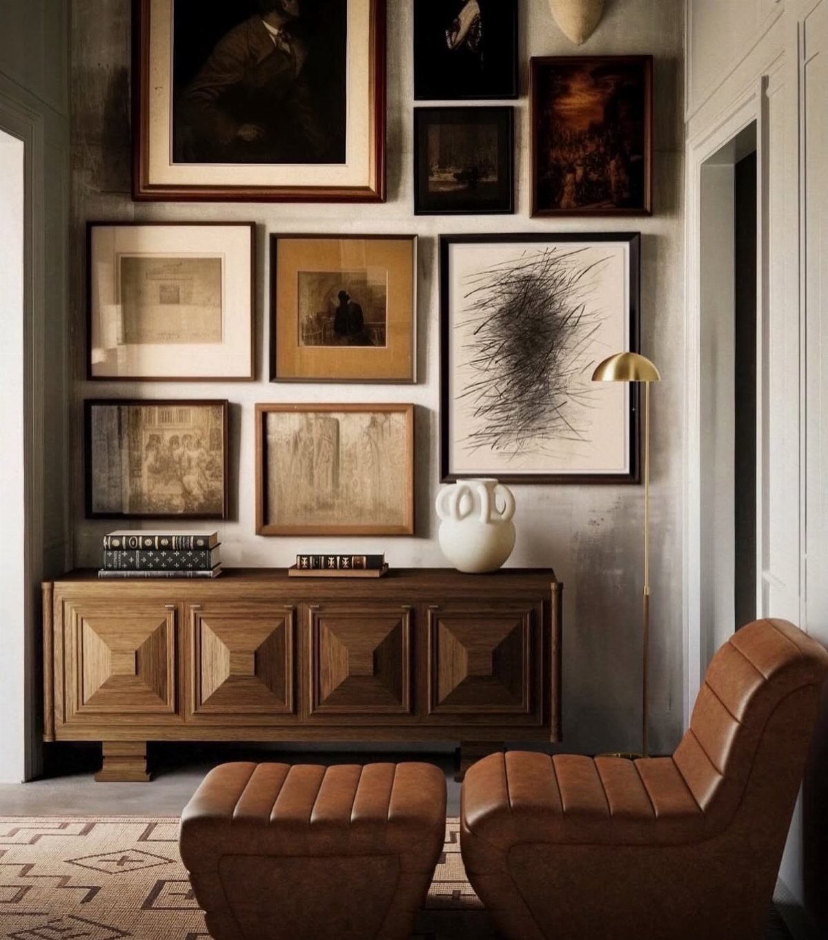
A green wall behind a gallery wall does what white cannot: it unifies the frames into a single composition before you even hang them.
Essex Green, deep and muted, is the shade I’d pick for this; it reads as sophisticated, not themed.
Mix your frames. Light wood, dark wood, black, a little gold if the art supports it.
The variety keeps it from looking like a store display, and the green ties them together regardless.
I start with the largest piece slightly off-center and build outward, measuring as I go; eyeballing reads as casual in a way that rarely works.
This suits renters who can paint one wall and patch later, or anyone with a collection of mismatched frames they don’t want to replace. The cost is a gallon of paint and an afternoon.
The limit is the art itself; if every piece fights for attention, even the green can’t save it.
12. Pair Green with Gold
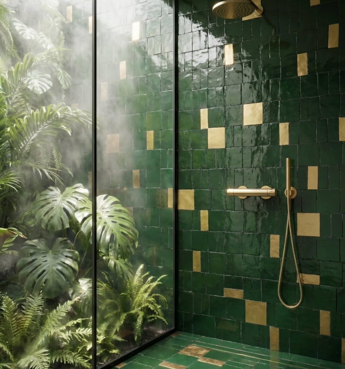
Gold against dark green reads as luxury because the combination shows up in old libraries and hotel lobbies; your living room borrows that weight without the mahogany and leather.
Lighting fixtures are the easiest entry point, followed by small tabletop pieces and furniture legs.
The green needs to be deep. Sage or mint with gold tips toward nursery; forest or emerald holds the balance.
I like glossy tile or high-sheen paint for the wall itself, since the light catch matters as much as the color. Matte gold, not bright brass, keeps it from going theatrical.
This is not a budget move if you do it throughout. One good light fixture and two or three objects gets you the effect without the invoice.
It trades away the casual, lived-in feel; the room will read as intentional, which suits some personalities and oppresses others. Warm neutrals nearby, soft brown or cream, keep it from feeling like a stage set.
13. Add Shiplap to Your Fireplace
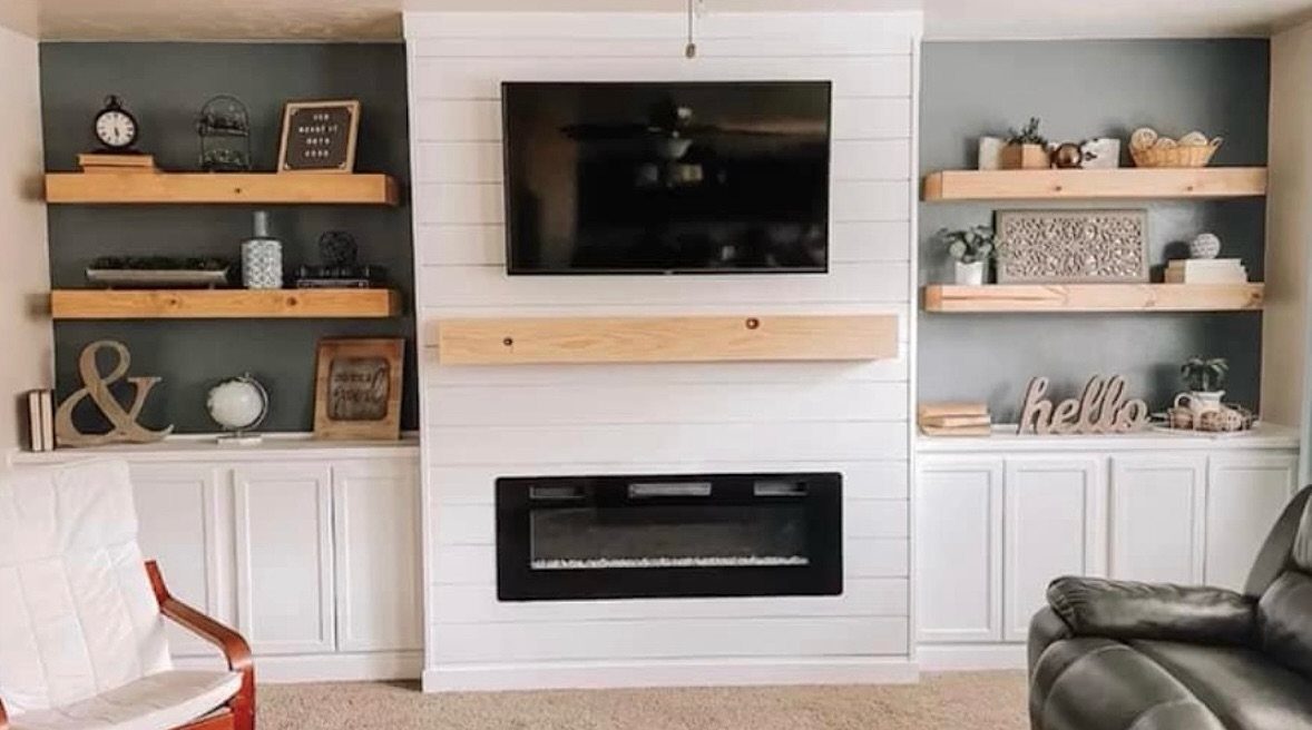
Painting a shiplap fireplace surround in an earthy green turns standard white cladding into the room’s anchor, and the electric insert keeps the look clean without the mess of a wood-burning setup.
The boards run vertical or horizontal; either way, the paint matters more than the direction.
I would prime first, then use a satin or eggshell finish so the ridges catch light without reading too rustic.
The green above the mantel works best with natural wood tones nearby, and a few stems of eucalyptus or dried grass on the mantel or a flanking shelf tie the color back to something living.
This suits renters who can paint but cannot reface brick, and owners who want the texture of old stone without the weight of it. If your fireplace sits in a dark corner, white shiplap stays the safer choice.
14. Olive Green Walls
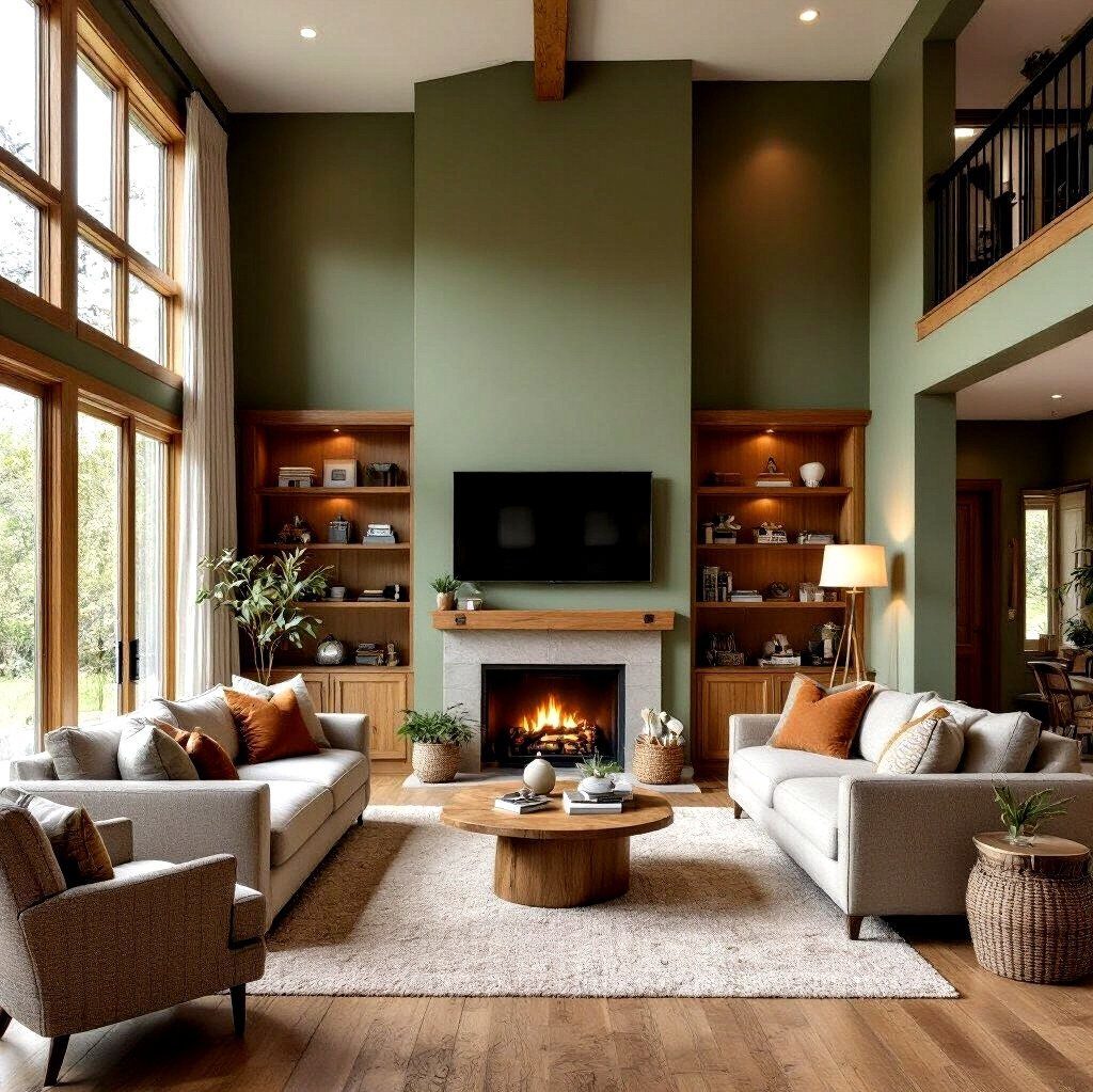
Olive green walls read warm and lived-in without going dark, which makes them forgiving in rooms that get decent light but not direct sun all day.
The gray sofas here keep the pairing quiet; wood shelves and a fireplace do the rest of the work.
Paint the shade one step lighter than the chip first looks, since olive thickens as it covers the whole wall. I’d test a 2-foot square and live with it at evening light before committing.
This suits renters or owners who want color that feels grown-up and can handle artwork, plants, or a busy shelf without fighting for attention.
15. Green Marble Architectural Accents
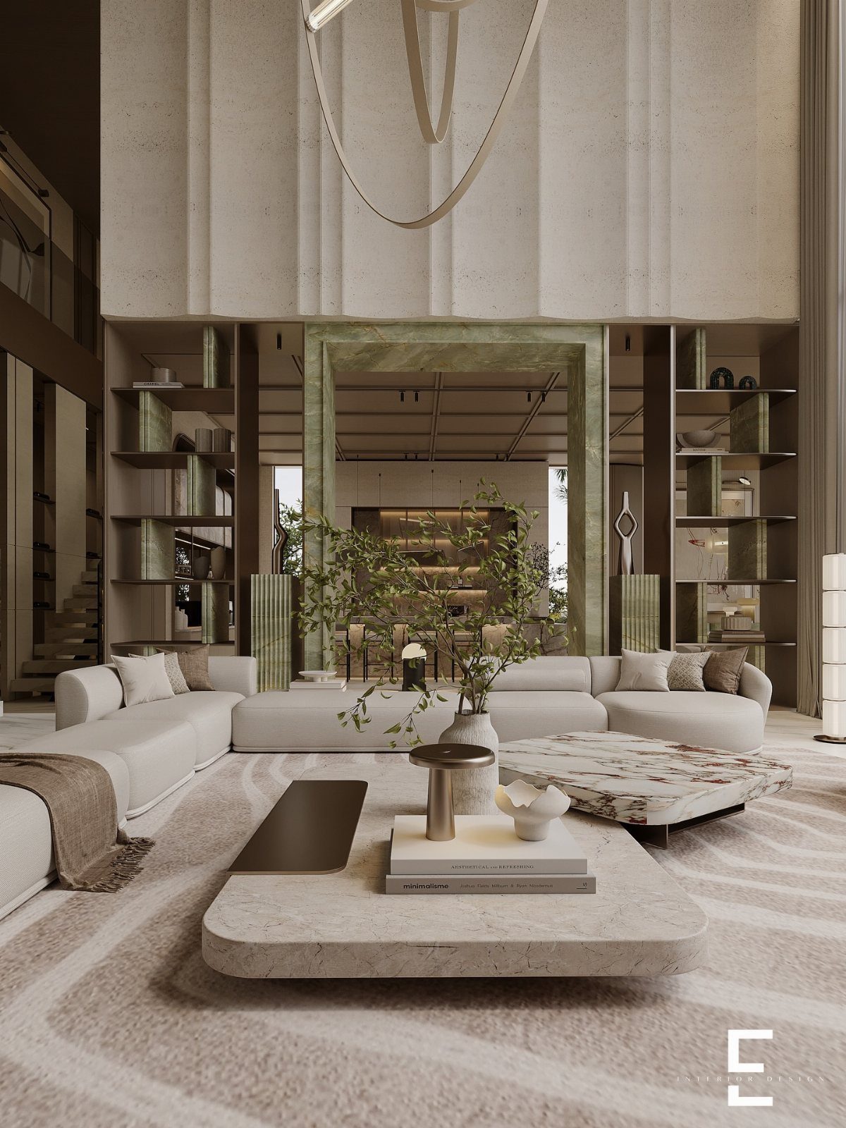
A single green marble arch turns a doorway into an event without touching the rest of the room. The white sofa and neutral shell here stay calm because the stone carries all the drama; the arch becomes architecture, not decoration.
Real marble at that scale runs expensive and needs professional install, so for a weekend budget I’d look at green marble-look contact paper or laminate on a simple MDF frame for a doorway surround.
The veining does the work, not the material.
Best for open plans where one bold move defines the seating area from the hall beyond. Small rooms with many doorways get busy fast with this trick.
16. Lush Indoor Houseplants
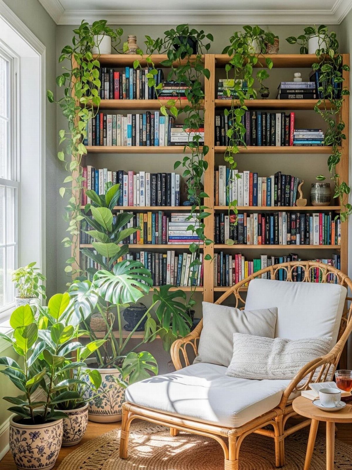
Plants are the one green living room idea that moves with you, costs only what you spend at the nursery, and fills a room while you’re still deciding on paint.
A pothos trailing from a shelf, a monstera on the floor, and a ficus catching window light give three heights without any planning.
Terracotta pots or woven baskets keep the look from going too sleek; a rattan chair carries that same warmth through the rest of the room. Watering once a week and a south or east window handles most of these plants.
This wins for anyone who wants change without commitment. A corner like this builds over months, not a single Saturday, so start with one or two plants and let it grow.
17. Green Built-In Bookshelves
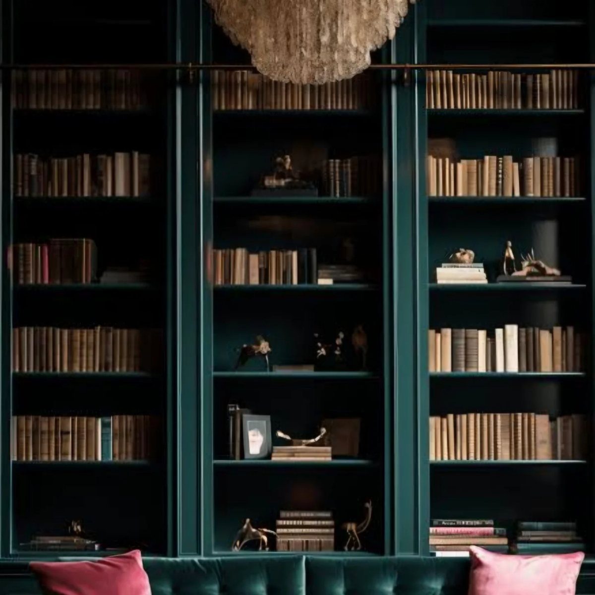
Built-in bookshelves painted deep green turn storage into scenery. The velvet sofa and pink pillows here sit against that darkness like a stage set, and the books themselves read as texture rather than clutter.
If you are renting, a pair of tall bookcases painted the same shade and pushed to the wall gives nearly the effect without the carpentry. Match the wall color behind them and the line blurs.
The chandelier helps; green shelves swallow light, so plan for a fixture or a lamp on the top shelf. I’d pick this for readers with collections they want to display and the wall space to hold them.
18. Floral Wall Mural
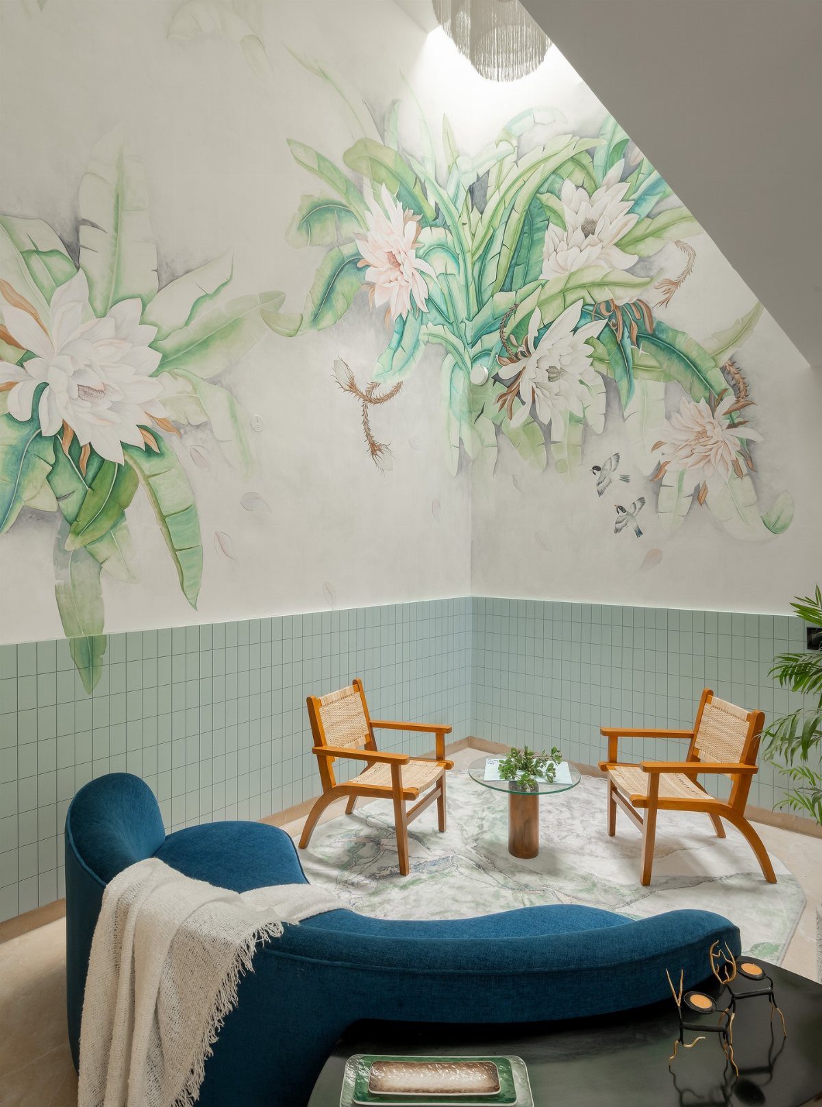
A floral mural scales a pattern bigger than any repeat wallpaper, and the white lilies here stay fresh rather than fussy because the green foliage grounds them.
The blue sofa and wood chairs keep the seating simple so the wall speaks.
Peel-and-stick mural panels come down without damage, which suits renters, and the cost stays well below a painted mural. Measure twice; most need trimming at the edges and the pattern has to align across panels.
The lower green tile is a separate choice, but the same paint shade as the mural’s leaves would tie it together. This one is for someone who wants green without committing to paint on every wall.
19. Green Velvet Sofa
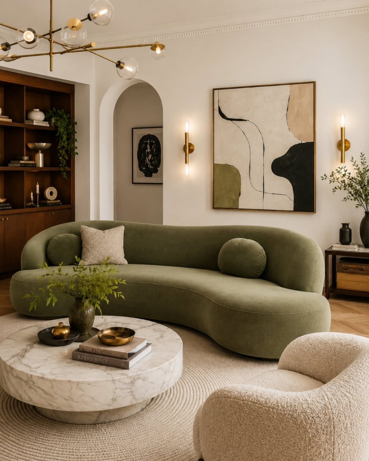
A green velvet sofa carries the whole room. The curved shape softens a modern space, and the fabric catches light differently through the day, so the color never sits flat.
Cream and marble nearby keep the pairing from going heavy.
Velvet wears better than it looks; the nap hides small marks and brushes clean.
This works best as the single splurge in a room of simple pieces. Against olive walls it doubles down on green, but in a white room it stands alone as the statement you build around.
20. Sage Green Paneled Walls
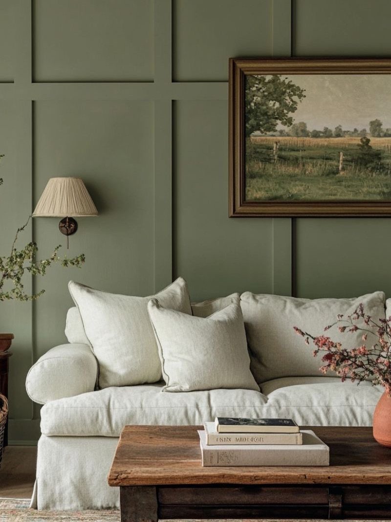
Painted panels give a flat wall the look of built-in architecture for the price of lumber and a weekend.
The color reads as neutral in morning light and turns moodier after dark, which means it carries a room that sees use at both hours.
Board and batten or simple vertical boards work at ledge height if you want a spot for frames or small objects; full height feels more formal and takes longer.
Paint the boards and the wall behind them the same shade so the seams disappear and the texture reads instead of the lines.
This suits renters who can patch a few nail holes later, since paneling attaches directly over existing drywall. Keep furniture light, cream or raw wood, so the green stays the story rather than competing with it.
Benefits of Green in Decor
Green settles a room in a way few other colors manage. It reads as growth without shouting about it, which is why it keeps showing up in living rooms where people actually want to unwind.
Cooler greens lean formal and hold their own in traditional spaces with real paneling or inherited pieces. Warmer, deeper greens, like the brown-tinged shades pulled from old military histories, wrap around you and slow the day down.
Light greens with a little sun coming through sheer curtains give an earthy, lived-in feeling without trying too hard.
I would pick a mid-tone green for a first project, something that looks intentional whether your furniture came from an estate sale or a big-box store last month.
You can also create a green living room with elements like furniture, plants, rugs, and other decor items. According to designers, green works with practically any decor style, from modern heritage to warm minimalism.
Combining Colors with Green
Matching your paint to your wallpaper sounds fussy until you see it done. The color locks in, and the pattern gets to do the interesting work without fighting anything.
Green also plays well across its own range. A teal-leaning wall can handle a lime sofa and a blue coffee table in the same room because the undertones talk to each other.
Dark browns and bronze accents keep the whole thing from floating away.
For a safer route, stay in one family: olive paint with pistachio cushions, or sage wallpaper against an emerald sofa. The layer of different greens does the work of "interest" so you do not have to chase it with clutter.
Incorporating Plants
Plants in a green room do something plants in a white room do not. They disappear into the walls just enough to feel like an indoor jungle instead of a collection of objects.
Trailing plants, ferns or spider plants, soften shelves and blur the edges of hard furniture. Succulents read more like sculpture; use them where you would place a vase, not where you want lushness.
Tall floor plants and hanging pots at different heights keep your eye moving without the room feeling busy.
I would start with one trailing plant on a high shelf and one structural piece at floor level. That is enough to test whether you will remember to water them.
Trends in Green Shades
The greens moving through 2025 share one quality: they look like they grew somewhere. Sage, moss, khaki, and pistachio all carry that slight dirt undertone that keeps them from reading as pastel or neon.
For a single piece, I would still pick emerald. It has enough saturation to anchor a sofa or a painted wall without the trend-fragility of brighter shades.
Layer it with softer greens if you want complexity, or let it stand alone against wood and white.
The mix-and-match approach works if you vary texture too: plush with knit, smooth paint with rough timber. Without that contrast, multiple greens flatten into one muddy note.
Frequently Asked Questions
Is green a good color for a living room?
Green quiets a room in a way red or orange never will; the eye reads it as alive without demanding attention.
A cool jade holds up against real millwork and molding, while olive or hunter draws the walls in and the day slows.
Pale mint with morning light through gauzy panels feels like a room that has always been lived in, not staged.
How to style a green living room?
Build the room around texture and contrast rather than more color. Sage behind raw linen and woven rattan gets you the living-world effect without the watering schedule; add a nubby throw and some slubby pillows.
Brass against forest green steals from old reading rooms, and a streak of rust or clay nearby keeps the dark tone from going dead.
Which green is best for a living room?
Sage is where I’d send anyone who doubts green; it steps back and the whole room breathes easier, though no one can name why.
For a first paint job, I’d land on a mid-tone that reads as chosen whether your sofa came from your grandmother or from Wayfair.
Emerald at full depth holds a wall or a velvet headboard without the dated feel of last year’s bright mint.
What are some ideas for a green living room in 2025?
The greens showing up now carry enough brown or gray to stay out of nursery or nightclub territory: dried sage, moss after rain, khaki field jacket, pistachio shell.
One emerald chair still works because the saturation carries the room without looking like you chased a trend.
Layering greens only succeeds if you break them up by surface, a woolly throw against smooth velvet or painted plaster against raw wood, or they pool into one dull puddle.





