
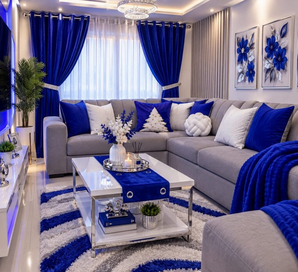
These 8 ideas run from a single rust throw to a full ombre wall that needs two pairs of hands, so the deciding factor is how much of your weekend you are willing to give.
A room used mostly after sunset wants the deep paneling and brass accents of a dark blue living room; a morning space wants the lighter end of the spectrum, like airy blue-and-white layers or a soft monochromatic scheme.
1. Complementary Colors
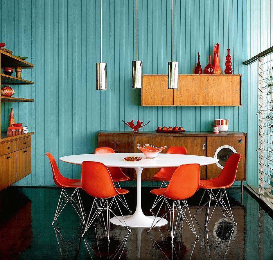
Teal walls against orange chairs prove that blue does not have to stand alone. The warmth across from it on the color wheel, reds through yellows, keeps a room from going cold.
I would start small if this feels loud: one rust throw on a navy sofa, or a single ochre lamp. Farrow & Ball’s sample pots are cheap enough to buy three shades and test the pairing before you commit.
The trade is that this takes more editing than a neutral room. Every warm piece fights for attention, so I stop at two or three.
Best for someone who wants energy without clutter, and who will curate what sits on the shelves.
2. Monochromatic Blue
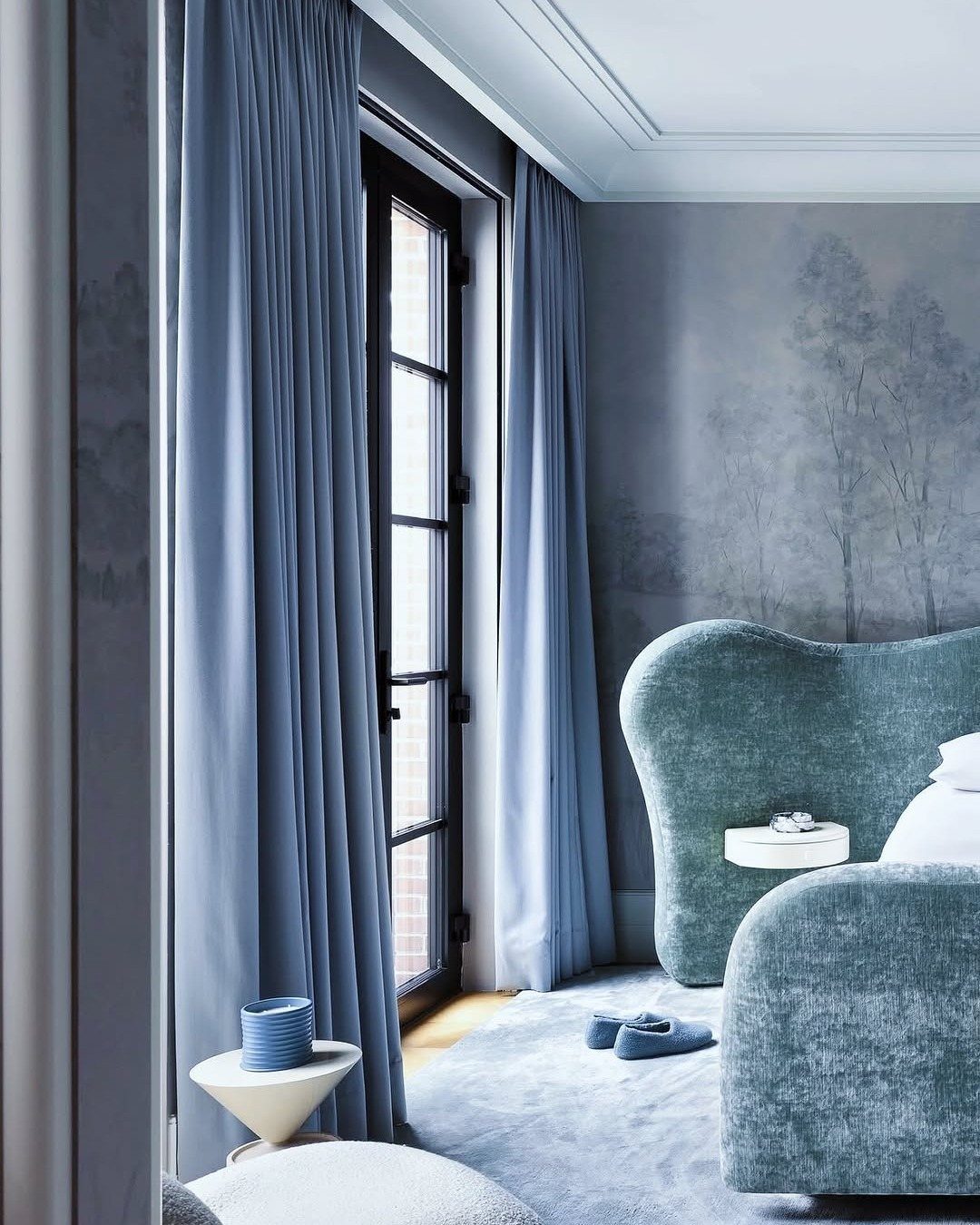
A single color, carried from curtain to rug to wall, reads as intentional rather than matched. Layer sky, teal, and near-navy without a single neutral to break them.
Texture is what keeps a single-color room from going flat. Flat paint, velvet, woven cotton, and a raised pattern all read as different colors even when the swatch says otherwise.
I would pick one pale shade for the largest surface, usually the walls, then go two steps darker for the piece you touch most. In a living room that tends to be the sofa.
This suits a weekend painter with a steady hand and a good roller. No cutting around trim for three separate colors; one tape line and you are done.
3. Dark Blue Living Rooms
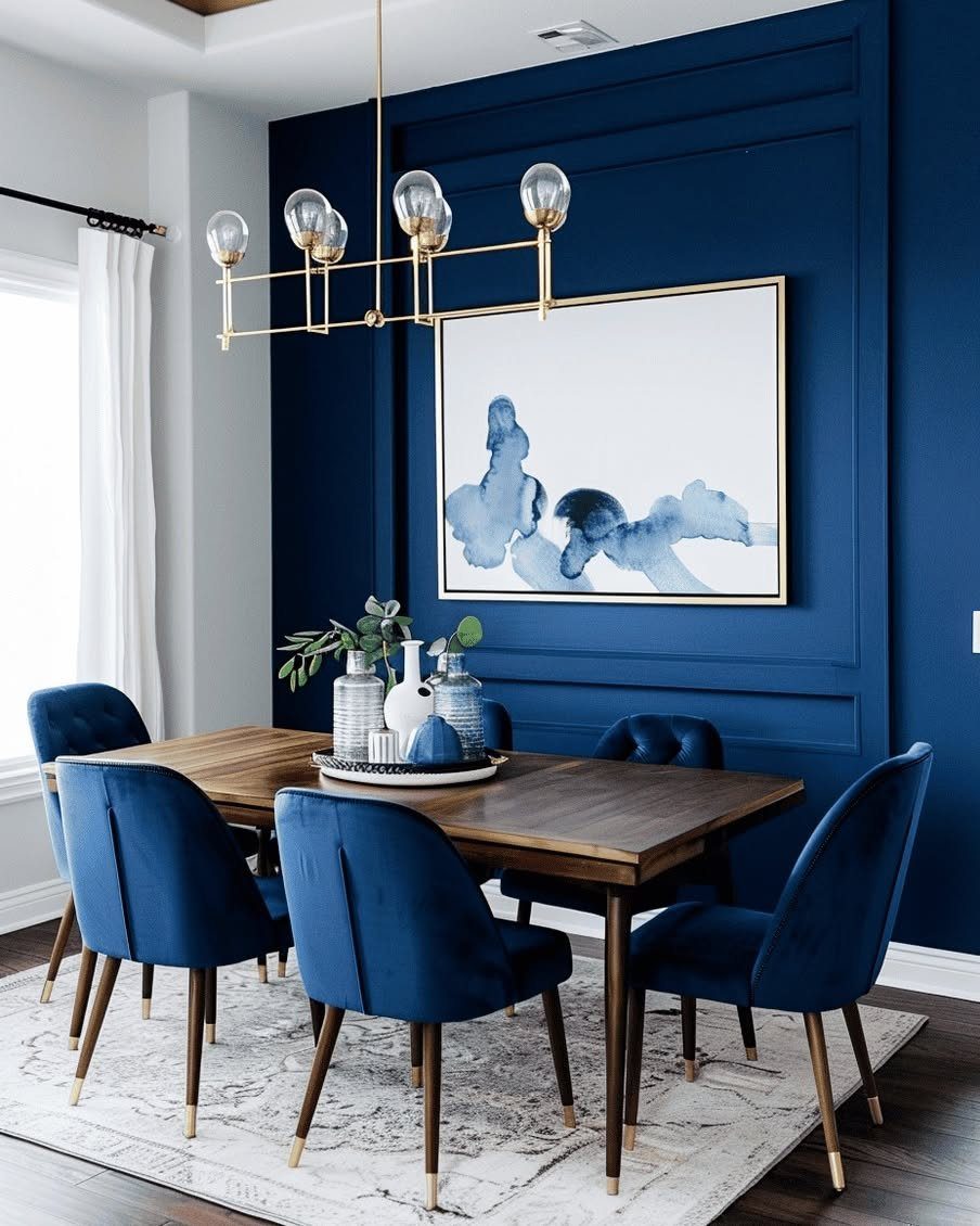
Deep blue swallows light and gives back coziness instead. Paneling, not flat drywall, carries the color; that shadow between boards is what keeps it alive after dark.
Metallic saves it from going flat. A gold chandelier, a brass picture frame, even a thin strip of metallic paint along a baseboard bounces the light that the walls absorb.
Benjamin Moore’s Knoxville Grey, a dark blue-grey, shows this well in their own shots.
I would reserve this for a room used after sunset or one with generous lamps. Morning coffee in here feels like a cave unless the windows are large.
After sunset, this is the living room that still holds a conversation.
4. Blue Gallery Wall
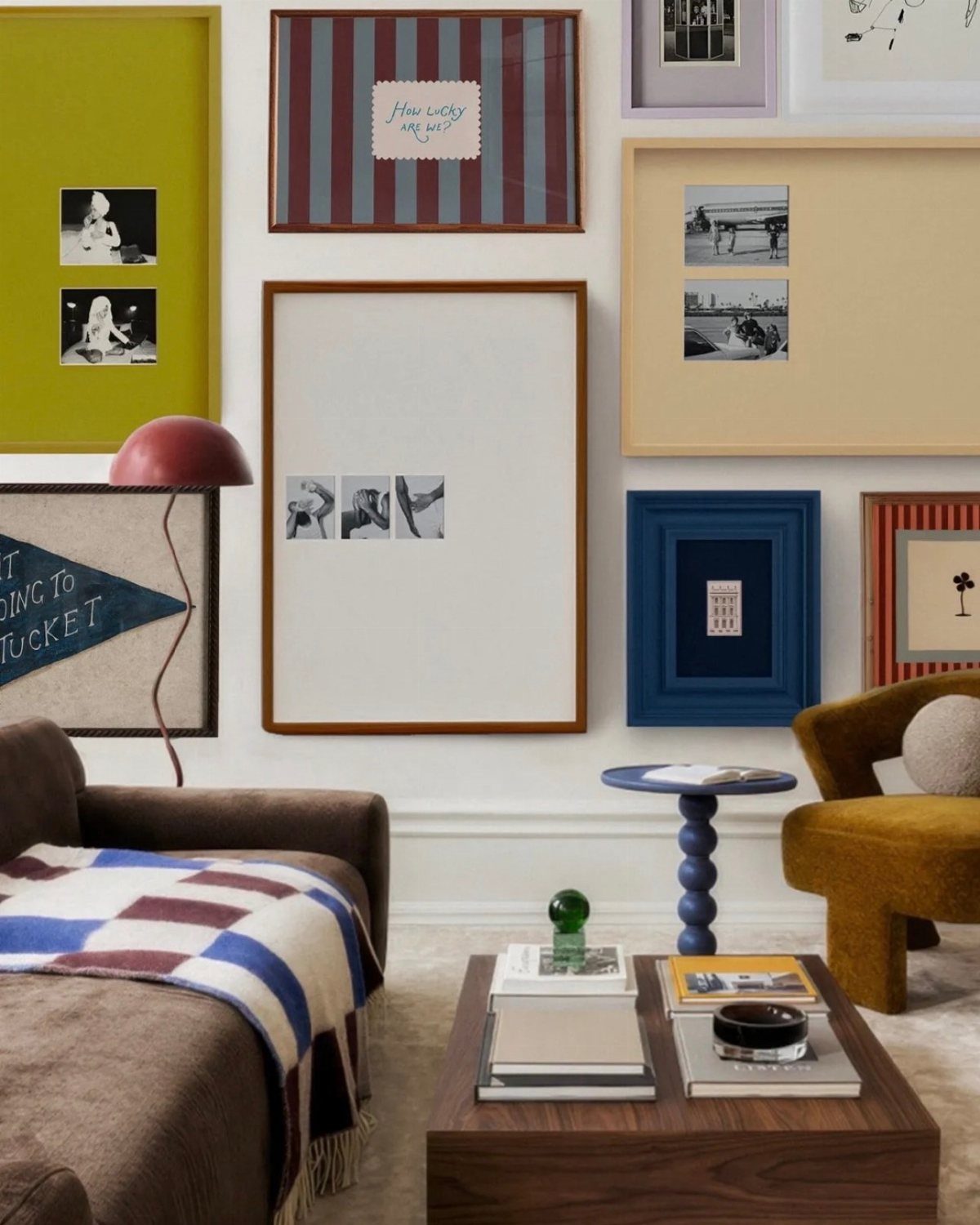
A gallery wall ties together faster when every piece shares one color. Frames that vary in wood tone and size save the blue theme from looking like a set bought as one.
Pale wood frames carry navy prints without heaviness. I would mix three frame widths, thin to substantial, and keep the mat borders uneven so the eye moves.
Desenio’s gallery sets run this way intentionally.
The limit is the wall itself. A blue gallery needs breathing room more than a mixed-color one; the repetition can feel like wallpaper if the pieces crowd.
I leave more space between frames than feels safe at first; the wall needs room to breathe.
5. Ombre Walls
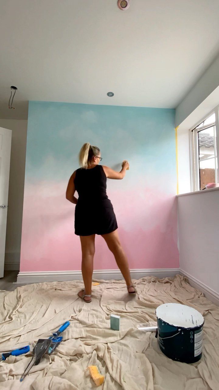
An ombre wall shifts from deep ocean blue through turquoise to barely-there white, and the effect reads closer to watercolor than house paint.
This is not a solo Saturday project. Blending wet edges across a large wall needs more than one pair of hands; one person rolls the next band while the previous is still workable.
I would hire out unless you have practiced on a closet wall first.
For the ambitious, a single accent wall keeps the labor sane. The rest of the room stays neutral and lets the gradient be the whole statement.
6. Bold Artwork
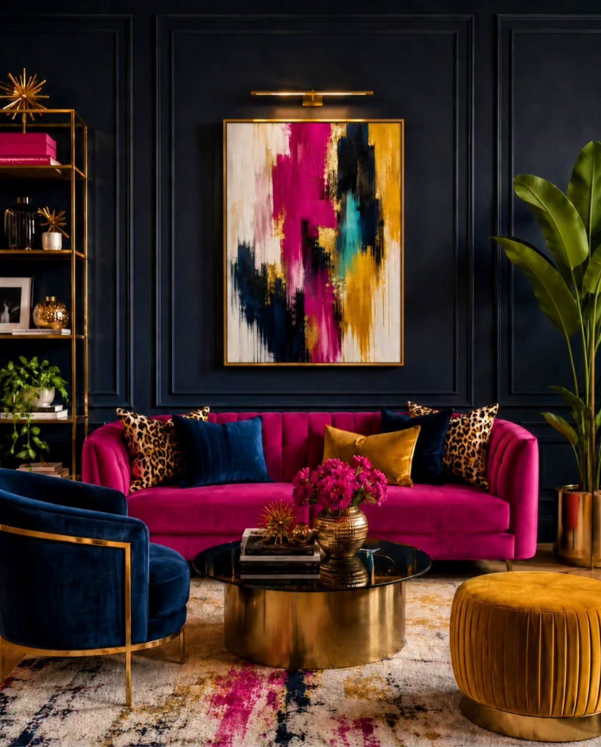
A bright pink sofa against dark blue walls works because the painting between them already said they could. Artwork that carries pink, yellow, and teal strokes gives permission for the furniture to clash on purpose.
I would pick the art first, not last. One large piece, wider than your arm span, sets the palette for everything else.
The frames can stay simple; the colors inside do the work. Nottingham designer shots show this maximalist approach holding together when at least two hues in the art repeat in the room somewhere, anywhere.
The cost is decision fatigue. Every new object has to answer to the painting.
The gain is a room that looks collected rather than decorated, which suits someone who shops slowly and keeps what they love.
7. Blue and White
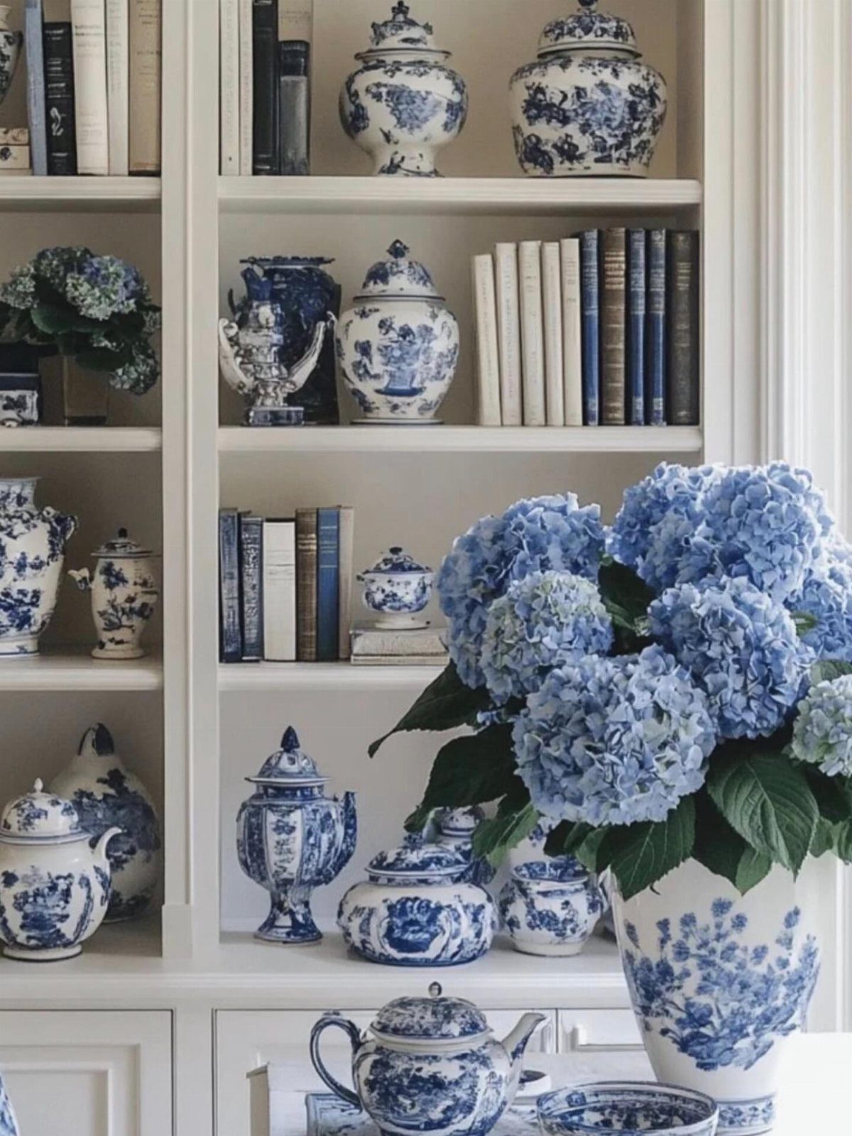
Blue and white together reads crisp without trying hard. The pairing works because white gives blue somewhere to breathe, and blue keeps white from feeling sterile.
For walls, a deep shade like Farrow & Ball’s Serge against white trim builds the contrast in one stroke.
Painting shutters to match the walls rather than the trim keeps the eye moving across the whole surface instead of chopping it up.
On shelves or a mantel, blue and white ceramics stack easily; the shapes do the work, so a few pieces go a long way.
This suits renters who cannot change wall color and anyone who wants a look that holds up for years without editing. Restraint keeps the palette clean: too many additional colors and the clarity muddies.
8. Accent Furniture
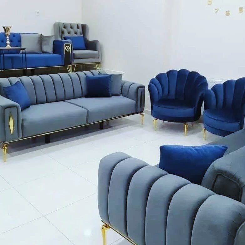
A blue sofa or armchair carries the whole room without touching a wall. A channel-tufted velvet piece in a mid-tone blue anchors white floors and walls without darkening the space.
Gold legs warm it up just enough.
For a Mediterranean lean, pair that blue with ochre or sunshine yellow in a throw or a ceramic bowl, and add something with weight: a stone-look side table, terrazzo coasters, a painted wood piece with some age on it.
Plants help here; the green reads as neutral against blue.
The cost lands where fabric choice does. Velvet looks expensive at every price point, but a tight-weave performance fabric in the same color wears better with dogs or kids.
One blue piece is usually enough; two starts a collection, and collections need curating.
Color Psychology of Blue
Blue carries a strange double life in color psychology. The same hue that slows your pulse in a bedroom can sharpen your focus in a living room.
A mix of calm and alertness makes blue worth returning to for shared spaces.
Energy, harmony, and serenity are the three traits most often tied to blue, and a living room asks for all of them at different hours of the day. Morning coffee needs the energy.
Evening conversation needs the harmony. The serenity carries both.
What surprised me after years of using it is how little you need to shift the mood. A few well-placed accents do the work of a full repaint.
The color seems to expand in a room, filling more visual space than its physical footprint.
Versatility of Blue
Blue’s real trick is shape-shifting between styles without changing its essential character. Modern spaces pick up the same color in flat planes and clean edges.
Cottage, Japandi, preppy, moody: the hue adjusts to the grammar of the room rather than fighting it.
In a sunlit space with white trim it reads cheery; under dimmer light with brass accents it turns brooding. The paint chip does not change; the context does.
That adaptability matters for renters and first-home owners who might inherit a style they did not choose. Blue meets the room where it is, then quietly nudges it somewhere better.
No single color gives you that range with so little risk.
Frequently Asked Questions
What colors go well with a blue living room?
Rust, ochre, or a muted coral across from blue on the wheel keeps the room from feeling like an icebox.
Gold and copper do the same job, though natural wood and ochre against deep shades tend to feel more lived-in than polished.
What are some good ideas for decorating a blue living room wall?
An ombre wall that shifts from deep ocean blue through turquoise to barely-there white reads like watercolor, though it needs more than one pair of hands to blend wet edges across a large surface.
Paneling in deep blue, rather than flat drywall, carries the color through shadow between boards.
How can I add warmth to a blue living room?
Metallic saves deep blue from going flat: a gold chandelier, a brass picture frame, even a thin strip of metallic paint along a baseboard bounces the light the walls absorb.
Gold legs on a blue velvet piece warm it up just enough without darkening white floors and walls.





