
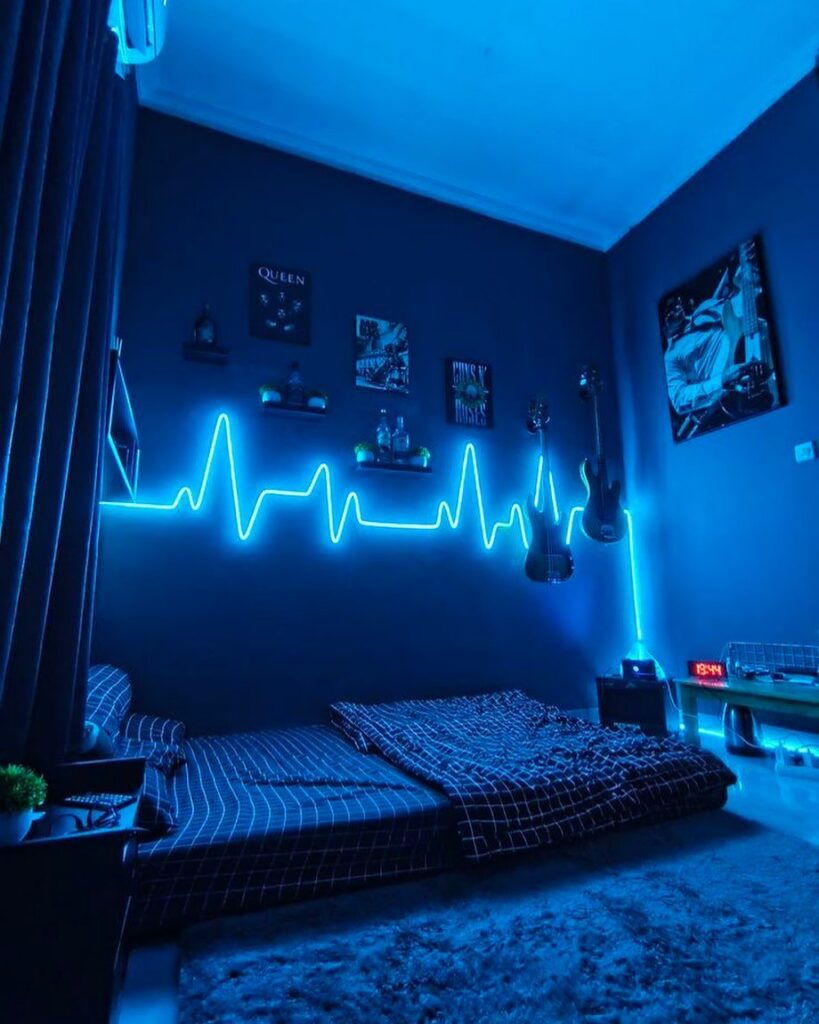
These blue bedroom ideas run from a single gallon of paint on a Saturday to wallpaper that asks more of your budget and your landlord’s permission.
The right choice depends on whether you can paint the wall behind your bed or need to work with what is already there.
1. Blue and White Bedrooms
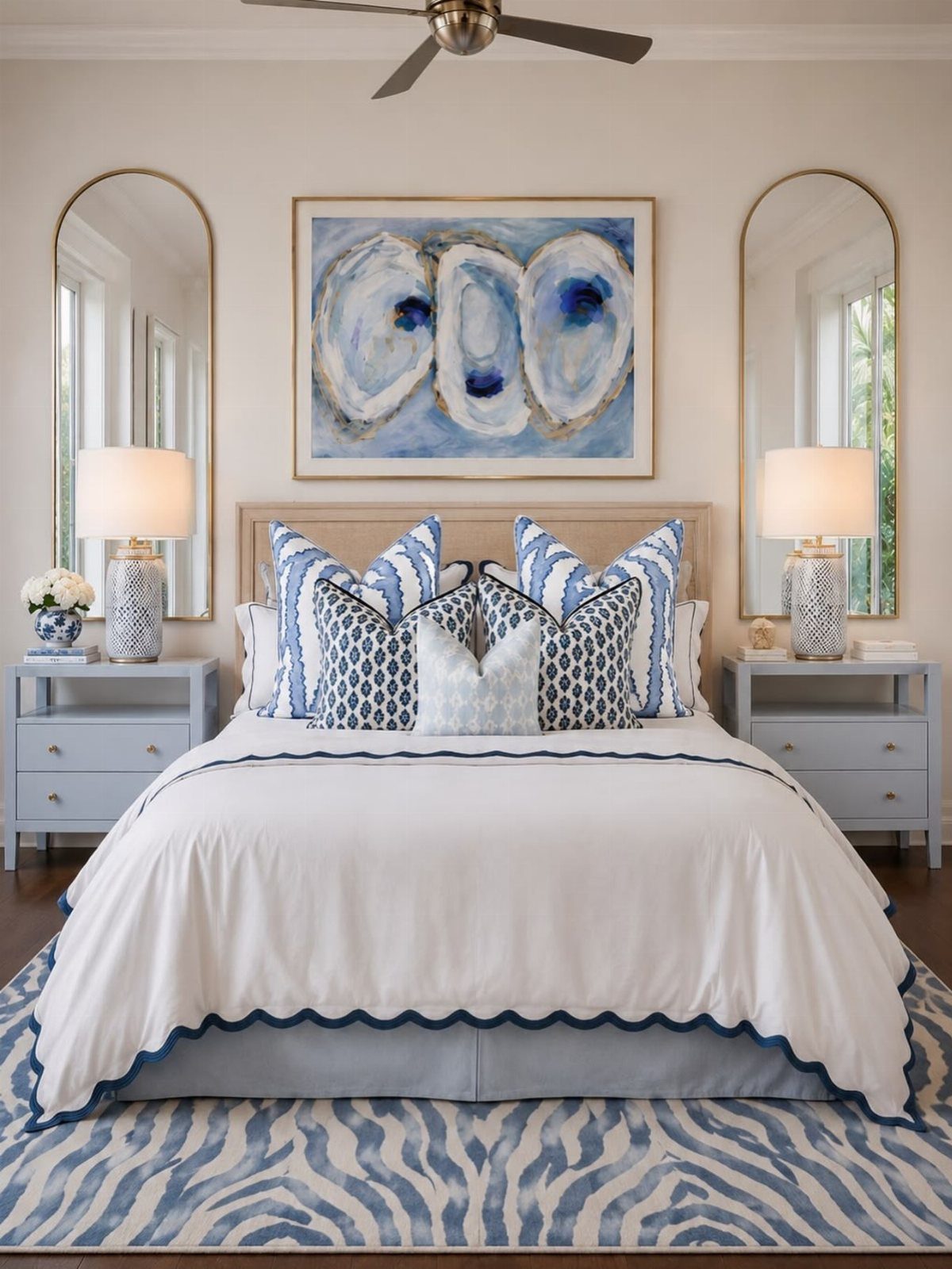
A blue and white bedroom starts with something soft and builds from there. Creamy whites let navy or cobalt stand out without shouting, which matters when you are working with bedding you already own and maybe one new rug.
A white spread with a scalloped edge and patterned pillows can carry a blue-and-white bedroom without touching a paint can. I would start with the textiles, add the mirrors last, and stop before the room turns nautical.
2. Light Blue
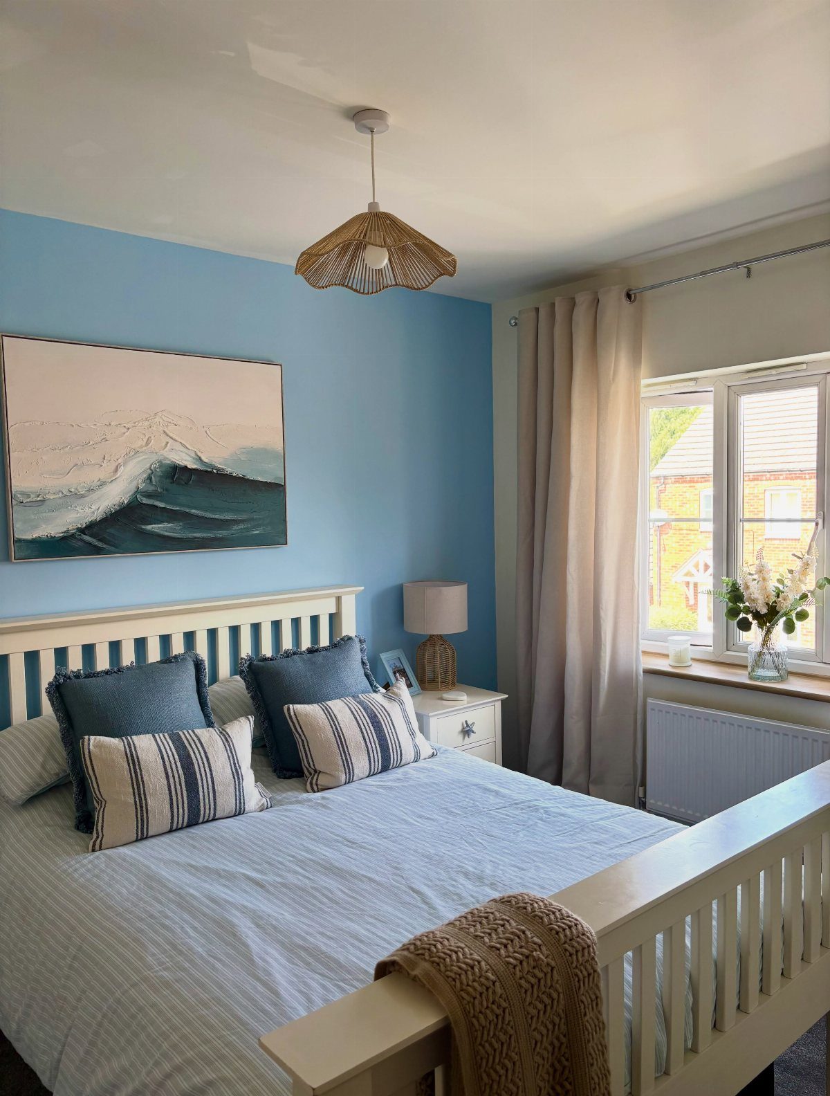
Powder blue walls open a room up in a way darker colors fight against. Benjamin Moore’s Perspective carries enough gray to stay calm through afternoon light, and it pairs cleanly with a white bed frame you probably already have.
Natural textures like a woven pendant or a wave painting keep pale blue from feeling cold. Two coats in a standard bedroom takes a Saturday and enough paint to cover every wall twice.
Skip the ceiling if the budget is tight.
3. Small Bedrooms with Blue Accents
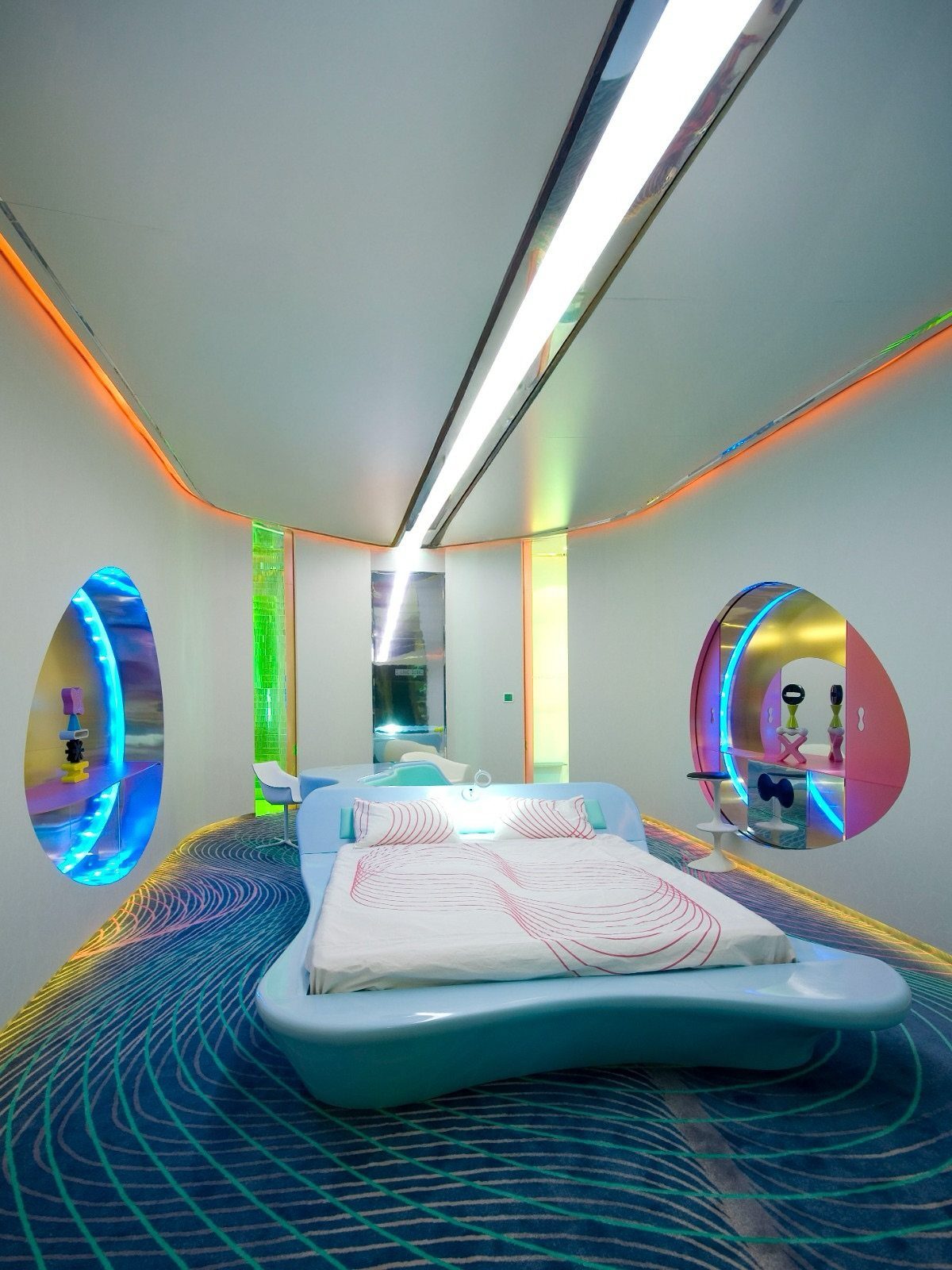
Blue in a small bedroom works best when it is deliberate, not accidental. One curved piece, one patterned floor, and the rest stays white so the walls do not close in.
Limit the blue to two elements you love, and let the architecture do the rest. A skirted nightstand or a pleated sconce shade adds softness without stealing square footage.
Renters can swap hardware and lighting; the floor and the bed shape are harder to fake on a weekend.
4. Saturated Blue Bedroom
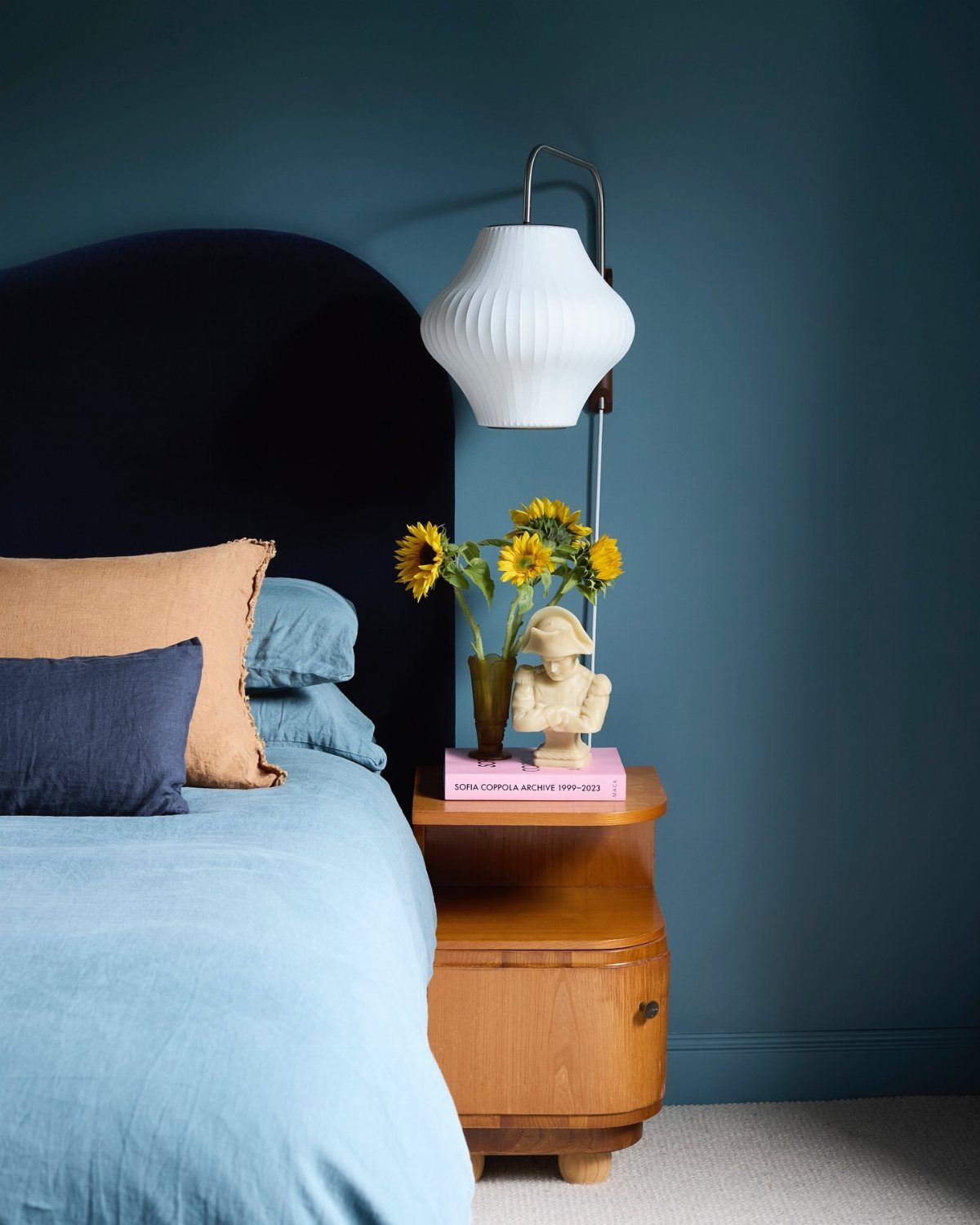
Saturated teal on one wall reads as bold, not loud, when the bed stays quiet. Navy velvet against that wall works because the linens stay light and the wood warms everything up.
Ralph Lauren wool suiting on walls is not my budget, but the move copies down: one rich color, one luxe texture, everything else restrained. Sunflower yellow works as a partner for saturated blue only if you already own the piece.
Start with the headboard or the wall, not both.
5. Blue and Green
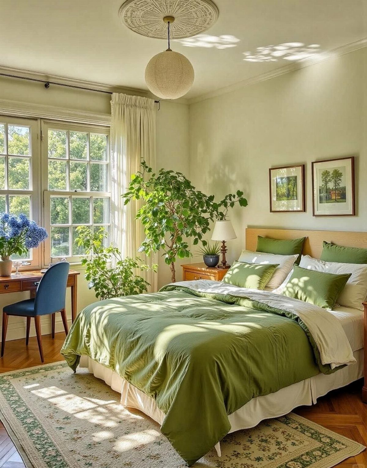
Blue and green together fix the coldness blue can fall into.
Something living-shaped, real or fake, belongs in this mix and often does more visual work than the furniture. I would keep the greens soft and the blue to one accent piece, or the room starts reading like a nursery.
Navy works here too, if the green stays pale.
6. Royal Blue Bedroom
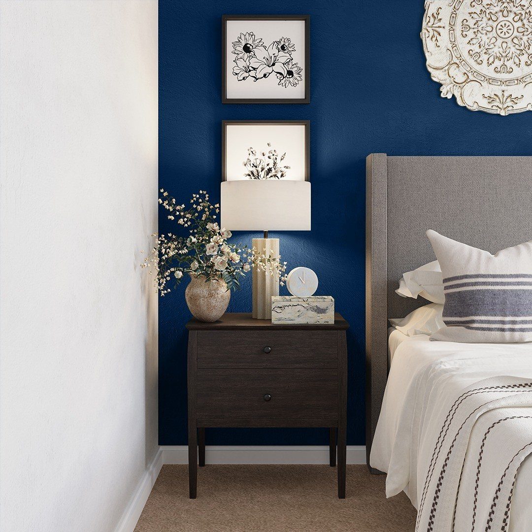
Royal blue walls in wool suiting fabric turn a plain rancher bedroom into something that photographs well and lives better. The glam comes from the material, not the color alone; paint would read flat by comparison.
Upholstered walls are a hired job, not a Saturday project, and the cost runs past what most of us spend in a year.
The copyable move is one royal blue element against gray and white: a headboard, a curtain panel, a single wall in high-gloss paint. I would pick the headboard and keep the rest calm.
7. Navy Blue Bedroom Ideas
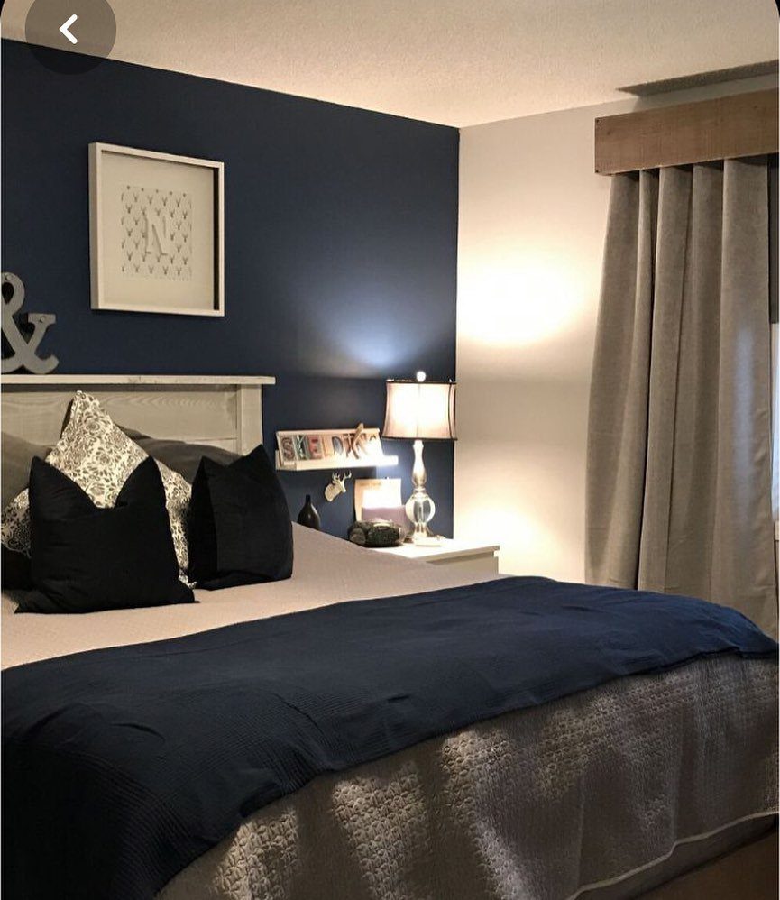
I would keep the surrounding walls light and bring in white or natural wood furniture to keep it breathable; the contrast does the heavy lifting.
Gold or brass lamps, drawer pulls, or a simple mirror frame warm the tone and keep it from reading too cold.
Benjamin Moore’s Gentleman’s Gray and Farrow & Ball Hague Blue both carry enough green undertone to feel lived-in rather than flat.
This suits renters who can paint one wall and landlords who allow it. If painting is off the table, a navy headboard against a pale wall gets you most of the way there.
8. Integrate Hushed Hues
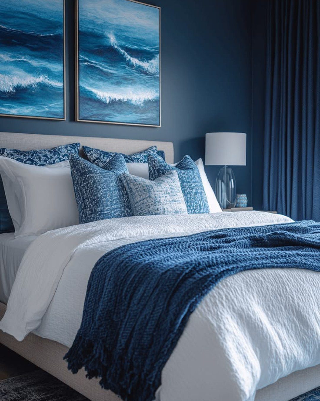
Layering blues from slate down to nearly black, then cutting them with white or warm beige, keeps a bedroom from feeling like a paint chip display.
The eye reads it as one color with movement, not a collection of competing shades. I would start with the darkest tone on the largest surface, usually the wall, then step lighter through bedding, curtains, and any upholstered piece.
Jen Baxter’s approach of pairing those blues with crisp white or soft gray works in small rooms because the neutrals give the eye a place to rest.
Stick with tonal variation instead of piling on every color.
9. Cozy and Luxurious Deep Blue Bedroom Ideas
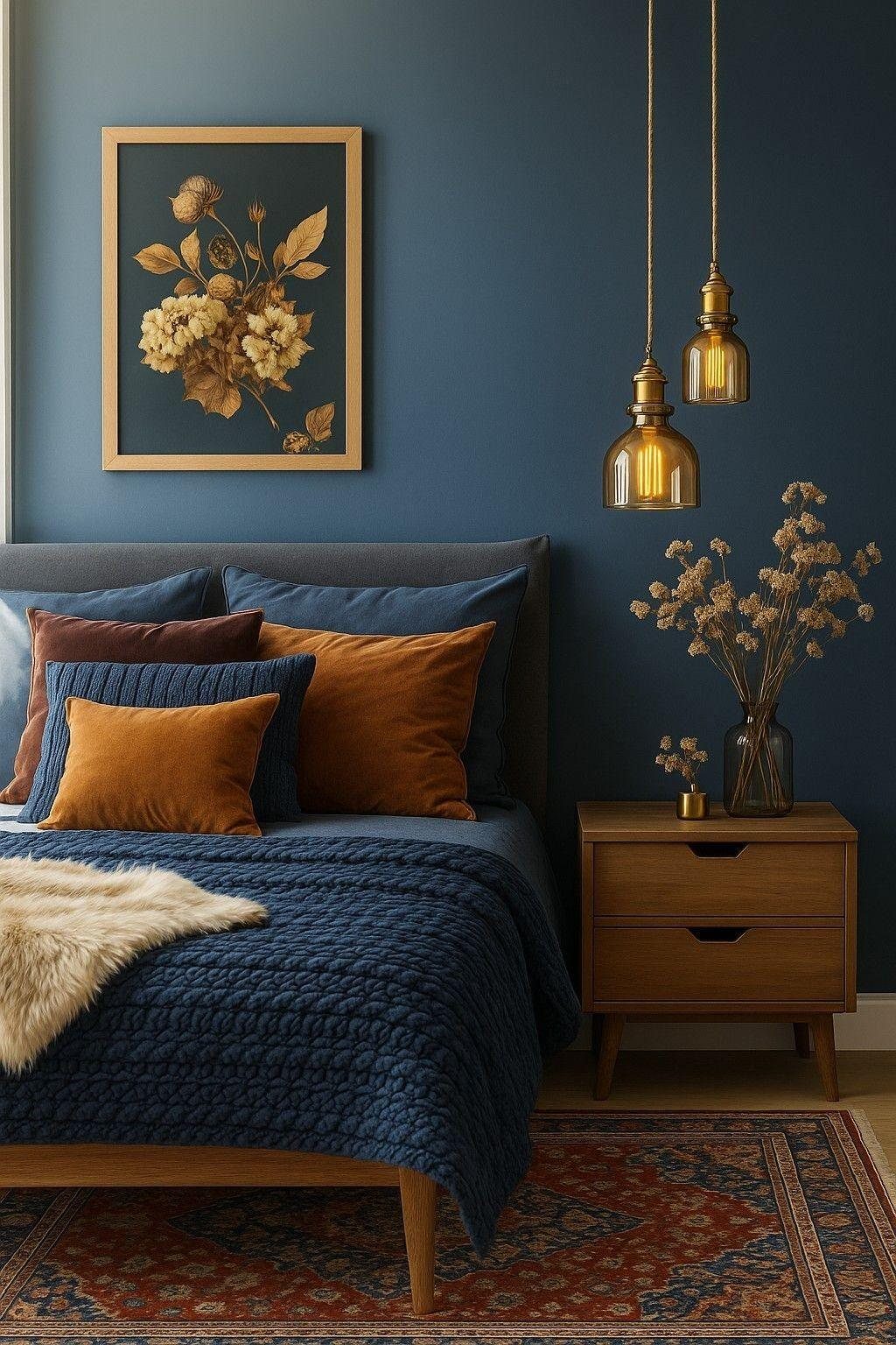
Deep blue walls make a bedroom feel like somewhere you actually want to be at night. Dark matte blue grounds the space and pushes warm wood furniture forward.
Rust and burnt orange velvet cushions plus a faux fur throw break up the block color and give deep blue the warmth it needs to feel inviting.
I would follow that same logic: deep walls, warm wood, one accent color with some texture to it.
For paint, Sherwin-Williams Indigo Batik or Benjamin Moore Blue Note both carry enough depth to cocoon a room. Layer linen or high-thread-count cotton bedding, add dimmable lamps or wall sconces, and the room shifts from merely dark to genuinely luxurious.
10. Layer on Fabrics
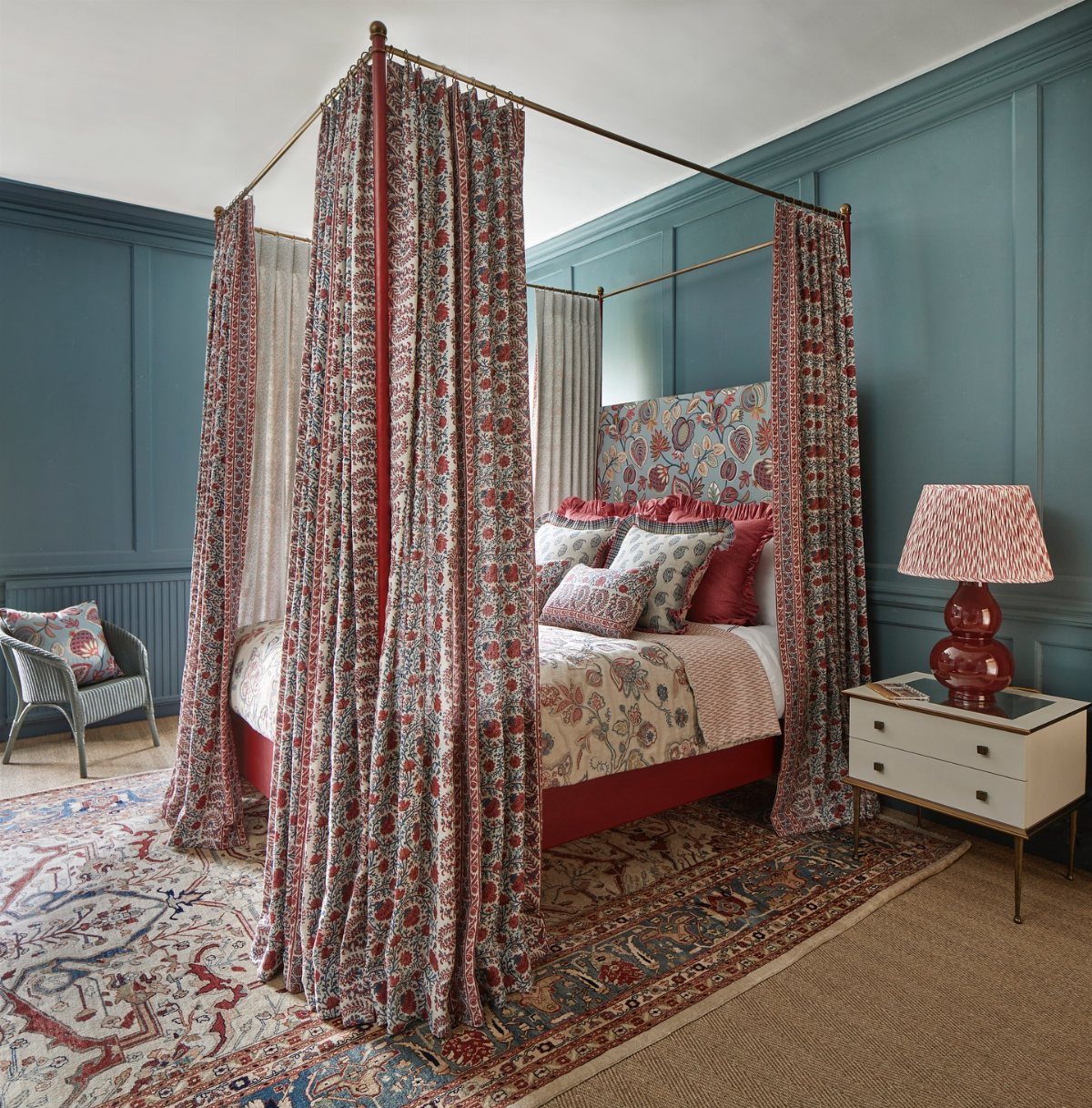
A canopy bed that reaches the ceiling turns sleeping into something that feels intentional rather than accidental.
Build the room around layers of blue fabrics and patterns, from floral curtains to patterned pillows to a matching duvet, so the eye never lands on one single busy thing.
I would start with one anchor pattern, something large-scale on the curtains or duvet, then add smaller prints in the same color family for pillows or a rug.
The canopy frame itself, in wood or painted metal, gives structure that keeps the fabrics from feeling messy.
This demands more yardage than a minimal bed, and more patience in shopping, but the result is a room that feels finished rather than furnished.
11. Stick to One Shade
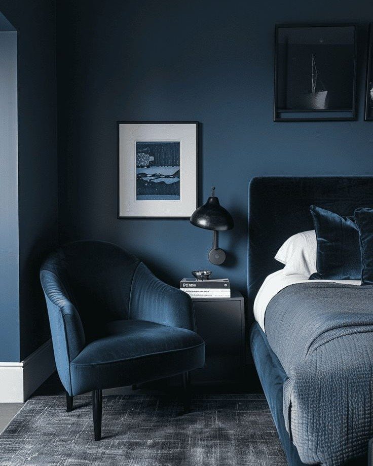
Using one blue everywhere, walls to upholstery to bedding, creates a room that feels held together by a single breath.
The effect is ethereal rather than monotonous because texture does the work that color variation usually does: velvet against linen, matte paint against a woven rug, smooth ceramic against nubby wool.
I would pick a mid-tone blue with some gray in it, something that shifts in different light, and let the material changes provide the interest.
A gray or natural wood floor keeps it from floating away entirely. This approach fails if the blue is too bright; a soft, dusty shade is the safer bet for a space you actually sleep in.
12. Mix in Metallic Pieces
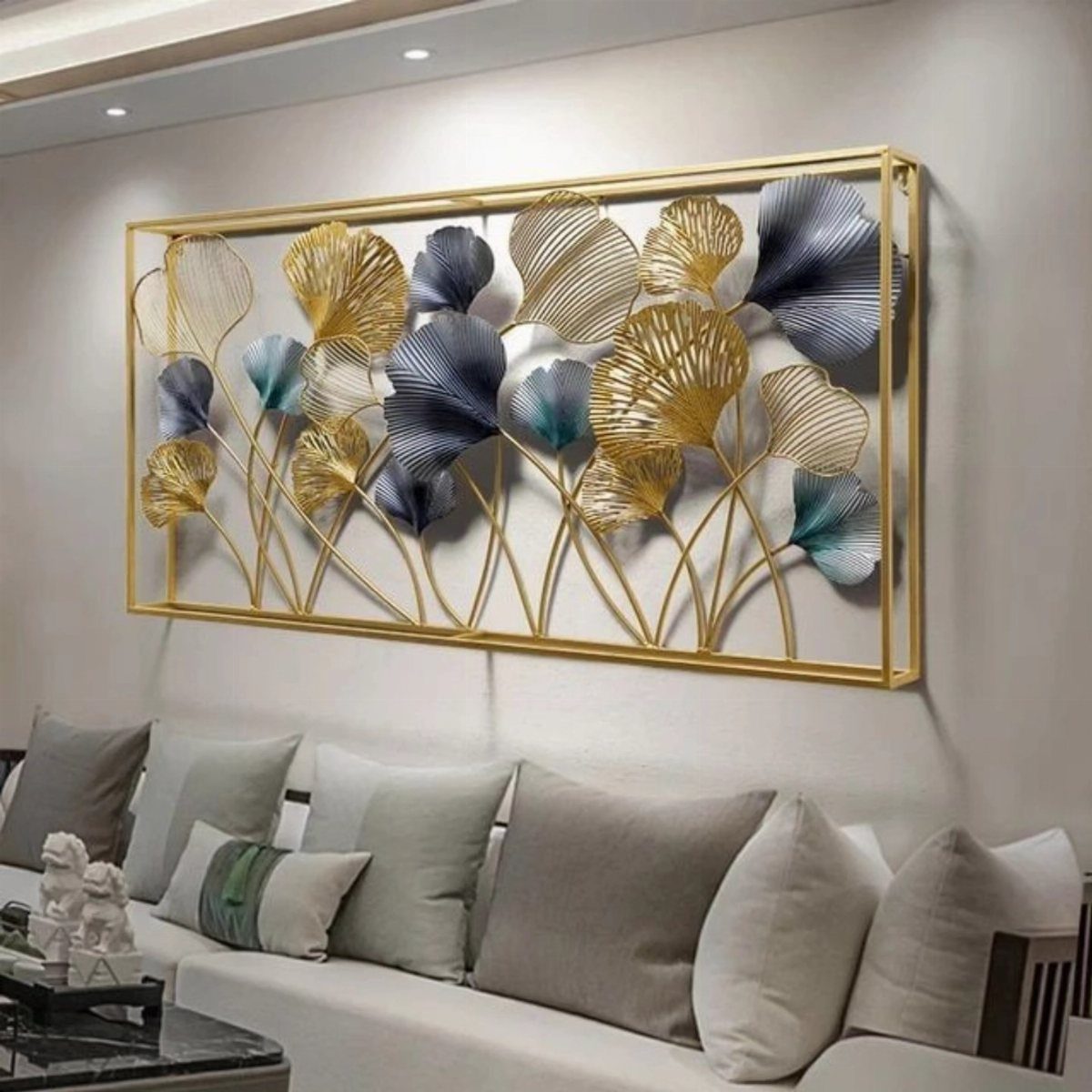
Metallic accents against blue and white add the one thing an all-matte room often lacks: a point of reflection that catches light and moves it around.
A gold wall piece, brass lamp bases, or even a thin metallic thread in a curtain fabric does this without demanding a full redesign.
I would place one larger metallic element where morning or evening light hits it, then repeat the metal in smaller touches, a drawer pull, a picture frame, so the choice reads deliberate.
Eliza Crater’s approach of mixing prints and fabrics with metallic accents keeps the palette tight while adding depth; the blue stays calm, the white stays clean, and the metal keeps the whole thing from feeling flat.
Silver works too, though it reads cooler; gold or brass warms the blue in a way that suits bedrooms.
13. Let the Wallpaper Guide Your Palette
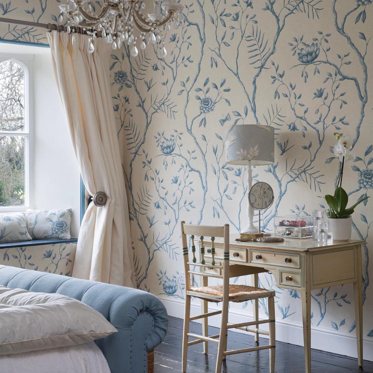
Wallpaper with a varied blue palette does the color-commitment work for you. Pick a print that carries at least two tones you can pull from: one for the bed, another for curtains or a chair.
The white already in the paper lands on linens without fighting anything. A floral like this one reads traditional; a stripe or geo would tilt modern.
Either way, let the paper’s darkest tone set your floor or frame finish and its lightest handle the ceiling.
One wall of removable paper sets the whole palette without committing the whole room, and it travels with you when the lease ends. Cost runs higher than paint but lower than a full room redo you second-guess.
14. Indigo World
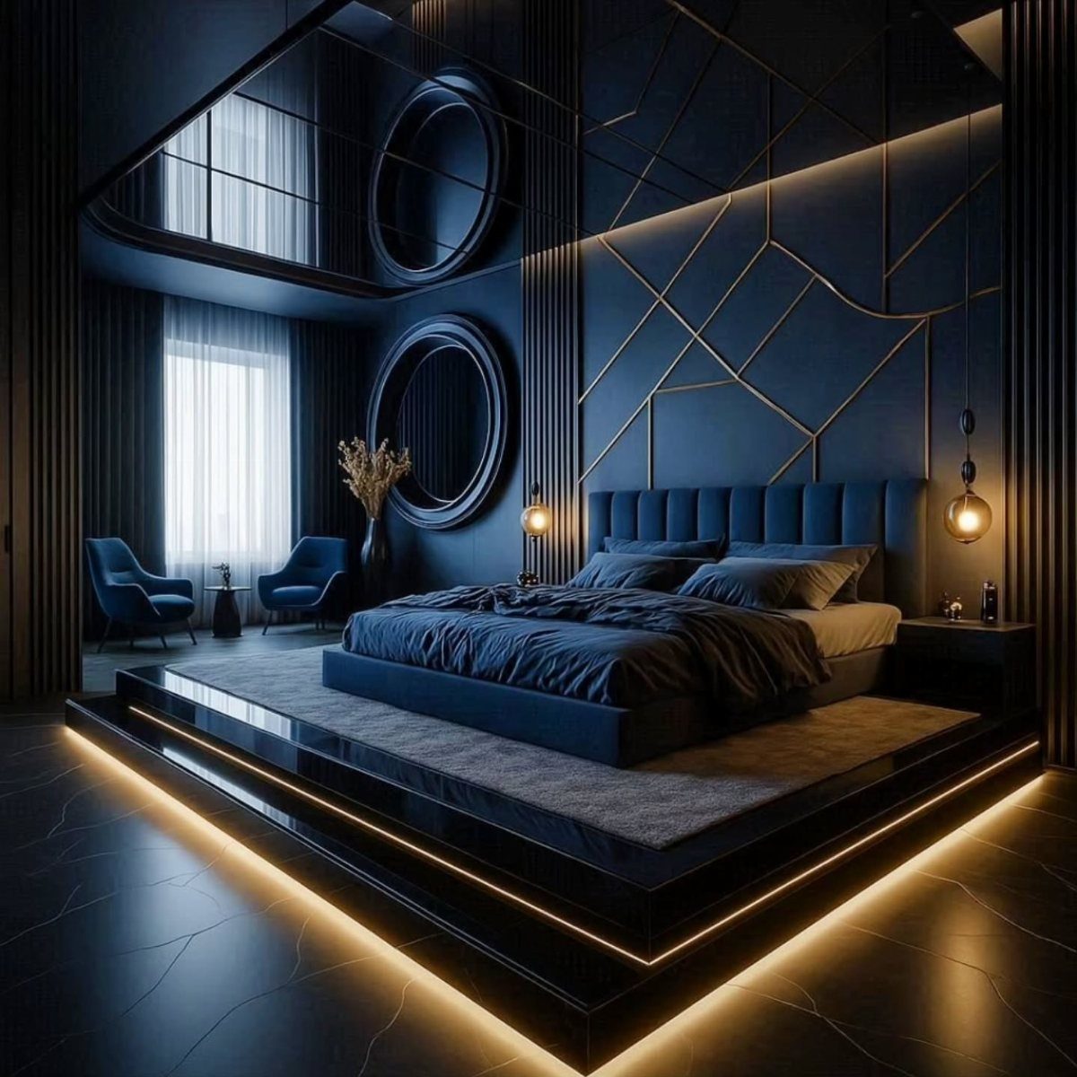
Indigo at full saturation turns a bedroom into a contained night.
Thin metallic lines catch light against deep indigo and keep the color from sinking flat; a warm glow at the baseboard does the same work by lifting the lower edge.
You could get there with matte paint and brass nailheads, or with textile panels and thin mirror frames. The platform bed helps, raising the sleeping surface so the walls feel taller above it.
This trades morning brightness for evening calm. If you need both, keep indigo to the wall behind the bed and run pale blue everywhere else.
Global textiles, block-printed or ikat, hold their own against this depth; minimal patterns disappear.
Combining Colors
Orange sits directly across from blue on the color wheel, which is why a marigold accent lifts a room heavy with deep, saturated blues without fighting them.
A marigold trim on canopy fabric comes alive when you carry it through to an orange lampshade and a gilt mirror; the repetition keeps the eye moving without letting any single piece shout.
The gold does double duty: it picks up the warmth in the orange and keeps the blue from reading cold.
Green works on the same principle, especially sage or olive with a gray undertone that lets the two colors settle together rather than compete. Metallics operate more like neutrals with temperature.
Brass and copper lean warm against navy or indigo; chrome and nickel stay cool enough for a light blue room without startling the eye.
Choosing the Right Blue
Gray undertones matter more than the blue itself. A tone that carries enough gray reads as color without shouting, and it shifts with the light in ways a pure primary blue never will.
I look for paints labeled "steel," "slate," or "dusty" when I want something that behaves in morning sun and lamplight both.
Warmth comes from the gray’s direction. Green-gray blues feel quieter and more natural; red-gray blues turn moody and sometimes muddy in north-facing rooms.
I test three tones on the wall, not the chip, and I watch them across a full day before deciding.
The wrong blue in a bedroom can feel like a medical facility or a child’s room, and the difference is often half a step toward or away from gray.
Frequently Asked Questions
What color goes with blue in a bedroom?
A marigold throw or pillow cuts straight across the wheel from deep blues, which is why the pairing works without either color shouting. Rust, camel, and olive green also work, especially with blue tones that carry some green.
Brass lamps and copper hardware heat up navy or indigo; silver keeps its distance in rooms already washed with pale blue.
How to make a blue room cozy?
Matte deep blue walls drop back and let warm wood pieces step forward into the room. Add rust or burnt orange velvet cushions, a faux fur throw, and dimmable lamps or wall sconces.
A woven shade over the bed or rumpled linen sheets keeps sky-blue walls from turning chilly.
Is a blue bedroom a good idea?
Yes. The gray that lives inside most blues settles the eye in morning sun and under a reading lamp alike.





