
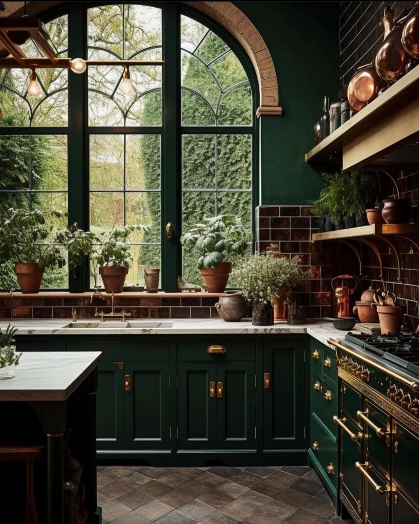
The ideas below start with a single cabinet wall you can paint in a weekend and run through full kitchens where dark green anchors beams, brass, and stone, so the deciding factor is how much of the existing kitchen you are ready to change.
A rental with standard gray cabinets only needs a can of Regent Green 2136-20 and new pulls to shift the room’s whole weight; an owner with beams and wide plank floors can let charcoal green ground the architecture instead.
1. Dark Green Kitchen Cabinets
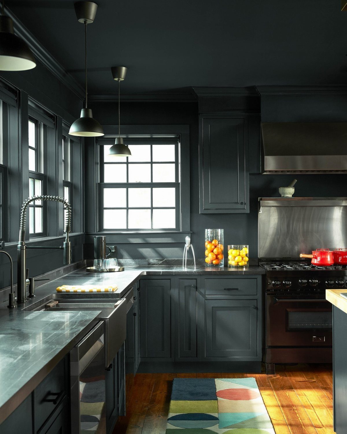
Regent Green 2136-20, a deep pine green that verges on black, turns standard cabinetry into something that reads designed rather than inherited.
I would put gold or brass hardware against it; the warmth keeps the color from flattening into something purely moody.
In my own search, this combination kept showing up in urban apartments where owners wanted to replace gray with something that still felt controlled.
The look works for both owner-occupied spaces and rentals where you need a distinctive finish that photographs well.
Painting existing cabinets in this tone and adding new pulls is the kind of weekend project that changes the whole room’s weight without touching the layout.
2. Two-Tone Green Kitchens
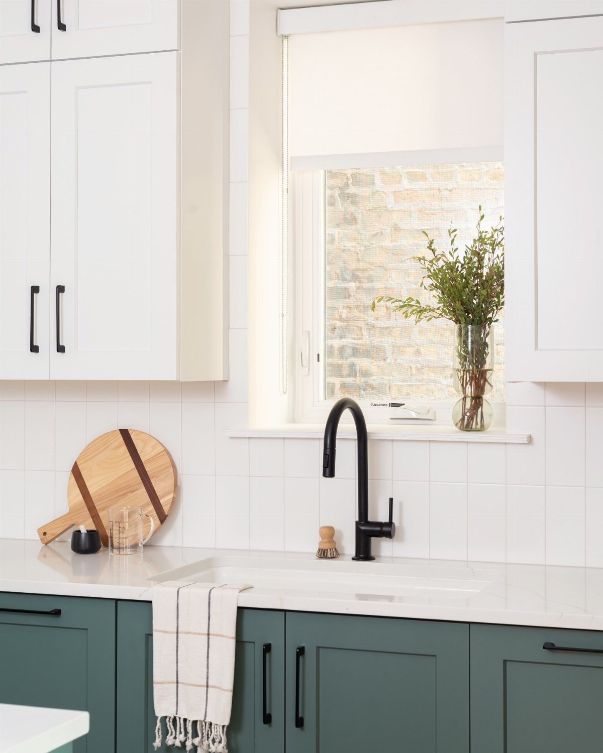
Splitting the color load keeps dark green from swallowing a small kitchen.
Green base cabinets with white uppers work in galley kitchens where full color would close the walls in; a green island against neutral perimeter cabinets gives open plans one anchor point.
The two-tone approach matters most when you are not replacing everything at once; paint the lowers this year, leave the uppers for next, and the kitchen still reads intentional.
White countertops and a black faucet bridge the two zones without adding a third competing element. This is the route I would take in a rental where only part of the cabinetry can change.
3. Forest Green Shaker Kitchen
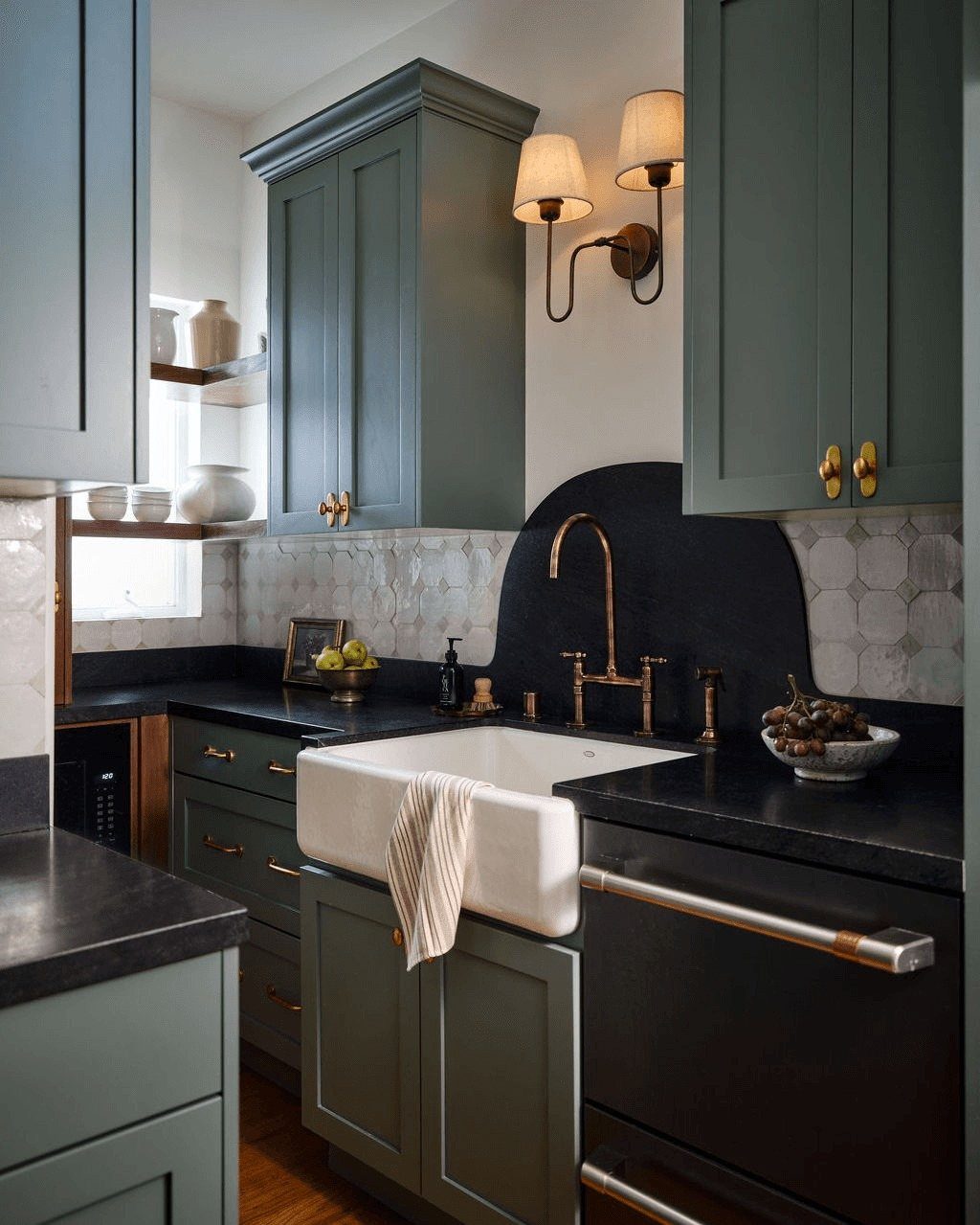
Shaker doors in forest green carry enough tradition that brass handles feel like a natural continuation rather than a contrast.
The style suits kitchens where you want the color to feel established, not experimental; the recessed panel keeps the eye moving so the green does not pool heavily.
Pale stone worktops and light timber flooring lift the tone, and a brass sconce near the sink gives you task light that also reads as jewelry.
I would watch the countertop choice here; anything too dark or too busy fights the brass for attention.
For a first project, painting existing Shaker doors and swapping hardware is manageable solo with proper prep, though rushing the sanding or the cure time between coats is where most people trip up.
4. Deep Teal Green Country Kitchen
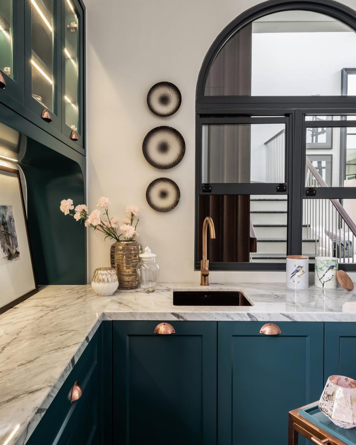
Deep teal reads as color in morning light and as shadow by evening, which makes it forgiving in a kitchen that serves both breakfast and dinner.
I would pair it with natural pine furniture rather than matching cabinetry; the variation keeps a country kitchen from feeling like a set.
Soft limestone flooring and white walls do the actual work of brightening the space, so the teal can sit deep without the room turning cave-like.
Copper handles warm the tone in a way chrome would not; a gold faucet under an arched window becomes a focal point you plan the rest around. This suits generous proportions where the color has room to breathe.
5. Bottle Green Kitchen
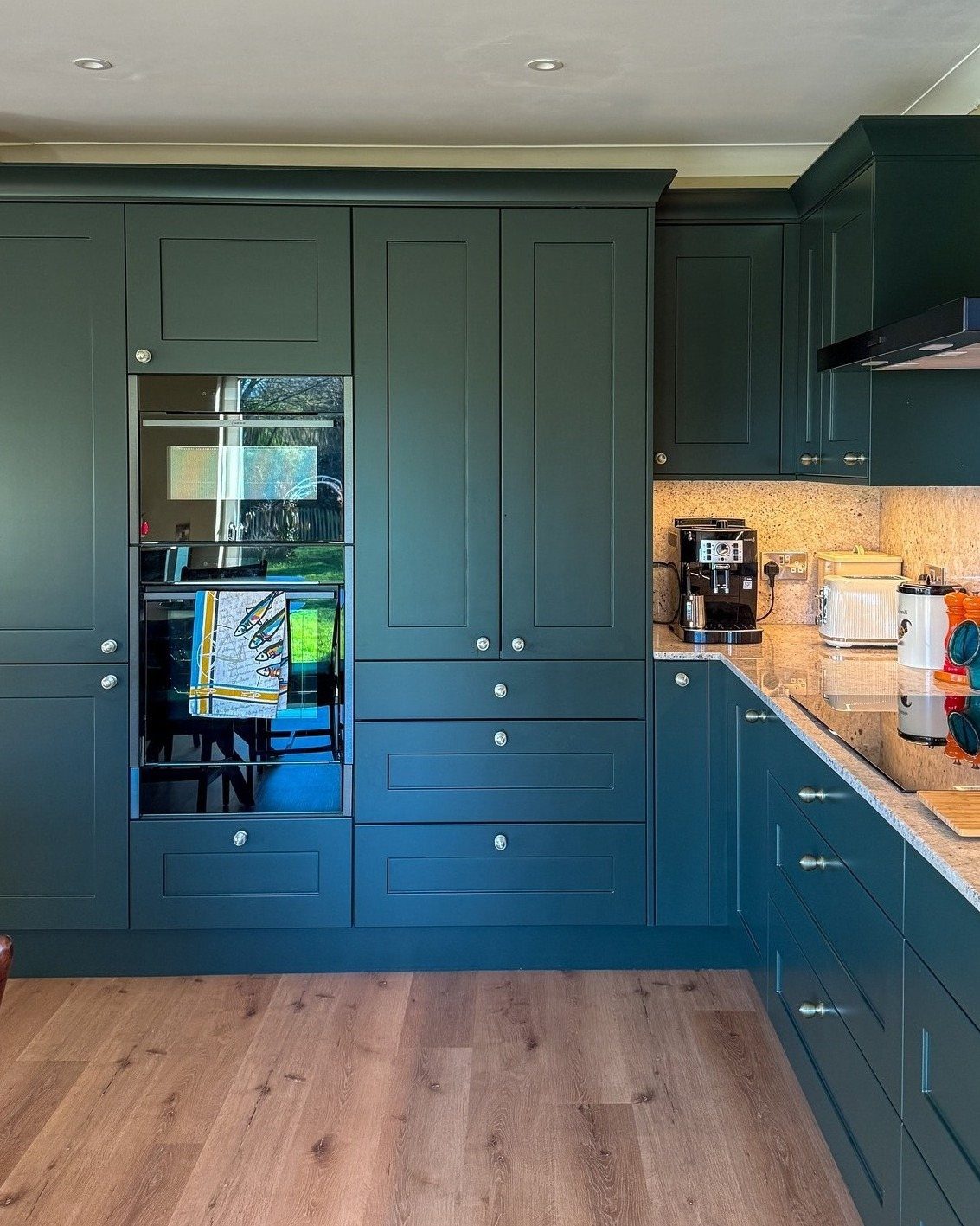
Bottle green carries more saturation than forest tones, so the surrounding materials need to stay quiet. Pale quartz worktops and light oak flooring provide that restraint; brass cup pulls and ribbed glass pendants add texture without introducing competing color.
I would keep the backsplash neutral, as the cabinets already deliver the statement.
An oak dining table in the same space extends the wood tone and gives you a place to test whether the green reads as rich or heavy at different times of day.
For a budget version, painted cabinets with new brass hardware and a single ribbed pendant over the sink gets most of the effect at half the cost.
6. Charcoal Green Farmhouse Kitchen
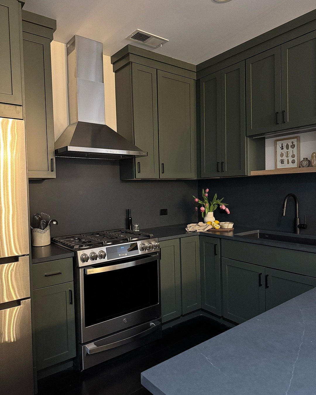
Charcoal green sits so close to neutral that it functions as a dark gray with undertones you notice only after you have lived with it a while.
In a farmhouse setting with whitewashed beams and pale floorboards, it grounds the room without the sharp contrast of true black.
I would use this in a kitchen with existing architectural character, beams or wide plank floors, where the cabinets need to participate rather than dominate.
The stainless range and hood in the visible example keep the look current; swapping to black would push it more rustic than I would want for a first home.
7. Emerald Green Kitchen
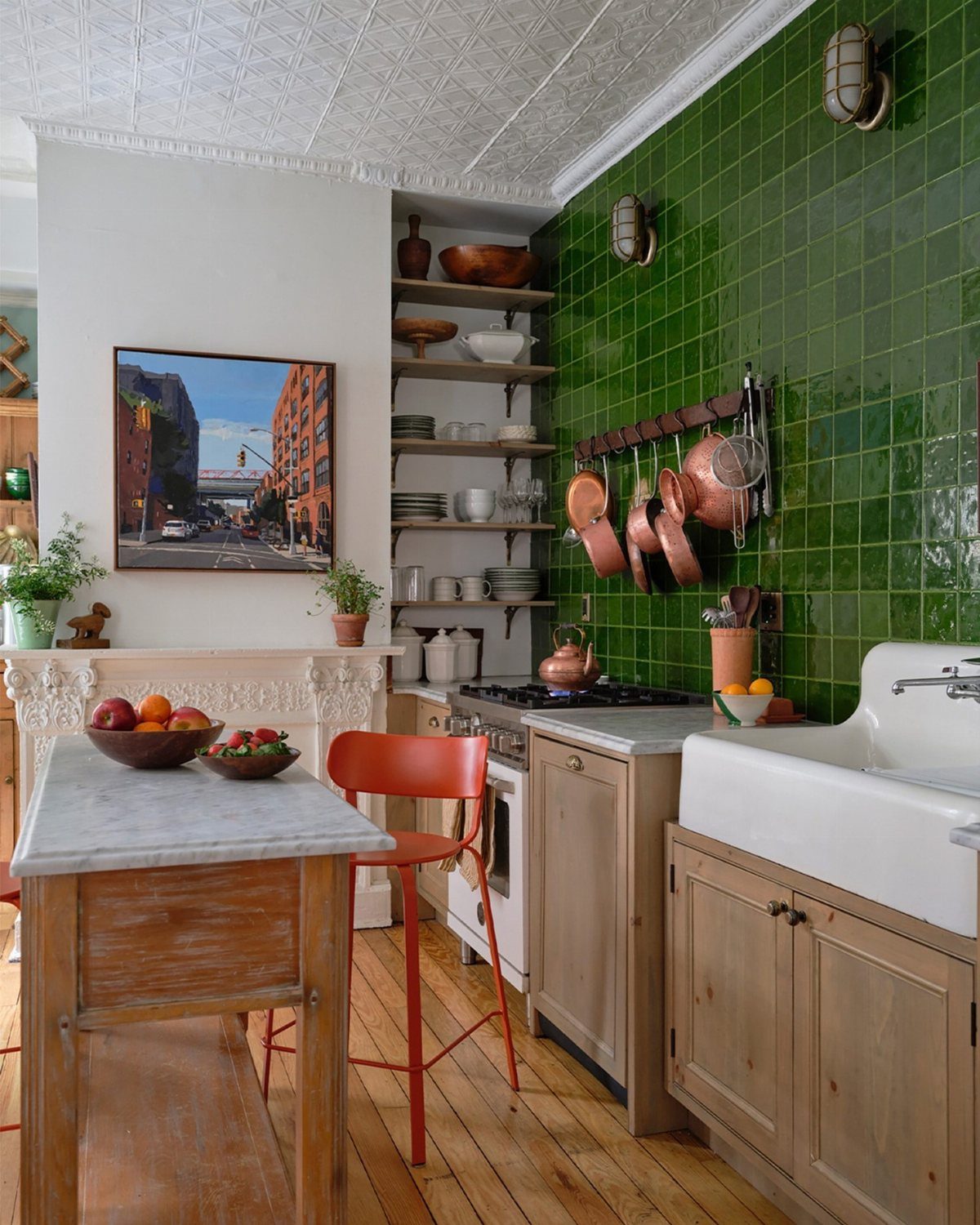
Emerald green reads loud on cabinets, so the balance comes from what sits next to them. Calacatta-style marble with soft gray veining gives the eye somewhere cool to rest, and brass fittings warm the whole thing back up.
A bridge faucet in brass keeps the sink area feeling intentional rather than busy.
If your kitchen runs open-plan into living space, this pairing travels well; the marble reads as classic in both rooms.
I’d pick this one for anyone with good natural light and an open plan to tie together. The materials cost, but the cohesion saves you from buying art for the walls.
8. Olive Black Kitchen
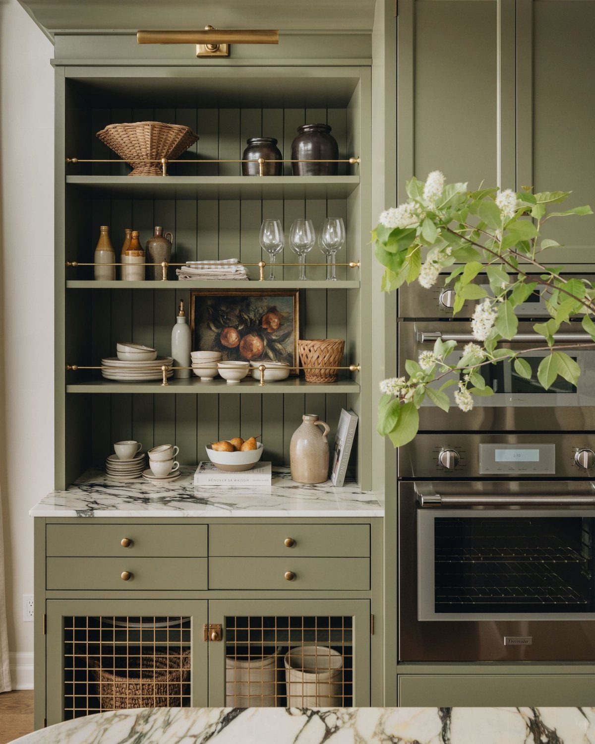
Olive black sits so close to furniture tone that the whole kitchen starts to feel like a built-in cabinet.
An oak worktop on the island answers that request. Brass knobs help, and pale stone flooring keeps the dark from dropping too heavy.
The look suits renters who can swap hardware and live with what the landlord installed, or owners who want one bold move rather than a full renovation.
Tradeoff: the color drinks light. North-facing rooms need more thought on bulbs and wall tone.
9. Dark Green Island Kitchen
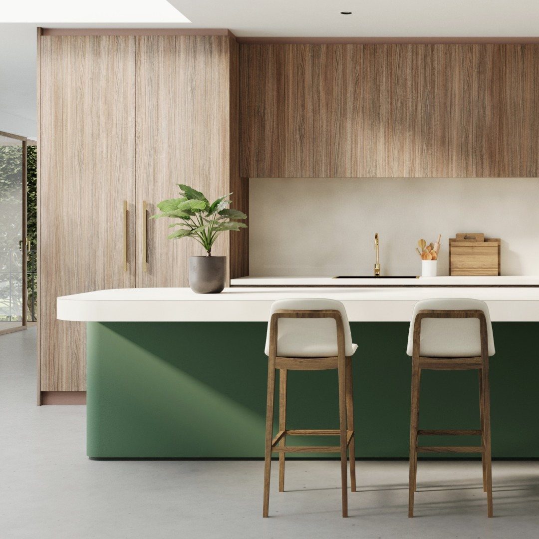
A dark green island anchors a bright kitchen without painting every cabinet. Light wood cabinetry and white backsplash run the perimeter, with the island doing the color work.
Black-framed glazing on windows or doors sharpens the edge and gives the green something to push against.
White counters on the island keep it practical; dark stone would lose the shape in shadow. Two stools with light cushions echo the perimeter and keep the seating from looking planted in a block of color.
This suits the homeowner mid-renovation who chose white everything and now wants one moment of intention. Cost stays lower than full cabinetry.
Limit: the island becomes the room’s focal point by default, so whatever sits on it matters more.
10. Classic Hunter Green Kitchen
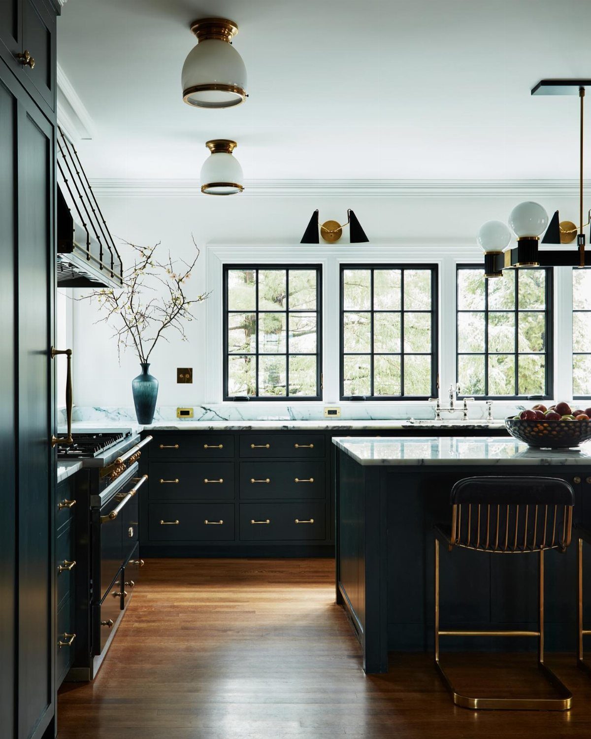
Hunter green carries a history that reads as choice rather than trend.
Base cabinets in this shade pair with marble splashback and worktop the way traditional kitchens paired wood with stone; the brass bin pulls finish the reference without sliding into costume.
A timber display shelf, kept simple, breaks up the marble and gives you somewhere for the odd bowl or jar.
The maker’s gallery-like restraint works because the materials do the talking; add too many colors and the room turns busy instead of composed.
Best for kitchens with some architecture already: tall ceilings, big windows, black frames. Small galley kitchens can feel cave-like at this depth without light to balance it.
11. Muted Moss Green Kitchen
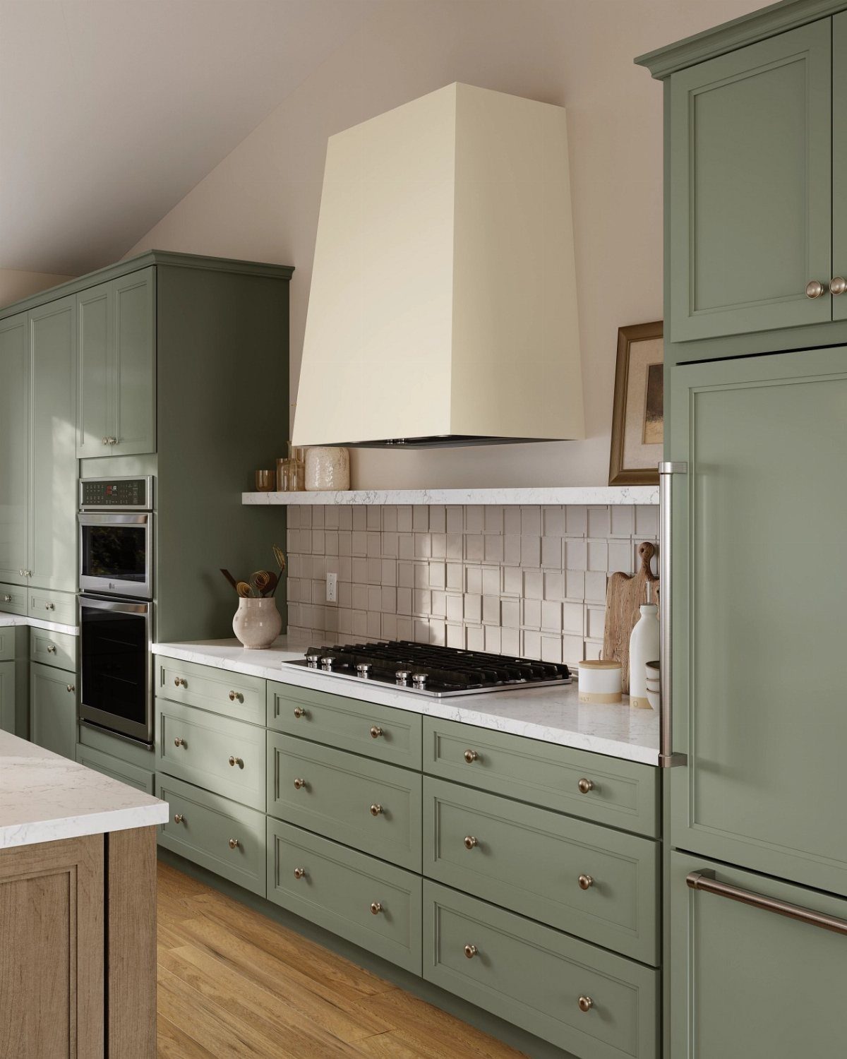
Muted moss green sits back far enough that soft sage walls can live above it without clashing.
Brass hardware and white marble counters keep the tone lifted; rustic wood counters would push earthier, and vintage-style lighting finishes the settled, lived-in feel.
A coffered ceiling in cream adds structure without stealing attention. Black metal stools against the wood counters give the eye a dark anchor lower down, which helps the room feel grounded rather than floating in pastels.
This is the entry point for anyone nervous about green in the kitchen. The shade reads as neutral from across the room and only reveals itself up close.
I’d aim here if the rest of the house runs beige and one room needs to step forward without shouting.
12. Dark Green Tiled Backsplash
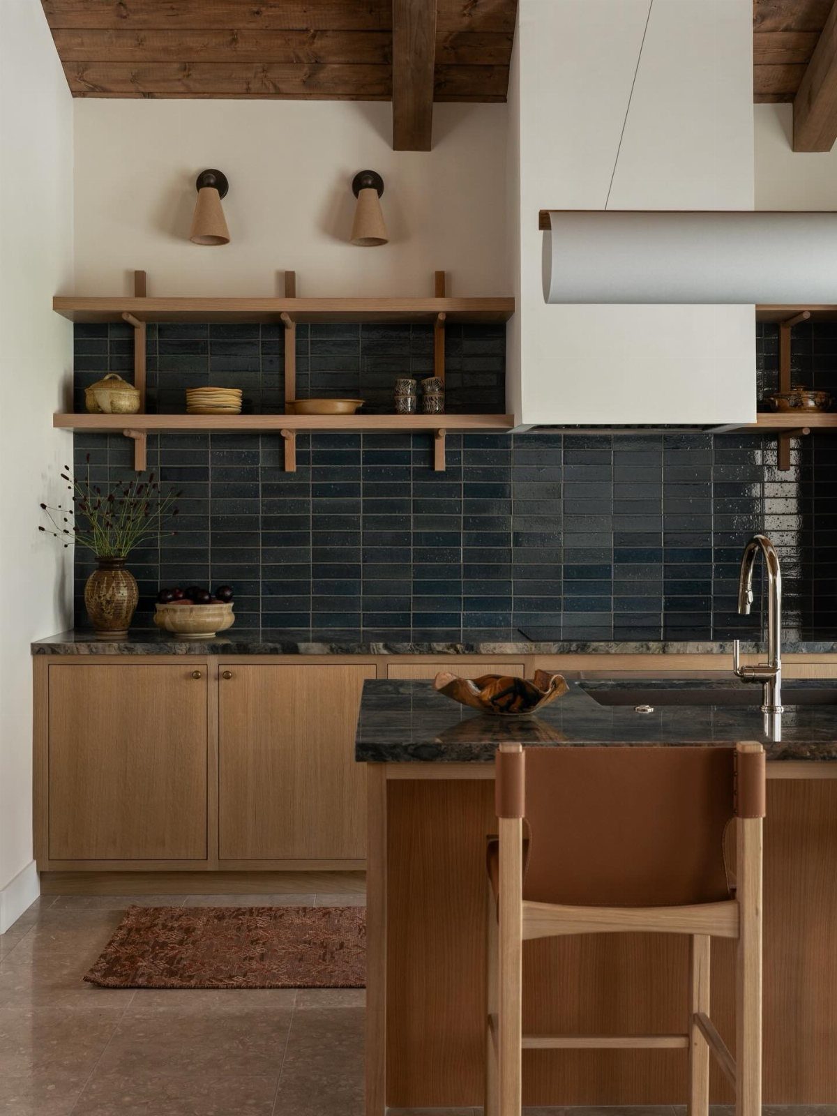
A dark green tiled backsplash gives you the color hit without committing every cabinet to the shade.
Warm, pale wood reads cleaner against deep green than white or gray does, and open shelves keep sightlines to the tile open.
Glazed subway tile catches light unevenly, which hides the slight variations in hand application that make a backsplash look alive rather than printed.
Grout choice changes everything. A matching dark grout recedes and lets the tile color read solid; light grout grids the wall and turns traditional.
I would go dark in a smaller kitchen, light only if the space already has strong horizontal lines that need breaking up.
Cost stays manageable because the square footage is limited. A backsplash is weekend work for anyone comfortable with a tile saw and spacers, or a short contractor job if you are not.
The real limit is your counter: dark stone handles dark green without competing, but busy patterned counters fight it. Solid surfaces or quiet veining win here.
This suits renters with landlord permission only insofar as tile is easier to remove than cabinets and easier to repaint than walls; still, it is not truly temporary.
For homeowners, it is the lowest-stakes way to test whether dark green belongs in your kitchen permanently.
Design Benefits of Green Cabinets
Green cabinets carry a natural calm that white or gray rarely matches. The color reads as grounded rather than trendy, which helps a kitchen feel settled from day one.
Matching comes easier than most people expect. Green sits between warm and cool on the wheel, so it bridges brass hardware and stainless appliances without fighting either.
I would pick a mid-tone sage if the rest of my finishes were already mixed.
For longevity, deep greens hold up better than near-black or high-contrast colors that read as a specific era. Forest green cabinets tend to age better than bolder colors that come and go with each season’s trend cycle.
Materials and Finishes
Finish matters more with green than with white, because uneven color shows instantly across a bank of cabinets. Matte or satin lacquer absorbs light softly and hides the small scuffs that gloss would broadcast.
A finish that resists fingerprints saves a lot of wiping if small hands reach for snacks or you cook most nights. The small upcharge pays back in hours of wiping.
Uniform color application means checking samples under your actual kitchen light, not the store’s. I would order a door sample and live with it for a week before committing.
UV-coated panels keep their depth longer than standard lacquer, especially on surfaces that catch morning sun.
Wood veneer adds texture that reads as warmer than flat color. It works best on uppers or an island where you want variation without pattern.
Balancing Dark Colors
Dark green can swallow a room if every surface goes dark with it. Light countertops, quartz or marble-look, create the breathing room that keeps a kitchen functional rather than cave-like.
Warm wood tones on open shelving or a floor prevent the coolness of green from going flat. I would limit the wood to one or two elements so the palette stays intentional rather than collected.
Hardware finish helps too. Black recedes and lets the color lead; brass or gold picks up warmth from the wood and keeps the eye moving.
Brushed metal sits in between, a safe default if you are unsure.
The balance is not about equal parts. One light surface in the right place, usually the counter or the backsplash, does most of the work.
Popularity of Green Cabinets
Green cabinets have moved from niche choice to standard option in most cabinet lines. The shift happened as manufacturers saw sustained demand rather than a spike, which suggests the color has staying power.
Dark greens specifically, forest and charcoal tones, are the shades that keep selling. Lighter sages had their moment and are leveling off; deep tones are still climbing.
Charcoal green reads closer to a neutral over time, while forest green stays unmistakably green.
Frequently Asked Questions
What colors go well with dark green kitchens?
Marble or quartz countertops, pale stone, and light wood flooring give dark green cabinets the breathing room they need. Brass or gold hardware warms the tone, while black hardware lets the green lead without competing.
White walls and backsplashes keep the room functional rather than cave-like, especially in smaller spaces.
Is dark green good for the kitchen?
Dark green adds sophistication without overwhelming the space, and it bridges warm and cool finishes more easily than most bold colors. Near-black cabinets or loud two-tone schemes tend to date themselves.
Forest and hunter greens just keep looking like themselves.
What are some trendy green kitchen ideas for 2026?
Forest and charcoal greens are the shades still climbing in demand, while lighter sages are leveling off after their peak moment. Two-tone kitchens with green bases and white uppers remain practical for anyone renovating in stages.
A dark green island against light perimeter cabinetry is another route that adds intention without a full commitment.
What is the new kitchen trend for 2026?
Every major cabinet brand now lists green as a standard finish, not a special order. That shelf space means the color has already outlasted the novelty phase.
Deep forest and charcoal tones specifically keep selling, as homeowners replace gray with something richer but still controlled. The shift happened gradually, which usually signals a color that outlasts the typical trend cycle.
Are green kitchen cabinets still in style?
Green cabinets have held their spot in the top three finish choices for three years running, and the orders are still increasing. Manufacturers added them as standard options after seeing sustained demand rather than a brief spike.
Lighter sage had its surge and has leveled off. Deep greens are the ones still gaining ground in showrooms and in kitchens people actually live with.
What shade of green is best for kitchens?
Sage green works for a soft, near-neutral look that reads as beige from across the room. Dark forest or charcoal green suits anyone wanting a bolder, more luxurious feel with real staying power.
A mid-tone sage meets brass and stainless somewhere in the middle, so neither metal ends up looking like the odd one out.





