
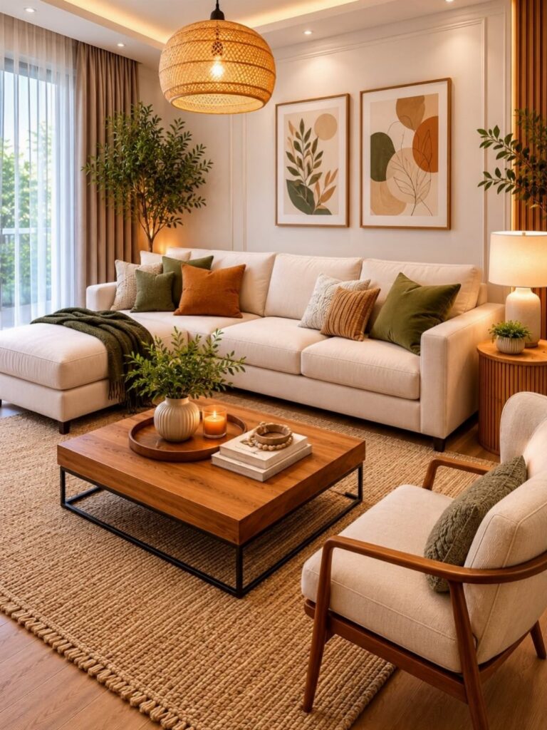
These 14 ideas run from a single swapped pillow to a full wall of deep forest green, and the right one depends on whether you rent or own, how much light the room gets, and whether you use the space after dark or all day.
A north-facing room needs bare windows and sheer linen to keep matte earth tones from going cave-like, while someone ready to paint can test burnt orange through a sofa cover before committing to the walls.
1. Rustic Softness with Soul
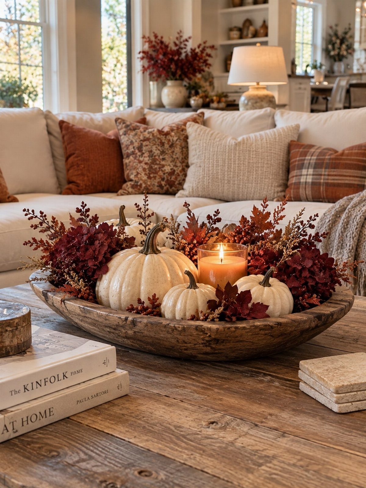
A wooden bowl with a candle, a few seasonal pieces, and something gathered from outside sets the tone: rustic does not have to mean rough. Raw materials work when they sit near soft surfaces.
Exposed beams overhead work because the sofa below is upholstered and inviting, not stiff or formal. I would start with one weathered piece, a bowl or a beam, then balance it with something plush.
Terracotta pillows against cream upholstery do this without trying too hard. The look suits renters who can swap pillows and bowls but cannot change the architecture, and it costs less than a single designer chair.
2. Add Layers
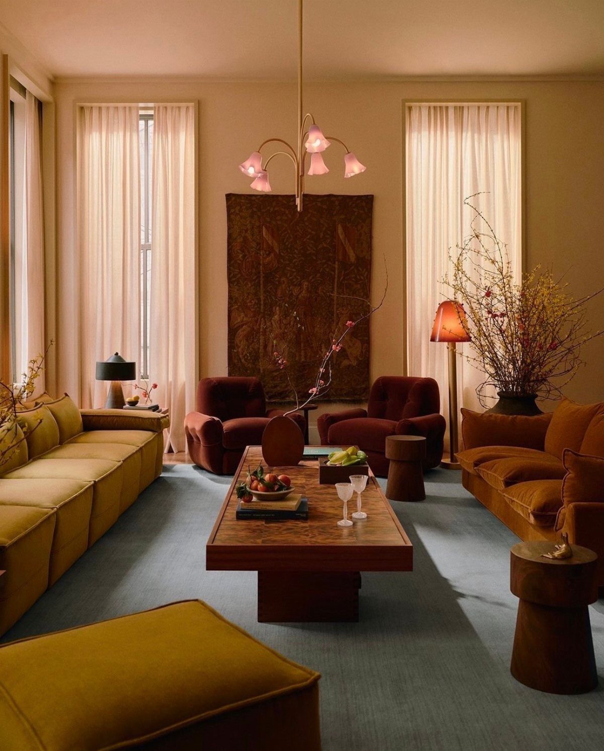
Mustard yellow and reddish-brown velvet sound loud on paper, but layered they settle into something warm. The blue rug underneath cools the palette just enough to keep the room from feeling like a furnace.
I have found that woven baskets and burlap runners do the heavy lifting for texture without demanding attention. For artwork, mountain ranges or coastal scenes in earth tones hang well in a grid or a loose cluster.
If the wall feels flat, a sandy, textured wallpaper behind the frames adds depth without a second layer of paint. The whole setup moves with the seasons; swap the runners, keep the frames.
3. Ground Yourself
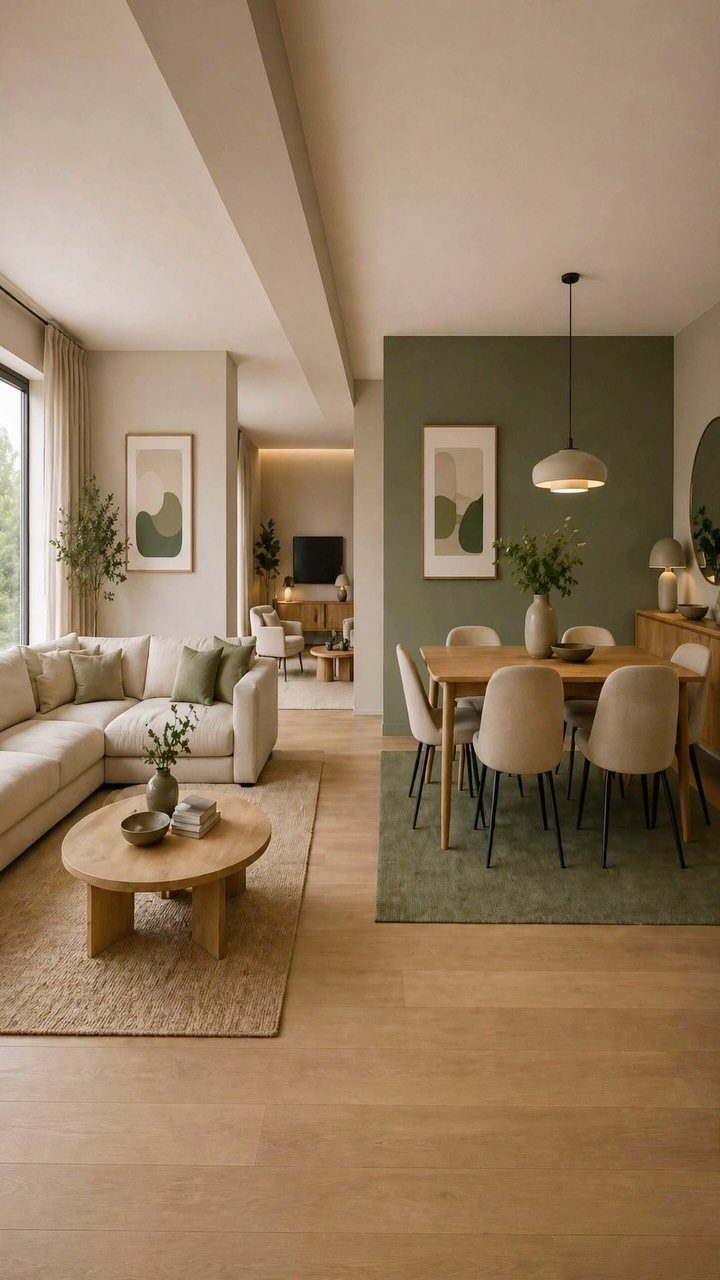
A chocolate brown suede sofa or wheat-colored linen upholstery sets the right foundation for earth tones, while cool-toned whites like egret or alabaster fight the warmth.
An ivory throw can turn gray-blue against terracotta; that is the mismatch to watch for. For autumn, burnt orange or yellow ochre pillows shift the room without a new purchase; moss green works the same trick in spring.
The restraint is what makes it livable. Nothing competes, so nothing needs updating.
4. Infuse Texture
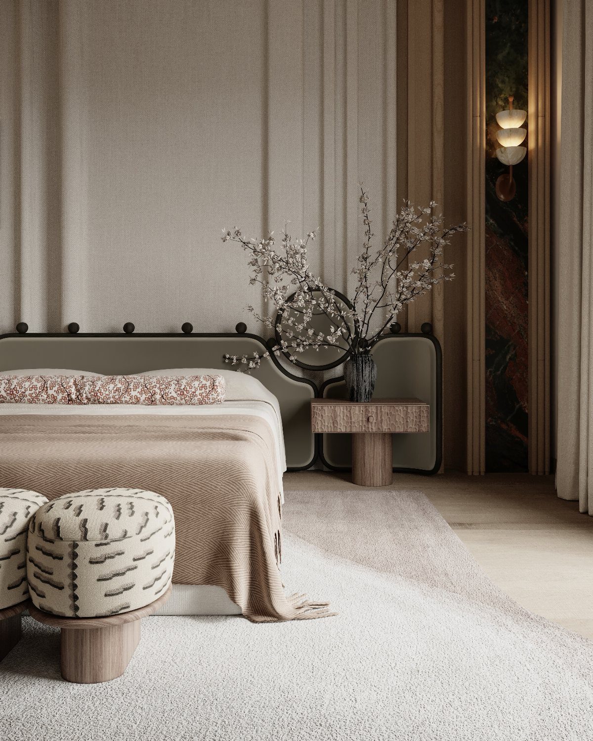
Texture in an earth-tone room works like seasoning: too little and the palette goes flat, too much and it grates. Wood, stone, and iron each read as earthy in a different register, so mixing them matters more than matching.
A cement planter or woven basket stores what you do not want seen; a burlap runner hides a table you are tired of. I would add one rough piece per smooth surface.
Plastered walls, plush seating, and a single speckled rug underfoot keep the eye moving without exhausting it.
5. Soft Neutrals, Strong Calm
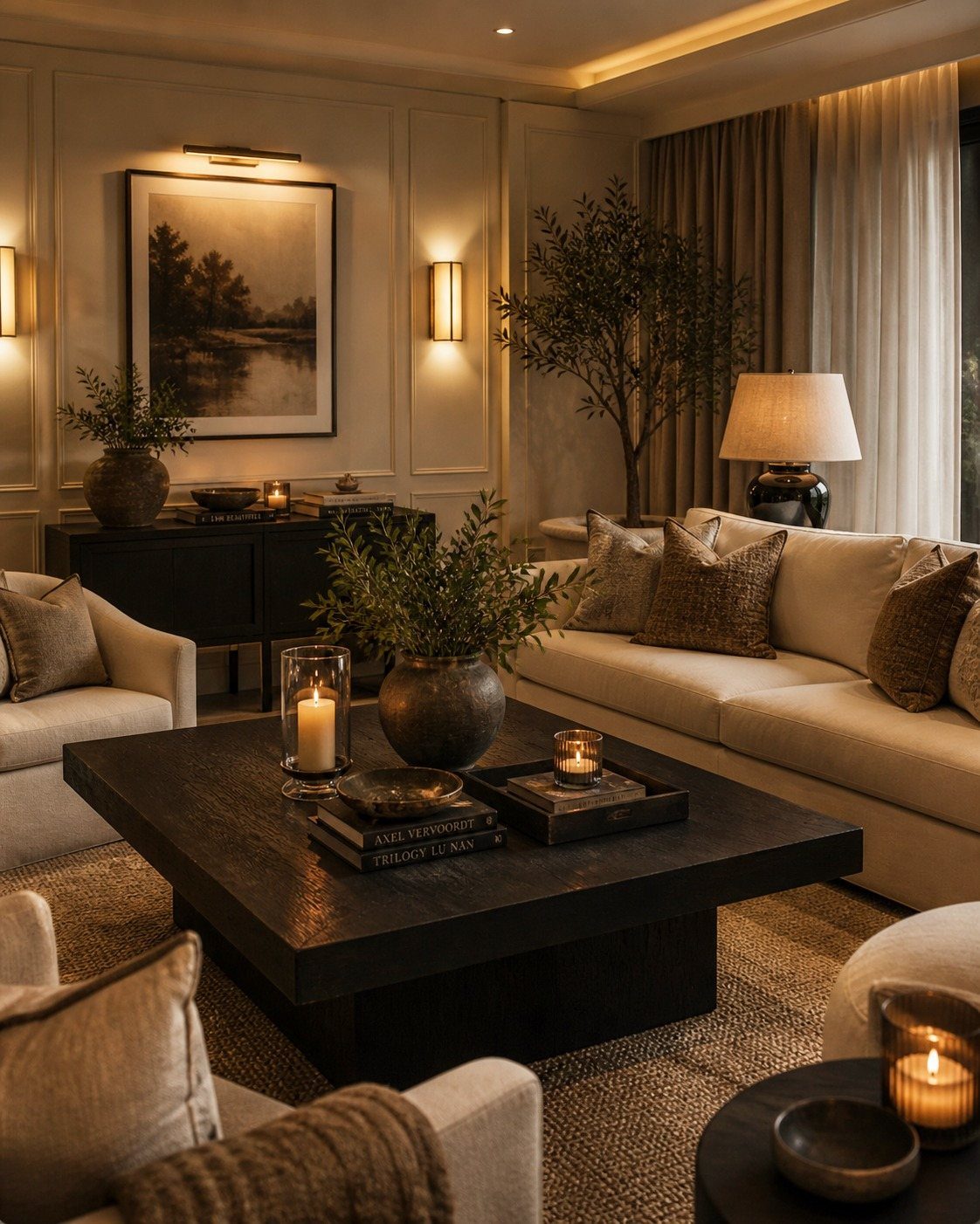
White and beige do not have to read as absence. Taupe and dusty mauve warm the neutrals enough that the room feels held, not empty.
I would keep the frames landscape-heavy and the lighting low; wall sconces at shoulder height do more than overhead fixtures for this palette. The balance is minimal without coldness, which is harder than it looks.
It suits someone who wants calm but finds all-beige rooms depressing. The trade is that every piece needs to earn its place; clutter breaks the spell fast.
6. Orange Living Room
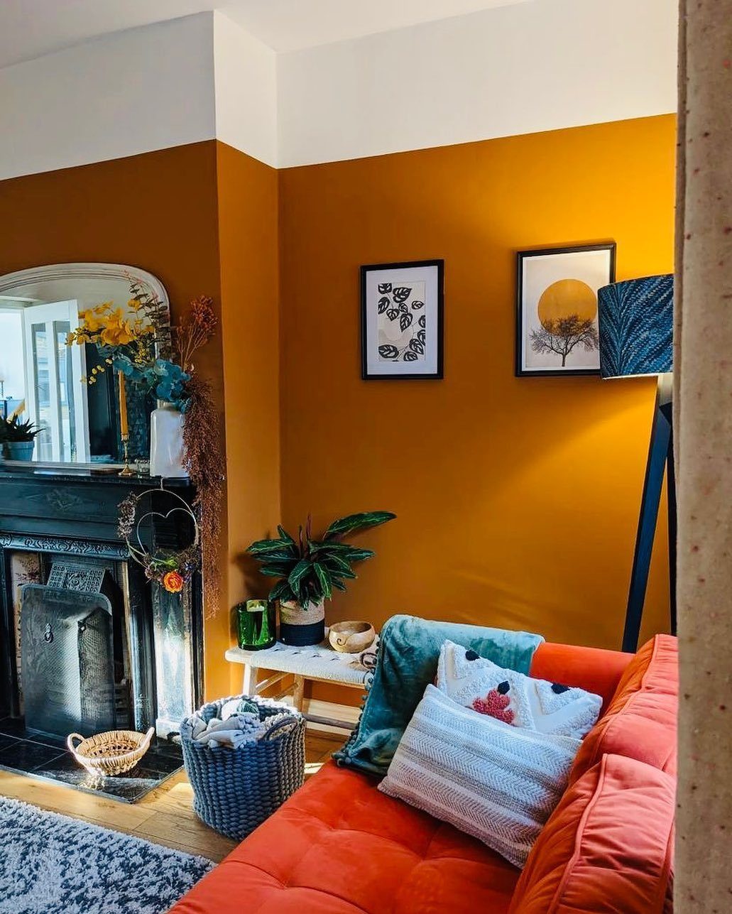
Full-bodied orange on walls and upholstery sounds like a risk, but against cognac brown and muddy olive it reads as earth tone, not circus. A black fireplace and mirror ground the warmth so it does not float away.
I would treat orange as the accent even when it dominates, adding blue in a lamp or a single pillow to keep the eye from glazing over. Burnt orange backdrops mirrors and portraits well; the reflection cuts the intensity.
This one is for the reader who finds beige oppressive and has the nerve to paint a whole room. Renters can test it with a sofa cover first.
7. Earth-Tone Palette Defined
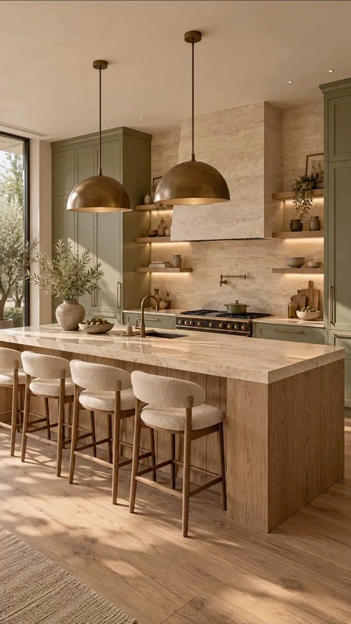
An earth-tone palette pulls from what you’d see on a slow walk outside: chocolate brown bark, green moss, taupe sand, terracotta clay, burnt orange leaves. These shades run warm to cool, reaching into wheat and caramel neutrals.
Layer in cognac leather or brass accents and the room feels complete without a single trip to a designer.
8. Keep It Light
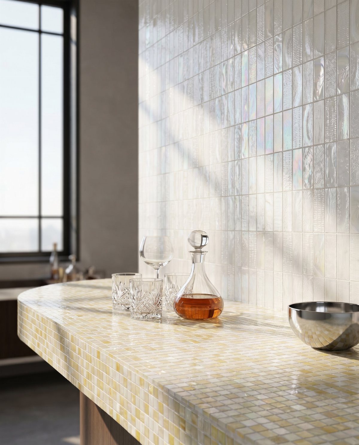
Earth tones are matte, not reflective, so light won’t bounce off them the way it does with glossier colors. A room heavy in these shades needs all the natural light it can get.
Keep window treatments minimal: bare windows, sheer linen, or a simple wood shade raised most of the day. For fixtures, wood, stone, and iron carry the nature-inspired thread without fighting the muted palette.
The result reads calm rather than cave-like, even in a north-facing room.
9. Accent with Glass
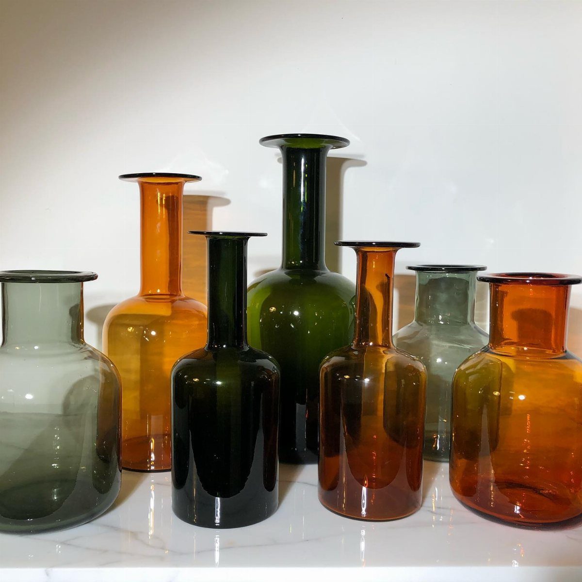
Glass in forest greens, smoky grays, and amber browns reads as river rock and wet leaf rather than typical shiny accent.
I’d use a single olive green vase with a handful of dried stems, or cluster three odd-shaped pieces in varying depths of green on a console table.
Smooth stones dropped into a wide amber bowl work as filler when botanicals feel like too much upkeep. The transparency keeps the earthy palette from going flat, especially in a kitchen with open shelving where everyday glassware becomes the display.
10. Moody Earth Tones
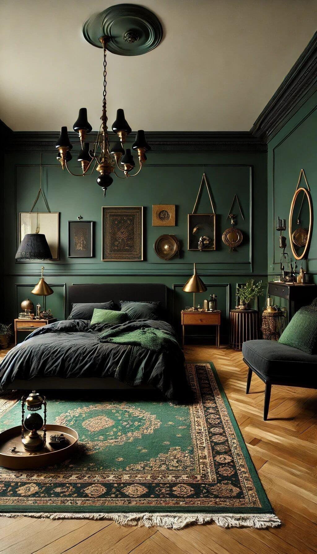
Deep forest green walls, warm espresso woods, and tobacco-toned leather build a room that wraps around you rather than performs for guests.
The cocoon effect comes from layering low-reflective surfaces: matte paint, nubby linen, unpolished wood with the grain still catching your thumb.
I’d keep lighting soft and indirect. One ornate fixture with warm bulbs, table lamps with linen shades, nothing overhead and harsh.
This room wants evening and candlelight; morning coffee needs a corner near the window or it can feel too sunken.
Best for someone who uses their living room after dark, for conversation rather than tasks.
11. Bring in Earthy Elements
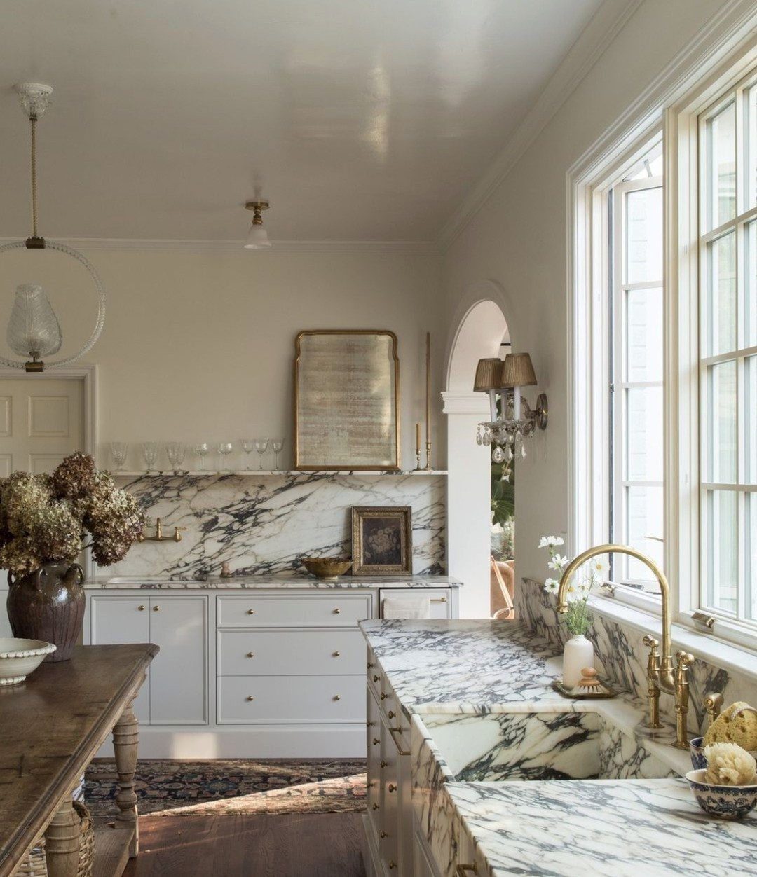
Earthenware vases in raw clay gray, a stone bowl catching keys by the door, a wooden stool with the grain still proud: these pieces bring the outside in without literal pinecones and antlers.
The ceramic or stone bowl pulls double duty as catchall while fitting the palette seamlessly.
I’d add one rough-textured piece for every two smooth surfaces, so the room stays grounded without going rustic. Wood accent pieces lean warmer than painted furniture and age better with scuffs and water rings.
For renters, a single heavy earthenware vase on a bookshelf does the work of a built-in stone feature.
12. Cozy Layers Done Right
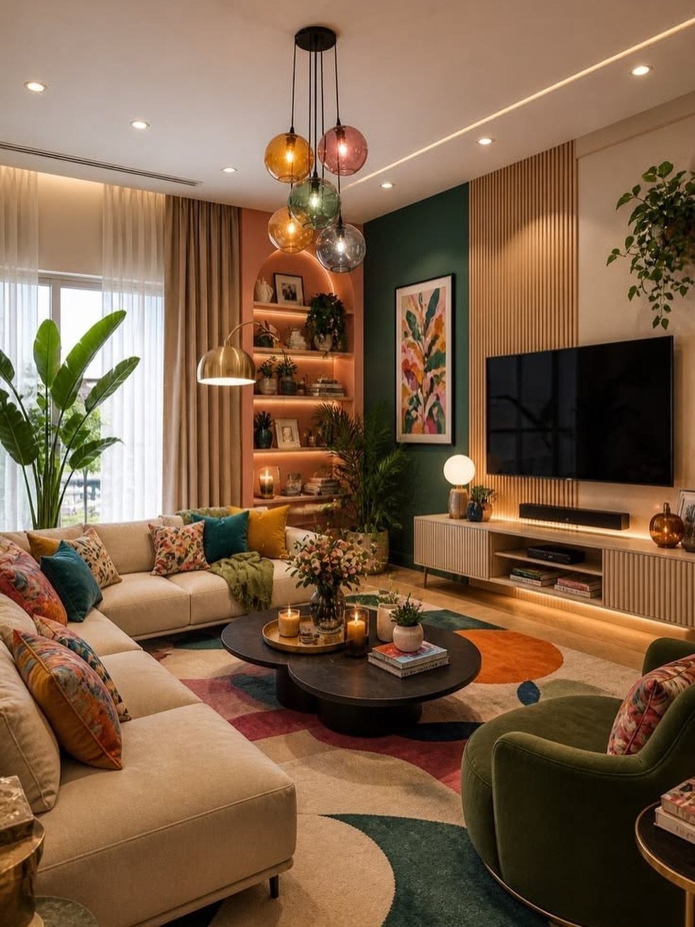
A plush curved cream sectional anchors the layout and gives everyone a place to land. Against it, a velvety olive green swivel chair adds depth without darkening the room.
I’d balance the soft upholstery with something harder: a dark circular coffee table, wood slats on the wall, a single metal light fixture. The contrast keeps neutral layers from going mushy.
For a weekend project, swap pillows to something nubby or faded, add a throw in oatmeal wool, and call the room done until next year.
13. Quiet Luxury, Naturally
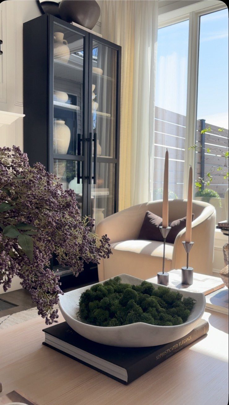
Quiet luxury in earth tones is about restraint, not restraint you notice. Soft warmth, clean lines, and nothing that shouts for attention.
Timeless shapes hold up better next to materials that get better with age. Linen, aged brass, matte ceramics.
Skip finishes that chase a trend; the dated look arrives fast.
A black glass-front cabinet works harder than open shelving; it corrals clutter while letting texture show through. One sculptural piece on top beats a cluster of small objects.
This suits renters who can swap furniture but not architecture, and anyone who wants a room that still feels right at 9 PM on a Tuesday.
14. Earthy Mountain Modern
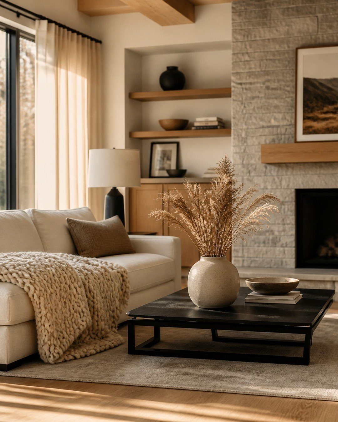
Mountain modern lives in the overlap between raw and refined. The windows do the heavy lifting, framing whatever grows outside so the room never feels static.
Natural materials ground the space, but the forms stay clean. A dark coffee table with some heft anchors the seating without blocking sightlines.
Dried pampas in a plain vase lasts through a season with no water, no trimming, no attention.
Warm woods matter more here than exact species. Oak, walnut, even a good pine with the right stain; what counts is tone that connects inside to out.
This works best where seasons change enough to matter, or anywhere you want to remember there is an outside.
Mixing Warm and Cool Tones
A well-balanced room usually mixes warm and cool earth tones, and the real work is picking which one takes the lead.
Let one temperature carry about two-thirds of the room, then work the other through pillows, a throw, or a single piece of furniture.
A room heavy on warm terracotta and honeyed wood stays grounded if one cool sage pillow or a single dusty blue vase sits among them.
Flip the ratio and the room still works; the eye just needs a clear majority to settle on.
A true 50/50 split between warm and cool earth tones tends to read as hesitation rather than harmony, so commit to one side and let the other play backup.
Importance of Texture
Earth tones without texture fall flat fast. The color does the mood; the surface does the work.
Plaster walls, a woven basket, a cement planter, or burlap over a matte table give the eye something to catch before it even registers the color.
These pieces also earn their keep by hiding what you do not want displayed: a basket corrals remotes, a planter lifts a plant off the cluttered surface beneath it. The layering does not need to shout.
Tone and proportion handle the quiet part; texture supplies the depth that keeps the palette from reading as a single beige sheet.
Frequently Asked Questions
What are some good earth tone colors for a living room?
Chocolate brown, green moss, taupe sand, terracotta clay, and burnt orange are the backbone of an earth-tone palette, with wheat and caramel as lighter neutrals. Cognac leather and brass accents layer in well without breaking the mood.
These shades share enough warmth to sit together without clashing, which is why they work in a room you actually live in.
What are earth tones, exactly?
Earth tones get their muted, grounded feel from brown pigment underneath, which keeps them quieter than cleaner, brighter colors. Terracotta, sage, ochre, olive, charcoal, and the full range of browns all count.
That shared brown base lets them stack together without the clashing you get from mixing cleaner, brighter colors.
What earth tones go with white walls?
Almost any earth tone works against white walls; the white does not compete the way cream or beige can.
The bigger question is what your floors and existing furniture are doing, since those surfaces take up more visual space than the walls.
What color makes a house look expensive?
Deep, muted earth tones read as expensive because they do not chase trends and they layer well with materials that age well: linen, aged brass, matte ceramics.
A black glass-front cabinet or tobacco-toned leather sofa carries more weight than a bright color ever could. The restraint matters more than the specific shade; nothing here shouts, so nothing dates fast.





