
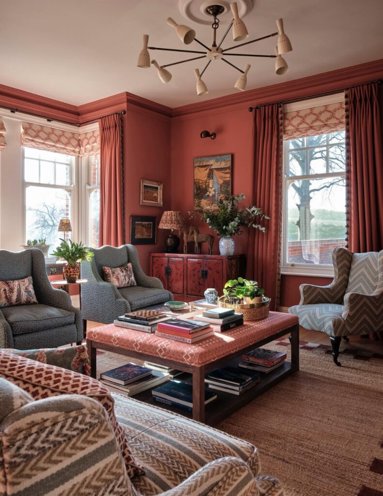
A red living room can cost the price of a single paint sample or stretch to a velvet sofa from an estate sale, and the deciding factor is how much of the room your landlord lets you change.
The ideas below range from one burgundy accent wall to a full color-drenched space with wine on the walls, trim, and ceiling.
The proportion matters more than the shade; a rug that lets all front legs of your seating sit on it, or a ledge that clears your dresser by a hand’s width, does more for the room than the exact red you chose.
1. Dramatic Red Accent Wall
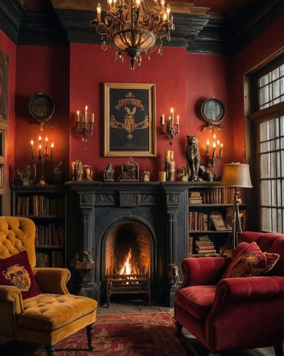
A single wall in burgundy, wine, or oxblood does the work of a whole room’s worth of color.
Frame it around a fireplace, a built-in bookcase, or another architectural feature that already draws the eye, and let the depth do the talking.
Cream upholstery, warm walnut, and a single brass sconce keep the furniture restrained against a red wall so the room stays livable, not theatrical. The red reads as intentional, not accidental, and the room gains presence without shouting.
If your walls have texture, smooth them first or the color catches every bump.
Best for renters who can paint one wall and landlords who notice the right wall more than the wrong color.
2. Red Patterned Wallpaper

Pattern breaks red into manageable pieces. A red toile or graphic wallpaper wraps the room in movement without the flat punch of a solid coat, and the eye reads it as texture first, color second.
Paper the wall behind a media console or the back of a bookcase, not every surface; the 3D floral and gold swirl pattern needs a white console beneath it and that breathing room matters.
Grasscloth or a heavy vinyl holds up to hands and chairs in ways flat paper won’t.
Start with a single roll for a bookcase back or small feature; most media console walls need two. Skip this if your room already fights for attention with busy upholstery or competing patterns.
3. Create a Moody Dark Red Living Room
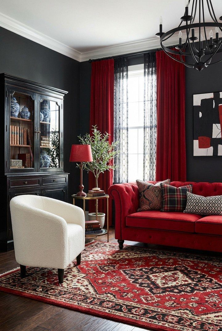
Dark rooms deserve dark color.
Joa Studholme at Farrow & Ball makes the case I had to learn myself: white walls in a shadowed room go flat and cold, while a deep burgundy or wine on walls, trim, and ceiling wraps the space like a library after hours.
Charcoal walls carry the same logic, with a red sofa and curtains doing the warm work instead of paint.
I would add sheer linen for daylight, a shaded lamp for evening, and one ivory piece, an ottoman or a faded rug, to catch what light there is.
Color-drenching costs the same as any paint job; the gamble is the commitment. Start with a sample pot and live with it at the day’s darkest hour.
4. Red Velvet Furniture
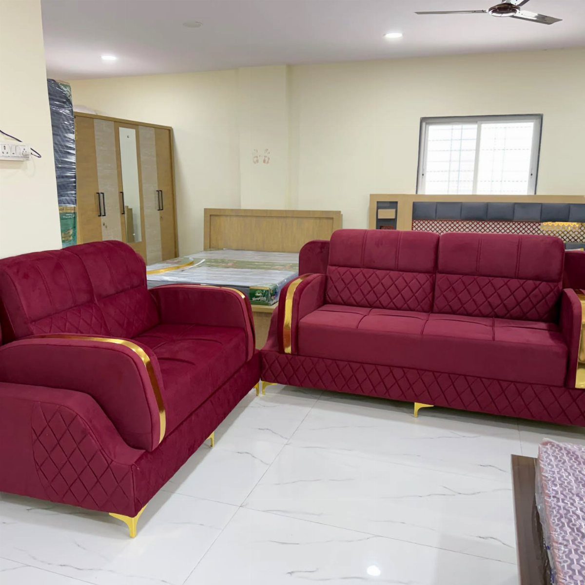
One velvet piece changes a whole room’s temperature. A red velvet loveseat or sofa on white marble with light walls around it reads as luxury rather than alarm because the setting stays quiet.
I would choose burgundy over brighter reds; it shifts with the light from near-black at night to warm wine in morning sun. A chaise works as well as a sofa if the room is small.
Pair it with pale stone, aged brass, or dark wood, and keep the rest of the upholstery neutral.
Velvet shows every mark; keep a lint brush within reach. Quality velvet furniture commands real money, but estate sales turn up old velvet that wears its age forgivingly and cheap.
5. Cozy Red Living Room
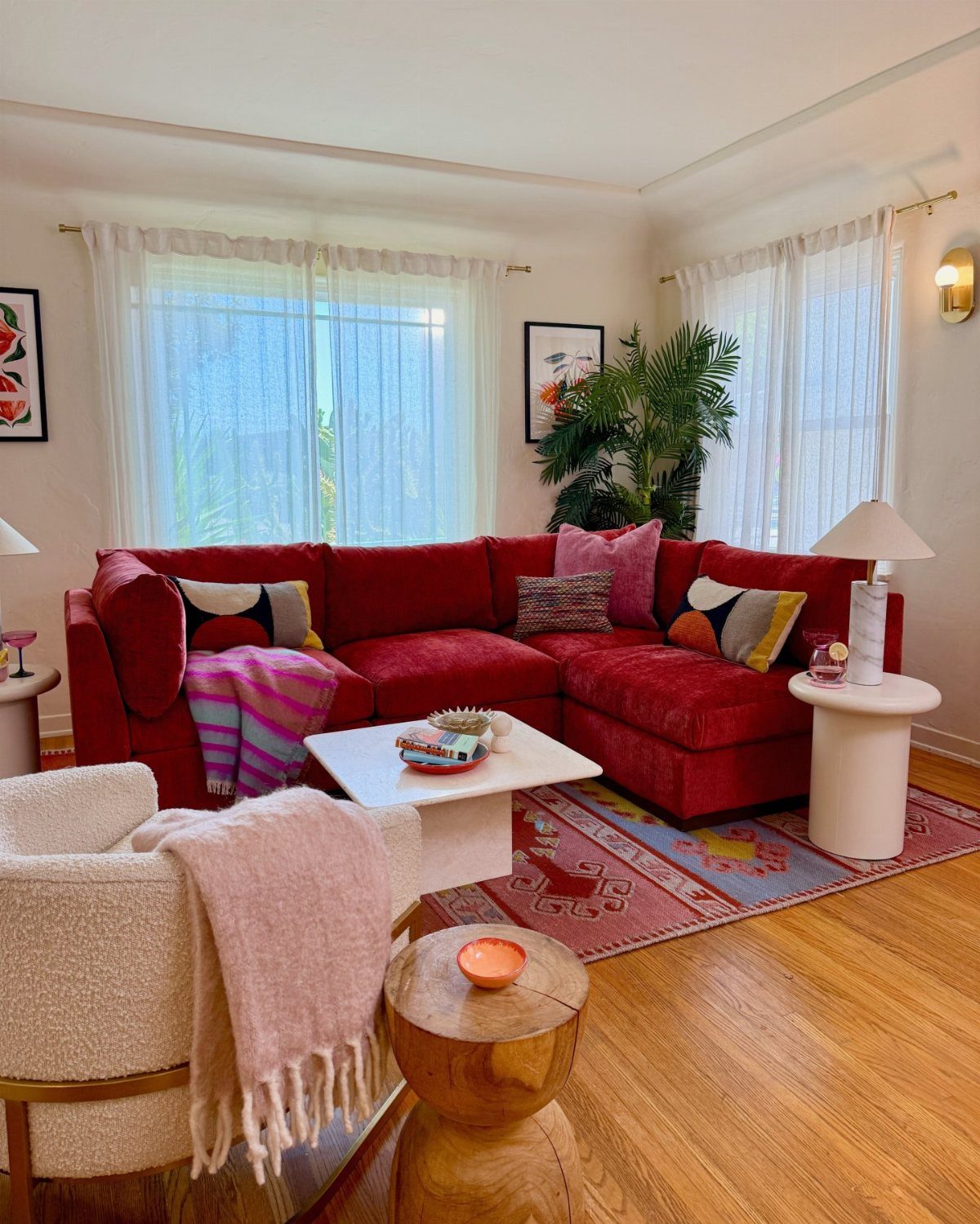
A rust-red sectional turns a living room into the place people settle in without being asked.
I would add one low glass table to keep sightlines open around the bulk of the sofa, then layer in cream and ochre through cushions or a rug.
The gray walls matter; they keep the red from tipping into sports-team territory.
This suits the reader who wants warmth without drama and has a weekend to move furniture and hang curtains. The sectional is the investment; everything else can come from what you own.
6. Red Floor Accents
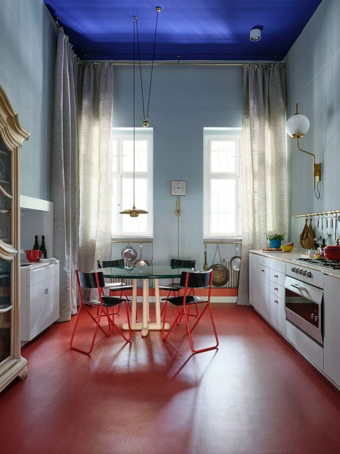
Floors carry color the walls refuse. A red rug underfoot, or painted floors in bright scarlet, warms a room without committing the vertical surfaces.
I would start with a rug: flat-weave or low-pile in a solid red or a geometric pattern, sized so all front legs of the seating sit on it.
Glossy painted floors need prep and time to cure but reward the effort in rooms with good light and not much wall to spare.
A rug large enough to anchor a standard sofa and two chairs is the place to put your money; skimp on size and the room loses its footing.
Painted floors suit renters only if you plan to repaint before you leave, or if your landlord is the rare sort who counts color as improvement.
7. Natural Red Shades
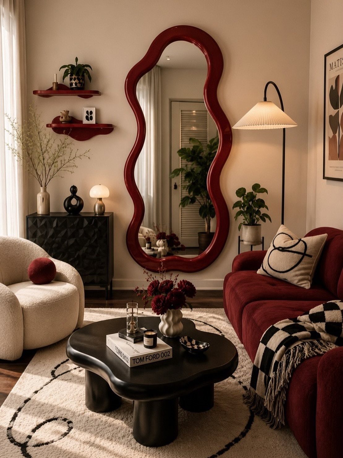
A rust-toned red reads quieter than a true primary, and that softness is what makes it livable.
In a room built for slowing down, a muted red like Nutkin from Earthborn sits closer to soil and fallen leaves than to a stop sign.
The pairing matters as much as the shade. Olive green, warm wood, and creamy walls keep the palette grounded; jute, linen, and a little brass keep it from going flat.
A few organic shapes, a checkered throw or a wavy mirror, keep a red sofa from feeling too posed.
This is the route for anyone who wants color without the energy of a brighter red. You lose some punch, but you gain a room that still feels calm at the end of a long day.
Choosing the Right Shade
North-facing rooms pull red toward purple; south-facing ones push it toward orange. Testing paint on the actual wall and watching it across a full day beats any swatch decision made under store lights.
The hundreds of available shades split roughly into orange-reds and purple-reds, and that underlying tone matters more than the darkness level.
A burgundy with purple undertones can look muddy in dim light, while a brick-red with orange undertones stays warm even on gray afternoons.
I lean toward testing three: one brighter than I think I want, one duller, and one that looks wrong on the chip. The wrong one often reads right in the room.
Small swatches lie; a poster-board-sized sample in two coats tells the truth.
Balancing Red with Neutrals
Beige walls with a cream sofa and taupe armchairs give red somewhere to breathe. I would add wine-red through curtains or a single sculptural chair rather than spreading it evenly; concentrated reads expensive, scattered reads accidental.
Warm gray works too, especially against a deep red velvet sofa with earth-toned wood. The floor matters: soft white or pale wood keeps the ceiling high, while a rug that mixes beige, rust, and brown knocks down the formality.
Brass lighting and dark wood trim bridge the gap between neutral and red without adding another color. Cushions and flowers in the same rust family let the accent repeat through the room instead of fighting itself.
One darker element, a stone fireplace or a walnut table, keeps the room from floating away into softness.
Frequently Asked Questions
Is red a good color for a living room?
Yes, red creates warmth and intimacy in a living room when it has a place to breathe. I would pair it with cream upholstery, warm walnut, or beige walls so the room stays livable rather than theatrical.
A single accent wall in burgundy or wine adds presence without shouting, and a deep shade can wrap a shadowed room in the kind of warmth that white walls only flatten.
What color goes with red in a room?
Beige, cream, taupe, and warm gray give red somewhere to breathe, while olive green and earth-toned wood keep the palette grounded. Brass lighting or dark wood trim bridges the gap between neutral and red without bringing in another competing color.
What is the red rule in interior design?
The red rule keeps red as the accent against a dominant neutral and a secondary tone, so the eye knows where to land. A small dose still carries the room if the surrounding colors stay quiet.





