
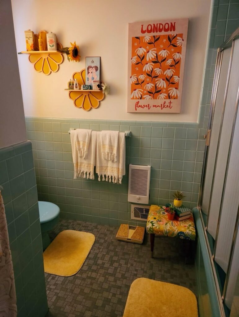
These retro bathroom ideas run from a hardware swap you finish in a weekend to a full clawfoot tub install with a plumber on the clock.
The deciding factor is how much of your existing bathroom you are willing to replace, since one person might only trust a new faucet while another will tear out the floor.
1. Black and White
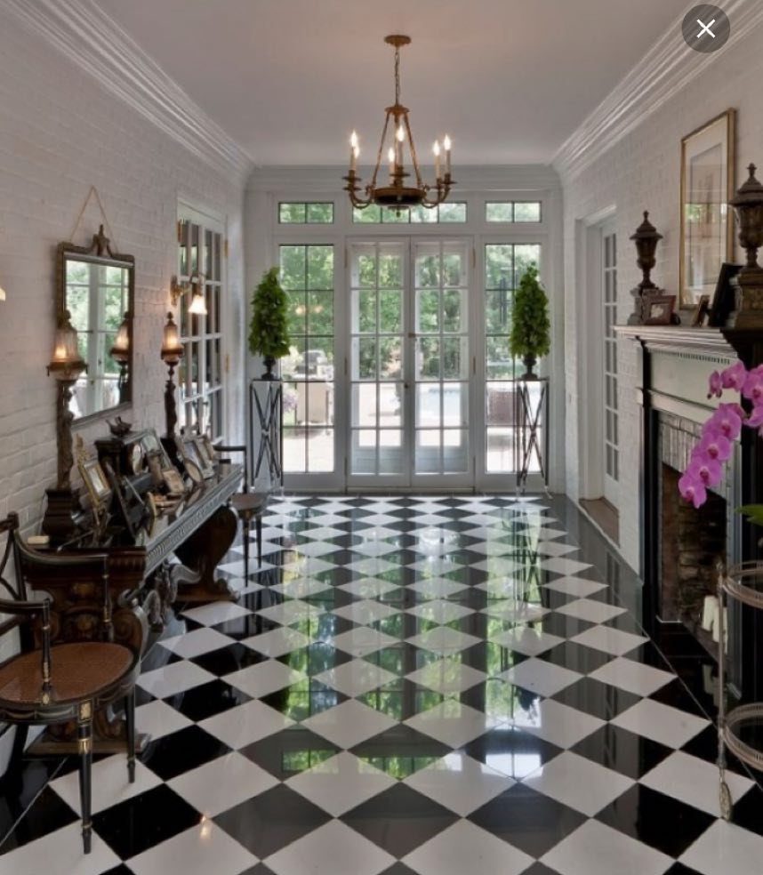
A checkerboard floor reads 1920s faster than any fixture you could buy. Black and white vinyl or ceramic tile does the period work on its own, so the rest of the room can stay simple.
In a compact bath, a 12-inch tile scale keeps the pattern from feeling busy. In a larger space, 6-inch hexagons tighten the rhythm and feel closer to original 20th-century installs.
I would keep walls white and let the floor carry the statement. Add a chrome or porcelain light fixture and the era lands without costume.
2. Retro Wallpaper
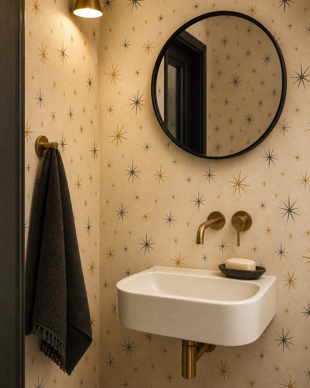
Wallpaper in a bathroom used to mean peeling corners within a year. The vinyl-backed papers and proper pastes available now handle steam fine, so the risk is really just whether you’ll tire of the pattern.
A powder room is the safest test: one wall, one bold print, and a small enough space that the material cost stays manageable.
Geometric starbursts or oversized florals read more 1960s–70s than traditional florals, which can tip toward grandmother if the colors go soft.
For a full bathroom, stick to one feature wall behind a pedestal sink or opposite the tub. The moisture exposure is higher and the replacement cost stings more.
3. Retro Color Palettes
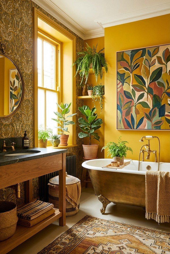
Mustard yellow, mint, blush pink, and powder blue each carry a specific decade. Using one color as the dominant voice and treating the rest as accents keeps the room from looking like a set piece.
A painted vanity in mint or a yellow accent wall behind a clawfoot tub gives the nod without the full commitment.
Tile in these colors costs the same as white; the limited stock is what narrows your options, so order samples early.
I like mustard with warm wood tones and black hardware. The pairing keeps the color from reading too playful.
4. Green Vintage Bathroom Tiles
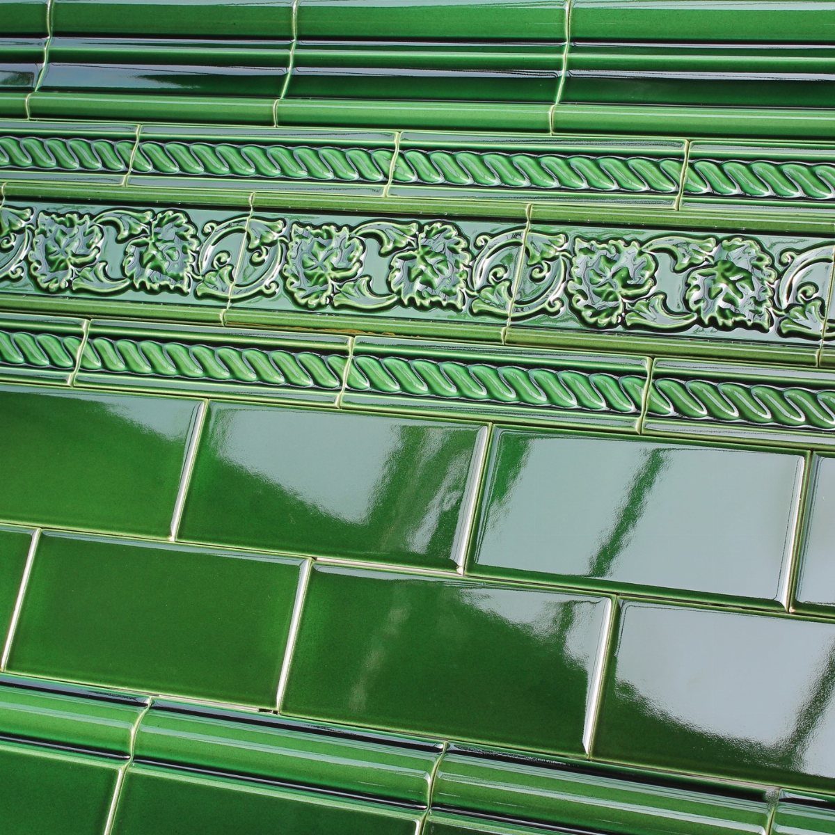
Glossy green subway tile with a decorative border reads 1930s–40s, especially in the deeper sage and forest tones that were standard then.
Standard subway tile is the cheaper line; the decorative border tile adds a noticeable jump to that line.
Install the field tile first, then cut the border to fit the available wall length rather than trying to hit a perfect repeat.
Green sanitaryware, sinks, and toilets turn up at salvage yards.
5. Clawfoot Tubs
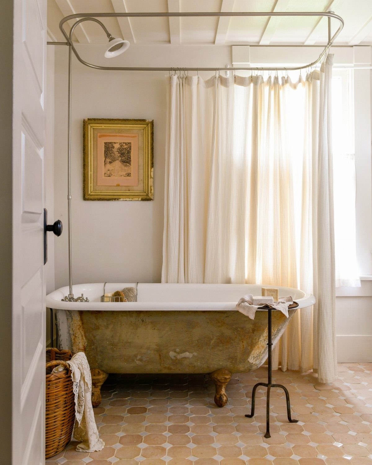
A clawfoot tub anchors a bathroom the way no built-in can. The sculptural legs alone draw the eye, and in a smaller space the raised base keeps the floor plane visible so the room reads larger.
New reproductions start high; vintage salvage costs less but may need refinishing inside and out, which adds another line to the budget.
Matte black or brushed brass fixtures keep the look current. Chrome reads more authentic 1920s but can feel cold in a modern home.
6. Hexagon Tiles
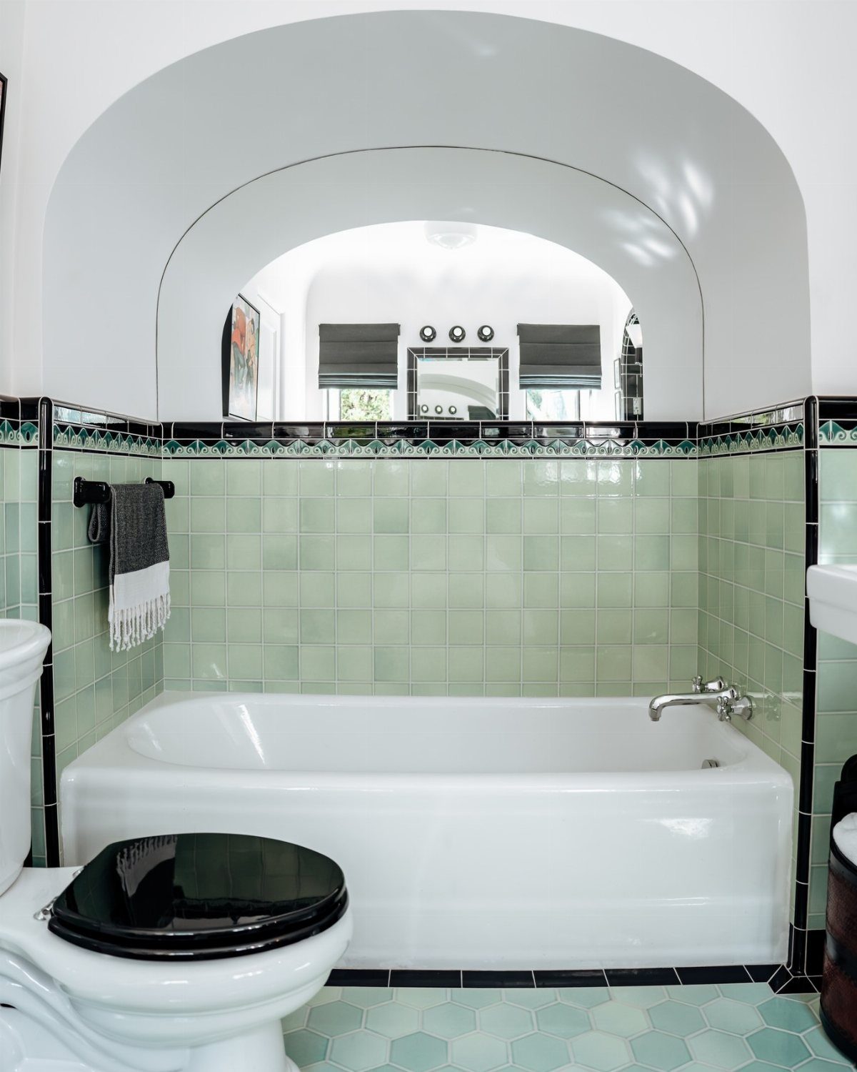
Hexagon floor tiles carry two distinct eras depending on size. Small 1-inch mosaics in black and white read Victorian through 1920s; larger 4–6-inch formats in solid colors or marbles feel more 1950s–60s.
Cement hex tile sits at the higher end and needs sealing. Porcelain versions run cheaper and lower maintenance, though the surface sheen differs.
Either way, order 15% overage; the shapes create more waste at edges than squares do.
7. Subway Tiles
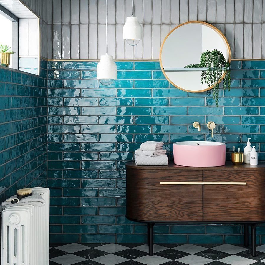
Offset brick pattern, the same layout that lined actual subway stations in the early 1900s, gives teal subway tiles their retro credibility.
That staggered arrangement reads older and more lived-in than the stacked alternative, which is why I would pick offset for a retro bathroom and stacked only if I wanted the room to feel more contemporary.
White ceramic is the cheapest and easiest to keep clean, but the gloss finish matters more than the color. A matte subway tile catches soap scum and needs more scrubbing.
Floors are a different job and usually need a pro.
This idea suits someone who wants a recognizable vintage look without hunting down salvage.
Subway tile is common enough to feel like every rental bathroom, so varying the grout color or switching the layout is what separates a deliberate choice from a default one.
8. Penny Tiles
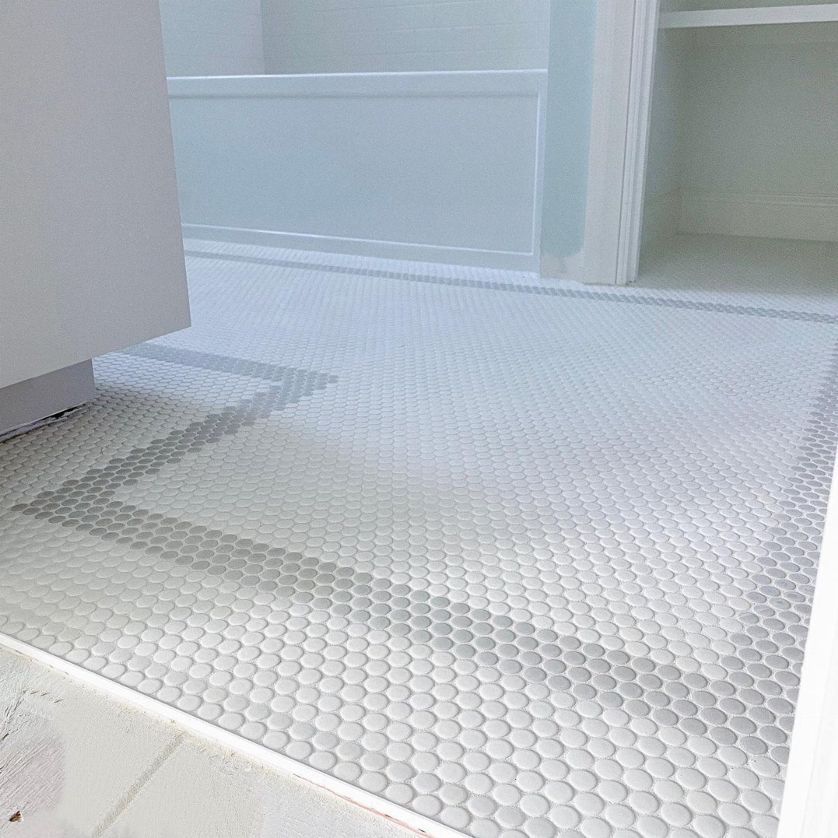
Penny tiles are those small rounds you see on the floor, each one about the size of a penny.
They were standard in bathrooms through the early 1900s because the scale let installers curve them around fixtures and the grout lines gave feet something to grip.
A second color at the border turns a simple penny tile floor into a pattern without much extra cost. Matching grout disappears; contrasting grout makes the shape pop.
Either way, the texture reads handmade even when the tile is machine-made.
On a floor, expect to pay more in labor than in materials. The sheets are small, the cuts are many, and a pro will charge for the time.
Walls are easier to DIY if you have a wet saw and patience.
I would use penny rounds on a floor only if the bathroom is small enough that the tile does not feel busy, or if I wanted one strong period detail and planned to keep everything else plain.
9. Embrace Unique Tiles
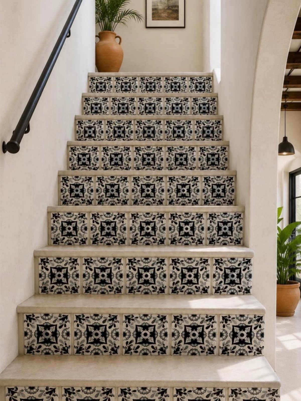
Cement tiles carry their pattern through the body of the tile itself, made by pouring pigment into a mold rather than glazing a surface, which is why the black and white survives wear that would scrape off a printed finish.
That manufacturing method gives the matte finish and the slight color variation that reads older than it is.
For a bathroom, these tiles work best on a floor or one accent wall where they will not fight with fixtures. The patterns are usually geometric or floral, and the colors run to blues, greens, and earth tones.
A full patterned floor in a small bathroom can feel like a rug; on a wall, the same pattern becomes art.
Cement tiles need sealing and will develop a patina, which is part of the point. They are durable but not maintenance-free.
I would budget more than for standard ceramic and plan to reseal every few years. This idea suits someone who wants one strong, worldly detail and is willing to build the rest of the room around it.
10. Art Deco Elements
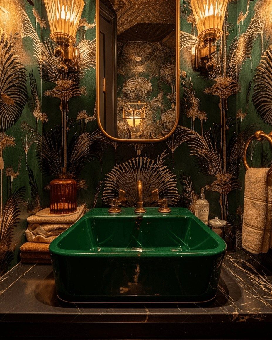
Dark color, metallic fixture, symmetry everywhere: that combination is what reads as 1920s glamour in a bathroom. Art deco favors geometry over the softer curves of earlier periods, so you see fan shapes, zigzags, and stepped patterns rather than florals.
To get this look without a full renovation, swap in one or two metallic accents. A gold faucet, a mirror with a geometric frame, or wall sconces with stepped backplates do most of the work.
The tile can follow with hexagons or chevrons in black, emerald, or navy.
I would not try to mix art deco with too many other vintage styles in one room. The glamour relies on restraint.
If your bathroom already has busy wallpaper or patterned floor tile, art deco fixtures will compete rather than complement. This idea suits a small bathroom where one or two bold choices read as intentional, not cluttered.
11. Vintage-style Sanitaryware
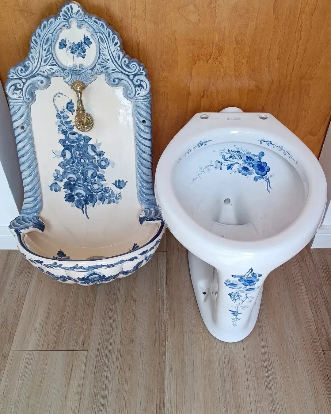
Reproduction blue floral sanitaryware, not salvage, is how you get the look without the plumbing headaches of actual 1920s porcelain. The gold hardware and the scrollwork border are the details that signal vintage; the shapes themselves are fairly standard.
For a bathroom update, a vintage-style basin is easier to source than a matching toilet, and it makes more visual impact. Wall-mounted sinks free floor space in a small room, though they sacrifice storage.
If you need a cabinet, look for a vanity with turned legs or a curved front rather than a boxy modern shape.
I would pair one statement piece like this with plain tile and simple walls. The sanitaryware is already doing the decorative work.
Reproduction fixtures run from mid-range to expensive depending on the manufacturer; for a budget version, keep the standard white toilet and swap only the basin and the taps.
12. Bring Back Terrazzo Tastefully
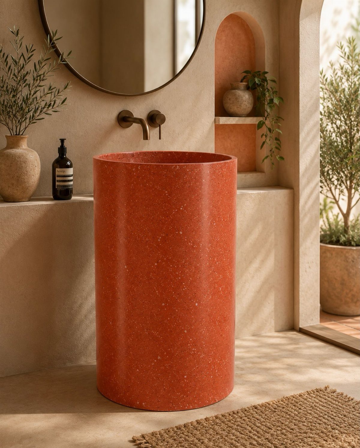
A warm, earthy terrazzo mix in a pedestal sink reads 1970s without the full commitment of a terrazzo floor.
Terrazzo is composite stone, chips set in cement or resin, and the mid-century association is strong enough that even a small piece carries the reference.
For a bathroom, a terrazzo sink or countertop gives you the material without the cost and labor of a full floor.
A cylindrical, simple sink shape keeps terrazzo from looking too busy; the material already carries enough interest on its own. Pair it with wood tones and muted walls, as here, rather than competing patterns.
If you do want terrazzo underfoot, the poured version is expensive and permanent; tile versions are more forgiving and easier to install. Either way, the material is hard and cold, so plan for a bath mat or underfloor heating.
I would use terrazzo as one accent in a room that otherwise feels warm and natural, not as the dominant surface.
13. Pedestal Sinks
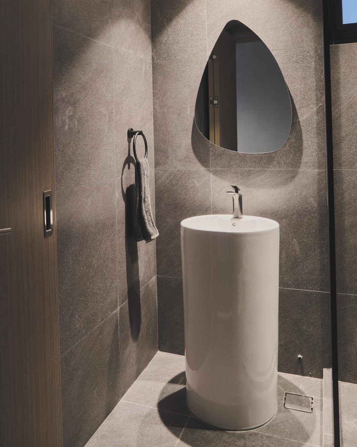
A pedestal sink opens up floor space in a small bathroom where every inch matters. The column base leaves the floor visible, which makes the room feel larger than a cabinet vanity would.
I like pairing one with a mirror that has some shape to it, since there is no counter to style. A round or organic form above the sink keeps the look from feeling too bare.
If storage is tight, add a narrow shelf or a basket on the floor nearby.
14. Soft Pastel Tiles
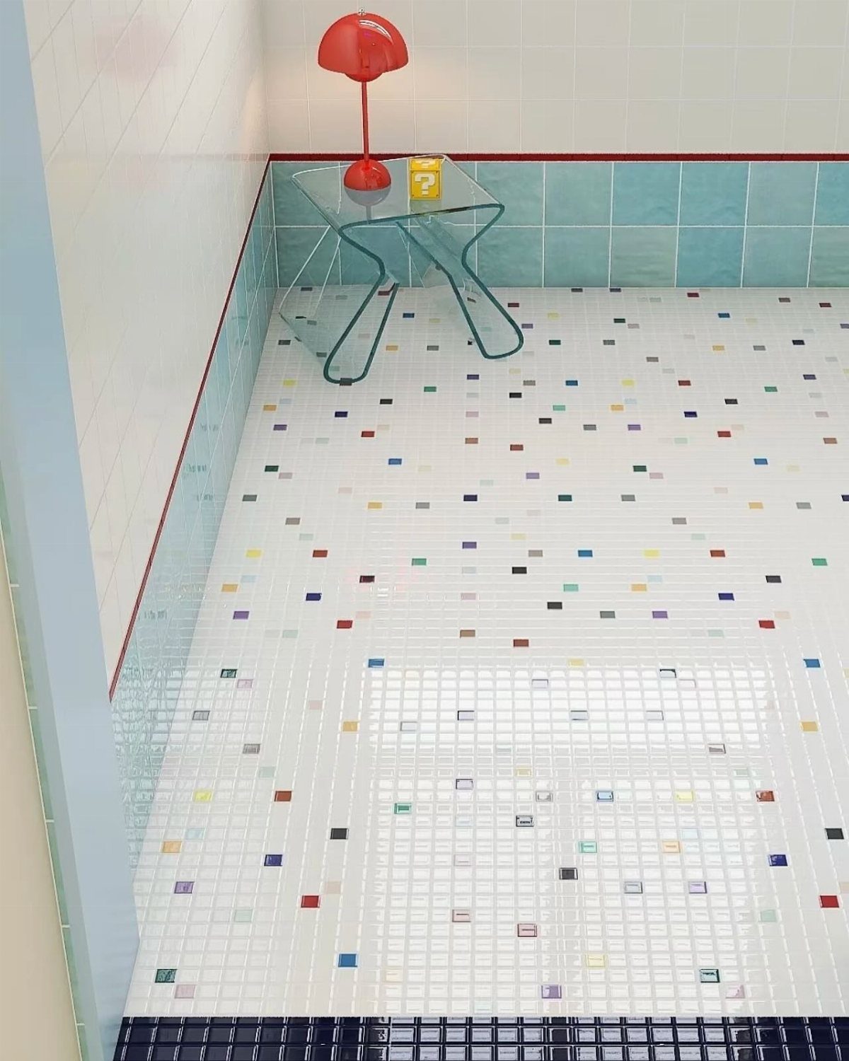
Soft pastel tiles carry the 1950s bathroom look without needing a full period set. Mint green, baby pink, and powder blue read as color rather than commitment, especially in a small bath or as a single accent band.
A white field tile with scattered colored squares keeps the tone gentle without going full mint or pink. Light blue subway tiles on the lower wall do the same job with a simpler install.
Pastels work best against white or neutral grout and fixtures. Too many competing colors and the calm turns busy.
15. Mixing Styles and Eras
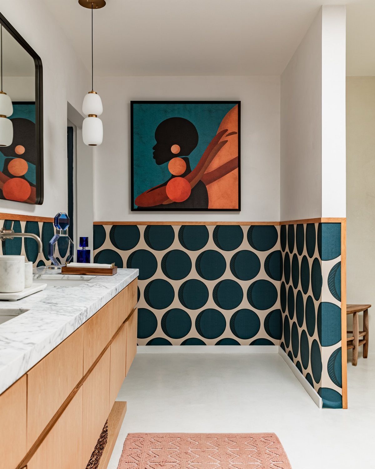
A retro bathroom risks looking like a museum if every piece comes from the same decade.
I would pick one or two standout vintage pieces and let newer elements support them. A bold tile wainscoting, for instance, needs simple hardware and lighting so the eye has somewhere to rest.
Time spent editing is the real cost of mixing styles well. Layering too many periods reads as clutter; restraint reads as taste.
16. Layering in Plants
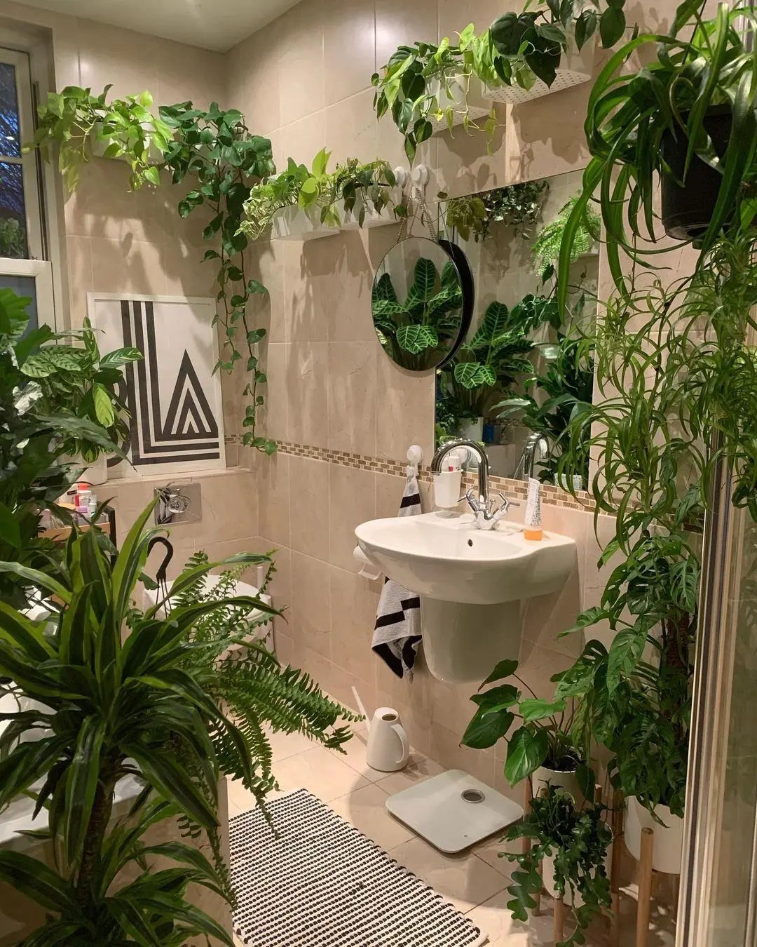
Plants soften the hard surfaces that dominate most bathrooms, tile especially. A small fern on the back of a toilet or a pothos trailing from a shelf adds living color without competing with the fixtures.
In a steamy bath, humidity lovers like ferns and spider plants need less fuss than they would in dry rooms. Hanging planters keep counters clear, which matters when a pedestal sink leaves no surface.
The risk is overdoing it. Two or three well-placed plants warm a space; a dozen turns the room into a greenhouse.
Start with one, see how the light falls, and add from there.
17. Upgrade Fixtures and Hardware
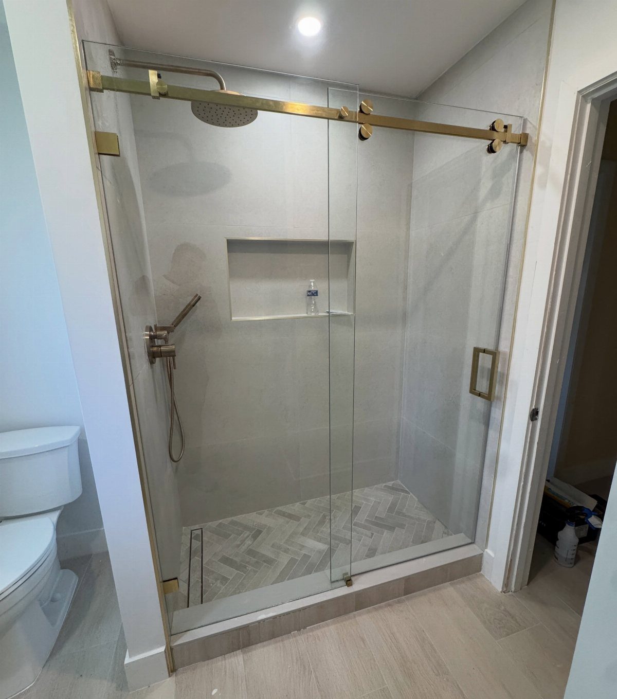
Swapping hardware and fixtures refreshes a bathroom without tearing out walls or retiling. A gold-toned metal finish alone can carry a vintage mood on shower fittings.
Knobs and pulls on a vanity need only a screwdriver; a new faucet or shower head needs a plumber or some patience. Glass shower doors replace curtains with a cleaner line and less mildew.
I would budget for metal updates in the same range as a weekend project, more if plumbing changes. The limit is existing holes and configurations; matching a new faucet to old sink drillings saves the cost of replacement.
Balancing Old and New
A claw-foot tub or a pull-chain toilet adds period character without freezing the room in one decade. I pair these with smooth drywall and simple porcelain basins to keep the look grounded in actual use.
New old stock decorative vintage liner tile works well as a narrow accent strip at eye level, not a full wall statement. The stash exists because someone saved it; that limited quality is the point.
Sturdy, natural materials in neutral tones handle daily wear better than reproductions trying too hard for patina. A simple porcelain basin reads as honest rather than nostalgic.
I stop at one or two vintage fixtures per bathroom. Any more and the space starts performing a decade instead of living in one.
Choosing Colors Wisely
Retro color schemes run glorious and overwhelming in about equal measure. I use them on one plane only: the floor, a single wall, or the tile liner, never all three.
Thirty-six sources now carry tile in authentic mid-century colors, which means the shade you want probably exists without a custom order. I check actual samples against bathroom light, though, since mint and salmon shift hard under fluorescents.
A few ideas from past bathrooms help me narrow down. Pink and black read 1950s.
Avocado and gold lean 1970s. I pick one era’s palette and stay there; mixing decades turns into visual noise fast.
The neutrals that balance these colors need to be truly quiet: warm white, soft gray, or natural linen. Anything with its own undertone fights the vintage shade for attention.
One part retro color to three parts neutral keeps the balance from tipping into costume territory. That leaves the bathroom feeling intentional, not themed.
Frequently Asked Questions
What are the bathroom trends for 2026?
Retro bathrooms are trending, with playful patterns and nostalgic colors leading the way. Checkerboard floors, pastel tiles, and vintage fixtures like clawfoot tubs are showing up in searches and project boards.
The look survives a real budget when you limit the period details to one or two elements rather than renovating the whole room around a single decade.
Are retro bathrooms still in style?
Yes, retro bathrooms remain popular for the character they add to otherwise plain spaces. The style works because it offers recognizable vintage details without requiring a full period restoration.
A mint vanity or one wall of geometric wallpaper nods to the era without turning the room into a museum piece.
What makes a bathroom look outdated?
Too many competing vintage elements from different decades turns a bathroom into visual noise rather than a designed space. Layering 1920s fixtures, 1950s pastels, and 1970s terrazzo in one room reads as clutter.
The line between retro and dated comes down to editing: let one or two vintage pieces carry the look while everything else stays simple and modern.
What are the most regretted bathroom upgrades?
Overly kitschy designs that go full period without editing often get tiring fast.
A bold tile wainscoting or patterned cement floor makes sense as one strong detail, but pairing it with busy wallpaper, ornate sanitaryware, and competing metals fights for attention.
Time spent removing layers later is the real cost of not stopping at one or two vintage statements.





