
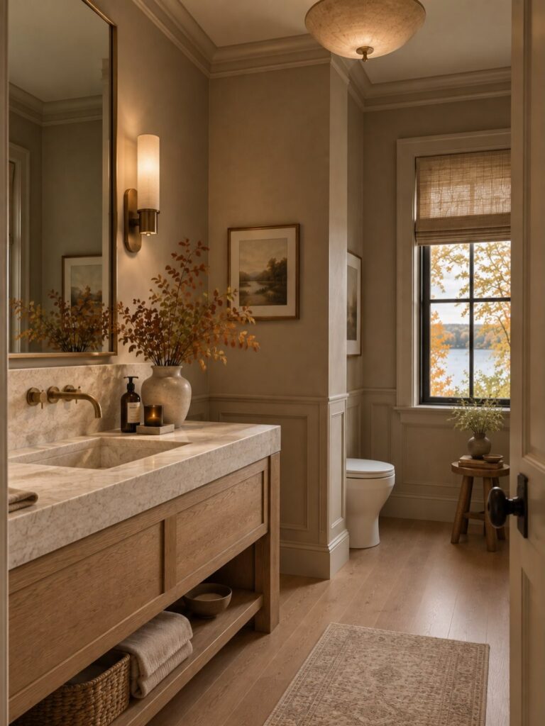
These ideas run from a towel swap to full tile layouts, and the deciding factor is how much of your weekend you are willing to give.
A single painted wall and brass fixtures ask for an afternoon; mixing matte and textured taupe tile across a whole shower wants more time and a higher budget.
Keep the board height at 60 inches and the ledge at 61 inches, and don’t worry about the small cost gap between chrome and softer metals like antique brass—it easily absorbs into the total.
1. Elegant Simplicity with Taupe Walls
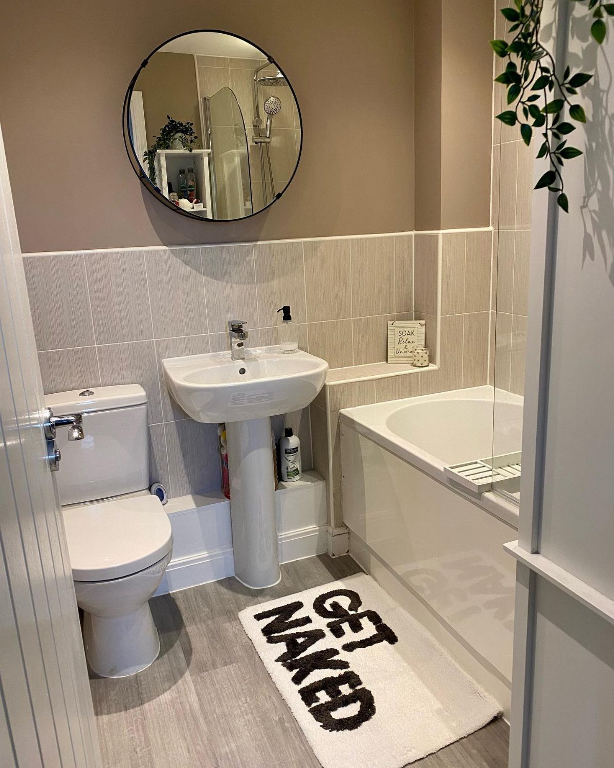
A single taupe wall can pull a bathroom together without fighting anything you already own. The shade reads warm in morning light and steady under evening bulbs, so the room keeps its composure from one hour to the next.
Gold fixtures pick up the undertone without shouting; a round mirror with a thin brass rim and a simple faucet in muted brass finish the job without a hardware splurge.
Brushed nickel or soft black work too if the warmth of gold feels like too much.
This suits renters who can paint and homeowners who want one calm backdrop for towels and art that change with the season.
2. Rustic Charm with Taupe and Wood
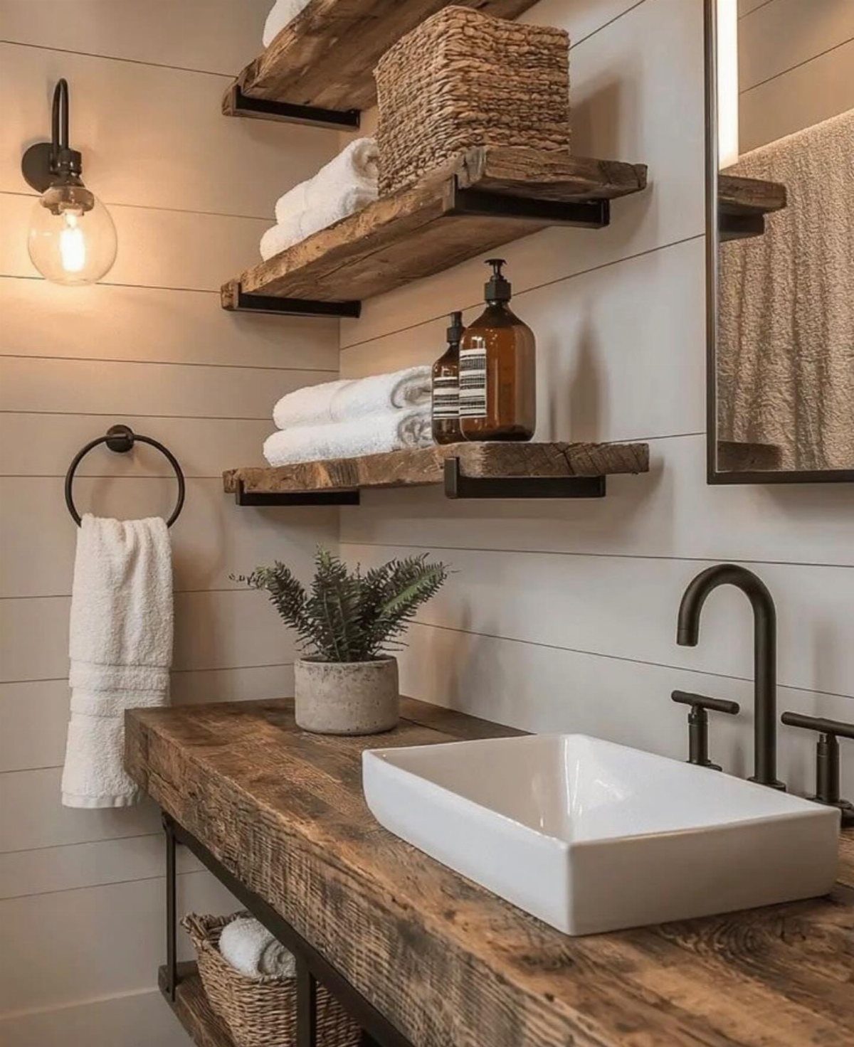
Reclaimed wood against taupe walls brings in the grain and wear that make a bathroom feel settled rather than staged. A thick vanity top shows its age well, and floating shelves in matching wood carry the same story upward.
Woven baskets and a white vessel sink keep the look from sliding into cabin territory. Vintage-style brass or bronze fixtures bridge the rustic and the refined without costing more than standard hardware.
This trades the sleekness of a built-in vanity for character you cannot fake with new material.
It asks for a weekend of installation and a source for old wood, whether that is a local salvage yard or a barn you have permission to pull from.
3. Minimalist with Taupe Accents
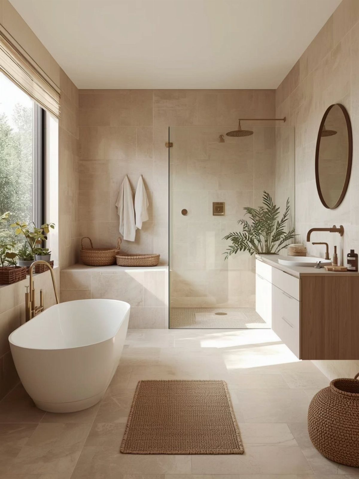
Taupe works as a quiet accent in a bathroom that is mostly white or gray, which keeps the space from feeling cold without adding a color you will tire of.
Large-format taupe tiles on the floor and walls let the tone do its work through texture rather than pattern.
This is the path for anyone who wants a neutral bathroom with enough variation to feel designed rather than default.
4. Spa-like Retreat with Taupe and Greenery
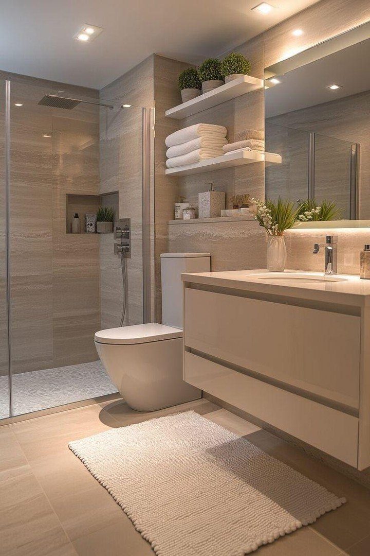
Plants in a taupe bathroom read as intentional because the color already suggests earth and quiet.
Ferns or snake plants handle the humidity and do not need the bright light that a white bathroom would demand; their green against taupe tile looks like a deliberate pairing rather than a rescue attempt.
Wooden or bamboo accents, a floating shelf in light oak or a simple stool, extend the spa feeling without clutter.
The same large-format stone-effect tile on walls and floor, as the creator of this bathroom noted, blurs where the room ends and makes a small footprint feel larger.
Start with one plant and one wooden piece before deciding if the room wants more.
5. Layer Taupe Tile in Different Finishes
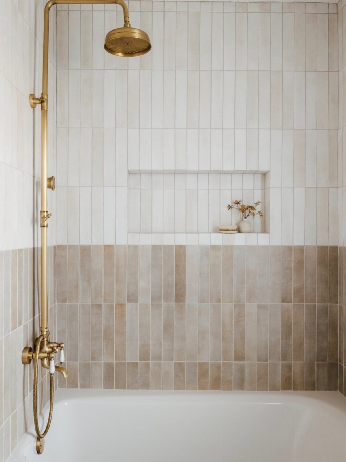
Mixing matte and lightly textured taupe tiles adds depth that a single finish cannot manage on its own.
Vertical rectangles, some flat and some with subtle variation, catch light differently across the day so the wall stays alive without busy pattern.
A handheld shower in brass and a small recessed niche for a vase or soap keep the function visible and the lines clean. Arabesque or herringbone layouts work too, though they ask more of the installer and the budget.
This approach suits someone who wants a neutral bathroom that still rewards attention. The cost runs higher than uniform tile, but the result avoids the flatness that minimal palettes often settle into.
6. Classic Elegance with Taupe and White
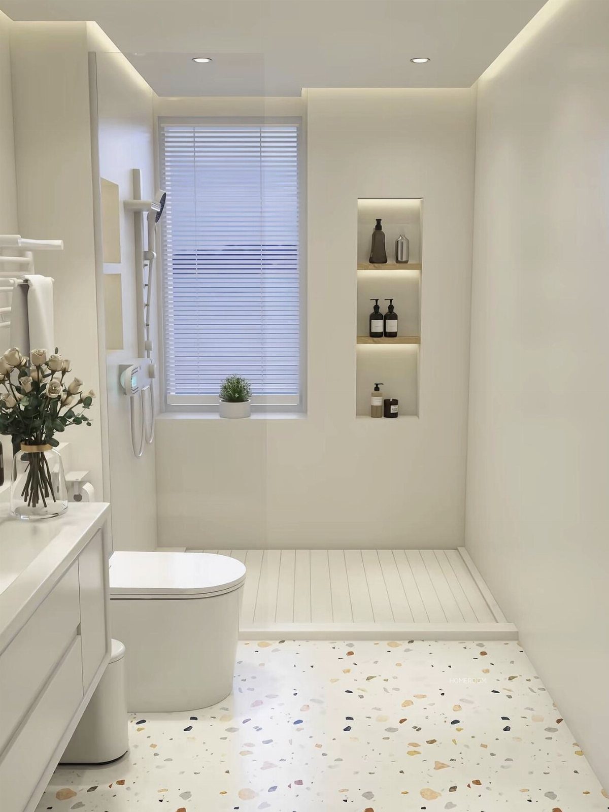
Taupe and white together carry the clean feeling of an all-white bathroom without the sterility. White subway tile with taupe grout, as one route goes, keeps the geometry sharp while the grout line softens the grid.
A terrazzo floor brings in speckled variation that a solid surface would miss.
White cabinetry and a slatted shower floor keep the eye moving upward and outward, so the taupe walls feel like warmth rather than weight. A recessed shelf in the same taupe holds dark bottles without visual noise.
This combination works for a first renovation because both colors stay available and forgiving, and the materials do not require a specialist order.
7. Luxurious Touch with Metallic Accents
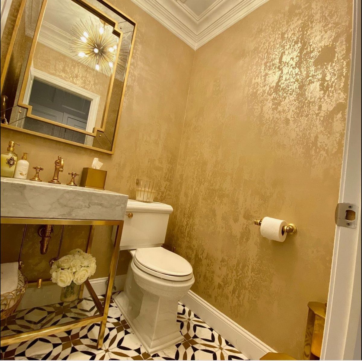
Gold fixtures against taupe read as warmth rather than flash, which is why this pairing works in a regular bathroom and not just a showroom.
I would stick to a single metal, mix two only if they already live elsewhere in the house, and place the brightest piece where the light hits it.
A geometric floor with a thin metallic thread running through it grounds the scheme without adding another color to manage.
8. Keep Hardware Soft and Elegant
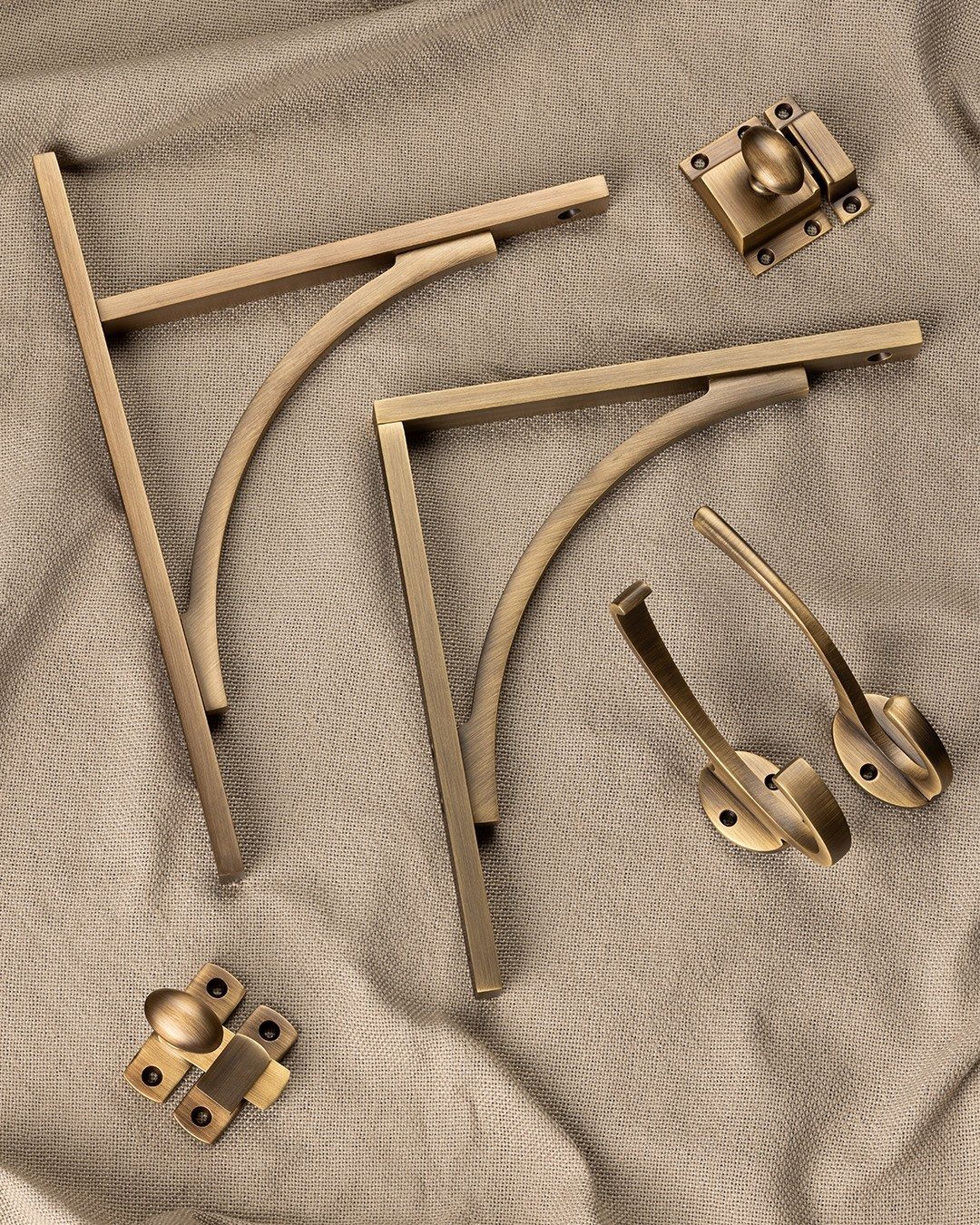
Brushed nickel, muted brass, or soft black finishes sit back against taupe instead of competing with it.
Antique brass warms taupe without turning it yellow; on a knob or hinge it catches the light once in a while, not every time you walk in.
One finish throughout the room strengthens the calm mood, and the cost difference between basic chrome and a softer metal is usually small enough to absorb into the total.
9. Taupe Cabinetry and Countertops
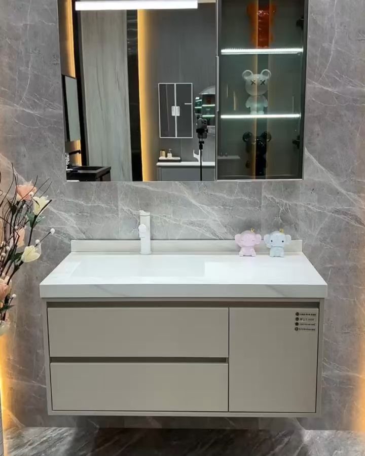
Taupe cabinetry carries color through the lower half of a bathroom where walls often stay white out of habit.
Oak takes stain evenly and holds up near moisture if the finish stays intact, which is why it turns up so often on bath cabinets.
Marble-look walls behind the mirror extend the neutral palette upward without demanding a full renovation. I would seal any natural stone countertop yearly; the upkeep is brief and worth it.
10. Taupe and Marble Combination
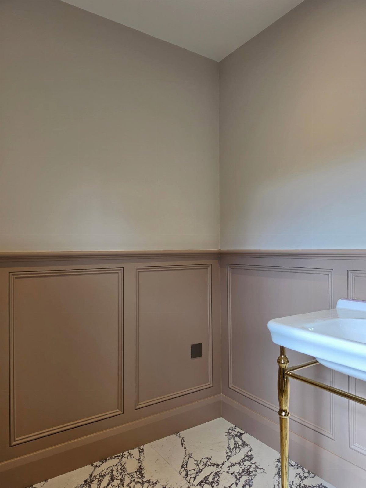
Taupe wainscoting with decorative molding gives marble somewhere to land visually so the stone does not float in an all-white room.
The white pedestal sink and marble floor read as intentional choices rather than defaults because the taupe middle layer connects them.
The maker sprayed the woodwork in Everal Aqua 10 and used Farrow and Ball on the walls, a combination that keeps the taupe from going muddy near natural light.
I would match the marble veining to the depth of the taupe; pale stone with dark taupe can look stranded.
11. Use Plush White Towels Against Taupe Walls
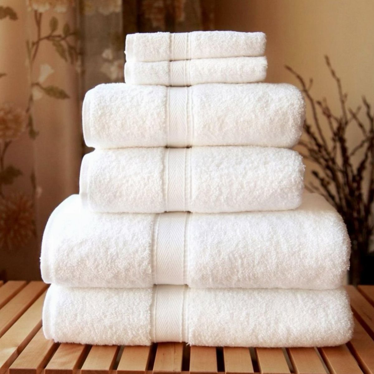
Plush white towels against taupe walls do two things at once: they add the contrast that keeps a neutral room from flattening out, and they signal clean the way white linens always have.
Texture is what makes this work; thin or worn towels would read as institutional against the same wall.
This is a swap, not a project. Good cotton towels last years if washed without fabric softener, which coats the fibers and dulls the absorbency.
The spa effect costs less than a single fixture upgrade.
12. A Taupe Bathroom That Feels Quietly Restorative
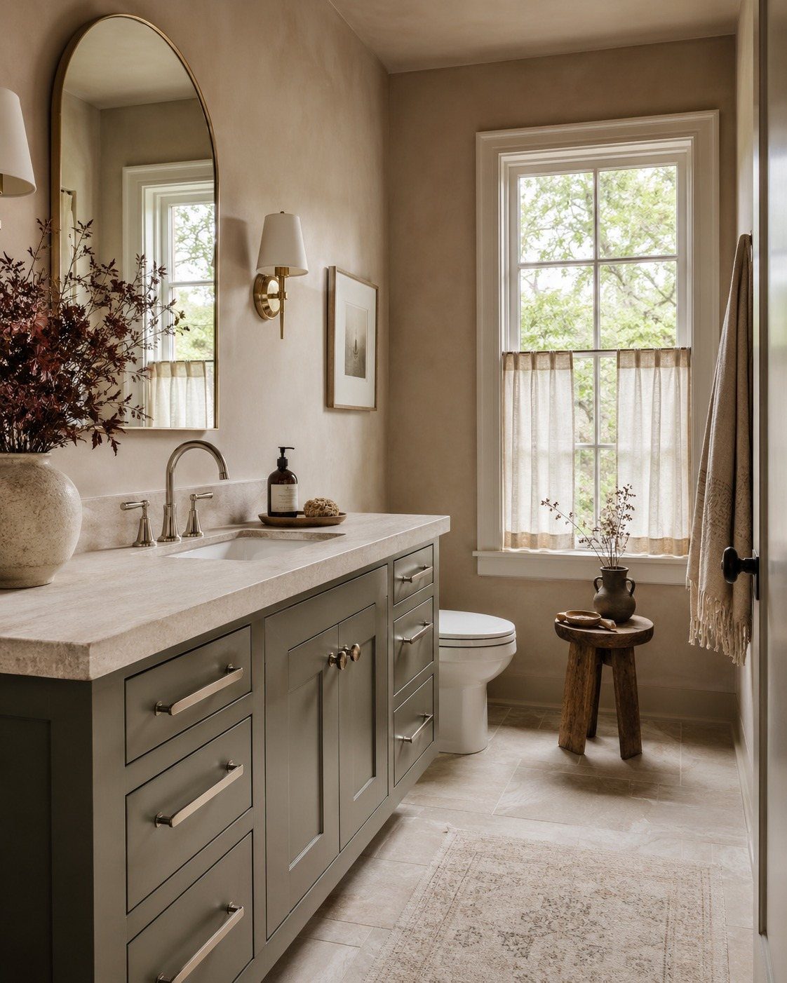
A taupe bathroom becomes restorative when the textures do the work and nothing shouts. The arched mirror adds curve where everything else runs straight, which keeps the calm from turning sterile.
I would add one living thing, even dried branches, and stop there. Sheer fabric over a window keeps the daylight soft; without that, a dimmable sconce at face height prevents the taupe from going shadowy in the evening.
13. Transform with Taupe and Burgundy
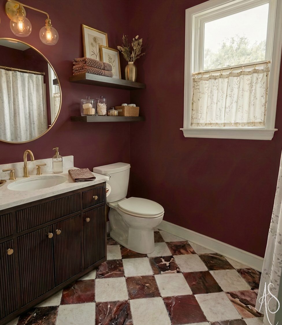
Burgundy against taupe is a period pairing that came back without the irony that usually accompanies revival. A checkered floor sets the proportion best when taupe covers the larger squares and burgundy the smaller ones.
Complementary Colors for Taupe
A bathroom with too many competing colors loses the quiet effect that makes taupe appealing in the first place.
I would keep the palette to two or three tones at most. Let taupe handle the walls or the larger fixtures, then bring in one accent color through towels, a small stool, or a single plant.
The room stays more unified this way, and the spa-like calm that taupe promises actually arrives.
Lighting Considerations
Taupe changes noticeably depending on the light source. Natural daylight brings out its warmth and keeps the color from reading too gray or too flat.
Artificial light shifts it, sometimes toward purple or green depending on the bulb, so the fixture choice matters.
Warm-toned lighting deepens the color and keeps the room feeling cozy rather than merely neutral. Harsh overhead light flattens everything and strips away the depth that makes taupe interesting.
I would swap a single bright ceiling fixture for layered sources at lower wattage, or add a dimmer if the wiring allows it. The difference in how the bathroom feels, especially in the evening, is immediate.
Frequently Asked Questions
What colors go with taupe in a bathroom?
White, burgundy, soft green from plants, and warm metallics like brass or antique gold pair well with taupe. A two-tone ceiling, taupe below and white above, stretches the walls upward without adding clutter.
Navy or soft pink can work too, though I have not used them myself.
What color compliments taupe?
White is the safest complement; it keeps the clean feeling of an all-white bathroom without the sterility. A single fern on the tank or a trailing pothos on the sill reads as intentional because taupe already suggests earth and quiet.
Is taupe suitable for smaller bathrooms?
Yes. Large-format stone-effect tile on both walls and floor blurs where the room ends, which makes a small footprint feel larger.
Taupe also stays calm under evening light, so the space does not feel closed in when natural light fades.





