
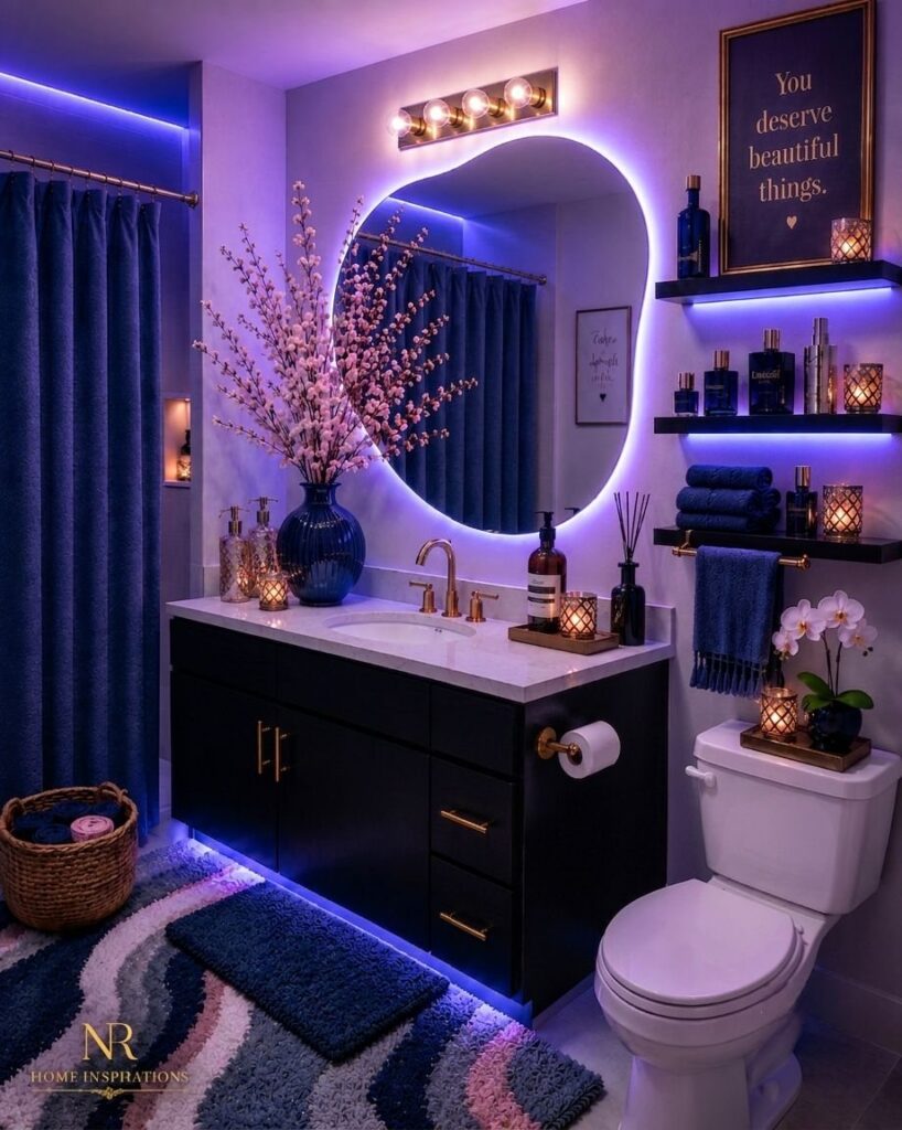
The ideas below range from a single swapped shower curtain to a full room wrapped in dark paint and tile, and the right one depends on whether you own the bathroom or just the weekend.
1. Blue Tiles
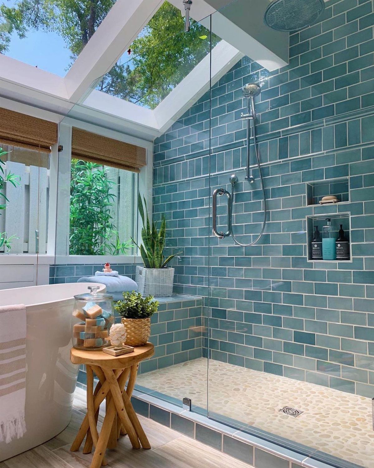
Diagonal subway tiles in teal bring more movement than straight stacks, and mixing lighter with darker shades keeps the shower from reading flat. The glass enclosure lets the color do the work without closing the room in.
For a weekend project, tile the lower half of one wall rather than wrapping the whole room. Brass hardware against blue warms it up; chrome reads cooler.
This suits renters doing one statement wall, or owners who want the bath to feel designed without gutting the layout.
2. Painted Vanity
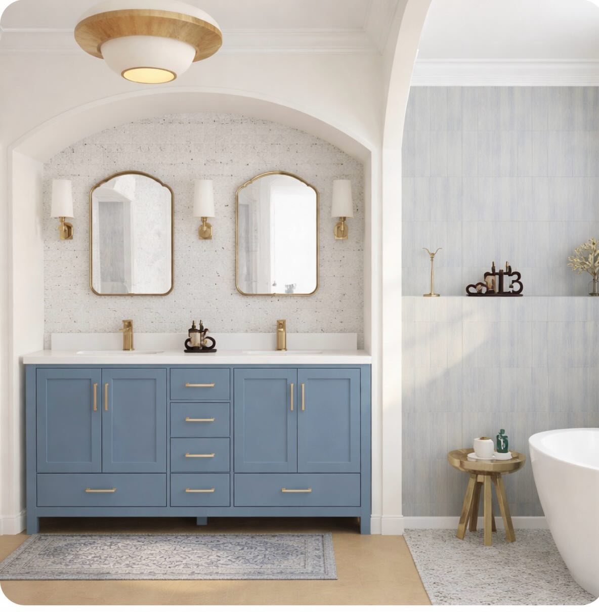
A deep navy vanity with a white countertop and gold handles turns the usual bathroom setup into something intentional. The arched mirrors echo the alcove shape, which helps the whole wall feel planned rather than assembled.
Painting an existing vanity takes a Saturday, two coats of cabinet-grade paint, and new pulls if the old ones read dated.
I like Benjamin Moore’s Nickel for a blue-gray that shifts with the light, or a true navy for contrast against white walls.
Best for bathrooms where the architecture is plain and the budget is tight; a white counter does mean noticing every water spot.
3. Moody Blue Walls
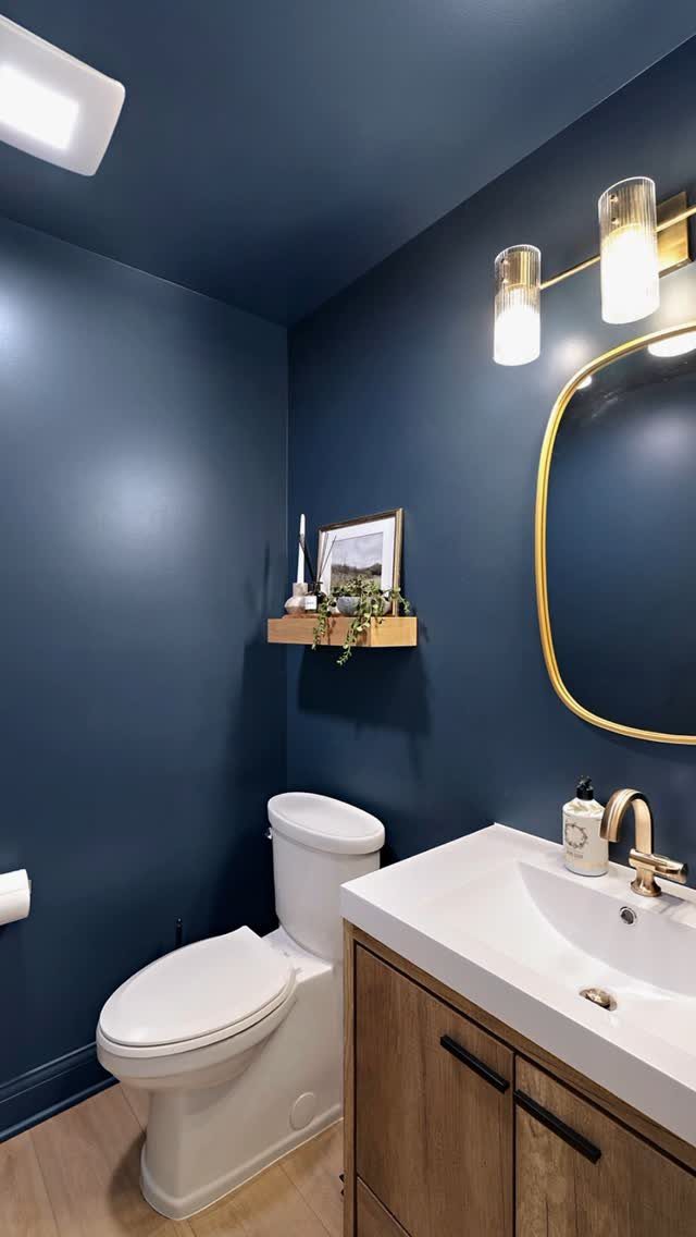
Dark blue on every wall plus the ceiling wraps a small bathroom like a box. The white fixtures and warm wood vanity pop against it instead of disappearing, and the gold mirror frame catches what light there is.
In a powder room or a bath with a window, this reads cozy rather than cave-like. Without natural light, add a warmer bulb and paint the trim white to keep the edges defined.
This is the highest-impact move for the lowest cost: a gallon and a half of good paint, a roller, and a free evening. The risk is touching up; keep the can.
4. Blue Patterned Tiles
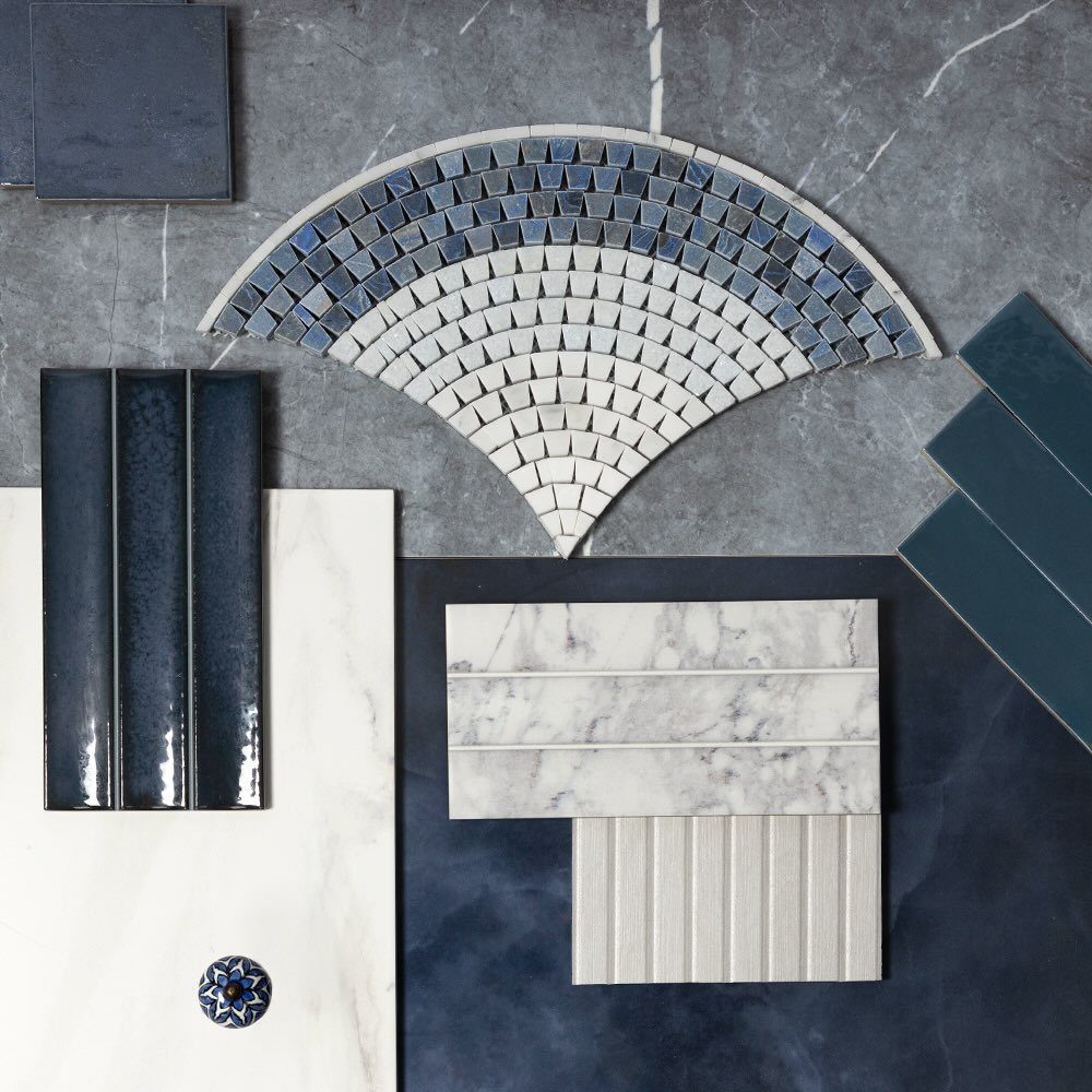
Patterned blue tiles work as a single accent band or a full feature wall without the busyness of wallpaper.
For a rental or a cautious budget, a patterned tile rug at the center of the floor gives the look without committing the whole floor.
Seal the grout well; light colors in the pattern will show every coffee splash and dropped toothbrush.
Suits someone who wants the bathroom to feel collected, not decorated.
5. Blue Wallpaper
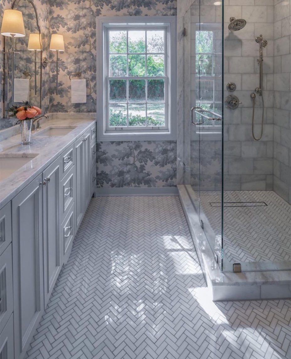
Floral blue wallpaper in a bath with all-white fixtures and tile keeps the room from feeling sterile. A white vanity and herringbone floor give the pattern room to breathe; too much competing color and the eye tires fast.
Vinyl or coated paper matters here, not just for splashes but for the humidity cycle every bathroom runs.
A single accent wall behind the vanity carries the look without the commitment of wrapping the whole room, and it comes down in an hour if the mood changes.
Best in a guest bath or a powder room where the shower steam stays minimal.
6. Blue Accents and Accessories
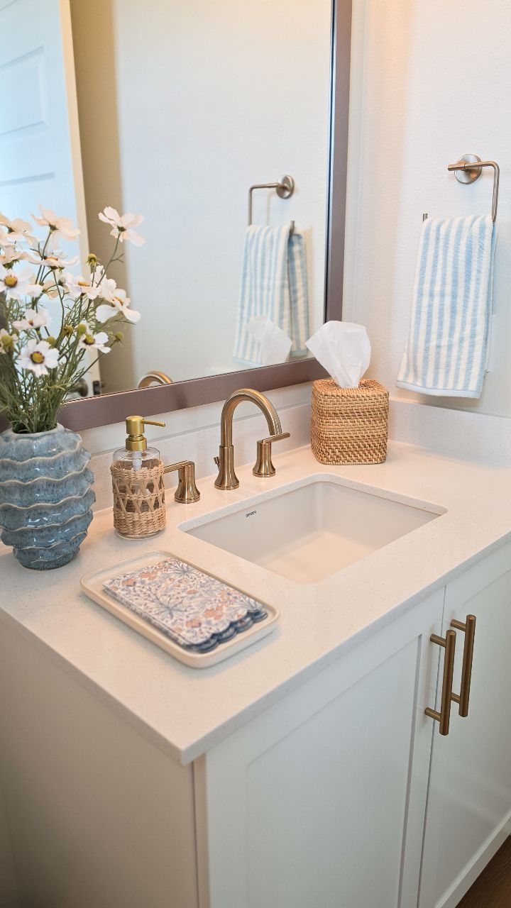
A blue vase, a patterned hand towel, and a soap dispenser in matching tones add color without a single permanent change.
Gold hardware keeps the palette from drifting too casual; mixing metals is fine, but one dominant finish anchors the look.
Rotate accessories seasonally or when the set starts feeling tired. If the walls or tile are already blue, white towels rest the eye.
In a neutral room, blue textiles carry the whole theme.
The maker of this setup plans to add wainscoting and wallpaper later, which is the right order, test the color in small doses before you commit to the wall.
7. Bold Flooring
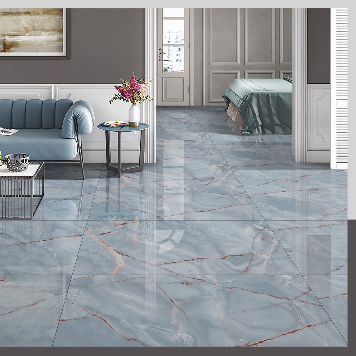
A bright blue floor turns the bathroom into the one room that wakes up before you do.
Rust-colored veining keeps blue from reading as cold, and the same effect works with paint on wood or concrete for a fraction of the cost.
A water-resistant enamel in a muted, slightly dusty blue will outlast a trendier shade, and pairing it with white walls keeps the whole space feeling open rather than boxed in.
Best for someone tired of playing it safe with tile or vinyl, but not ready to commit above eye level.
Ekeland has one tried-and-true go-to: “Since it was launched in 2018, Farrow & Ball’s De Nimes has been a blue paint color favorite,” she says.
8. Blue Fixtures
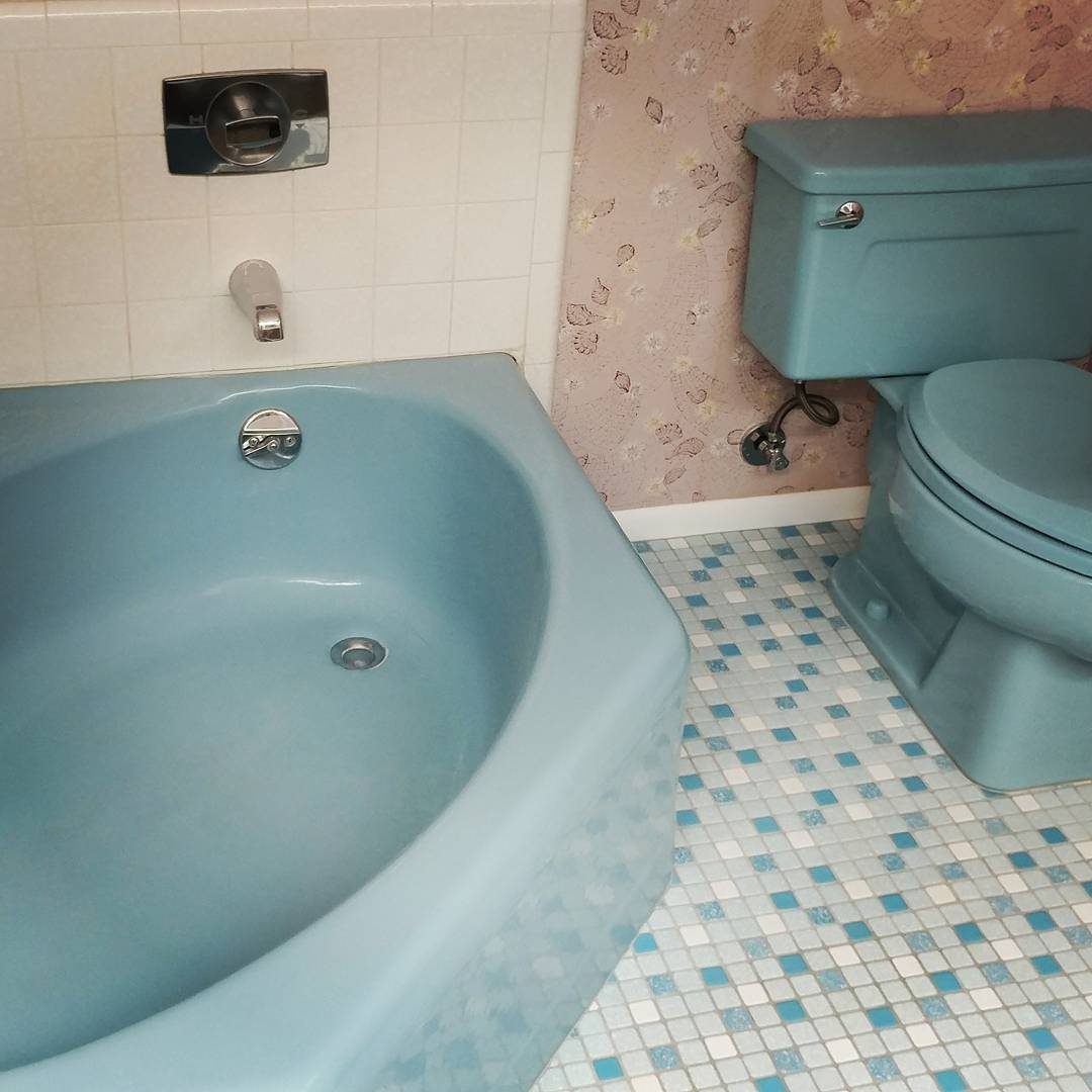
A blue faucet or showerhead lands at exactly the height where the eye naturally rests, so the color reads as intentional rather than accidental.
Matte or ceramic finishes soften the look compared to polished chrome, and in a bathroom with white or neutral fixtures, even one blue piece reads as a deliberate choice rather than a leftover.
A single blue showerhead or wall sconce does the same work with less risk than going all in.
Swap it seasonally if you rent, or keep it for years if you own; either way, the finish matters more than the shade.
9. Skirted Sink
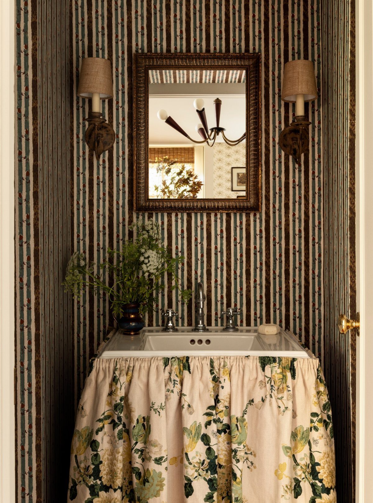
A skirted sink hides plumbing and the clutter you meant to organize last month, and ticking stripe adds just enough pattern to keep a neutral bathroom from going flat.
Performance fabric is the detail that makes this last; regular cotton wilts under splashes and humidity, but something rated for outdoor or marine use holds its shape and color.
A few yards and a tension rod or adhesive hooks are all it takes, no sewing required if you finish the edge with iron-on tape.
The farmhouse look suits renters especially; the skirt lifts off fast when you move.
10. Blue Shower Curtain
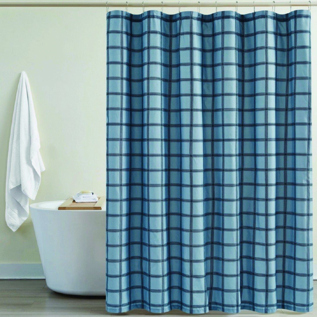
A shower curtain is the fastest color commitment you can make and the easiest to undo.
Plaid reads coastal without being literal, but any blue pattern, texture, or solid will pull the room together if the rest of it reads neutral.
For renters, this is often the only change allowed, and even owners benefit from a swap that costs little and takes almost no time.
Change it with the seasons or when the mood shifts; the hardware stays, the statement moves.
11. Nautical Design
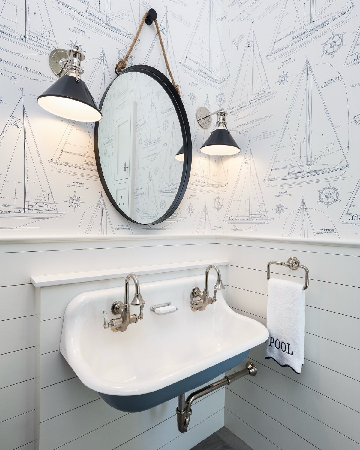
Nautical design works best when you borrow the mood rather than buy every anchor in the catalog.
Royal blue plays well with silver fixtures or a single bright accent like yellow, and sailboat wallpaper keeps the theme light enough for a guest bath.
A rope-framed mirror or submarine-style sconce nods to the idea without turning the room into a gift shop.
This suits a small bathroom where a full theme would overwhelm, or a household that wants the feeling of a weekend place without the drive.
12. Blue and Gold Accents
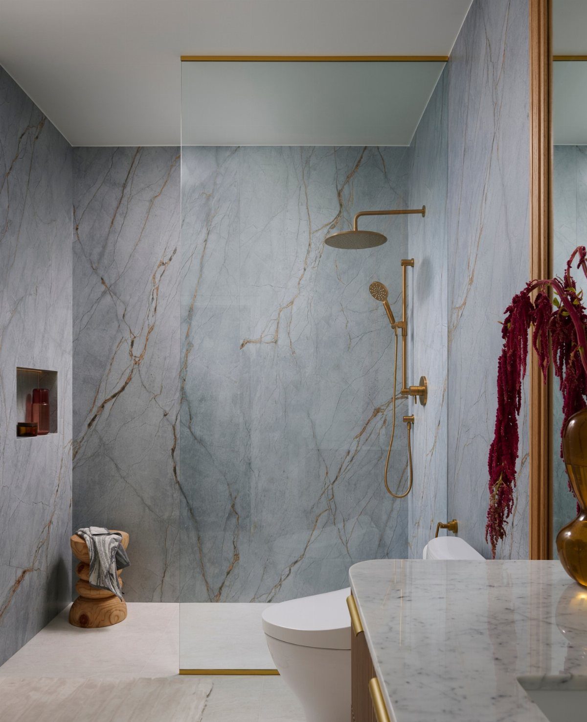
Gold against blue reads as warmth against cool, and veined marble does the pairing for you. If your tiles or paint lack that natural gold thread, brushed gold hardware on a navy vanity creates the same contrast with less expense.
Keep the gold to fixtures and small details rather than spreading it across every surface; one or two metallic points catch the light without competing.
This combination suits a bathroom where you want the finish to feel considered, not decorated.
13. Blue Beadboard
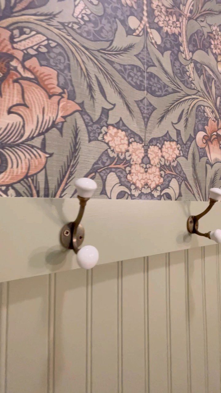
Blue beadboard gives a bathroom the kind of texture that flat paint never quite manages.
I like it running up the lower third of the wall with white or soft green above; the two-tone split keeps the color from swallowing a small room whole.
A 36-inch wainscot height works in most standard baths, though I have gone taller in spaces with high ceilings. Paint the boards in a satin or eggshell finish so they stand up to splashes without looking too glossy.
Brass hooks mounted straight to the beadboard add function without extra holes in drywall.
This one suits cottage and farmhouse styles best. In a very modern bath, the same boards read more nostalgic than intended.
14. Blue Artwork
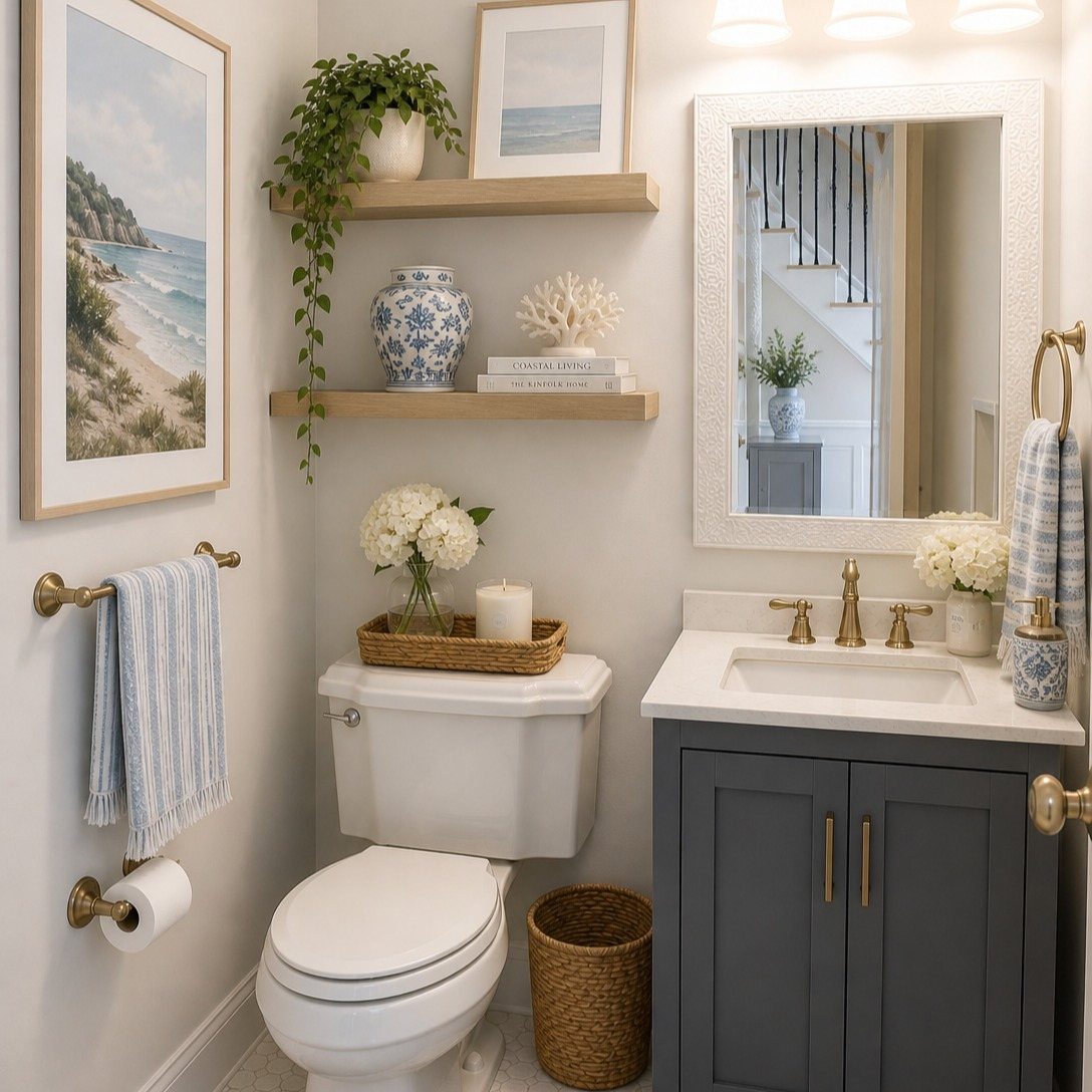
Framed blue artwork is the lowest-commitment way to pull a bathroom together. A coastal print, a botanical in indigo, or even an abstract with navy strokes will do the work without touching a fixture or opening a paint can.
I hang pieces where they will catch morning light, usually opposite a window or beside the vanity mirror. Simple wood or black frames keep the focus on the image; ornate gilding fights the calm that blue is meant to bring.
Two or three pieces at different heights read as a collection, but one strong piece above a towel bar works fine in a powder room.
For renters, this is the idea to steal first. Everything comes down when the lease ends.
15. Light Blue Shiplap Walls
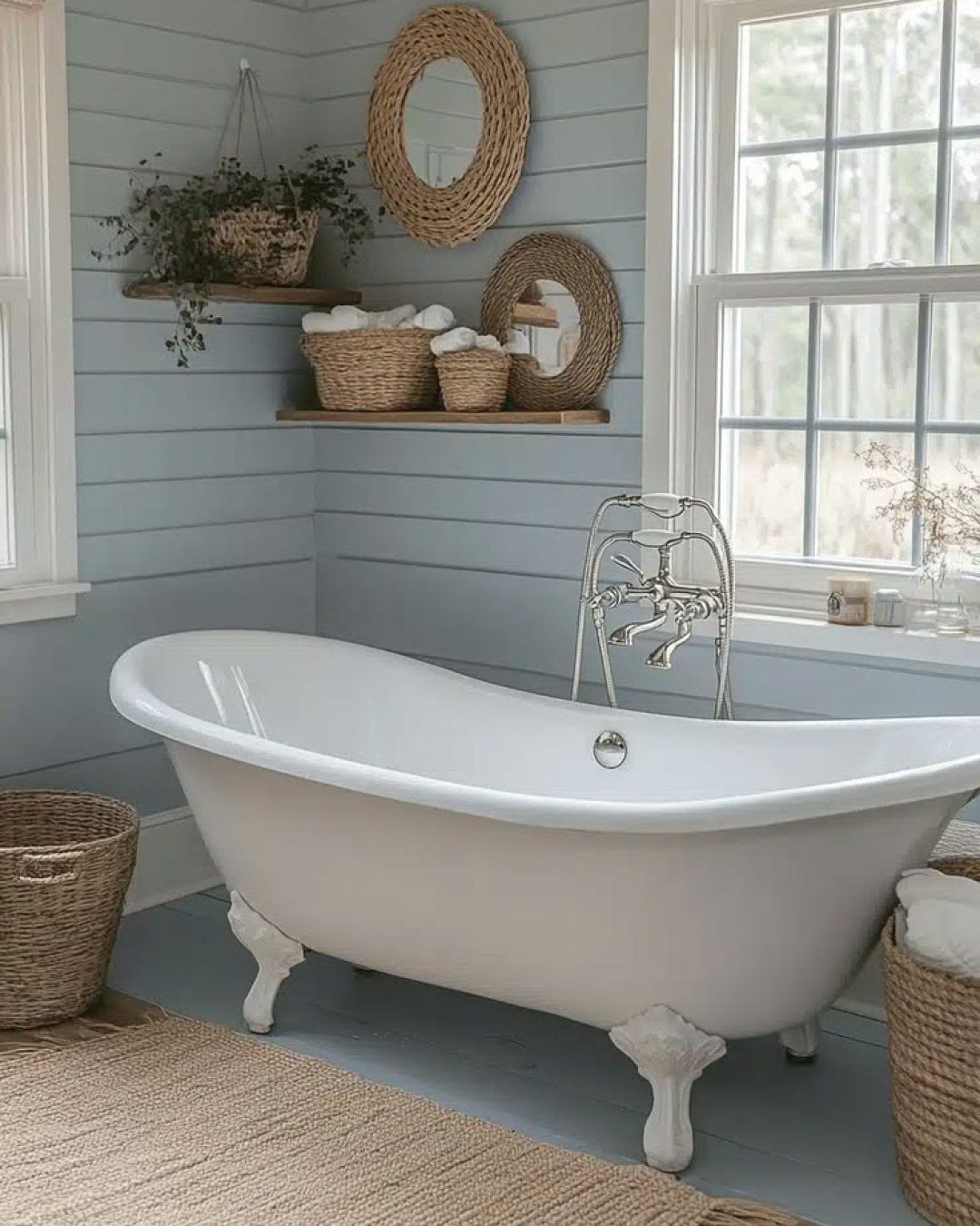
Horizontal shiplap painted a soft blue reads more cottage than coastal, especially when the boards sit low and wide like these. The spacing matters: boards kept close together keep the wall from looking busy in a small bathroom.
I would run the shiplap only to chair-rail height in a tight room; full walls need generous ceiling height to carry the weight. Paint matte or eggshell, not gloss, or the grooves throw shadows that read as stripes.
This treatment works best for renters who can panel one wall and take it with them, or for owners who want permanence without the cost of tile.
Cleaning is the catch: the grooves collect dust and the odd splash of toothpaste. A quick wipe with a dry microfiber cloth on a regular schedule keeps it presentable.
Choosing the Right Blue Shade
Lighting changes everything about how a blue reads in a bathroom. A shade that looks crisp under showroom LEDs can turn muddy under a single vanity bulb, so I always test paint and tile samples where they’ll actually live.
Wet tile shifts color too; the same glaze can look entirely different after a shower steams the room. If you love the saturated look of wet tile, a wet-look sealer keeps that depth without adding slip.
Small bathrooms can handle darker blues better than you’d expect. A deep navy on all four walls can push the corners back and make the space feel larger, not closed in.
Lighter blues do the opposite work: they bounce light around and open up a room that already has windows to spare.
Layering one blue through several tones keeps a bathroom from going flat. I’d anchor with one dominant shade, maybe a medium blue on the walls, then step darker on the vanity and lighter on towels or a shower curtain.
The variation reads as intentional, not like you ran short of paint.
Mixing Blue with Other Colors
Blue gives you more freedom than most colors. It sits naturally with anything in the cool family: greens, teals, deeper blues, purples, even pinks.
That said, white still solves every hesitation. A crisp white stripe or a white clawfoot tub against blue walls needs no more complication to feel complete.
For a balanced bathroom, I like blue with warm natural wood, gray stone, or brass and gold hardware. The pairing doesn’t need to be loud.
A single brass sconce or a gray limestone counter is enough to keep blue from feeling too flat or too coastal.
If you’re nervous about adding another color, start with white and stop there. It works with any blue at any saturation, and it leaves room to swap in bolder accents later when you’ve lived with the space awhile.
Frequently Asked Questions
What colors go with blue in the bathroom?
White, gray, gold, and natural wood tones all sit well with blue. Greens, teals, purples, and even pinks sit in the same cool family, so they share space with blue without clashing.
If you’re hesitant, start with white; it solves every hesitation and leaves room to add bolder accents later.
What are some creative blue bathroom ideas for 2026?
Bold blue flooring, a painted navy vanity, and diagonal teal subway tiles are three moves that read current without chasing a trend too hard. Each of these fits a weekend or a single evening, not a full renovation.
What are the most trendy colors for bathrooms in 2026?
Navy, pastel blue, and earthy tones are showing up most often in the baths I see.
Deep navy works on walls or vanities for saturation that doesn’t read juvenile, while lighter blues open up rooms that already have windows to spare.
Warm wood vanities or stone counters usually carry that earthy thread and keep blue from reading too flat.
What colors make a bathroom look expensive?
Deep blue paired with gold or brass hardware carries a luxurious feel without the cost of actual luxury materials.
Veined marble handles the pairing on its own if you have it; if not, brushed gold pulls on a navy vanity build the same warm-against-cool tension.
Keep the metallic details to one or two points so they catch light rather than compete for it.





