
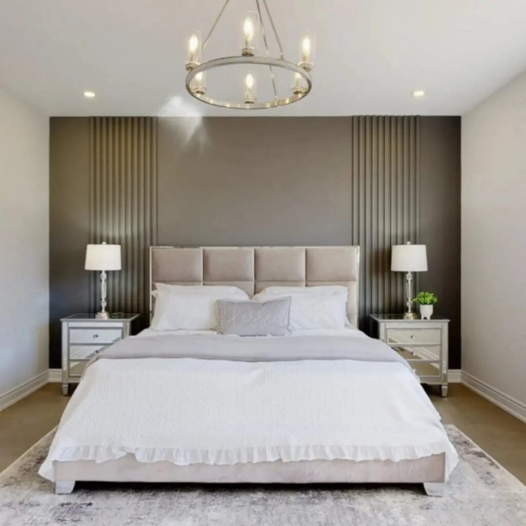
Bedroom accent walls run from a quick paint job to a full weekend of trim carpentry, and the right choice depends on whether you own the wall or answer to a landlord.
Renters lean toward peel-and-stick wallpaper and floor-to-ceiling drapes; owners can commit to built-in paneling, real brick veneer, or adhesive-mounted molding that stays put. A board-and-batten project shows how specific the math gets when furniture and lamps enter the equation.
1. Extended Headboard
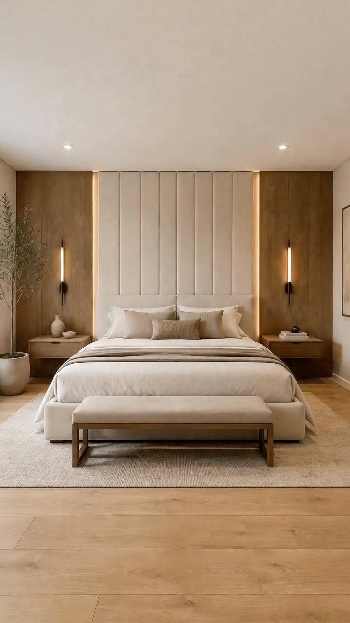
An extended headboard turns the wall behind your bed into architecture instead of just paint. A floor-to-ceiling upholstered headboard in cream, flanked by wood panels with hidden lighting, hides wall imperfections underneath so the drywall never has to be perfect.
Built-in sconces and floating nightstands keep the look clean without buying separate pieces. I’d aim this at anyone with a smaller bedroom where a freestanding headboard plus end tables would eat walking space.
Fixed installation means you can’t rearrange on a whim later. If your walls are textured, the paneling covers that too.
2. Large Art Piece
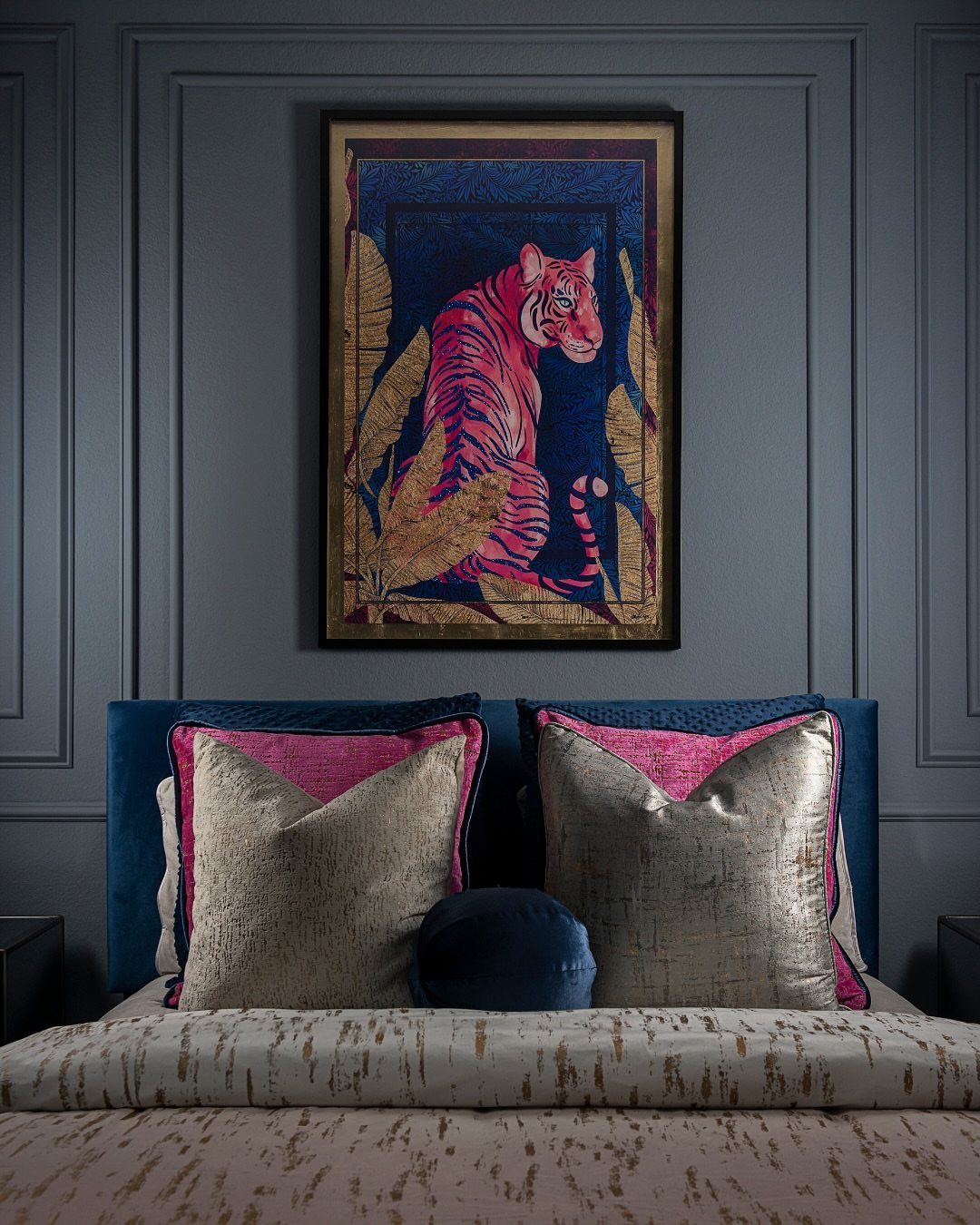
A single oversized piece does the work of a dozen small frames without the gallery-wall math.
A large pink tiger on dark paneling shows the same principle works on plain paint: pick something large enough to read from the door, and let it carry the whole color story.
How it relates to your bedding and nearby textiles decides whether it works.
If your room is mostly neutral, a bold piece becomes the accent wall by itself; if you already have pattern, go quieter or the eye has nowhere to rest.
Check the weight before you buy hardware; a framed canvas this size needs a wall anchor, not a nail.
3. Brick Wall
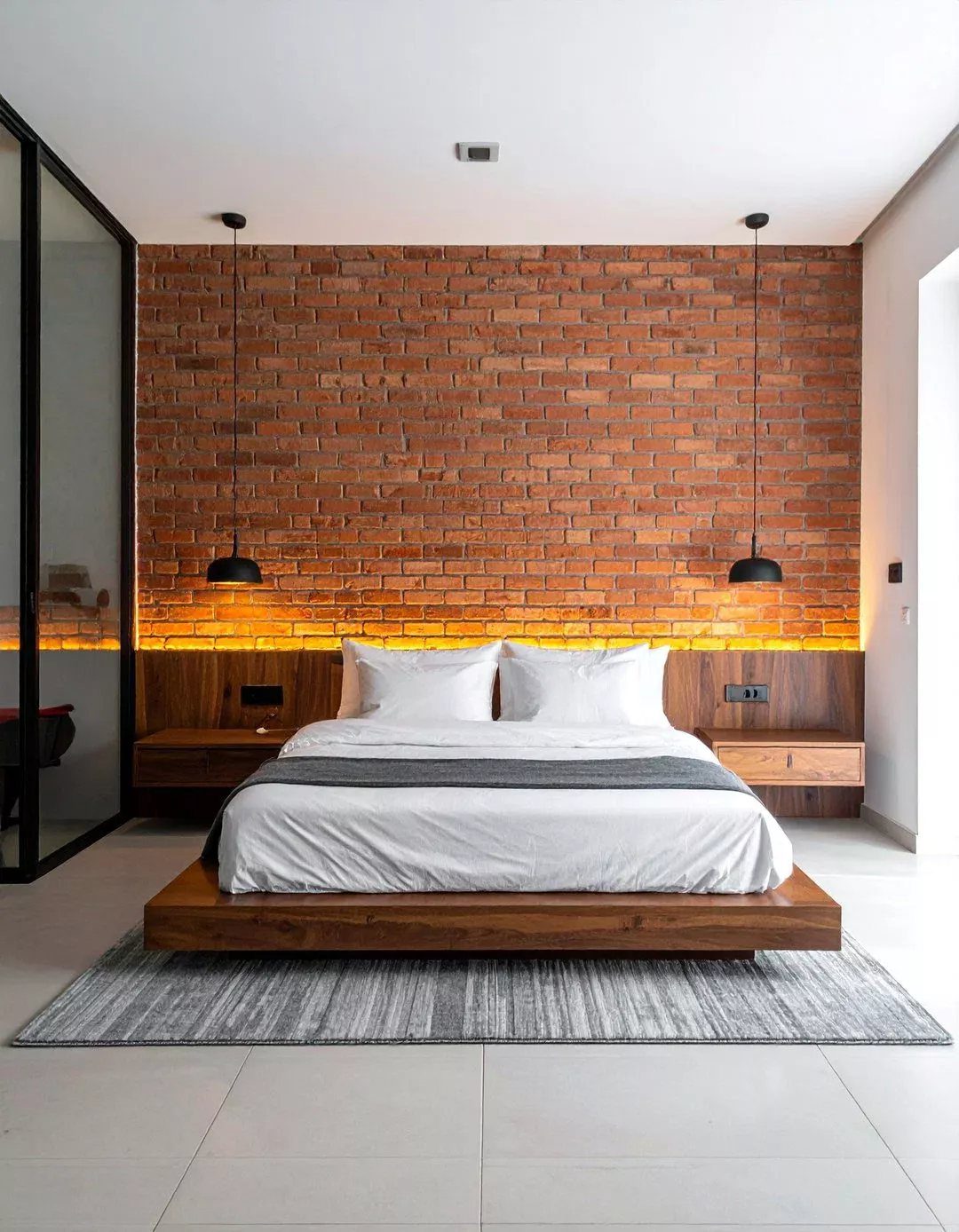
Real brick gives you texture that paint can’t replicate, and 2026 is very much a year where texture matters.
Original exposed brick with warm lighting washing across it gives this effect, though brick veneer over drywall gets you the same look in a newer build.
Veneer runs lighter and installs without structural reinforcement; a single wall of thin brick costs roughly what mid-grade wallpaper does.
The rustic feel pairs naturally with wood beds and linen bedding, though I’d skip it if your style runs glossy or minimal. White-painted brick shifts the mood toward cottage without losing the shadow and variation.
4. Wood Paneling
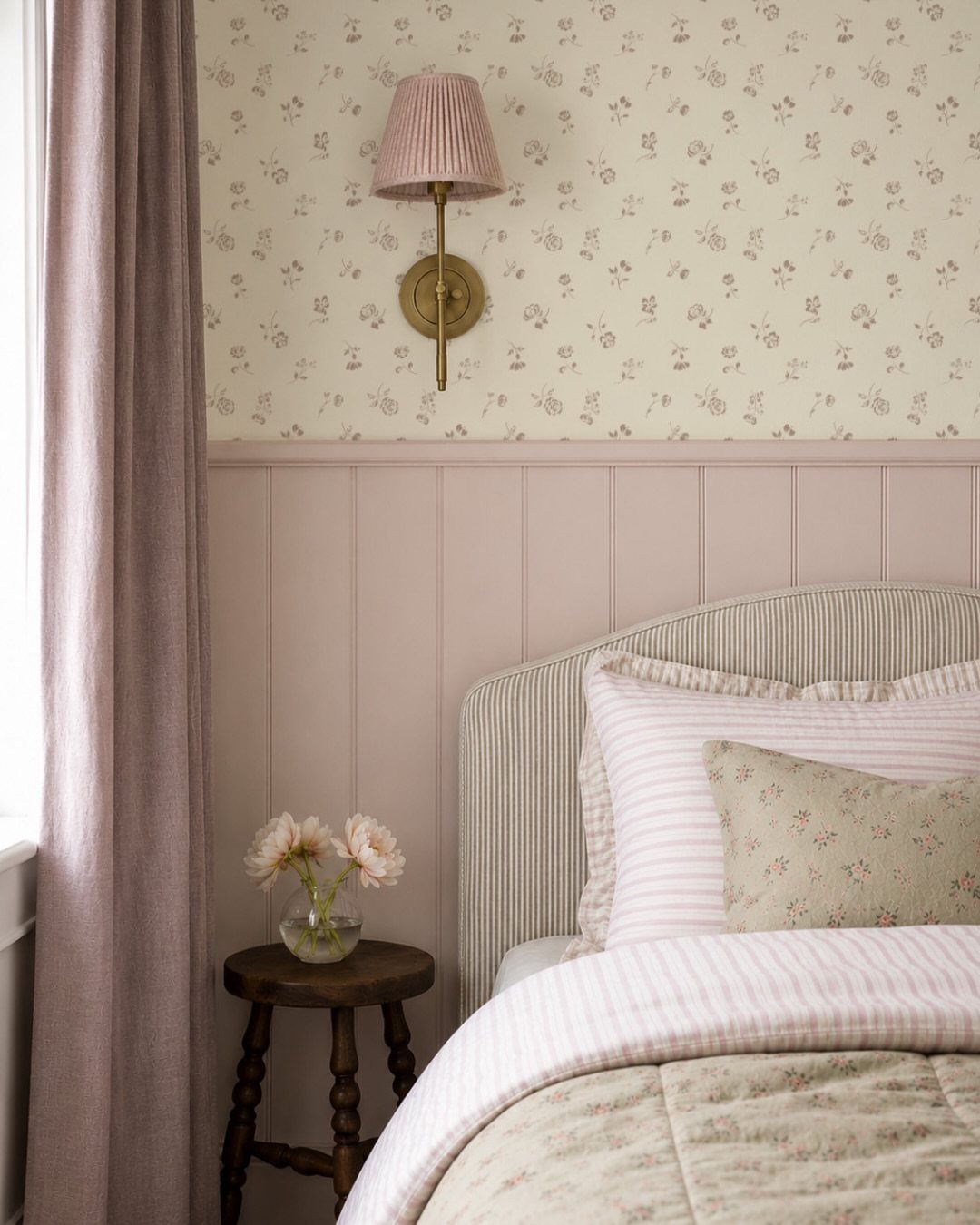
Vertical slats add warmth and a subtle height trick, drawing the eye upward if your ceilings sit on the lower side.
Pink paneling meeting floral wallpaper at a chair rail shows one combination, but slats work alone behind a bed just as well.
I’d do the math on whether you need outlets moved before you commit; slats cover simple drywall but not junction boxes.
5. Geometric Patterns
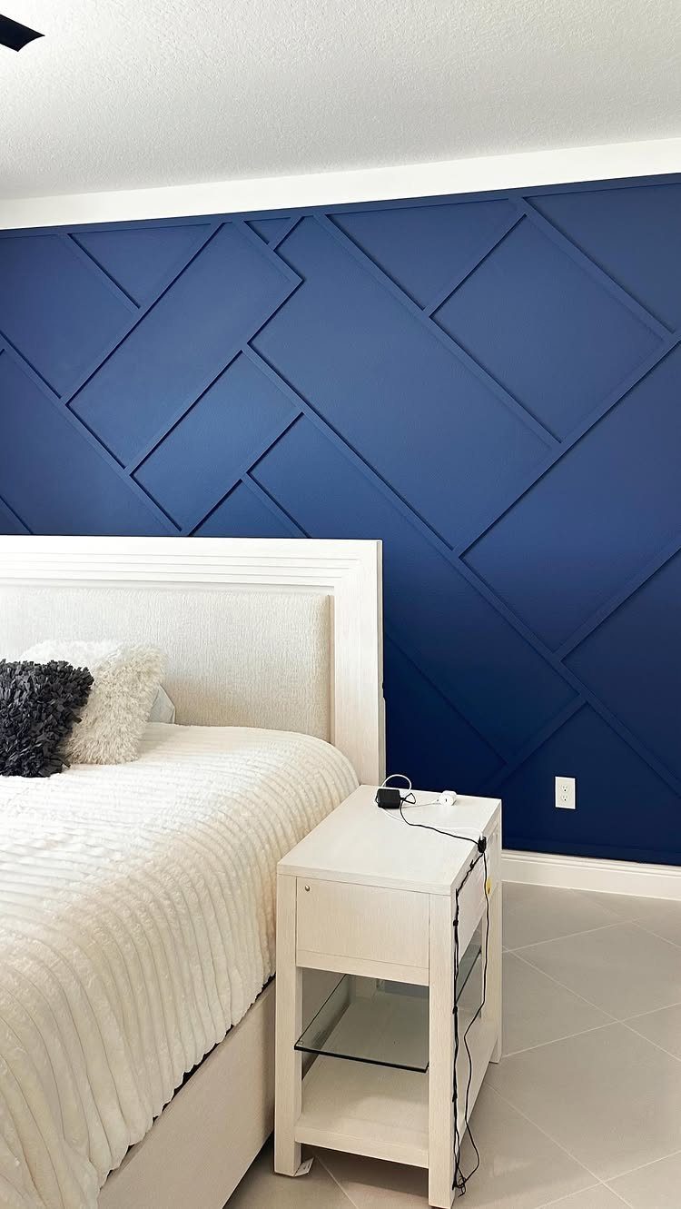
Raised wood trim on a painted field gives you geometry with actual shadow, not just printed pattern. Intersecting rectangular strips in matching navy paint create a shape that reads as texture more than color clash.
You build the grid from thin molding, attach with adhesive and finishing nails, then paint the whole wall in one go; the seams disappear and the lines stay crisp.
Wallpaper with geometric print is the faster route if you rent or change your mind often.
I’d pick the built-up version for a permanent bedroom and the printed one for a guest room or anything you might want to undo in a year.
6. Half Wall Treatments
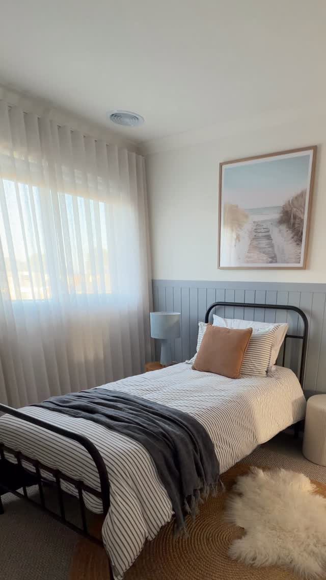
Splitting the wall at chair-rail height lets you use two finishes without either one overwhelming the room.
Gray wainscoting grounds the bed while the white upper half keeps the ceiling feeling high; swap in wallpaper on top and you get pattern at a distance where it doesn’t crowd your sleep space.
A shelf running the length of the divide turns the break into display space for small frames or a clock you can see from the pillow.
Paint the lower section in something that hides scuffs; the top half sees less contact and can take something lighter or more interesting. I’d use this in a narrow bedroom where full-wall pattern would close the walls in.
7. Deep Green Accent Wall
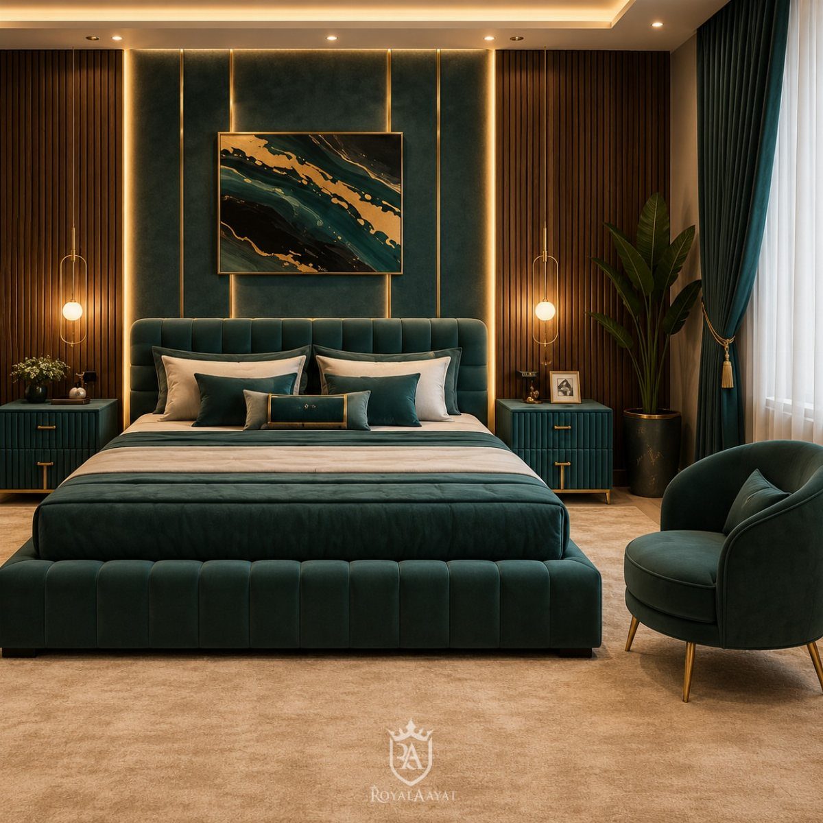
Deep green reads as expensive even on a budget. A shade between forest and teal works for a bedroom: dark enough to sleep against but lively enough to wake up to.
A panel treatment like this one costs more than flat paint but less than full millwork.
The vertical slats add shadow lines that shift through the day, so the wall never looks flat even under a single ceiling fixture. I would prime and paint the boards before installation; cutting in between slats afterward wastes a weekend.
This color suits north-facing rooms especially.
It holds its depth instead of going muddy where light is scarce. Pair it with brass or black metal, never chrome.
8. Minty-Blue Accent Wall
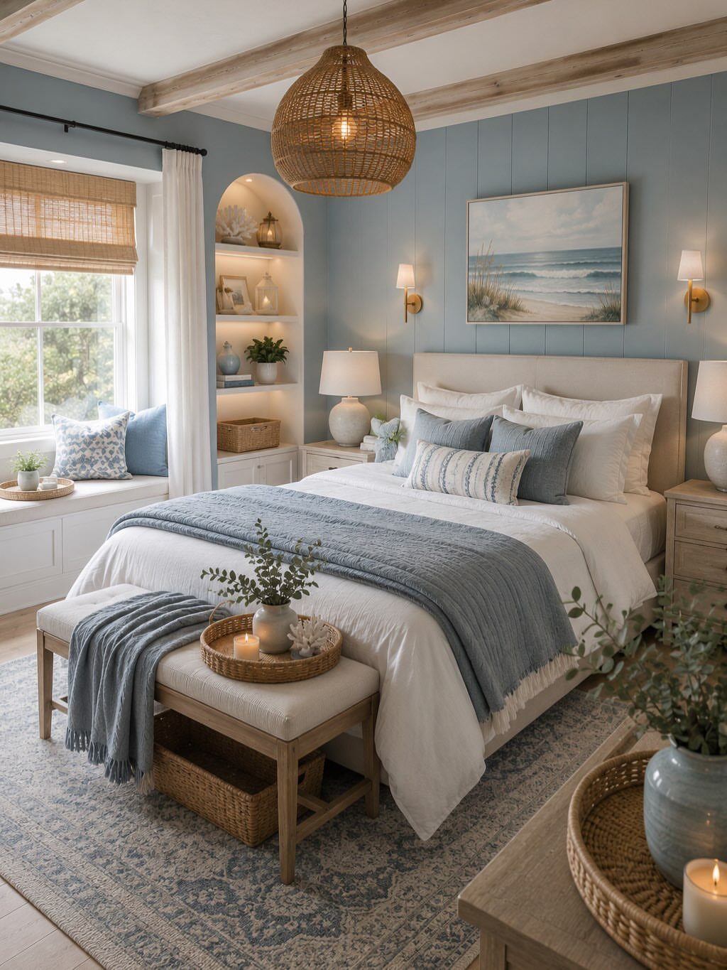
Minty-blue works because it borrows from coastal palettes without requiring rope, driftwood, or any of the usual beach-house props. The paneling here is simple shiplap run vertically, which feels newer than the horizontal version every rental bathroom already has.
The tone matters more than the material.
Too green and it goes institutional; too gray and it disappears into the wall. I look for a sample that still reads blue in late afternoon light, when windows face away from the sun.
White bedding and natural wood keep the room from feeling themed. One woven pendant or a single rattan nightstand is enough texture; more than that, and the room starts selling seashells.
9. Navy Blue Geometric Feature Wall
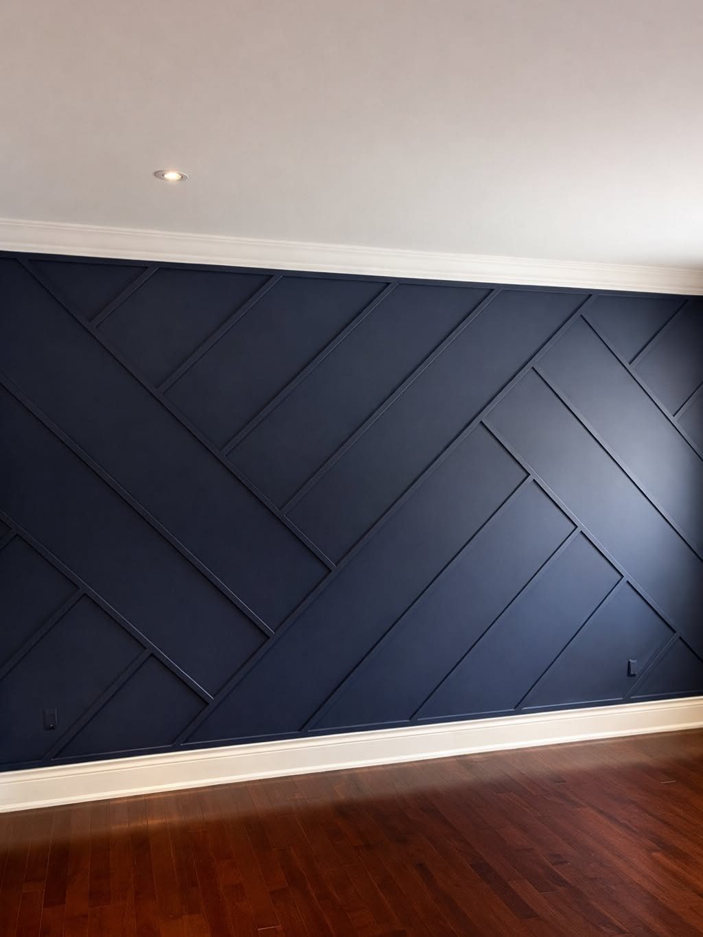
Navy with raised geometry looks like a long project but comes together fast with painter’s tape and a steady hand.
The base coat goes on first, then 1×2 or 1×3 trim gets cut to the pattern, attached with adhesive and finish nails, and painted to match.
Diagonal lines catch light differently than a grid, so the wall changes as you move through the room.
I would lay out the full pattern on the floor before cutting anything.
The angles have to meet cleanly at intersections or the whole thing looks off. A laser level helps, but a chalk line and patience work fine.
This wall wants simple furniture. Keep the bed and side tables low and quiet; anything ornate fights the geometry.
10. Rich Terracotta Wall
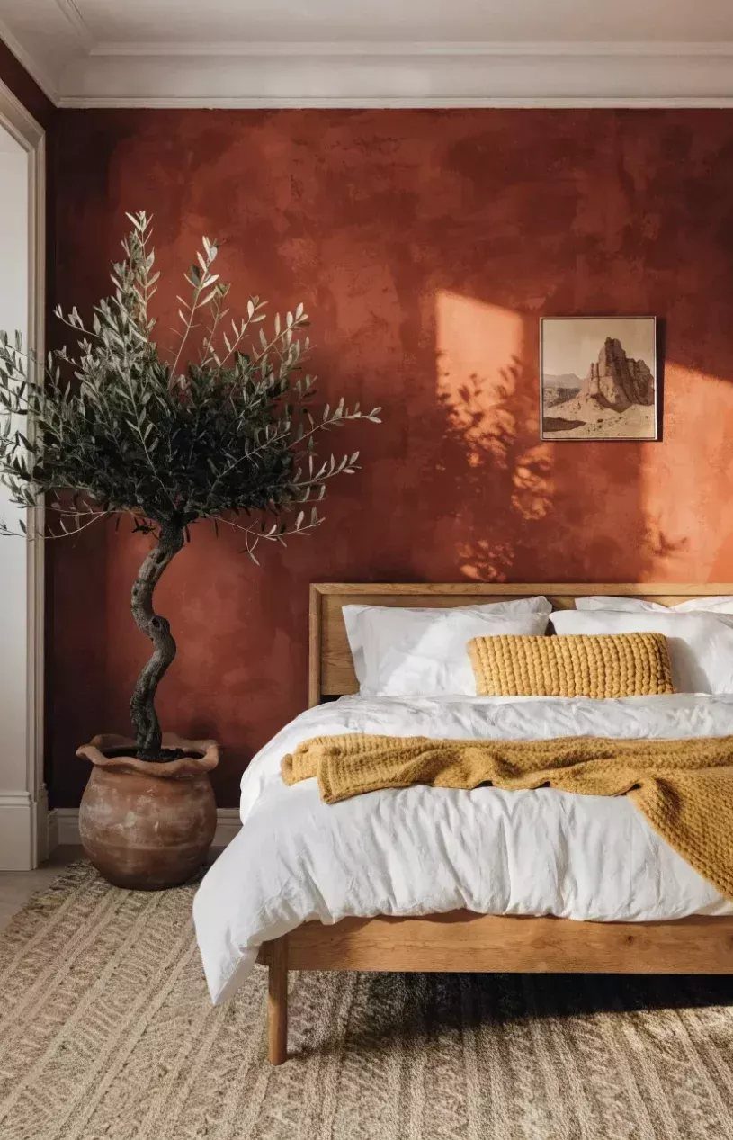
Terracotta carries warmth that beige lost somewhere in the last decade.
The texture visible here matters as much as the color; smooth paint in this tone can read like a gymnasium. A limewash or heavily rolled application gives the variation that makes it feel lived-in.
Warm clay tones pair with living green better than bright white does; an olive tree in a simple pot carries the whole room.
Terracotta leans toward the Mediterranean, and a few natural elements keep it from going too rustic or too slick. I would add one plant, one wood piece, and stop.
This color demands good light.
In a room with a single small window, it can feel like a cave. Test it on the wall for a full day before committing; morning sun and evening lamplight change it completely.
11. Floral Wallpaper
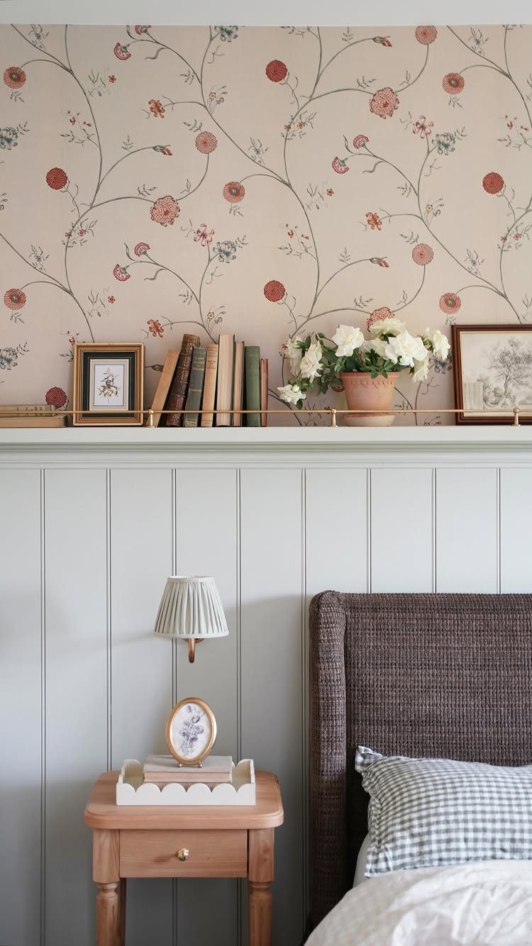
Floral wallpaper above wainscoting solves the problem of pattern overwhelming a small bedroom. The chair rail or shelf line breaks the print into a band the eye can handle, and the solid paneling below anchors the room.
The specific flowers matter less than the scale.
Large blooms in a small room feel like a mural; tiny repeats read as texture from across the room. I would hold a sample at headboard distance to judge.
Peel-and-stick wallpaper removes clean, which matters for renters, and costs far less than the traditional kind. A narrow ledge for books or a single plant, painted to match the trim, disappears into the wall.
12. Gallery Wall
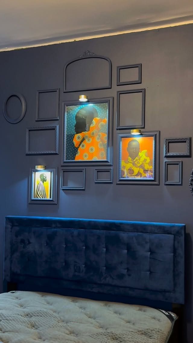
A gallery wall over a dark headboard works because the frames float instead of sinking.
Navy or charcoal behind black frames reads as intentional, not muddy. Spacing matters: too tight and the frames read as one blob, too loose and they look scattered.
I start with the center frame at eye level from the bed, then build outward in a rough rectangle rather than a strict grid. Empty frames break the rhythm and let you add later without rehanging everything.
Picture lights are a splurge. If the budget is tight, a ceiling spotlight or a well-placed floor lamp gives the same effect for the cost of a bulb.
13. Board and Batten Accent Wall
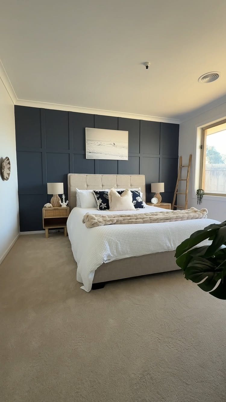
Board and batten turns flat drywall into something that reads intentional, not improvised. The grid of vertical battens and horizontal boards catches light at different angles, so the wall changes slightly as morning moves to afternoon.
Half-height batten, roughly chair-rail height, keeps a classic feel and works in almost any room.
The trim itself hides minor wall flaws, so this is a forgiving project if your drywall is not perfect. Paint everything one color for a quieter look, or use a darker shade on the grid to push the pattern forward.
14. Ombre Wall
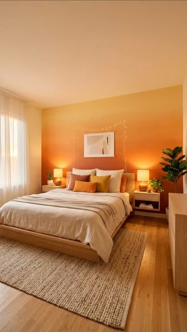
An ombre wall moves from one color to another in a single, continuous blend rather than a hard line. The effect reads as color doing something, not color sitting still.
A warm ombre, orange into yellow with the darker tone low, keeps the gradient from floating away. That grounding placement is the safer choice; putting the darker shade up high can make a ceiling feel lower than it is.
2 paint colors are enough, mixed in graduated ratios on a single tray. Work in sections while the paint stays wet, or the blend sets with a visible seam.
This takes longer than a solid wall, expect most of a weekend, and the first attempt might need a redo.
A wall finished this way does not look like it came straight from a paint can. I’d save this for a room where you want one strong gesture and the rest stays quiet.
15. Floor-to-Ceiling Drapes
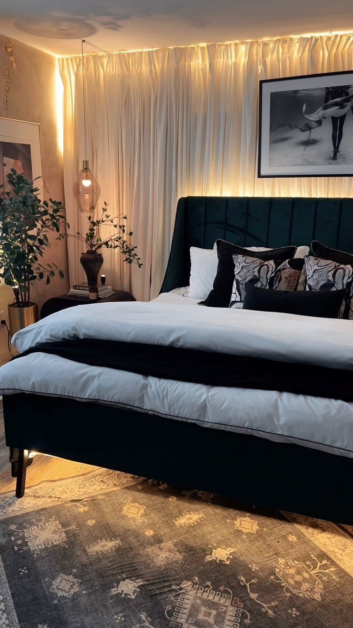
Floor-to-ceiling drapes frame the bed the way a headboard never could, softening the whole wall instead of anchoring one point. Sheer white panels with hidden cove lighting behind them turn into a glowing plane after dark.
Mount the rod at ceiling height, not window height, and extend it past the frame on both sides so the fabric stacks clear of the glass when open.
The extra width also makes the window read larger than it is. For the pooled look, order panels long enough to puddle on the floor; hold them up and mark where the break looks right before you buy.
This works best when you already have the hardware budget; quality rods at that span run higher than the fabric.
Choosing the Right Wall
The wall your eyes find first when you step into the bedroom is usually the right one, not just wherever the bed ended up.
If your headboard wall breaks up with a window or closet door, look for genuine architectural weight. A fireplace, built-ins, or the wall you face sitting up in bed can carry the treatment instead.
“Bedroom accent walls serve a unique purpose, drawing attention to the bed, nightstands, and lamps—those essential elements that make a tranquil, beautifully designed retreat,” says Amy Kartheiser of Amy Kartheiser Design in Chicago.
Color Selection Tips
The mood you want should drive the shade, not the other way around.
Darker colors add coziness without shrinking the room if you place them right. Deep blues, blacks, reds, and greens create a base that makes bright or neutral frames stand out against it.
A dark wall works especially well when you have artwork, shelves, or mirrors to layer on top; the contrast does the highlighting for you.
A larger-feeling room starts with keeping the cooler tone on the wall that draws the eye and letting the rest stay quiet. The accent wall is where dimension lives; the other walls should step back and let it.
Accent Wall Trends
Wallpaper has come back hard, though its popularity has driven prices up. That makes a single accent wall both an aesthetic and economical choice; you get the pattern without papering the whole room.
Texture matters in 2026 more than it has in recent years; smooth painted drywall alone reads as unfinished now.
DIY Vs. Professional Help
Paint, peel-and-stick wallpaper, and basic molding grids need patience more than skill.
Some treatments call for professional hands. Real brick veneer over drywall, built-in lighting runs, and any electrical relocation, moving outlets or junction boxes behind new paneling, need permits and a licensed person.
Floor-to-ceiling drapes at span width need quality rods installed into studs or proper anchors; a sagging rod up high ruins the whole effect.
I’d hire out anything involving structural reinforcement or hidden wiring. The trim and paint you can handle on a weekend if your walls are smooth and your cuts are measured twice.
Frequently Asked Questions
What is a good accent color for a bedroom wall?
Deep greens, blues, and warm terracotta all work well because they add depth without closing the room in. I like deep green especially for north-facing rooms, since it keeps its richness where weaker light would wash paler colors out.
Navy with raised geometry or terracotta with limewash texture both read as intentional rather than like a single coat of bright paint.
What are some good ideas for bedroom accent walls in 2026?
Texture is the thread running through this year: brick veneer, vertical wood slats, limewash, and raised geometric trim all add physical surface rather than flat color.
Wallpaper has swung back strong, which makes an accent wall a practical way to use it without papering the whole room. Floor-to-ceiling drapes and oversized single art pieces are also holding their place.
Are accent walls out of style for 2026?
No, but the approach has shifted. A single wall of bright paint reads dated now; the current version uses texture, pattern, or contrast in material to add actual dimension.
Think board and batten, slatted wood, limewash, or wallpaper with physical presence rather than just a different color on flat drywall.





