
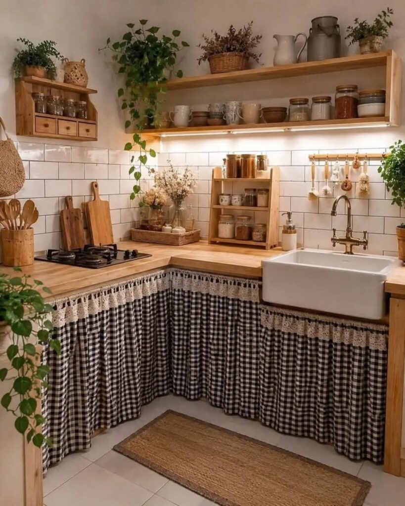
These ideas run from a single ceramic sconce over the sink to a full checkerboard floor, with most landing in a weekend and a budget that fits a rental security deposit.
The right pick depends on whether your kitchen faces the morning sun or needs a grow light to keep herbs alive.
A white apron front sink in fireclay starts around $700, but three terracotta pots on a windowsill cost far less and still carry the same farmhouse weight.
1. Ceramic Lighting Fixtures
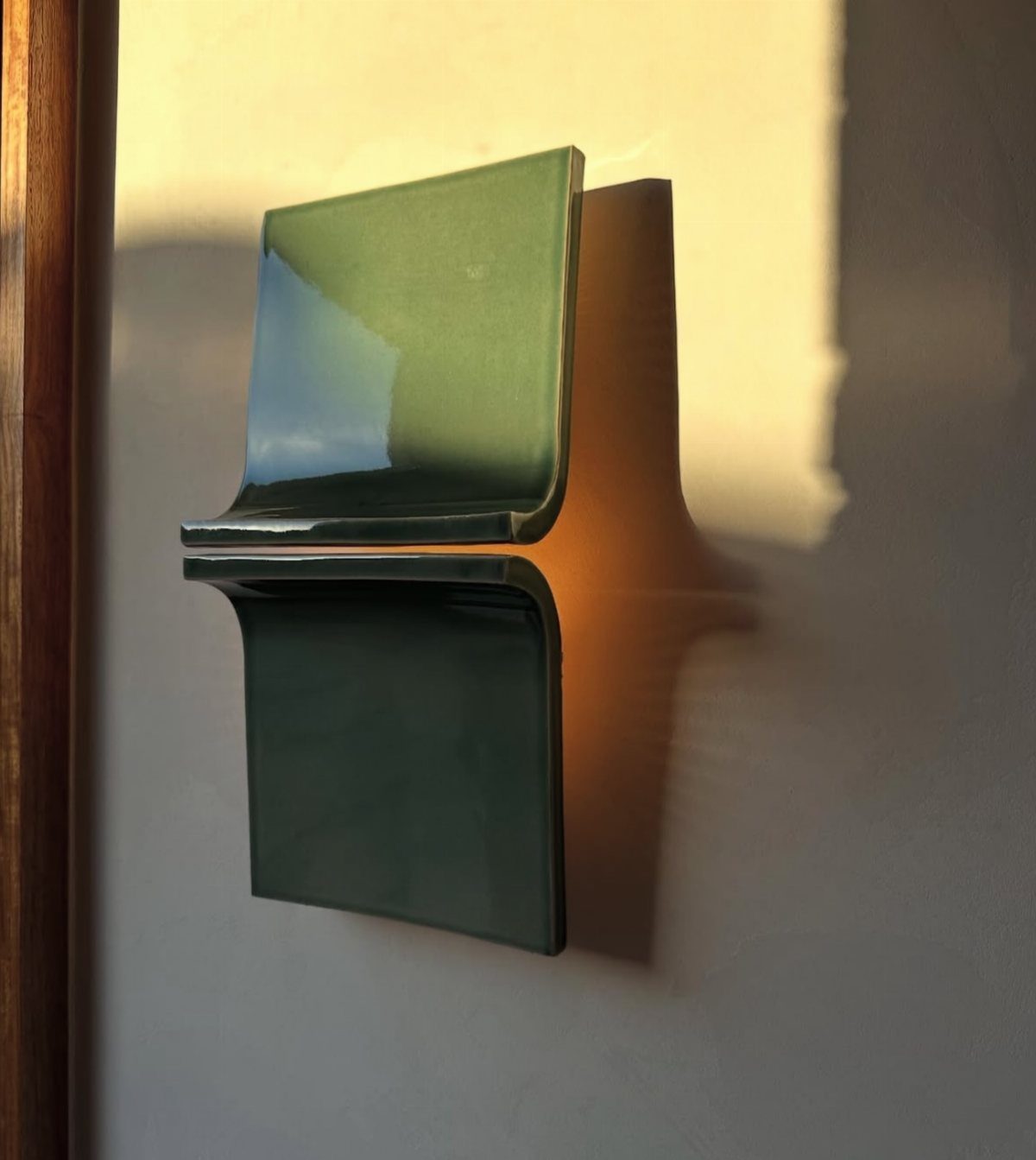
A ceramic wall sconce in folded sage green brings back the schoolhouse fixtures that hung in every country kitchen before recessed lighting took over. The glaze catches morning sun and softens after dark in a way painted metal never does.
Vintage-style pendants or schoolhouse lights work best when they echo something else in the room: cabinet hardware, a tile color, the tone of your wood floors.
I look for one detail that ties them in so they feel found rather than bought.
If your kitchen runs small, one ceramic sconce over the sink does the job without crowding the ceiling. In a larger space, a row of three pendants at 30-inch spacing over an island keeps the rhythm human.
2. Open Shelving
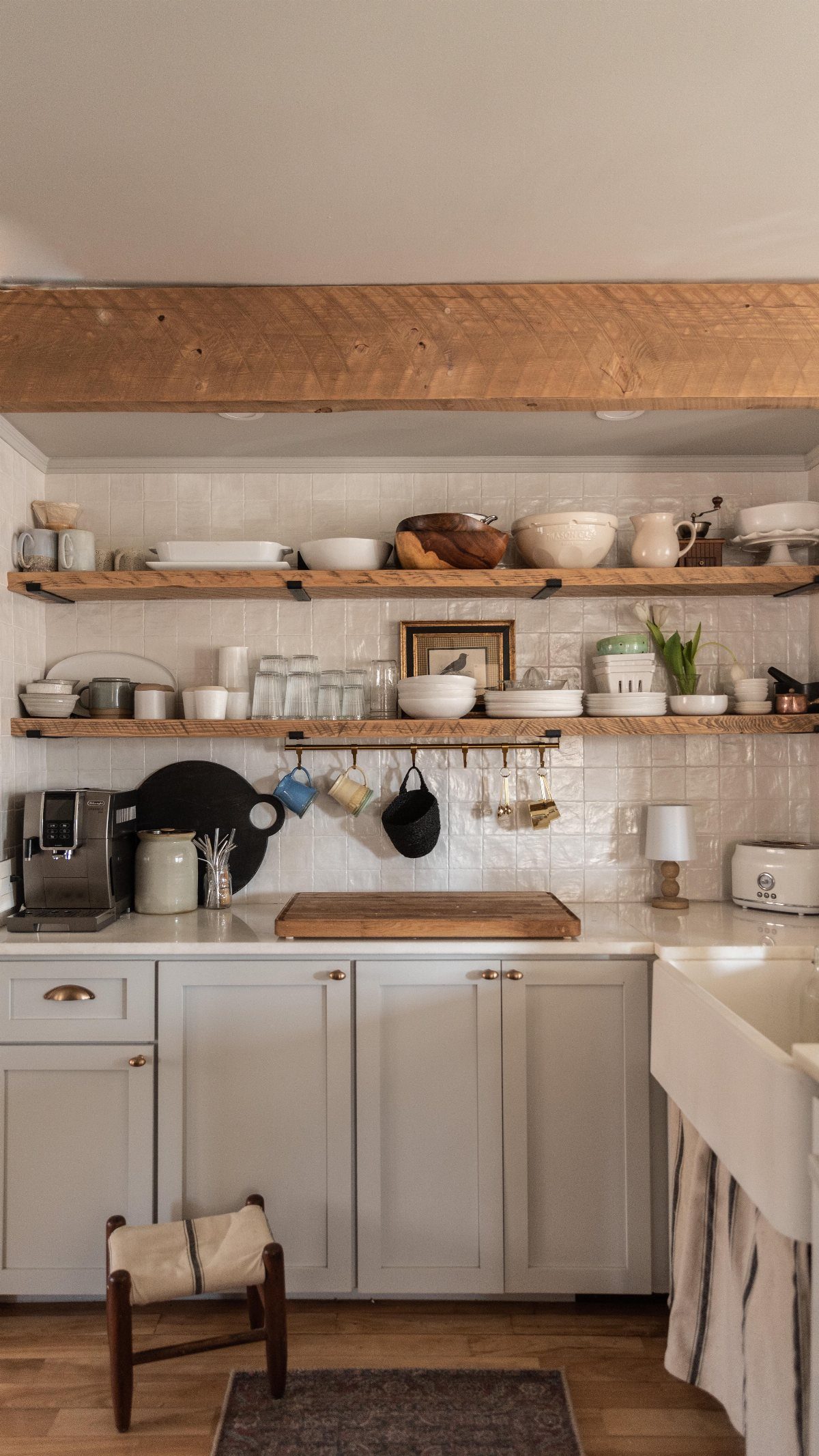
Two thick floating shelves in white oak, ten to twelve inches deep and anchored straight into studs, hold the dishes you actually want to see.
Depth matters more than anything: a shelf too narrow leaves plates hanging past the edge, and one too deep turns the wall into a bulky mass.
I finish these in a wipeable satin topcoat because grease travels in kitchens, and open shelving is not the place for oil-based poly that yellows.
The airy feel disappears fast if you’re cramming.
3. Functional Decor

Pressed glass goblets that flip to hold candles are the kind of thing that earns its shelf space twice.
The diamond pattern catches light whether the cup is upright or inverted, and the weight of good glass feels better in hand than thin reproduction stuff.
I look for functional decor that does a real job: a pepper grinder that sits out because the wood grain is worth seeing, a crock that holds utensils and saves a drawer, a wooden cutting board that leans against the backsplash when not in use.
The line between styled and cluttered runs thin here. Three useful things grouped read as intentional; seven read as storage failure.
4. Apron Front Farmhouse Sink
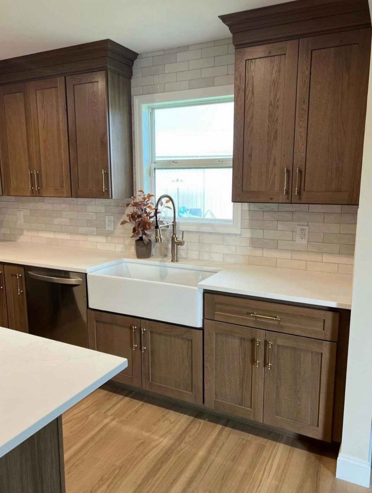
A white apron front sink in fireclay or stainless steel changes how the whole kitchen feels before you touch a cabinet.
The front edge gives you more reach and less strain when you’re scrubbing sheet pans at the end of a long cook.
Stainless runs $700 to $1,500, holds up to kids, and suits rentals where you can’t rebuild support. I’ve seen black farmhouse sinks in white kitchens that set a completely different tone than white ones; the sink really does drive the rest.
A bridge faucet pairs well here. The two-handle setup keeps the look period without going costume.
5. Farmhouse Table
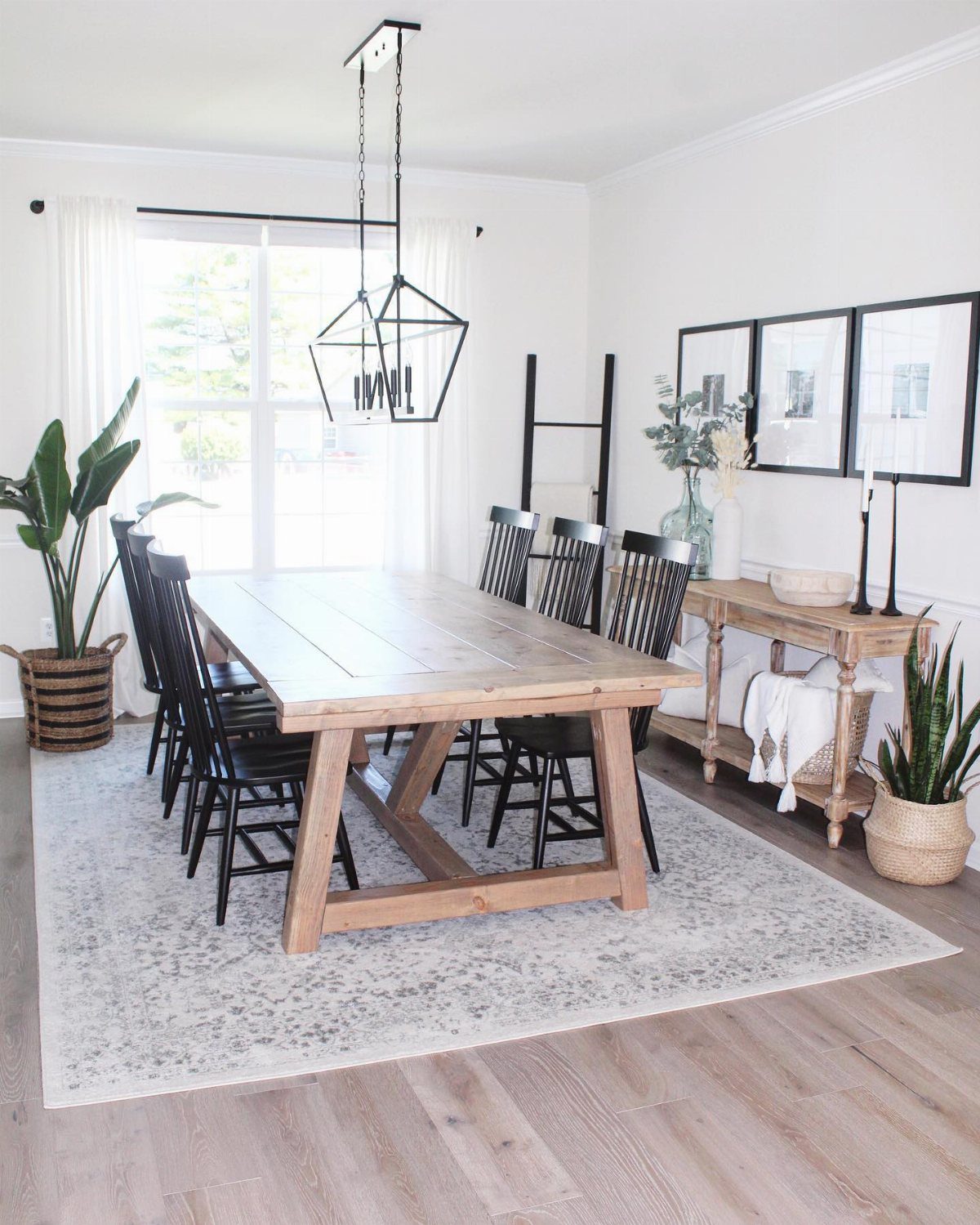
A freestanding wood table with an X-frame base gives a kitchen soul even when you already own an island.
People sit down at a table differently; they stay longer, and the room starts to feel like the center of a house instead of a prep station.
Harder woods and wipeable finishes suit daily family dinner. Rougher pine works if the table sees mostly weekend use.
The table should invite movement, not block it.
6. Vintage Accessories
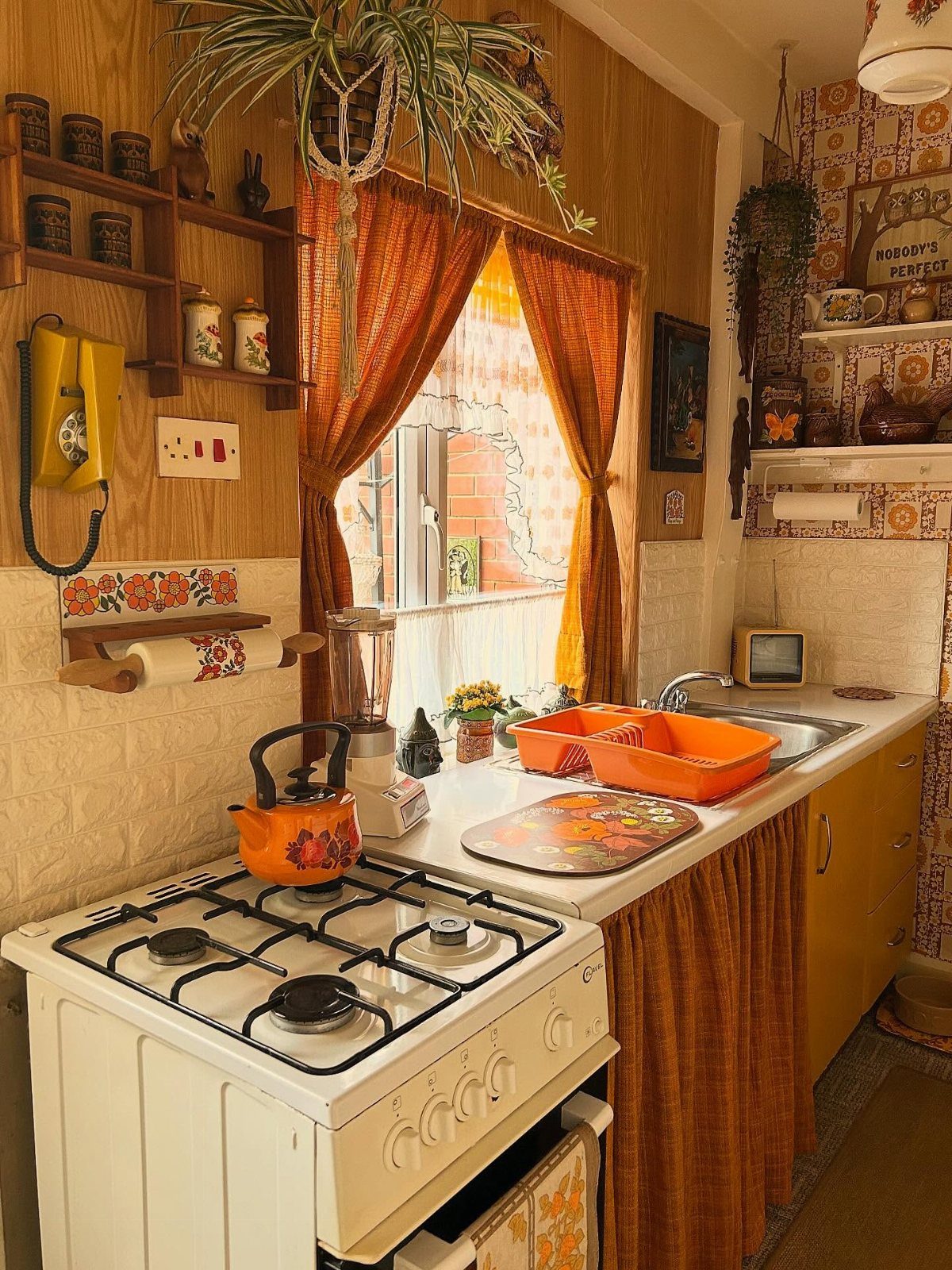
Thrifted stoneware, a chippy wood scale, an old telephone in butter yellow: these are the details that keep a farmhouse kitchen from reading as a catalog spread.
The best vintage accessories carry the wear of actual use, not the uniform distressing of factory reproduction.
I look for flatweave or low-pile rug runners in front of the sink; they soften the floor and add color without trapping crumbs like high pile does.
A faded Persian-style pattern feels right against simple cabinetry because the worn surface matches a room that’s supposed to look lived in.
7. Natural Wood Elements
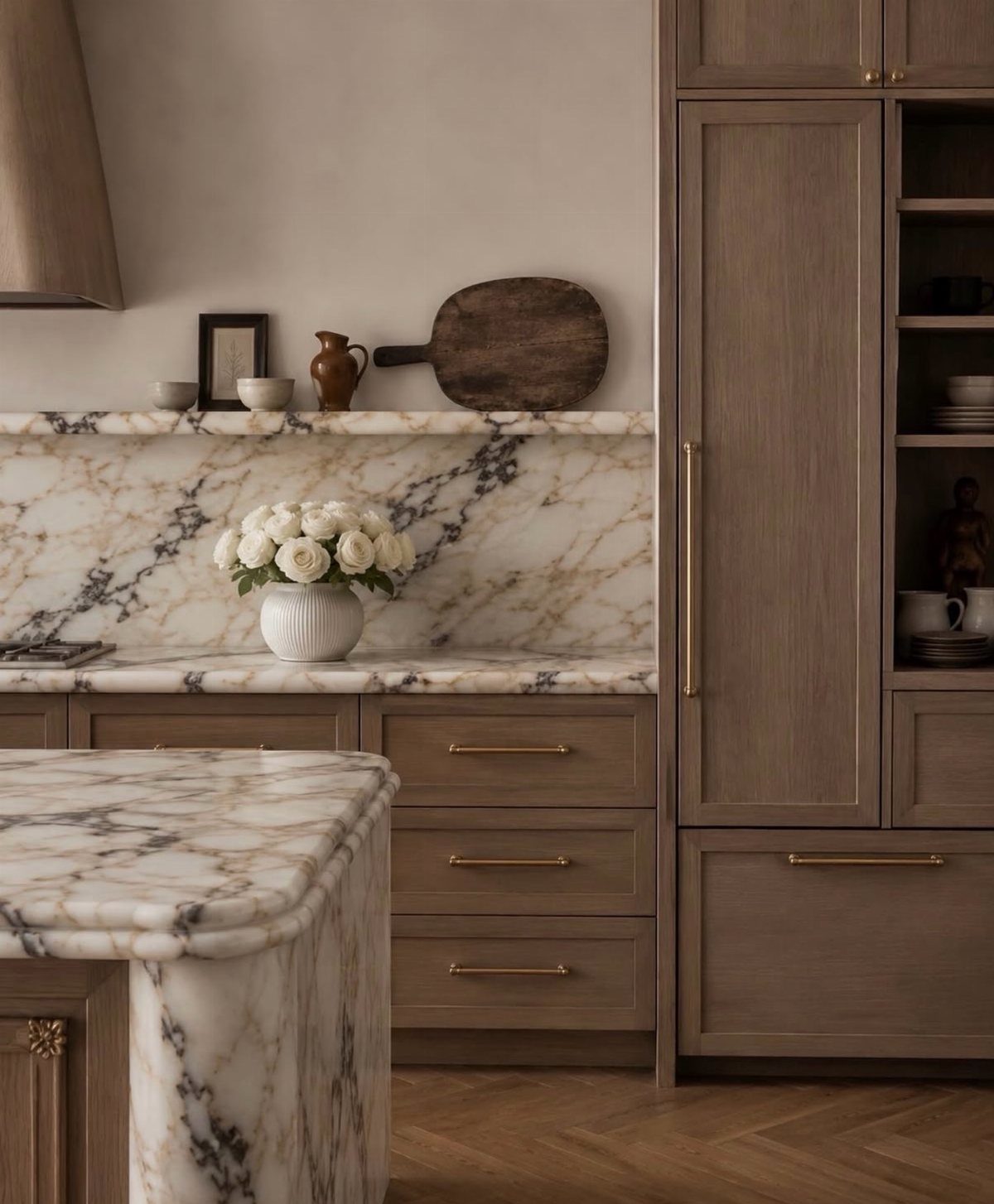
Light wood cabinetry with gold hardware carries the whole room without shouting for attention. Natural wood elements work because the grain itself adds texture without extra ornament.
I would start with one timber feature rather than committing to every surface. A pine ceiling plank, rough oak flooring in a warm stain, or even a single pantry cupboard in visible grain adds warmth that paint cannot replicate.
The variation between boards, the knots and the tone shifts, guarantee the kitchen does not look catalog-ordered.
Concrete countertops or marble with heavy veining pair well because they stay cool and smooth against the wood’s texture.
If your existing cabinets are painted, open shelving in a matching timber is a smaller project that still brings in the material. Keep the finish matte or lightly oiled so the grain stays readable.
8. Shiplap Walls
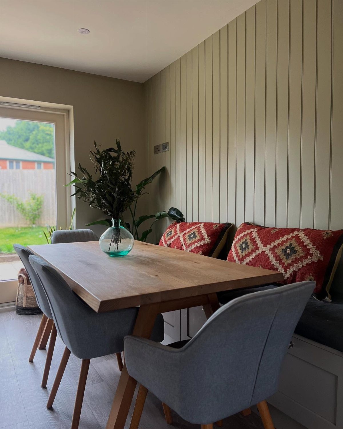
Vertical paneling behind a breakfast nook or on a dry accent wall reads as farmhouse without the maintenance headache of a full backsplash application. Shiplap reads cleaner in dining areas than behind a range, where grease settles into every seam.
Shiplap grooves collect grease and dust where cooking splatter hits, so I would keep it away from the stove and sink. Near water, pick boards rated for moisture and top them with scrubbable enamel.
A shallow board profile cleans easier than deep grooves; unsealed shiplap behind a stove collects grease that never fully washes out.
For a kitchen with heavy splash zones, painted wood paneling or tile behind the range protects better while the shiplap lives on a wall that stays dry. The rustic backdrop still arrives; it just arrives where it can last.
9. Farmhouse Decor Accessories
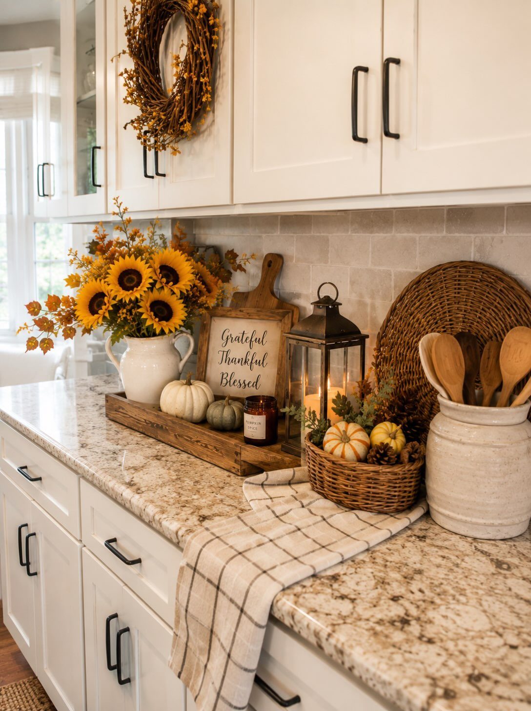
Farmhouse accessories avoid clutter when they share scale and season; mix a pitcher, small produce, a wooden tray, and one lantern in similar sizes and the grouping holds together.
That is the trick with farmhouse accessories: restraint in number, coherence in theme.
Wicker baskets, terracotta pots, and vintage jars work the same way. One or two on the counter, a cluster on an open shelf, and the kitchen feels collected rather than decorated.
I rotate mine with the season so the same spots stay interesting without new purchases.
The slightly imperfect, handcrafted quality matters more than the specific item. A crock holding wooden utensils, a basket corralling onions, a jar that actually stores flour: these earn their place because they function.
The best accessories in this style look like they were found gradually and kept because they were useful.
10. Rustic Lighting
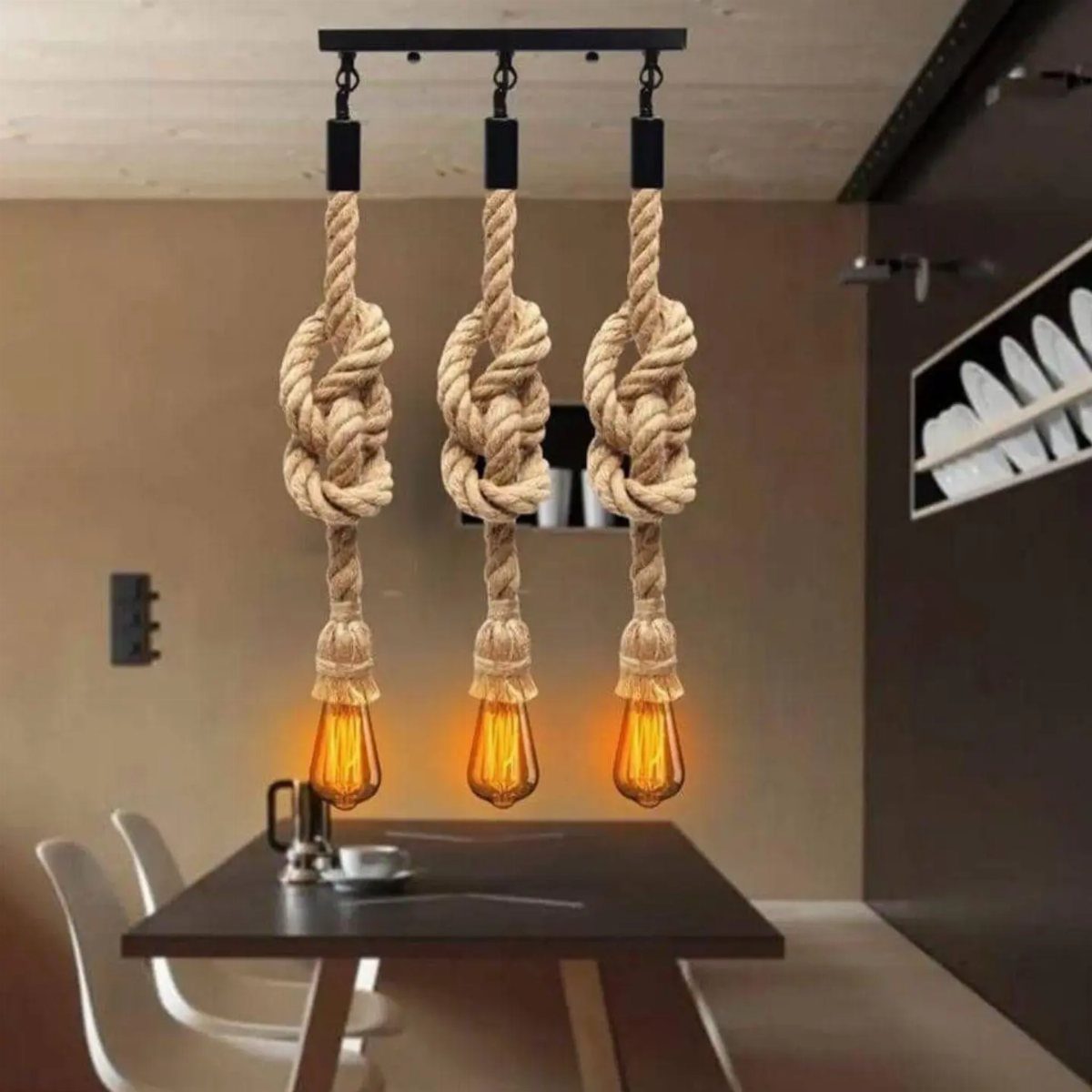
Thick rope cords and Edison bulbs cast warm, low light that flatters a dinner table and slows the evening down. Rustic lighting works in a farmhouse kitchen because it lowers the formality without dimming the room to uselessness.
Metal fixtures in black, bronze, or aged brass hold up to kitchen humidity better than bare wood. Vintage-style bulbs throw a warm tone that flatters food and faces; standard LEDs often read too cool against natural materials.
A dimmer switch is worth the extra wiring if you use the kitchen for evening meals. Full brightness for prep, low glow for sitting.
I would hang pendants 30 to 36 inches above a table surface, or higher if people walk underneath. Rope carries a rough, coastal texture; leather pendants or simple iron chains hit the same rustic note with a cleaner line.
11. Vintage Rugs
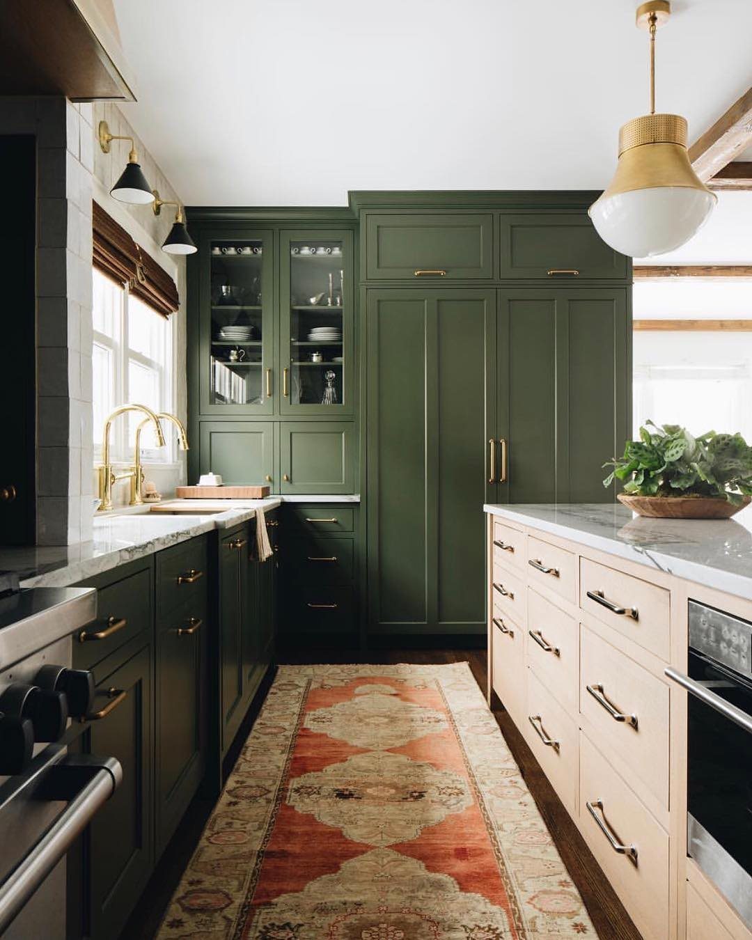
A patterned runner in terracotta and cream between dark green cabinets softens the floor and gives the eye somewhere to rest.
Vintage rugs in a kitchen work best when they are flatweave or low-pile; high pile traps crumbs and stains fast.
The worn pattern of a faded Persian or kilim-style runner suits farmhouse kitchens because it already looks lived in. It does not compete with simple cabinetry.
I always add a rug pad with real grip; a runner that slides near the sink is a hazard, not a style choice.
Budget versions exist but the color depth and genuine wear pattern are harder to fake. A narrow runner in front of the sink also saves your feet during long stretches of standing.
Define the work zone, add warmth underfoot, and the room feels finished in a way bare floors do not.
12. Farmhouse Decor Signs
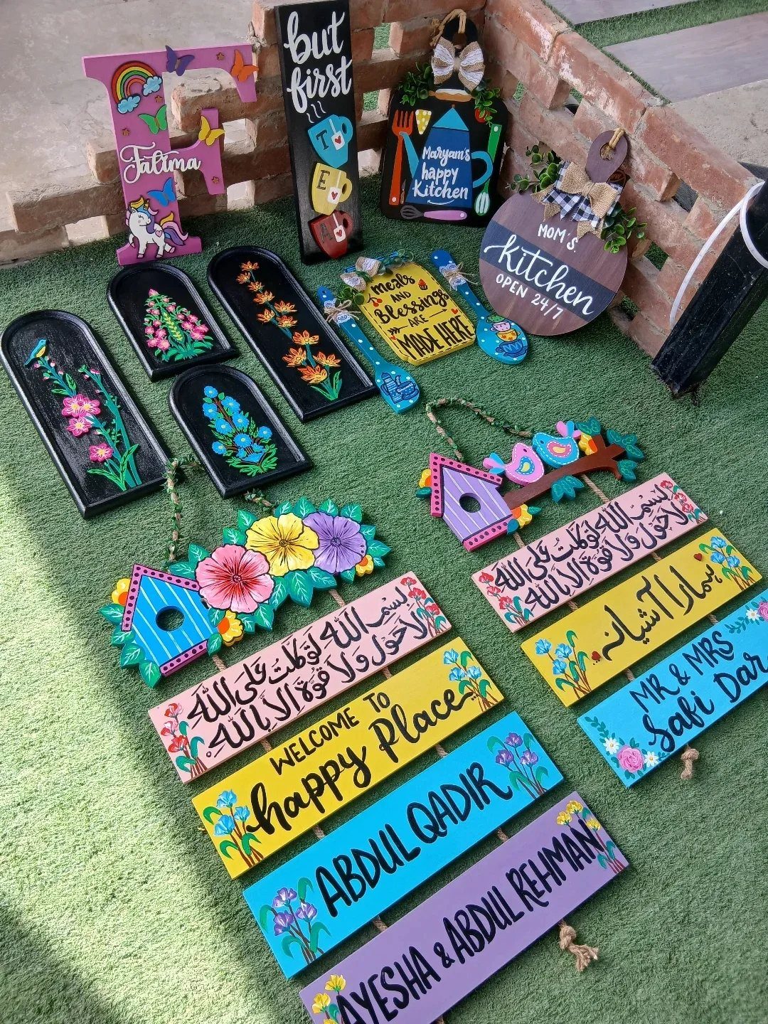
Hand-painted wooden signs with farm themes or short phrases lean into the personality side of farmhouse style. Bright, varied signs that look collected rather than matched keep the charm from tipping into theme-park territory.
I would hang one or two on a wall that needs something, or prop a smaller sign on a shelf among functional items.
A sign alone on a blank wall can read as an apology for not knowing what to put there; mixed in with cutting boards, plants, or crockery, it reads as part of a story.
The messages matter less than the paint handling. Slightly imperfect lettering, visible brush marks, and colors that have faded a little all feel more authentic than crisp vinyl on new wood.
If you buy new, look for the handmade marks; if you make your own, stop before the edges get too clean.
13. Cottagecore Elements
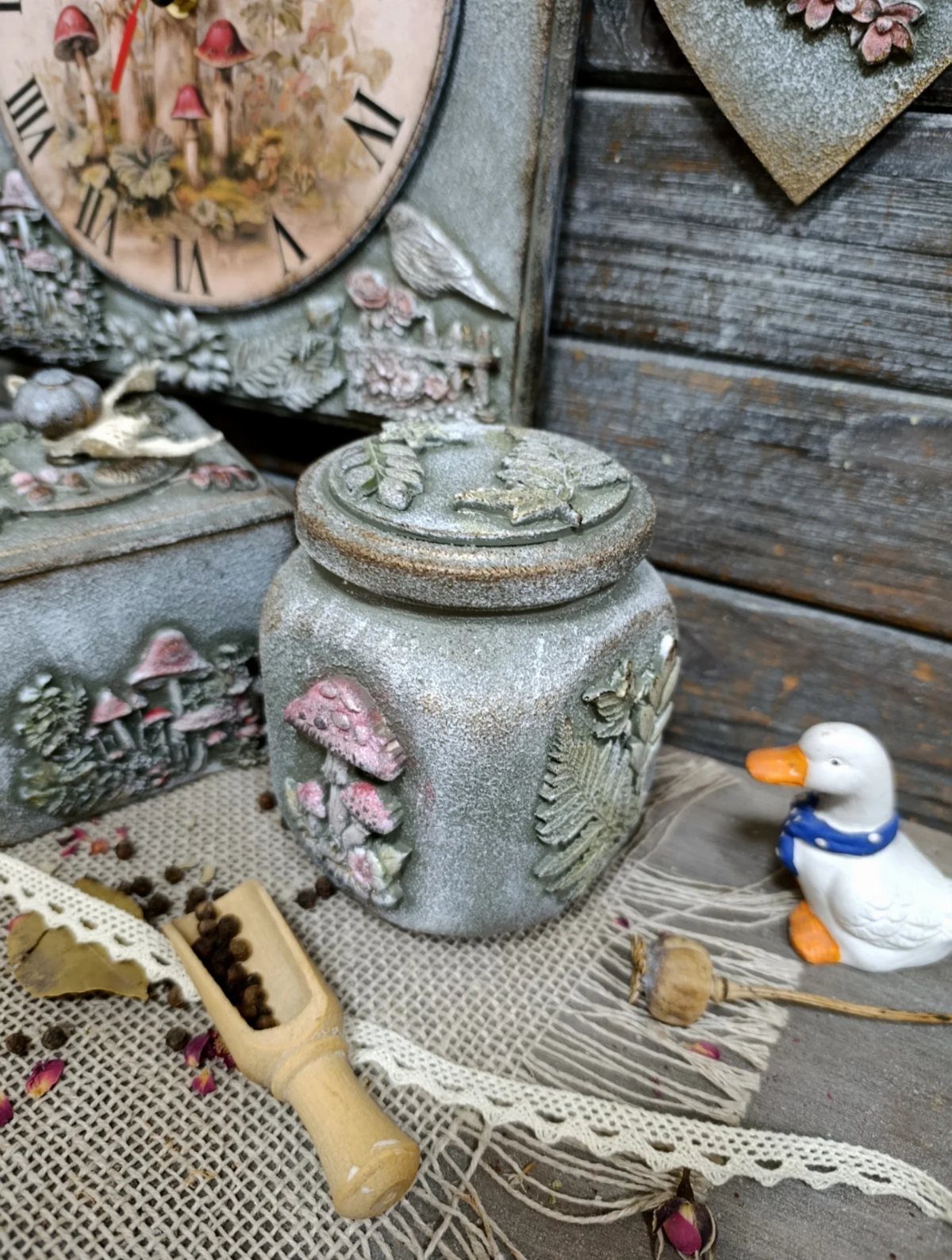
Cottagecore leans into the softer side of farmhouse style, where floral dishes and textured ceramics feel at home on open shelves.
Handmade decoupage and dimensional detailing, especially in vintage-inspired natural forms like mushrooms or botanicals, add the kind of cottagecore texture that factory pieces miss.
Layered neutrals help the whimsy land rather than overwhelm; too many competing prints and the kitchen turns into a curiosity shop. I’d keep the palette tight, maybe cream and sage, and let one or two pieces carry the story.
Best for renters or first-home owners who want personality without a gut renovation, and who can swap items seasonally.
14. Farmhouse Style Backsplash
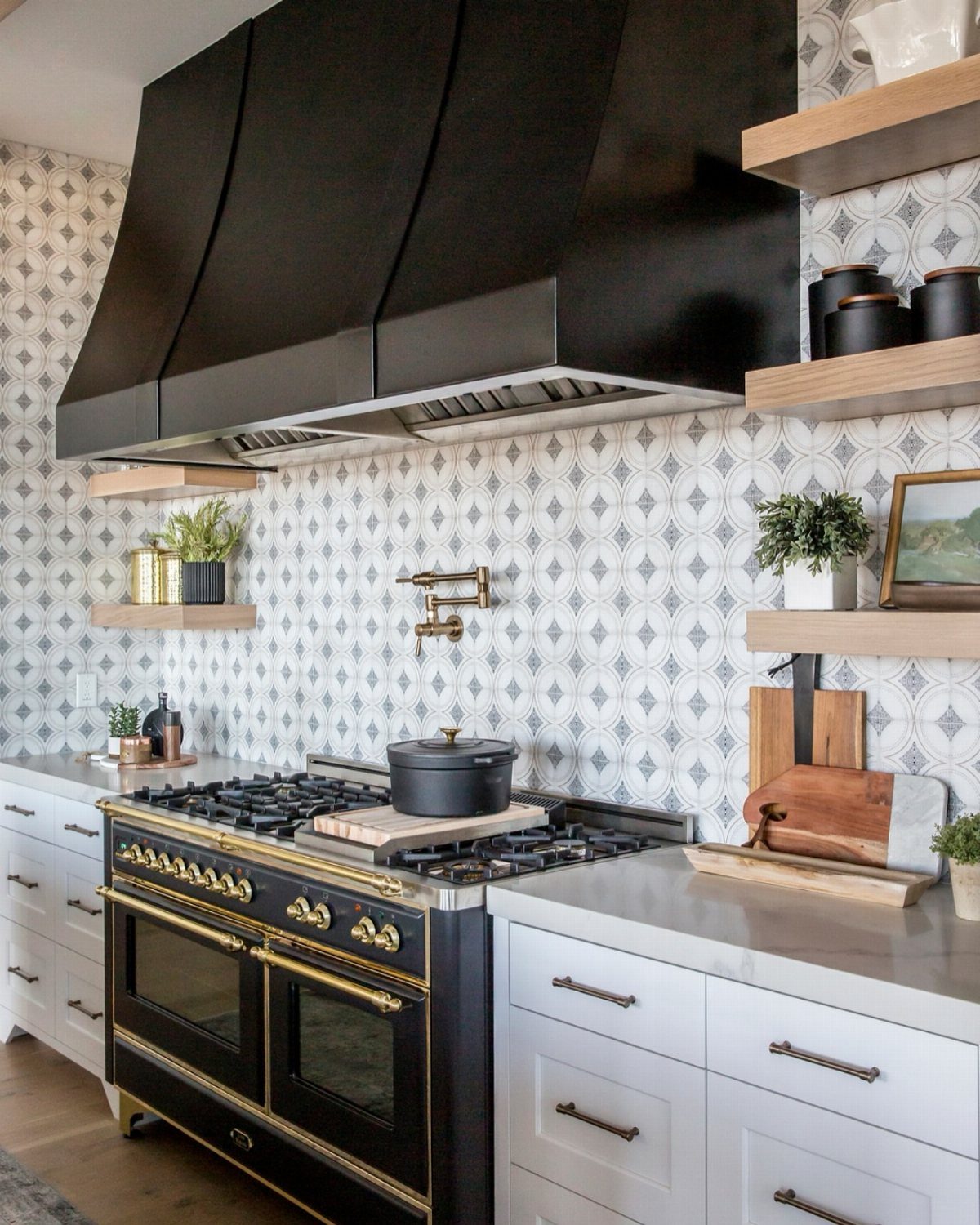
A patterned tile backsplash above the range carries more visual weight than most people expect; that single strip decides whether a farmhouse kitchen commits or plays it safe.
Subway tile stays the reliable default: white or soft grey, stacked or offset, grout matched close so the lines stay quiet. Shiplap behind a cooktop is riskier than most people expect.
Deep grooves catch grease and moisture; if the boards aren’t sealed properly, the cleanup turns ugly fast. For a dry wall or breakfast nook, moisture-resistant boards with scrubbable enamel paint work, but keep the profile shallow.
Behind the range itself, I’d still choose tile or a painted panel.
15. Mixing Textures
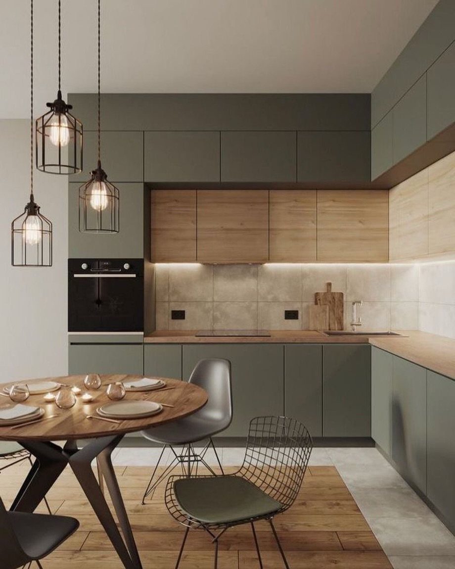
Two wood tones that do not match, like olive cabinets against pale wood uppers, keep a kitchen from flattening out.
Metal enters through wire mesh chair backs or a matte black pendant; fabric might be a linen curtain or a worn cotton runner on the counter. The rule is simpler than it sounds: every surface shouldn’t share the same temperature.
All warm wood reads as a cabin; all cool metal reads as industrial. One or two deliberate contrasts, held to a limited palette, do more than scattering textures at random.
Start with the biggest planes, cabinets and counters, and build outward.
16. Seasonal Decor
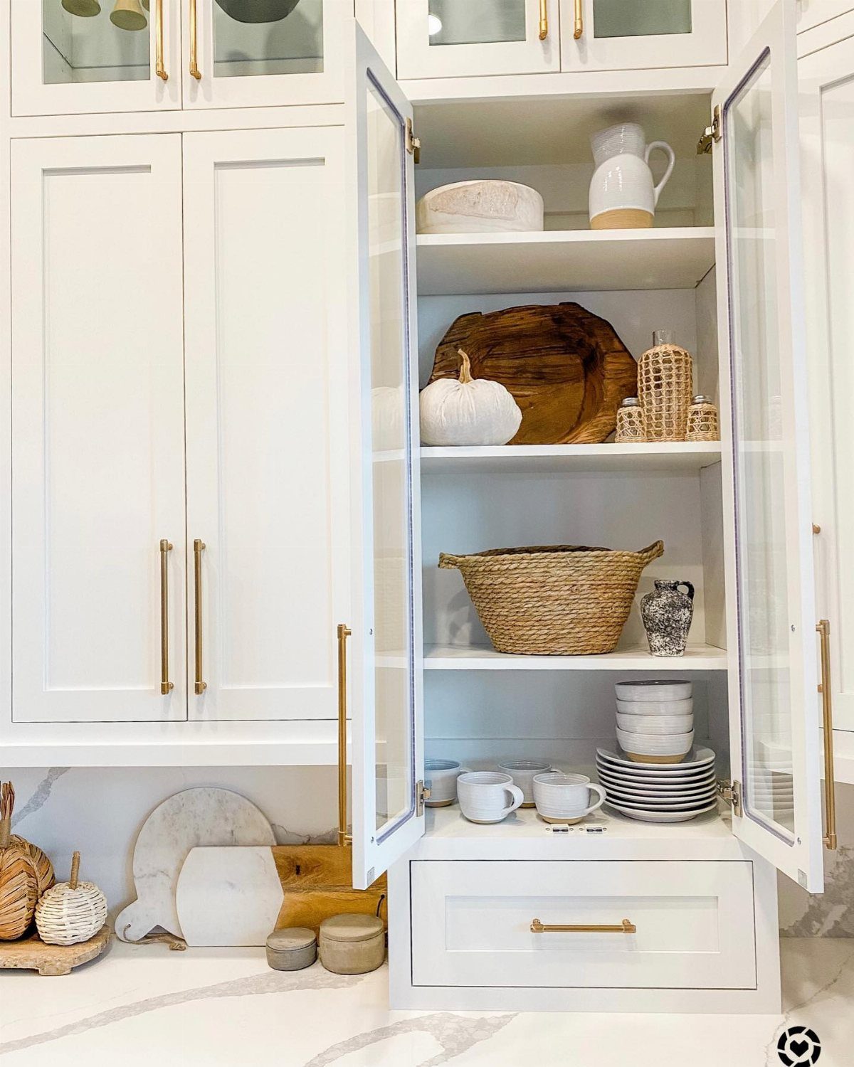
A white pumpkin on open shelving in September, a sprig of dried lavender in July, a bowl of river stones in January: seasonal shifts keep a farmhouse kitchen from feeling staged rather than lived in.
Glass-front cabinets make seasonal swaps visible, which is the point of rotating decor. Natural elements age out gracefully; plastic harvest decorations do not.
I change three to five items per turn, enough to register, not enough to store a warehouse. The best spots are shelves you pass daily, where the eye lands without effort.
Skip the full holiday overhaul; a single ceramic gourd or fresh herb bundle carries the season.
17. Herb Gardens
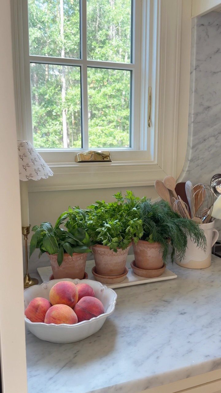
Three terracotta pots on a windowsill give you basil, thyme, and rosemary within arm’s reach of a cutting board, which is the only geometry that matters. Terracotta breathes and dries between waterings, forgiving the over-attentive owner.
A white tray underneath catches drainage and keeps the sill clean. If counter space is tight, a drawer organizer for knives and utensils frees the surface for the pots to sit where the light is.
Herbs need direct sun; a north-facing window will not sustain them. For low-light kitchens, a ledge-mounted grow light on a timer costs less than replacing dead plants twice.
18. Rustic Wall Decor
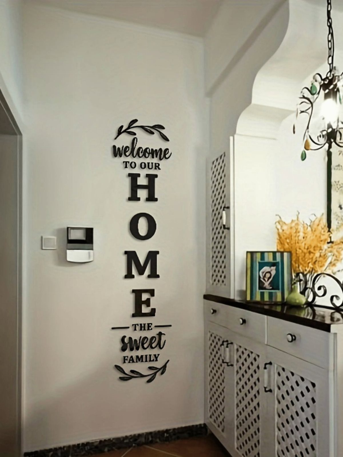
A vertical sign with mixed lettering turns a blank wall into something that reads as collected rather than bought in a set.
Vintage metal signs, framed seed packets, or a cluster of family photos in mismatched wood frames build the same effect. Uneven spacing and varied sizes keep wall groupings from looking deliberate; a grid is the opposite of farmhouse.
Exposed wood with imperfect finishes helps a wall feel grounded, not assembled by checklist. I’d start with one anchor piece, the largest, and add around it over months.
Best for a wall you face while working at the sink or island, where you’ll actually see it.
19. Natural Light
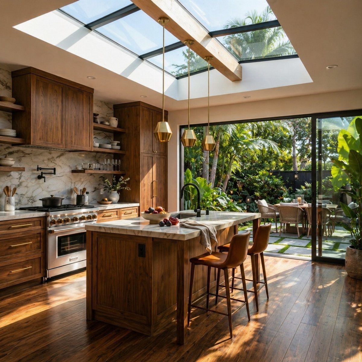
A skylight does more than brighten a room; it turns the kitchen into the place you actually want to be in the morning.
Sheer curtains on large windows keep the light soft without blocking it, and pale walls bounce that brightness into corners that fixtures never reach.
I like soft whites and warm creams for the palette, layered with natural wood so the space doesn’t go sterile.
A kitchen that faces north or sits under heavy tree cover needs a second layer of light for evening; interior cabinet lighting on its own switch does that without relying on the overheads. Even light matters more than spotlights.
20. Paint the Cabinets
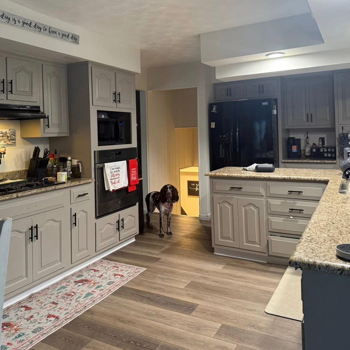
Two-tone cabinets give a kitchen depth without the cost of a full remodel. Cream on the uppers keeps the room open; charcoal on the island or lower cabinets grounds it and hides the scuffs that collect near the floor.
The balance matters. Black cabinets can swallow a room whole.
Cream with too much yellow in it looks old before its time.
Both colors need testing under the actual kitchen lighting before the brush hits the wood. Black hardware and a wood table finish the look without adding clutter.
21. Beadboard Glass Cabinets
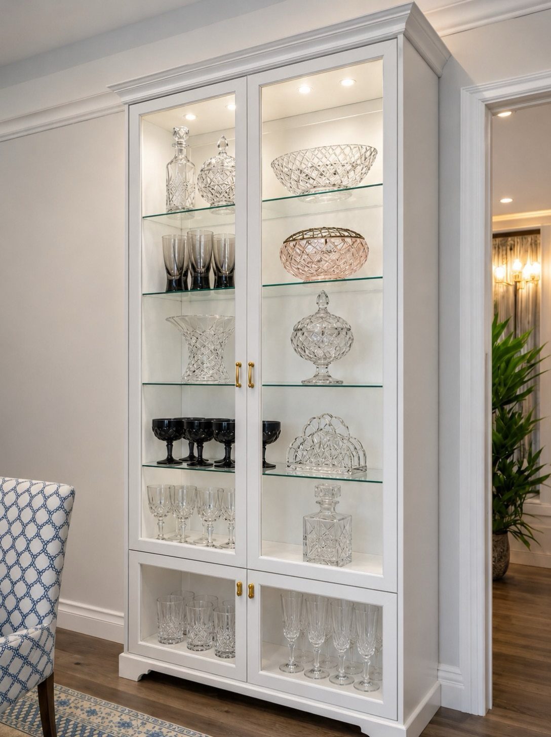
Glass front uppers with beadboard behind them add texture without the solid weight of wood doors. Glass on every upper turns the kitchen into a showroom.
The beadboard gives depth behind dishes or ironstone pieces, and interior cabinet lighting on its own switch makes the glass look intentional after dark.
One maker renewed dated cabinets using ALL-IN-ONE Paint in Oyster; the finish held up on the frames while the beadboard backing carried the farmhouse detail.
22. Butcher Block Countertops
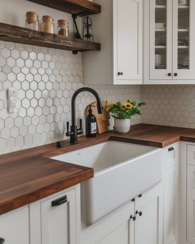
Butcher block brings warmth that stone cannot fake, especially against white cabinetry where everything else reads cold. Maple or white oak hold up better than softer woods, though the maintenance is real.
Oil them regularly, keep hot pans off, and wipe standing water promptly.
Butcher block right next to the sink will take on patina fast; that look isn’t for everyone. Wood only on the island and quartz everywhere else splits the difference without the upkeep everywhere.
That keeps the rustic feel without turning the whole kitchen into a maintenance project.
23. Colorful Accents
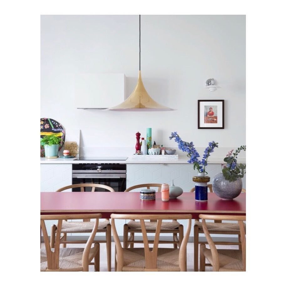
A green painted floor can carry a whole farmhouse kitchen; color that bold on the ground changes how the whole room feels.
Deep greens or blues on lower cabinets work the same way: they brighten without overwhelming, and they tie to other rooms if you carry the shade through in smaller doses.
Accents need to talk to the rest of the house, not shout over it.
One red table, a teal bowl, blue flowers: each piece needs to speak to something else in the house or the kitchen starts to feel like a separate project.
Pretty glass canisters or a textured vase for wooden utensils add color that doubles as storage.
24. Checkerboard Flooring
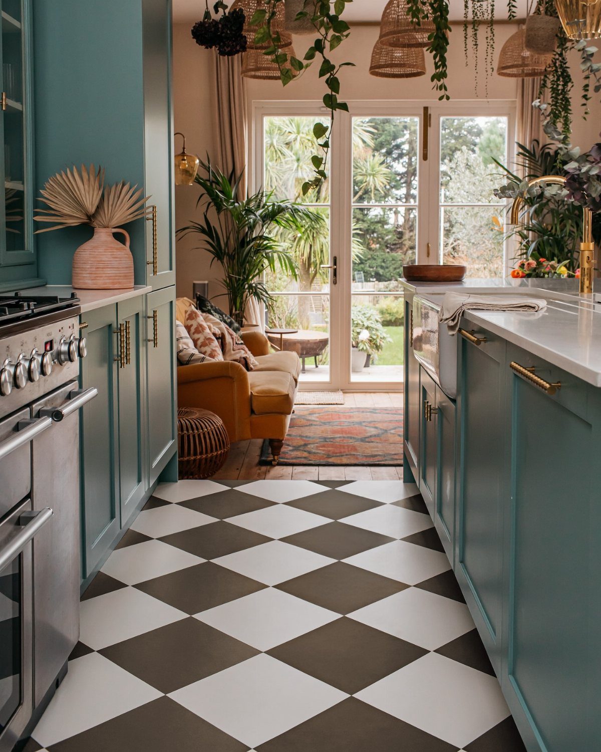
Checkerboard flooring anchors a farmhouse kitchen with pattern that does not need much else. Black and white is classic; cream and charcoal soften the look for a gentler country feel.
The grout choice matters as much as the tile. Pale grout needs more cleaning.
Too-dark grout turns harsh. A mid-tone lets the pattern do its work without screaming.
Bold floors need quieter finishes everywhere else; competing patterns are where farmhouse style starts to wobble.
25. Antique Furniture
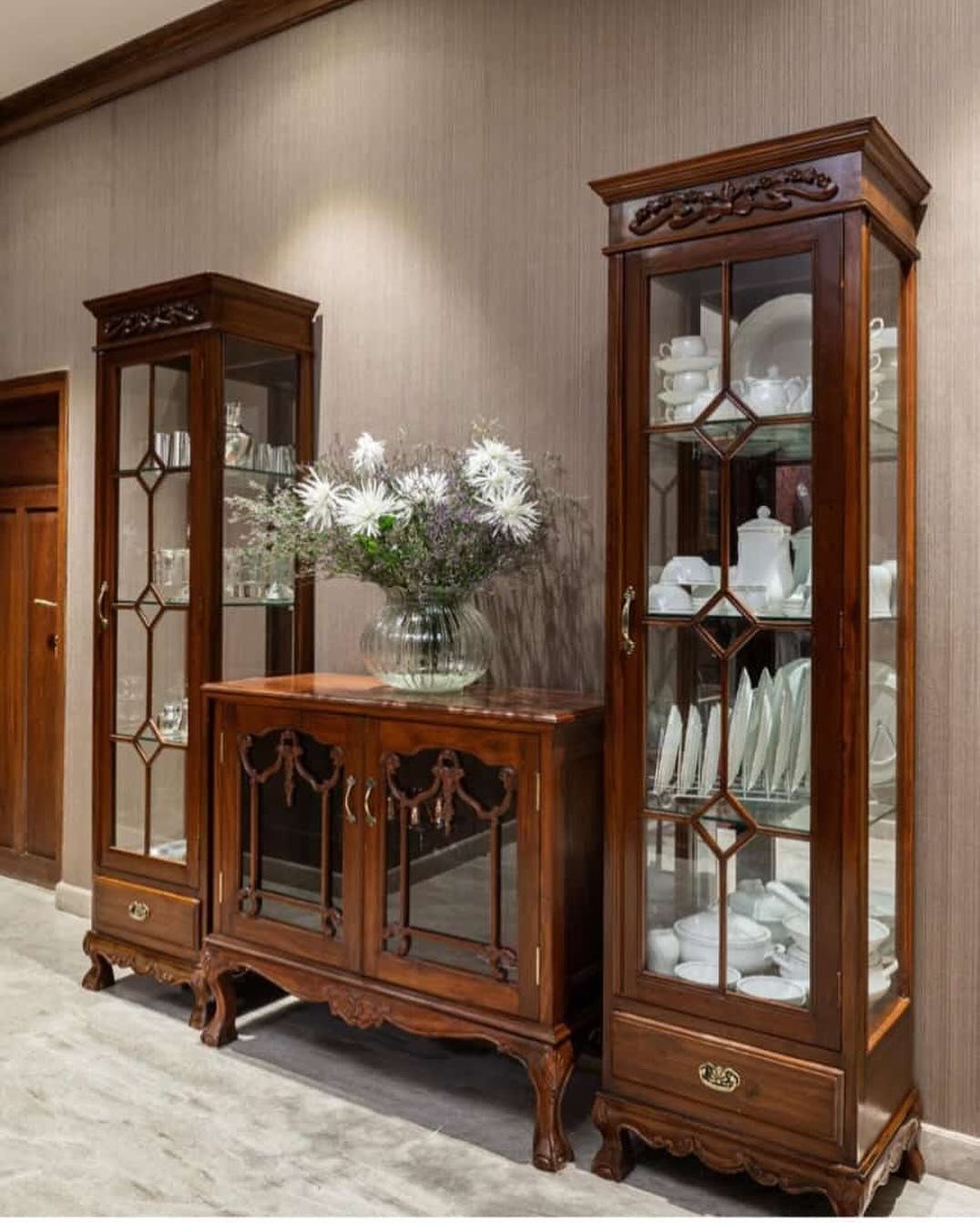
A vintage hutch against the kitchen wall does work that built-ins often can’t: it stores the overflow and shows off the pieces worth seeing.
I look for solid wood with its original hardware still turning, since reproductions rarely match the heft. Glass-fronted cabinets let you put dishes on display while a lower sideboard keeps everyday items close but out of sight.
One piece is usually enough.
If the finish is too dark for your space, a light sanding and wax changes the tone without stripping the history.
Water rings and worn edges make a kitchen feel lived-in rather than staged; I’d pick those marks over perfect surfaces every time.
26. Layered Lighting
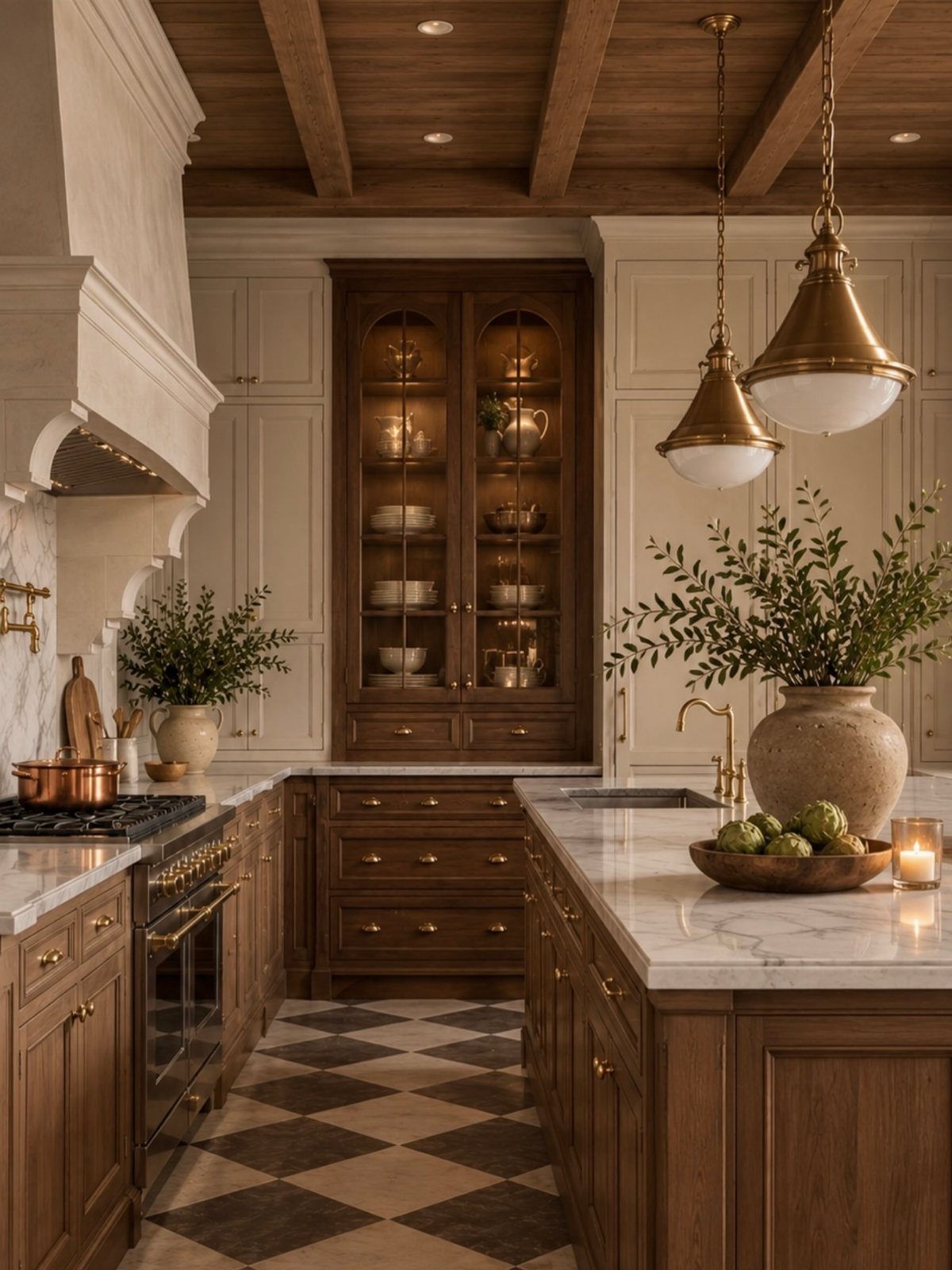
The brass pendants in this kitchen hang low enough to light the island surface for chopping, while recessed cans overhead keep the rest of the room from going dim.
That pairing is the core of it: one layer for working, one layer for moving around, and a third somewhere if you can manage it. Glass cabinets with interior lighting, switched separately, become their own accent at night.
Dimmers matter more in a farmhouse kitchen than in most rooms. Full brightness at 6 a.m. feels harsh; the same fixtures at half strength after dinner turn the space into somewhere people linger.
I put every layer on its own control so I’m not choosing between cave and operating room.
The mistake is matching all the metals. The photo mixes brass pendants with whatever finish the recessed housings carry, and the room holds together because the tones are warm rather than identical.
I aim for coordination, not a set.
27. Farmhouse Style Appliances
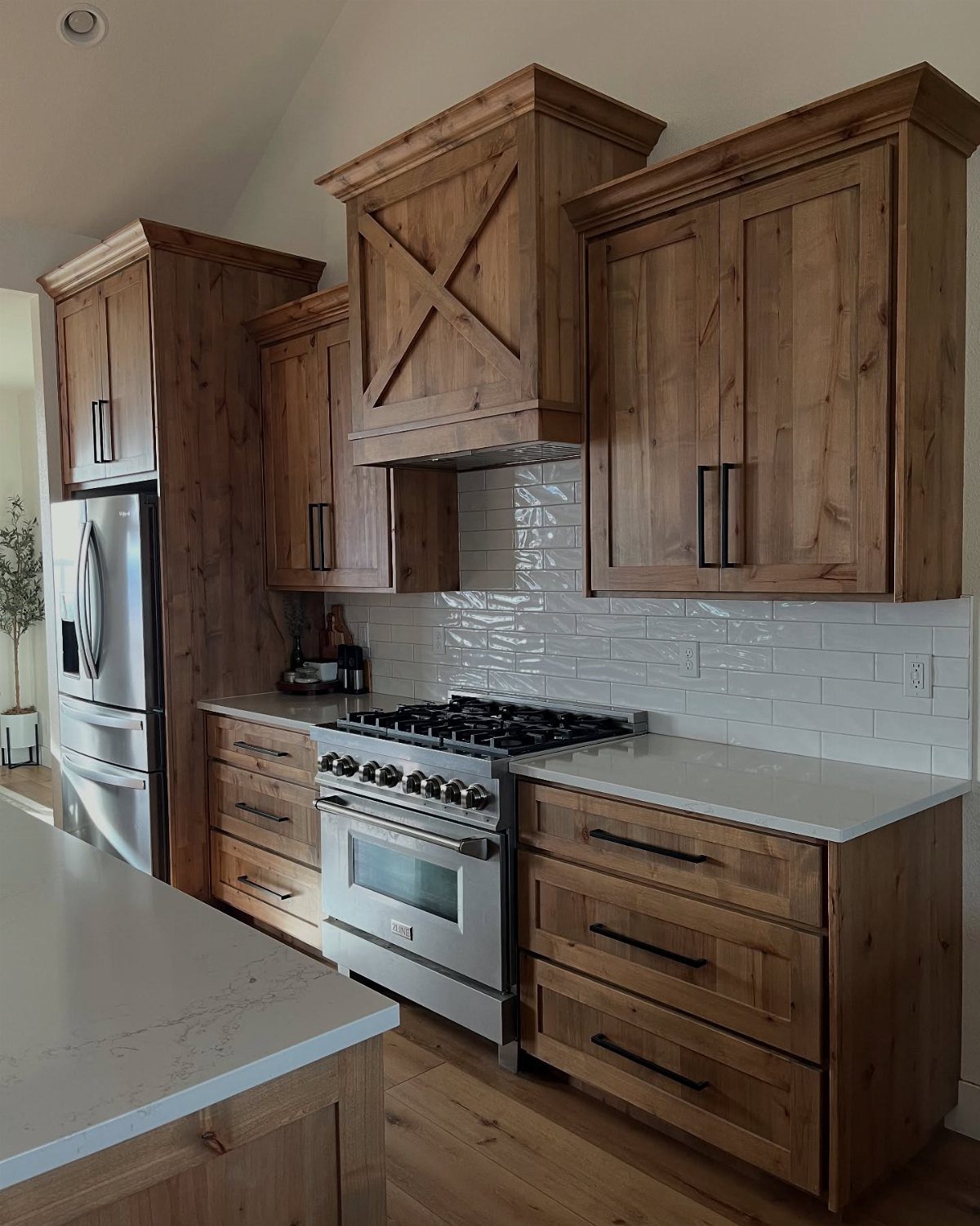
A retro-styled range in cream or mint reads farmhouse without sacrificing the BTUs or oven capacity you’d get from a pro-style unit.
Stainless appliances keep a kitchen modern while Shaker cabinets and subway tile nearby do the farmhouse work; a colored range tilts the room further toward country without a full renovation.
I draw the line at performance. A beautiful refrigerator that can’t hold temperature, or a charming dishwasher that leaves spots, becomes an expensive prop.
The brands that do this well charge more than basic stainless, typically 30–50% above comparable standard models, so I budget for one statement appliance rather than outfitting the whole kitchen.
The handles and control knobs carry more visual weight than you’d expect. Simple black knobs on a range fit a farmhouse room better than industrial hardware; I’d take the right detail over the right color alone.
Small detail, big difference.
28. Functional Kitchen Islands
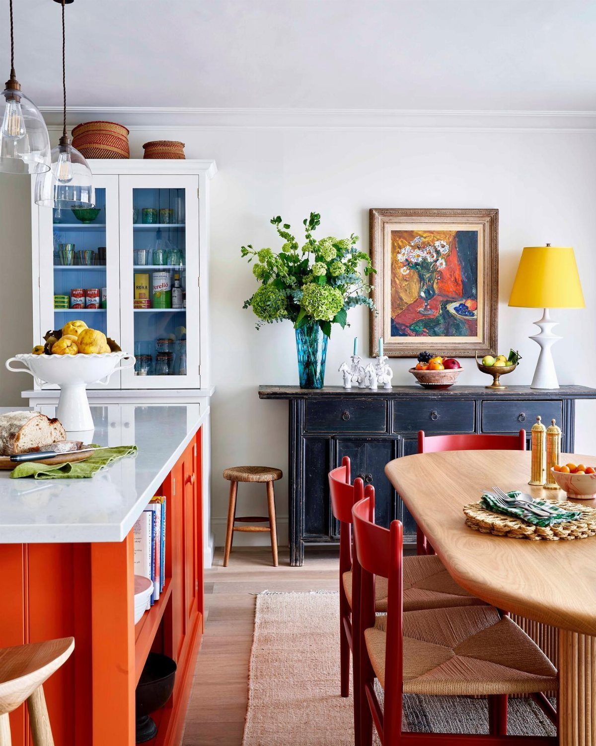
An island that seats two for breakfast and still leaves room to roll out dough is the hardest working piece in a farmhouse kitchen.
A painted base, not stained, keeps the cost down if you’re converting a piece you already own or buying a ready-made cabinet to top with stone or butcher block.
I plan storage for what actually accumulates: the mixing bowls I reach for daily, not the serving platter I use twice a year. Drawers beat cabinets for lower island storage; bending into a cabinet from a stool is awkward.
An island sink works best with clear counter space around it for prep; a soap dispenser and a small crock for utensils that need washing is plenty.
A dining table nearby changes how the island functions. When a table is in the room, I skip island seating and gain more workspace.
Without one, the island becomes the only gathering spot, and I budget for overhang and stools.
29. Checkerboard Patterns
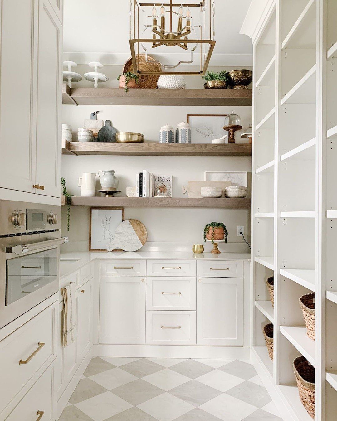
Checkerboard floors read playful in a farmhouse kitchen when the scale is right. Larger tiles keep a checkerboard pattern bold rather than busy; smaller checks tighten the room and show every crumb.
Grey and white pairs softer than classic black and white, which suits a kitchen that doesn’t want to compete with open shelving already full of color.
Grout color decides how graphic the floor feels. I go mid-tone, neither matching the pale tile nor the dark one, so the pattern stays clear without turning harsh.
Pale grout looks fresh for about a month; dark grout against light tile can feel like a grid laid over the room.
The maker of this kitchen used marble for their checkerboard, which raises the cost significantly. Porcelain or ceramic tile in the same layout runs cheaper and wears better under chair legs and dropped pans.
I save the marble budget for a countertop I’ll actually touch.
30. Farmhouse Style Curtains
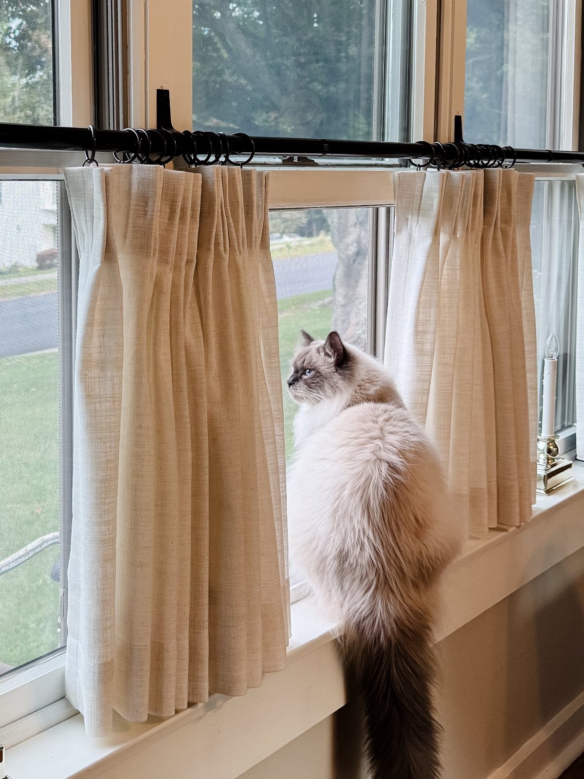
Linen curtains in a natural cream, hung from a simple black rod, filter morning light without blocking the view to the yard. This is a spot for looking out, and heavy drapes would defeat it.
Farmhouse kitchen curtains stay light enough to push back during the day; the style depends on brightness.
Gingham checks in soft colors, or a small-scale floral, both work if the rest of the room is relatively plain. I avoid patterns that compete with open shelving or a busy backsplash; one visual layer at a time is enough.
The rod sits a few inches above the window frame, sometimes higher if the ceiling allows, which stretches the wall visually without changing the window size.
For a kitchen window over the sink, I choose machine-washable fabric. Grease and steam accumulate faster than in other rooms, and dry-clean-only curtains become a maintenance burden I won’t maintain.
Linen softens with each wash, which is part of its appeal; I look for pre-washed or garment-dyed options so the shrinkage happens before they hang.
31. Vintage Cutting Boards
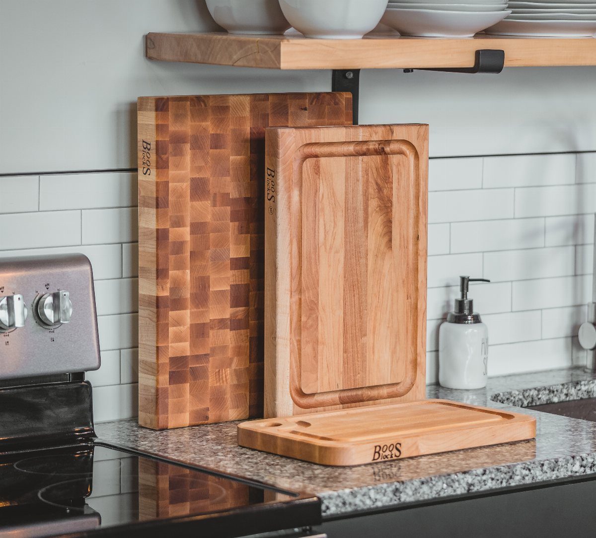
Three wooden cutting boards with different grain patterns and wear marks look gathered over years rather than bought in a set. Mix dark end-grain, lighter grooved, and flat plank boards for variation that keeps the eye moving.
Three boards with different shapes, round, paddle, or rectangular, give enough presence without crowding the space. Ten boards would look like a collection got out of hand.
A single oversized bread board worked in a narrow kitchen I helped a friend set up. It filled the wall alone, no cluster needed.
Reproductions exist at lower cost, though they often read too clean. Check the surface in person if you can.
32. Woven Baskets
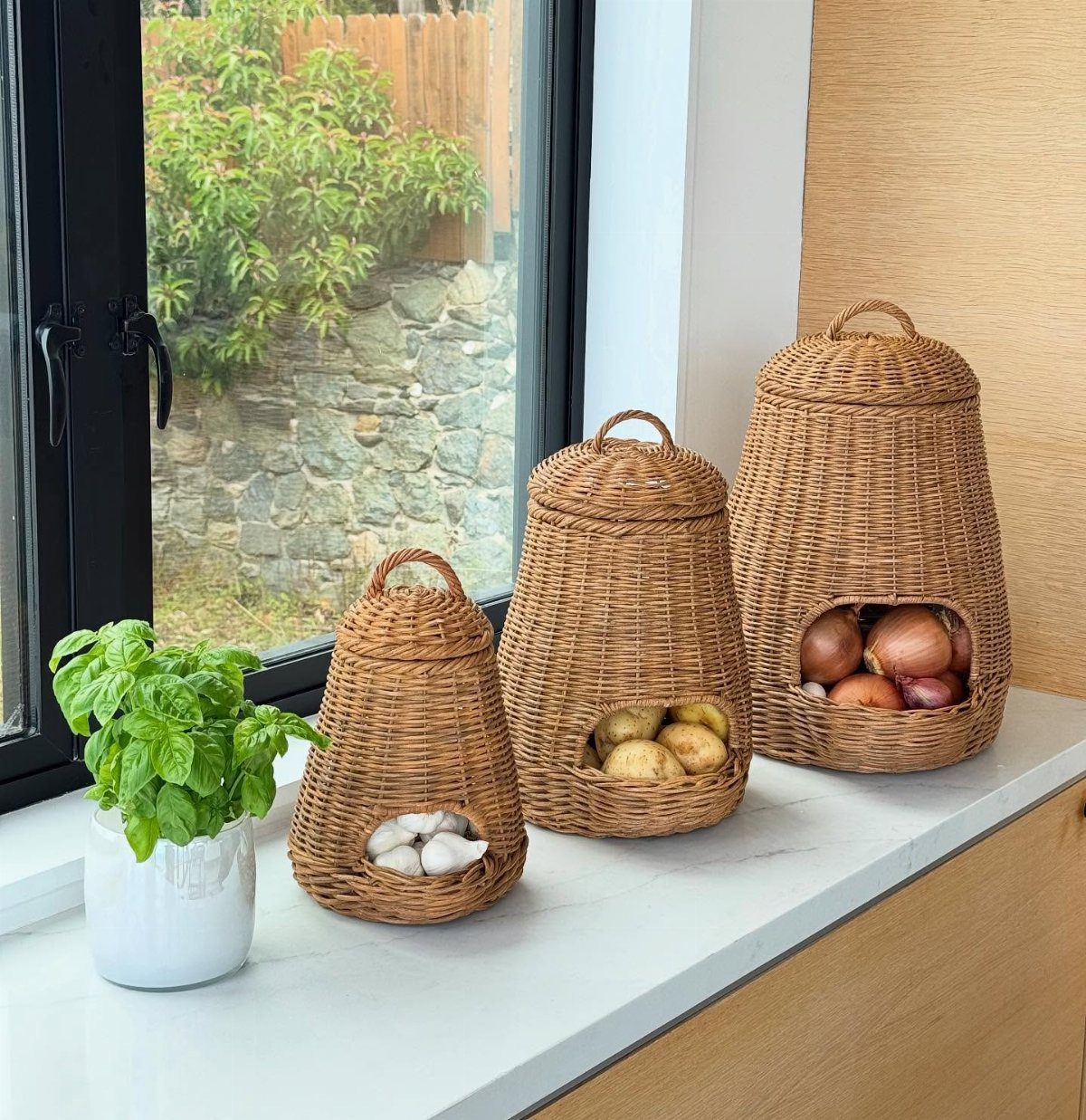
Three woven baskets with arched openings, each holding a different vegetable, turn open storage into something that looks intentional rather than leftover.
The tight weave matters more than the material, seagrass, water hyacinth, or rattan all work if the strands hold together. Loose weaves shed fibers and snag on anything with an edge.
Open pantry shelves go messy fast. A label helps when you cannot see inside at a glance.
I measure shelf openings before buying, half an inch too tall and the basket sits useless on the counter.
No remodel, no tools, just the right size container in the right material.
Choosing a Color Scheme
Soft white still leads for farmhouse kitchens, but the shade matters more than the name. Warm white with a hint of cream tends to look better against wood and doesn’t show every scuff the way a cooler shade will.
Green paint on the floor can tie everything together. The unexpected color brought a younger energy without breaking the rustic feel.
I would steer toward warm neutrals for anyone starting fresh. They let vintage wood and metal read as intentional rather than mismatched, and they hide the scuffs that accumulate between deep cleans.
Incorporating Vintage Elements
An old runner can gather up the colors you already have into one quiet line. A Virginia mountain kitchen had bold tile, a forest green range, and deep blue workbench cabinets that all finally felt settled once the rug arrived.
The copper vent hood helped, but the runner did the grounding.
Thrifted chairs around a worn table do the same work. On a Scottish island, Vanessa Branson used a vintage set in blue against white backsplash tile.
The pop of color kept the space from feeling like a museum piece.
I would look for one strong vintage piece rather than filling every surface. A single workbench cabinet or a set of chairs with real age gives the kitchen an authentic, pieced-together vibe without the pressure of matching eras.
The farmhouse feel comes from use, not accumulation.
Frequently Asked Questions
Is farmhouse decor still in style in 2026?
Yes, farmhouse decor continues to be popular and adaptable. Farmhouse kitchens in 2026 look more cottage than country: open shelves, worn neutrals, and hardware that looks like it came from your grandmother’s drawer.
Shaker-style cabinet fronts remain classic, and the overall look still embraces natural materials and layered personality without feeling dated.
What colors look good in a farmhouse-style kitchen?
Neutral palettes with earthy tones work best, layered with natural wood so the space doesn’t go sterile.
White oak and painted cabinets share space now; I like sage or a muted salmon on the island because it darkens the floor plan without swallowing it.
What are the must-haves in a farmhouse kitchen?
An apron front sink in fireclay or stainless steel changes how the whole kitchen feels before you touch a cabinet.
What is the new kitchen trend for 2026?
Cottagecore and vintage-inspired designs are emerging as the softer evolution of farmhouse style.





