
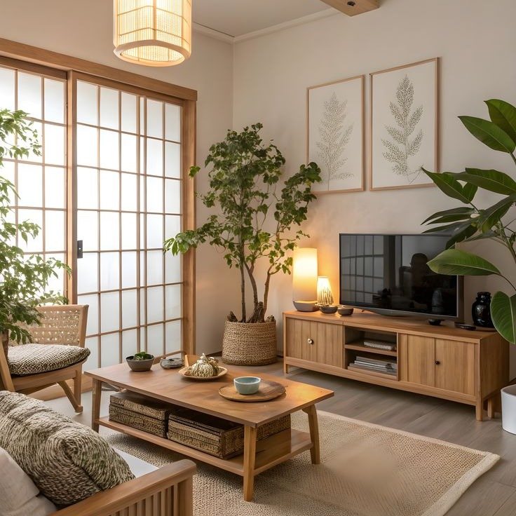
These ideas run from swapping in a ceramic vase or woven basket to building floating shelves or a cushioned bench for the weekend.
The right pick depends on whether you rent and need plug-in dimmers and battery candles, or own and can hardwire fixtures or mount shelves.
One detail that threads through: 2700K bulbs, the color of sunset through linen, which turns up in the lighting section and again as the baseline every dimmer starts from.
1. Neutral Color Palette
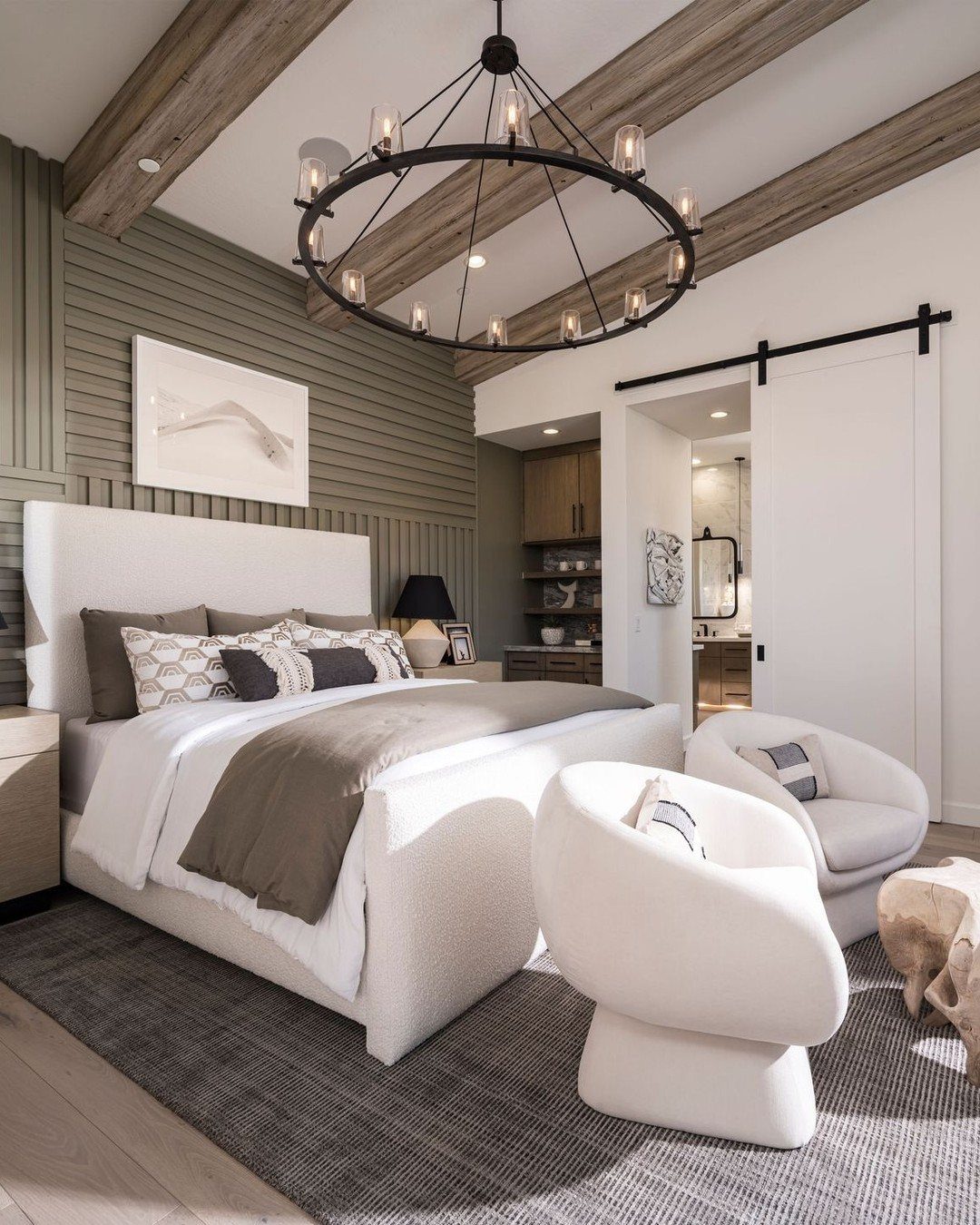
A Japandi room starts with color that quiets the eye. Accents stay spare: black only where it defines a line, muted blue only where it settles a corner.
Paint makers now label these shades honestly; matching a warm off-white to existing oak trim takes an afternoon and one quart of decent paint. A wall that recedes lets furniture and light advance.
2. Layered Textures
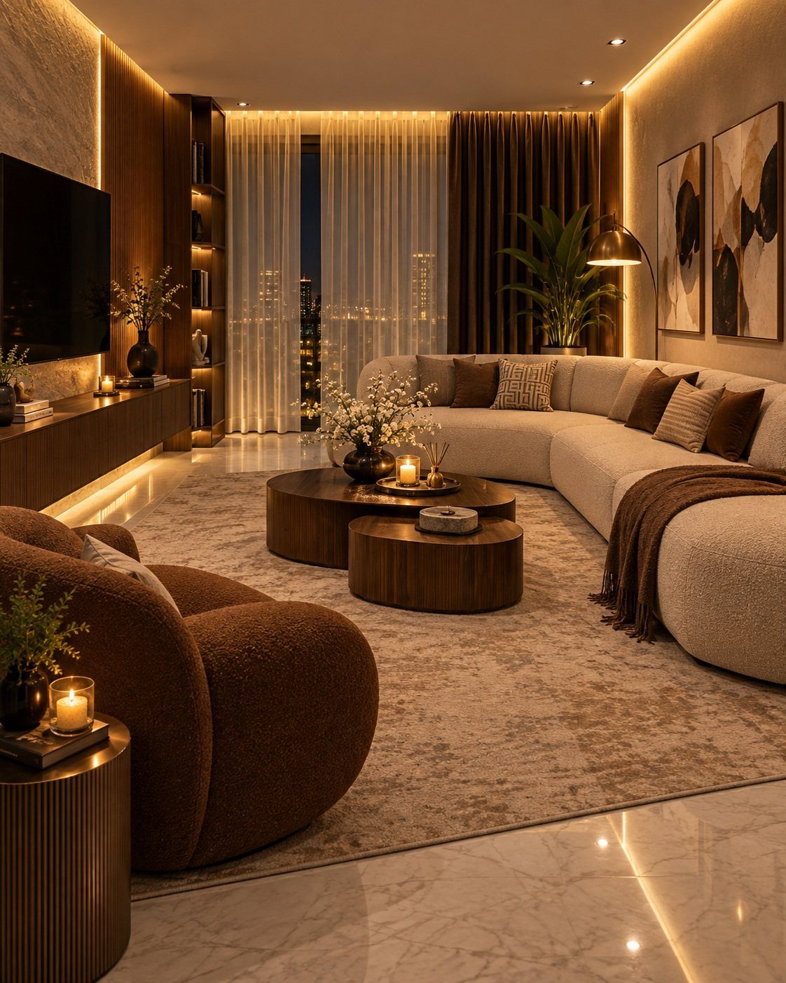
Texture does the decorating when color stays quiet. A boucle sofa against a flat-weave rug, a linen throw over a wooden armrest: each material catches light differently and the room gains depth without gaining objects.
Natural fibers carry this best. Wool and hemp turn up in remnant bins at textile suppliers; undyed linen with enough slub to read as handmade costs less than you’d expect.
Mix at least three textures, five only if two of them whisper.
3. Intentional Decor
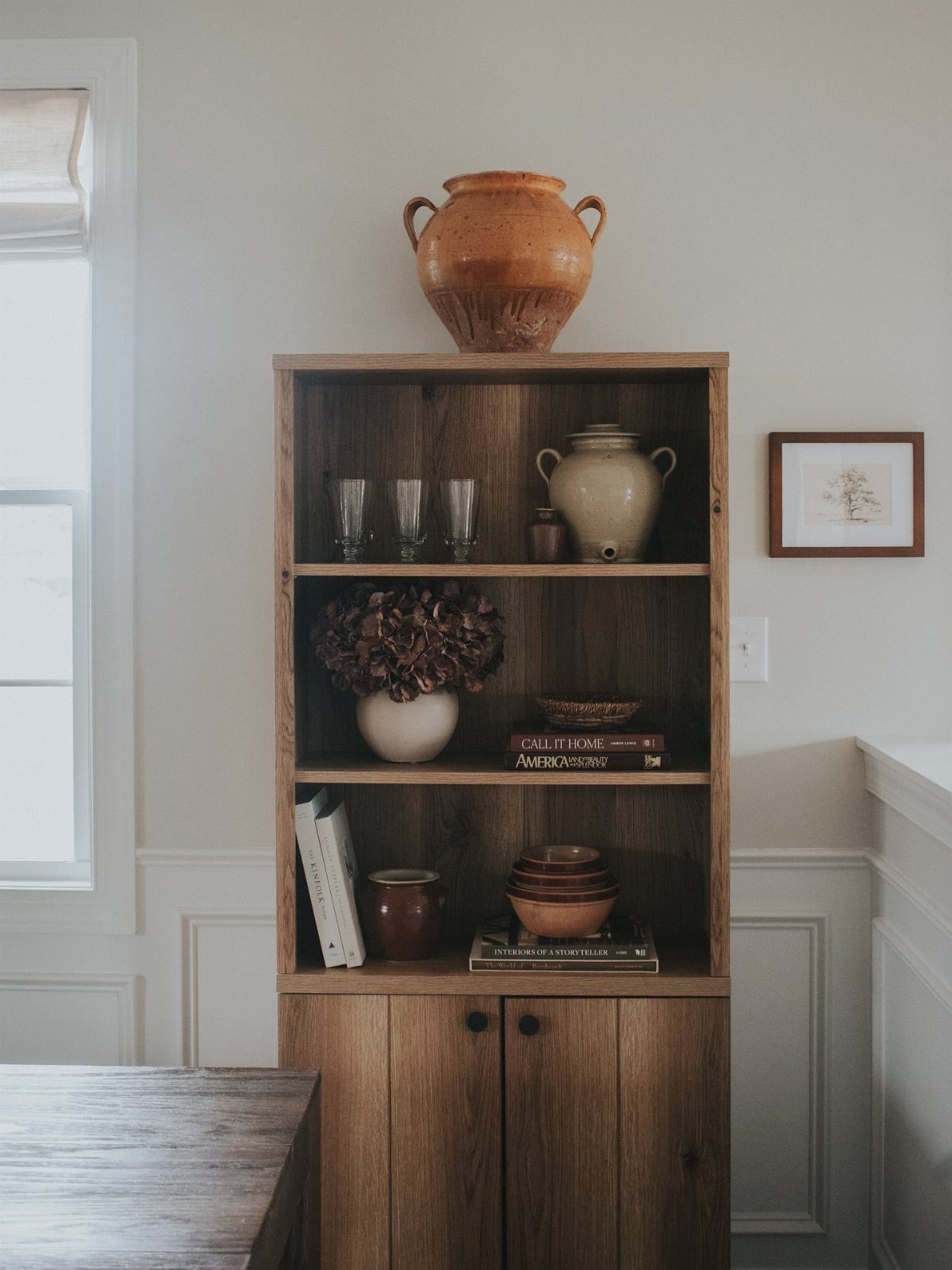
Every object in a Japandi room earns its square footage. Surfaces hold what gets used weekly or what someone made carefully: one ceramic bowl, one book pressed open, one branch cut from the yard.
Start with empty. Add until the silence breaks, then remove one.
4. Natural Light
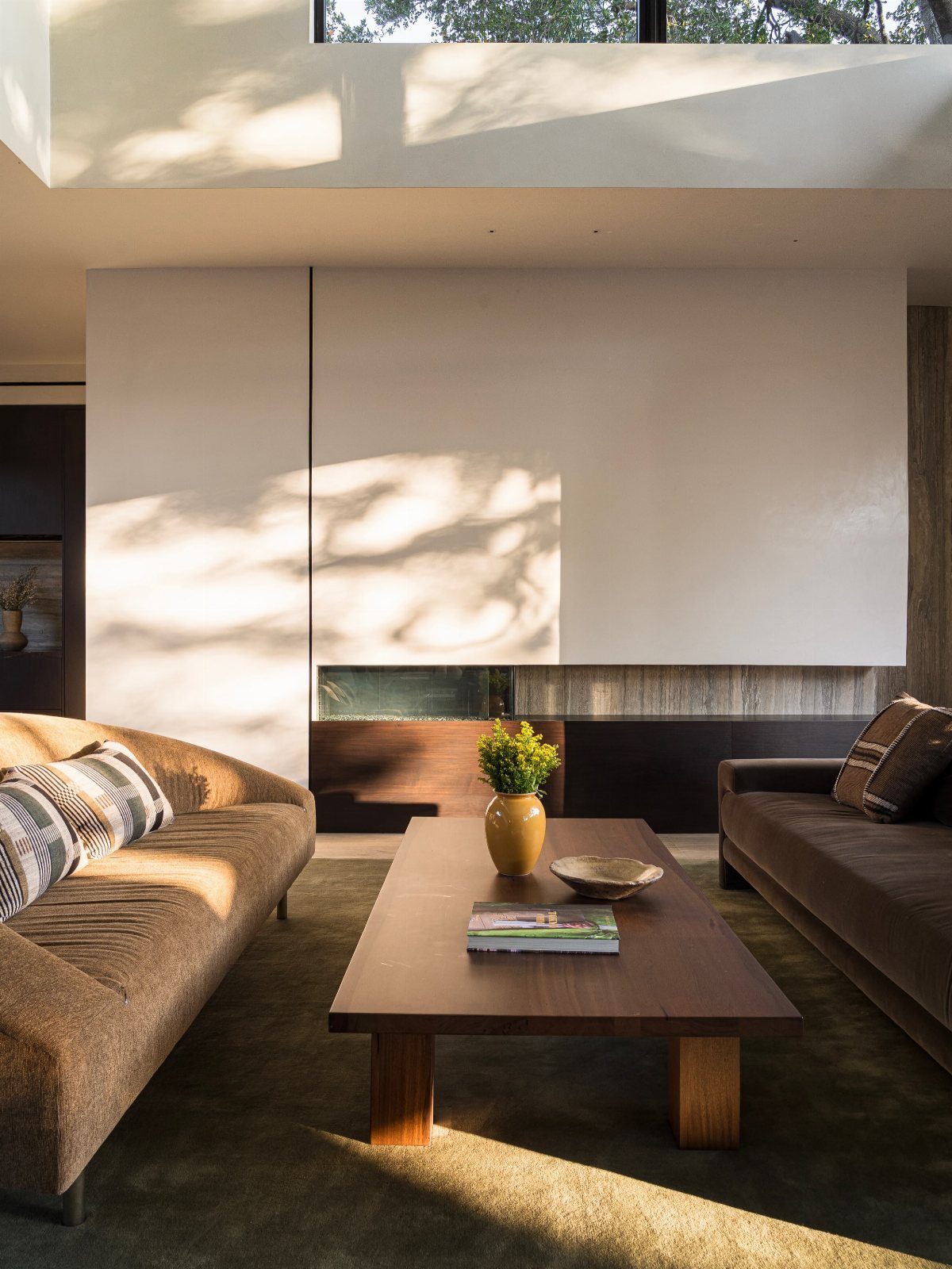
Light in a Japandi room behaves like another material. Sheer linen curtains filter afternoon sun into something you can sit in without squinting; a tension rod from the hardware store and a free morning handles the install.
The wall color matters here: soft whites and warm off-whites reflect daylight deeper into the room than cool greys, which can flatten it. Two test patches watched across a single morning tell you what the paint will do.
5. Artful Simplicity
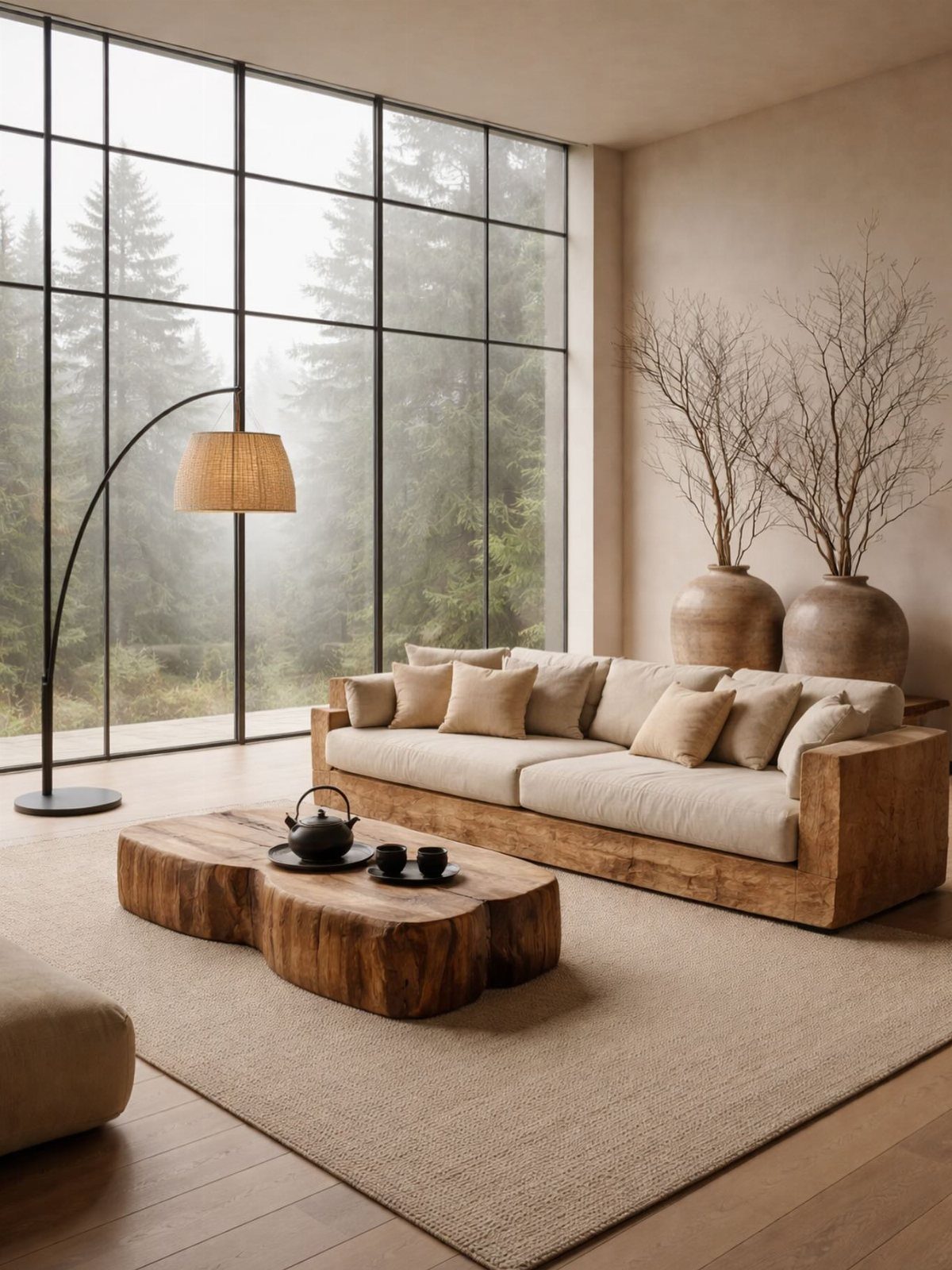
Artful simplicity means choosing pieces that hold their own against empty space. A floor lamp with a woven shade that patterns the wall when lit.
A first decent vase from a pottery sale sits empty half the year because the shape suffices.
Sliding ash screens divide space without closing it; a freestanding rice paper panel from a Japanese import shop adapts the same idea for a studio apartment when guests stay over.
6. Functional Storage Solutions
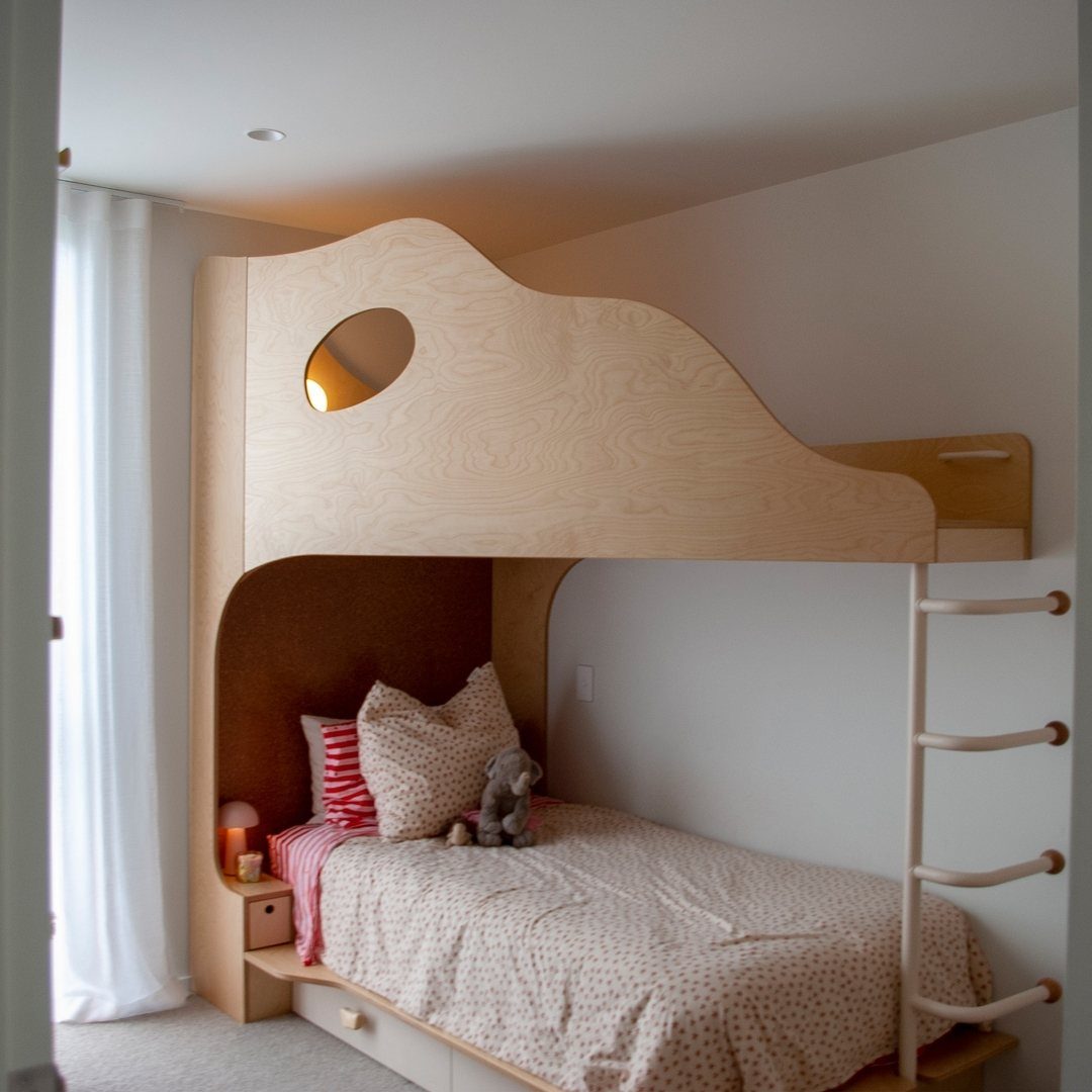
Storage in a Japandi room must disappear. Built-in drawers under a bed frame, cabinets flush to the wall, a bench that opens: the clutter lives inside so the calm lives outside.
A standard platform bed converts to drawer storage with rolling bins underneath; casters and plywood, one Saturday.
Low-profile furniture helps; anything that lifts off the floor on visible legs breaks the visual quiet you are paying for with all this concealment.
7. Soft Lighting
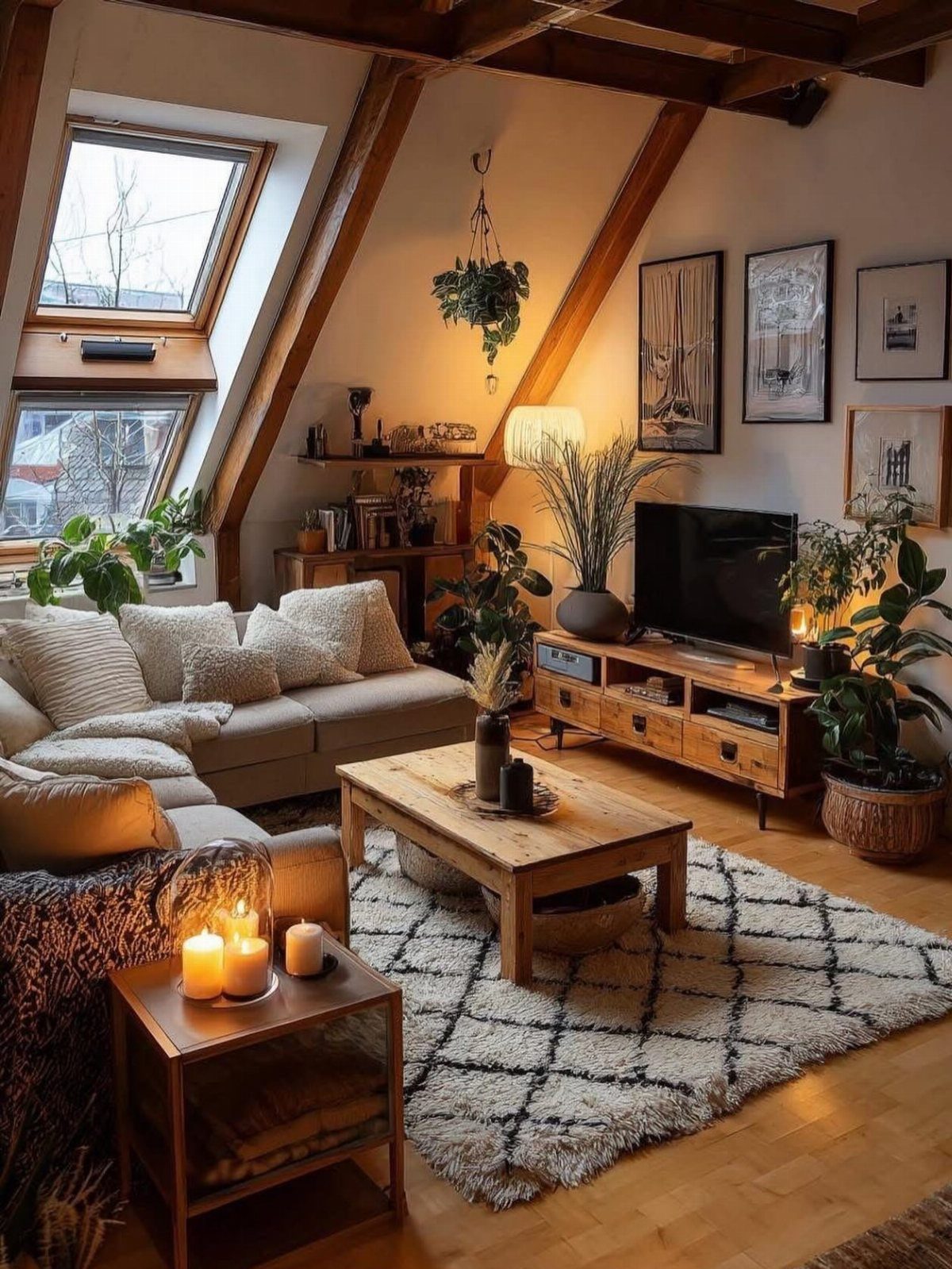
Harsh overhead light kills the calm that Japandi needs. I switch to paper lanterns and lamps with warm-toned bulbs, usually 2700K, which casts the same color as sunset through linen curtains.
A single paper lantern over a seating area costs little and hangs in minutes. Battery-powered versions work for renters who can’t touch the ceiling wiring.
Light pools at human height do more for a room than a ceiling fixture washing every corner.
Candles on a coffee table soften the gaps when overhead light feels too fixed. The whole setup suits someone who wants to feel the room shift toward evening rather than flipping one switch and losing the day.
8. Low Seating Arrangements
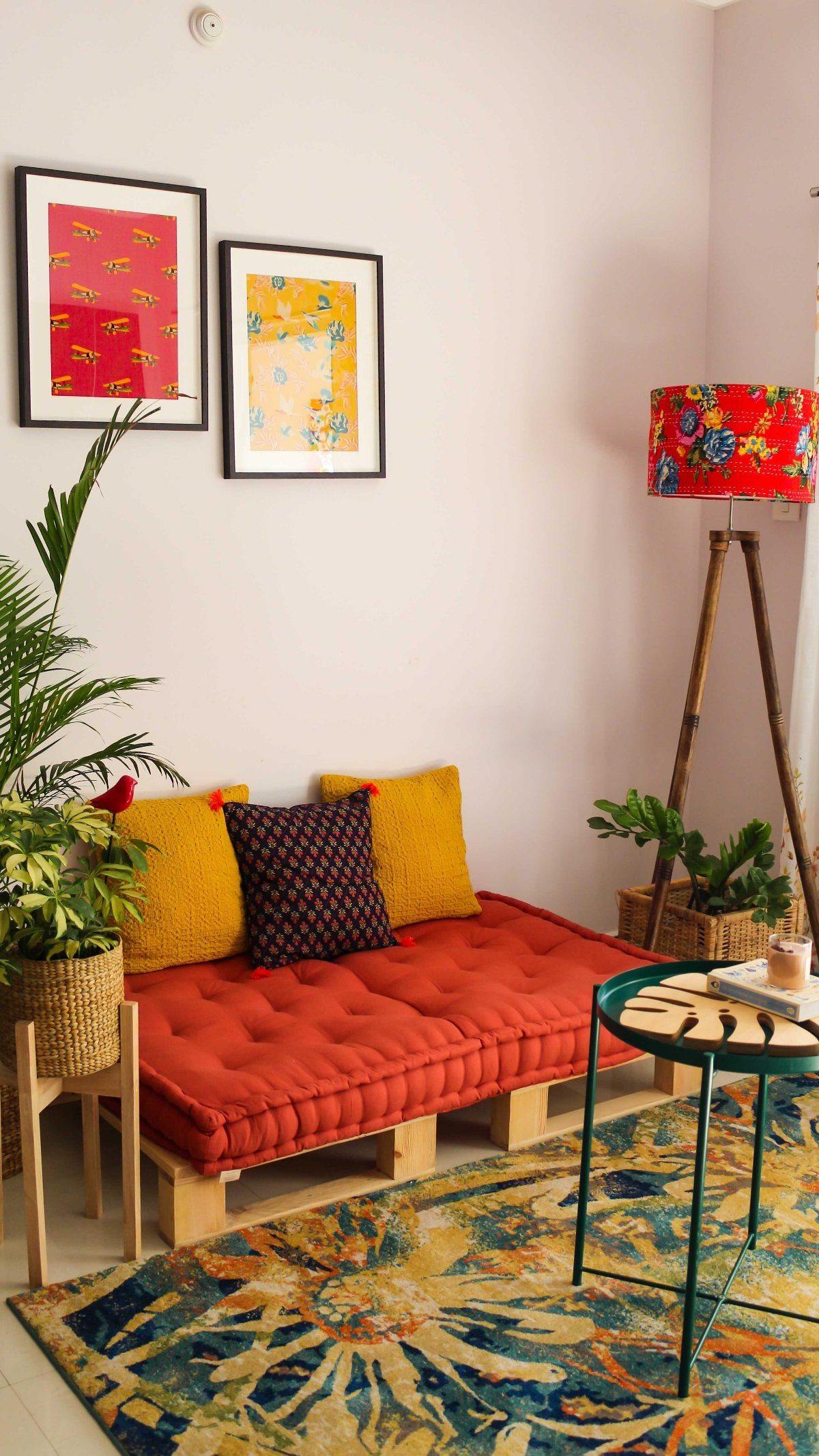
Floor cushions and poufs around a low central table bring everyone closer to eye level, which changes how conversation moves. A floor mattress on a wooden pallet works as a daybed base, and leftover fabric can stretch into wall art.
The platform or pallet base is the smaller cost in a low seating setup; the cushion eats most of the budget. Two twin mattresses side by side make a workable low platform without much spending.
This trades away back support for anyone who struggles to rise from the floor. A low bench with a thin cushion splits the difference and still keeps sightlines open across the room.
9. Contrast in Materials
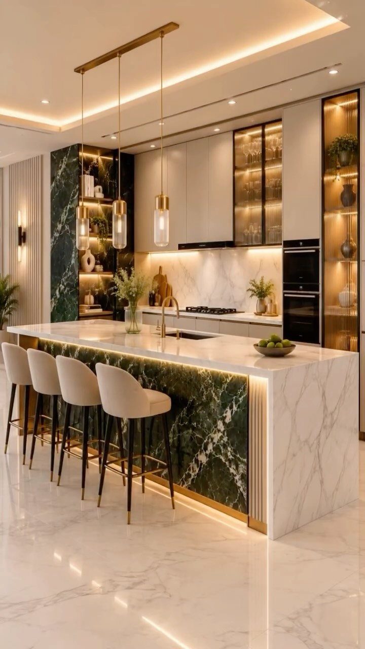
I like pairing light oak with walnut, or adding one muted accent in rust or moss green against a neutral field.
A single handwoven bowl on a smooth table does the same work at smaller scale. The roughness against the finish catches light differently through the day and keeps the eye moving without clutter.
Start with one pairing and live with it a week. Adding a second too fast turns the room into a collection; the style wants restraint more than variety.
10. Open Floor Plans
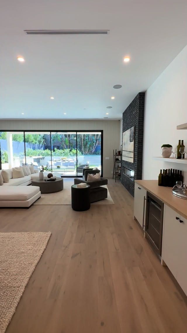
Open plans in Japandi aren’t about square footage. They are about clearing sightlines so a few pieces read as intentional rather than scattered.
I move seating to face each other across the shortest distance, then fill the longer walls with nothing or with one thing that earns its place.
Multi-functional furniture helps: an ottoman that stores blankets, a sofa deep enough for naps.
A small apartment gains more from an open plan than a house does; the single room needs to feel like several settled zones instead of one crowded box.
11. Incorporate Nature
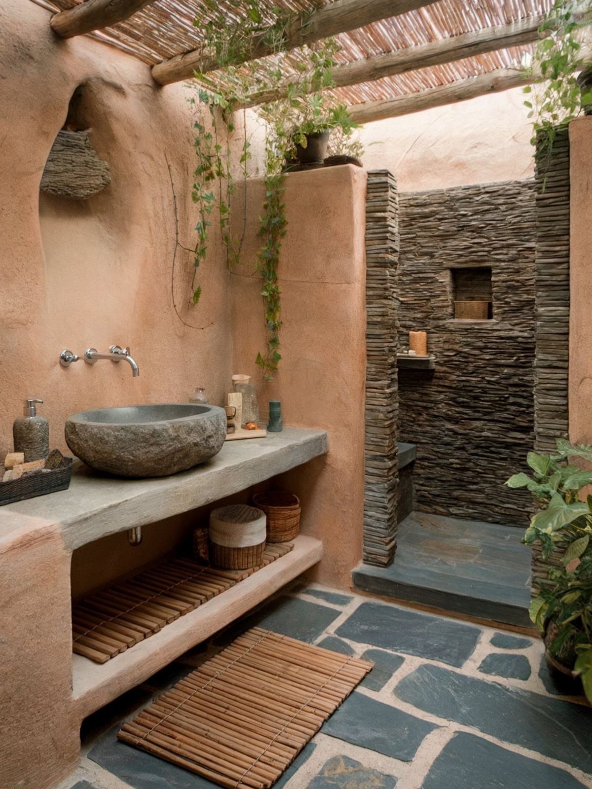
Living plants, a ceramic pot, a windowsill bonsai, or a tall vase with branches add what paint cannot.
I start with one plant per room, placed where it gets the light it actually needs. A dead plant is worse than none; a thriving one changes the air in the room.
For renters or the forgetful, dried branches last months and carry the same sculptural weight. Water is the only cost.
12. Intentional Color Accents
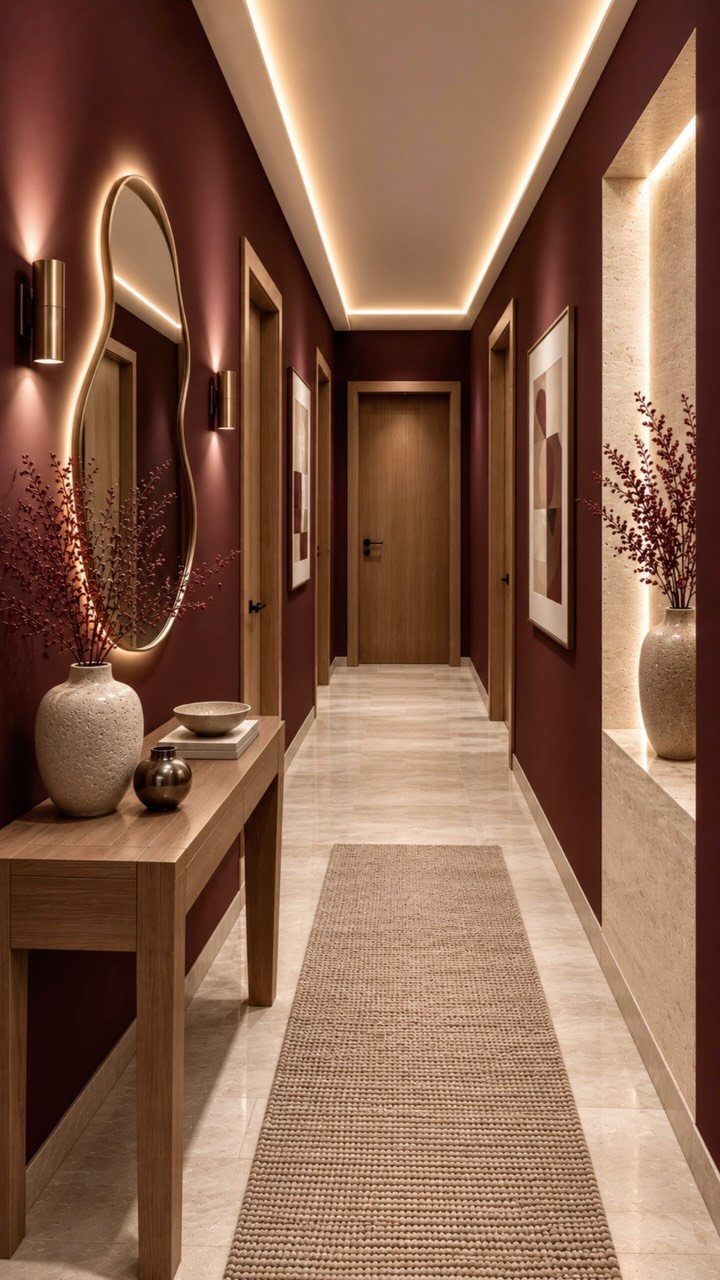
A single muted tone, properly deep, reads as warmth rather than shout. I use rust, navy, or charcoal in small, fixed elements: a runner, a ceramic bowl, the frame on one print.
The rule is one accent per view, never competing. Earthy neutrals carry 90 percent of the room; the accent answers the question of whether anyone actually lives there.
Matte paint or unglazed ceramic keeps the color from turning slick. A glossy accent in Japandi feels like a mistake even when the hue is right.
13. Woven Baskets

A handwoven basket turns clutter into something you actually want to look at. Straw or seagrass weaves add the raw texture Japandi rooms need, and the open weave lets air move through stored linens or throws so nothing sits musty.
One basket by the sofa holds spare pillows, another near the door catches shoes. Handles in a dark accent give the eye a place to rest.
For a weekend project, scout thrift stores for misshapen finds; a little steaming reshapes most natural fibers. Skip anything with a printed pattern or plastic coating.
Material you can see and touch matters more than perfect weave.
14. Ceramic Vases
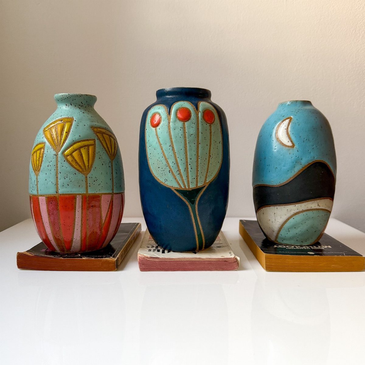
Stoneware clay, hand-painted in small batches, carries the slight irregularity that makes a shelf feel lived-in rather than staged. Raw wood bases lift these pieces above the furniture surface; that small gap protects both and reads as intentional.
I look for matte glazes in muted blues, warm whites, or unglazed bisque. A single branch or dried grass stem is enough; filling the vessel competes with its form.
The maker works with sculptural shapes and painted surfaces that vary piece to piece, so buying in person beats ordering matched sets online.
15. Floating Shelves
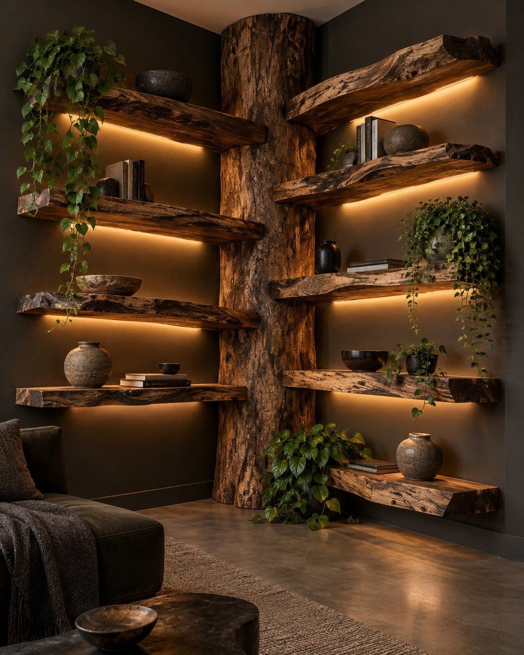
Live-edge shelves with hidden brackets keep walls feeling light while giving you a place to rotate objects in and out.
Integrated lighting is a detail I now add to every floating install; LED strips tucked underneath cost little and change how a corner feels after dark.
Mount at 16 inches on center to hit studs, or use toggle bolts rated for twice what you plan to load. I leave the front edge raw and oil it yearly.
One shelf holds a single ceramic, another a stack of books, never both crowded together. The floor stays open, which matters more in small rooms than the storage you gain.
16. Wooden Accents
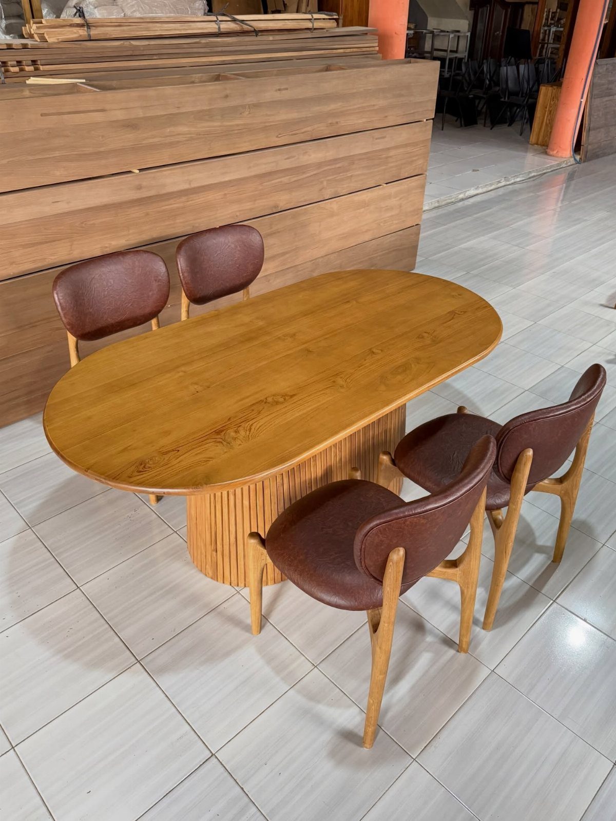
Oiled oak or walnut, left to darken with handling, brings warmth that painted furniture never manages. A fluted base adds visual weight without bulk; simple turned legs or rectangular plinths in the same tone do the same job.
Trays, bowls, and small stools in matching wood scatter through a room to tie pieces together. A single species per room keeps the look quiet.
Offcuts from local mills work well for small items; scrap oak or maple becomes bowls with a spokeshave and food-safe oil. The grain should run horizontal on trays, vertical on upright pieces, following how the tree grew.
17. Cushioned Benches
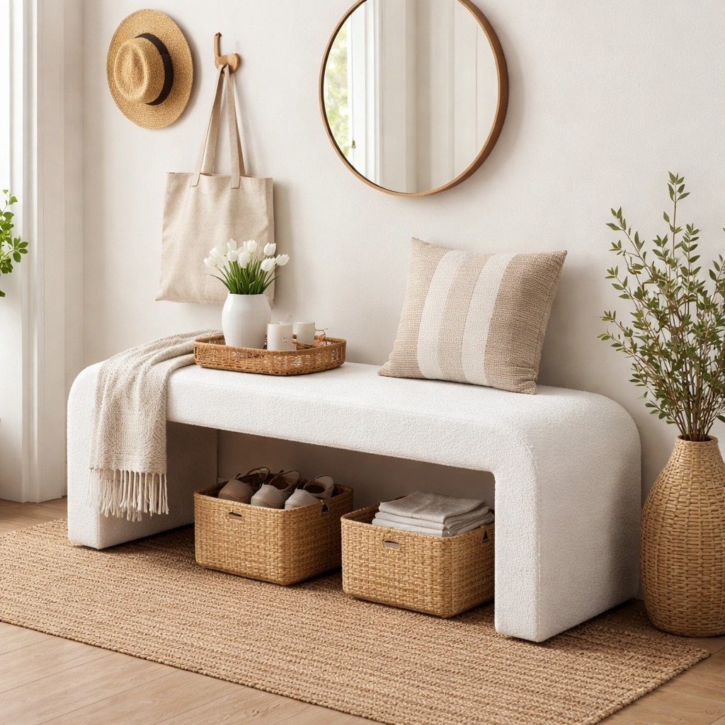
A bench at the foot of a sofa or under a window catches bags, books, or a guest who arrived with an extra person.
White linen upholstery softens with washing and hides less than you’d think; I prefer a shade darker for actual use. The baskets underneath store what the seat collects during the week.
A weekend bench build starts with a pine top on hairpin legs, with foam and fabric the next purchase after that. Tie the pillow to something else in the room, a throw to something else again.
A mirror above doubles what light the bench catches.
18. Dimmer Switches
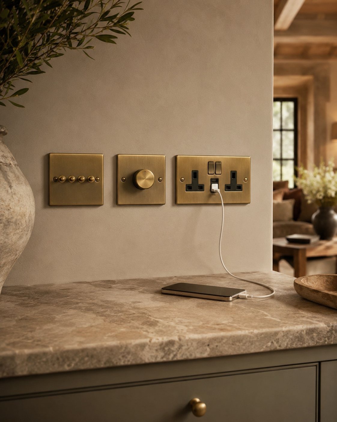
Brass wall plates with rotary dimmers let you drop from reading light to barely-there in one turn.
The install takes an afternoon if you are comfortable with a voltage tester; otherwise I would rather spend the electrician’s fee on better hardware itself.
Corston and similar makers machine their plates thick enough to sit flush, which matters more than the brand name. I start every room at full brightness, then dial down until the shadows look intentional rather than accidental.
Paper lanterns and wood-base lamps layer with this; the dimmer is the control point that makes the layering work.
Importance of Decluttering
The style falls apart when surfaces fill up and sight lines clog.
Start by clearing every horizontal surface in the room. What goes back earns its place; what stays gone frees up negative space that reads as calm.
Rethink storage next: closed cabinets beat open ones for the stuff you use daily, and the floor plan should let someone walk through without dodging furniture. Reorganize so the pieces you kept have room to breathe.
Flow matters more than emptiness; one statement chair reads better than three adequate ones crowding the same corner.
Balancing Light and Dark
Japandi goes cold fast when every tone sits in the same narrow band. The light-and-dark balance keeps a room warm and dimensional.
Pair pale oak with walnut, or bleach linen against charcoal wool.
A single floor lamp that pairs oak and birch against a white shade carries both tones at once; that is how the style balances light and dark without overthinking it.
The Breeze throw in beige and the Calm pillow case in Almond Brown from Ferm Living do the same job at smaller scale.
Skip going too minimal; one dark element anchors a pale wall, and one light element keeps a dark corner from dropping out entirely. Synthetic materials fight this balance, natural ones hold it.
Frequently Asked Questions
What colors work best in a Japandi living room?
Warm off-whites, soft greys, and beiges carry most of the room, with black reserved for defining lines and muted blue or rust for settling a corner. One accent per sight line reads as warmth; two start to shout.
Matte paint and unglazed ceramic keep these tones from turning slick; glossy finishes feel out of place even when the hue is right.
What are common Japandi decor mistakes?
Going too minimal leaves a room cold, and ignoring the light-dark balance flattens it into one narrow band. A single dark piece steadies pale walls, and one light piece keeps a dim corner from going flat.
Synthetic materials fight the warmth that natural fibers hold; restraint matters more than variety.
What is a Japandi style living room?
It blends Japanese minimalism with Scandinavian warmth, letting a few intentional pieces breathe in quieted space. The calm comes from concealment, not emptiness: built-in storage hides clutter so the room stays settled.
Is Japandi style still trending?
Hygge and Wabi-sabi have been around long enough that the style outlasts trend cycles. Japandi ages well because it favors natural materials that darken with handling and objects that gain character over time.
The desire for calmer, more intentional living spaces keeps it relevant regardless of trend cycles.





