
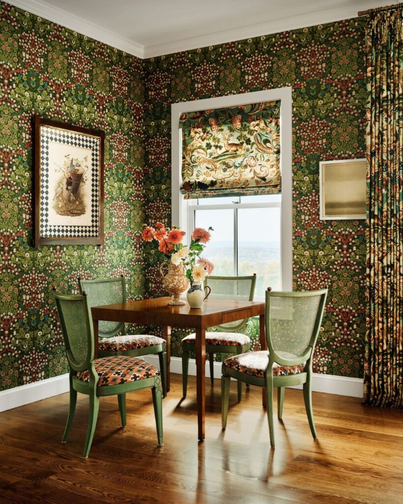
These ideas run from a single painted wall to a ceiling you actually want to look at, and the right one depends on whether you rent, own, or share walls with a kitchen.
1. Accent Wall
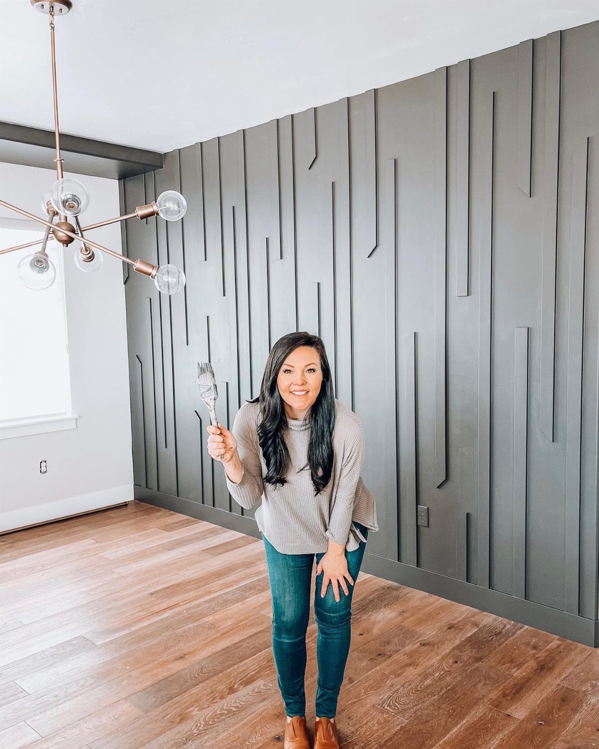
A single painted wall behind your table does more than add color; it carves out a dining zone in an open floor plan without a single partition.
Dark gray or navy works best against lighter walls, and the contrast reads as depth rather than clutter.
My own preference runs to matte finish over eggshell for this spot, since it hides the scuffs that collect where chairs scrape.
If your dining area shares space with a living room or kitchen, keep the table within about 18 inches of that bold wall; any farther and the grouping falls apart.
This suits renters who can paint one wall and patch it later, or anyone who wants definition without building anything permanent.
2. Two-Tone Walls
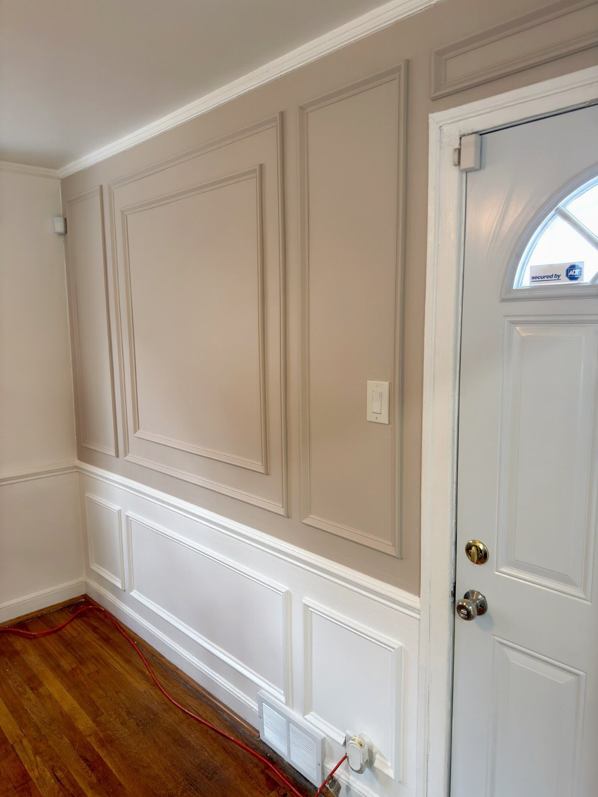
Wainscoting with a color split above and below turns a plain wall into architecture you do not have to dust.
The white base keeps the room from closing in, while the upper tone, warm taupe or something bolder, draws the eye upward and stretches the ceiling.
Installation took me a full Saturday once: chair rail about waist height, picture-frame molding below, then two coats of paint on each band.
MDF trim keeps the cost low for a standard wall, and the whole job needs only a miter box, a nail gun, and patience.
Best for square rooms that feel boxy; skip it if your walls are heavily textured, since the molding will not sit flush without hours of prep.
3. Built-In Seating
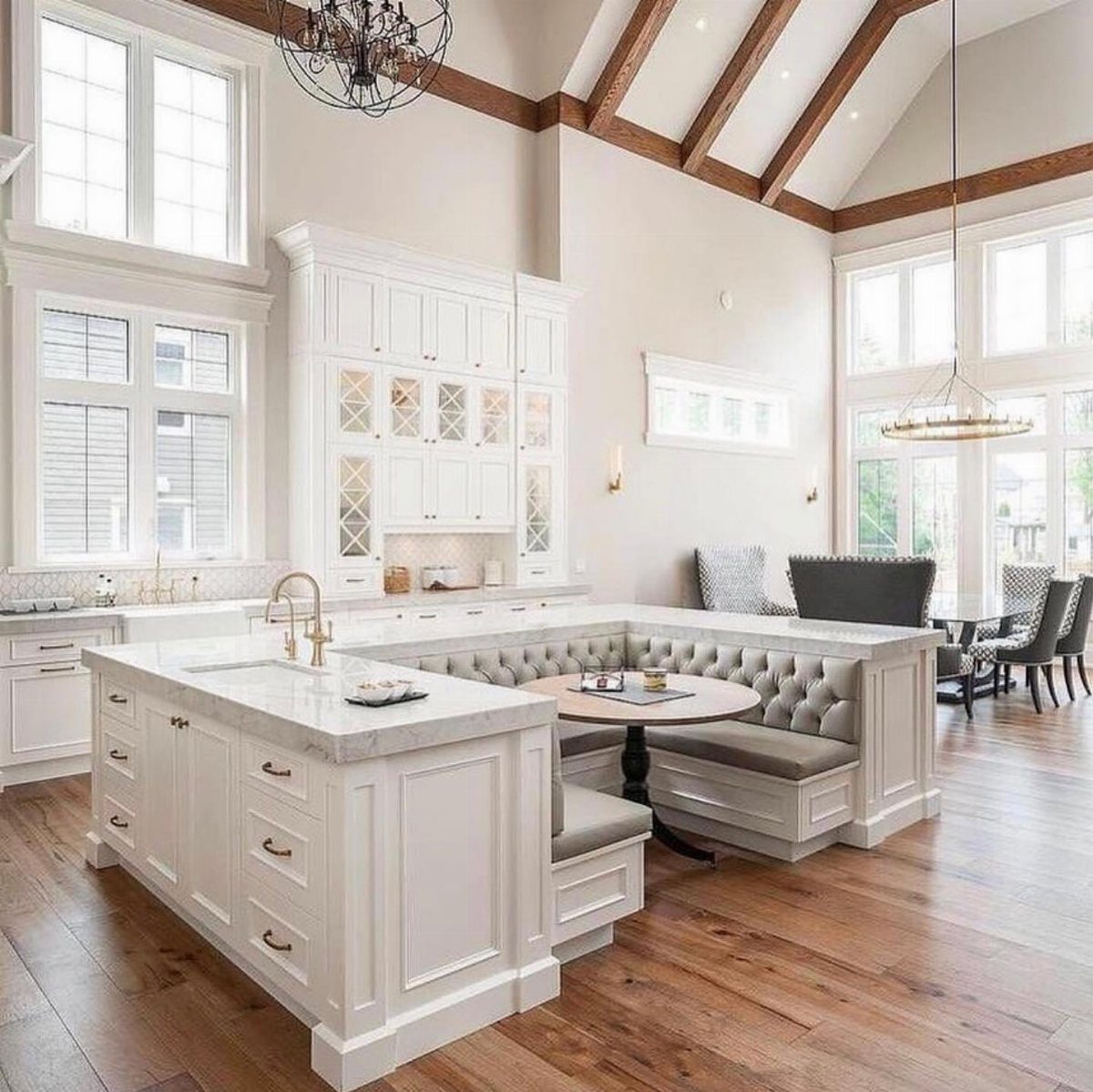
Built-in seating turns the dead zone under a window or in a corner into the most used seats in the house.
An L-shaped banquette with a hinged lid over storage gets you both seating and a place for the table linens you have nowhere else to stash.
Upholster the back and seat in something you can wipe down; pale linen looks good until the first dinner party.
A thick cushion over plywood feels firm at first but holds up for years, and a bench lets you fit more people than individual chairs would allow.
This works when your table backs against a wall anyway; if you entertain rarely, the fixed seating trades flexibility for storage you may not need.
4. Use Mirrors
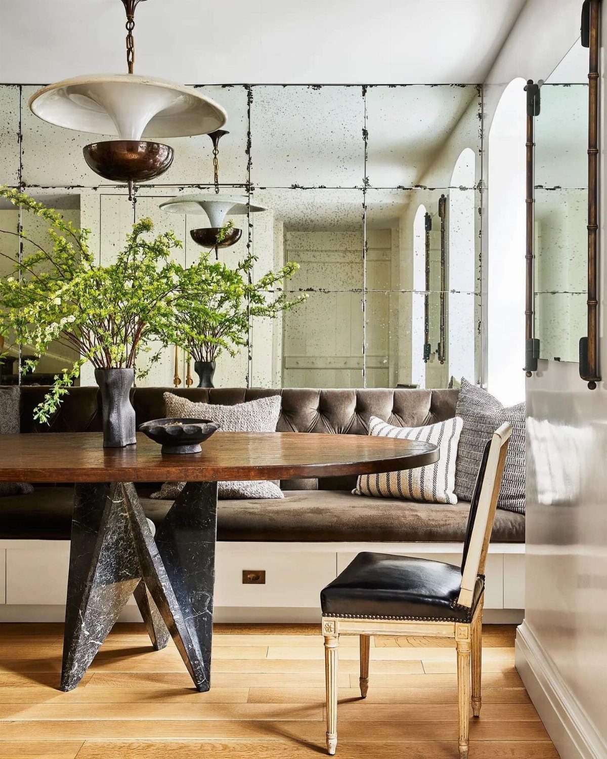
A mirror hung where it catches window light doubles what little sun your dining room gets and fakes another room beyond the wall.
Antiqued glass, with its mottled silver backing, does this without the harsh glare of a new mirror, and the aged surface reads as intentional rather than leftover.
Size matters more than frame style here. One large panel outperforms a cluster of small ones, which fragment the reflection and read as decoration rather than space.
Renters can lean a tall mirror against the wall instead of mounting it; the effect holds, and you take it with you.
5. Round Table
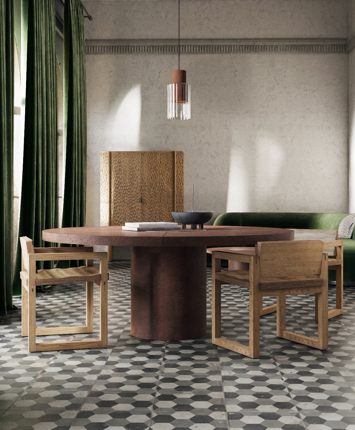
A round table keeps sight lines open in a room where every inch of floor counts.
No corners to navigate around means the chair behind you does not block the path to the kitchen, and conversation flows without anyone stranded at a far end.
A medium diameter fits four comfortably in a space barely wider than the table itself, and the shape lets you squeeze in a fifth chair when someone brings a guest unannounced.
I would pick this for any dining area under 10 by 10 feet where the table must also serve as a desk or a game surface.
6. Moody Hue
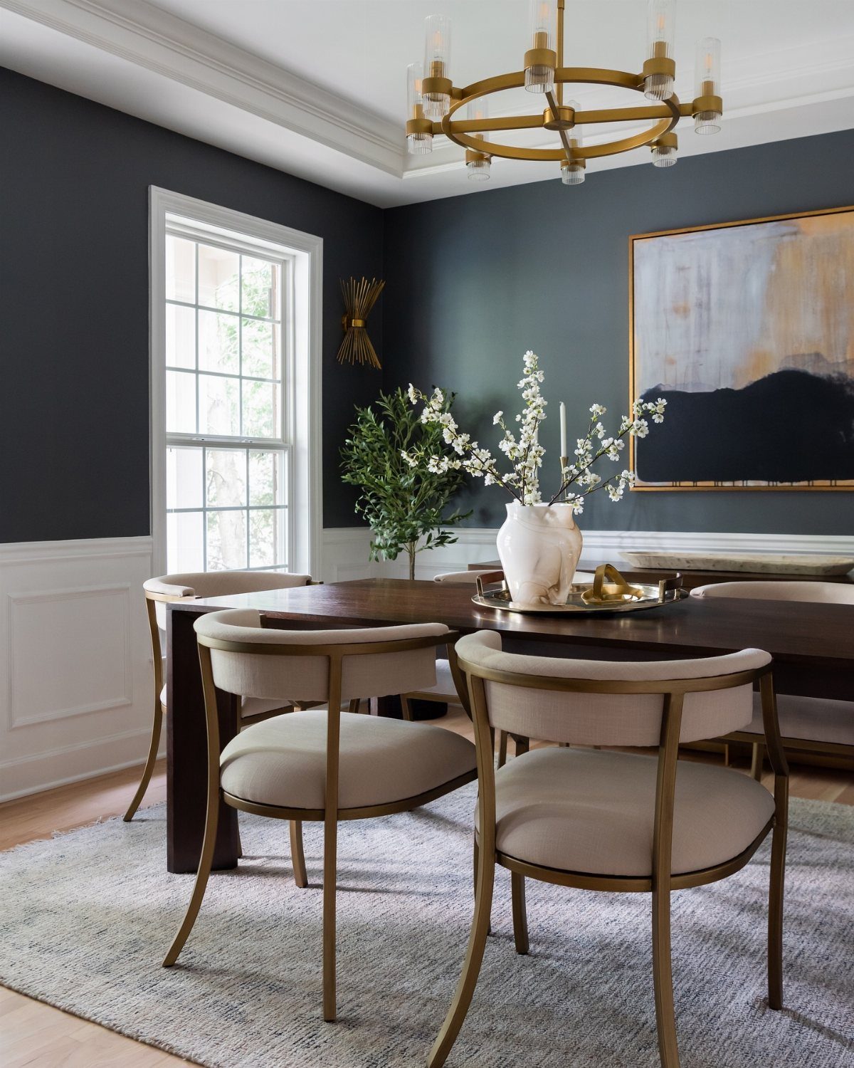
Dark walls in a small dining room do not shrink the space; they wrap it like a booth in a good restaurant, and the intimacy is the point.
Charcoal, deep navy, or forest green works best with white wainscoting or trim to keep the ceiling from dropping.
The paint itself is standard eggshell, nothing special, but the preparation takes longer than you’d expect: two coats minimum, and the edges against light woodwork need a steady hand.
Brass or gold hardware and a warm wood table keep the mood from turning cave-like.
This suits evening diners who use the room after dark more than at noon; if your meal times run to breakfast and lunch, the same color can feel heavy by 9 AM.
7. Bold Lighting
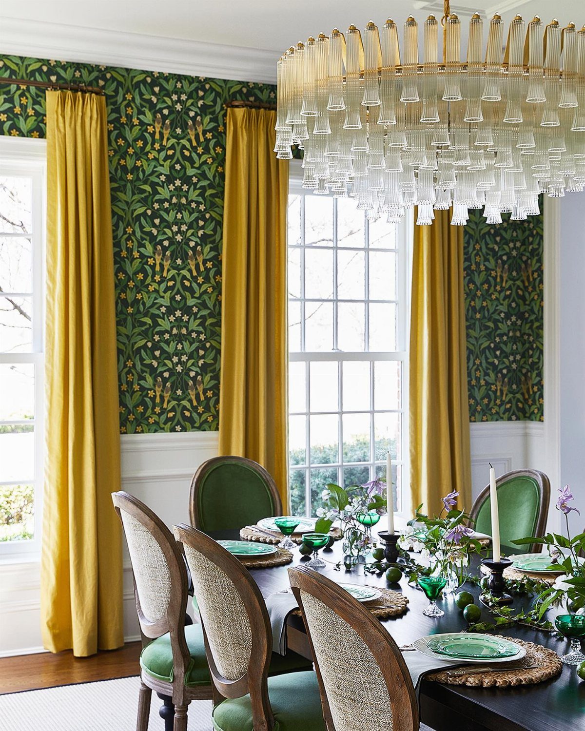
A chandelier that pulls the eye upward buys back the floor space a lamp would steal and removes the risk of knocking something over when you’re squeezing past chairs.
A pendant hung high enough to clear heads still pools light where you eat; aim for that balance rather than crowding the table.
Barbara Bestor pulled this off in a small Craftsman bungalow with a sculptural fixture, and the maker here went further by pairing an oval chandelier with matching sconces so the glamour stayed consistent across the room.
Brass, black iron, or tiered glass all read as bold in a small footprint. I’d pick a single oversized piece over a cluster of small pendants for a low ceiling; the visual weight lands cleaner.
8. Vertical Storage
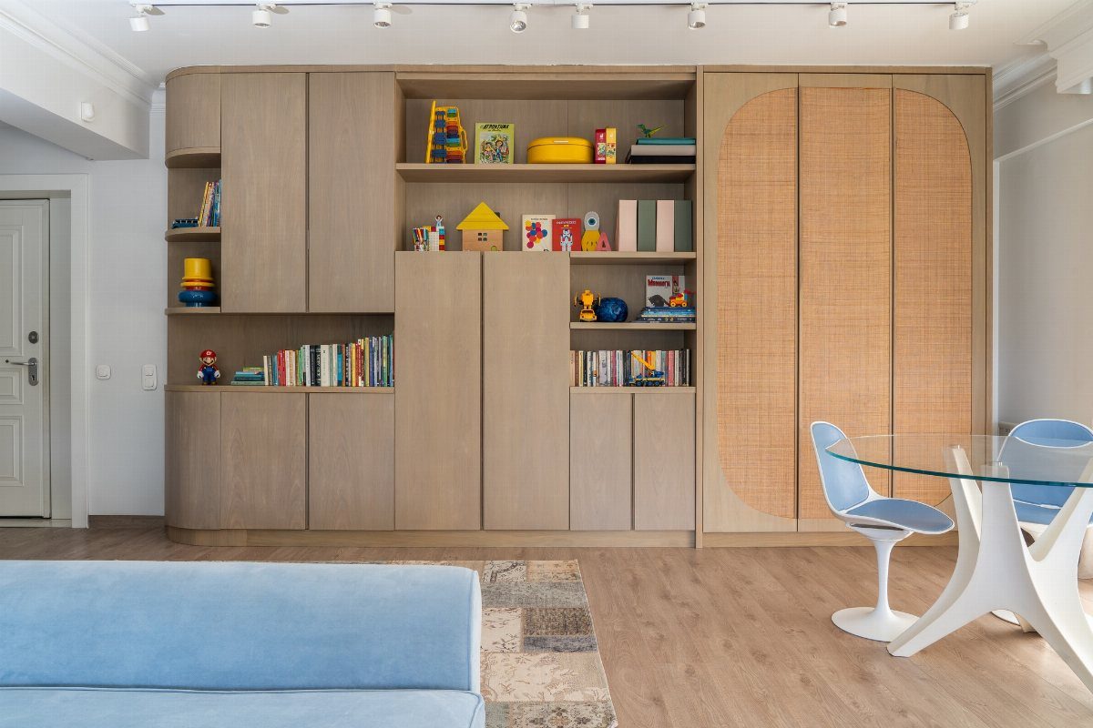
Built-ins that climb the wall replace the footprint of a credenza or china cabinet with depth you already weren’t using. Open shelving handles books and display, while rattan-front cabinets hide what you don’t want to dust.
Sara Hillery, a designer in Richmond, Virginia, points out that custom millwork can solve storage for someone who entertains even when square footage is tight; running it floor to ceiling makes the room read taller.
If you’re hiring out, expect to pay more than freestanding furniture but gain the wall space back. A plate rack version works for serveware you use weekly; closed lower cabinets suit linens and the good dishes.
9. Natural Light
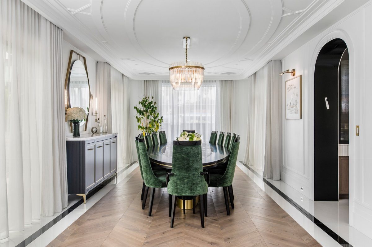
Green velvet chairs placed where the light falls get an extra boost from a mirror behind them that catches what the windows let in and pushes it deeper into the space.
If your only window faces a wall or an alley, a framed mirror wall can fake the effect by reflecting whatever light does arrive. South-facing exposure gives you the most hours; east-facing means morning meals glow.
I’d skip heavy drapes in a room under 120 square feet; the fabric competes with the airiness you’re after.
10. Folding Screen
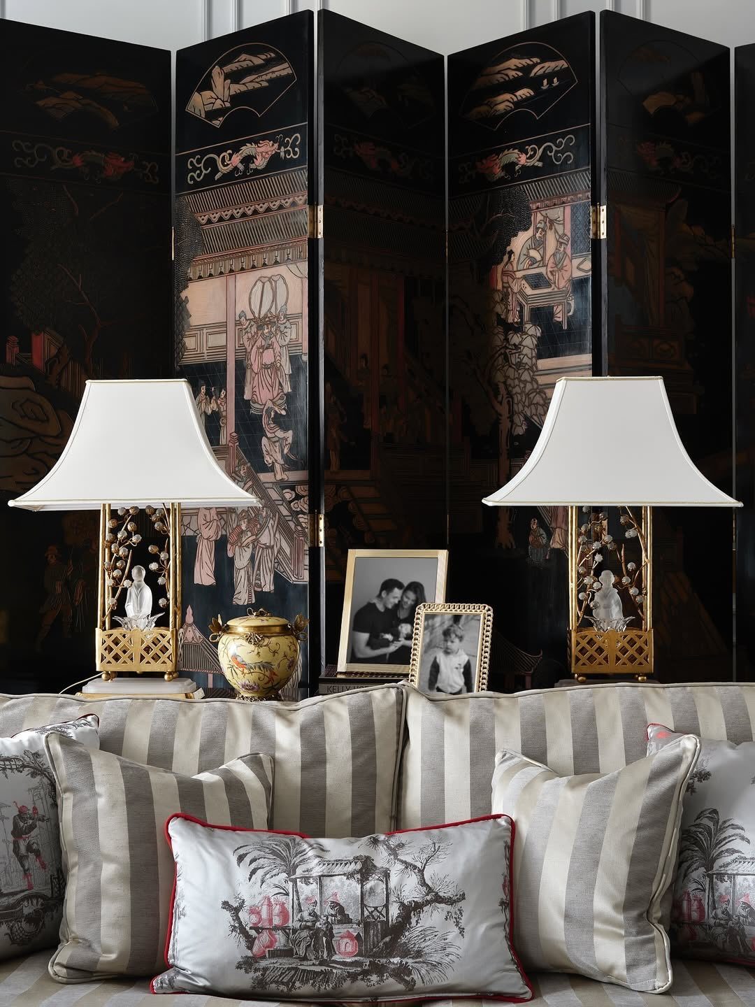
A folding screen carves out a dining corner in a studio or open plan without the commitment of a wall, and it moves when your needs change.
A folding screen behind a console marks the zone without blocking flow; that beats boxing anyone in. Screens with panels under 18 inches wide fold flat enough to slide behind a door when you’re hosting larger.
The maker of this one paired it with matching lamps to keep the vignette intentional. Rattan or paper panels pass light through; solid wood or upholstered versions read more as furniture.
I’d use a screen only where the dining area lacks any architectural boundary; otherwise it becomes one more thing to edge around.
11. Colorful Seating
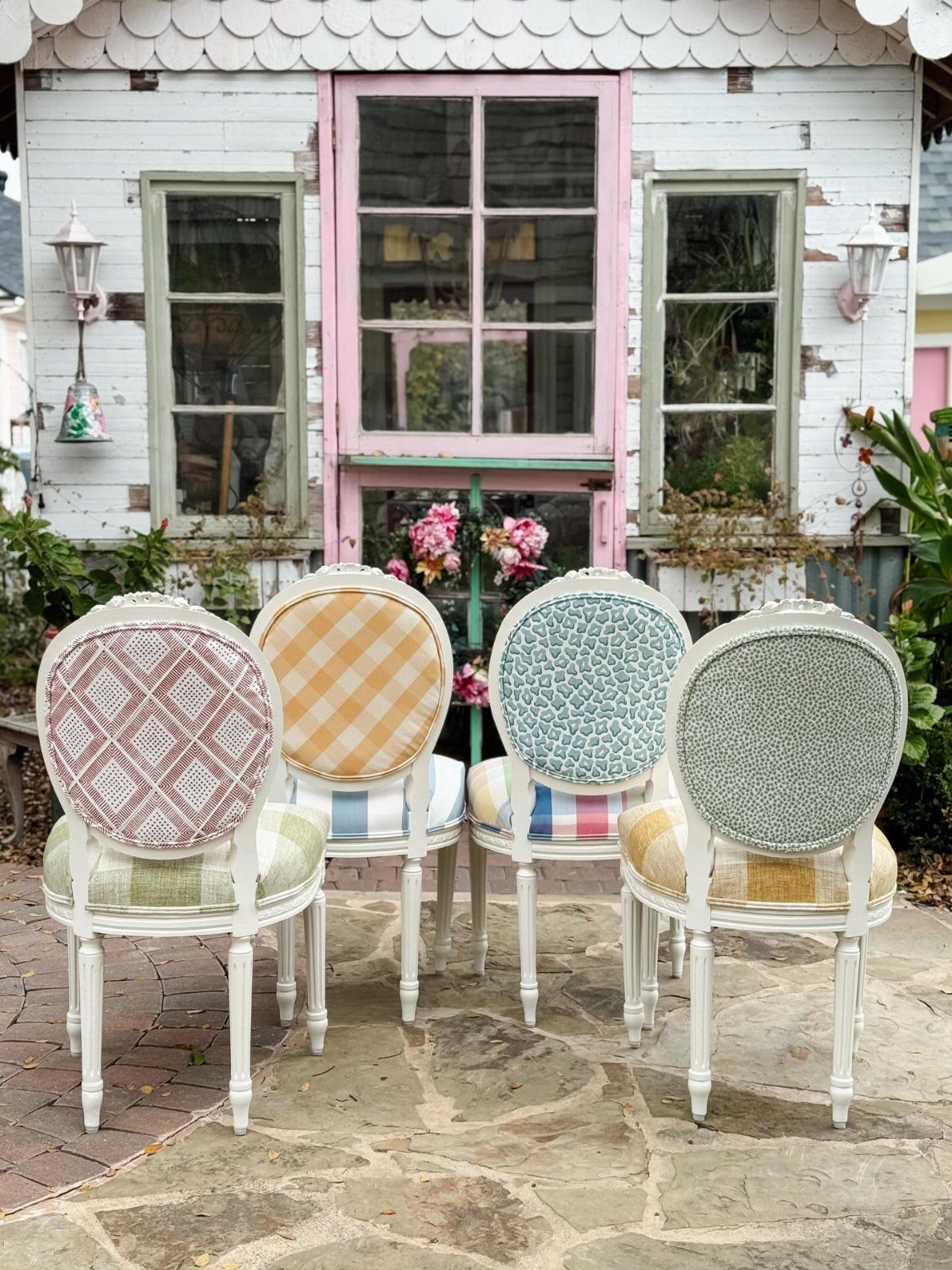
Mismatched chair fabrics turn a basic white frame into the room’s entire personality statement, and four different patterns still read as a set when the silhouette stays the same.
If you’re buying new, some makers sell frames and upholstery separately so you can mix without the work. Reupholstering four seats yourself runs cheap in fabric and foam, though costs climb fast if you need to buy tools too.
I’d limit the palette to four colors or fewer; beyond that the eye has nowhere to rest.
12. Plate Gallery Wall
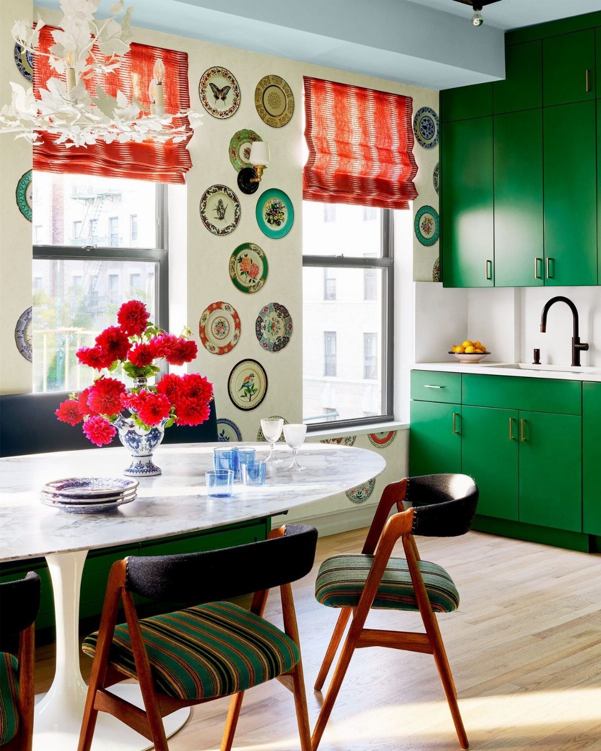
Plates hung in a loose grid turn the wall between windows into color and pattern that a small room can actually spare.
The shape reads as art, not clutter, because each piece sits in its own space and the collection stops at a clear border.
A plate wall asks for almost no depth, which matters when every inch of floor counts. I like thrift store finds mixed with one or two pieces that mean something; the mismatch is the point.
Adhesive plate hangers work on most surfaces and leave no holes if your lease says no.
This one suits renters who want color without paint, or anyone whose table sits too close to the wall for a sideboard. Dusting is the only real downside.
Skip it if you need that wall for a folding chair or two.
13. Checkered Flooring
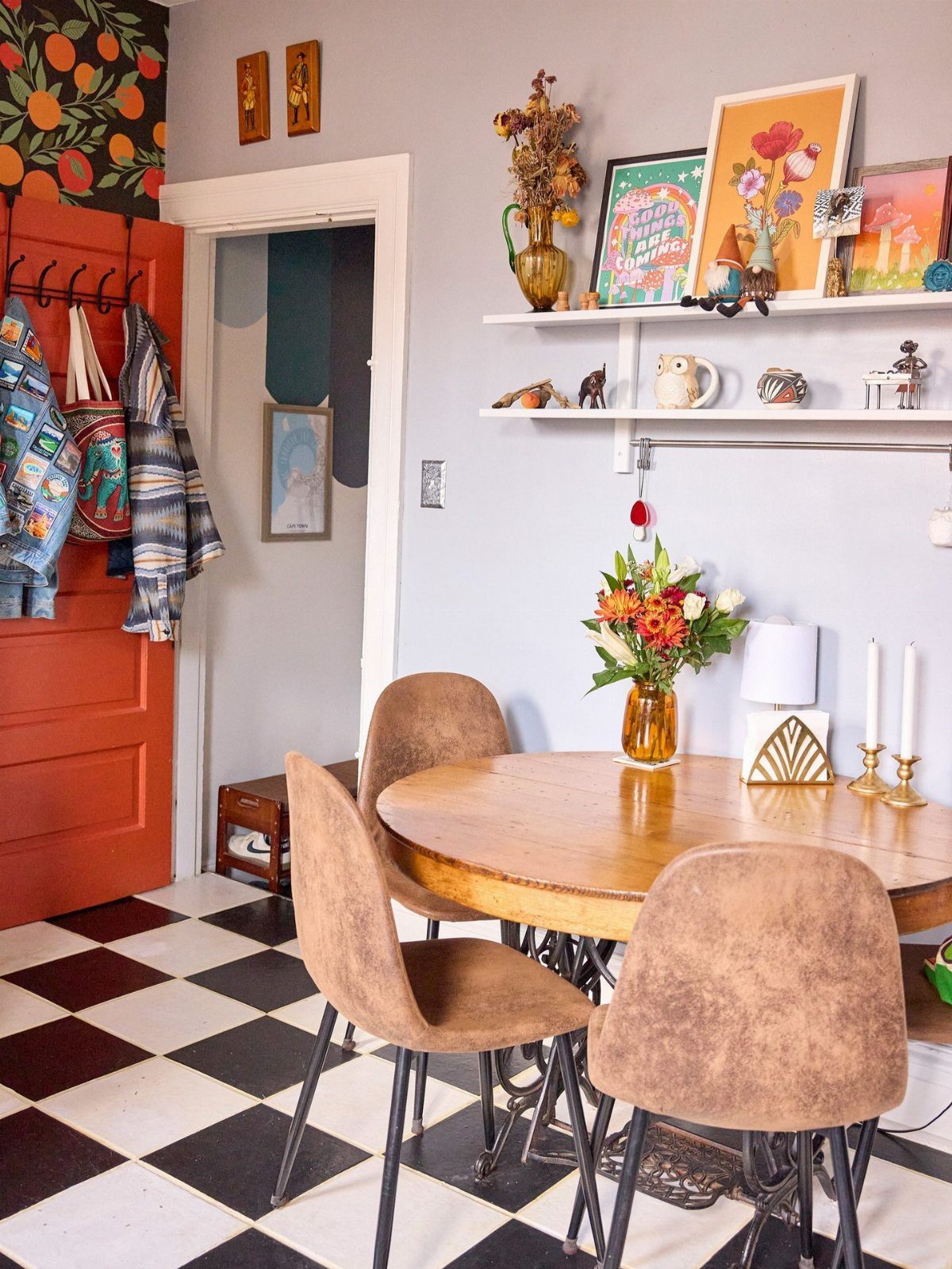
A black-and-white checkerboard floor does the heavy lifting in a room too small for much furniture. The pattern creates its own architecture; the eye reads depth that the square footage does not hold.
Vinyl tile or peel-and-stick versions run cheap and go down in a Saturday, which matters for a rental you cannot modify permanently. Squares that repeat every other tile keep the pattern from feeling busy.
Start from the center and work out, so the cut edges hide at the walls.
This floor reads bold and a little retro. It pairs best with simple furniture and walls that stay quiet, letting the grid be the whole statement.
Busy patterns elsewhere fight it. Pick this if you want one big choice that solves the rest of the room by default.
Maximizing Small Spaces
Small dining rooms work best when every choice earns its place. A Murphy bed or sleeper sofa in an adjacent room can free the dining area from double duty, letting it stay set up for meals.
In a studio or open plan, that separation alone makes the space feel larger.
I like a monochromatic palette for the tightest spots. One color carried across walls, trim, and even the ceiling keeps the eye moving instead of stopping at every edge.
Sara Hillery’s approach makes sense to me: small rooms already read cozy, so pushing for "spacious" can fight the architecture. Better to choose whether you want intimacy or airiness, then commit.
Texture adds the warmth that color sometimes can’t. Layered textiles, a footed silver bowl with hydrangeas, small table lamps on a sideboard; these fill a room without crowding it.
“A small dining room can feel larger by enveloping it all in one color or even tenting the space,” says New Orleans–based designer Chad Graci. “Don’t forget: Mirrors add depth and dimension.”
Choosing Colors
Light colors recede, dark colors advance, and either can work if you don’t split the difference. A moody navy or deep green wraps a small room like a booth at a good restaurant; it feels intentional, not apologetic.
For airiness, keep the palette simple and the values close.
Nina Venice at Four Hands puts it plainly: clunky seating ruins a graceful small space, but undersized furniture makes the room itself look smaller. The pieces need to suit the space, not just fit inside it.
A bench or banquette on one side of the table gains you walkway where individual chairs would jut out. Sliding it into a corner keeps the path clear without knocking anything down.
Heather French in Santa Fe goes round instead of square; the curve leaves more room to move. I agree; the curve lets people slide past without the corner catches of a rectangle.
Furniture Scale
Scale matters more in a small dining room than in a large one because there’s nowhere for mistakes to hide. A table that functions for work and meals solves two problems if you actually use it both ways.
Leanne Ford’s farmhouse table approach; spread out projects, then clear for dinner; works when the room must serve double duty.
One bench instead of two chair sets changes the geometry entirely. The flat face takes less depth than a pulled-out chair, and you can push it flush to the wall between meals.
For a table, I measure the room both ways, then shave off enough for someone to slide behind a seated chair; that leftover space is your hard ceiling on table size. Less if the traffic path is tight.
Round tables earn their keep in awkward nooks. A compact round seats four where a stretched-out rectangle would catch the door every time it swings.
Lighting Importance
A single bold fixture does more for a small dining room than several cautious ones. Emily Johnston’s gold globe pendant is the right idea: one strong shape overhead pulls the space together and gives it a center.
In a room with no architectural features worth noting, the light becomes the feature.
I hang pendants low enough to pool light on the plates, high enough that no one bumps them standing up.
Lower than that and tall guests take it in the forehead; higher and the light pools uselessly while you strain for candlelit atmosphere. Dimmers matter here.
Full brightness for setting the table and cleaning up; low for the meal itself.
The goal is enough light to see your food and your company, not to read the fine print. Small rooms feel smaller under a single harsh source; multiple softer ones let the walls breathe.
Frequently Asked Questions
What color is best for a small dining room?
Either light or dark works if you commit fully rather than splitting the difference. A monochromatic palette, walls through ceiling in one color or very close values, keeps the eye moving and the room reading larger.
Dark navy or forest green wraps the space in intimacy, like a restaurant booth, while pale tones push walls outward for airiness.
I would pick the mood you actually want and stay consistent; mixed signals make the space feel smaller than either extreme.
What can you do instead of a dining room?
A Murphy bed or sleeper sofa in an adjacent room lets the dining area stay set up for meals without double duty, which alone makes the space feel larger.
What are some unique ideas for a dining room?
Mismatched chair fabrics on identical silhouettes turn seating into the room’s whole personality statement, limited to four colors so the eye has somewhere to rest.





