
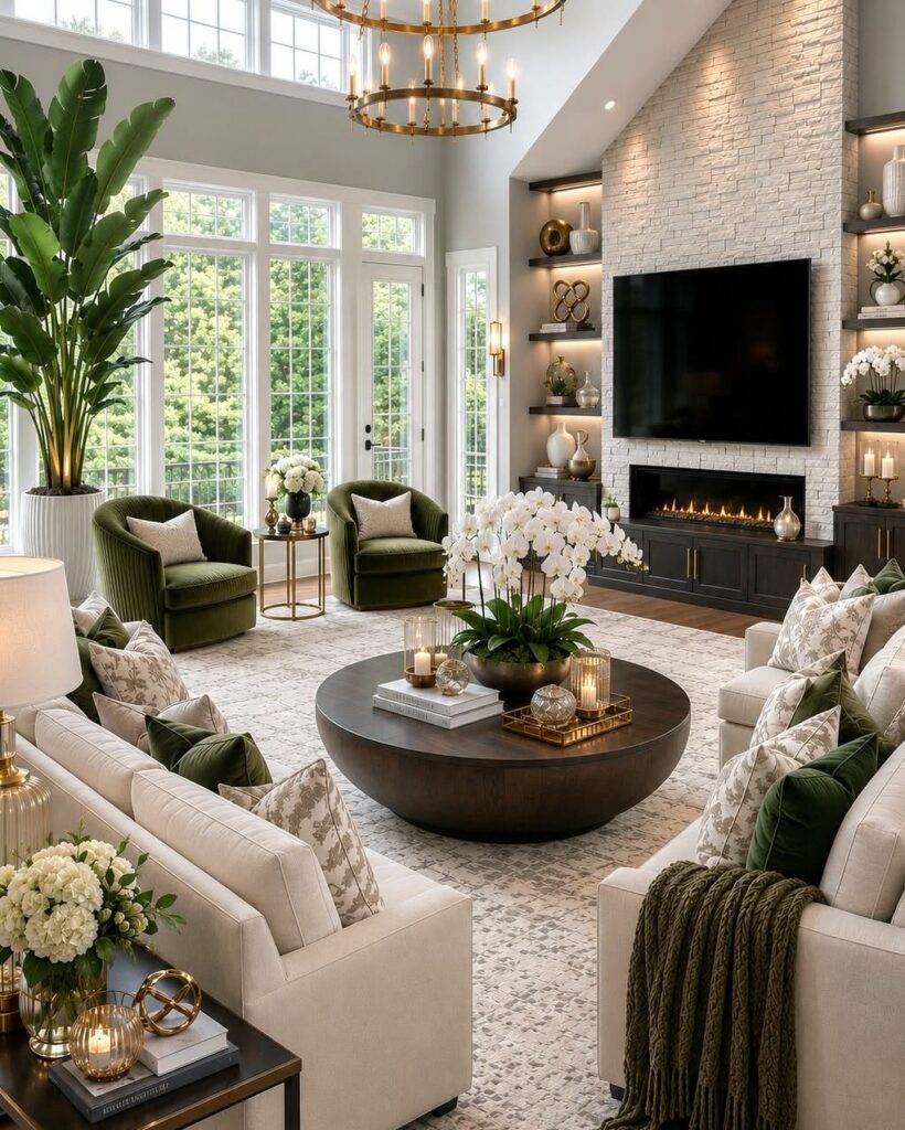
These ideas run from dimmer switches and paint to the serious cost of a grand piano or custom shutters, and the one that fits depends on whether you are dressing a rental you cannot alter or finishing a room you own.
A mirror leaned against the wall gives renters the same light bounce as a built-in panel, while a grand piano asks for a permanent address and a tuning budget.
1. Layer Luxurious Textures
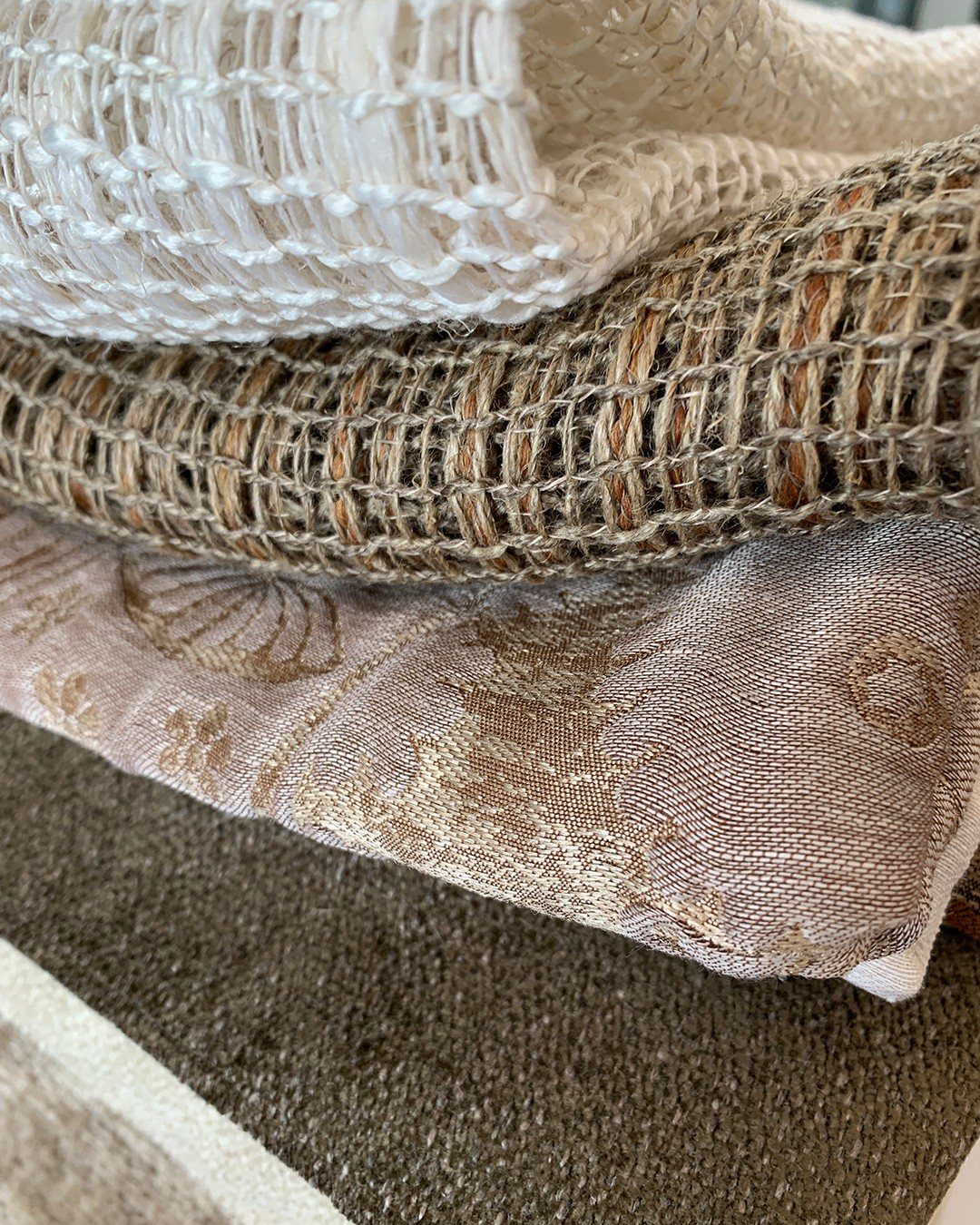
A luxury living room lives or dies by what your hand actually touches. Velvet against marble, leather beside raw linen, a chunky knit thrown over a polished bench: the contrast is what reads as expensive, not any single fabric.
Start with what you already own. Add one opposite texture, something rough against something smooth or matte against shiny.
Sheer curtains only work when the fabric floats; too heavy and they hang like drapes, too light and they read as gauze.
The maker’s own name for this mix, "in the air," gets at the same thing: weight matters as much as weave.
Cashmere throws and shag rugs layer well for warmth without clutter. Keep the palette tight; three textures in two colors beats five colors with no touch.
2. Minimalist Luxury
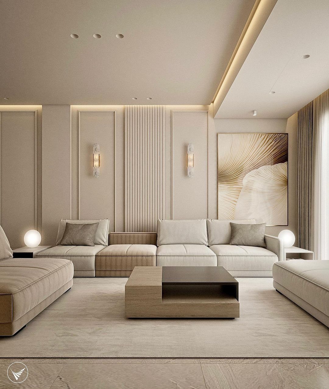
Minimalist luxury is the bet that one perfect piece beats twelve good ones. A low sofa and quiet paneling read as calm because nothing competes for attention.
I would put the money into a single marble coffee table or a sculptural fireplace surround, then stop. Roman clay walls, softened with a warm neutral, keep the room from feeling like a showroom.
A big vase or grouped objects on that table gives the eye somewhere to land. Without that anchor, the space drifts.
3. Accent Colors
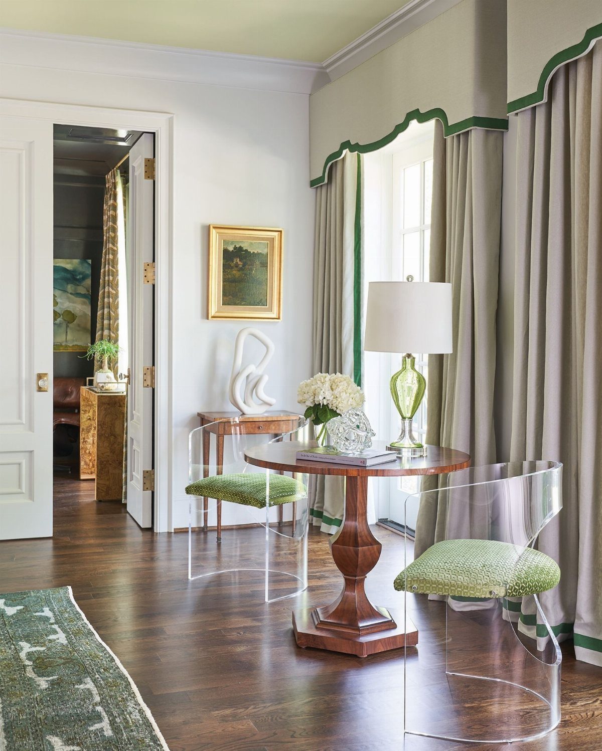
One color, repeated three times, turns random objects into a plan. Green cushions, trim, and a lamp carry the same color through a room with less commitment than painting a wall.
Pick your accent first, then hunt for it in two more places: a frame, a book stack, a single stem. Metallics work the same way; brass or matte black in legs, frames, and fixtures ties a room together without shouting.
The base stays neutral. Emerald, burgundy, even a sharp mustard all read richer against grey or cream than against white.
4. Opt for a Statement Sofa
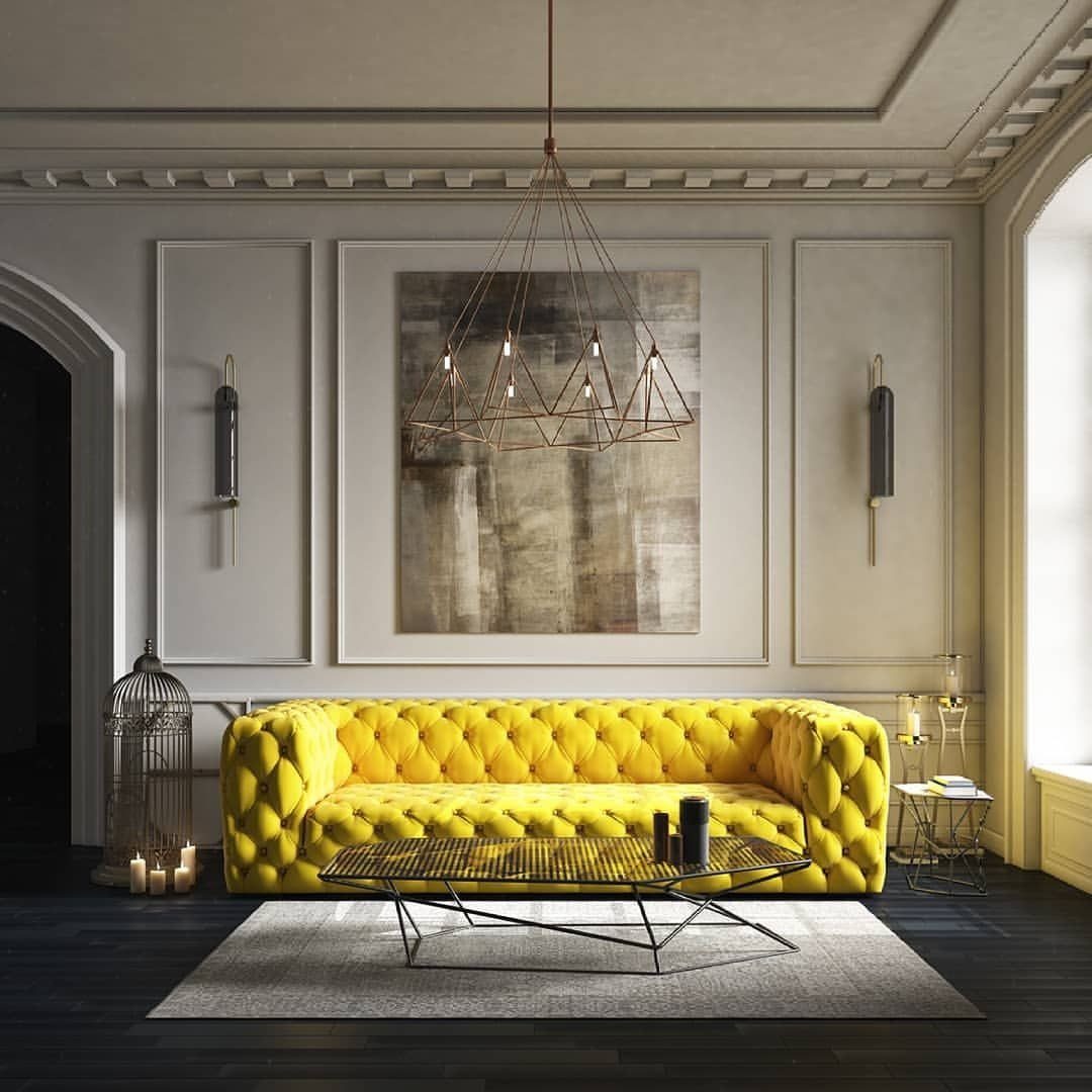
A yellow velvet sofa that size is a gamble that paid off.
The tufting and wire chandelier keep it from reading as a mistake, but the real lesson is simpler: one big piece in a strong color lets everything else stay quiet.
Too much velvet kills the effect. I’d use it on the sofa or the chairs, never both, and balance with linen, wood, or metal nearby.
The designer who chose this one started with the coffee table, then matched the sofa to it. Working backward from a piece you already own keeps the bold choice from floating free.
5. Smart Lighting
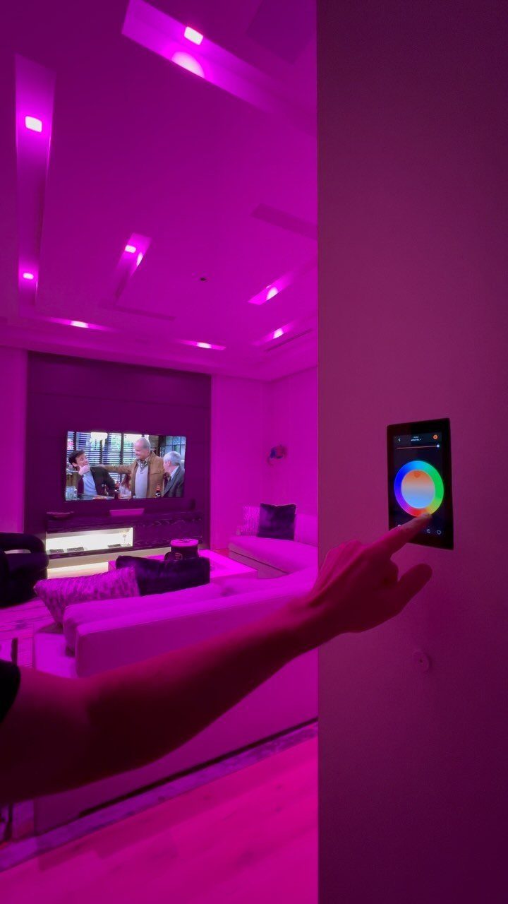
Layered lighting means never relying on the ceiling fixture alone. Sheer panels or linen curtains pull in daylight; brass or matte black lamps and sconces carry the room after dark.
Dimmer switches are the cheapest upgrade that reads as luxury. One on every circuit lets you drop the room from task brightness to something softer after 8 pm.
A pink wash like that one comes from smart bulbs set to a scene, not from colored shades or gels.
The hardware costs more than standard fixtures, but the control it gives, mood by mood, replaces a dozen lamps you do not need to buy.
6. Bold Lighting
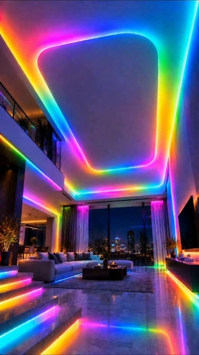
LED strips outlining the ceiling and floor turn architecture into a fixture.
Big lampshades or a gleaming gold base do the same work without wiring. A chandelier scaled to the room, not the table beneath it, draws the eye up and makes the ceiling feel higher.
I would choose one dramatic light source per room. Two fight; one decides the mood.
7. Eclectic Style Fusion
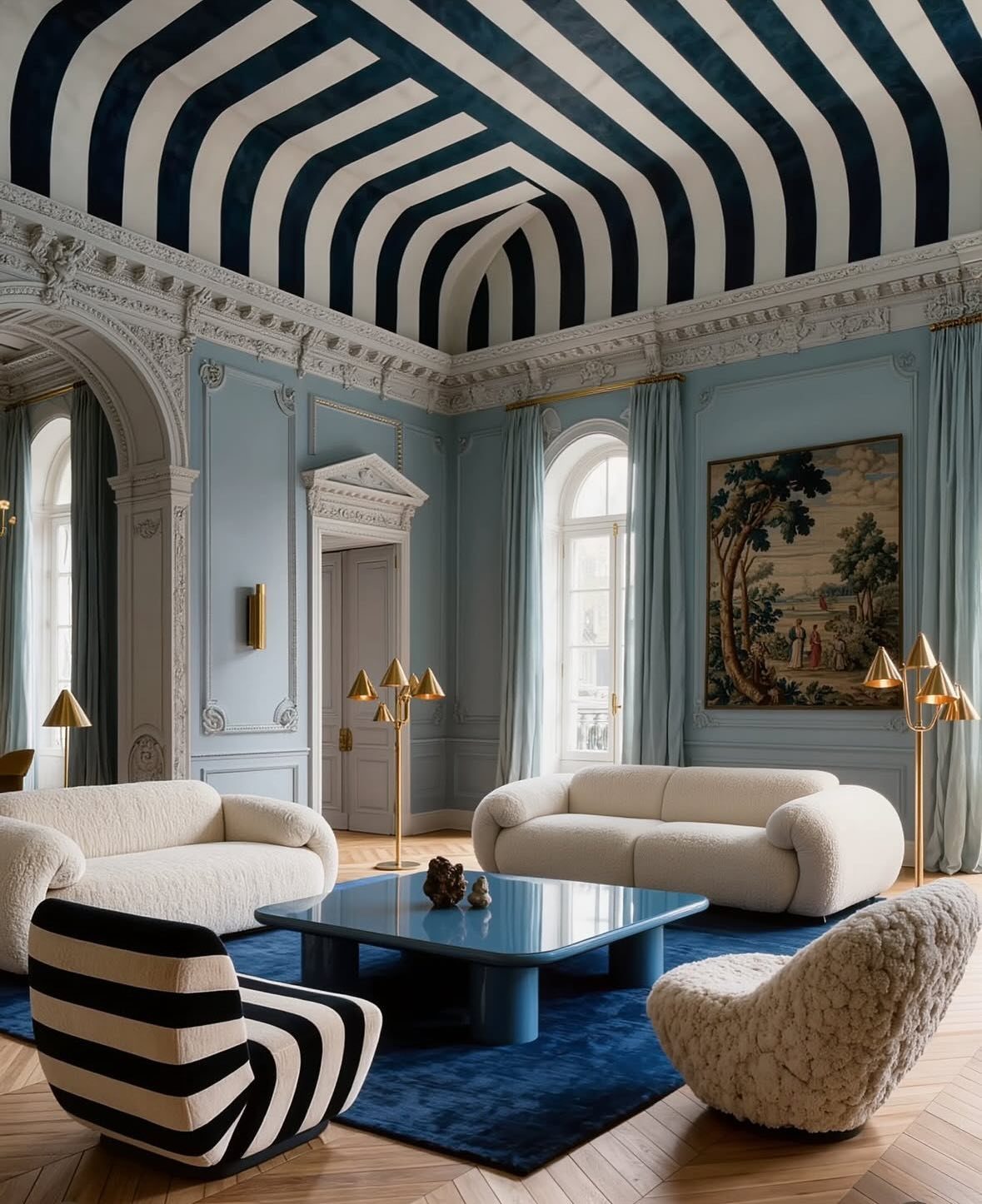
An eclectic living room pulls together pieces from different eras and movements until they start talking to each other. Striped ceilings and curved sofas push contrast right up to the edge before it finally clicks into place.
Start with one piece that demands attention, like a vintage Mario Bellini sofa or a bold contemporary table. Build outward from its color or shape, mixing in neutrals to keep the eye from tiring.
A mustard velvet sofa works the same way: anchor it with pillows that pick up its undertones rather than matching it exactly.
The risk is clutter. I stop at three distinct styles in one room, and I repeat one material, like the gold floor lamps here, at least twice to tie things together.
8. Statement Rug
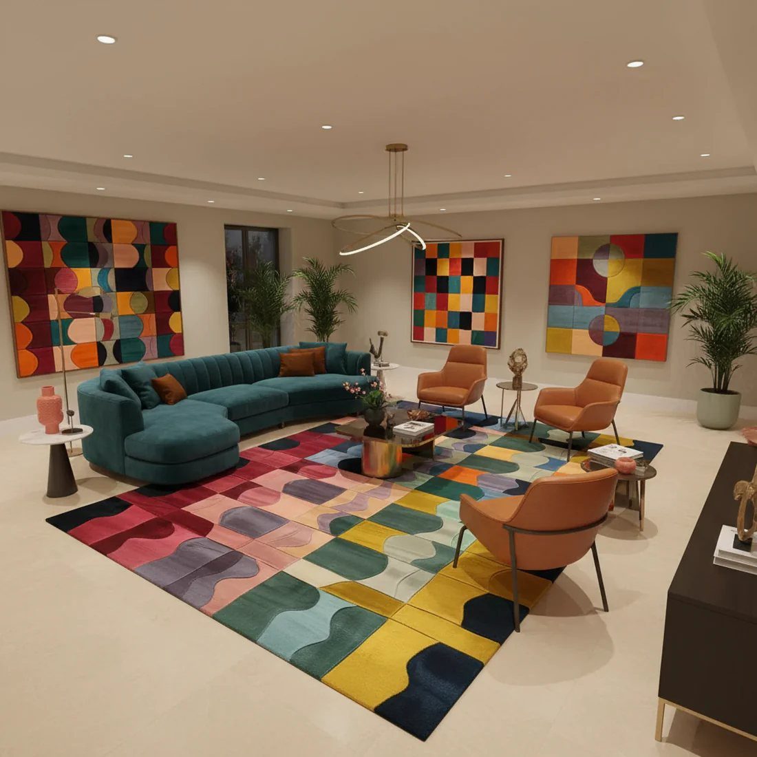
A rug that stops short of your sofa legs makes the whole room feel like a waiting area. A geometric pattern that reaches under every major piece is what makes a space feel finished.
Wool or a wool-silk blend holds up best for the traffic a living room gets. Natural fiber rugs run cheaper than you’d expect for the size, and they age better than synthetics that pill or flatten.
Measure your seating area, then add 18 inches on each side. For a standard 7-by-10-foot grouping, that usually means an 8-by-10 or 9-by-12 rug.
If your budget forces a choice between large and ornate, go large and plain every time.
9. Incorporate Art
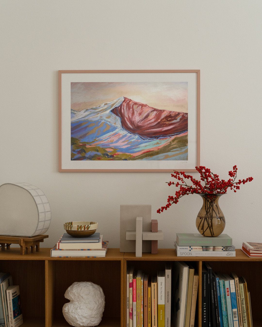
One large canvas does more than a wall of small frames. The mountain landscape above the bookshelf reads as a deliberate choice, not a collection that accumulated by accident.
James Thomas used soft white walls in a Beverly Hills project to let bold abstract work dominate, and the same principle scales down. A single oversized piece becomes the room’s punctuation mark.
Mix styles if the palette stays related. A soft sky print sits well beside a geometric piece that shares one of its hues.
I hang art with its center at average eye level, which puts it where people actually look without measuring up from the sofa back.
10. Sculptural Furniture
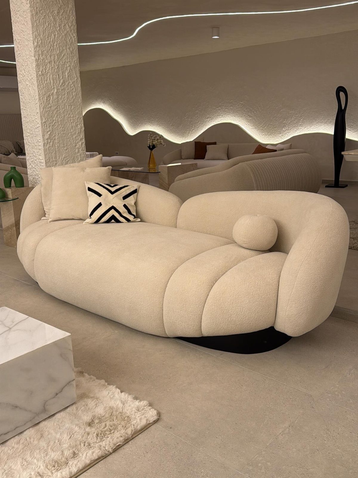
Bouclé texture carries a space without competing with a wavy light fixture behind it.
A regular furniture hunt turns up pieces with this kind of presence. Swapping standard legs for tapered wood, blackened steel, or a simple metallic finish turns a basic frame into something intentional.
Gold legs on one piece and black on another looks accidental; repeating one finish across two or three pieces reads as a decision.
I look for one curved or unexpected silhouette per room. More than that, and the space starts to feel like a gallery instead of somewhere to sit down.
11. Vintage Accents
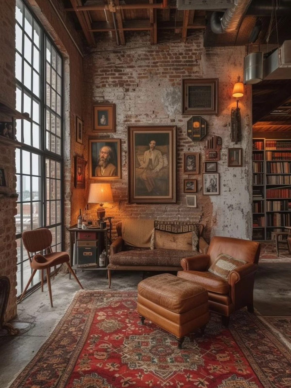
A vintage leather armchair against exposed brick carries weight that new materials struggle to match. Portraits and a worn rug layer time periods until a room feels collected rather than decorated.
Old pieces need clean modern lines nearby that give them room to breathe. A loud contemporary artwork, like the Stanley Whitney piece Cliff Fong used in a 1927 Los Angeles mansion, can become the bridge between eras.
The vintage starts the conversation; the new work answers it.
I limit true vintage to two or three pieces per room. A shag rug, a worn leather seat, a set of framed prints: enough to suggest history, not a museum annex.
12. White Luxury Living Room

White reads as luxury because it demands maintenance. Crisp white furniture against a window demands the kind of attention most households do not give.
Performance fabrics have changed the calculation. A white sofa in a high-traffic room is now possible if the upholstery is rated for heavy use and cleaned on schedule.
I still would not attempt this with pets or small children unless the slipcovers come off and go straight into a washer.
That restraint amplifies natural light and never fights with a changing view. Layer textures, linen against wool against ceramic, so the monochrome does not flatten into blankness.
One warm tone, a cream or a soft gray, keeps the space from feeling sterile.
13. Elegant Shutters
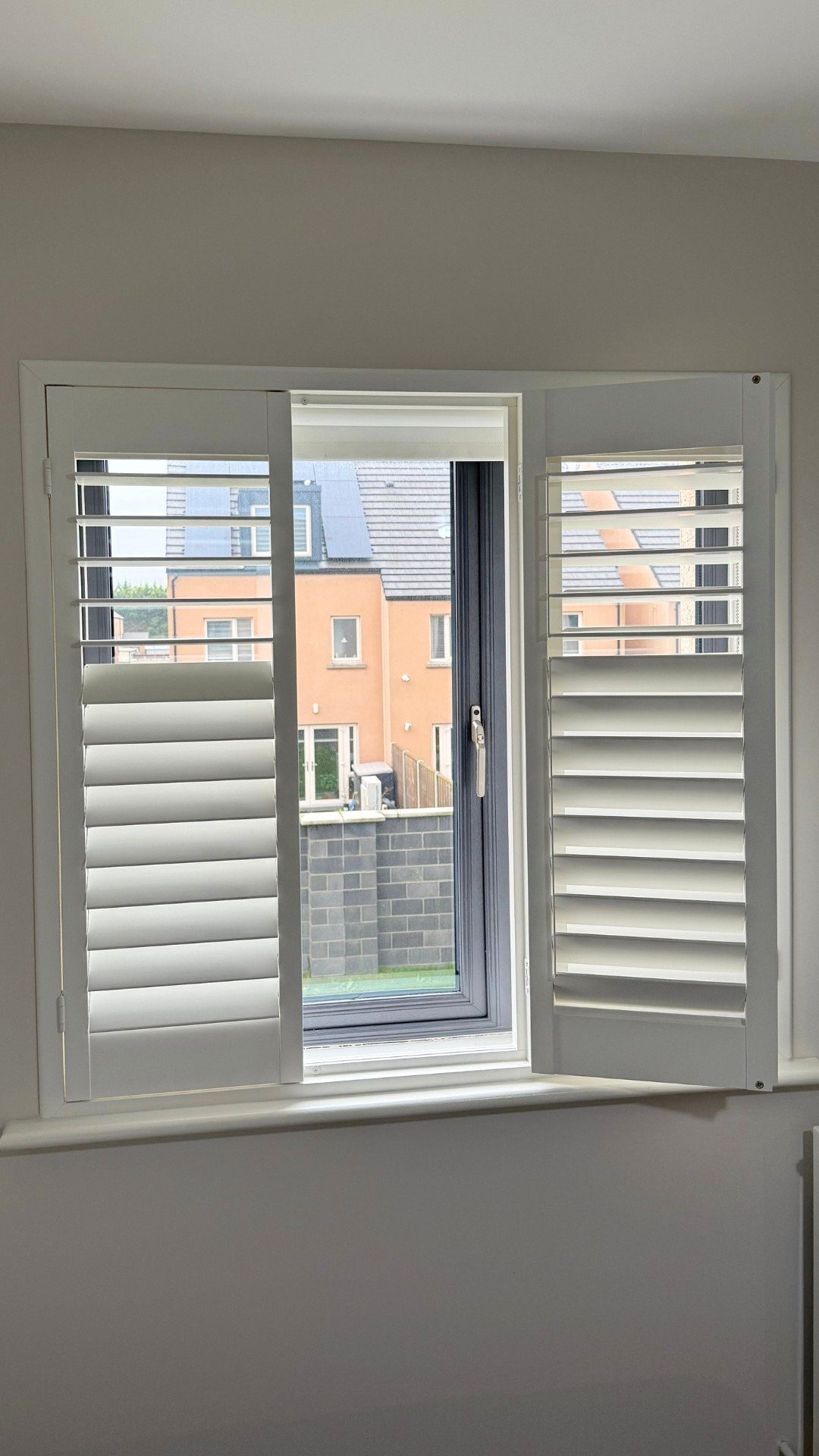
Plantation shutters frame a window like built-in architecture, not an afterthought. Their solid louvers tilt to cut glare without killing daylight, and the panels fold back completely when you want the view.
I chose wood over vinyl for the weight and the way it takes paint; the finish matches the trim exactly instead of reading as a separate purchase.
For rooms where shutters won’t work, floor-length linen or velvet drapes hung high and wide past the frame do the same job of finishing the window like a deliberate choice.
The cost runs higher than blinds, but the insulation and the fact that they stay with the house help justify it.
14. Highlight Architectural Details
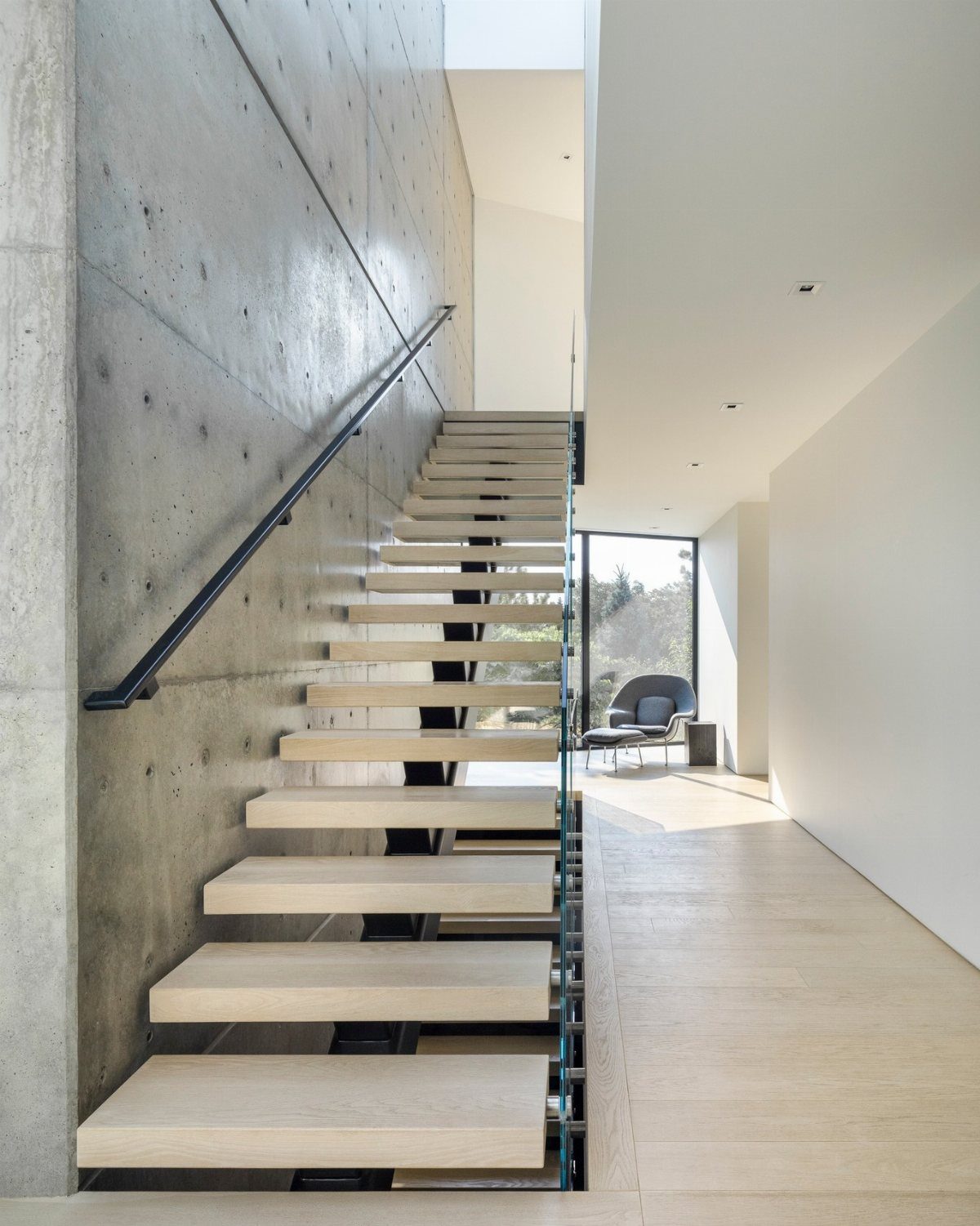
Raw concrete with tie-rod holes left exposed reads as luxury because it is something you chose not to cover up.
Crown molding, ceiling beams, original brick, or a staircase’s honest structure deserve paint that sets them apart, not paint that hides them.
In newer houses with none of that history, you build it back in.
Picture-frame molding on flat walls, a coffered ceiling in a room that feels too tall and empty, or a simple trim band where wall meets ceiling at an awkward height.
Paint the ceiling a shade darker than the walls; it drops the visual lid and makes the room feel intentional rather than unfinished.
15. Large Artwork
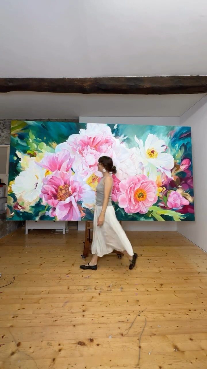
A single wide canvas does what three smaller pieces cannot: it reads as commissioned, not collected. The scale forces the eye to travel, and the room suddenly owns the gallery effect without the white cube attitude.
I hang oversized work higher above the sofa than usual so the piece breathes and the furniture doesn’t crowd it. For budgets under a few hundred, a printed and mounted photograph at similar scale delivers the same wall presence.
16. Indoor Plants
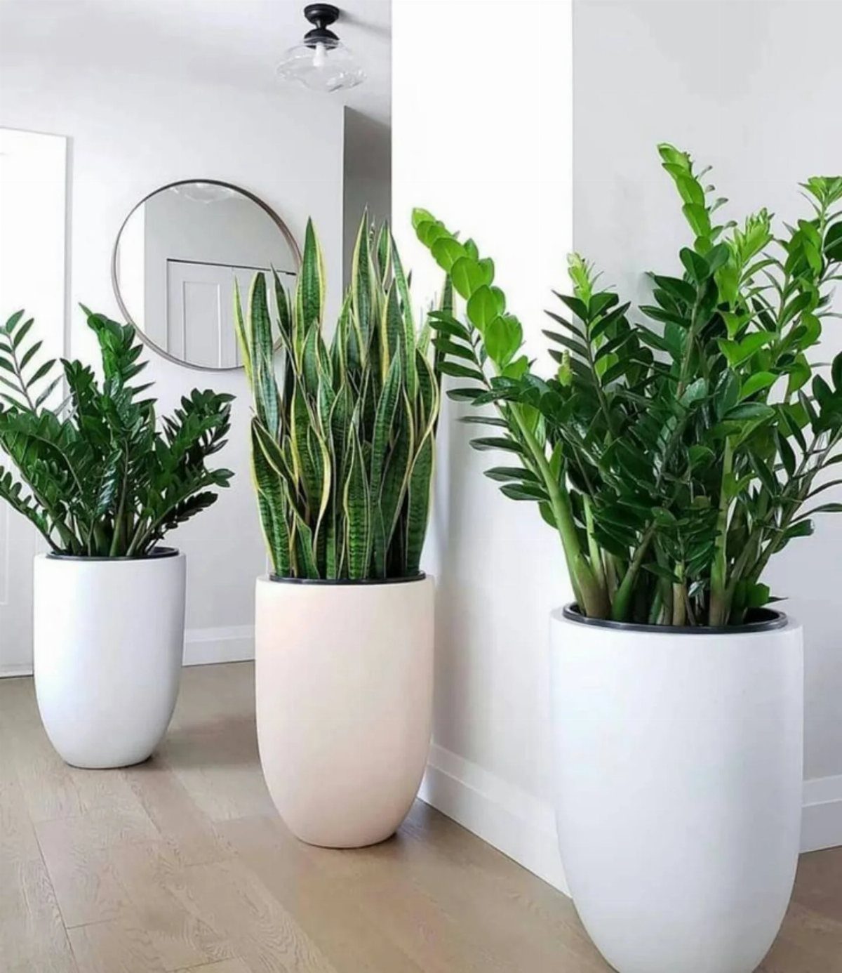
Three plants in clean ceramic pots against a white wall prove that green reads as color without demanding a decision.
Fiddle-leaf figs, olive trees, or simple snake plants soften corners that furniture can’t fill and break up the flatness of painted drywall.
I water on the same day each week, which keeps me from loving them to death. The pots matter as much as the plants; smooth oval shapes in quiet colors let the foliage do the talking.
For travelers, a single large specimen in a heavy pot survives a missed week better than a cluster of small ones that dry out fast.
17. Grand Piano Centerpiece
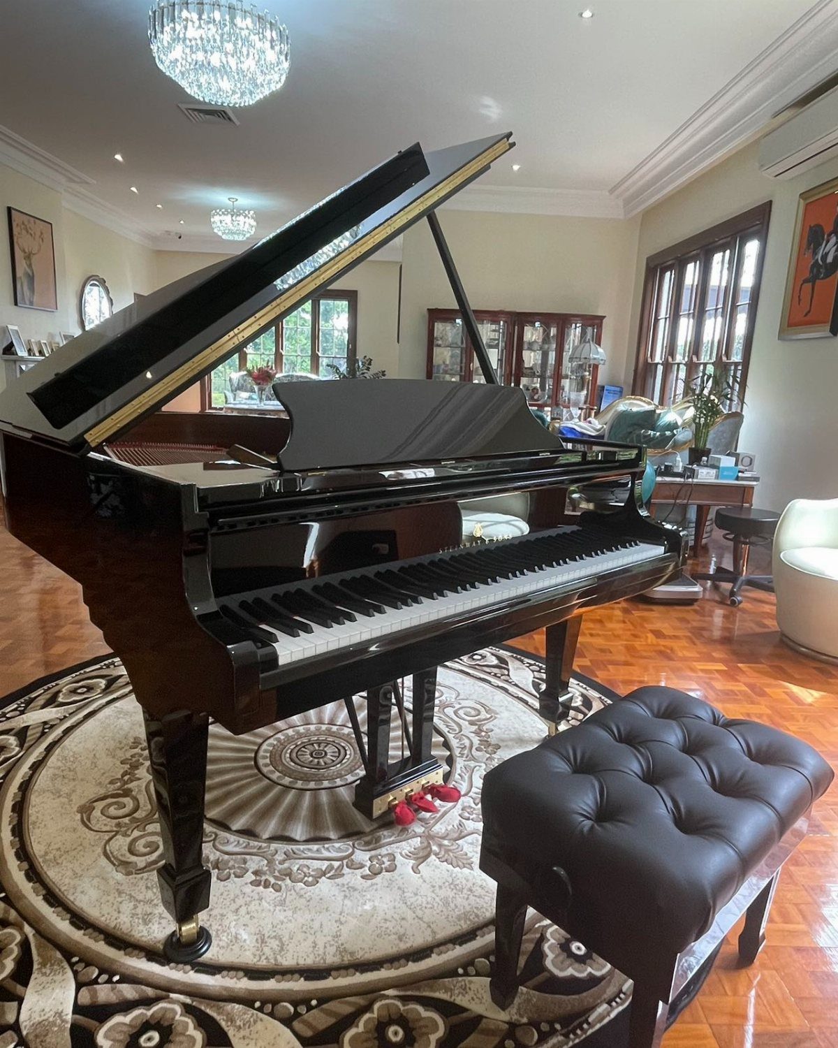
A grand piano announces that the room is for something besides television, and the footprint it asks for is part of that statement.
The lid up or down changes the silhouette completely; open, it invites playing, closed it becomes a polished black sculpture.
I don’t play well enough to justify one, but I’ve seen a client’s Baldwin anchor a room so completely that no other focal point was necessary.
The bench becomes extra seating in a pinch, and the surface holds drinks only at your peril.
For the look without the instrument, a baby grand’s empty case or a vertical piano’s stripped harp mounted on the wall borrow the shape without the tuning bills.
18. Fireplace as Focal Point
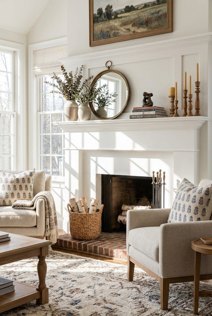
A working fireplace with a proper mantel gives a room its natural gathering point, something the television tries to replace and rarely manages.
The mantel itself is display space: a mirror that throws light back, tall candlesticks that draw the eye upward, or a stack of books you actually mean to read.
A woven basket for firewood beats a metal rack; the texture warms up the stone or brick surround.
In homes without a flue, a gas insert or even a well-arranged collection of pillar candles in the hearth delivers the same visual anchor.
19. Monochromatic Color Scheme
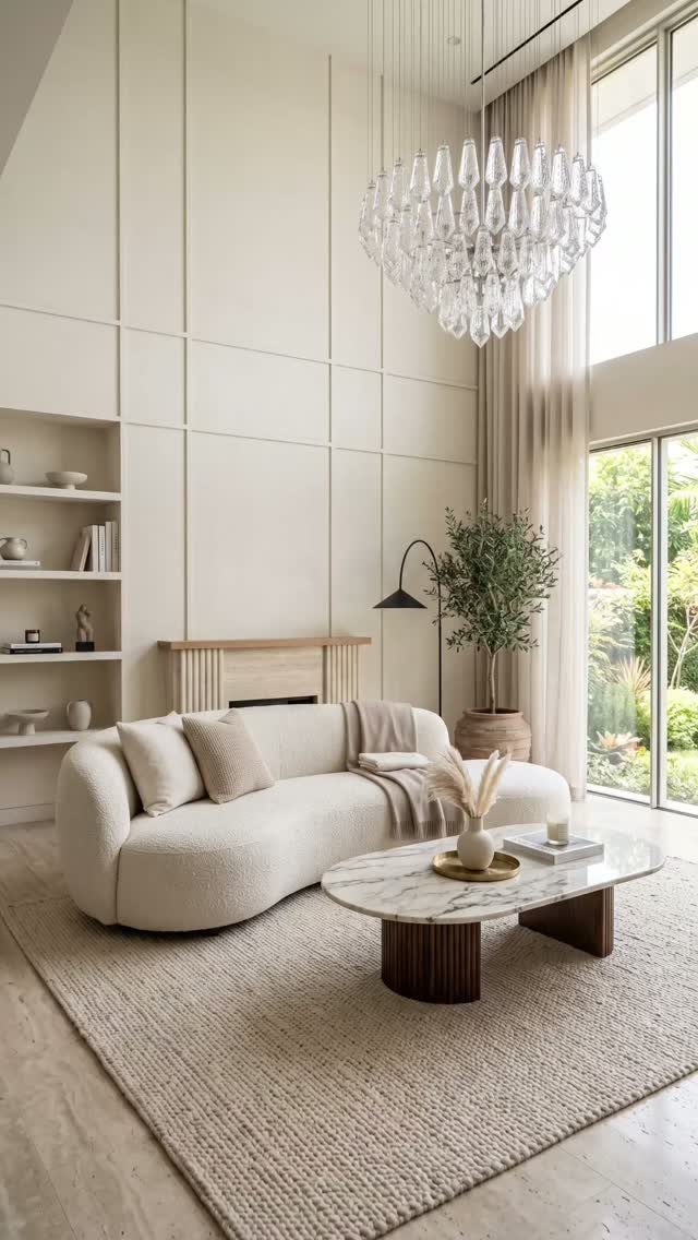
A quiet room can come from stretching one color across every surface: warm beige running from sofa to rug to walls without a hard stop.
Keep it alive through tone alone: cream against oat against sand, each layer a half-step off from the last.
Texture carries the weight when color can’t; a nubby rug, a veined marble table, a chandelier’s crystal catching light at different angles. Without that variation, the room flattens into a showroom.
For this reader, the palette is forgiving. Paint, fabric, and stone don’t need to match exactly; they need to stay in the same warm or cool family.
A single off note, a gray with blue undertones slipped among beiges, breaks the spell.
Best for spaces that already get good natural light. In a dark room, the same palette turns muddy.
20. Large Mirrors
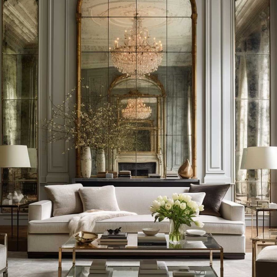
Oversized mirrors do the work of a window you don’t have to frame. The paneled glass above the mantel catches the chandelier and throws it back, so the fixture reads twice without the electric bill doubling.
Two mirrors facing each other, as one designer sets them in spacious rooms, pull the same trick further: light bounces until the eye loses track of where the room ends.
Placement matters more than frame. A mirror opposite a real window harvests daylight; one across from a lamp does the same after dark.
A gold frame above a fireplace has a natural anchor point that keeps the mirror from floating.
Cost runs high for custom sizes. A standard 48-by-36-inch framed mirror, leaned rather than hung, gives most of the effect for less.
Who it suits: renters who can’t install, or anyone whose wall can’t take the weight of a full-length panel.
Color Choices
Black and white, grey and gold, or off-white with rouge: these pairings work because they let one tone recede while the other steps forward. The balance matters more than the specific combination.
A soft top ottoman in a color drawn from the room’s featured art ties the palette together without shouting for attention.
I would pick a muted accent over a loud one every time, especially in a space where children put their feet up on the furniture.
Texture keeps a limited palette from going flat. Velvet against linen, or a matte wall against something with a slight sheen, gives the eye something to do even when the colors stay quiet.
Lighting Importance
A single overhead bulb will flatten any room, no matter what you spent on the sofa. Layer the light instead.
Linen or sheer panels let daylight through without blocking it. Dimmers let you pull the mood back for evening without switching anything off entirely.
Backlit mirrors or wall art count as accent lighting, not decoration with a side function. They draw attention to what’s already there rather than adding something separate.
I would put dimmers on every switch in a living room I actually used.
Texture and Material
Cashmere, leather, and a shaggy rug together sound like too much until you feel them in the same room. Soft and structured pieces belong together: a heavy throw across a firm sofa, a nubby rug beneath a leather ottoman.
Simplicity in the layout lets the materials do the work. The luxury comes from the finishes themselves, not from how many you can name in one glance.
I would rather have three textures I actually touch than six I walk past. Quality shows in the ones you use daily.
Attention to Detail
Crown molding, ceiling medallions, and fireplaces only read as luxury if you look at them. A shade slightly off from the wall color makes the workmanship visible.
Coffered ceilings or a painted ceiling treatment do the same job in a room that came with nothing worth showing. Newer builds benefit from added trim or wall paneling that fakes the history.
Hardware on cabinets, the finish of a lamp base, the edge of a mirror: these small choices accumulate.
Frequently Asked Questions
How do I make my living room look luxury?
Layer your lighting so you are never relying on one overhead bulb alone. Dimmer switches on every circuit cost less than most people guess, and they do the heavy lifting after 8 pm when task brightness starts to feel harsh.
I drop mine to about 30% once dinner is cleared; the same room reads completely different.
Mix textures your hand actually touches, like velvet against marble or leather beside raw linen, and keep the palette tight at three textures in two colors.
What colors are luxurious for a living room?
Black and white, grey and gold, and off-white with rouge all work because one tone recedes while the other steps forward. The specific pairing matters less than getting the balance right.
Two colors at equal volume fight each other; one needs to carry about 60% of the surface and the other gets the rest.
Pull a muted accent from whatever art you already own and the palette holds together without trying too hard. Quiet colors survive real living better than statement ones, especially where kids put their feet up.





