
Renters will lean on peel-and-stick murals, French-cleat panels, and picture ledges that leave only nail holes; owners can reinforce ceiling joists for a suspended fireplace or commit to textured stone that stays.
The plug-in electric fireplace with its painted shiplap surround goes up in an afternoon for that three hundred, which is the price point where most hands-on projects on this list begin.
1. Fireplace!
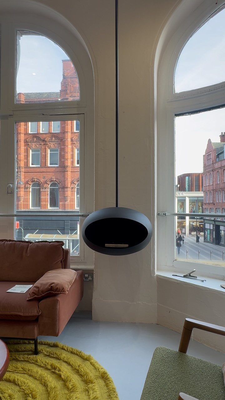
A hanging fireplace turns an empty corner into the reason people gather.
A spherical black fireplace works in rooms where floor space is tight and a chimney run already exists; for renters or budgets under a thousand, a wall-mounted electric unit with a slim surround gives the same anchor without the structural work.
I like the spherical shape for high ceilings with big windows, since it holds its own against that scale without cluttering the sight lines. Lower ceilings do better with a horizontal unit that spreads the visual weight.
If you are adding one instead of inheriting it, plan the fuel source first: gas needs a line, electric needs a dedicated outlet rated for the draw, and wood needs clearance to combustibles that most modern walls do not have.
Gas fireplaces suspended from a reinforced ceiling joist need pro installation; my own preference for a weekend project is a plug-in electric model on a painted shiplap surround, which runs about three hundred and goes up in an afternoon.
2. Mirrors
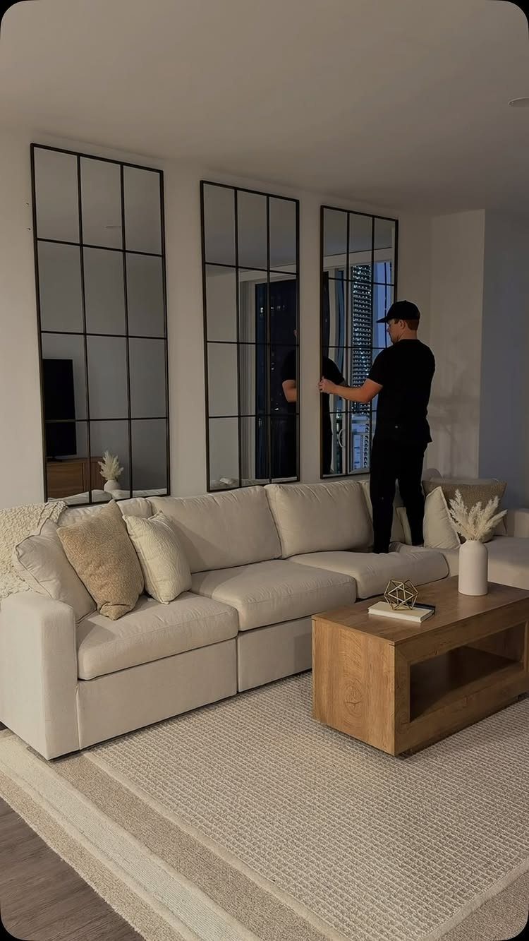
3 matching mirrors above a sofa multiply the window light without asking for a single new piece of furniture.
Black windowpane mirror frames read as architectural detail against white walls, which is the move when your room already has color elsewhere.
Position matters more than size. From your usual seat, the mirror should catch daylight, a window view, or a lamp; doubling the back of a television or an open kitchen just makes the clutter feel permanent.
Hang the center mirror at eye level for someone standing, with the flanking ones spaced close enough to read as related but not touching.
For renters, leaning an oversized floor mirror against the wall avoids patch kits later. Behind a narrow console, a mirror makes the room feel twice as deep.
3. Gallery Wall
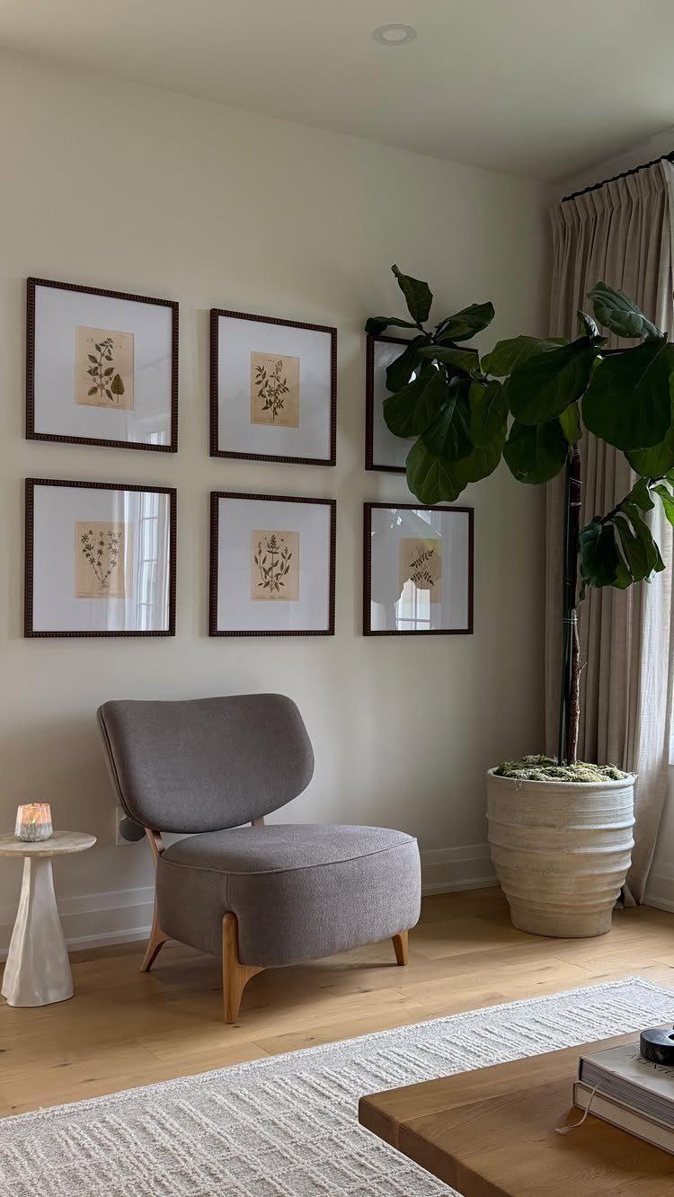
6 botanical prints in matching frames give a gallery wall the restraint that keeps it from looking like a storage solution.
A grid of two rows of three works because identical frames and white mats let the plant forms do the variation.
A grid is the easier path.
Mark your wall in a light grid pattern first, then hang. For an eclectic mix, lay it on the floor first and photograph your layout; what looks balanced at foot level often surprises you at eye level.
Painter’s tape is the right tool for mocking up a grid before you commit to holes.
Blue tape a rectangle on the wall, step back, live with it for a day. The rectangle tells you if the scale fills the wall or floats; most people hang too small and too high.
Floating ledges, mentioned in some setups, let you swap prints seasonally without new holes. That trades permanence for flexibility, which suits renters or anyone who tires of the same view.
4. Oversized Artwork

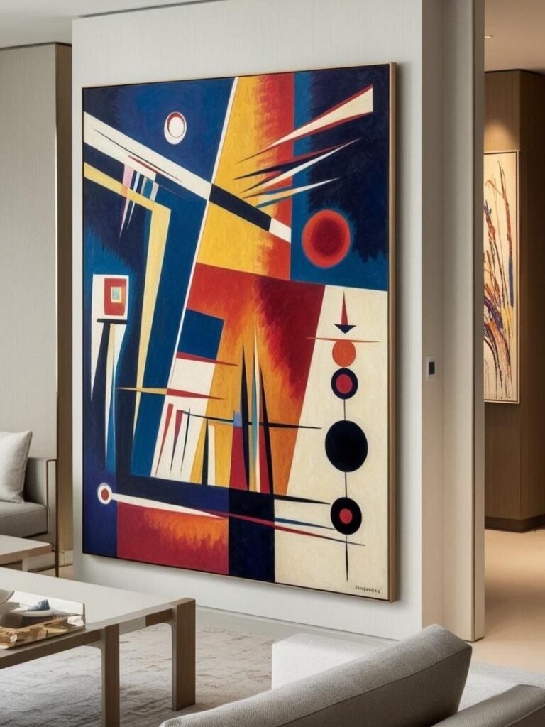
One piece of art at four feet wide or more does the job of a whole wall of smaller frames.
Too high and the art disconnects from the furniture; too low and heads bump during couch naps. For a pair instead of one, two vertical pieces with a narrow gap between them read as a single statement.
Cost is the limit here.
A single large original runs past most budgets; unframed canvas prints stretched at a local frame shop come in under two hundred. The texture of paint on canvas, even printed, carries further than paper behind glass.
5. Accent Wall
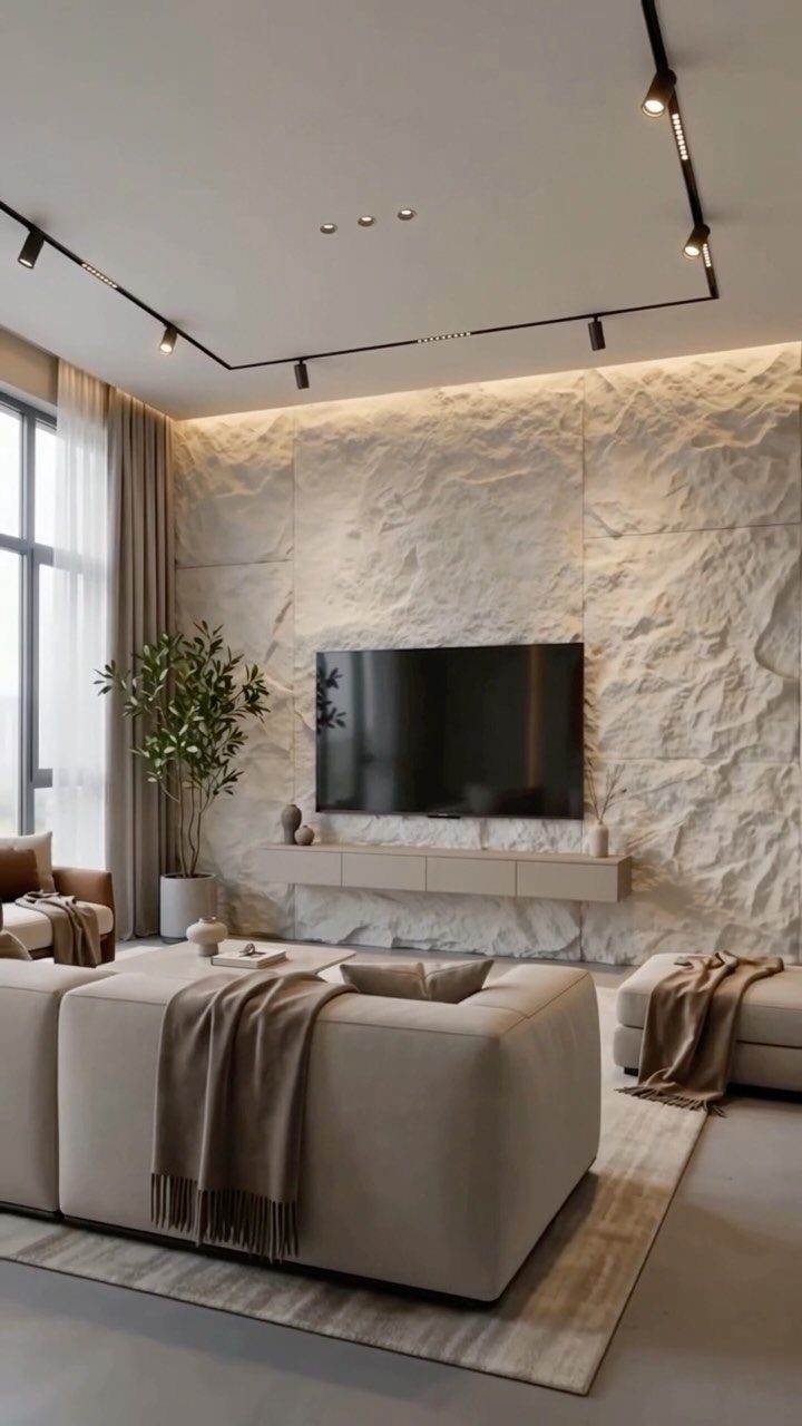
A single treated wall carries the room so the others can stay quiet. Textured white stone works because the sofa, console, and television are all low and neutral; the wall gets to be the event without competition.
Paint is the cheapest route and the easiest to undo.
Bold color works best on the wall you face when entering the room, not the one behind you; wallpaper with texture or pattern costs more and takes a Saturday, but it handles the whole statement in one product.
Paint works in a rental if you are willing to reverse it; a deep teal took two coats and one Sunday, and the landlord’s white returned before move-out.
If you own, consider whether the texture will feel dated before you sell; smooth paint ages slower than trendy cladding.
6. Lighting Fixtures
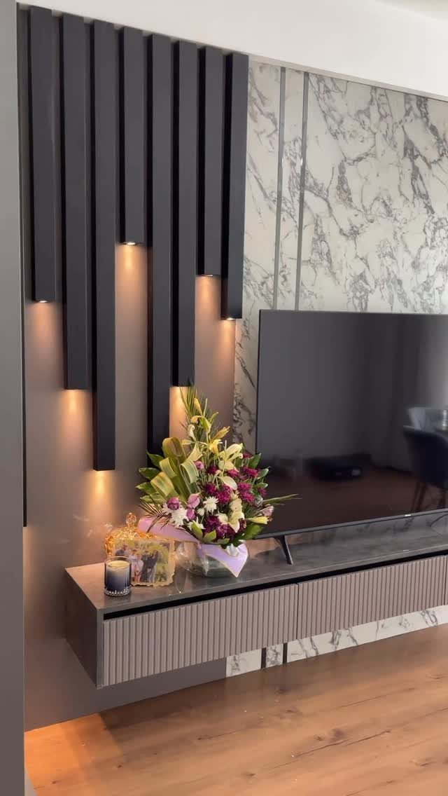
Light built into the wall itself, like vertical slats, turns architecture into ambiance.
The warm LED strips behind or between the slats graze the surface with shadow instead of washing the room flat; that is the difference between a lit wall and a room with a lamp.
For existing walls, sconces flanking a mirror or artwork do similar work at lower commitment. Hardwired sconces need an electrician and a switch, but plug-in versions with a cord channel, or battery-operated picture lights, go up fast.
Dimmers matter more than fixture choice; a sconce at full brightness feels like a bathroom, turned low like a lounge.
My own living room has 2 plug-in brass sconces with linen shades from a big-box store, on a dimmer switch that plugs into the outlet.
The wall reads as designed because the light pools where I want it, not because the fixtures were expensive.
7. Tapestries
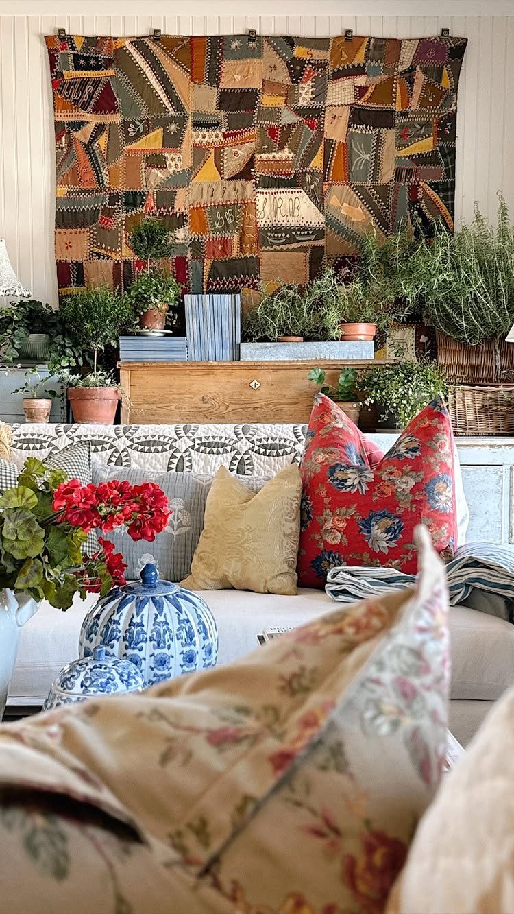
A patchwork textile turns a blank wall into something that actually feels lived in.
Fabric hangs lighter than framed art, and vintage finds often cost less at estate sales or online. The maker of this piece worked with saturated blocks of color against a neutral room, which keeps the effect warm rather than cluttered.
Modern reproductions work too, though I’d pick worn cotton or wool for the texture. Mounting is simple: a wooden dowel through the top hem, 2 nails, done.
Dust is the catch; tapestries need a gentle vacuum every few months, and direct sun will fade them fast. This one suits renters who want impact without holes everywhere, or anyone whose walls feel too flat and too cold.
8. Architectural Details
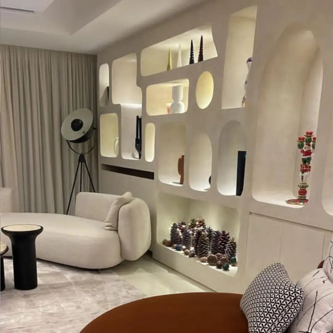
Crown molding and wainscoting add what new construction usually strips out: the sense that someone thought about where the wall ends. Board-and-batten costs less in materials if you DIY; hiring out raises the price considerably.
Match trim to your wall color for quiet sophistication, or paint it in a contrast that frames the room.
Low ceilings favor vertical details; they pull the eye up. High ceilings can carry heavier crown.
What changes the answer is existing trim style, baseboard height, and whether your walls are textured, smooth, or already carrying another treatment. Check those three before buying anything.
9. Faux Tile or Brick
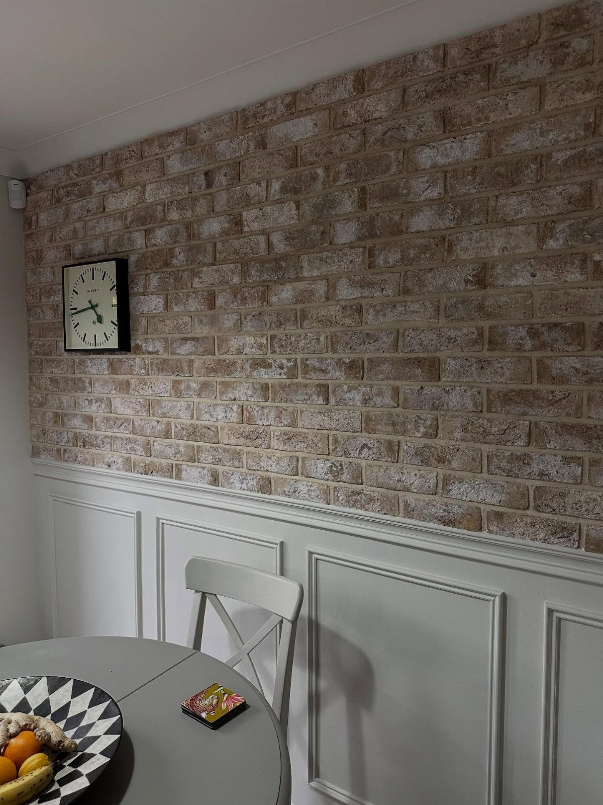
Peel-and-stick faux brick gave this wall the texture of a converted loft without the structural weight or the mason’s bill. The panels run at a moderate price per square foot, and a single weekend covers most living room feature walls.
The light brown and cream here reads warmer than the gray industrial look; that choice depends on what else shares the room.
Wainscoting below breaks the pattern so it doesn’t overwhelm.
I’d add that division for any small space. The backing needs a clean, smooth surface; textured drywall or existing gloss paint will show through or fail to adhere.
Test one panel in a corner for a couple of days. If it lifts, sand and prime first.
10. Vintage Decor
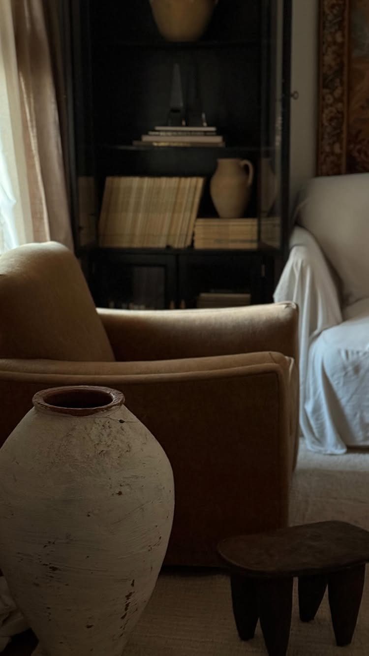
A single vintage piece on a wall does what matching sets cannot: it carries the slight irregularity of actual use. Frames, small mirrors, or even a weathered shelf work the same way.
Estate sales and auctions remain the best hunting, though patience matters. I’d pay more for provenance I can verify than for a reproduction with artificial wear.
The risk is clutter; one strong piece beats three that compete. This approach suits someone who collects slowly and edits ruthlessly, or anyone whose room feels too new, too catalog-perfect.
11. Be Intentional About Bookshelf Styling
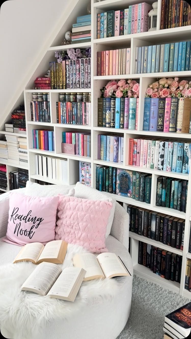
Built-in bookcases become furniture only when someone treats them as display, not just storage.
The color-coordinated spines and scattered flowers here turn shelves into a composition. Group books by spine color, or turn selected covers outward; either takes little time and changes the whole wall.
For smaller collections, intersperse objects: a ceramic bowl, a small frame, a plant cutting in water. The danger is preciousness; every shelf does not need symmetry.
One shelf of pure chaos, one of careful arrangement, reads as a person rather than a set. This suits anyone with books they actually own, not spines bought by the yard for color.
12. Baskets and Round Objects
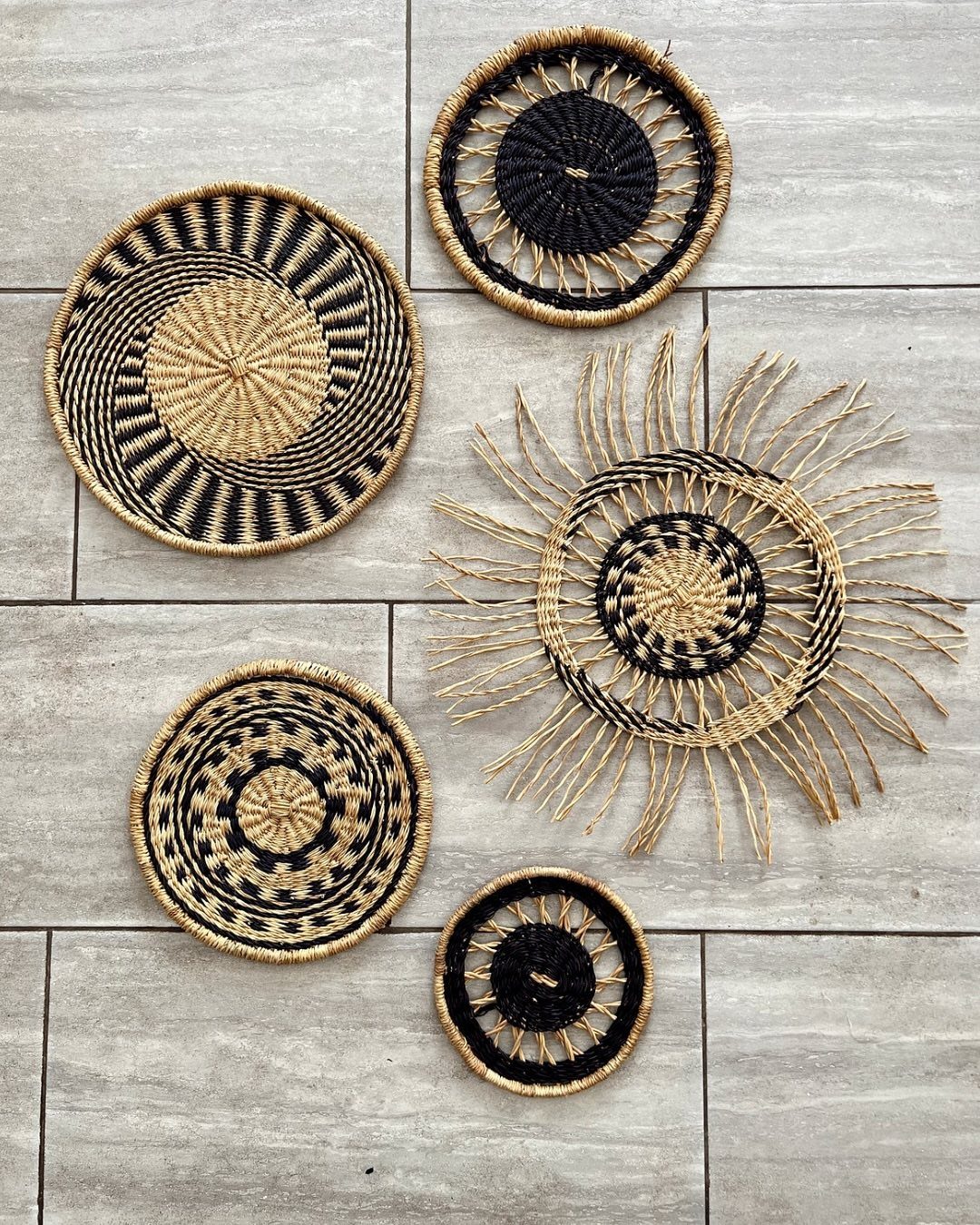
Circular shapes break up the straight lines that dominate most rooms: door frames, windows, rectangular sofas.
Five woven baskets in black and natural straw, hung at varying heights, cost less than one framed print and fill a wider stretch of wall.
Thrift stores and estate sales yield the best finds here; mismatched patterns read as collected, not accidental.
A single oversized round mirror works above a console table if you first check what it will reflect, no ceiling fixture or cluttered doorway.
Metal wall art in ginkgo or sunburst shapes is easy to find secondhand and needs only a stud or anchor. Clustered baskets weigh almost nothing; 2 nails each, no level required if you step back and nudge.
This approach trades the crisp edges of gallery walls for something softer and more forgiving of slightly crooked hangs. Perfect for anyone whose drill skills stop at picture hooks.
13. Wall Art with Plants
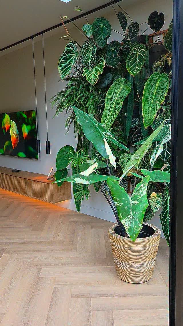
Living walls ask more of you than a pothos on a shelf. A vertical garden uses tropical varieties like philodendron and fern that handle indirect light and share similar watering schedules; mixing succulents with moisture-lovers guarantees casualties.
Hanging planters or mounted ceramic pockets let you test the look before committing to irrigation. A simple drip tray system, routed to a bucket below, handles the weekend away; without it, you are watering almost daily.
Start with one column of three plants and expand if the habit sticks. Fake versions have improved enough to read green from across the room, though they collect dust and give none of the air quality claims back.
This idea rewards the reader who already owns a mister and checks soil moisture without an app. Anyone who has killed a snake plant should try metal ginkgo wall art instead.
14. Picture Ledges
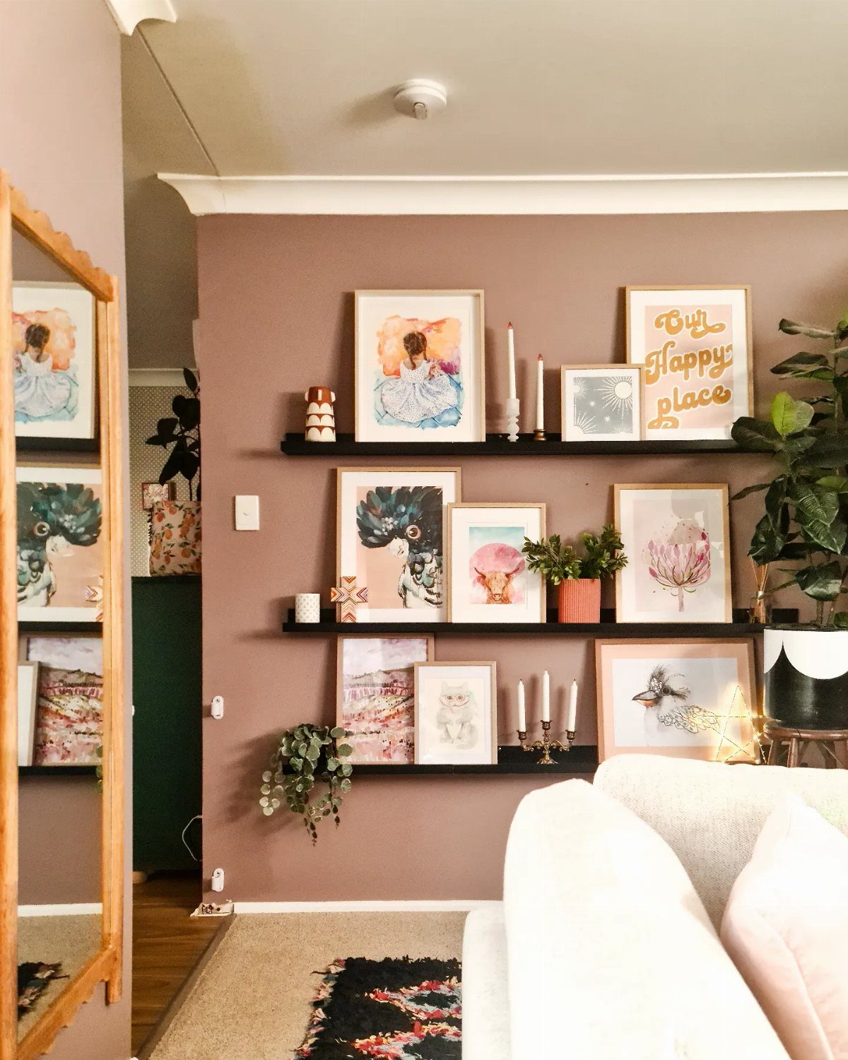
Picture ledges let you swap a summer watercolor for a fall photograph without new holes in the wall.
Ledges at varying heights on a painted wall each hold a mix of framed pieces, small plants, and candles that would clutter any flat surface.
Shallow shelves keep items from tipping forward into the room. Editing matters more than quantity: 2 larger objects with space between them read as intentional, a tight row of small frames reads as anxious.
Ledges suit renters perfectly; they need only a level and a stud finder, and the holes are minimal when you move. They also lift fragile decor above coffee tables that collect board games, snack bowls, and daily living.
Most home stores stock basic ledges in wood and painted finishes. I would mount the first one at eye level seated, then build upward rather than crowding toward the ceiling.
15. Wall-mounted Storage
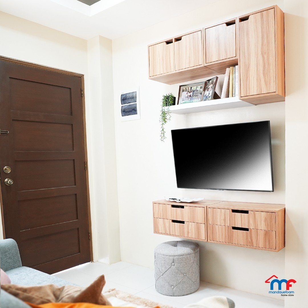
Wall-mounted cabinets and floating shelves reclaim floor space a media console would claim. A wall-mounted unit in light wood handles books, remotes, and the small plant that would otherwise compete for table space.
A tambour door with built-in cable openings keeps equipment accessible but out of sight; open shelves demand constant curation or they read as messy.
Floating cabinets require finding studs or using heavy-duty toggle bolts; a falling cabinet damages more drywall than a falling picture frame. The shelf above the television works because its white color matches the wall, reducing visual weight.
This option trades the grounded feel of furniture for cleaner sightlines. Best for small rooms where every square foot of floor matters, or for anyone tired of dusting around console table legs.
16. Color-matching Decor
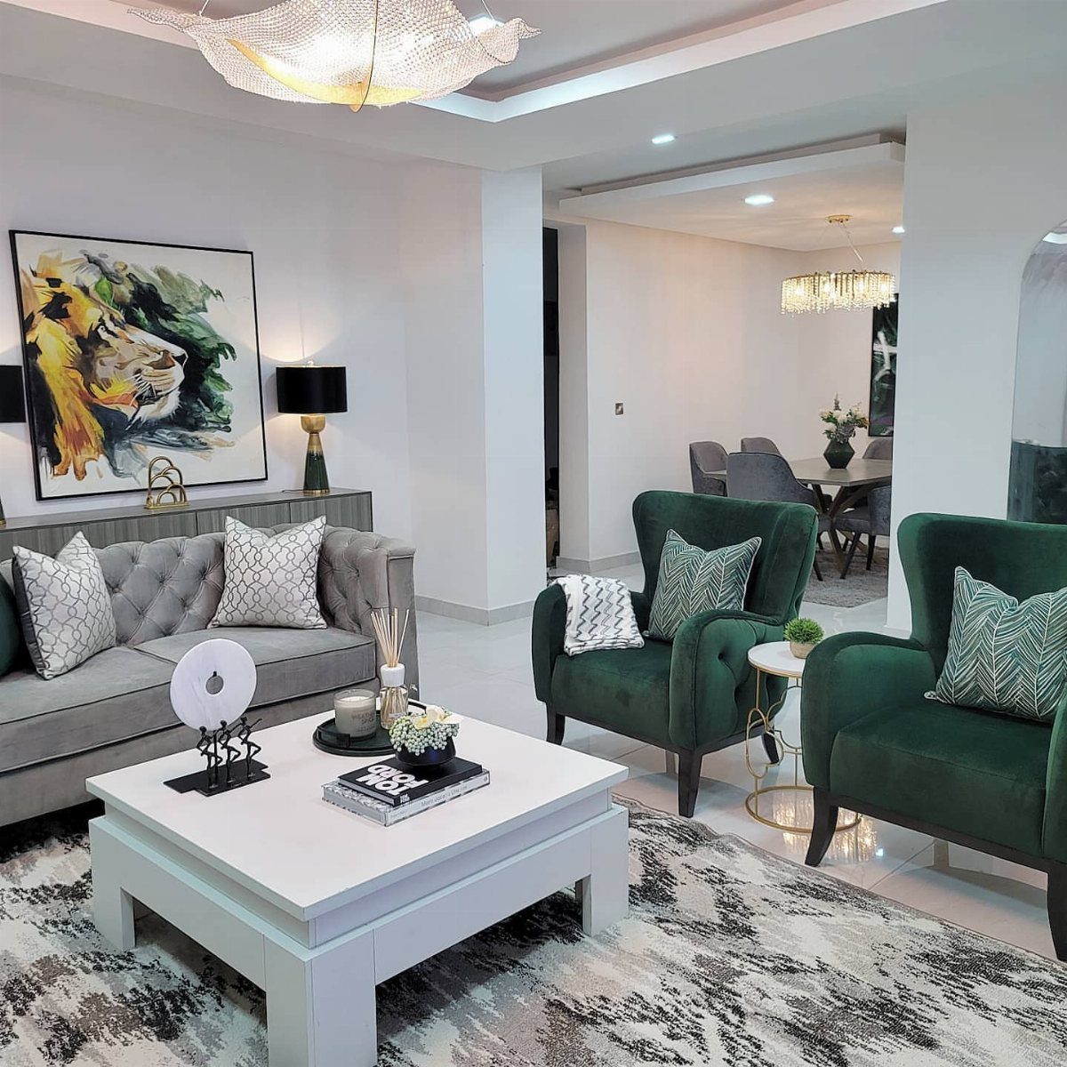
Color-matching does not mean matching exactly; the chairs and painting share a mood, not a Pantone number.
A neutral sofa lets accent colors move where they want without fighting the base.
This is the safer method: anchor with quiet upholstery, then thread one stronger color through walls, art, and accents. Reversing it, a bold sofa with bold art, exhausts the eye.
Indigo paintings that pick up a rug’s lines work the same way. The cohesion does not come from sameness but from repetition with variation.
This approach suits the reader who buys slowly, piece by piece, and needs each new find to feel at home with what is already there.
It fails for the impulse shopper who falls for colors in isolation; that person needs a mood board first.
17. Three-dimensional Objects
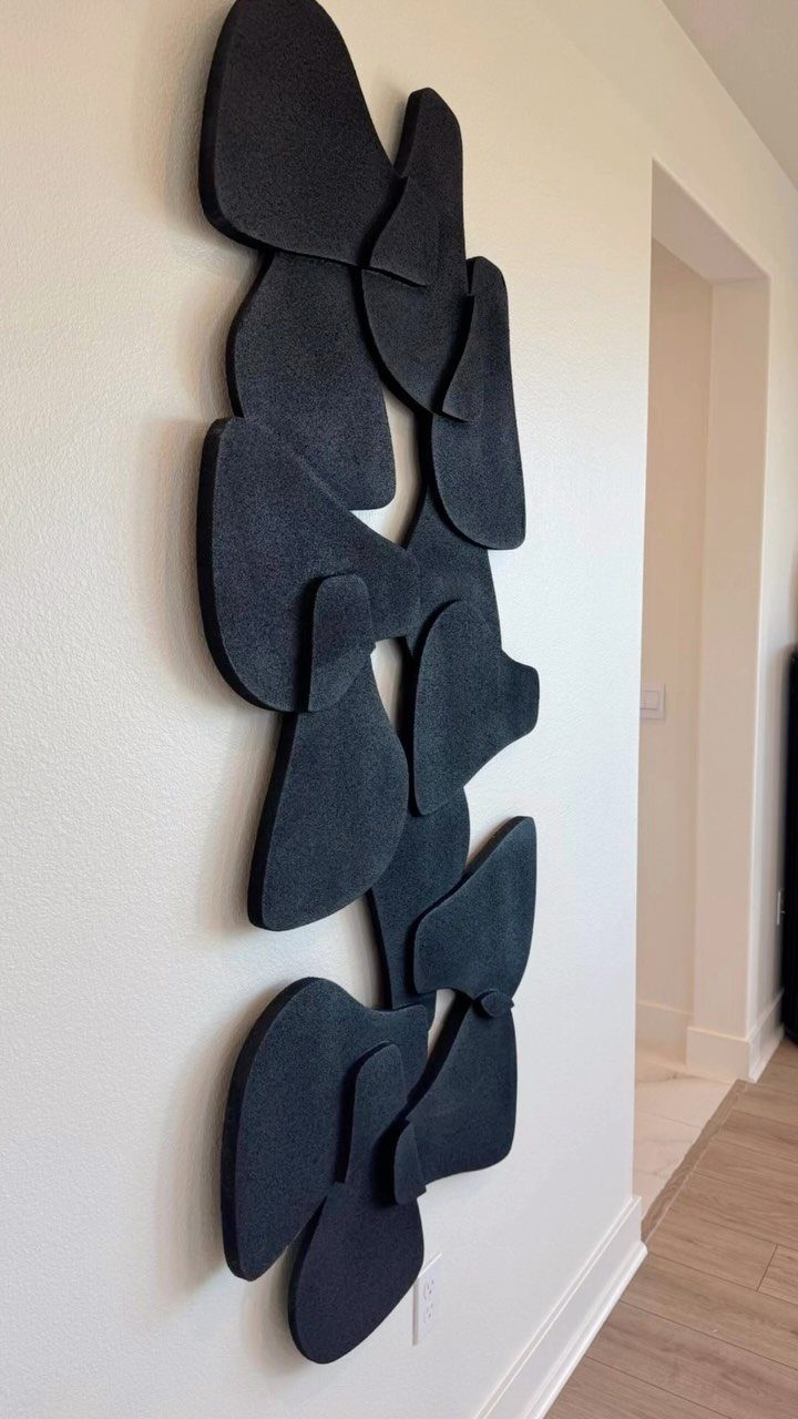
Sculptural pieces catch light in ways flat art never manages, and they turn a wall into something you want to walk around.
Black organic shapes against a white wall read almost like shadow, which is the point: high contrast and simple color keep three-dimensional work from feeling cluttered.
Plates from estate sales, woven baskets from trips, or a single ceramic piece all work.
Grouped items need a shared thread, color or material, or the wall goes chaotic fast. One large sculpture, hung at seated eye level, often wins over a scattered collection in smaller rooms.
Renters should look for lightweight resin or foam pieces that hang on a single hook.
Heavy plaster or metal needs a stud finder and a drill, which means patching later. I would skip the gallery-style grid and mount one piece off-center, where the asymmetry feels intentional rather than accidental.
How to Choose Wall Decor
One framed piece sometimes leaves a wall feeling empty; a feature wall fills that gap. Once the wall itself carries the visual load, what hangs there can stay spare.
A playful pattern like plaid or paisley brings personality; solid drapes in a strong hue do the same work without competing with furniture.
In small living rooms where wall space is tight, letting window treatments carry the decorative load leaves room for what you actually need to live with.
Placement Tips for Wall Decor
Go larger than your first instinct suggests.
A print above a credenza should run almost as wide as the furniture itself; too small reads awkward and misplaced. Large wall art, sized right, anchors a space in a way clusters of small pieces rarely match.
Eye level matters, but so does the relationship to what sits below.
The art and the furniture need to read as one unit, not two objects that happened to land near each other. Step back after hanging; if the gap between them feels like a mistake, it probably is.
Current Wall Decor Trends
Pantone singled out bright yellow with true gray as a fresh pairing.
Benjamin Moore once named teal their color of the year. These are starting points, not rules; color is doing more of the decorative work now, on walls, in textiles, or through single large pieces.
Oversized art, textured surfaces, and natural elements like living walls all fit the same direction: fewer, bigger statements rather than walls crowded with small frames.
Mixing materials, a metal sculpture with a woven textile, keeps the effect from feeling too planned.
“In 2026, living room walls reject the obvious,” says Weisz. “Literal word art, underscaled pieces, mass-produced canvases, and overly matched sets dilute a room’s authority.”
Creating a Cohesive Look
Painting trim, doors, and even built-ins in one exact shade lets them blend together and lets the architecture read as intentional rather than incidental. Arches and other details stand out more when the color stays quiet.
Color-matching a bookshelf to an existing fireplace or brick wall does similar work. The storage reads as part of the original structure, not furniture added later.
Gunmetal paint on both preserved brick and new shelving is one example: the match balances old texture against clean lines. The result is cohesive because the eye travels across the wall without hitting a contrast that stops it.
Frequently Asked Questions
How do I decorate my living room walls?
Start with one oversized piece at four feet wide or more, or hang three matching mirrors above the sofa to multiply window light.
Add vertical slats with warm LED strips behind them, or lean an oversized floor mirror against the wall if you are renting.
What are some good wall decor ideas for a living room?
A gallery wall in a grid of identical frames keeps botanical prints from looking scattered, while floating ledges let you swap pieces seasonally without new holes.
Picture ledges at varying heights hold framed pieces, small plants, and candles that would clutter flat surfaces.
What is the 3-5-7 rule of decorating?
This rule suggests grouping items in odd numbers, three, five, or seven, for visual balance.
I find it more useful for shelf styling than for walls; one strong piece of vintage decor or a single oversized canvas usually beats a cluster that competes for attention.
Grouped pieces read as related, not accidental, when the spacing stays tight enough to connect them.
What are the current wall decor trends?
Oversized artwork, textured wall treatments, and integrating natural elements like woven textiles and living walls are showing up in rooms that read current. Warm LED strips grazing vertical slats turn architecture into ambiance without washing the room flat.





