
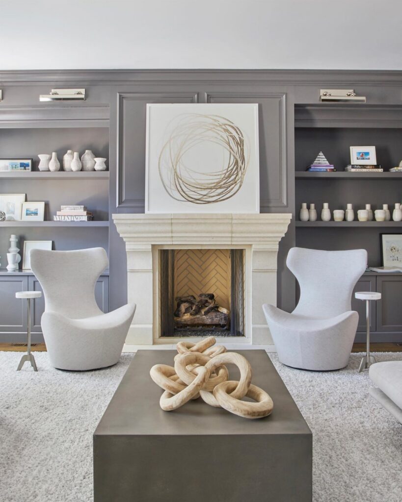
These ideas range from hanging a single potted pothos to building out a full accent wall, and the right one depends on whether you rent or own and how much wall you can change.
Most of these ideas come together over a weekend with supplies from a hardware store run; only the nook with lumber framing and a custom cushion asks for more time and a landlord’s permission or your own mortgage.
A rug that sits under the front legs of your sectional while leaving the back legs off shows up in the ideas below because grey rooms need deliberate boundaries more than most palettes do.
1. Incorporate Greenery
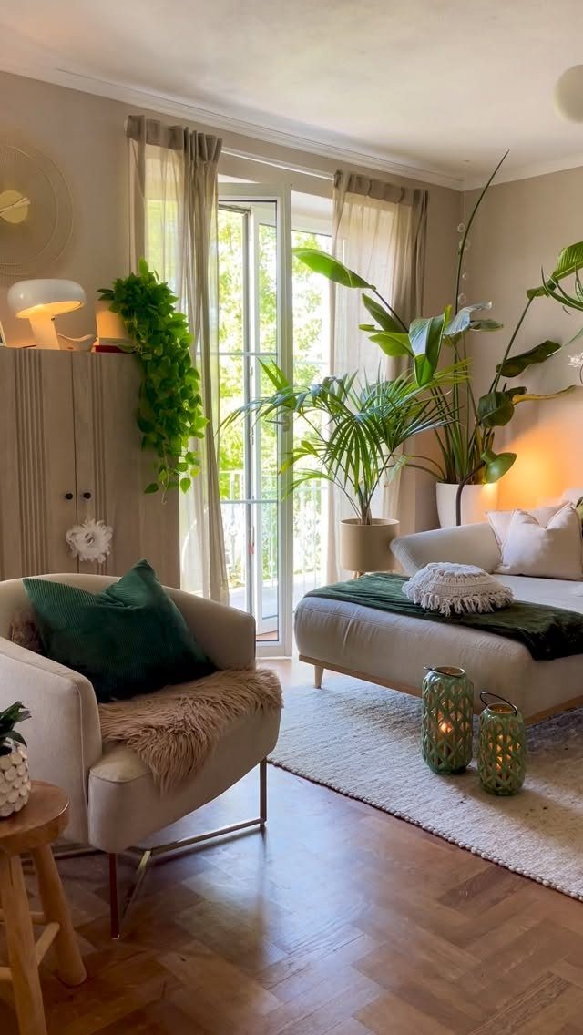
A grey room can read flat until something living shows up. A tall fiddle-leaf fig or a trailing pothos in a simple terracotta pot breaks up the monochrome without demanding a new color scheme.
A spot near the window but back from direct afternoon sun works best, and watering only when the top inch of soil dries keeps the roots healthy.
For renters, a single large plant on a rolling stand moves with you. Two or three smaller ones clustered on a side table work if floor space is tight.
Cost stays low; a nursery pothos in a small pot fills out in a season and asks almost nothing of you.
2. Get Cozy
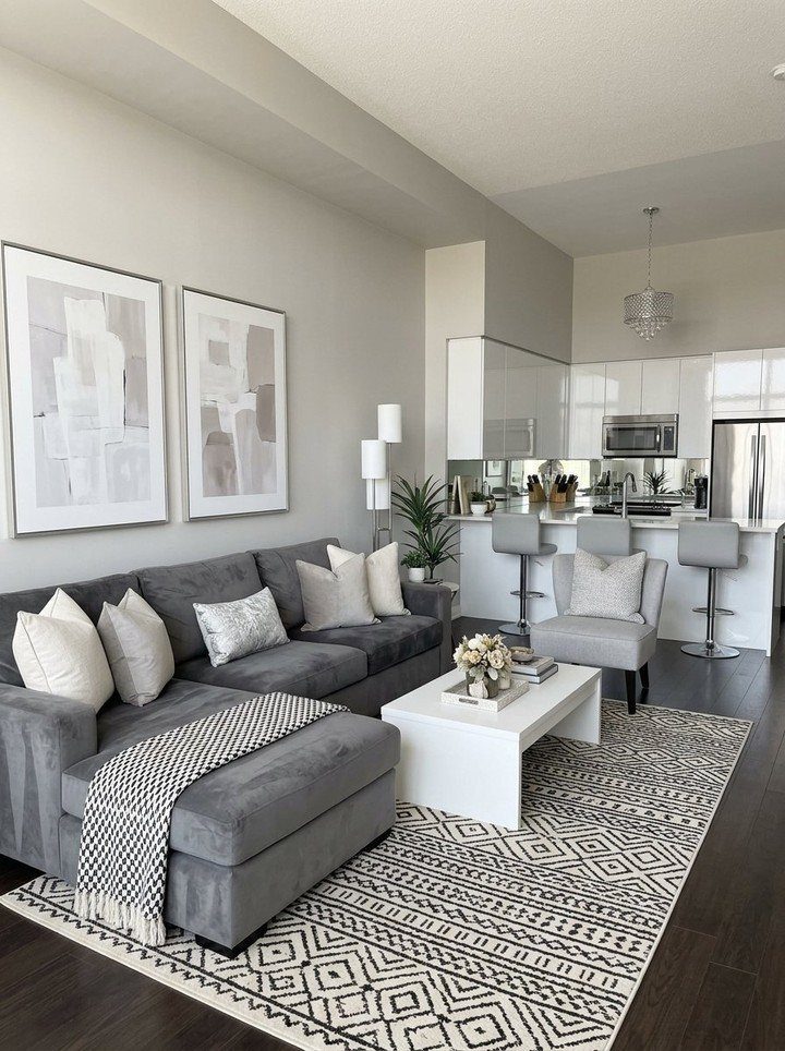
Grey can run cold, so I pile on the soft stuff. A chunky knit throw, a few velvet or linen pillows in varying tones, and a rug underfoot turn a sleek sectional into something you actually want to sink into.
The round rug trick works in tight spaces: the curved edge fakes extra floor area where a rectangle would chop the room into blocks.
A grey flatweave rug that runs wall to wall makes a small living room feel less boxed in without fighting the rest of the palette.
For warmth, steer toward greys with brown or green undertones rather than blue. The difference shows up once the lamps are on.
3. Create a Cozy Nook
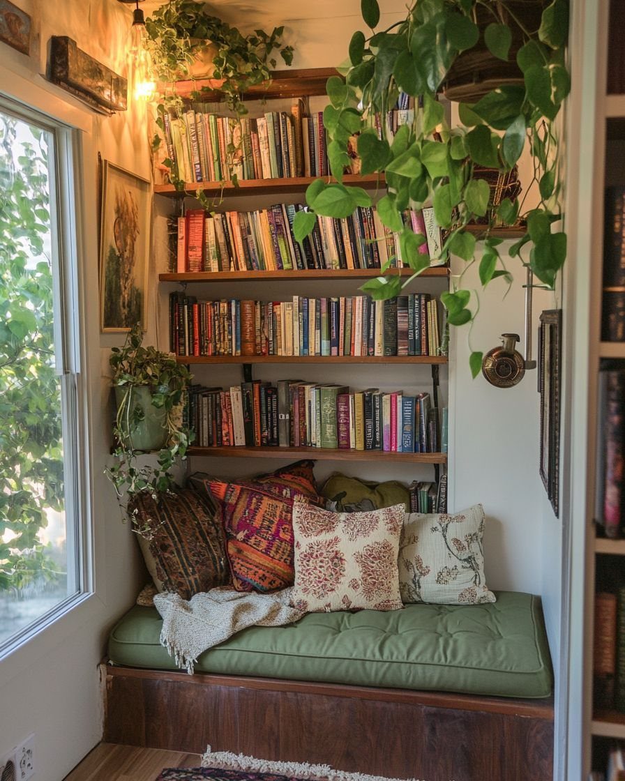
A window seat built from basic lumber and a custom cushion turns dead space into the best seat in the house.
A simple frame of lumber and plywood, painted to match the walls, supports a foam cushion in warm grey tweed for a reading corner that looks built-in.
The shelves flanking the seat hold books I already owned; the color comes from their spines, not from buying new. A hanging pothos above and a knit throw on the bench finish it without clutter.
If you rent, skip the built-in. A low bench under a window, a cushion, and a freestanding shelf beside it gets the same effect and moves out when the lease ends.
4. Monochromatic Scheme
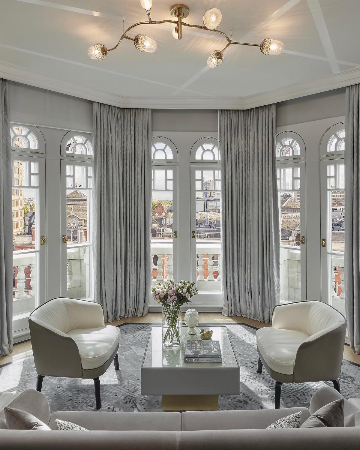
Committing to grey alone sounds safe until you try it.
Distance between shades carries a monochromatic scheme: charcoal on the sofa, mid-tone on the rug, pale fog on the walls. Too close and everything muddies; 3 clear steps apart and the room gains depth without a single accent color.
I start with the largest surface, usually the walls, and work darker toward the floor. Curtains can match the walls to keep the eye moving, or drop one step darker to anchor the windows.
This suits small rooms especially. One color family erases boundaries and reads larger than the square footage.
5. Accent Wall
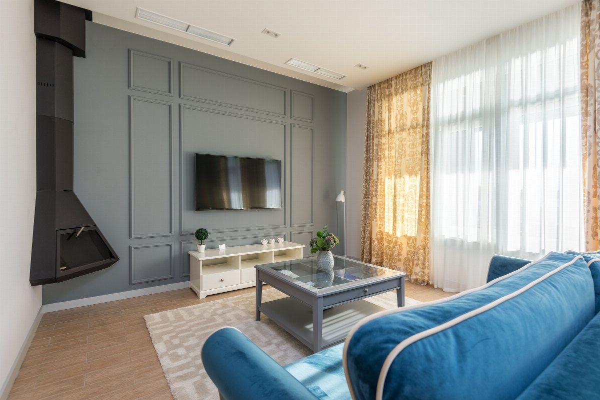
One wall in a deeper grey draws the eye and gives the television or sofa a place to belong.
A satin finish over existing flat paint works with no primer needed, as long as you stay within the same depth family.
Picture-frame molding adds architecture without the cost of actual paneling. The team at Painter1 builds these with trim cut to size, applied with adhesive and finish nails, then painted to match.
The whole job runs a weekend if you measure carefully; Saturday for laying out the grid and Sunday for paint.
South-facing rooms handle cooler greys. North light needs the warmer, putty-toned shades or the wall goes flat.
6. Use Metallic Accents
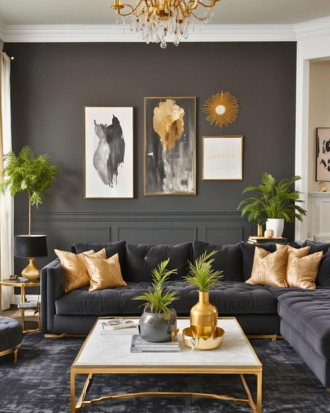
Gold against charcoal reads intentional; silver against pale grey reads serene. I choose based on the wall tone and the light: warm metals for north rooms, cool ones where the sun already warms the walls.
A marble-topped coffee table with a thin brass frame gives the hit without going full glam. Two gold pillow covers on a grey sofa are enough; let an existing chandelier handle the rest.
Velvet fabrics catch metallic light better than linen or cotton. A remnant piece of velvet from the local fabric store makes 2 lumbar covers that shift from grey to gold as the day moves.
7. Play with Patterns
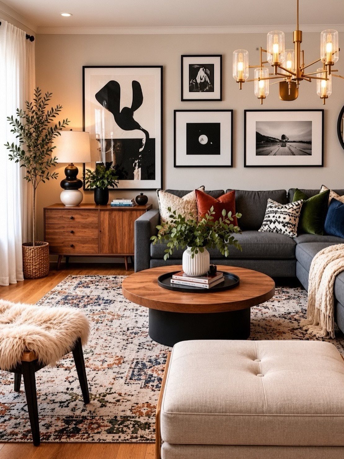
A grey room can flatten out fast without something to break the plane. I add pattern in three places: the rug, a couple cushions, and one wall piece.
Stripes or herringbone work best because they read as texture from across the room without shouting. Geometric prints on a flat-weave rug cost about the same as solid but do twice the work.
Large-scale patterns on the floor and smaller ones on the sofa keep the eye moving instead of stalling. 3 patterned items is usually my limit; more starts to feel like a showroom set.
8. Use Grey in Furniture
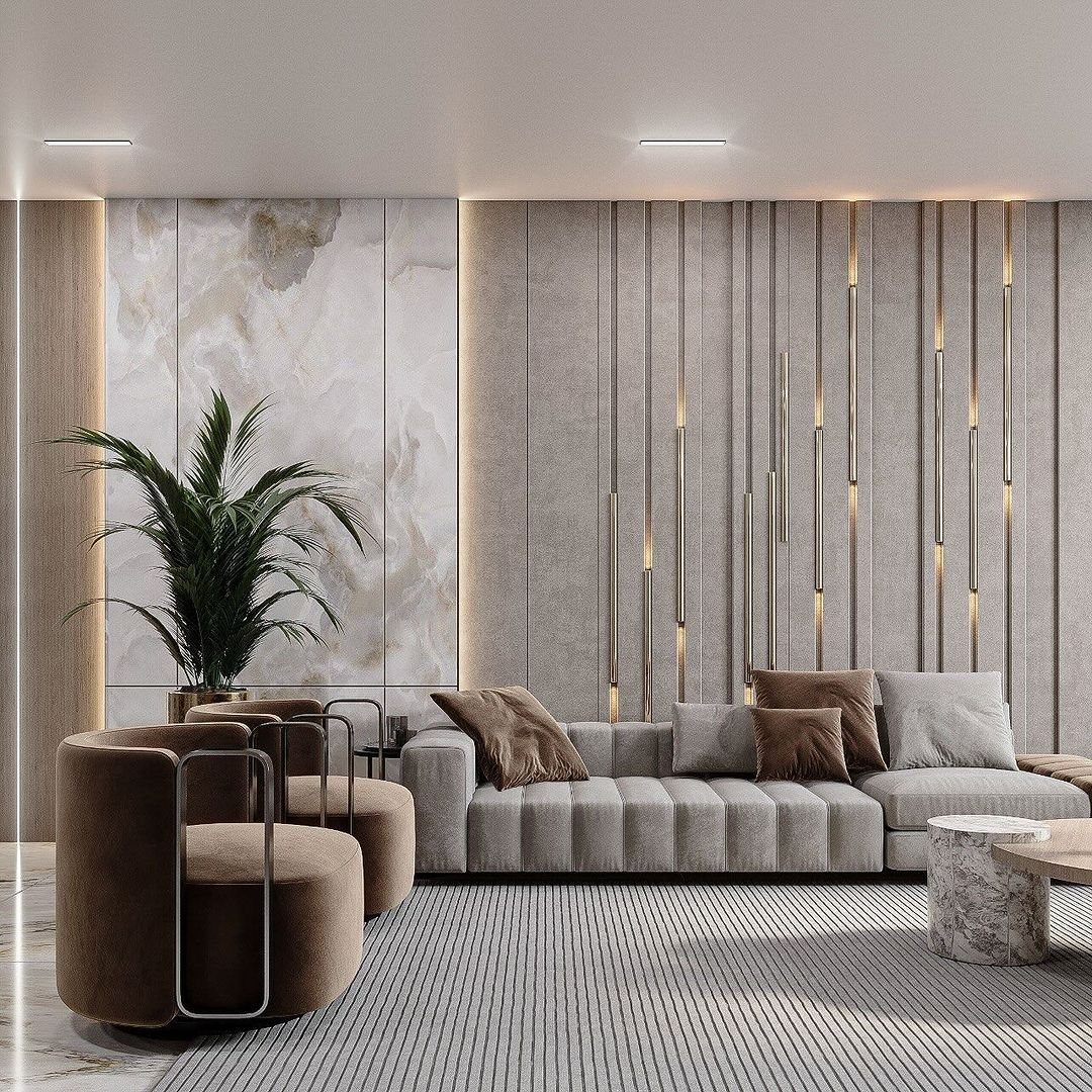
The sofa sets the tone, so I pick grey for the biggest piece and build around it. A ribbed or boucle fabric in light grey reads warmer than flat weave and hides the wear of daily sitting.
My last grey sofa sat across from two brown velvet chairs; the grey held the room together while the chairs added their own story.
If you rent, a grey sofa is practical insurance: it suits whatever wall color your next place throws at you. Look for one with removable covers if you have a dog or a toddler.
9. Incorporate a Statement Piece
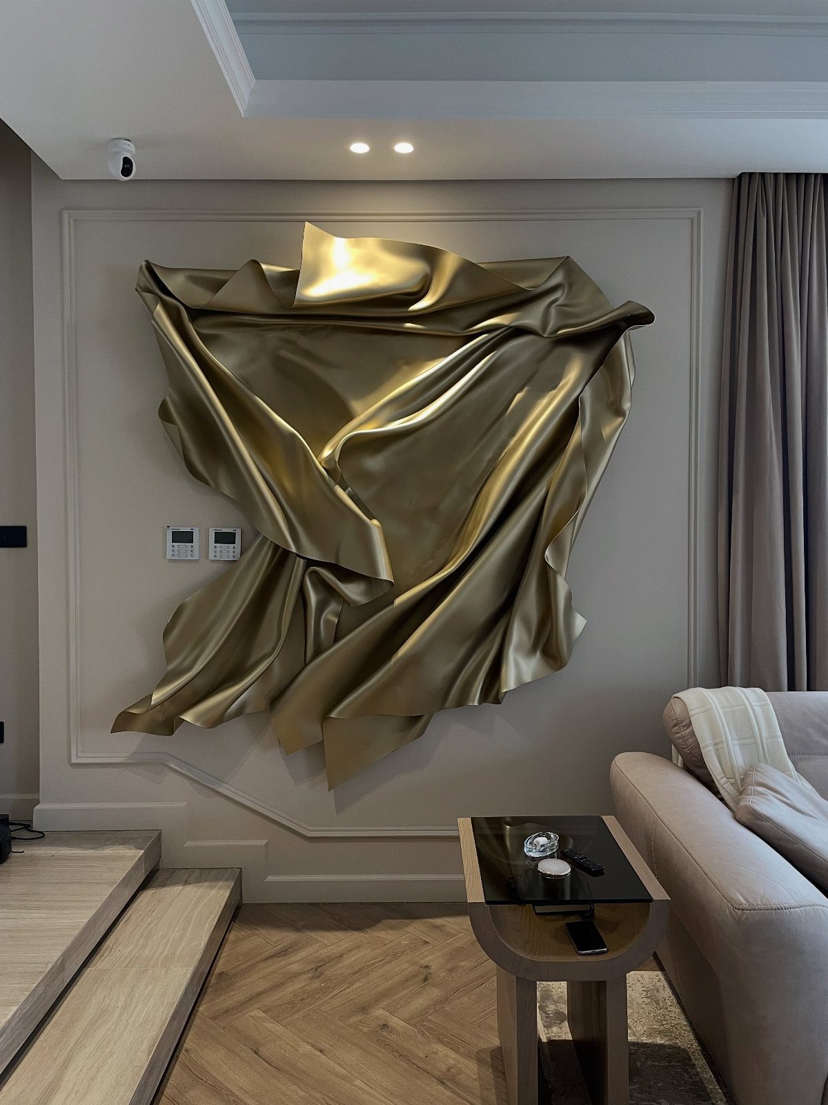
One bold piece does the work of five careful ones. A gold sculptural form against pale grey paneling works because the wall stays quiet so the shape can speak.
I look for something with real dimension, not just a big flat canvas, something that casts a shadow and changes as the light moves across it.
A single large piece saves money over a gallery wall and takes one afternoon to hang.
If gold feels too loud, raw plaster or dark metal gives the same weight in a different key. The tradeoff: this piece has to be good, because everyone will look at it.
10. Layer the Hues
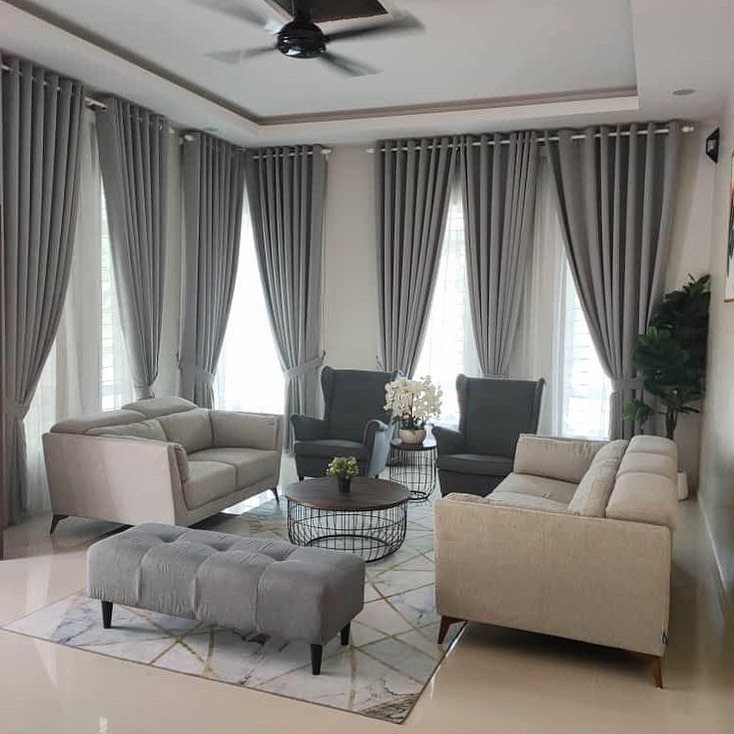
I think of grey as a family, not a single color. Layering runs from near-white curtains down to charcoal armchairs with a mid-tone ottoman in between.
Keep them all warm or all cool; mixing a blue-grey sofa with a green-grey wall turns muddy fast. I start with the darkest piece I can stand, usually the seating, then layer lighter around it.
Floor-to-ceiling curtains in a mid-tone grey pull the ceiling down just enough to feel cozy without shrinking the room. Same tone family, 3 distinct values: that is the whole formula.
11. Use Texture
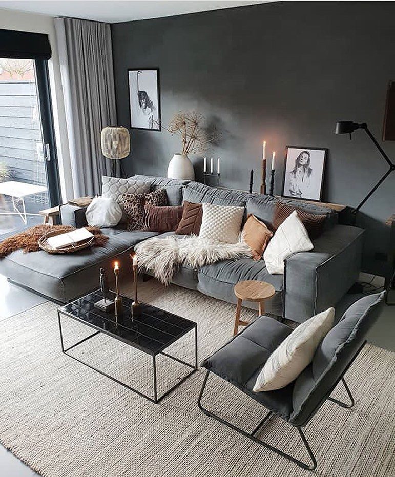
Grey can read cold if every surface is smooth.
I break it up with velvet cushions, a chunky knit throw, and something woven underfoot. A faux-fur throw on a grey sectional catches light that flat fabric would swallow.
I add one rough texture for every two smooth ones so the room does not turn into a cave. A wool rug with a visible weave costs more than synthetic but lasts through style changes.
My budget shortcut: splurge on the one thing you touch most, usually the throw or the rug, and save on what hangs on the wall.
12. Pop of Color
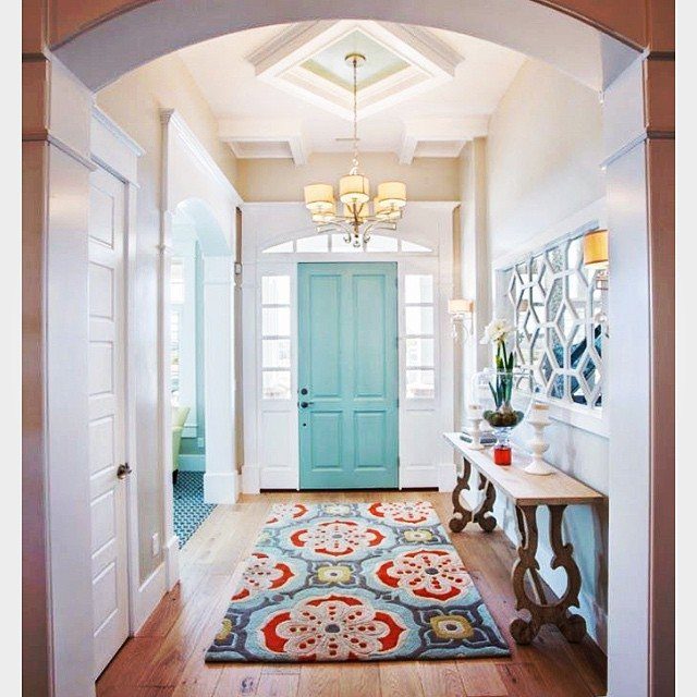
Grey gives you permission to go bright. Mustard yellow cushions, a blush ceramic lamp, or an emerald green side table from a flea market all work because grey does not fight back.
One strong color reads as intentional; three read as accident. I pick the accent color from something I already own, a painting or a textile, so the choice has a reason.
The grey stays on the big pieces; the color lives in what you can swap out when you tire of it.
13. Combine with Black and White
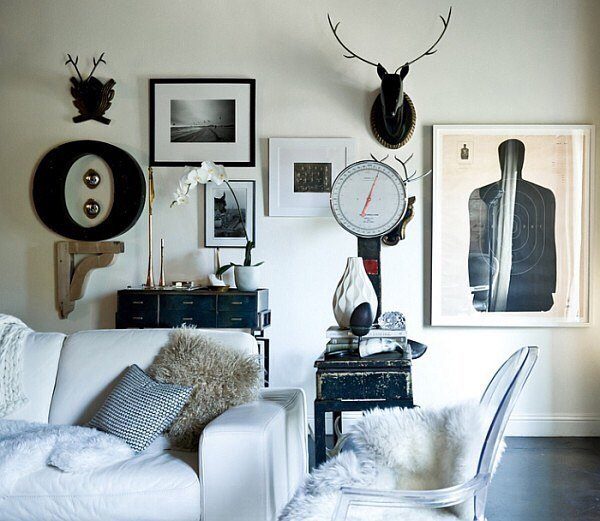
A black and white pairing turns grey walls into something sharper than cozy. The contrast reads as intentional, not accidental, which matters when your furniture comes from different years and stores.
Start with one large piece in either black or white: a sofa, a credenza, the rug. Add the opposite color in smaller doses so the room doesn’t split in half.
A white sofa carries most of the light while black frames and accents do the punctuating. Grey holds the middle ground without fighting either side.
This suits renters who can’t change wall color and buyers who want a living room that photographs well for resale. The risk is starkness; soften it with texture in the textiles, not with a third color.
14. Use Grey Wallpaper
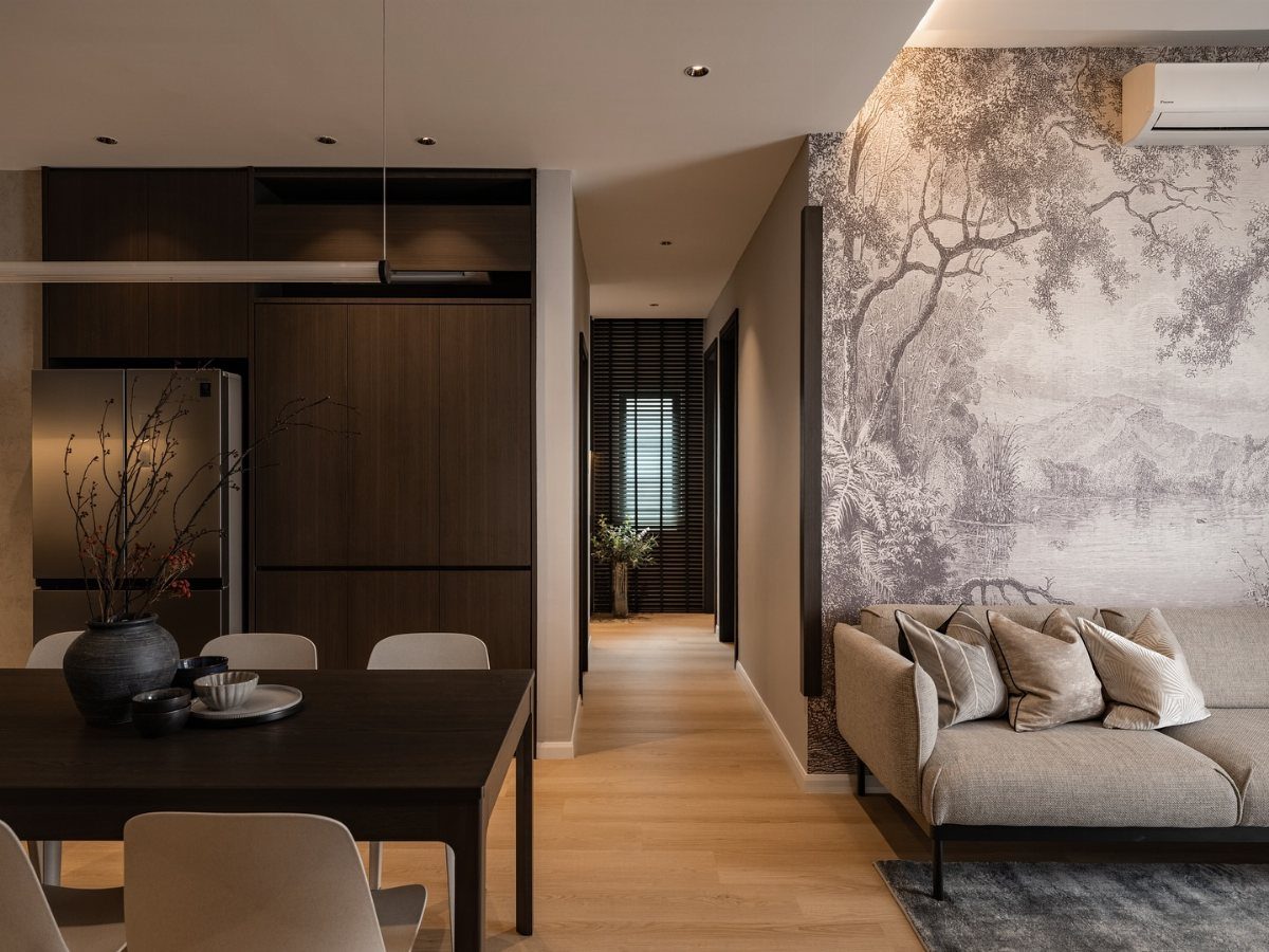
Wallpaper in grey gives the wall something paint cannot: a shift in surface that catches light differently through the day. A landscape pattern reads as texture from across the room and as detail up close.
Choose the scale to match your ceiling height.
Tighter patterns or plain texture suit smaller rooms better than large repeats. One papered wall can carry two zones without demanding a new color for each.
Paste-the-wall papers go up faster than the old soak-and-book method, a real consideration for a weekend project.
Expect two rolls minimum for one feature wall in an average living room, three if the pattern has a large repeat that wastes more in matching.
15. Create a Gallery Wall
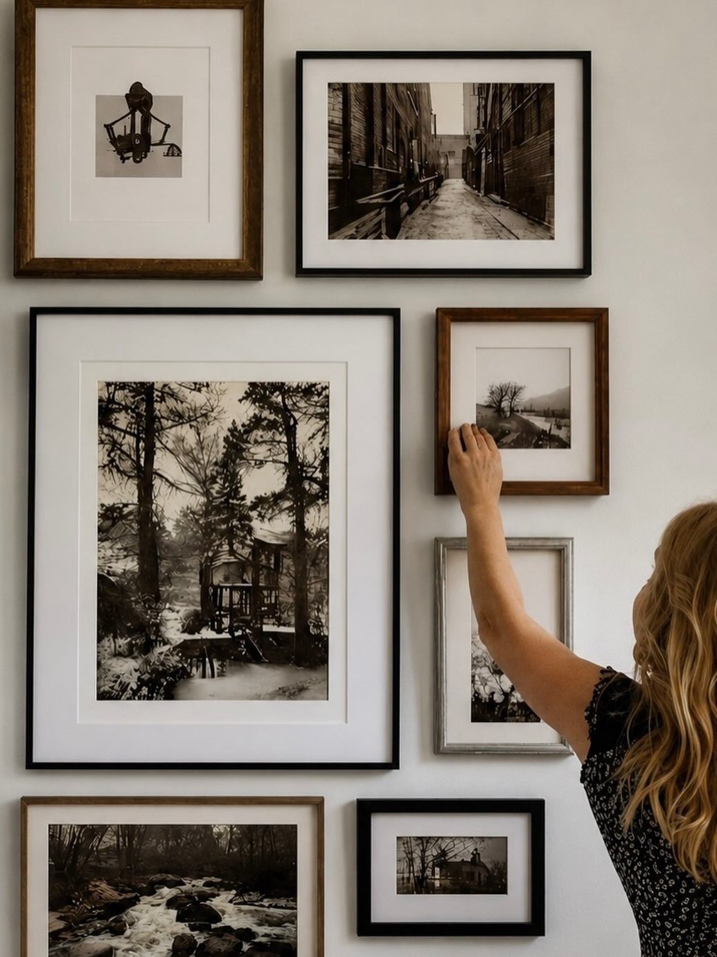
A gallery wall works against grey because grey doesn’t compete for attention the way a strong color would. The wall recedes; the frames advance.
Mix the frame finishes: black, silver, wood tones that share nothing but the room they live in. Black and white photography works, but the method holds for color prints, pressed botanicals, small textiles in clip frames.
Treat the collection as one shape before you hang it. Lay it on the floor, photograph it, live with the photo for a day.
One small colored piece among monochrome keeps the arrangement from feeling like a set purchased together. That deviation is the signature; without it, the wall reads as store display.
16. Create a Layered Lighting Scheme
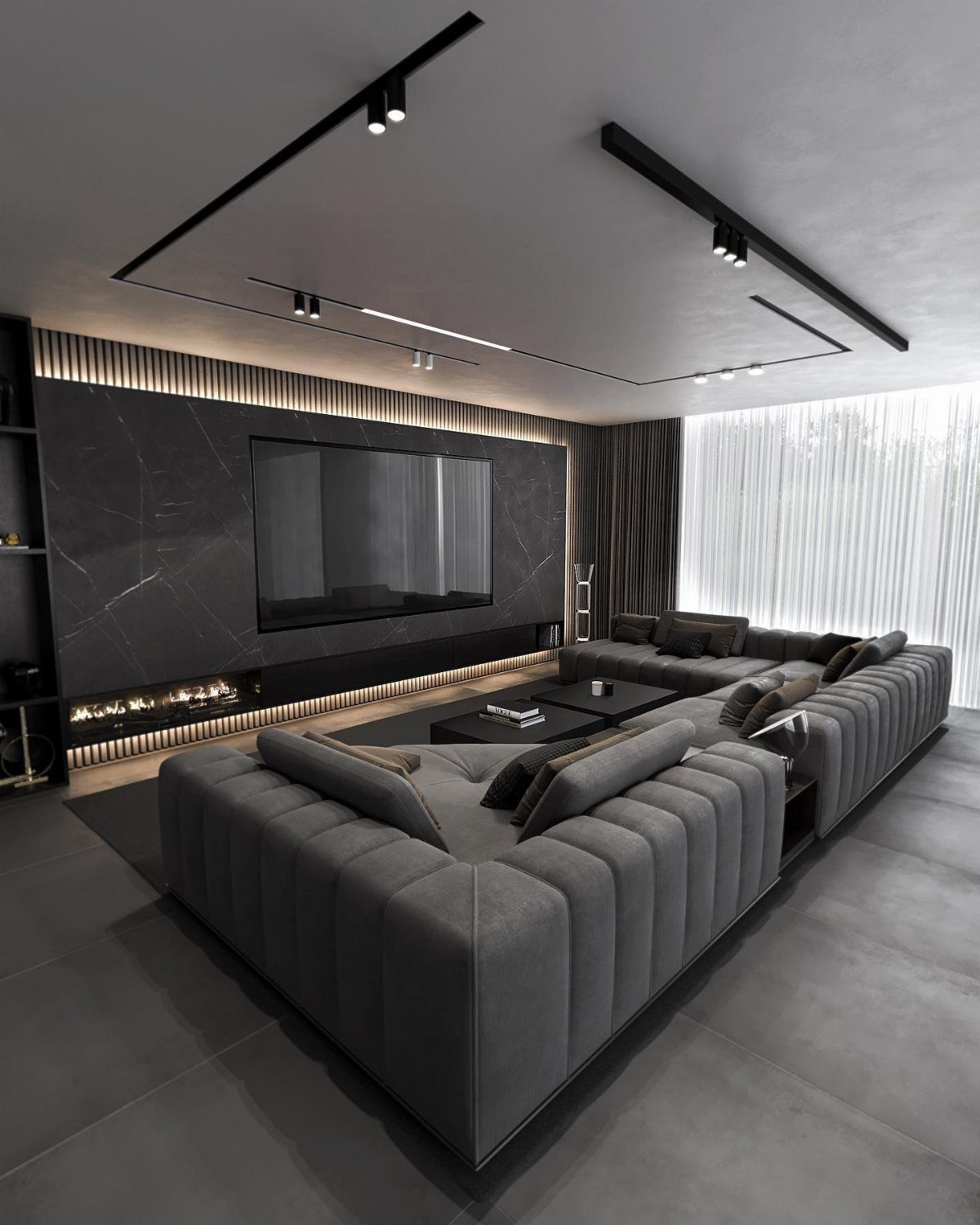
Grey rooms depend on light more than most colors do. In shadow, grey goes flat and cold; in layered light, it shifts and deepens.
The ceiling uses 2 sources already: recessed spots for task brightness, linear strips for ambient wash. Add a third layer at human height: table lamps with warm bulbs, floor lamps that throw upward, candles for evening.
The color temperature matters as much as the fixture. Bulbs at 2700K keep grey warm; anything above 3000K steers toward institutional.
Track systems suit renters who can’t hardwire.
Battery-operated LED strips tucked behind the sofa rail or under a shelf add glow without an electrician. A reflective surface doubles whatever light you give it.
17. Soft and Shabby Chic

Grey reads modern by default, but soften the edges and it turns rustic without going farmhouse. The finish on every surface matters: matte, worn, slightly imperfect.
Start with pale grey, the natural shade of weathered wood rather than mixed paint. Gauzy curtains in linen or cotton let light through and move in any draft.
Furniture with visible grain, maybe stripped and left bare, carries more texture than color. Warm metal, not bright, and used sparingly sets the accent tone.
This is the slowest style to assemble because it relies on found pieces with the right wear. A weekend won’t build a whole room, but one grey linen throw over a white slipcover begins the shift.
18. Pair Gray and Brick
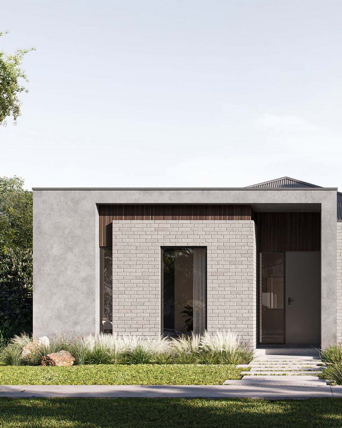
Brick and grey share a useful tension: one is warm and irregular, the other cool and flat. Set them against each other and both improve.
The exterior photo shows painted brick in grey, but inside the logic reverses. Leave brick exposed, even partially, and paint surrounding walls in a warm grey like Benjamin Moore’s Revere Pewter.
The grey picks up the mortar lines; the brick keeps the room from feeling like a catalog spread. Interior designer Tracy Morris used this exact paint to balance cool blue fabrics against a coastal home’s original warmth.
This works best with existing brick, not brick veneer.
The cost is mostly in the paint and the decision to stop covering what you have. If your brick is currently painted a color you hate, grey walls let it read as texture rather than mistake.
19. Use Rugs to Define Spaces
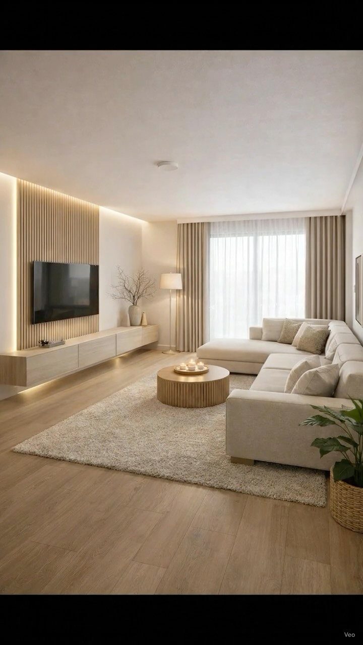
A rug does more than cover floor; it draws a border around where conversation happens. In an open living room, that boundary matters more than the pattern itself.
A beige rug with some texture grounds a grey sofa and fixes the coldness smooth wood floors bring in.
For a grey palette, I look for rugs one shade lighter or warmer than the walls so the furniture sits in between.
A 9 by 12 foot rug usually anchors a standard sectional with both front legs on and both back legs off, which sounds fussy but keeps the room from feeling like a furniture showroom.
Plush pile softens hard lines; flat weave survives pets and vacuuming. That tradeoff is worth deciding before you shop, not after the first cleaning.
20. Use Grey to Highlight Features
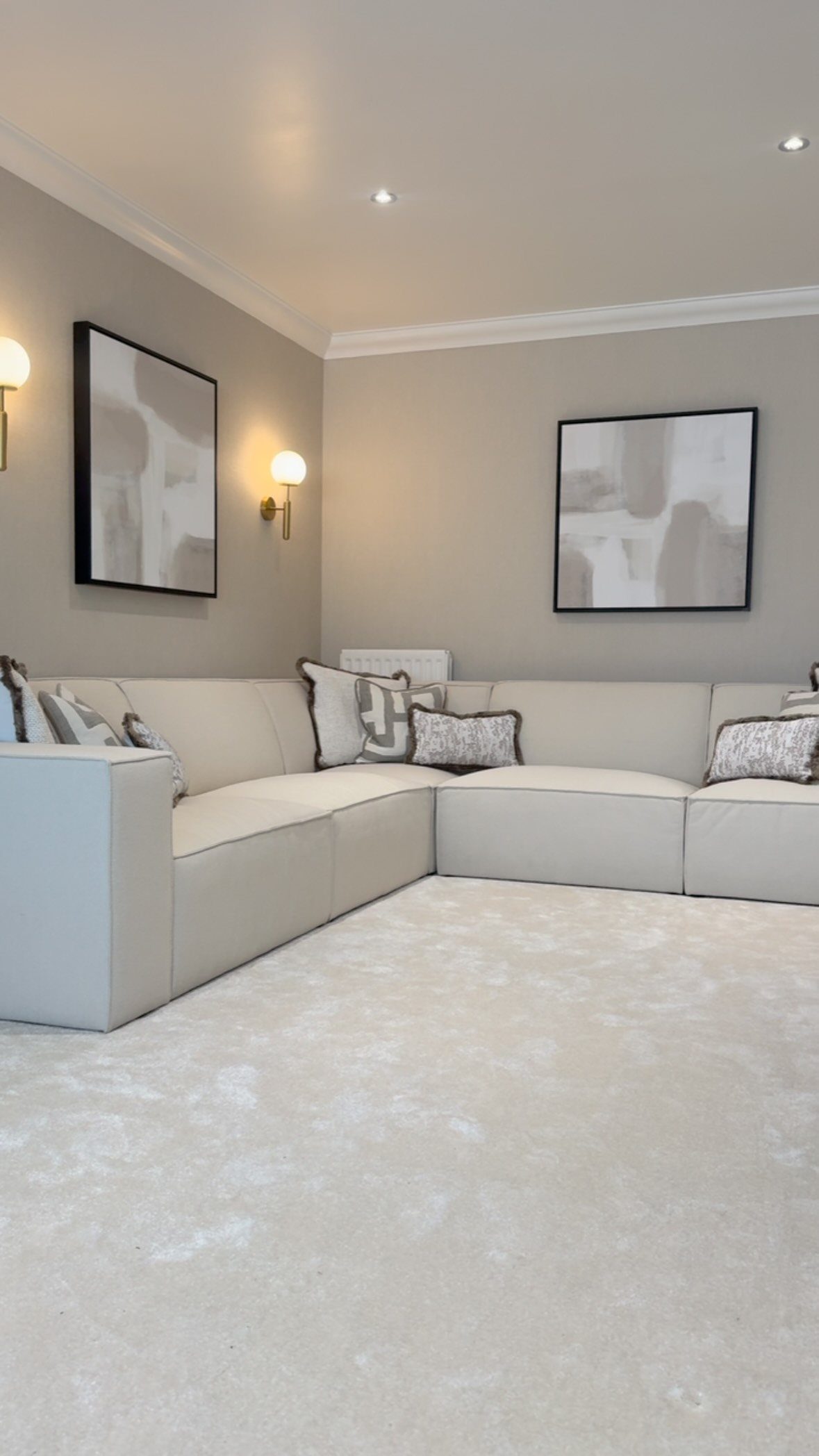
Crown molding reads as white in most rooms and disappears. Painting it grey, the same grey as the wall or one step deeper, makes the eye stop and notice the shape of the space.
Soft grey walls with white trim is the common move; reversing that, or taking the walls pale and the molding smoky, puts the architecture forward instead of the paint job.
Built-in cabinets, fireplace surrounds, or ceiling coffers work the same way. Pick one feature that deserves attention, not every feature at once.
A shallow alcove in mid-tone grey against cream walls draws the eye without shouting; the grey does the work, not the size of the space.
The alcove became the reason the room worked. One feature, one depth shift; more than that and the trick diffuses into noise.
21. Use Grey for a Sophisticated Look
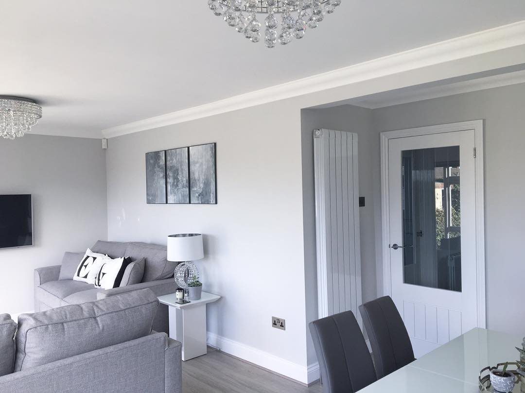
Cool grey reads as deliberate rather than default when the finish has some shine to it. A satin sheen in wall paint, or a sofa fabric with slight luster, carries the same dressed-up effect without needing a chandelier.
For a sophisticated look, I avoid mixing warm and cool greys in the same sightline. Dove grey walls and silver-toned accents stay in one family; a camel leather chair or honey wood tone would fight them.
Concrete floors, metallic light fixtures, or a single large abstract piece in black and white keep the palette restrained without going cold.
This suits someone who entertains occasionally and tidies before guests arrive. The look depends on order; clutter breaks it faster than bolder palettes would forgive.
Color Combinations for Grey
Mustard yellow warms it up, blush pink keeps it quiet, and emerald green gives it a jolt; each one shifts the same grey into a different mood.
Yellow leans sunny and modern, pink softens the edges, green goes deep and grounded.
A monochrome room built on grey reads as intentional rather than flat when one of these accents shows up in a lamp, a pillow, or a single painted door.
Pantone’s recent Color of the Year leans into that same quiet luxury, a near-neutral that sits comfortably with cool greys without demanding attention. One accent color is enough; three brights shoved up against grey just look noisy.
Creating a Cozy Atmosphere
Layering helps: a wool throw over a cotton sofa, a jute rug under a velvet chair, each material catching light differently. Plants do similar work, breaking up flat planes with irregular shapes and actual green.
Warmth also comes from pattern scale; small repeats in peach or sage read cottage and inviting against a dark grey sofa with a blue undertone, where large geometric prints would feel sharp.
You want enough softness that the room still works at 9 p.m., overhead light off, some series running.
Frequently Asked Questions
What color compliments grey in a living room?
Mustard yellow warms grey into something sunny, blush pink pulls it back to something softer, and emerald green drops it straight into a moodier register.
One strong accent color, pulled from something already in the room, reads as intentional; more than that starts to look like whatever was on sale.
Is gray a good color for a living room?
Grey works because it does not fight back against whatever you pair it with, and it suits renters who face a new wall color at the next place.
The risk is flatness; grey goes cold in shadow and needs layered light and at least one living thing, a plant or a textured throw, to keep it from reading like a catalog spread.
What are some good decor ideas for a grey living room?
3 distinct values of grey, running from walls down to furniture, build depth without needing a single contrasting hue.
Velvet, chunky knit, or a rug with a visible weave add the texture that keeps monochrome from going flat; one bold piece that catches light and shadow differently through the day does the rest.
What colors don’t go well with gray?
Warm grey beside cool grey in the same glance turns muddy, so I sort them by temperature before anything goes on the wall.
A blue-grey sofa against a green-grey wall is the clash to watch for, not the accent colors you add later.





