

Bedroom wall decor can be as cheap as a quart of chalkboard paint or as involved as a framed sign from a salvage yard, and the right pick depends on whether you rent and need your security deposit back or own and can hardwire a sconce.
A single wall treatment, a gallery spread, or a guitar on a hook all solve the same empty wall, but the timeline and the tools change.
1. Accent Wall
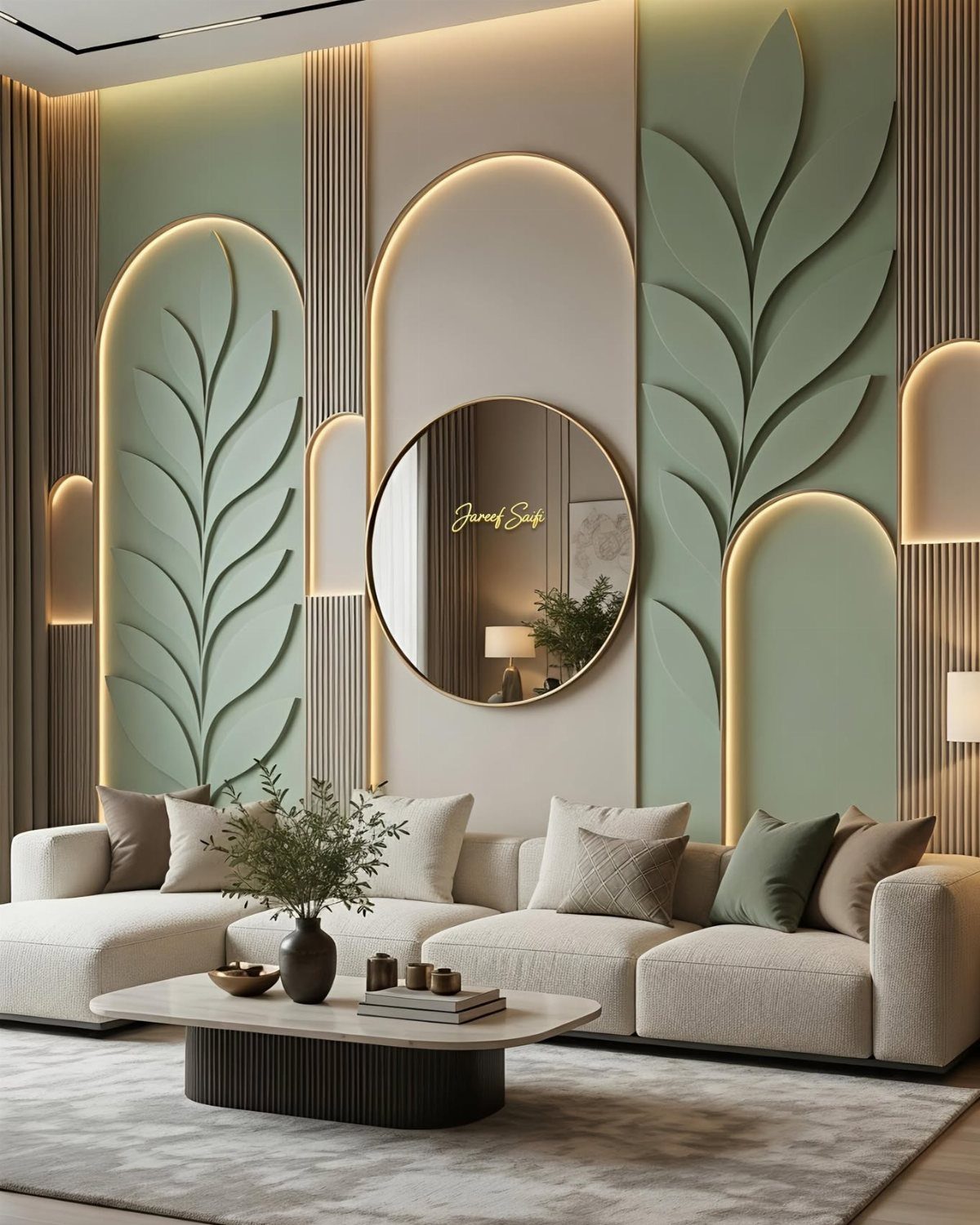
A single wall in a different color or pattern pulls the eye to one spot and gives the rest of the room permission to stay simple.
Black high-gloss paint reads design-forward on a sloped ceiling and pairs with a patterned bed frame for a guest room that feels intentional, not leftover. A weekend accent wall needs bold paint, good painter’s tape, and patience more than money.
Best for renters who can paint one wall back later, or owners who want impact without committing the whole room.
2. Gallery Wall
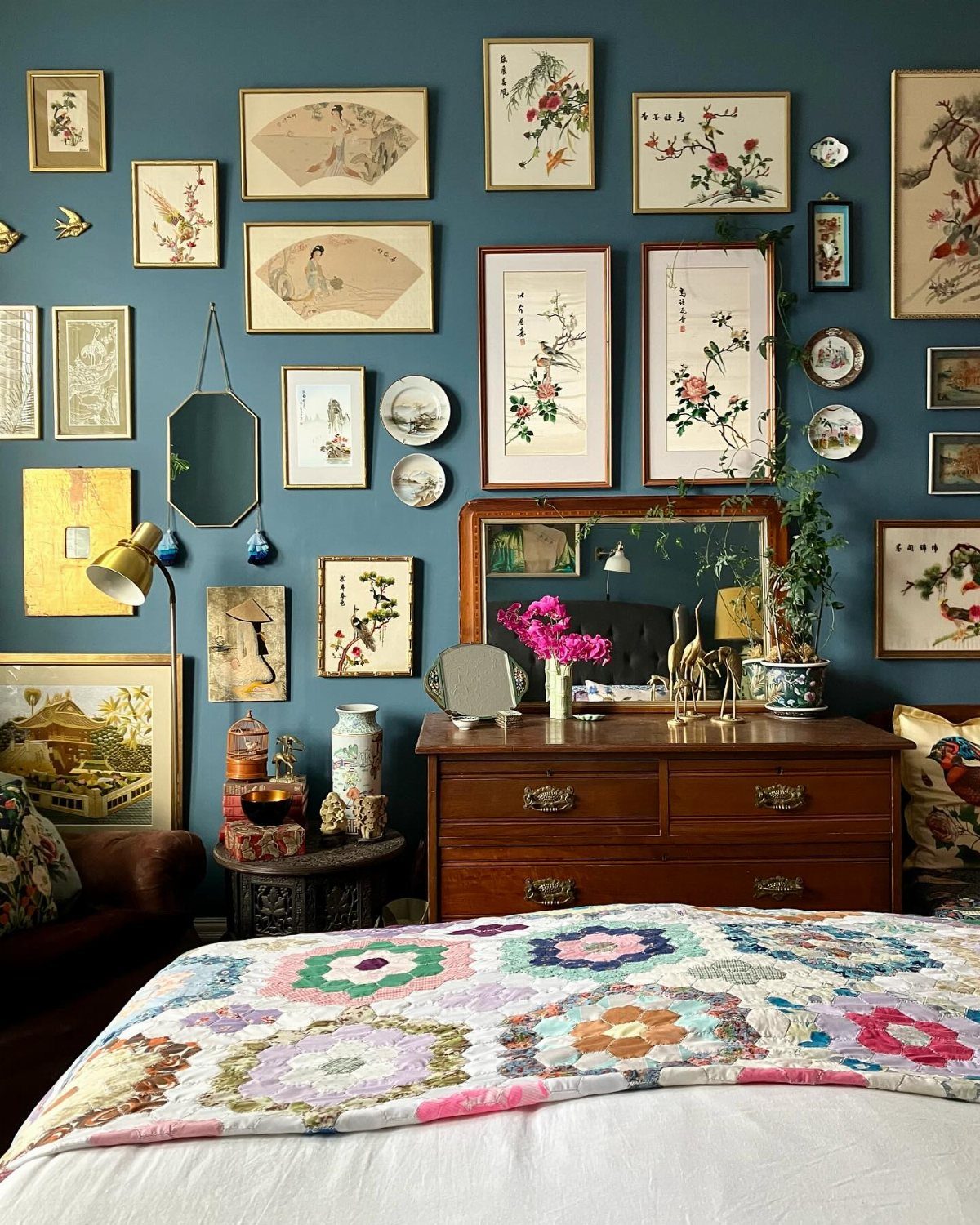
A wall of mixed frames turns travel photos, botanical prints, and that one plate you found at a flea market into a single story. Start with the largest piece slightly off-center, then fill outward with smaller ones in 2-inch increments.
Black frames keep a cohesive backbone even when the art inside jumps from landscapes to family snapshots. Lindye Galloway places these arrangements around beds and furniture, not floating on blank expanses, so the grouping feels grounded.
Frames for a wide gallery arrangement cost less if you source secondhand and print at home. The sorting on your floor takes an evening; hanging another.
3. Oversized Art Piece
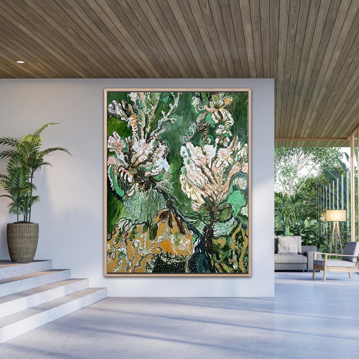
One large vertical canvas above a bed or dresser replaces a cluster of smaller pieces that fight each other.
Lindsey Colhoun uses oversized graphic pieces to break up rooms heavy on neutral texture. A large print in teal, baby blue, or peach calms a space instead of energizing it, which matters where you sleep.
Original work or quality giclée at poster size costs more than mass-market prints but lasts longer. Lean it first to test the spot; holes in drywall at shoulder height are easier to patch than ones you have to reach.
4. Mirrors
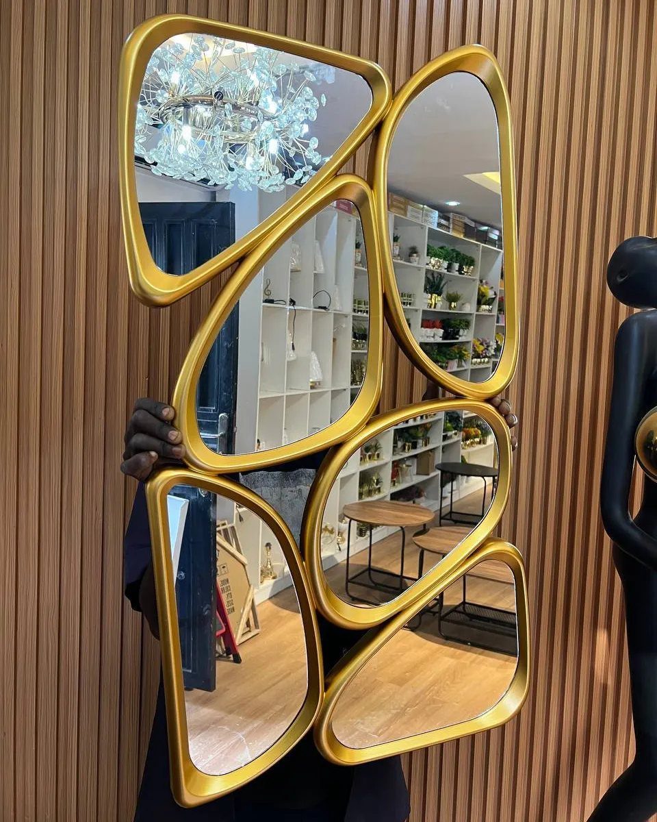
A mirror with some shape to its frame does two jobs: it throws window light into dark corners, and it acts as sculpture when the light changes. Irregular gold panels catch morning sun differently than evening lamplight.
Heather Fujikawa hangs leather-strapped mirrors above nightstands to add height and symmetry against dark walls. For a rental, a leaning oversized mirror needs no hardware and travels with you.
Distressed wood reads casual; ornate gilt reads traditional; bright white reads clean and slightly feminine. A mirror with real weight to it costs more than the lightweight versions but hangs flat and stays put.
Check the back for proper hanging wire, especially if you’re going over carpet.
5. Chalkboard Wall
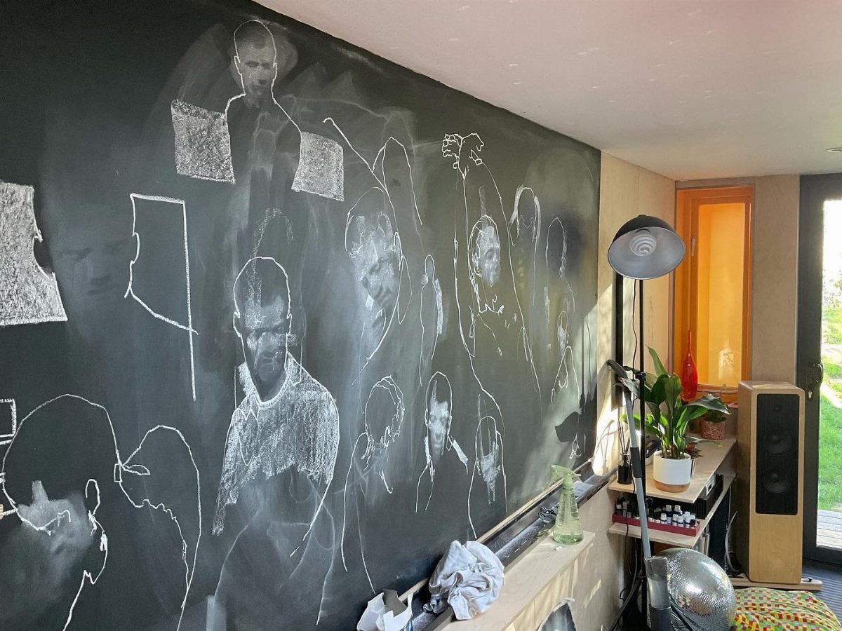
A chalkboard wall turns the space above a desk or dresser into somewhere you actually write: grocery lists at 11 pm, a doodle when you can’t sleep, a quote that stops working after a week and gets erased.
A framed chalkboard keeps the black from bleeding into trim and baseboards, which helps in a small room where an entire black wall would swallow the light.
Chalkboard paint is cheap by the quart, or buy a framed panel if you want portability later. The surface needs re-seasoning with chalk before first use or marks linger.
Best for guest rooms or teenagers, not master suites where you want stillness.
6. Art as Headboard
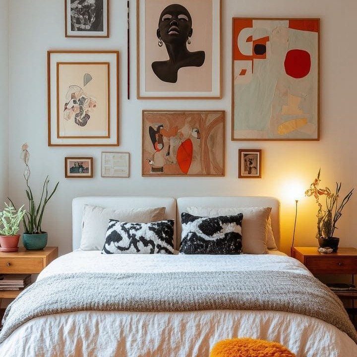
Skip the upholstered headboard and hang one large piece, or a vertical pair, where your pillows stop.
Nina Grauer uses charcoal sketches from the same artist on each side of a bed; the monochrome adds romance without demanding a color scheme.
Sizing matters more than subject. The frame or grouping should reach within a few inches of the nightstands on each side, or the bed looks marooned.
For a queen bed, art hung just above the mattress reads as a headboard without the bulk.
A single large framed print at headboard scale costs more than a gallery spread but needs no arranging.
If you rent, a picture ledge lets you lean the piece instead of anchoring it, and you can swap it when the mood shifts.
7. Decorative Shelving
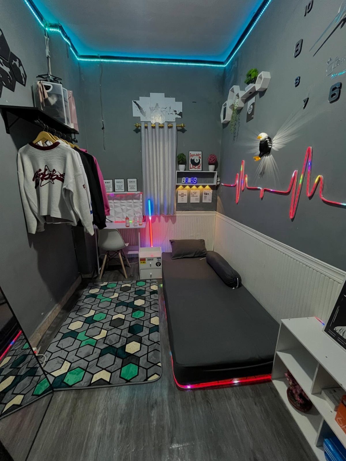
A single long shelf above the bed turns open storage into a display you actually look at. I like this setup for renters because it fills the wall without a single nail in the plaster below.
White hexagonal shelves work the same way in tighter corners, not above the bed if it’s a kid’s room, but nearby where a fall wouldn’t matter.
Shelves hung at sitting height work best loaded with books you actually read and one plant that trails down to soften the line.
The ledge version needs only two brackets and a 1×4; figure 15 minutes with a level and a stud finder. For a cleaner line, skip the lip and let the books hold each other up.
8. Use of Wall Sconces
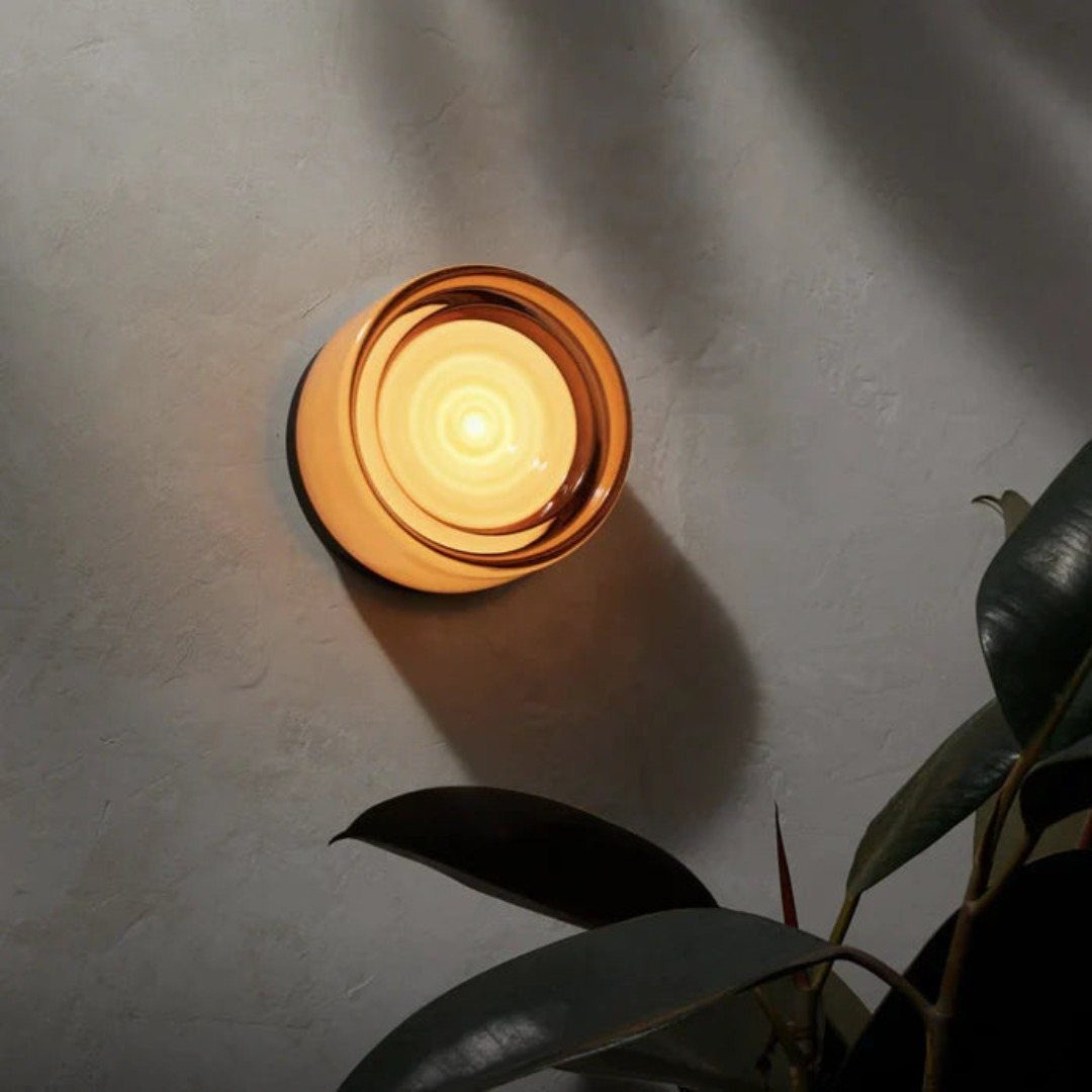
Sconces do two jobs at once, which matters when floor space is already gone to the bed and the dresser.
I wired a pair on either side of my old frame and finally stopped knocking over the bedside lamp every morning.
Amber glass like this throws a warm glow that flatters skin tones; I chose it over white shades because the grey wall needed the color. The light hits the plant below it and doubles the shadow into something that moves.
Hardwired is permanent; plug-in with a cord cover keeps your security deposit intact. If the sconce itself is plain, a small sign or print hung from the arm adds interest without competing.
9. Woven Wall Decor
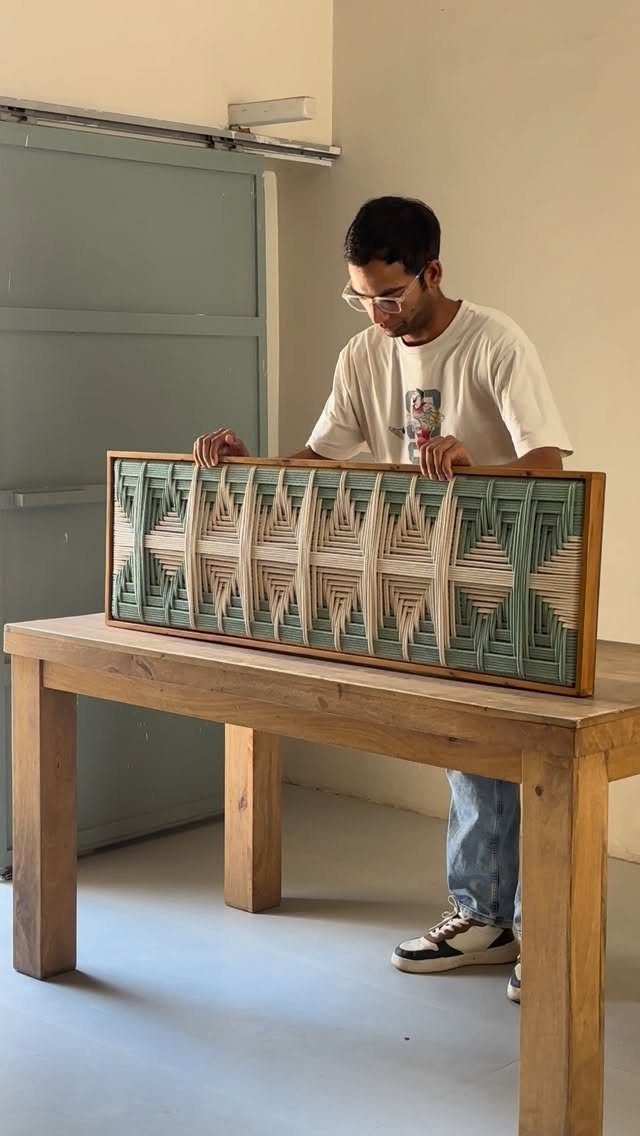
Woven pieces bring in what painted walls lack: actual texture you can see across the room.
A macrame piece from a local maker costs about the same as a mass print, and the knots show the hours in a way a screen never does. Hung above the bed, it replaces a headboard without the bulk.
Three handwoven baskets in a loose cluster turn up often at thrift stores and estate sales for less than a single framed print.
Stagger them at different heights and keep the tones within two shades of each other so the grouping reads as intentional, not clutter.
10. Layered Artwork
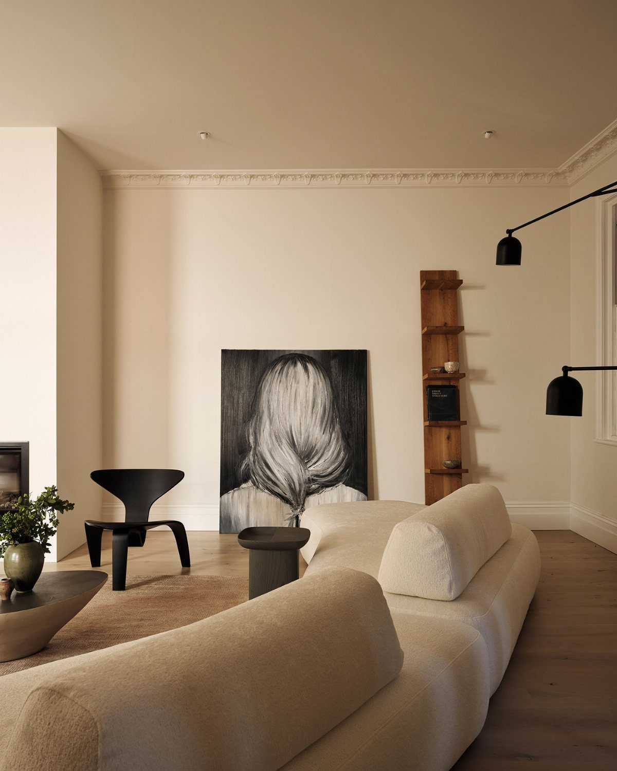
Leaning art against the wall instead of hanging it saves holes, saves time, and lets you change the stack when you tire of it.
Start with a larger black and white portrait and add a smaller sketch in front; the overlap gives the corner depth without costing anything.
Mixing frame sizes matters more than matching them. My pairing is a 24×36 inch print with an 11×14, both thin black frames so the clash is in proportion, not color.
Good artwork answers both the furniture and the architecture together; move things until the room feels lived in, not arranged.
This works best where you won’t knock it: a dresser back, a deep windowsill, a shelf above eye level. In a high-traffic spot, a strip of museum putty behind the frames keeps them steady.
11. Use of Fabric
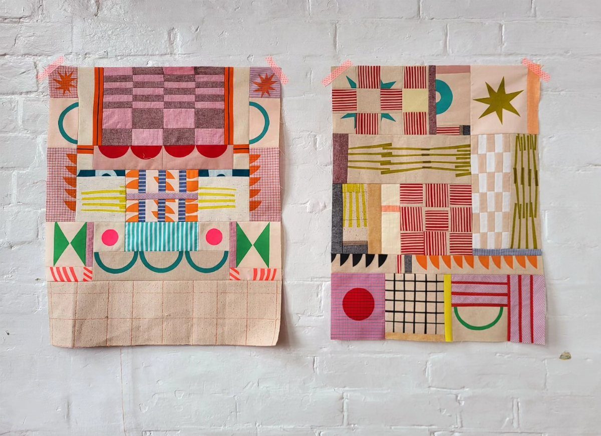
A stretched fabric panel over a simple frame gives you a headboard, a color block, or both, and the whole thing weighs less than a framed print.
Geometric cotton and a canvas stretcher turn into something you can swap out by season with a staple gun and a little patience.
Patchwork reads as art from a distance, but up close you see the seams and the handwork. That tension is what makes fabric different from paint on the wall.
A wooden curtain rod and two clips hold a length of yardage without any construction. In a rental, rod holes fill with spackle and the deposit comes back in full.
The fabric behind the bed should hang low enough to read as intentional, not as a window treatment that wandered.
12. Symmetrical Arrangements
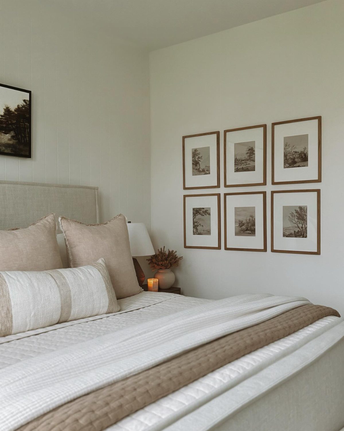
Six small frames in a strict grid turn a blank wall into something orderly without demanding a single large piece.
Two rows of three over the bed, each print identical in size and frame, and the repetition does the calming work.
The gap matters: keep it even, measured with a strip of painter’s tape as a spacer. Any wider and the shapes separate; any tighter and you might as well have bought one big frame.
Landscape prints in soft tones suit this format because the eye reads them as texture, not content. I chose mine from a single series so the colors wouldn’t fight.
For a lower-commitment test, lay the arrangement on the floor first, or trace each frame onto newspaper and tape the shapes to the wall. Skip both and spend an evening filling extra holes.
13. Vintage Signs
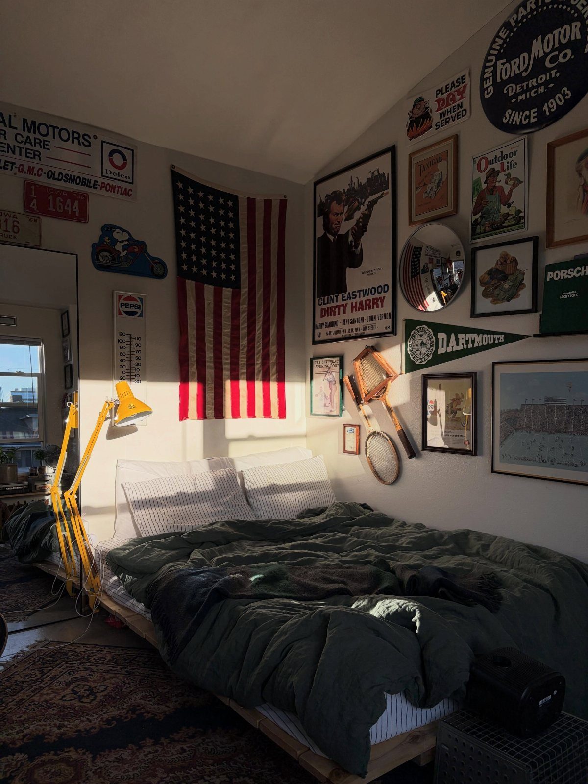
A rusted metal camp sign or a faded gas-station advertisement carries more weight than any reproduction. The dents and patina are the whole point.
Hunt at estate sales or salvage yards for pieces with local history. A 24-inch sign hung above the headboard reads as intentional; three or four clustered tight read as collected over time.
I frame paper posters under glass to stop the foxing, but leave metal bare.
This one asks for restraint. One loud piece fills a wall; two fight each other.
14. Display Musical Instruments
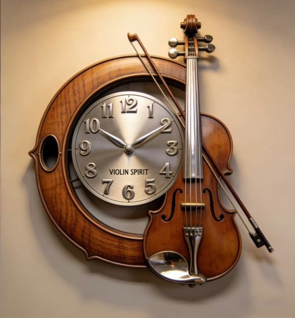
A real instrument on a wall catches light at odd angles and casts shadows that shift through the day.
A guitar on a hanger needs only a wall hook rated to its weight; most acoustics are lighter than they look. Keep it out of direct sun or the finish will check.
For instruments you play, humidity matters more than aesthetics; a closet with a humidifier beats a dry wall display.
The wall becomes a practice reminder. That is the tradeoff: it looks lived-in because it is.
15. Framed Sports Flags
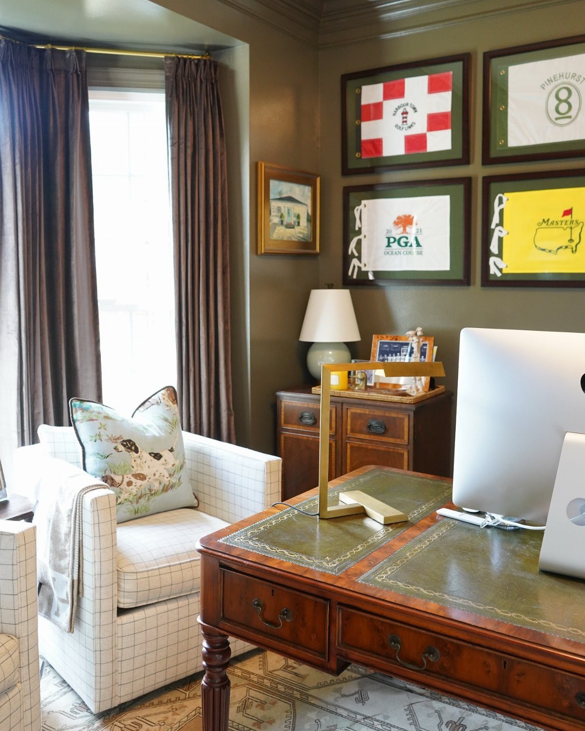
Four flags in matching black frames against olive green turns allegiance into geometry. The frames do the work of making it decor rather than dorm room.
Two flags read intentional; six read like a storage problem. The limit is real.
Choose frames with a slim profile, around one inch, so the flag stays the subject. Museum glass cuts glare if the wall faces a window.
The desk below matters. A wooden surface and a brass lamp echo the framed textile without competing.
16. DIY Headboard
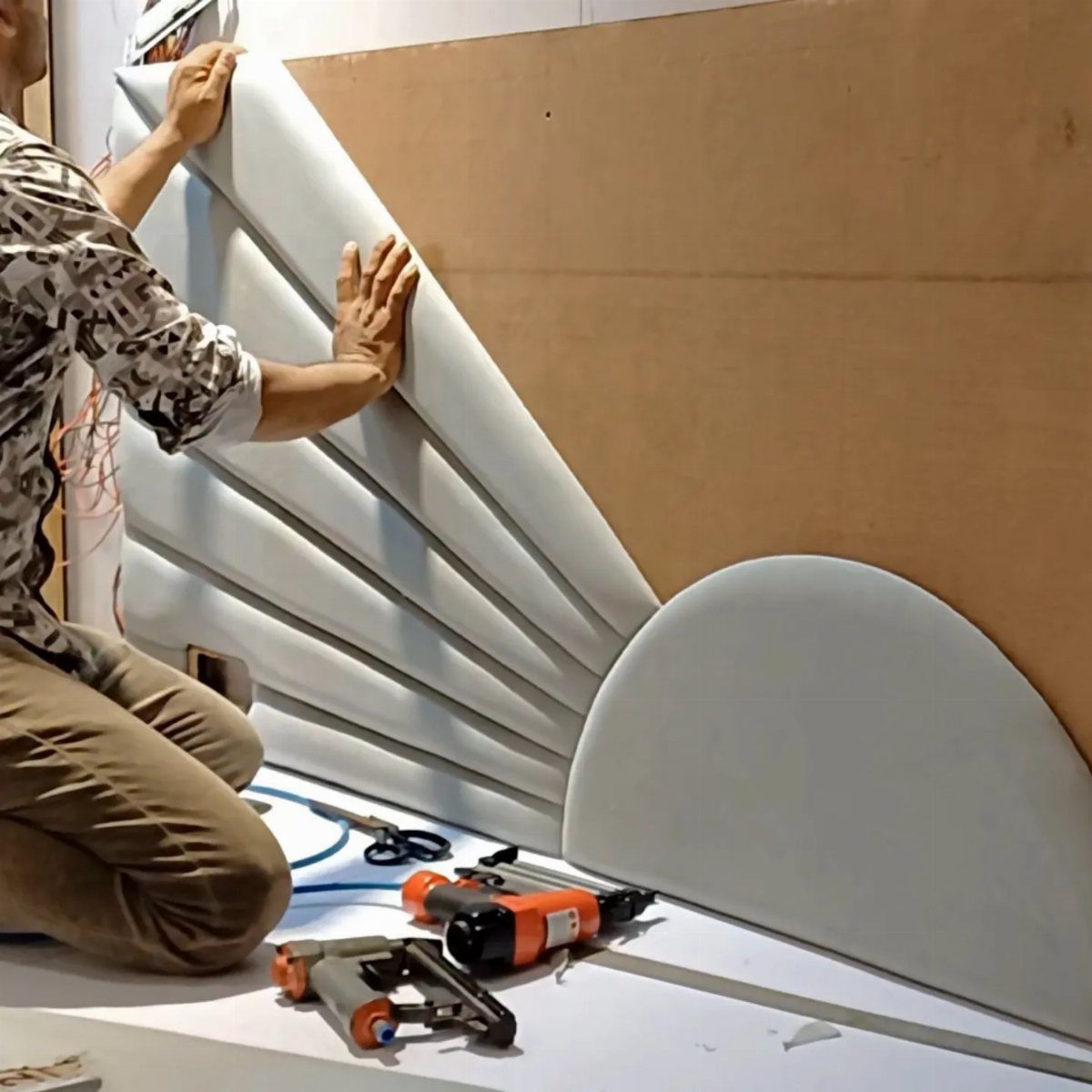
Curved panels are upholstery foam over plywood, stapled tight and trimmed clean.
I would pad an old door with upholstery foam and cover it in heavy linen for a soft, low-profile headboard. The door gave me structure without joinery.
The foam is where the money goes; everything else can come from the shop or the closet.
Shape sets the tone. Straight rectangles read modern; a gentle arch softens the room.
Mount with French cleats for weight.
17. Layering Textures
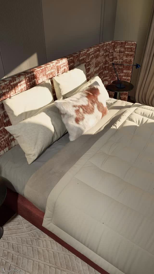
Mixing materials on the bed does the same work as mixing them on the wall. Carry that logic upward.
A woven piece beside a metal sconce, or a raw wood shelf below a glossy frame, builds depth without clutter. I limit myself to three textures in view at once; four starts to look like a catalog spread.
The headboard fabric is already one texture. Add art with a visible weave or a frame with grain, then stop.
Let the eye rest.
18. Use of Decorative Frames
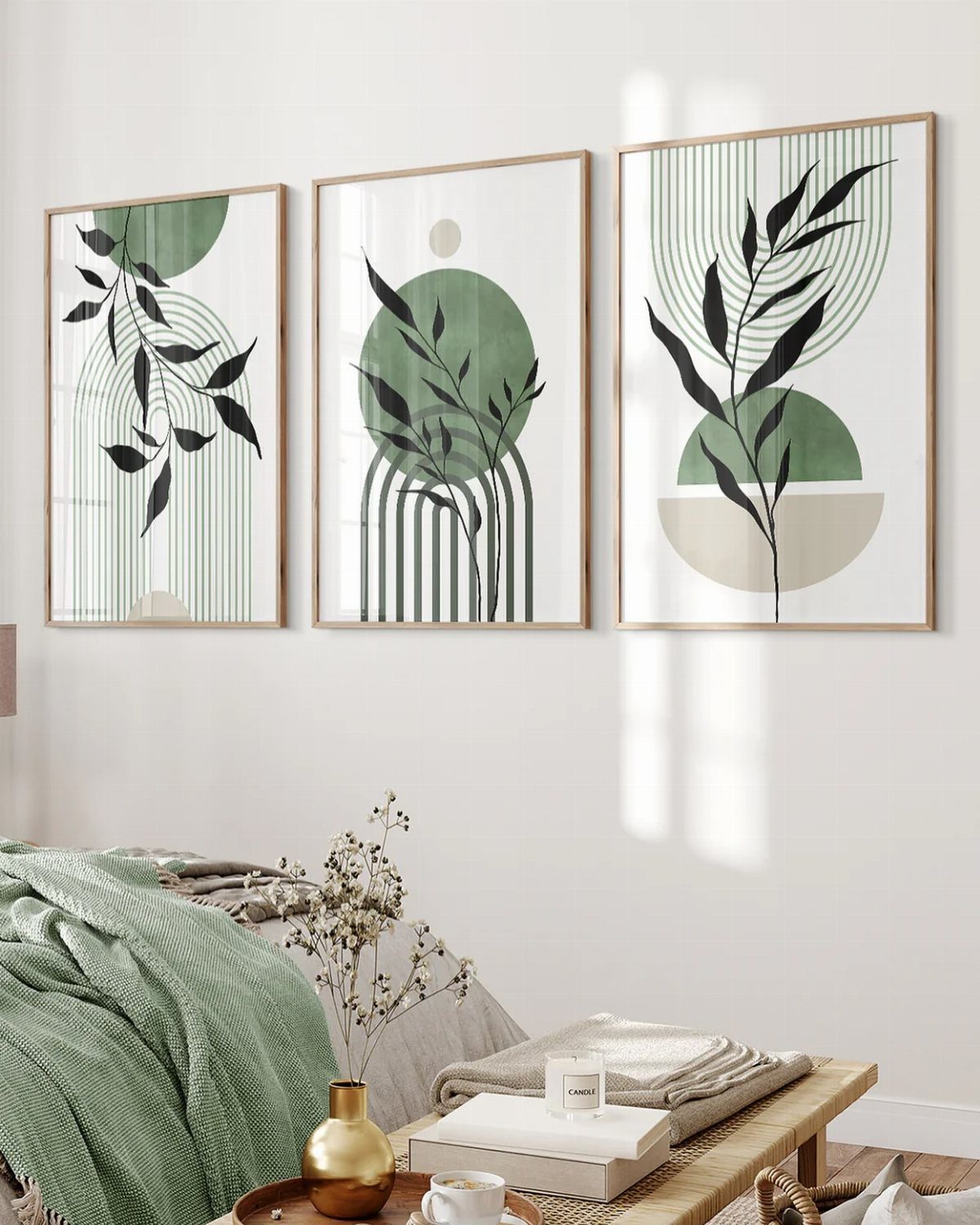
The frames are barely there, which is the choice.
I pick frames after the art, never before. A busy print needs a quiet border; a quiet print can handle a carved or gilded frame.
Thrift stores yield solid wood cheap, though custom cuts cost more per piece.
For the three-print grid above a bed, I measure the total width first, then subtract for gaps. A narrow gap between frames reads tight; a wider one reads relaxed.
19. Use of Wall Molding
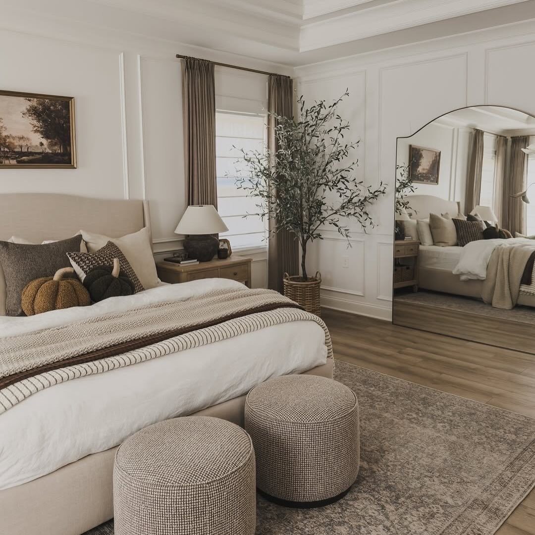
Wall molding turns flat drywall into something that reads as built-in character.
You can start with a single picture-frame box behind the bed. A weekend project with 1×3 lumber, a miter saw, and construction adhesive.
Paint it the same color as the wall if you want texture without contrast; go one shade darker if you want the shape to stand out quietly.
This suits renters in older apartments where the walls themselves are the main event. Caulking the seams takes longer than installing the boards, so budget the time.
Choosing the Right Decor
The mood you want sets the filter. A room for unwinding calls for different colors than one where you want to feel alert in the morning.
Warm, earthy tones lean romantic; pastels read sweeter and more feminine; black and white stays modern and clean.
Your existing furniture matters more than most people think. Antique or vintage-inspired pieces pair naturally with artwork that shares the same era.
A $49.95 customizable canvas like a couple map sign can work in a romantic setup, but only if the frame style and lettering match what is already in the room.
Color scheme comes last, not first. Once you know the feeling and the furniture style, the palette narrows itself.
Wall art that fights the bed frame or the dresser never quite settles in, no matter how good it looks alone.
Mixing Textures and Materials
A flat wall reads as one surface. Layering breaks that up without adding clutter.
Start with a base that has physical presence: woven pieces, fabric panels, or dimensional molding. Against that, smoother elements like framed prints or mirrors create contrast.
The eye moves between the two instead of sliding past.
Metal and fiber pair well in bedrooms because they balance temperature. Cool brass or black iron against warm cotton rope or linen keeps either one from dominating.
The same goes for glossy and matte finishes.
Thickness matters more than pattern. A thin woven mat and a thick macrame piece read as the same texture family; two pieces of identical depth, even in different materials, flatten out.
Vary the relief by at least half an inch where you can.
One rough element per wall is usually enough. Two compete; three look collected by accident.
Frequently Asked Questions
What looks good on a bedroom wall?
A mix of art, mirrors, and textured pieces works best, with one rough element per wall so things stay intentional rather than cluttered.
Mixing textures keeps a wall from going flat: a woven hanging next to a slim brass sconce, or a rough-sawn shelf under a glass-front frame, gives the eye somewhere to travel.
Keep to three textures in view at once, and let the eye rest.
What is the best wall decor for a bedroom?
Mood sets the palette. Rust and oatmeal feel like a Sunday morning, soft pinks and creams read young, and stark black and white still looks like a hotel that cost too much.
The bed frame is the boss. A delicate watercolor over a heavy oak headboard looks like a guest who showed up in shorts; the room never quite relaxes.
What should I put on an empty wall in a bedroom?
A gallery wall, one oversized vertical canvas, or a mirror with some shape to its frame all fill blank space without fighting each other.
Anchor a gallery wall with your biggest piece a little left or right of dead center, then work outward in roughly 2-inch jumps so nothing lines up like a grid.
One oversized print over the headboard does the work of five small frames that keep stealing focus from each other.





