

These ideas run from swapping out hardware on a lunch budget to full wallpaper and lighting overhauls that need a weekend and real money.
Renters can still layer textiles, swap hardware, and use plug-in lamps, while owners get the full range including paint and built-ins. A 2700K bulb temperature matters more than the fixture price; anything cooler and cream walls turn sterile after sunset.
1. Layer Textures for Added Depth

A velvet cream headboard against black wood nightstands only works if something rough sits between them. I start with a cream jute or sisal rug for the floor, then layer 400-thread-count cotton sheets with a waffle-weave blanket on top.
The light hits each weave differently, creating micro-shades that keep the same two colors from going flat. Boucle, linen, leather, and wood each do a different job.
One mohair throw or a few velvet scatter cushions finish it. The more textures you stack, the less the room looks like a render and the more it feels like somewhere you actually sleep.
2. Explore Statement Headboards
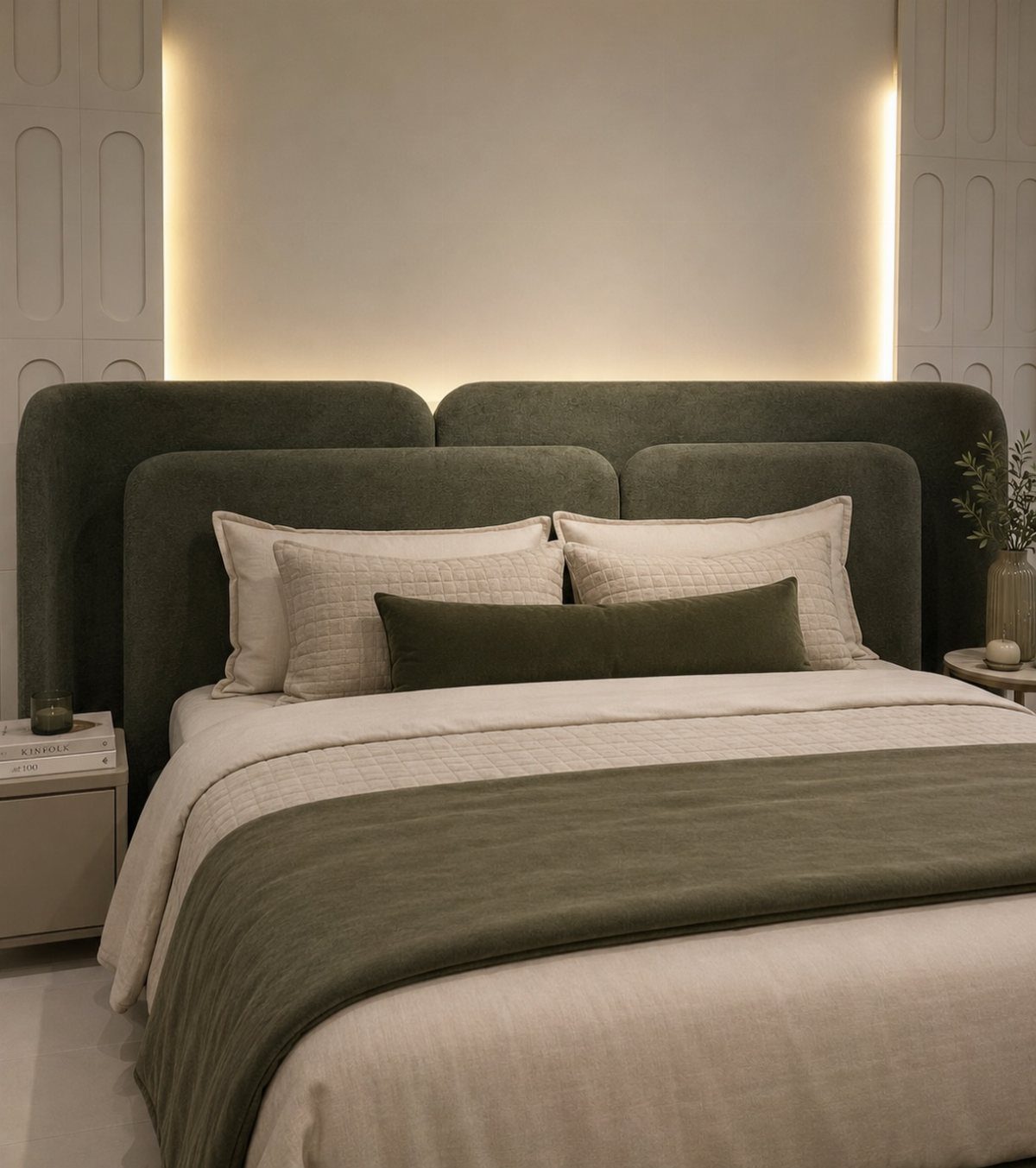
A curved headboard does half the work of making a bed feel designed rather than assembled.
For a black and cream room, I’d go black velvet against cream walls, or flip it to a cream upholstered frame if the walls are already dark. Channelled upholstery or rattan work too.
A bold headboard becomes the center without needing much else. Built-in shelves or lighting integrated into the frame add function, though a plain tall silhouette is enough if the budget is tight.
3. Choose a Cream Base with Black Accents
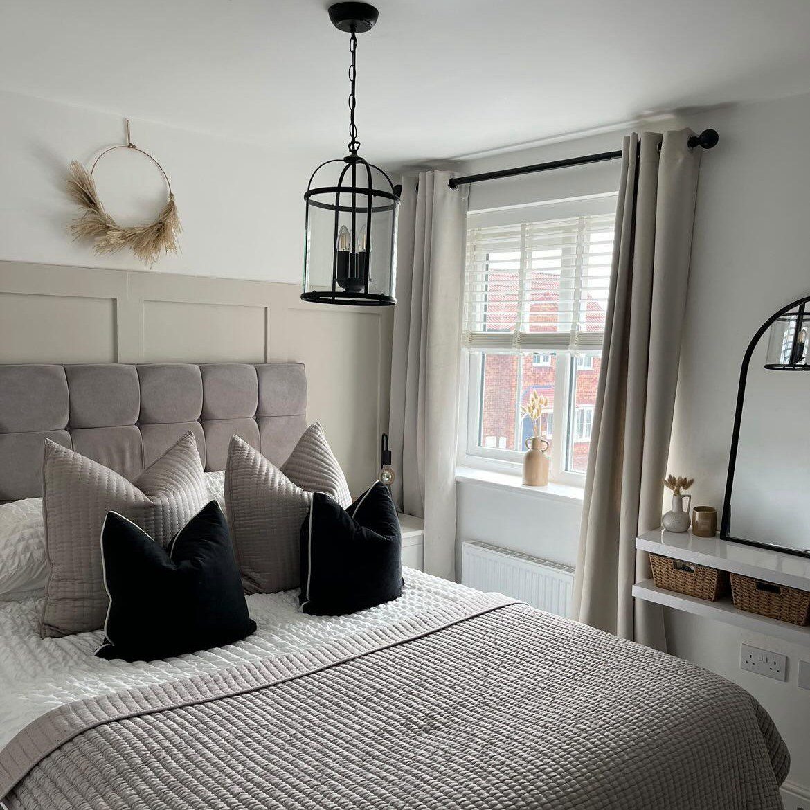
Cream walls with black accents suit renters who cannot paint dark and homeowners who want to test the palette before committing. Black door handles or curtain rods work the same way.
The cream matters more than you’d think. Three or four sample pots painted in large wall squares, checked at 8:00 AM, 2:00 PM, and 9:00 PM, will save a repaint.
One cream that reads as parchment in morning light can turn sickly yellow under bedside lamps. The green-based creams and the red-based creams shift differently through the day.
4. Add Gold or Brass for Warmth

Brass and gold keep a black and cream bedroom from reading as too stark or too cold. I use them on handles, mirror frames, or light fixtures.
Just a hint goes a long way. Light oak or walnut works as a bridge material too, sitting between the two main colors so the room does not feel binary.
For a more masculine or modern tone, brushed nickel or additional matte black fit better. I skip chrome.
It fights the warmth of the cream and tends to read as cheap in this particular palette.
5. Use Artwork to Balance the Palette

A single oversized piece in black, cream, and beige does more than a scattered arrangement when the walls are already neutral. I look for monochrome prints, cream-toned abstracts, or black-framed photographs that pull both colors together.
A gallery wall over the bed anchors the space if you have several smaller pieces. One large framed work with textured gold leaf, like the visible example, reinforces the palette while adding personality the room would otherwise lack.
Art is where you get to be expressive without breaking the color contract.
6. Experiment with Black and Cream Wallpaper
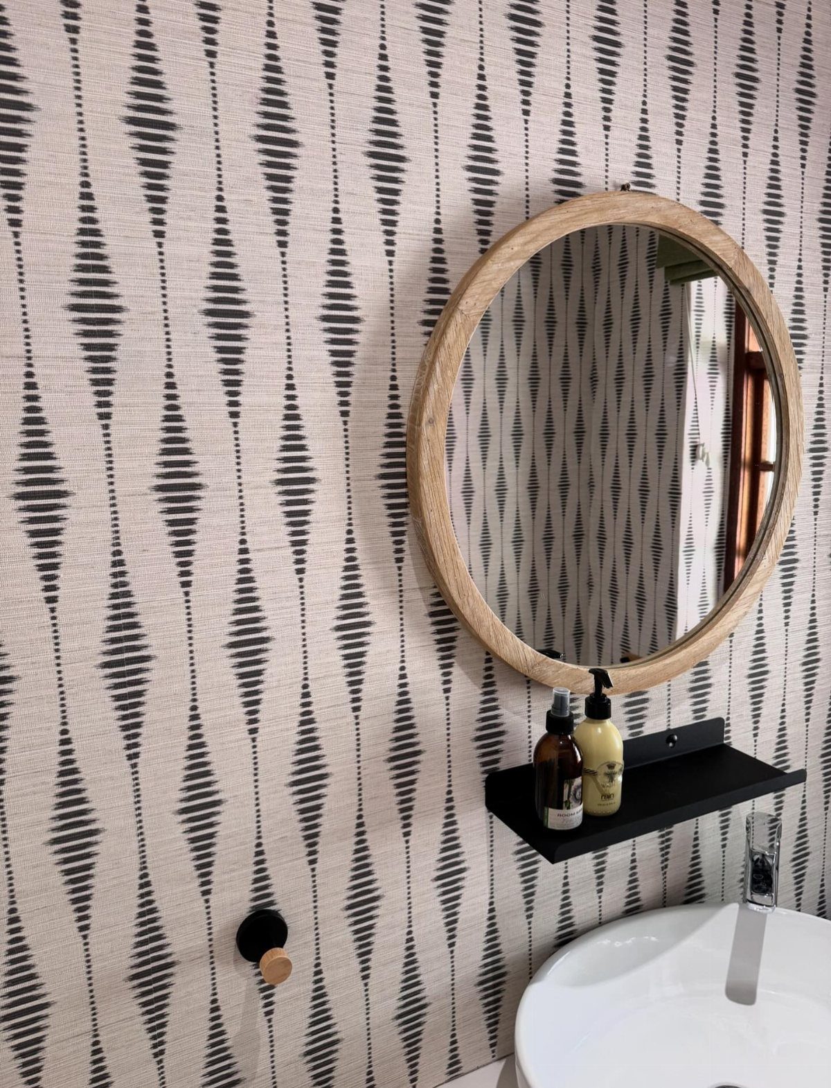
One feature wall behind the bed carries wallpaper quietly; wrapping the whole room works if you can sleep with that much pattern. Geometric patterns, art deco prints, or subtle florals in cream and black add depth without demanding additional decor.
Tone-on-tone prints in warm cream with inky black accents read softer if bold feels too risky. Small-scale geometrics or trailing florals are other ways to do it.
I would not paper every wall in a large pattern unless the ceiling is high and the furniture is minimal.
7. Go Minimal with Maximum Impact
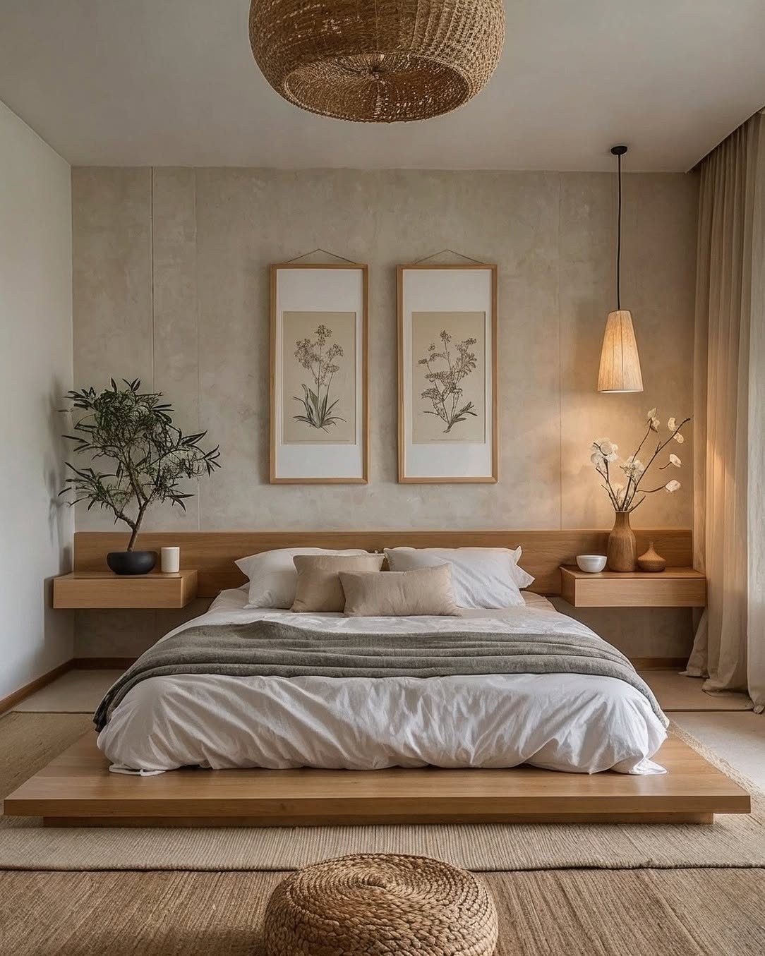
A minimalist bedroom lives or dies on what you leave out. Handleless fitted wardrobes strip away visual noise; floating bedside tables do the same.
A low platform bed keeps the black and cream palette calm rather than empty.
Warmth has to come from somewhere. Natural wood, linen bedding, or a single textured wall panel keeps the room from feeling like a showroom.
A brass pendant or minimal sconce adds the same human touch without cluttering the lines.
This suits renters who can swap hardware and textiles but cannot reshape the room itself. Handleless cabinets need precise planning inside to stay useful.
8. Try Dark Flooring with Light Textiles
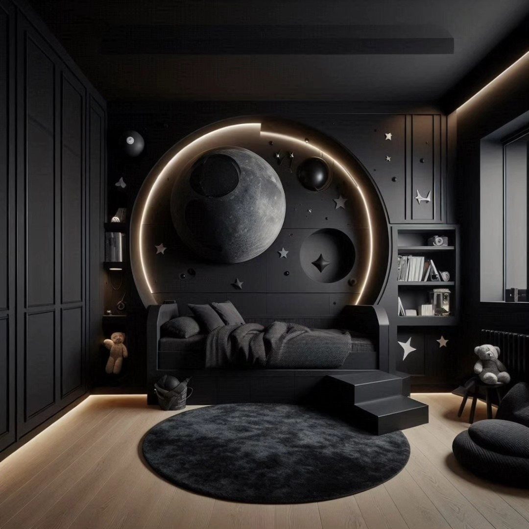
Dark flooring anchors a bedroom the way a black frame anchors a photograph. The light wood visible beneath that circular rug works the same way in reverse; either direction gives the eye a place to rest.
In a rental without dark floors, a large black rug under the bed creates the same grounding effect against cream walls or bedding.
Layer a jute rug on top for texture, or add a bamboo shade at the window to keep the contrast from feeling too staged.
Light textiles do the actual work of balance. Cream cushions, a pale throw, or a natural linen duvet soften the weight below without fighting it.
The risk is dust and pet hair on dark surfaces, which shows faster than on medium tones.
9. Choose the Right Lighting
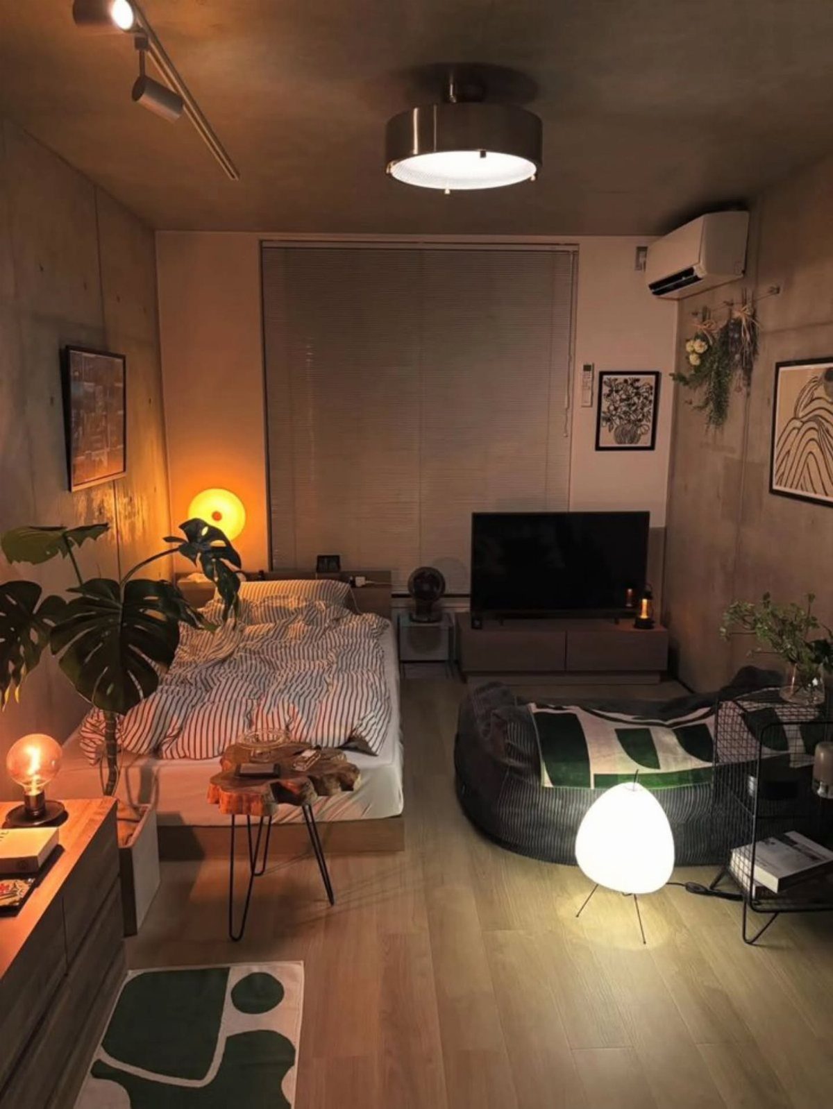
Bedroom lighting is where most people stop at one overhead fixture and wonder why the room feels flat. In a black and cream space, shadows are half the design; you need layers to shape them.
Start with a dimmable ceiling light for ambient wash. Add black reading lamps at the bedside for task light that also punctuates the cream walls.
Backlighting behind a headboard or inside a wardrobe gives a soft glow that eases the shift between the two colors.
Bulb temperature matters more than fixture price. Warm white around 2700K keeps cream looking buttery; cool white turns it sterile and makes black read cold.
Small warm orbs scattered around the room beat one central fixture for this.
This is the easiest upgrade to undo if you get it wrong. Start with plug-in lamps before hardwiring anything.
10. Use Matte Black Finishes
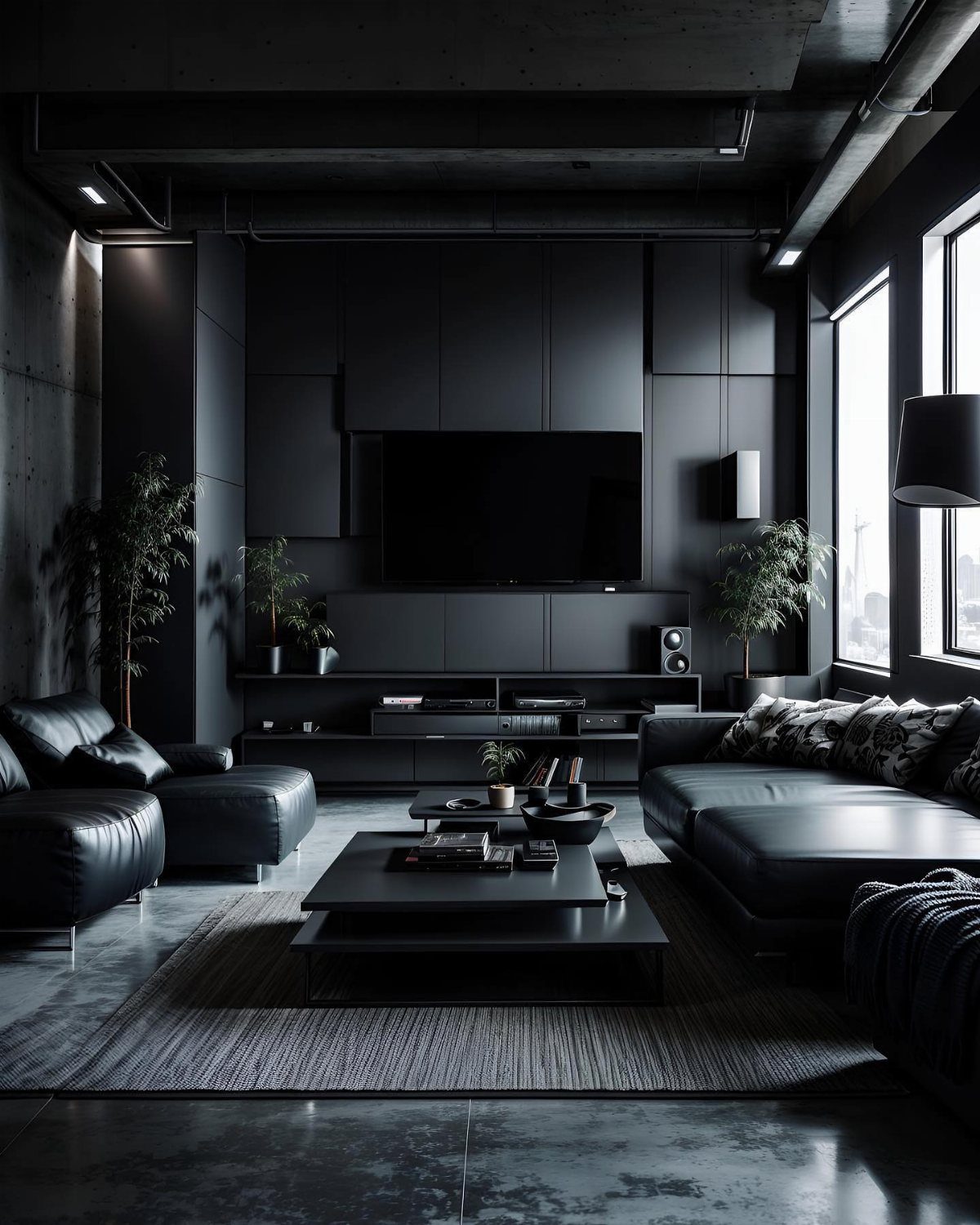
Matte black finishes absorb light instead of reflecting it, which hides fingerprints and softens the industrial edge that glossy black can carry. Paneled walls in matte black read as texture, not mirror; the same principle works for cabinet pulls.
Swapping existing hardware for matte black versions takes an afternoon and a screwdriver. Door handles, curtain rods, picture frames, or a slim picture rail all anchor the room without demanding new furniture.
The finish ties together pieces that otherwise would not speak to each other.
This works best when at least one surface already carries the color, whether walls, bedding, or a rug. All-matte-everything flattens a room; you need some variation in sheen or texture to keep the eye moving.
Role of Natural Light
Window direction decides what cream you can get away with, so start there before committing to paint. North-facing light runs cool and blue, so your cream needs warm yellow or pink undertones or the room goes swampy.
Rooms that bake in afternoon sun from the south can take a cooler, grayer cream without looking flat.
Dark flooring grounds the palette, but light textiles on top keep things from going heavy. Woven shades or a natural-fiber rug loosen the look so the palette doesn’t turn too formal.
No dark floors?
Avoiding Common Mistakes
Scale trips up more bedrooms than color does. A hulking black wardrobe against pale cream walls in a tight room reads like a missing chunk of architecture.
Cream body, black legs, or a cream shell with the interior painted black keeps the visual weight in check.
Ceilings matter too. Builder-grade white against rich cream reads like a mistake.
Carry the wall color straight across the ceiling in flat paint. The eye keeps traveling upward, so the room gains height and the color holds together instead of stopping at a hard line.
Importance of Texture
Without enough texture, two neutral tones fall flat fast. Every surface smooth, and the space reads like a render, not a bedroom.
A coarse natural-fiber rug in cream on the floor gives the eye something to land on. On the bed, smooth percale sheets under a nubby waffle blanket build contrast you can feel.
Boucle, linen, leather, and wood mixed together keep the palette from going one-note.
A velvet cream headboard against a black wood nightstand, finished with a mohair throw, gives the eye enough variation that the limited color range feels intentional, not empty.
Psychology of Colors
Together they balance toward a space that actually relaxes rather than just looking restful.
Cream is not one color. Buy three or four sample pots, paint large squares, and read them at 8:00 AM, 2:00 PM, and 9:00 PM.
That perfect morning parchment can flip to sour under warm lamplight after dark. The only way to know which cream you have is to watch it shift through the day.
Frequently Asked Questions
What color goes with a black and cream bedroom?
Gold or brass adds warmth without breaking the palette. Warm wood tones, especially light oak or walnut, keep the two main colors from feeling like they are fighting each other.
For hardware and fixtures, brushed nickel or more matte black lean the room toward a modern or more masculine feel.
Chrome is the one finish I would not use here; it clashes with the warmth of the cream and usually ends up looking inexpensive against this palette.
What makes a bedroom look tacky?
Equal amounts of black and cream read as a fight rather than a balance. Cream should carry most of the room, with black as punctuation.
A massive black wardrobe shoved against soft cream walls in a small room leaves a hole in the space that reads as an afterthought, not a choice. Scale matters more than color choice.
What are some elegant black and white bedroom ideas?
A cream and black bedroom keeps the same timeless quality as black and white, just warmer. The contrast still reads as elegant, but cream softens the edges that pure white would sharpen.
Layer textures like velvet, linen, and wood so the limited palette feels intentional rather than stark.





