
These 17 kitchen wallpaper ideas run from a single Saturday project to a full-room statement, with the deciding factor being how much wall your cabinets actually leave bare.
A narrow strip behind open shelves or a coffee station needs something bold, while a feature wall or ceiling calls for scale that reads from across the room.
1. Color Coordination
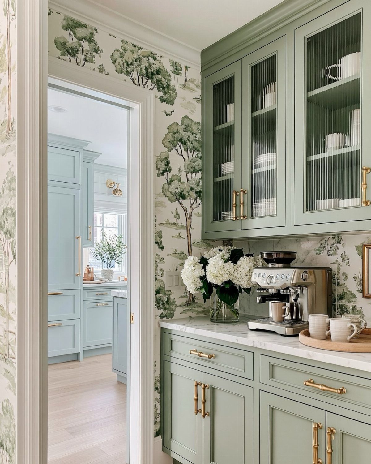
Matching wallpaper to your cabinets sounds fussy, but it actually saves money on mistakes. I look at the undertone in my wood or paint first: warm cabinets want warm prints, cool ones need something with blue or grey in it.
Sage Shaker cabinets and a tree print in the same muted green keep the palette quiet but intentional.
If you have glass-front cabinets, try lining the interior back panel instead. A botanical or chinoiserie print peeking through behind a few glass-front doors reads like a custom detail without much paper.
Best for anyone painting cabinets soon: pick the paper first, then match the paint to it, not the other way around.
2. Using Wallpaper in Breakfast Nooks
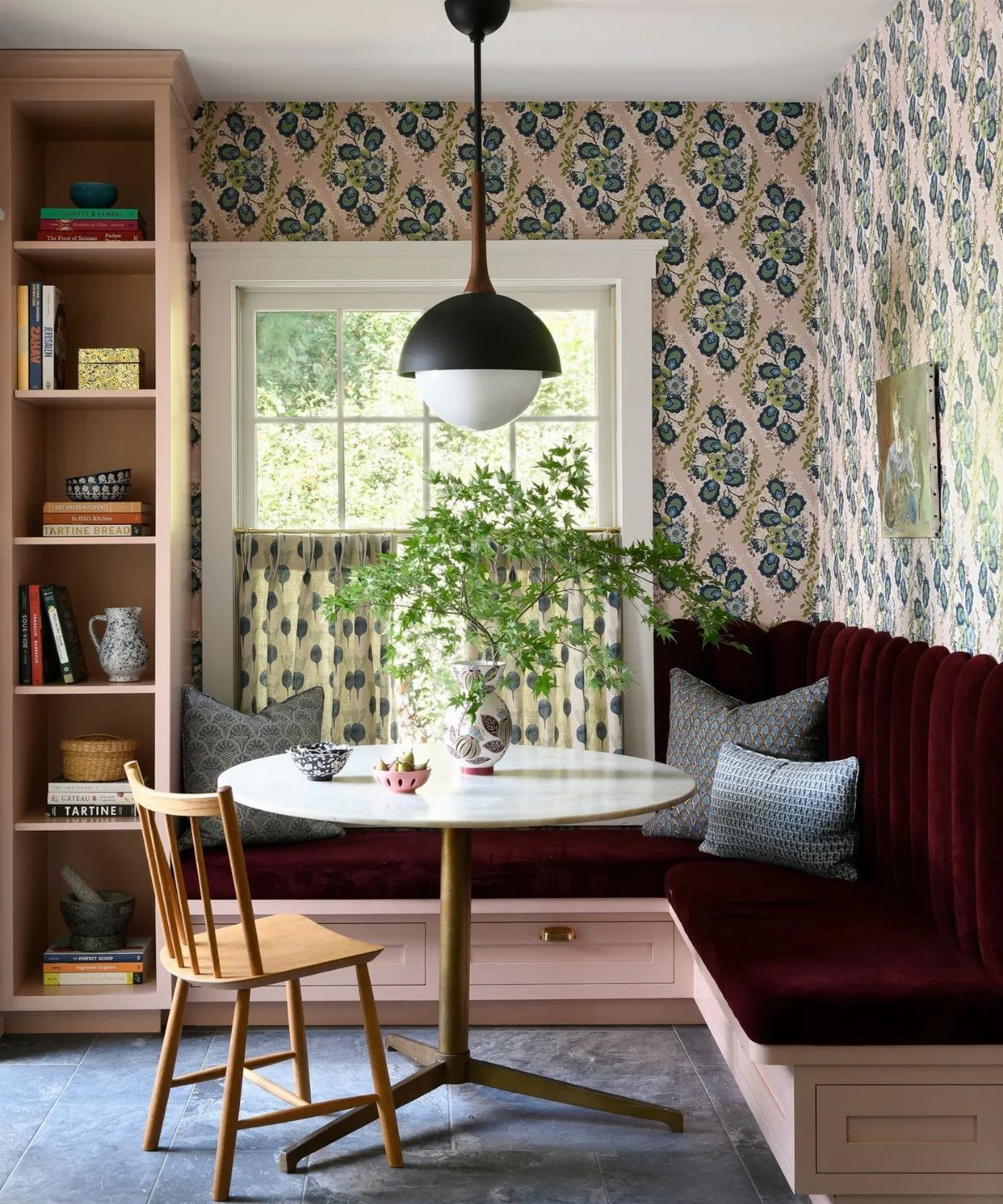
The eating corner is the safest place in a kitchen for wallpaper. No stove grease, no sink splash, and you actually sit still long enough to notice the pattern.
A built-in banquette tucked into a corner gains its own sense of place with paper on the surrounding walls. The burgundy velvet against that pink-ground floral is a lot of look, but because three walls stay quiet, it holds together.
If your nook opens to a dining area, carrying the same paper or a coordinating print through both spaces keeps an open plan from feeling chopped up.
This is where I’d spend my money if I only had one roll.
3. Feature Wall
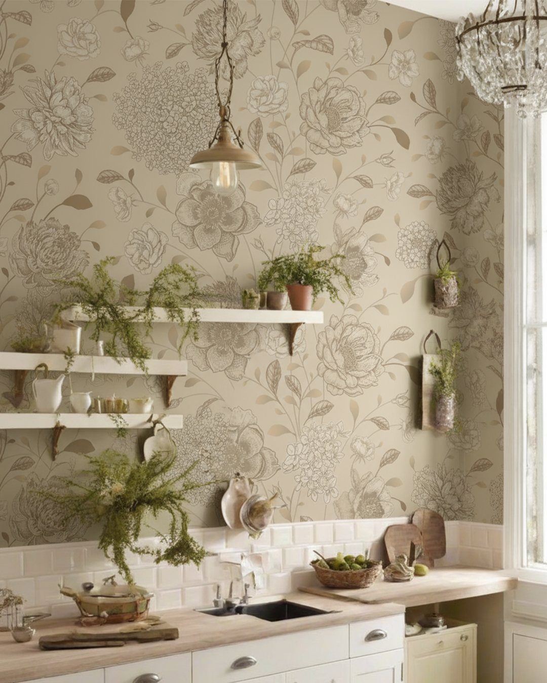
One wall, big pattern, done. The classic move works because your eye needs somewhere to land in a room full of hard surfaces.
A large floral behind open shelving and subway tile gives the eye somewhere to rest beyond the dishes. The white surround is doing heavy lifting: it lets the paper read as intentional, not busy.
Pick the wall you face when you walk in, or the end wall of a galley kitchen.
A botanical or tropical mural with scale enough to read from across the room belongs on this wall. The rest of your kitchen stays calm, your dishware stays visible, and you need maybe three to five rolls instead of fifteen.
4. Wallpaper the Ceiling
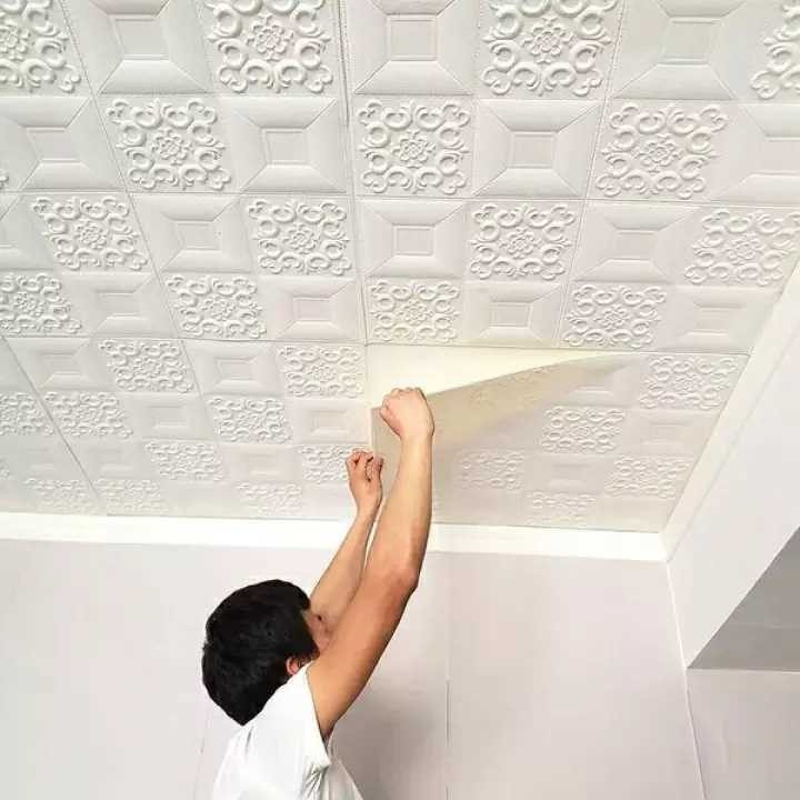
Ceiling wallpaper is the most dramatic thing you can do in a kitchen, and the most practical place to try something delicate. No grease, no water, no scrubbing.
Raised or 3D tile patterns read almost as molded plaster and catch light the way a flat ceiling cannot. Textured or relief papers work especially well overhead because the raking light from windows shows off the shadow.
If your kitchen feels low or boxed in, a soft tropical or floral over white cabinetry draws the eye up without closing the space down.
A tight, small-scale floral can wrap every surface in a compact kitchen and feel cozy rather than crowded.
5. Accent Wall
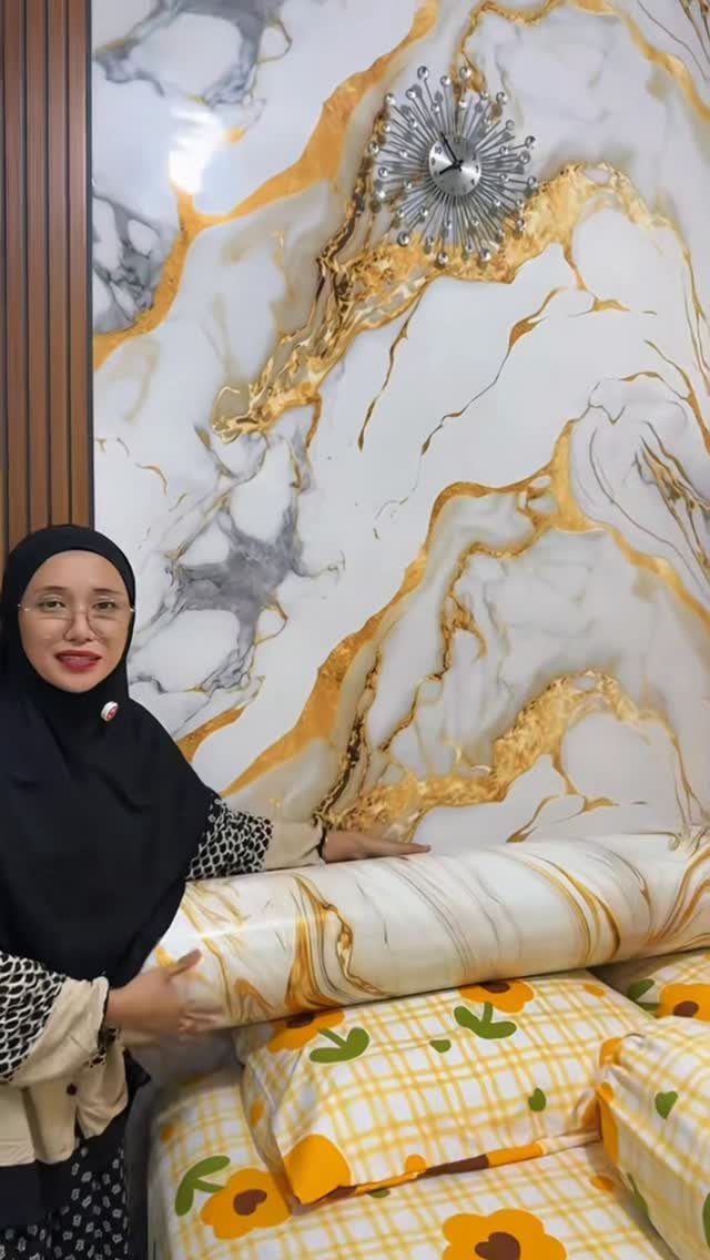
A single wall of marble-patterned paper with gold veining, set against whatever the surrounding paint happens to be. That’s the whole idea, and it works because marble already contains neutral tones.
Wallpapering one wall is the kind of project that breaks neatly across a Saturday and Sunday. Large-scale prints like this need careful matching at the seams; buy an extra roll.
The sunburst clock reads as jewelry against the stone pattern.
Cohesion matters more than contrast. Pull a grey or a warm cream from the paper for your cabinets and trim, and the wall looks built in, not stuck on.
6. Open Shelving Backdrop
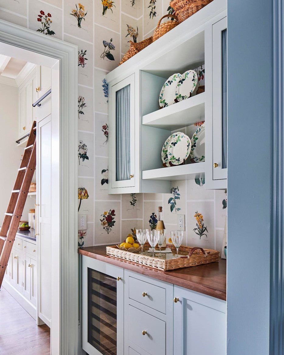
Open shelves leave your dishes exposed and your wall exposed; paper behind both solves the second problem and upgrades the first.
Light blue cabinets and a floral in the same family let the wall step back while the dishes step forward. Behind open shelves, where only a few square feet show, I’d use my boldest print without worrying about overwhelm.
Wicker and wood tones in the shelving keep it from feeling too pretty to use.
If your dishes are white or cream, almost any pattern works; if they’re colorful, pick paper with enough white ground to give the eye a rest.
7. Wallpaper the Pantry
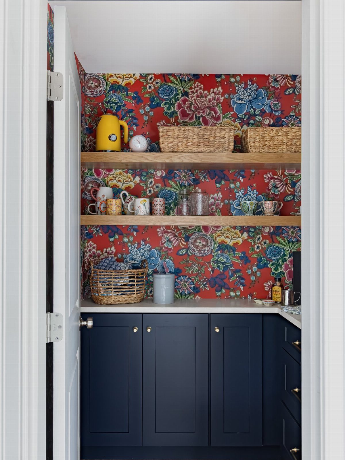
A pantry door swinging open onto something vivid turns a storage run into a small event.
The enclosed space keeps the risk low: one bold print, a few hours, and the daily grab for rice or mugs feels less like a chore.
I like prints with some saturation since the square footage is small and the door frames whatever you choose. Floating shelves in a natural wood tone keep the look grounded against busy pattern.
One maker used a simple tree motif in a pantry to keep the mood calm during routine household tasks; that quieter approach works if bright florals feel like too much first thing in the morning.
8. Colorful Stripes
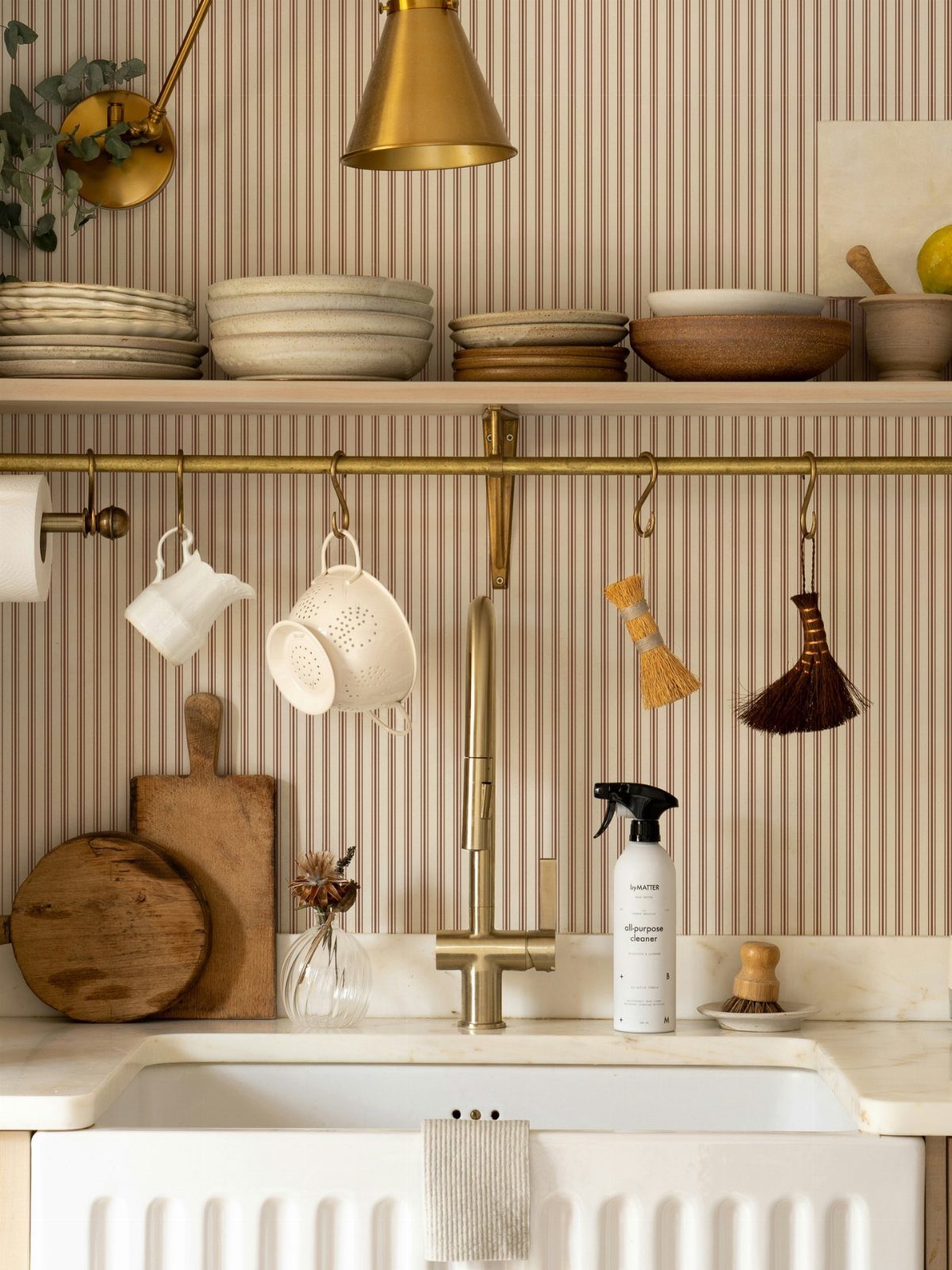
Vertical stripes run the eye upward and suit a sink wall or narrow galley where you want movement without clutter.
The spacing matters more than the color: wider bands read casual, pinstripes read crisp, and anything in between hits a kitchen that sees real use. Brass hardware against neutral stripes warms the whole thing up without fighting the pattern.
I would test a sample at the actual height of your cabinets since the rhythm changes where the stripe meets a horizontal line.
If the print looks like sewn scallops up close, the texture adds interest without demanding attention during cleanup.
9. Farmhouse Florals
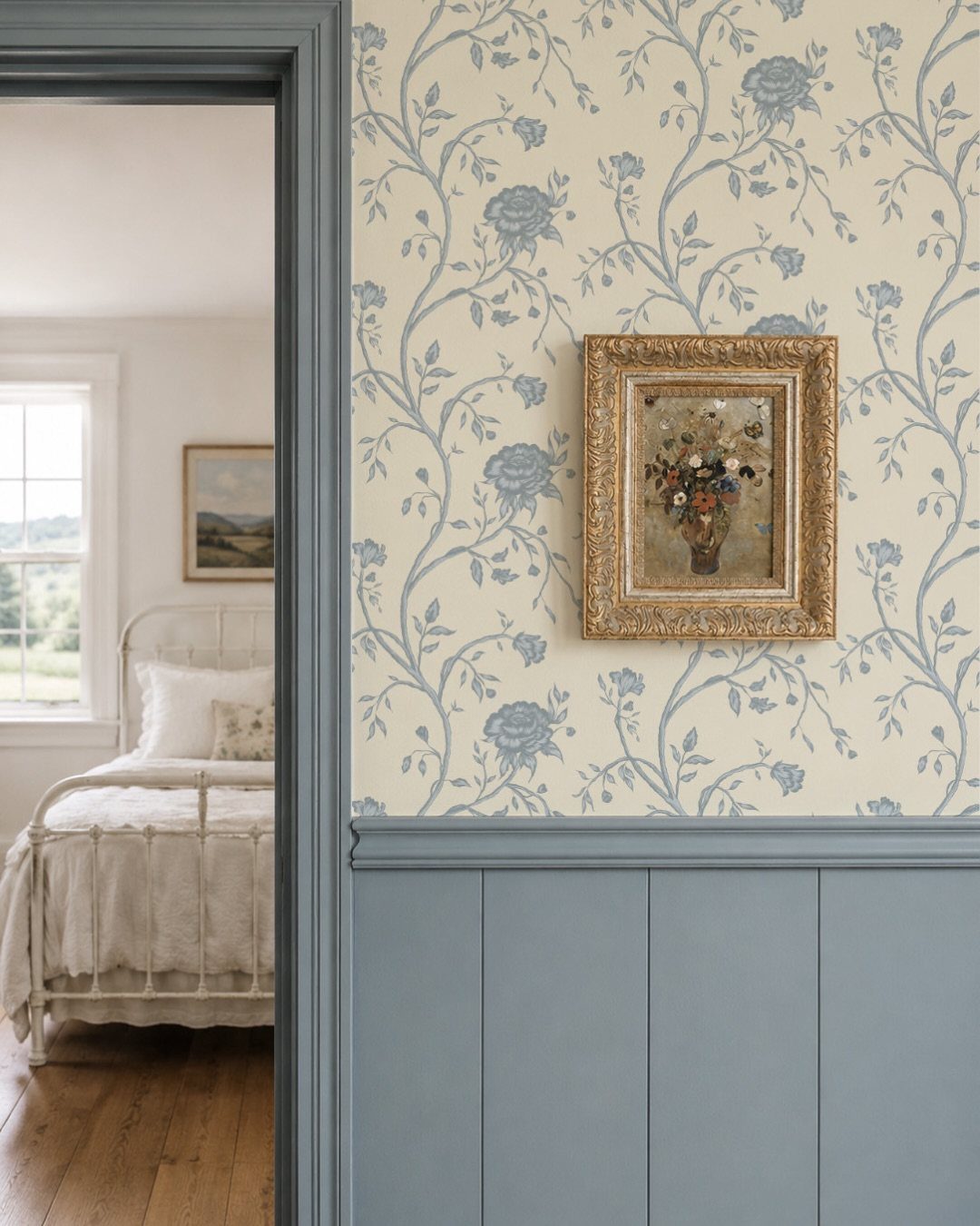
A floral vine above painted wainscoting splits the wall into two manageable zones and keeps the pattern from overwhelming a small kitchen.
The classic farmhouse version runs blue or muted pink botanicals on cream, with trim work between paper and paint to add the collected-over-time feel that makes a rental or first home look settled.
One designer paired De Nimes cabinets by Farrow & Ball with Dianthus Chintz wallpaper from Soane Britain; the moody cabinet color kept the florals from going too sweet.
I would keep the wainscoting height at 36 to 42 inches in a kitchen with standard counters so the paper starts where splatter ends.
10. Bold Geometric Patterns
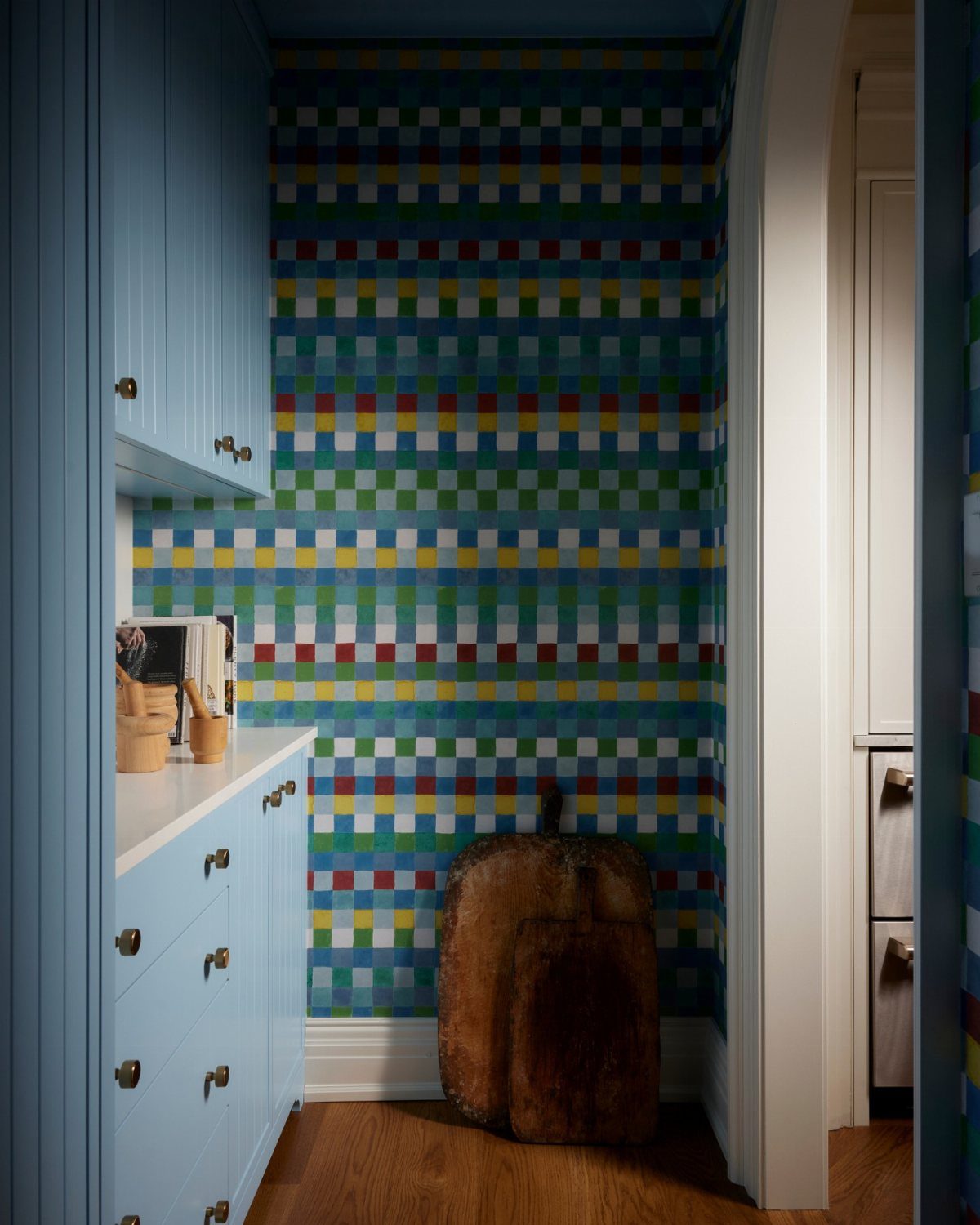
A small check in saturated blues, greens, reds, and yellows reads modern without the coldness of a single accent color.
Geometric patterns work best where the rest of the kitchen stays quiet: flat-panel cabinets, minimal hardware, and counters without heavy veining.
The maker of one pantry install described the brief as elevating the space for clients, which tells me this pattern type succeeds when the room needs energy more than warmth.
I would limit it to one wall or a pantry interior since the eye finds a resting point fast.
11. Colorful Mosaic Patterns
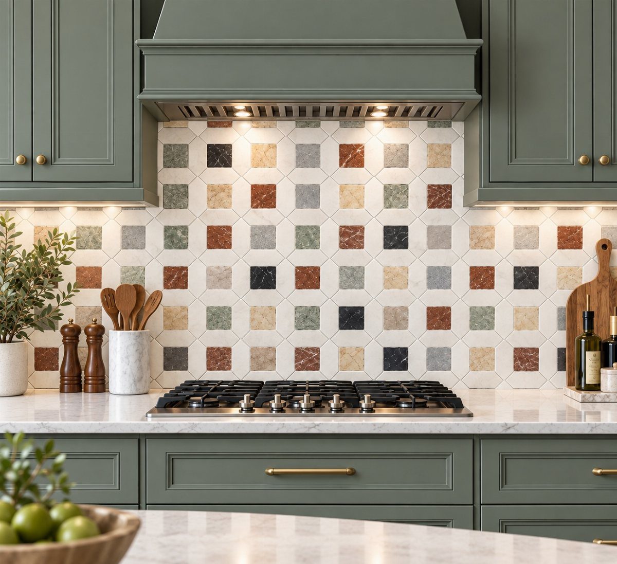
Mosaic-style wallpaper behind a stove or along a backsplash strip mimics tile without the grout line upkeep or the weight of real stone.
The terracotta, sage, cream, and charcoal mix in one install read as collected rather than matched, which suits a kitchen that already mixes finishes.
Natural stone variation and veining, as one maker noted, is what the print is reaching for; the wallpaper version costs less and ships in a weekend.
I would order extra for the dishwasher front if yours faces the room, since wrapping appliances keeps the pattern continuous and the eye moving.
12. Whimsical Designs
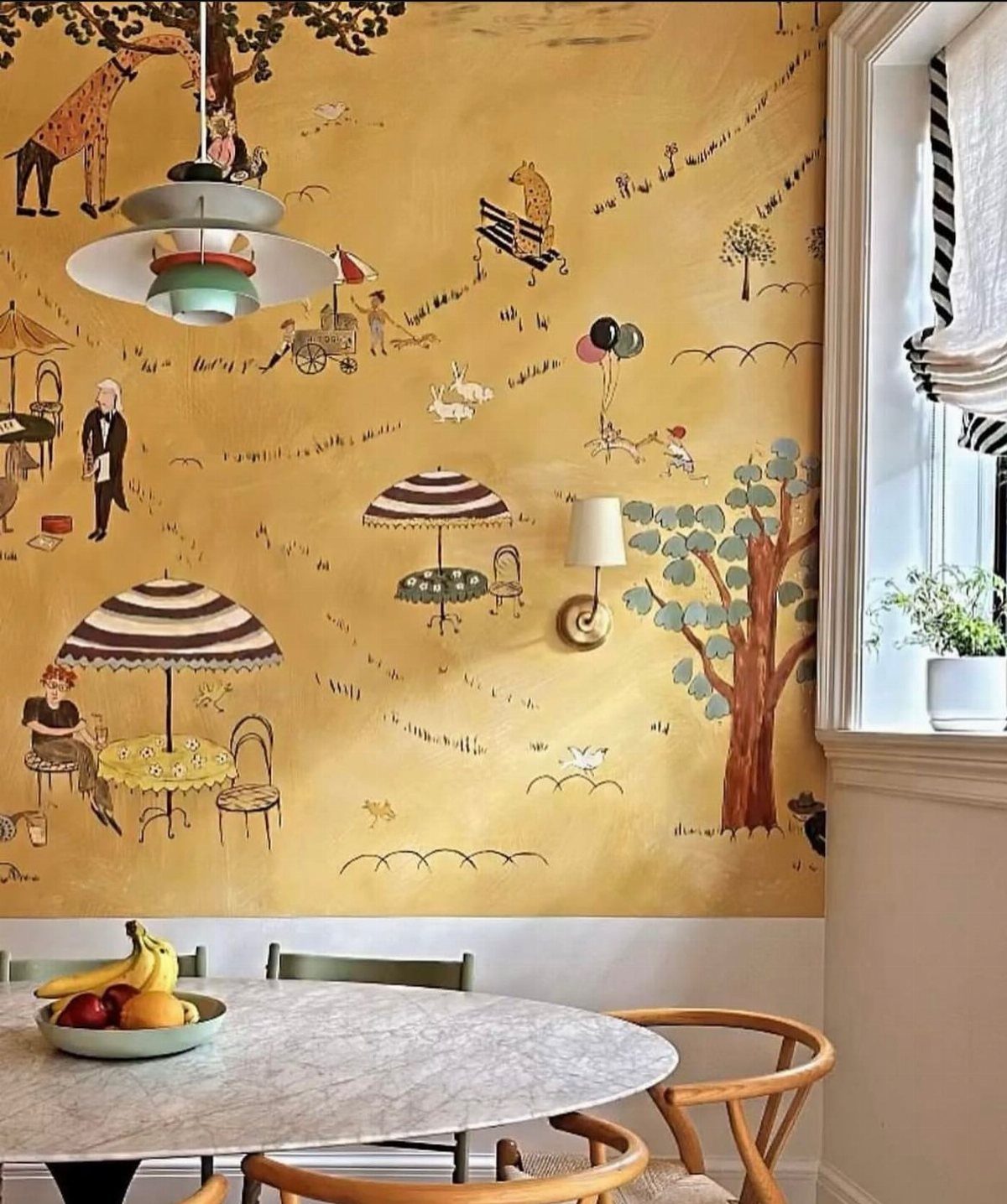
A kitchen wall with illustrated giraffes, umbrellas, or a hand-painted trellis stops being background and starts being company.
This works best in a breakfast spot or bar area where you stand still long enough to notice, not in a high-traffic prep zone where the pattern would fight for attention during cooking.
One bar install used aqua paint below mint trellis paper to make a pass-through feel intentional; the two colors need to talk to each other, not compete. I would keep the furniture simple and let the wall do the performing.
A round table and wooden chairs hold their own without adding more story to an already narrative print.
13. Highlighting a Coffee Station
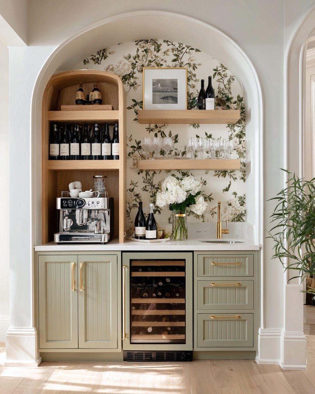
A short stretch of pattern above a coffee counter turns a few square feet of wall into something that feels intentional.
The maker of this arched station ran botanical paper behind open shelving and across the back panel, so the espresso machine and glassware read as props in a small set rather than clutter on a counter.
I would keep the paper to the zone above the work surface and below the cabinets, or to one framed panel if the station sits in an open run of counter.
A 24-inch height is usually enough to ground the area without fighting nearby finishes.
If your coffee setup moves around, this is also where peel-and-stick earns its keep. A papered backdrop takes about an hour to install and peels off clean when the layout changes.
14. Jungle Print

Deep navy paper crowded with parrots and oversized blooms turns a kitchen into something closer to a backroom bar or a reading nook.
Lily Sawyer used this move in her London house to make a busy family kitchen feel less like a utility space and more like a room someone chose.
The darkness matters more than the pattern. A saturated ground color swallows the visual noise of appliances and open storage, so the walls do the decorating and the counters can stay plain.
I would pair it with matte black or unlacquered brass hardware rather than chrome, which fights the mood.
This trades away morning brightness. If your kitchen has one small window or faces north, save this idea for a pantry, a powder room, or a wall that the sun hits at some point in the day.
15. Backsplash Alternative
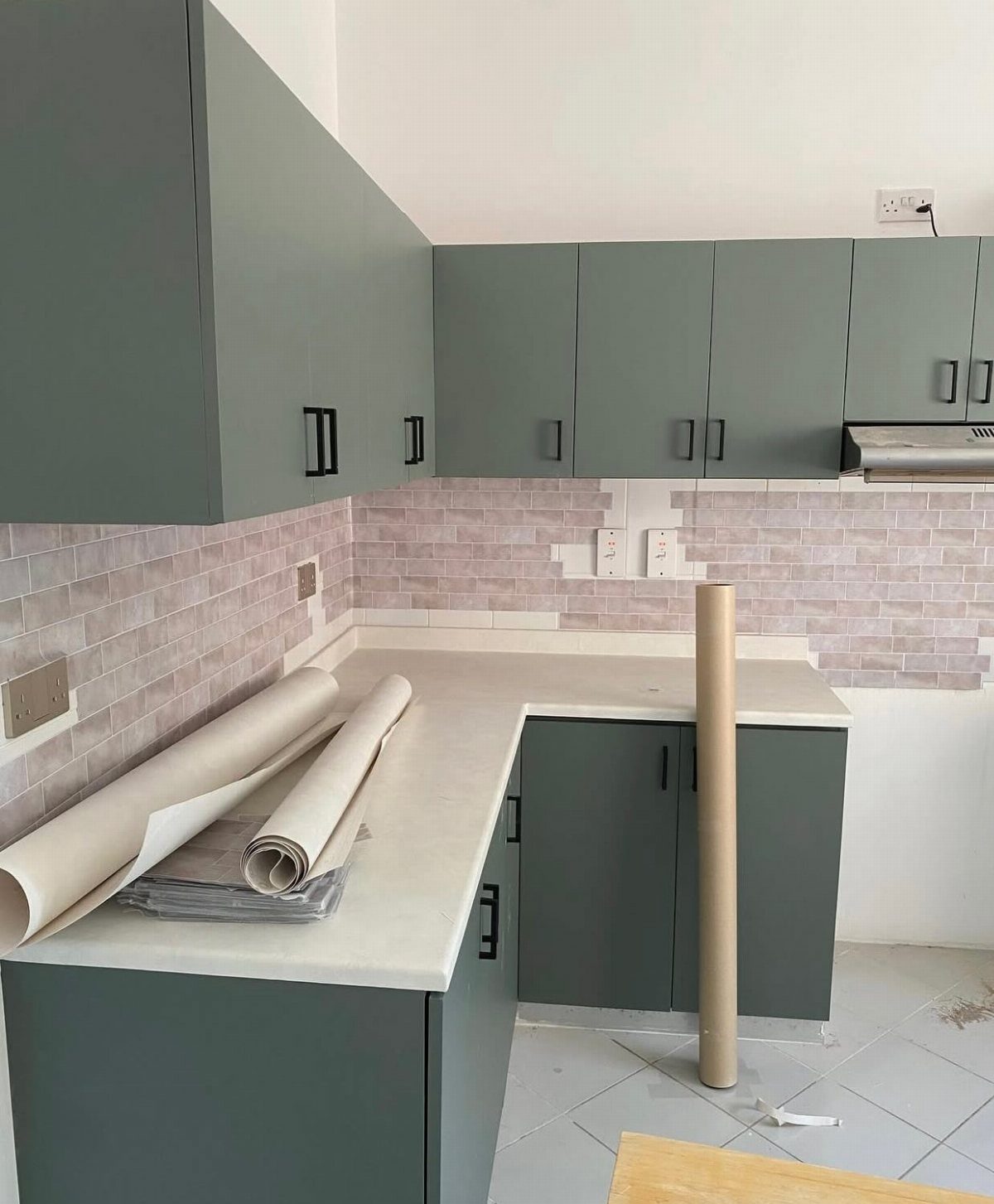
Wallpaper behind a counter reads as tile if the print is right, and costs a fraction of the demolition.
Soft lavender brick-look paper against dark cabinets reads as a backsplash without the grout work; the rolls still on the counter give a realistic sense of how long this project takes.
Keep it away from the sink splash zone and the wall directly behind a gas cooktop. The pattern still shows through, and the vinyl stays dry.
Peel-and-stick holds up to humidity and wipes clean, but it needs a smooth, grease-free surface or it will bubble within a month.
Degrease the wall with dish soap and water, let it dry overnight, then start in the morning when your patience is fresh.
16. Nature-Inspired Wallpaper
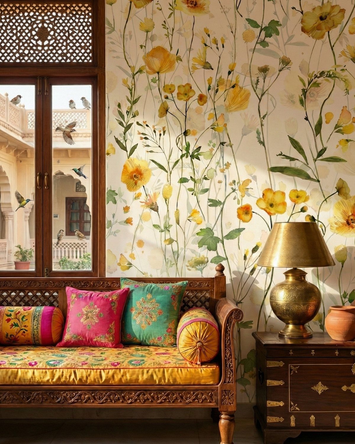
Yellow stems and small green flowers on a pale ground bring in the kind of light that a north-facing kitchen never gets on its own.
The maker of this paper calls it a watercolor floral, and the soft edges keep it from reading as grandmotherly.
Botanical paper works best where you spend time standing still: the wall behind a small table, the end of a galley run, the panel beside a window seat. In motion it blurs; stopped, it holds the eye.
I would avoid wrapping it around a corner or running it behind open shelving, where the pattern breaks into unreadable strips.
17. Temporary Wallpaper
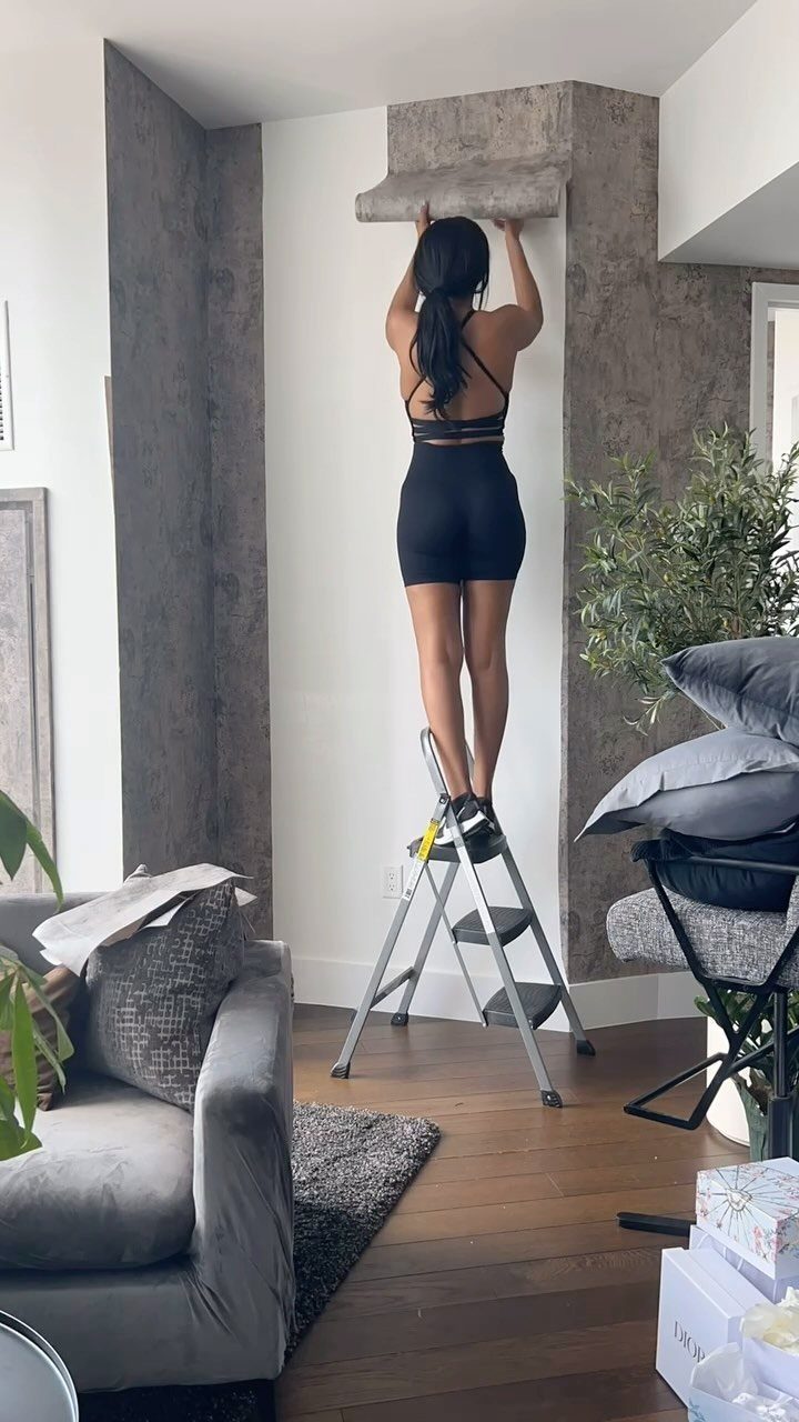
A woman on a step ladder, smoothing gray vinyl onto a range hood, is the whole pitch: no paste, no second person, no landlord to negotiate with later.
Peel-and-stick wallpaper installs in an afternoon and lifts off in one piece when the mood changes.
Textured temporary paper forgives small bumps in the wall underneath better than any flat finish can. That matters in a kitchen, where walls take hits from chair backs and vacuum cords.
Still, the adhesive needs a clean, smooth, grease-free wall or it will fail. Degrease with soap and water, dry thoroughly, and do not rush.
This option trades longevity for flexibility. A good vinyl lasts several years in a kitchen’s humidity, but the edges may curl eventually.
For a permanent house, traditional paste paper behind glass is the sturdier choice. For a rental or a trial run, this is the right risk.
Benefits of Kitchen Wallpaper
Wallpaper costs less than tile and hangs faster. A kitchen can be done over a weekend if the prep work is solid, and paste-the-wall products speed that up even more.
The vinyl coatings on kitchen-specific papers handle steam, grease, and wiping down without drama. Hundreds of designs exist now, from cottage florals to sharp geometrics, so matching an existing color scheme is straightforward.
Pair the paper with a matching paint on trim or cabinets and the room ties together without custom work.
Choosing the Right Materials
Vinyl is the material that survives in kitchens. It resists moisture, wipes clean, and handles the temperature swings near stoves and dishwashers.
Standard paper or fabric-backed products without that coating will bubble and stain within months. Washable and moisture-resistant are the two words to check on the label, not just the pattern name.
In small kitchens, bright and light colors read as more space; save the dense, dark prints for rooms with bigger square footage or strong natural light.
Cabinets and appliances eat up most of the wall space in a kitchen, which means the strips that stay visible are narrow.
That keeps the material bill small, and it also means a loud print won’t overwhelm the room the way it might stretched across a whole bedroom wall.
Frequently Asked Questions
What wallpaper is best for a kitchen?
Vinyl wallpaper is the only kind I trust behind a stove or next to a sink. It shrugs off steam, grease splatter, and the heat blast when you open the dishwasher mid-cycle.
Check the label for washable and moisture-resistant, not just the pattern name.
What are some modern kitchen wallpaper ideas for 2026?
Bold patterns, nature-inspired designs, and peel-and-stick options are where the interest is right now. A single wall or a breakfast nook in crisp lines and graphic shapes gives a contemporary kitchen that built-in, architectural quality without the built-in cost.
Quiet neutrals and simple geometry add something to look at without competing with the daily clutter of a working kitchen.
What color is on trend for kitchen walls?
Soft neutrals still dominate, though I’m seeing more green and blue used as full wall colors rather than just accents.
Sage and muted greens pair with botanical prints for a quiet look, while saturated navies and burgundies turn a wall into a statement. The move is either calm and collected or bold and contained to one zone.





