
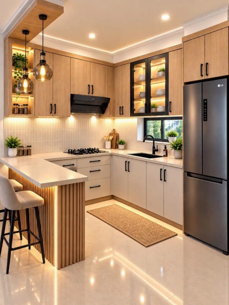
These ideas range from swapping out a ceramic jar to rebuilding an island in stone, so the deciding factor is how permanent your kitchen situation is.
Renters will find the portable island, peel-and-stick countersplash, and open shelving with concealed brackets; owners ready to invest get the stone slab backsplashes and the integrated dining island.
The 12-inch height limit for island styling is one of those small numbers that keeps a busy surface from blocking conversation across it.
1. Incorporate Natural Textures

A speckled clay jar or a woven linen runner breaks up all that smooth countertop and cabinet surface.
Start with one piece and build around it: a single ceramic utensil holder, then maybe a stone trivet or a rattan fruit bowl. Mix materials, not match them.
Wood, stone, and woven elements each read differently under kitchen light, so one of each usually fills a space without cluttering it. This suits renters especially; none of it is permanent, and good handmade pieces move with you.
2. Let Wood Finishes Shine
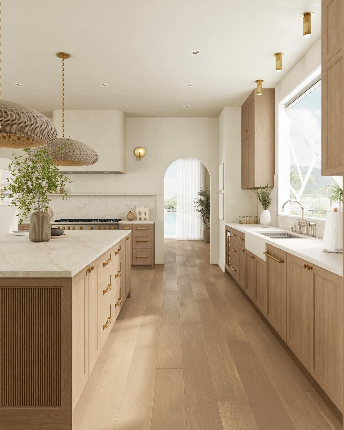
Light wood cabinetry catches morning light in a way painted finishes never quite manage.
I would run the same tone from cabinets through to the island base and the flooring, then let the veining in a marble countertop do the contrasting.
The fluted detail on that island adds shadow lines that read as texture without demanding extra color. Waterworks fixtures and brass pendants warm the whole thing up.
If your existing cabinets are dark, refacing just the uppers in white oak changes the room’s whole temperament for a fraction of a full replacement.
3. Use a Textured Paint Finish
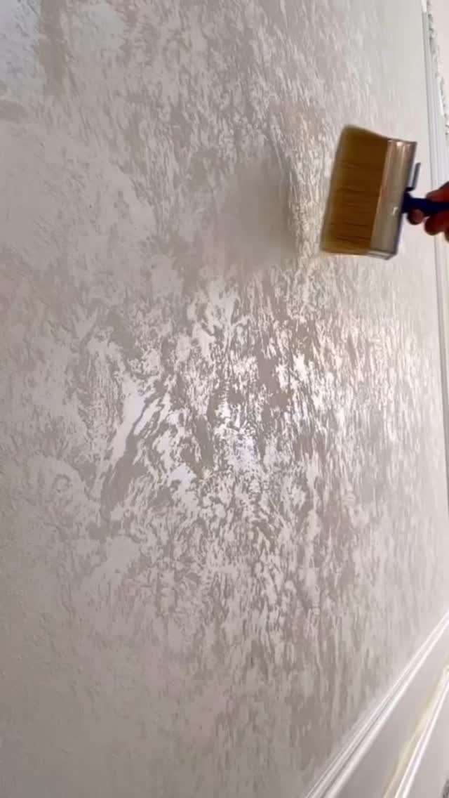
A textured paint finish turns a flat cabinet door into something that catches light like plaster. The technique is straightforward: thin your paint slightly, apply with a wide natural-bristle brush, and let the strokes stay visible.
Lime paint gives a chalky softness, or regular latex layered in two close tones adds depth. One designer used this on an Arts & Crafts kitchen to give cabinetry a hand-crafted feel that matched the house’s period.
The finish hides minor sins too; small dings and grain telegraphing matter less than they would under gloss.
4. Try Sea Green Cabinetry
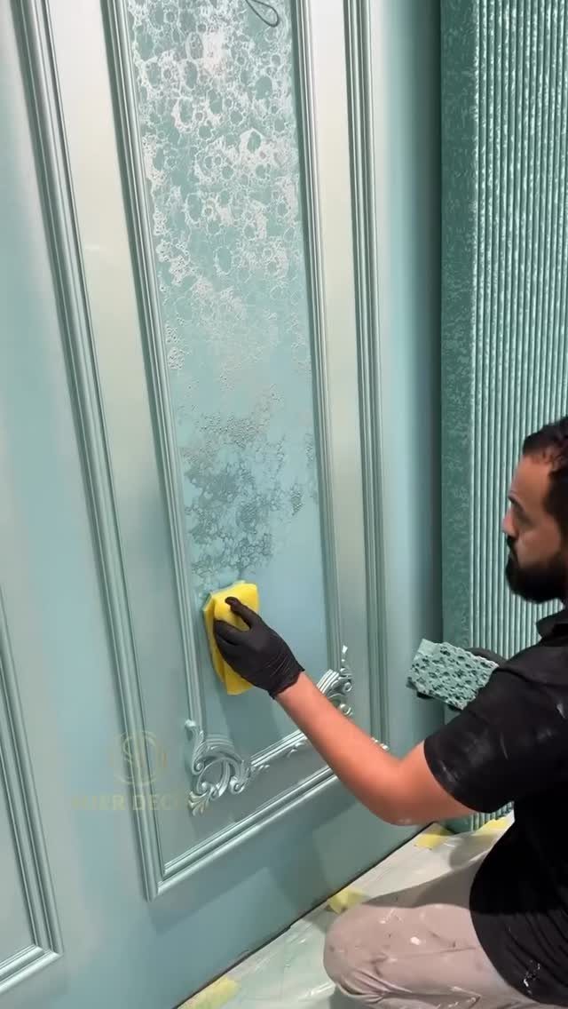
Painting the trim to match the cabinets carries color past where the eye expects it to stop, and the room suddenly feels intentional rather than assembled.
Running sea green through cabinetry, door trim, and molding lets a blue island sit against a quiet backdrop.
I would test this by taping off a door frame and brushing a sample; the continuity either works immediately or it doesn’t, and there is no middle ground.
Natural wood accents and aged brass hardware keep the green from reading too cool.
5. Add Brass Accents
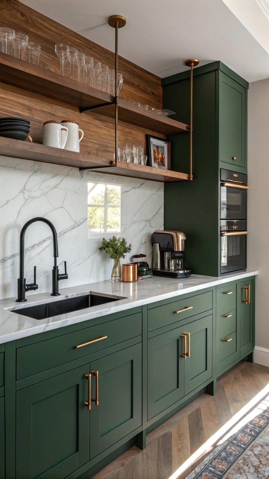
Brass warms a kitchen without the high polish of chrome or the farmhouse associations of black iron. I would start small if the budget is tight: drawer pulls first, then a faucet, then maybe a pendant or two.
Aged or living finishes hide water spots better than lacquered brass, which demands wiping. One Atlanta designer centered the whole scheme on a French bistro-inspired brass hood against gray tile; the metal became the statement rather than competing with one.
Brass shelving supports do that same job at a smaller scale.
6. Upgrade Everyday Accessories
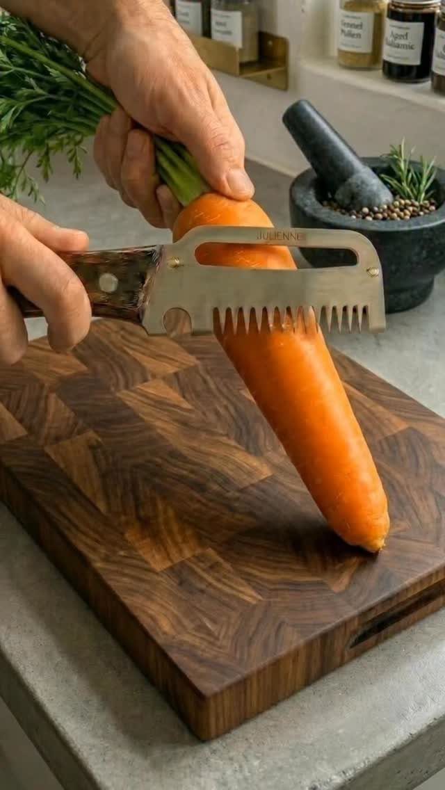
The tools you leave out are part of the room’s decoration whether you intend them to be or not. A wooden-handled mandoline, a black mortar, a ceramic salt cellar: these read as chosen rather than accumulated.
I replace the plastic soap bottle by the sink first; it is the thing guests notice without knowing they noticed it. A wooden-handled peeler lives in the drawer, but the ones on the counter should earn their place.
7. Create a Styled Kitchen Island
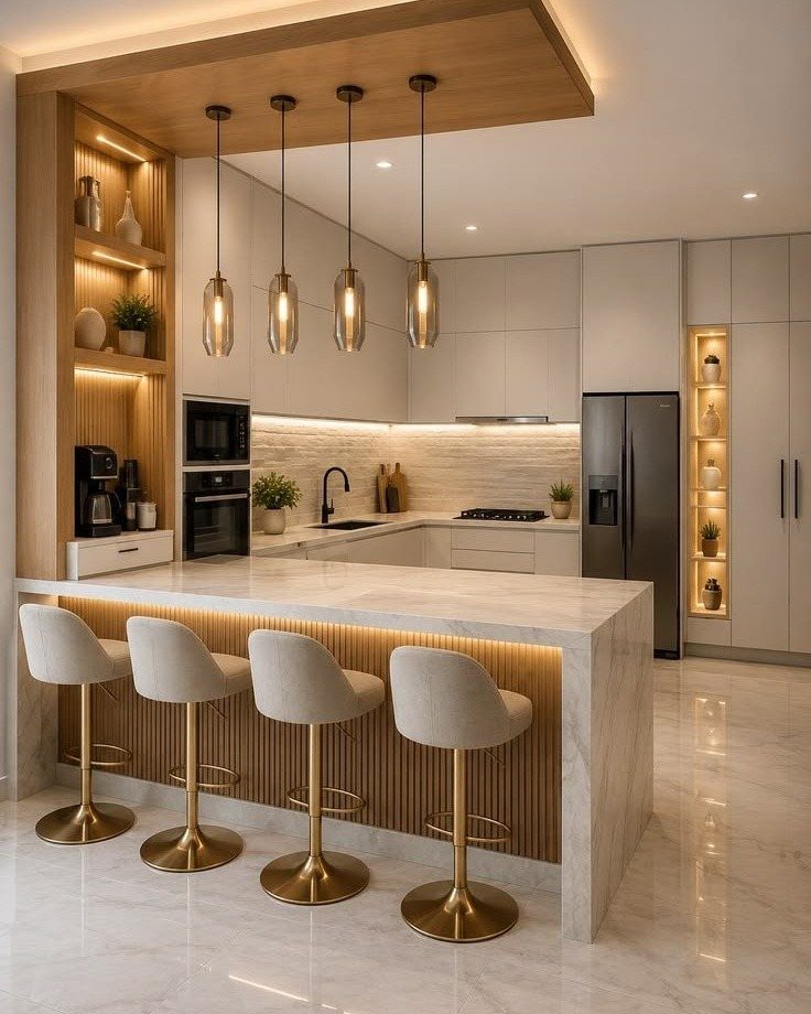
A styled kitchen island turns the room’s busiest surface into its best view. Marble and velvet do half the work in a styled island; the rest comes from what you set on top.
A narrow tray corrals oils or salt cellars, a low vase with cut greenery adds height without blocking sightlines, and one sculptural piece, ceramic or turned wood, gives the eye somewhere to land.
Keep the arrangement under 12 inches tall so conversation flows across it. This suits renters who can’t renovate and owners between projects, since the objects move when the mood changes.
8. Use Earthy Tones
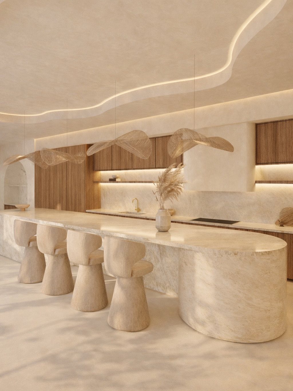
Warm, muted colors borrowed from stone, clay, and moss make a kitchen feel settled the day you finish. A curved island pairs that palette with honest materials: wood grain, rough stone, soft plaster.
Oak cabinetry with a cerused or limed finish reads lighter than raw timber; soapstone or slate-toned counters deepen the tone without going dark. Bronze hardware bridges the two.
For a smaller space, a single earth element does the job: a terracotta planter on the sill, a linen runner in ochre, cabinets in that mossy green that reads as neutral once the shock wears off.
9. Integrate a Dining Table Into the Island
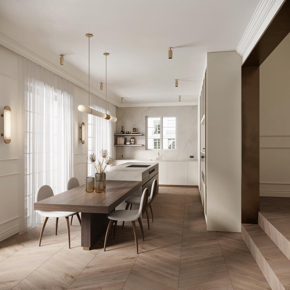
A dining table built into the island erases the gap between cooking and sitting down. A join where marble meets wood gives two heights that let prep happen at counter level while someone else eats a few inches below.
Staggered surfaces like this need at least 96 inches of total island length to feel generous; anything tighter and the table portion reads as an afterthought.
Butcher block works well for the dining leaf since it forgives knife marks and warms up stone or painted cabinets.
The mini-fridge tucked into one base cabinet in that walnut island keeps drinks within reach without crossing into the cook’s path.
10. Create a Seamless Look with a Countersplash
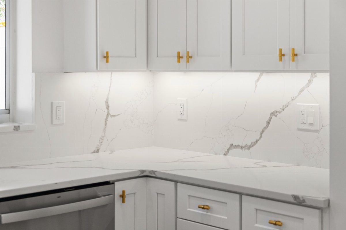
Running the counter material up the wall as a single surface, called a countersplash, removes the visual break where countertop meets tile.
Marble that carries its grey veining straight from the horizontal plane to the vertical quiets a small kitchen and lengthens a narrow one. This only works with materials that come in slab form: quartz, marble, some granites, solid surface.
The fabrication costs more than standard tile since the cut must be precise and the grain should align. In a rental, peel-and-stick vinyl in a stone pattern can fake the effect behind one stretch of counter for not much money.
11. Go Portable with Your Island
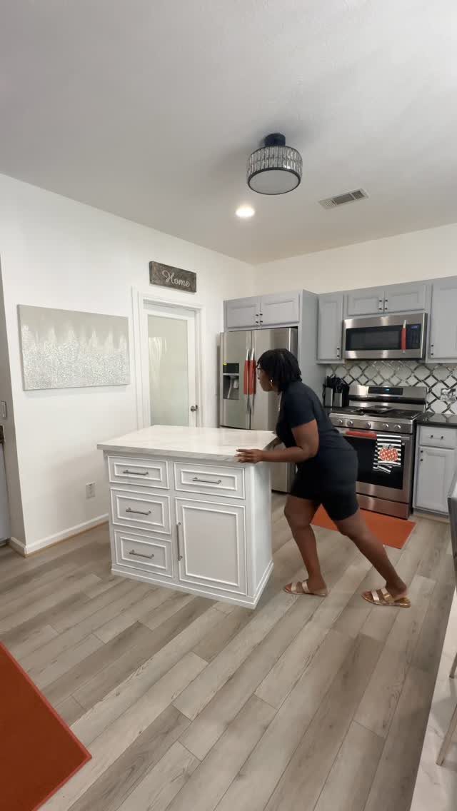
A portable island on casters gives you the work surface when you need it and the floor space when you don’t.
A small white unit on four locking wheels tucks against a wall or slides into a pantry when the kitchen clears out.
Look for one 24 to 30 inches deep with at least one drawer and an open shelf below; the drawer hides what you don’t want seen, the shelf holds what you use daily.
Chipped paint left as-is, not touched up, turns a cheap piece into something that looks inherited rather than bought. Lock the wheels before chopping anything.
12. Install Glass Cabinet Doors
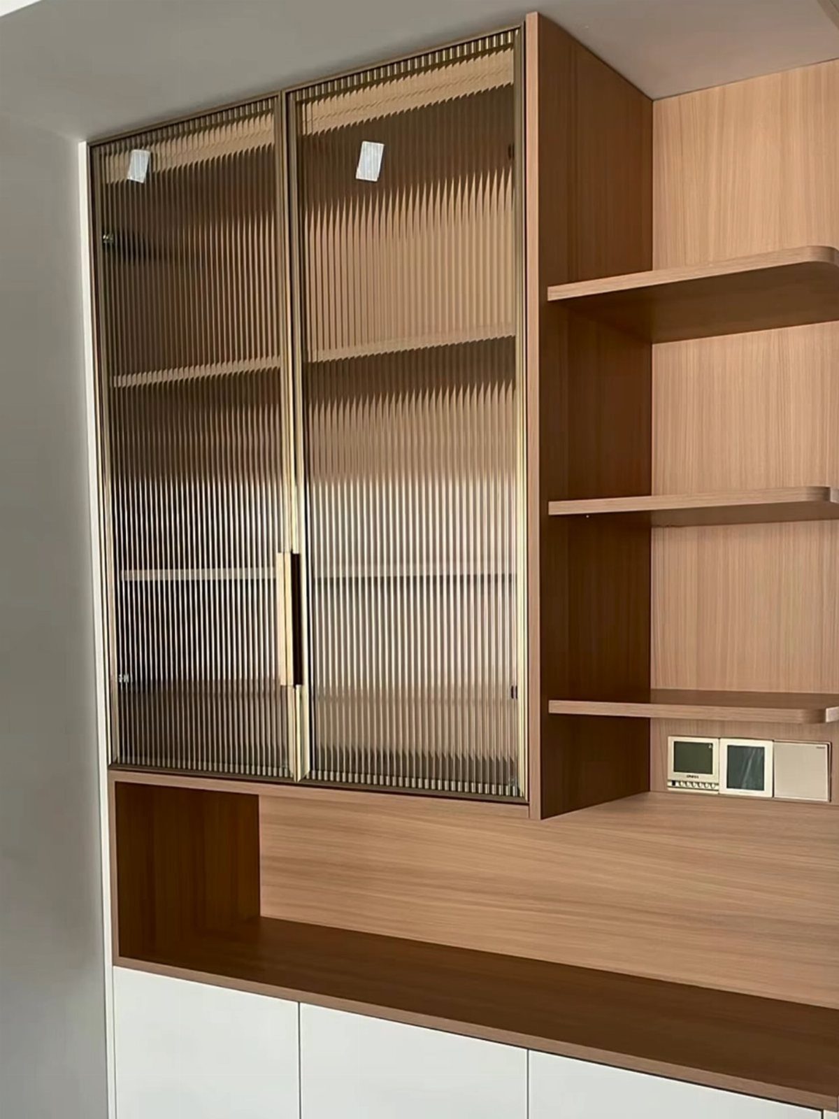
Glass cabinet doors divide a kitchen from the next room without stealing light or stopping the eye where a solid wall would.
Fluted glass set in thin brass frames blurs what’s behind just enough to hide clutter while the ridges catch and scatter daylight.
This works best on upper cabinets that face a window or a doorway; lower cabinets with glass tend to collect fingerprints and demand constant tidying.
If the collection inside is mismatched, the fluting or reeding does the camouflaging that clear glass won’t. For a weekend project, replace two existing upper doors with fluted glass panels cut to size at a local shop.
13. Cover Surfaces in Stone
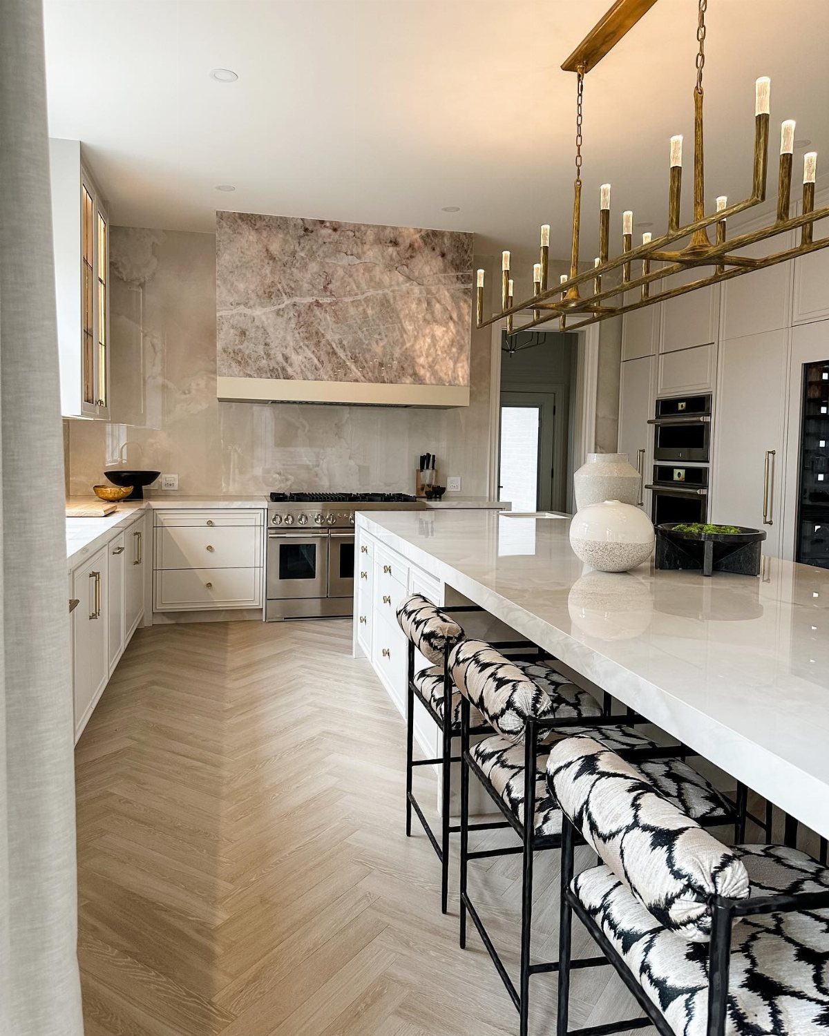
Stone surfaces turn the kitchen into something that feels built to last.
I like dolomite for islands because it takes a beating without looking precious, and mixing in arabescato or sivec on backsplashes keeps the eye moving so nothing reads as a slab showroom.
For a weekend project, start with one statement surface: the island, the range wall, or a single stretch of counter.
Full stone cladding runs into real money and needs pros who know how to seam it, but a single slab behind the stove or across the island changes the whole room.
This one suits renters only in spirit; it is for owners who plan to stay put and cook hard.
14. Consider Accent Flooring
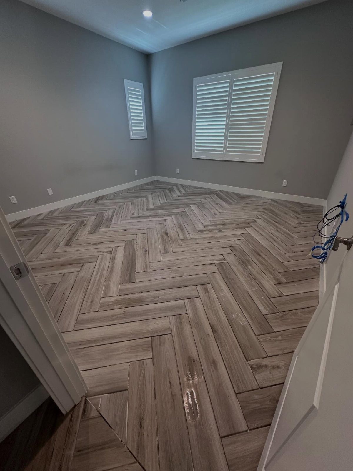
Flooring that steps away from basic wood or tile gives a kitchen its own footing.
Stone reads traditional in a way that warms up white cabinets, and running it through from an adjoining hallway tricks the eye into seeing one continuous space instead of a box tacked on at the back of the house.
A herringbone or cube pattern in light stone works especially well in older homes where the floors already have something to say.
Expect to pay more than standard tile and budget for a setter who can keep the lines true; the pattern is the whole point, and a wandering joint ruins it.
Best for ground-floor kitchens with sightlines to other rooms.
15. Open Shelving
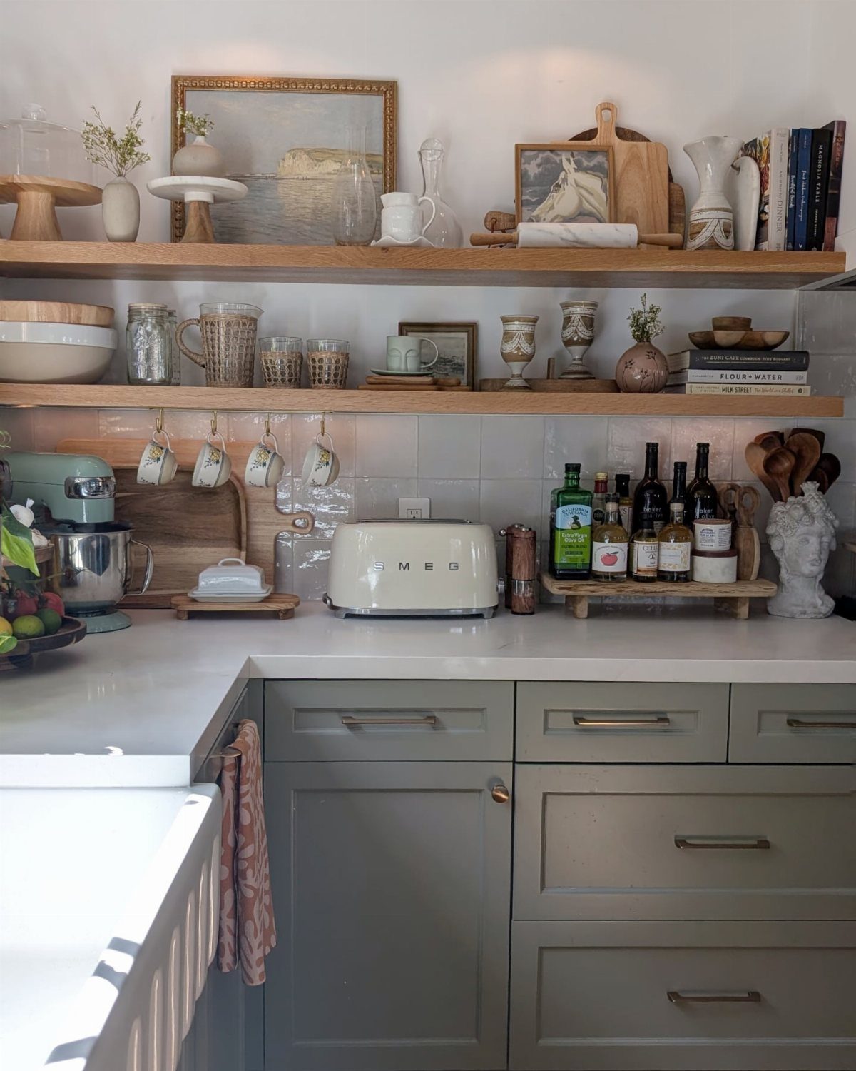
Open shelving trades the hidden stack for a display you actually have to tend.
Open shelves work best with two rows of dishes used weekly, a few bowls with shapes worth looking at, and one plant that does not mind grease.
The rule is simple: if it is not useful or good to look at, it goes behind a door somewhere else.
Wood brackets against white tile keep the look clean without going clinical. For renters, floating shelves with concealed hardware leave smaller holes to patch later than a full cabinet swap.
This works when you are willing to dust and edit. If your everyday dishes are a mismatched set from four roommates ago, stick with doors.
16. Use Bold Wallpaper
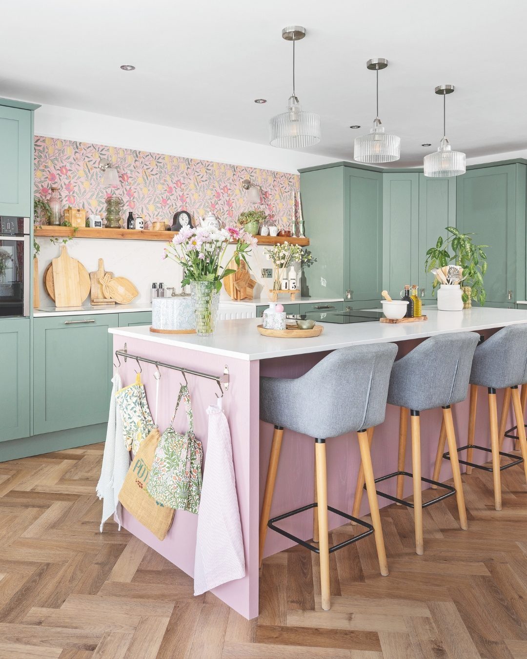
Wallpaper behind the range or across a single wall adds pattern without the commitment of tile. A metallic paper catches light differently through the day, so the same wall reads moody at breakfast and bright at dinner.
Floral or brushstroke patterns in green, pink, or blue pair well with painted cabinets in a single contrasting tone.
For a rental or a test run, use paste-the-wall paper on a smooth surface and plan to replace it in a few years; steam and splatter take their toll.
In a kitchen you own, a pro install behind glass or acrylic panels protects the paper while keeping the look.
Best for cooks who clean as they go. Grease settles on paper the same as on tile, but you cannot scrub it as hard.
17. Incorporate Statement Artwork
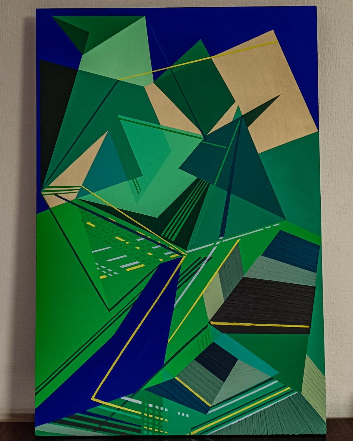
A single large piece over a breakfast nook or on the wall opposite the range does what rows of small frames cannot.
Scale matters more than subject: something that reads from across the room, with color that picks up a tone from the cabinets or the tile, ties the space together without trying to match.
For a standard ceiling, a canvas needs real size to read as statement art, and the wall height only pushes that higher. Abstract geometry in greens and blues works against both warm wood and cool stone without fighting either.
This is an easy swap when the rest of the kitchen is set. No tools beyond a stud finder and a level, and you can take it with you when you leave.
18. Ditch Upper Cabinets
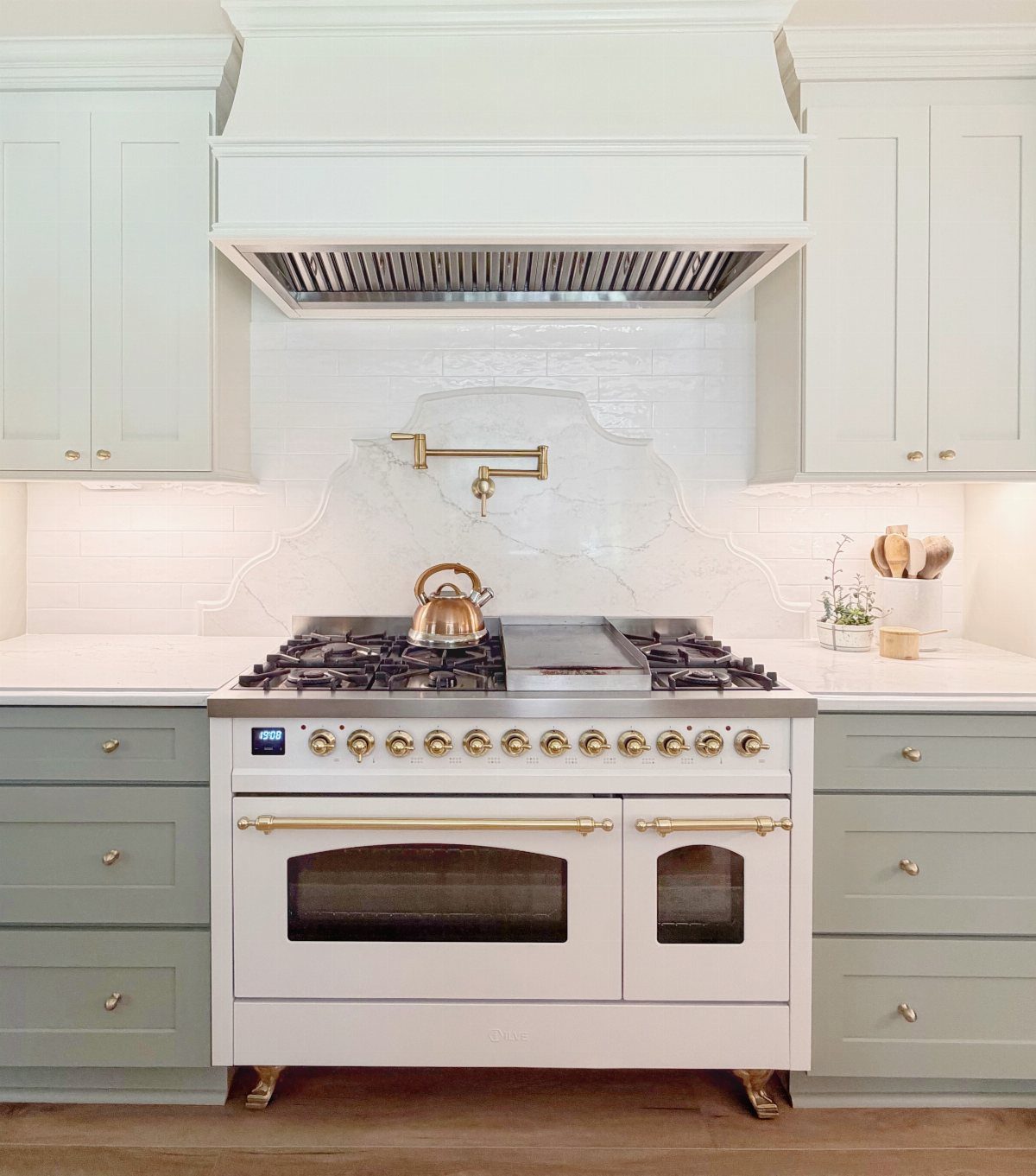
Losing the uppers opens sightlines and forces you to own less.
In a galley kitchen with windows too high to see out of while standing at the sink, removing cabinets on that wall puts the light at your back and the view in front of you.
The trade is storage. You need a pantry or deep drawers in the base cabinets to absorb what used to live overhead.
A pot rail or a single open shelf across the window wall holds what you reach for daily without closing the room back in.
This suits small kitchens with good windows and cooks who do not collect gadgets. If you rely on upper cabinets for hiding clutter, sort that habit first.
19. Design with Windows in Mind
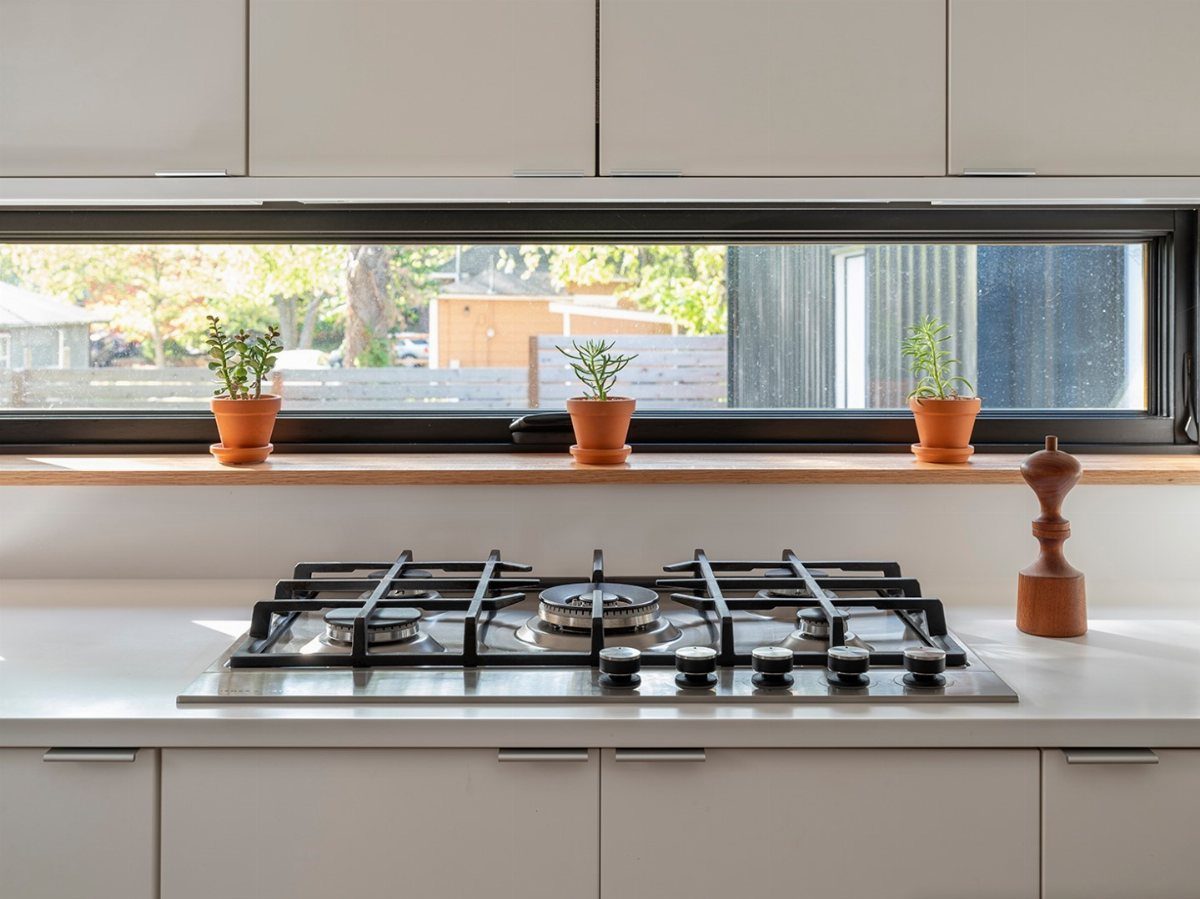
A window placed where a backsplash usually goes turns the wall into something you actually want to look at while you cook.
The ledge beneath it, even a narrow one, holds the few things you reach for constantly: small pots of thyme or rosemary, a wooden spoon rest, a pepper grinder.
Skipping upper cabinets on that wall is the move that makes this work in a small kitchen. The room reads larger because your eye travels past the counter line to the glass and whatever sits outside it.
Rift-cut white oak on the remaining millwork keeps the warmth from drifting sterile.
This suits galley layouts especially, where the back wall is your only real chance for daylight.
You lose some storage with a window wall, so plan the base cabinets deep and use open shelving below the sill if you need more.
20. Create a Wine Nook
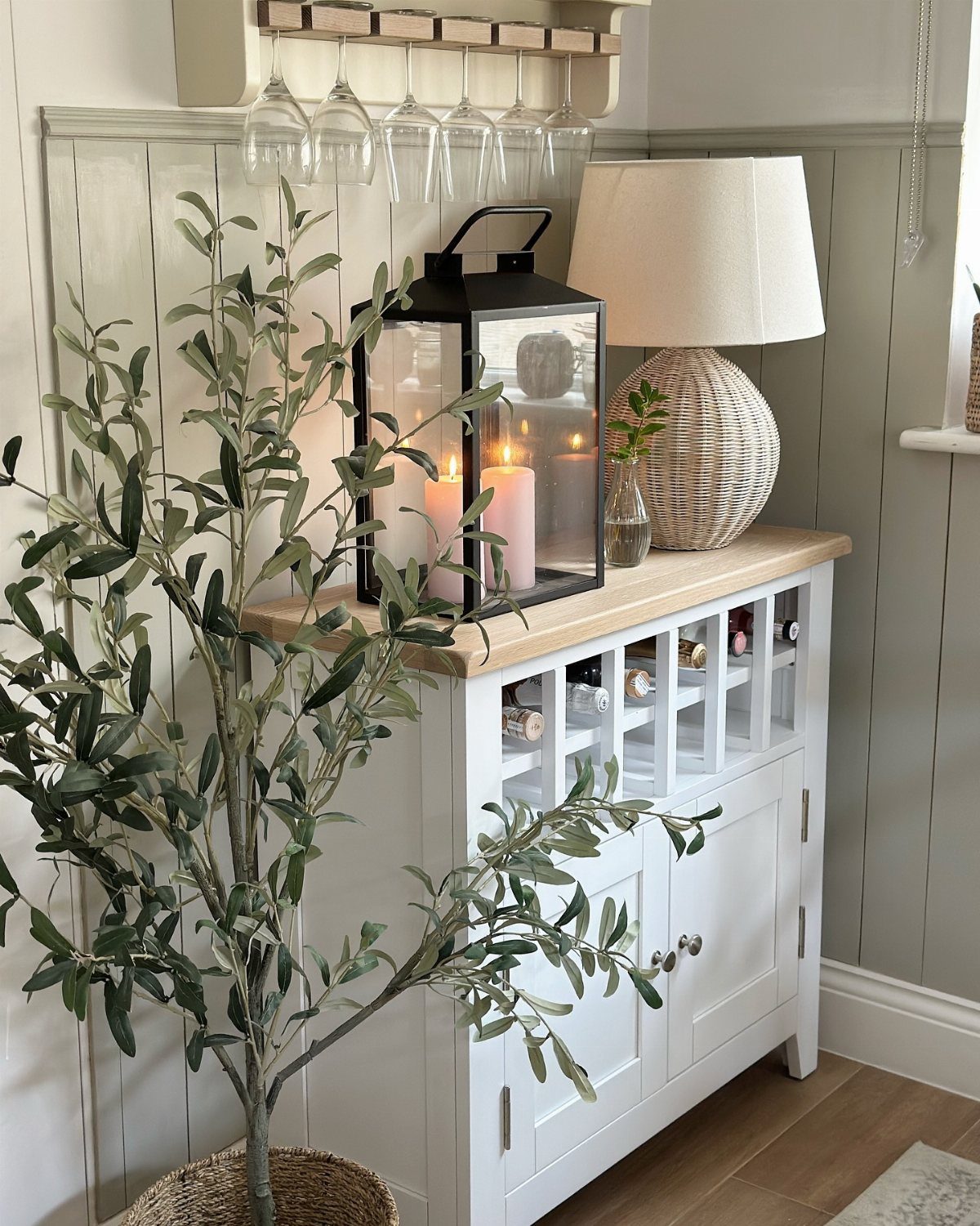
A built-in wine rack turns the sideboard or the end of your island into something that gets used instead of just filled.
A wine nook at counter height, bottles horizontal and labels forward, saves you from pulling half the rack apart when guests arrive and you need the right pinot.
The hanging glass rack above it saves the cabinet space you’d otherwise lose to stemware. Black iron or brass, the metal should match whatever else is metal in that corner; mixed finishes read accidental unless they’re very deliberate.
A freestanding bar cabinet works the same way if you’re renting or if the layout shifts. Look for one with a ledge deep enough to mix a drink on.
The whole setup needs only a narrow slice of wall and costs less than most appliance upgrades.
21. Embrace Moody Colors
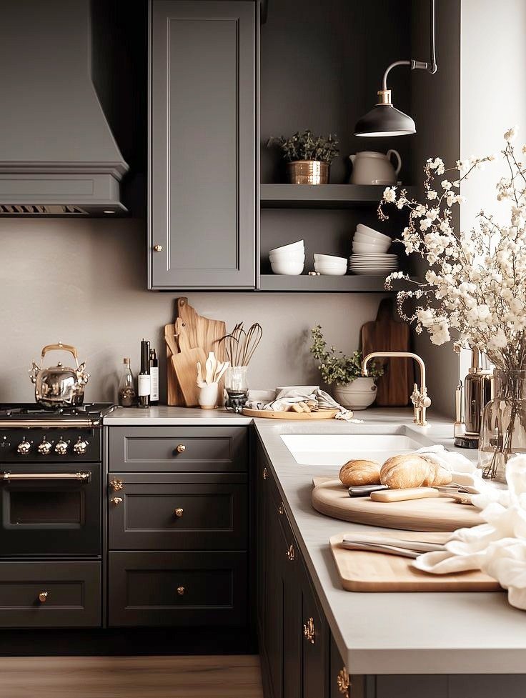
Charcoal cabinetry reads as intentional, not as a kitchen that couldn’t decide. Carry the dark through enough elements and it holds: the range hood, the hardware, maybe the backsplash in a quieter tone of the same value.
Light countertops, like the pale grey here, keep the room from feeling like a cave.
Cerused oak, which is oak limed to emphasize the grain, adds texture without introducing a second strong color. Burnished brass softens against the dark paint in a way polished chrome wouldn’t.
This works best in a kitchen with good natural light or very good artificial light. The cost is the same as any custom paint job; the risk is that every fingerprint shows, so the finish matters.
A matte or satin cabinet paint hides more than gloss.
22. Add Whimsical Colors and Fabrics
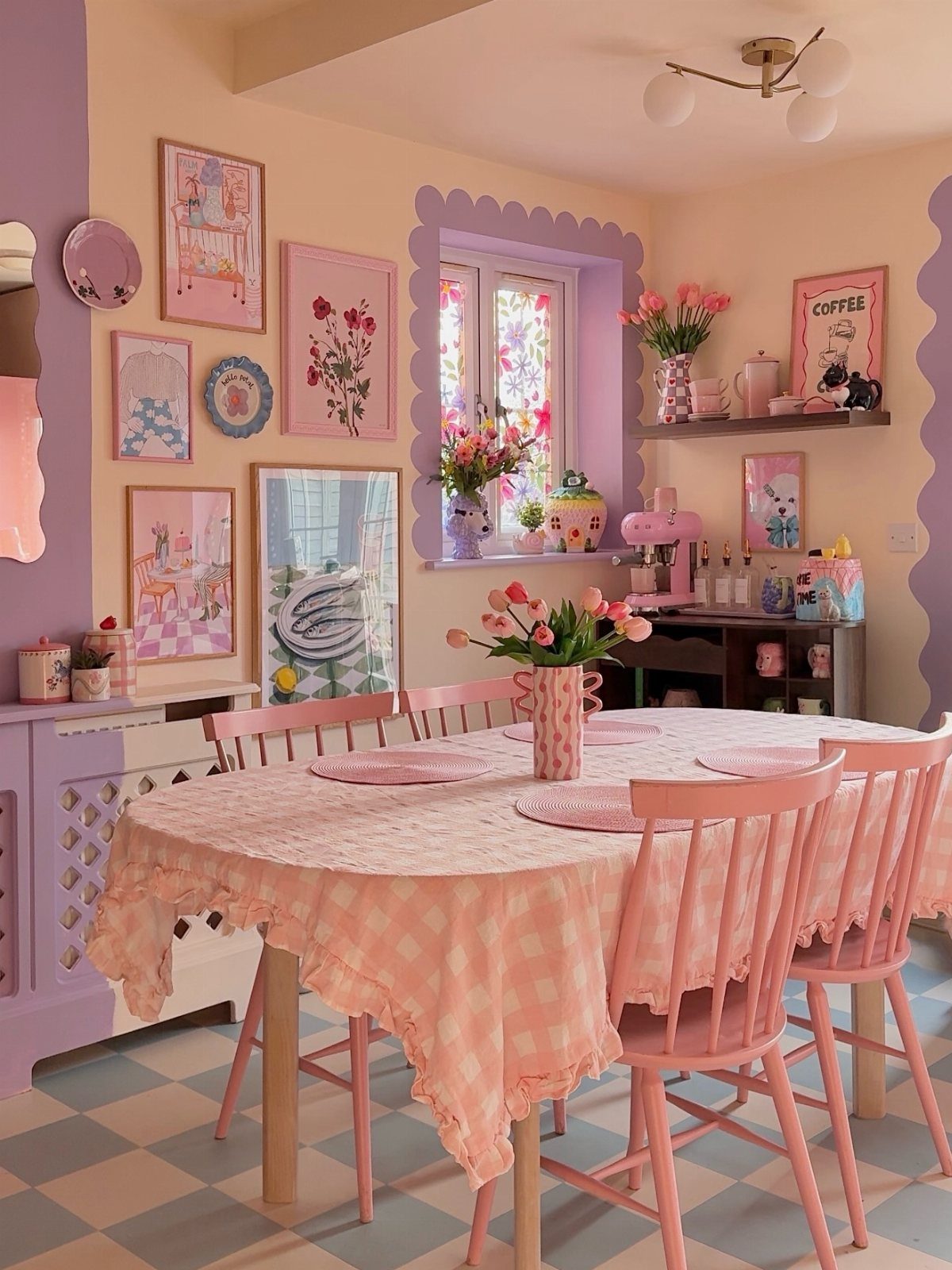
Nothing is muted, nothing is neon, so the room hums instead of shouting.
The fabrics do the heavy lifting. Leather on a banquette back, mohair on a stool, a cotton print on the table: the mix of textures keeps the palette from going flat.
Floral artwork and ceramic vases repeat the colors at different scales so your eye keeps moving.
This suits someone who cooks for pleasure, not for efficiency. The look ages fast if you tire of the colors, so start with textiles you can swap.
23. Layer Decorative Trays
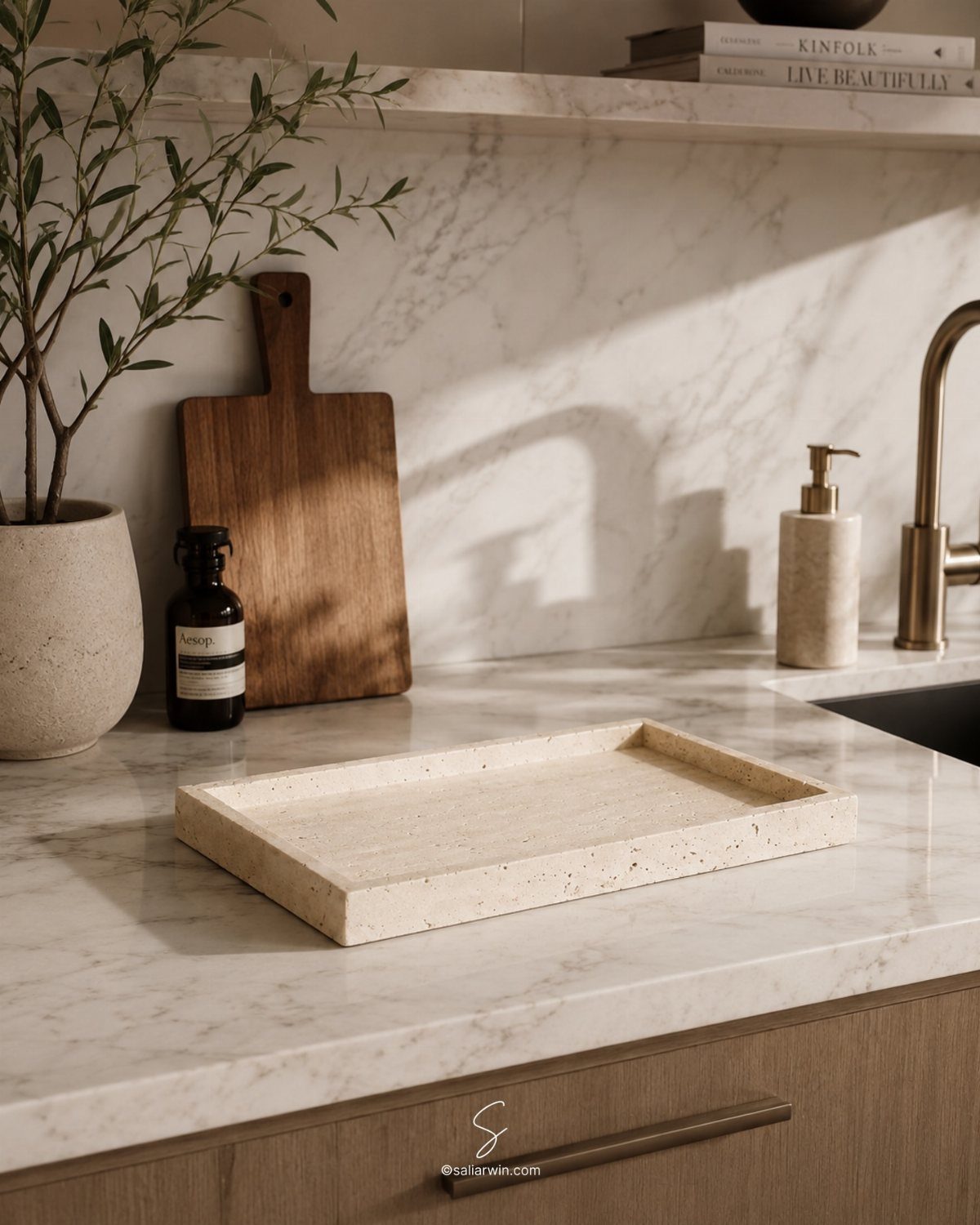
A tray on the counter corrals the olive oil, the salt cellar, the small plant that would otherwise migrate to every corner of the kitchen.
The beige speckled one here is large enough to hold four or five objects without crowding, which is the size to aim for: too small and things fall off the edge, too large and you stop editing what belongs.
Marble or stone trays ground a marble counter; wood or metal ones contrast. The material should differ slightly from the surface beneath it so the tray reads as a deliberate layer, not a continuation.
This arranges fast and wipes down faster. The real discipline is leaving the tray alone once it’s set.
Resist the impulse to add the mail, the charging cable, the grocery list.
24. Incorporate Modern Pottery
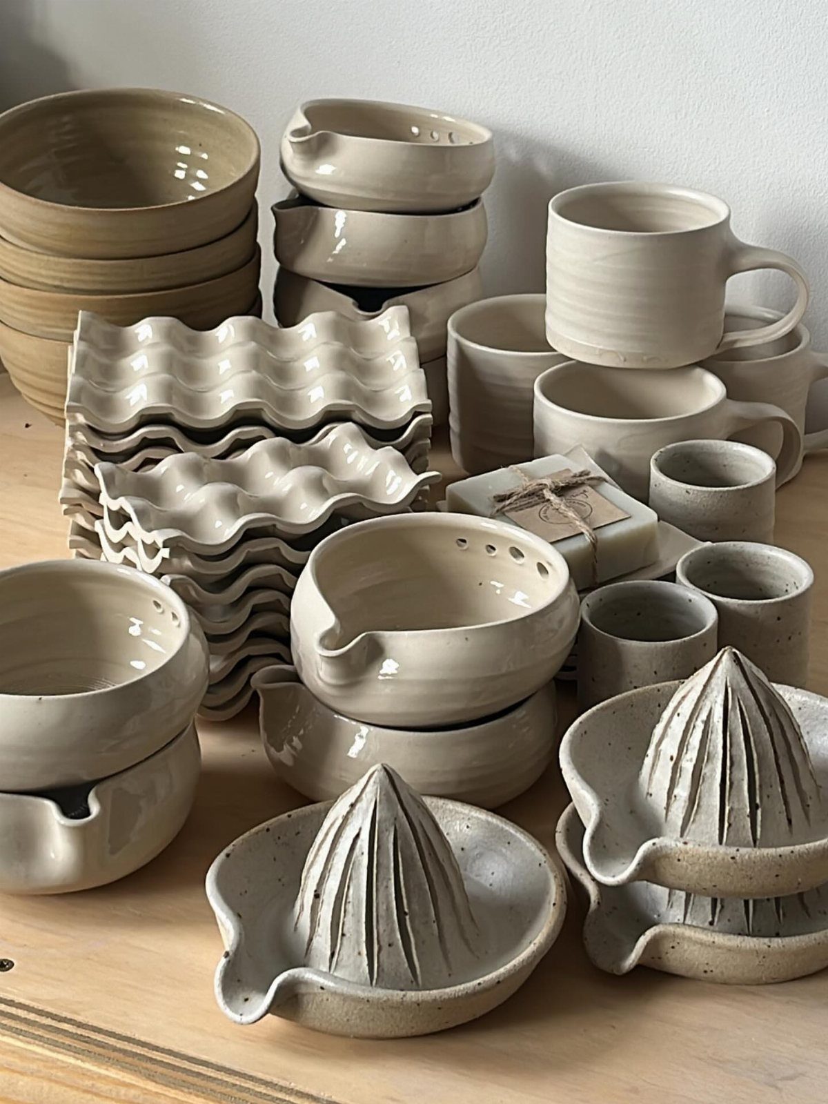
Cream ceramic against light wood and white: the palette is quiet, but the shapes carry the interest. Wavy plates, a juicer with a hand-pressed curve, mugs that taper or flare.
The collection works because the pieces share a tone but not a uniform style.
Neutral pottery bridges modern and traditional kitchens without forcing either. A matte cream bowl holds fruit as well on a walnut counter as on painted Shaker cabinets.
The organic feel comes from slight imperfections: a thumbprint in the clay, a glaze that pools thicker in one spot.
Start with three pieces that share a maker or a clay body. Add slowly; a shelf crowded with pottery starts to look like a tag sale.
Local markets and online studios carry good pieces, and a set of bowls costs less than one statement vase.
25. Emphasize Tall Ceilings
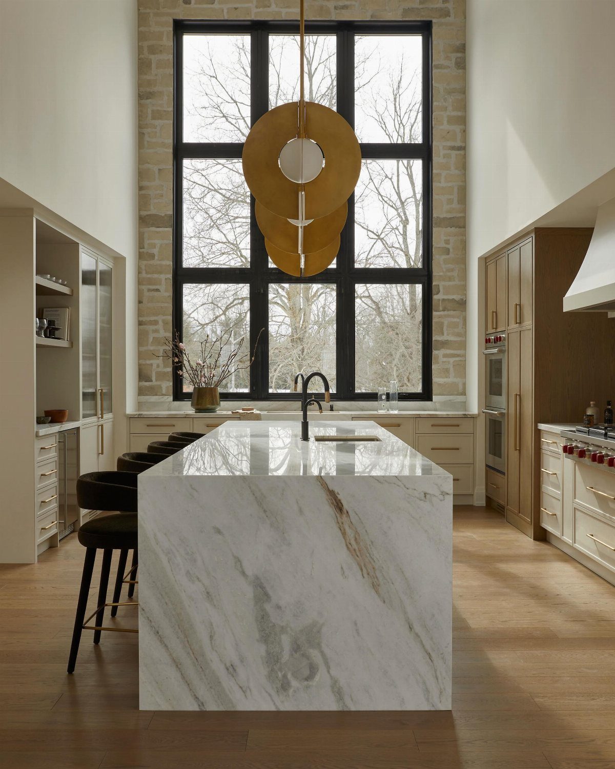
A sculptural pendant hung at full drop turns ceiling height into a deliberate feature rather than leftover space.
In my own galley kitchen, the eye used to stop at the cabinets; after swapping a flush mount for a long-drop brass fixture, the room finally felt finished.
Skylights do the same work with daylight. Three placed along a barrel vault, as one Santa Monica designer did, trace the curve and pull attention upward without adding a single inch of floor plan.
Tall cabinetry fills the gap when windows are not an option.
I would run one bank of uppers to the ceiling on a single wall rather than wrapping the room; the cost difference from standard cabinets is noticeable but the visual lift is immediate.
26. Mix in Tile with Character
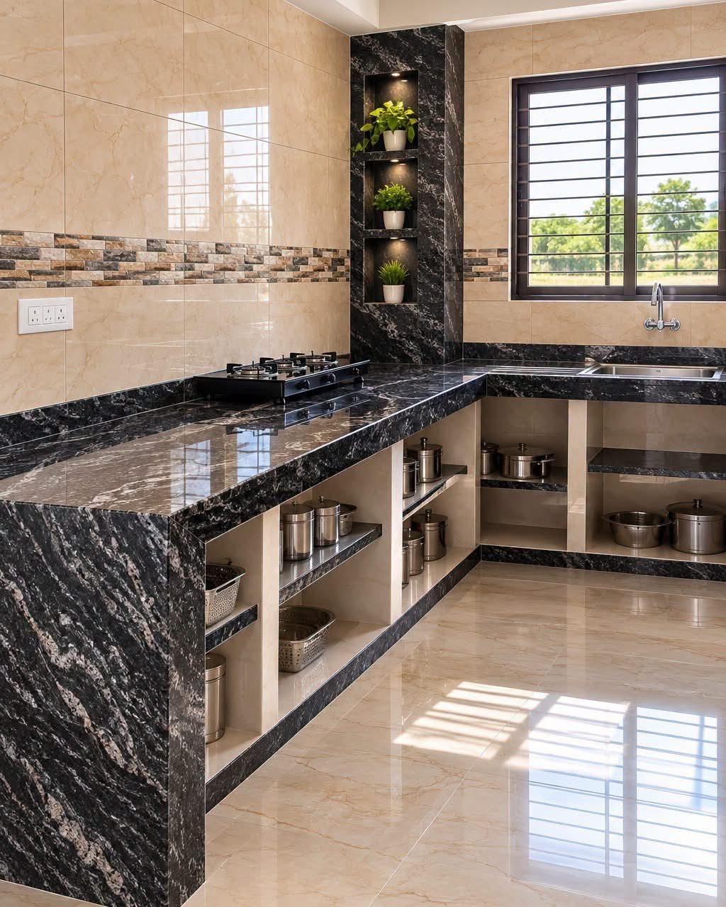
Hand-painted tile on a backsplash or floor strip reads as personality rather than pattern.
The floor in one Atlanta kitchen borrowed its motif from a Positano hotel bar; the backsplash in an Oxfordshire house used Delft tiles in green to tie the room to the garden outside.
Both approaches ask the tile to do one specific job: anchor the kitchen to somewhere real.
For a weekend project, a single horizontal band of patterned tile at counter height changes the whole room without the labor of a full wall.
I laid a 6-inch strip of Moroccan cement tile behind my own range in about four hours; the material cost $90 and the thinset was another $25. The rest of the field stayed plain white subway tile.
Patterned floor tile demands more commitment. A galley run takes longer and professional leveling if the subfloor is old, so I would save this for a renovation rather than a refresh.
The finished kitchen looks chosen rather than ordered by number.
27. Ground a Design in Black
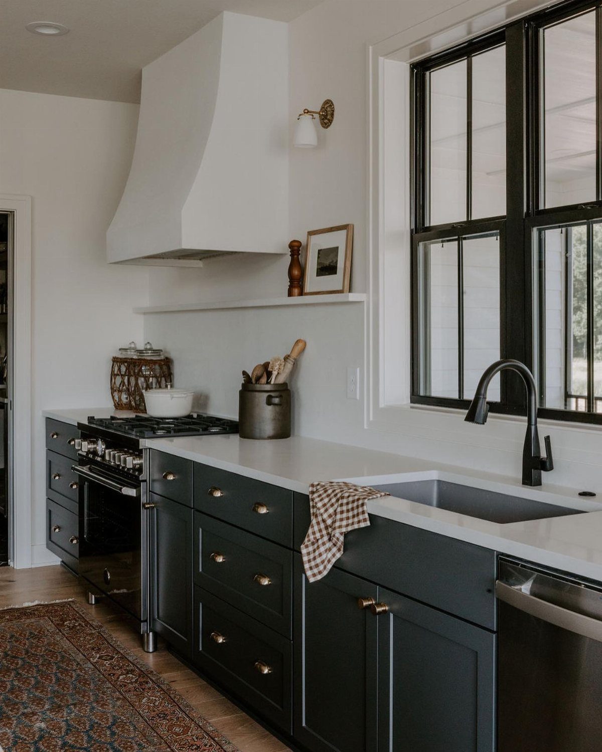
A soft black on base cabinets, something nearer charcoal than true black, makes brass pulls feel intentional rather than apologetic.
A black faucet and window frame extend the idea without requiring new cabinetry. These are single-afternoon swaps: a matte black pull-down faucet and a can of black enamel on existing metal window frames if the prep is thorough.
I would choose cotton over wool in a kitchen for washability.
Ceiling-height tile in black, as one California designer used, goes further toward drama than most renters or first-time owners need. I would try the cabinet-and-fixture route first and only expand if the room still feels unanchored.
28. Design a Kitchen That Doesn’t Look Like a Kitchen
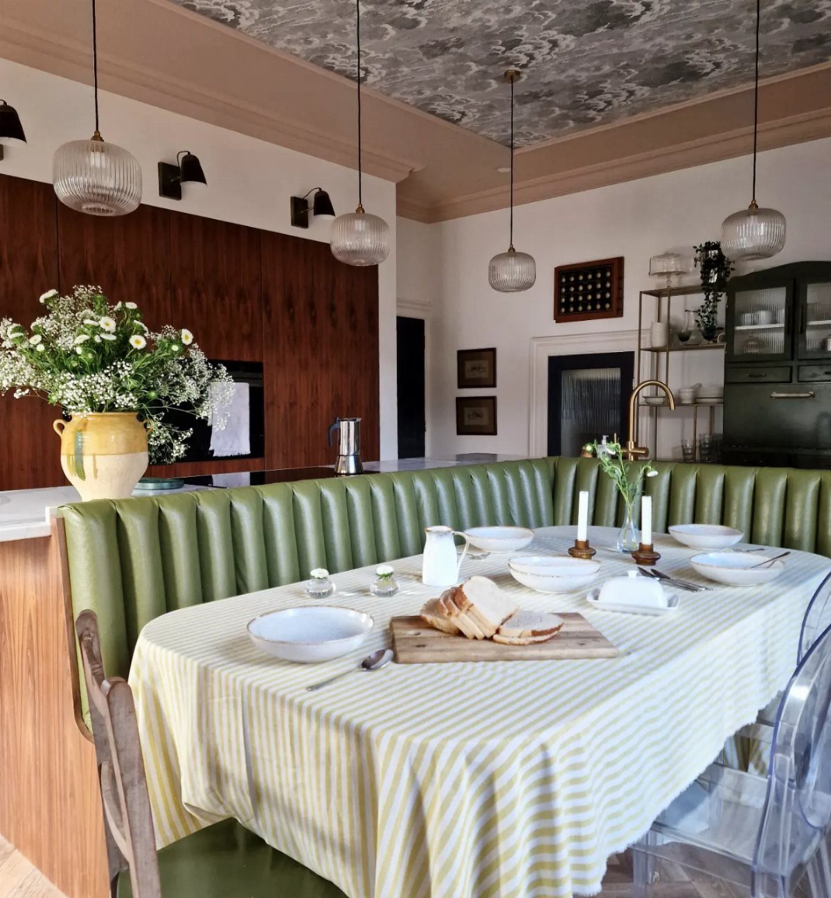
A kitchen that reads as a living room depends on hiding the machinery. No uppers, no visible appliances, cabinetry shaped like furniture: these are the moves.
The Paris apartment that pulled this off used an arched opening to the dining room so the kitchen became a view rather than a destination.
For someone mid-project, the lesson is smaller.
Removing two upper cabinets beside a window and replacing them with a painted wood shelf on iron brackets keeps dishes behind closed doors elsewhere, and the wall now looks like something from a breakfast room.
The lumber and hardware ran modest, plus an afternoon.
Furniture-like islands help too. A dresser converted to storage on casters, or a simple table with the same counter as the main run, breaks the built-in look.
Storage efficiency drops; I would only do this in a kitchen that already has a pantry or a full wall of lowers.
29. Add Cozy Textiles
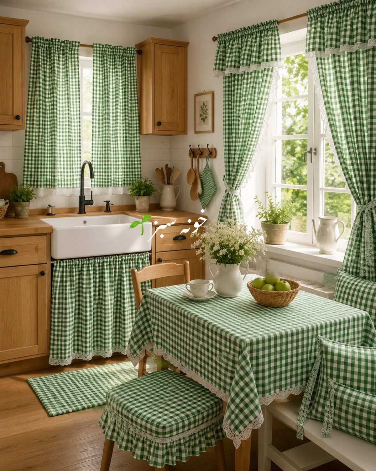
A sink skirt from cotton check is straightforward machine work; the fabric runs cheap and the labor is an evening. The skirt hides plumbing and cleaning supplies that open shelving would expose.
A matching pad on a wooden chair costs another hour and a small piece of foam.
For renters, tension rods hold the curtain without drilling into cabinetry. I would add a drop cloth or oilcloth liner behind cotton if the sink splashes; unlined fabric wicks water in a month.
The whole project stays cheap and moves with you.
30. Add a Sense of Luxury with a Waterfall Countertop
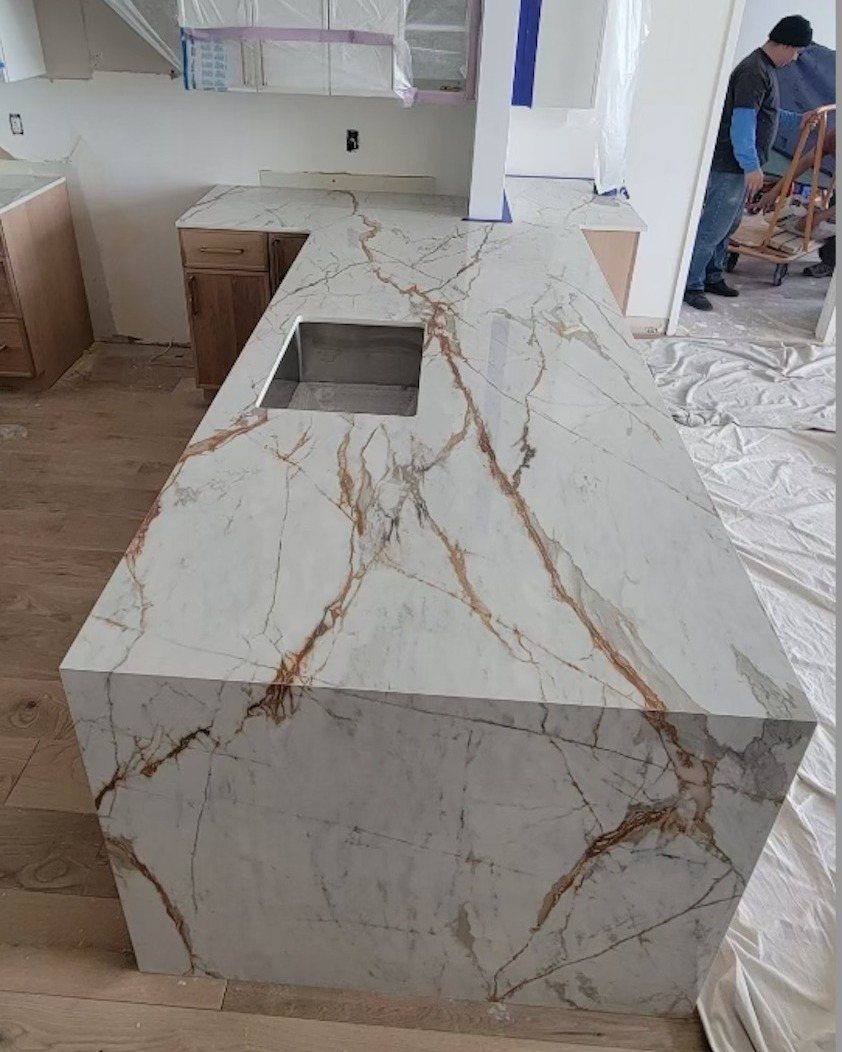
A waterfall edge carries the counter material down the island sides to the floor, turning the stone into a single visual piece.
In the Brooklyn townhouse that used this move, the veining runs uninterrupted from surface to base, and the lines draw the eye through the entry door.
The fabrication costs more than a standard edge: expect 20–30 percent added to your stone quote for the extra material and mitered cuts.
I priced this for my own island and stayed with a simple eased edge once the fabricator explained the seam at the floor would still be visible on anything except solid black or white.
In a stone with strong veining, that seam interrupts the very effect you are paying for.
For a smaller island, the upgrade runs extra and the result is genuinely sculptural.
I would do it if the island is the first thing visible from the living area; otherwise, the same money buys a better grade of stone or a thicker slab.
Latest Trends in Kitchen Decor
Open shelving has stayed current for good reason: it forces you to edit what you own and keeps everyday dishes within reach.
I like it best when the shelves carry a mix of wood tones and painted finishes rather than matching the cabinets exactly.
Natural materials are shifting toward rougher cuts and visible grain. Reclaimed wood for open shelves, unpolished stone with honed finishes, and hand-formed ceramics all read as modern without feeling sterile.
Two or three textures is plenty; any more and the kitchen starts looking like a showroom.
Bold color has moved past accent walls into cabinetry itself. Sea green, deep ochre, and even aubergine are showing up on base cabinets paired with pale uppers, or on an island alone.
I’d pick one strong color per kitchen and let the rest stay quiet.
Creating a Welcoming Kitchen
Artwork in a kitchen works better than most people expect. A single framed print above a doorway, or a small oil study leaned on a shelf behind glass, gives the room the sense that someone lives there.
A kitchen rug lasts longer set back from the range and the sink.
Decorative accessories earn their space when they do a job.
A ceramic pitcher that actually holds utensils, a wooden bowl for garlic and shallots, or a brass tray for olive oil and salt: these read as style because they are in use.
The staged look comes from objects that have no purpose.
The personal part is choosing what you already own. A pottery mug from a vacation, a cutting board with a worn handle, a tin of tea with a label you like.
Group two or three pieces on a counter or a single open shelf and let them be enough.
Frequently Asked Questions
How can I make my kitchen look more modern?
A speckled clay jar on the counter or a woven linen runner across the island adds enough texture to keep flat cabinet fronts from feeling sterile.
Wood, stone, and woven fibers all catch kitchen light at different angles, so mixing them beats matching every finish to the same tone.
For a bigger change, refacing dark upper cabinets in white oak shifts the whole room’s temperament without the cost of full replacement.
What are the latest trends in kitchen decor?
Open shelving, natural materials, and earthy tones are showing up everywhere. Thin brass frames around fluted glass doors soften daylight into the cabinet and keep the mess inside from reading as clutter.
Aged brass on pulls and faucets carries warmth that polished chrome never quite manages, especially under evening bulbs. Paint with visible brushstrokes, almost like plaster, gives cabinet fronts a surface that shifts as you move through the room.
What are 2026 kitchen trends?
The kitchens ahead read more like furnished rooms: appliances slip behind panels, uppers disappear, and islands stand on legs like tables that happened to grow sinks.
Earthy palettes from stone, clay, and moss pair with honest materials like cerused oak and soapstone. Sustainability shows up in portable islands on casters that adapt to the space, and in accessories you keep for decades rather than replace seasonally.





